Change to classic color space?

@maderafunk But I am not using any default renders, I am using Vignetting, Distortion and Crop on both and the CL - Classic (Legacy) or Wide Gamut i.e.

and it results in this on the first image

what exactly is going on to cause such a dramatic change in colour?

@KeithRJ Thank you for the flow diagram but that does not identify the cause of the profound change going on with the red channel in the images I picked to test!

It must be something basic but so far no-one has come up with a reason other than that is the way that DxPL works.

When Colour rendering is added, albeit the defaults for both are different

the colour differences begin to become less dramatic, and for some images in the test group they vanished, at least to the eye!

and the reason for that is …?

We are slowly getting away from the OP’s initial request (mass change from DxO Wide to Classic WCS), nevertheless, here are a few words about different hues as seen in different working colour spaces. Let’s pick a few lines of the page I linked to above:

About the new WCS

The DxO PhotoLab 6 working color space uses spectral colors as its primaries. It is big enough to contain all real-world surface colors

DxO’s arguments for the new WCS

We believe that this color space (…) provides the best possible trade-off between preserving as much color as needed (…). Combined with our gamut-squeezing algorithm and soft proofing tools, it allows photographers to reproduce any color they may encounter, as closely as possible to the original, without ever losing details.

I’ve highlighted “gamut-squeezing algorithm” because this squeezing leads to shifts of colours near the gamut’s edges. Squeezing out-of-gamut hues into a narrower gamut introduces shifts that not only depend on where the original and target hues are, but also on rendering intent and, in our case, the settings of “Protect saturated colors” as well as “Preserve color detail” and rendering intent.

Without any other correction, switching WCS changes the appearance of saturated colours due to “squeezing”. This change can be moderated by settings contained in DxO’s presets and by ourselves by either replicating such settings or any other action that will make the hues look like we want them.

But again, this does not help the OP to mass change images to Classic WCS.

1 Like

But this is exactly the reason why you see the difference in colors! There is always a default rendering active, even if you deactivate it! And by some design decision, DxO decided that the default rendering for Classic is the Generic Standard rendering, while for the Wide Gamut, it is Neutral.

You can verify this:
Activate the color rendering on classic, and select ‚Generic‘. When you deactivate the rendering, the colors should not change, even though you deactivated the rendering. That’s because it is the default rendering, even if deactivated.
Now select Wide Gamut. And do the same. When you select ‚Generic‘, and then turn it off afterwards, the colors will change. Because the default is ‚Neutral‘. If however you select ‚Neutral‘ and then turn it off, you will see no difference.

On the other hand, the neutral color profiles have changed a bit between Classic and Wide Gamut, so if you select Neutral on both, there might be some small differences. The Generic rendering should be pretty close however.

If the op only wants to change working color space,
@BHAYT gave the only “in the box” solution proposed by photolab : partial presets.

This has to be applied for each existing directory containing images to be modified.

1 Like

@platypus I am most certainly not getting away from the topic but rather I am trying to understand the reason why it is actually necessary to help the author which will benefit me as I am a very keen gardener and plant/garden “photographer” so the issue of colour fidelity affects me as well!

The fix to the @Bhard’s problem for all photos that have already been processed is to apply the presets I included and for the long term to create a “minimalist” preset and use that for all new images via the ‘Preferences’ setting, plus have some additional presets that take the editing slightly further if deemed necessary.

Applying the required preset does require opening each directory, selecting all images and executing the appropriate Gamut preset or navigating to the ‘Customize’ screen and choosing the Gamut with all images selected.

I have compared images before and as my examples have shown once the ‘Custom Render’ is applied the differences diminish considerably and sometimes disappear completely, but only to the eye, Beyond Compare can see them but that is an issue I can live with.

So I “developed” an image with ACDSee GEM 14, I decided to renew the licence this year, when the price got low enough, to see what masking can really look like!

I am a real novice with GEM but applied minimal changes and got this (the scenario names are in the image title)

I would contend that the GEM image is closer to the DxO ‘Wide Gamut’ image but it had sRGB selected and that is all I can see anyway on my monitors.

The Gamut diagrams show the extra greens available with Adobe and a lot of additional colours in the “reds” with ProPhoto

So for a final confusion I applied a reasonable set of (BHT) edits to the image and then just switched WCS between CL and WG and that gives a comparison with the original as

and when compared with the images with CR we have

So with CR only we have CL and WG looking very similar and with the BHT edits the WG image has “faded” more than the CL.

But none of the images have the exactly same colour so one last attempt comparing the out of camera JPG with BHT edits but no Smart lighting (SL) and no Tone Curve(TC), which weren’t really warranted in this case anyway we have

This is what is still missing imo: A way to change the WCS for all images at once instead of having to do it folder by folder…

@maderafunk executing your “experiment” the default selection in both cases is automatically ‘Generic rendering’ with ‘DxO camera profile (DC-G9)’ and as I stated before that goes some way to “levelling” the CL image with the WG image.

With the CL image toggling CR on and off does make a change but only a very, very slight one.

With the WG image there is a much greater change with the default of ‘DxO camera profile’ etc. but with ‘Neutral color’ none that can be seen, as you have stated.

The neutrals are very different between the VL and WG variants, the top two images are CL and WG alone and the two below are CL+CR(Neutral) and WG+CR(Neutral)

To do that would require accessing every image and adjusting one line in the DOP, having located it in the first place and then updating the database entry. That is never going to happen, as users we have a list of priorities already which will never get done!

The ways I have suggested for “correcting” old directories when revisited and preventing “incorrect” new ones is about the best you are ever going to get.

Imagine being able to see images in subfolders. That’s all it takes. Select all, apply Classic. Done.

Or, for RAW files: Look for all .dop files, overwrite the two lines (on Mac) with the WB setting with one that says “Classic”. Done.

@platypus Although it sounds easy there are a number of things that need to be place before you let anything loose on other users data!

My yet to be finished “DriveSwap” program copies the database, initially I added a counter to the name but then replaced that with a Date/timestamp and the program makes the amendments to the database copy, i.e. no living database was/will be harmed in the execution of that program!

However, that program needs to be made stronger to take into account the ‘-shm’ and’-wal’ files, which indicate either that the database is currently in use or that the previous run of DxPL failed!

If any program uses the database the the database must be backed up and/or the copy of the database must be used.

If DOPs are going to be changed they must be secured to provide a way back for the user (and the developer) in the event of a problem.

Either use a DOPCopy feature that secures the whole directory of DOPs (and, optionally Images and xmp sidecar files) before undertaking any adjustments or make a backup copy of each DOP just before making the changes to the DOP.

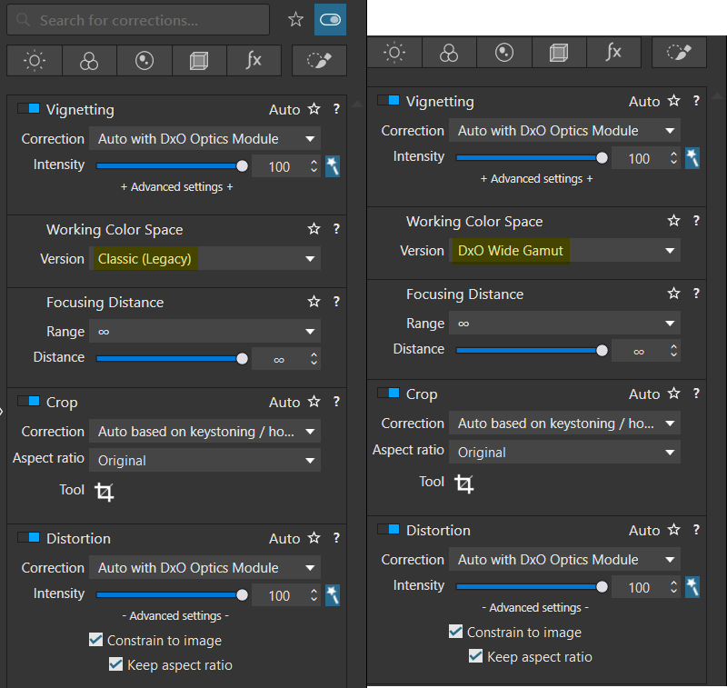
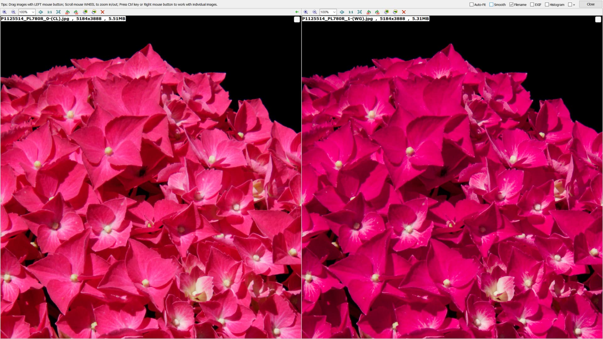
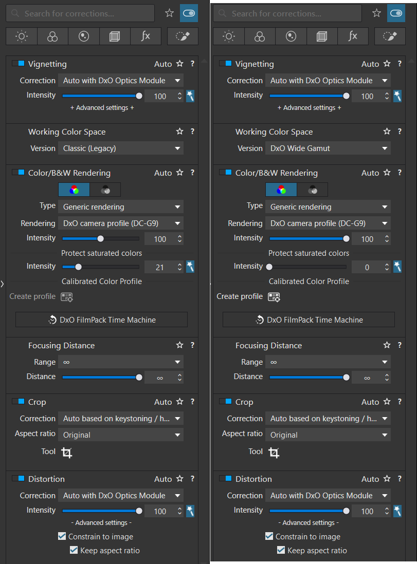
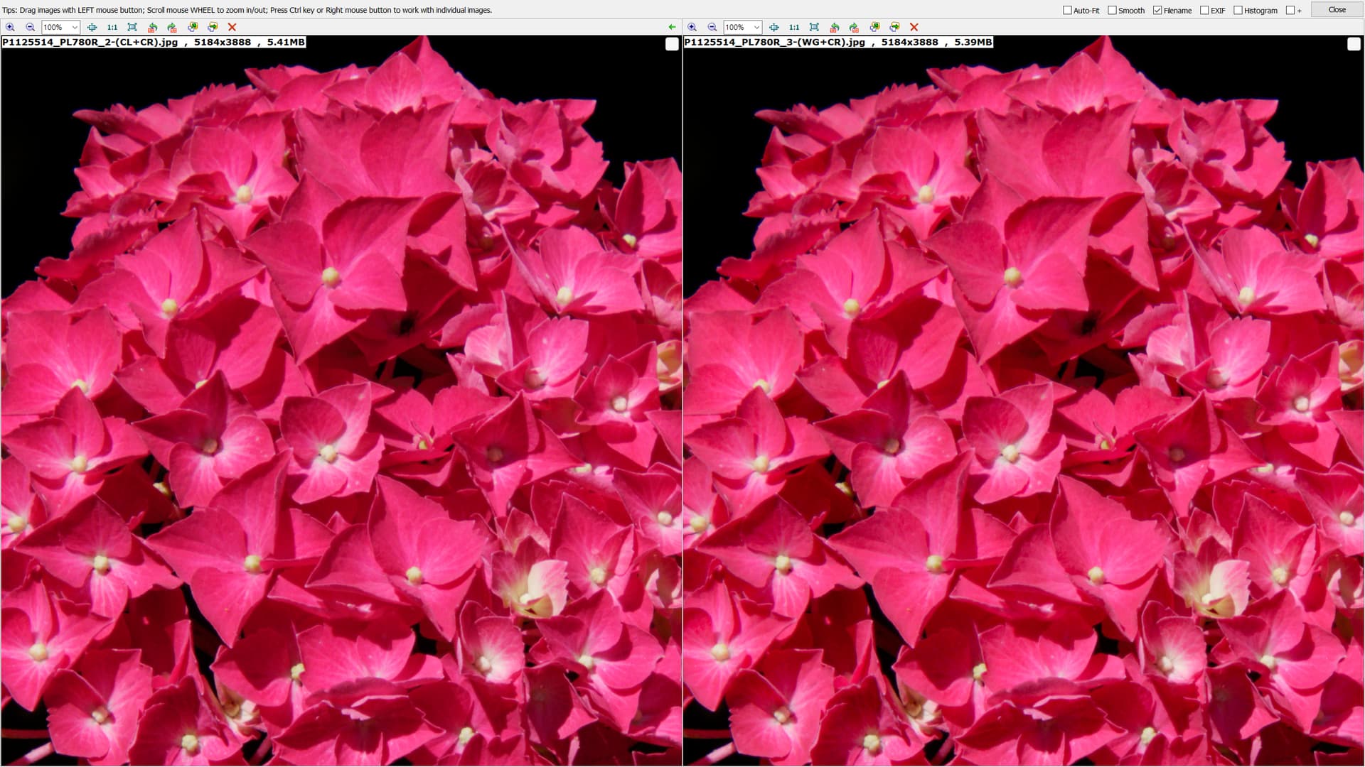
The whole directory DOP copy has uses for backing up DOPs before “destroying” them e.g. when installing a new release so that reversion to a previous state (release), alongside a previous database copy, is possible!? Once an update has been done on a new release then arguably there is no going back.

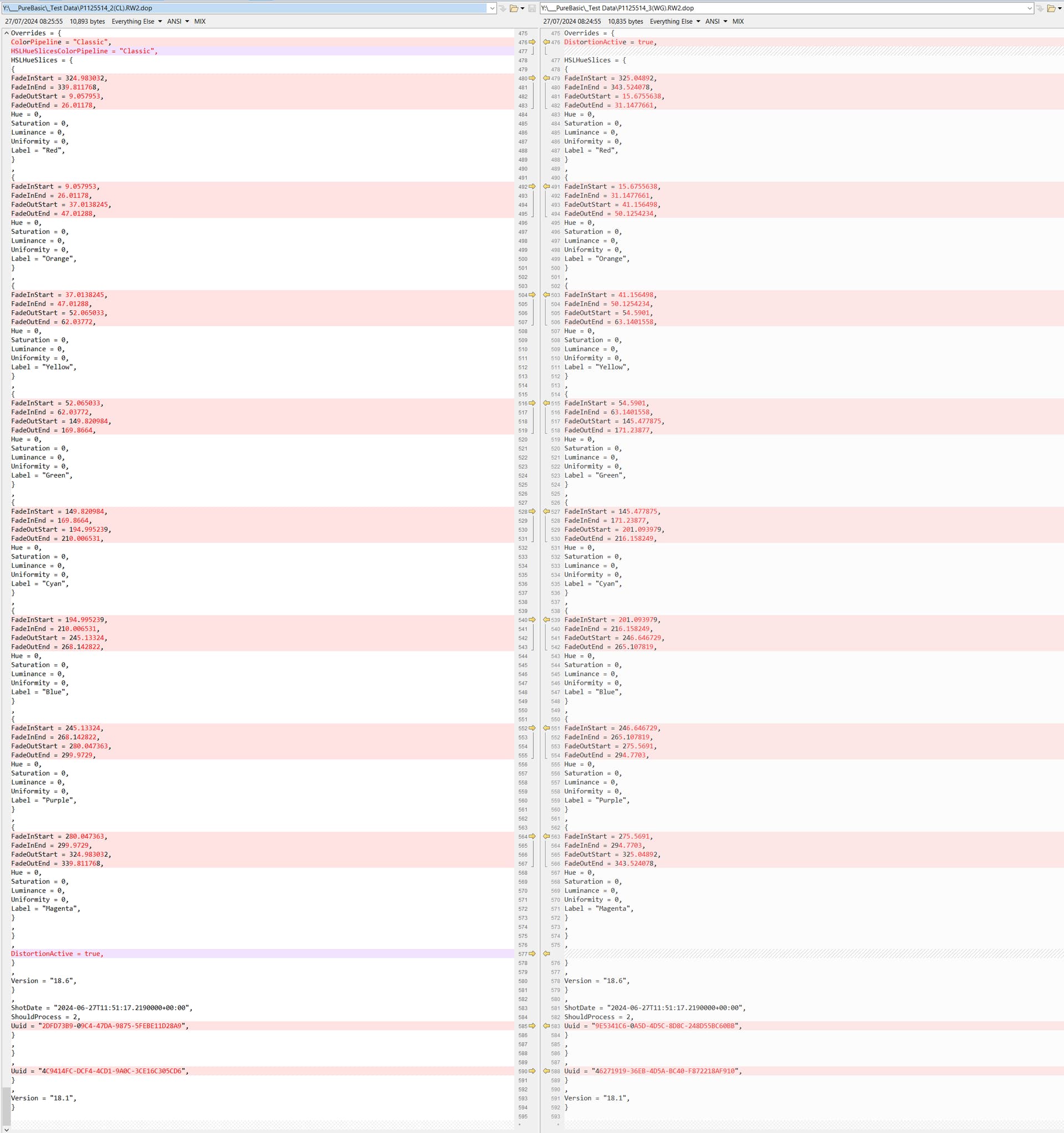
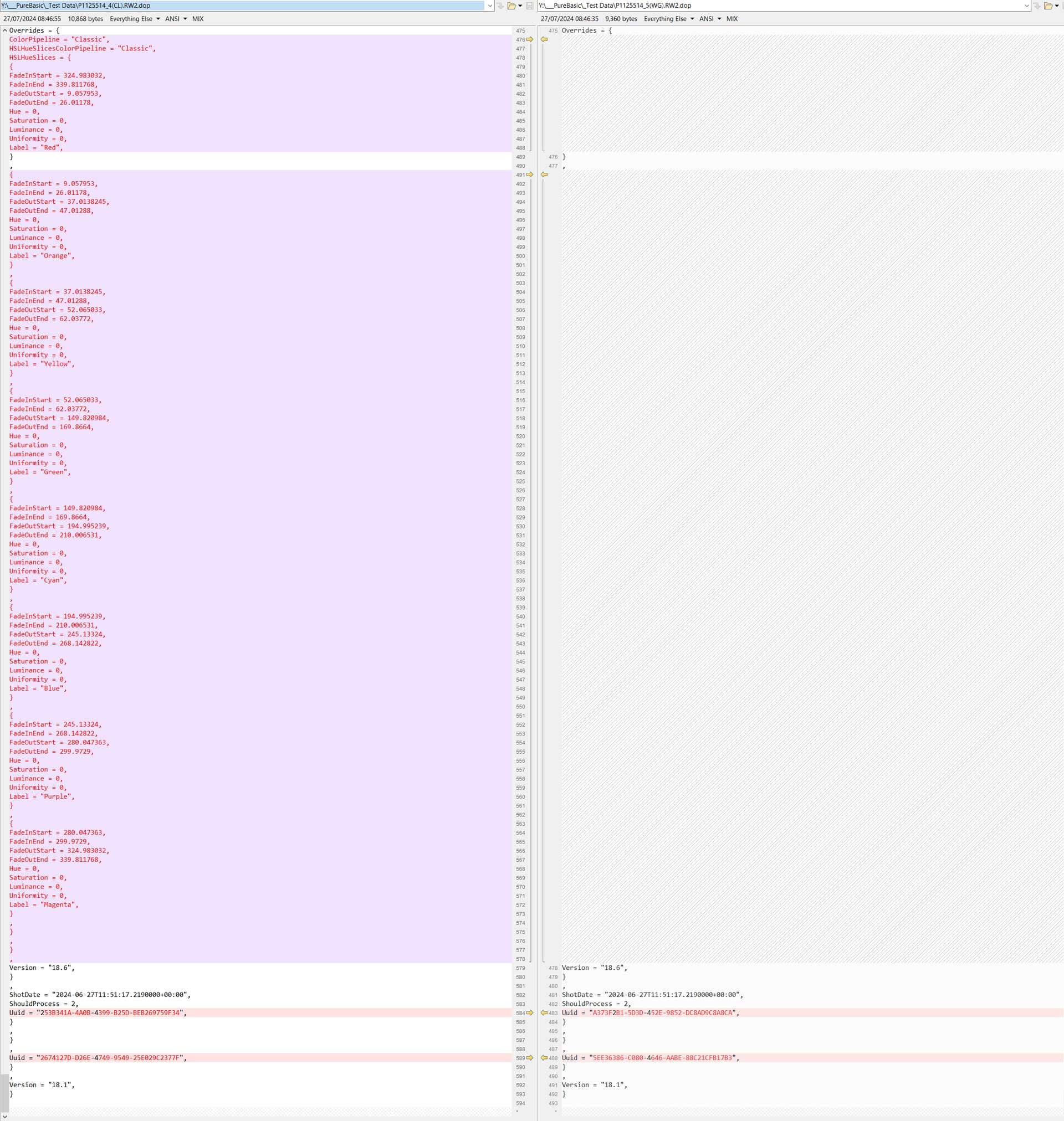
Going through the DOP line by line and locating and changing the appropriate line in this case is relatively easy but I am currently unsure if DxPL will recognise a DOP change from the ‘Date Modified’ attribute, the date in the DOP or …?

If DxPL does not do a DOP read and then update the database there is a danger it will simply use the database entry and overwrite the DOP! That is something that can be tested using a basic manual “hack”.

Currently I am learning PureBasic and (re-)discovering how careful you need to be when the data at risk isn’t yours!

or apply a preset (full or partial) or ‘Paste correction settings’ or return to being able to index a directory (of directories) and still be able to continue with normal editing on the Windows version!

@platypus Ignore what I said about a potential external fix!

Firstly, DxPL does not even write a DOP when WG is set but writes one immediately that CL is set, i.e. the assumption is that WG is the default the users will use.

So the following is a section of the DOP comparison between CL with ‘Distortion’ also set versus WG also with ‘Distortion’ set (to get DxPL to write the DOP).

This is definitely not a one line fix because the line doesn’t even exist for the WG case and the DOPs are very different!!

I repeated the test setting just CL and forced a DOP write for the new CL image and the new WG image and compared the two DOPs and got this

Its the “hard” way or no way at all!

@BHAYT , whether implementing such things are easy or not, I do not know and don’t really care about either. But in view of an improved service to the user, DxO could change a few things like e.g. accessing images in subfolders (they did it in projects and the Apple Fotos library) … but they’d also need to suppress unconditional rendering of all images, in order to not slow down the user from accessing the images for modifications.

As for WCS entries in DOP sidecars: Several entries exist, one set for the defaults and one set of overrides for each VC, if these change a default. A sidecar modifier script/app needs to be smart enough to find and change all those entries…and possibly modify the timestamp in order to make DPL read the sidecars again.

Anyways and as of now, changes need to be done folder by folder, which is not too bad - unless one has a heavily fragmented photo archive.

Interresting thread.
classic workingspace was Adobergb, which caused redisch and blueisch colors to saturate too soon. Specialy flowers and sunset’s where touched by the limitations i believe.
Much users where asking for pro photo because LR/PS was able to use that.
So DxO rewrote there hole preview engine and edit (color)space to create there Wide Gamut.(near prophoto but not completely the same.

Because of there “protect saturated color” algorithm much of the problems of redisch and blueisch where crushed gently so not very easy to spot if you didn’t look for it. And in the end squeezing it inside sRGB made it useless to work inside a bigger Workspace before.
So they added monitor proofing and softproofing along the default every one used highlight and shadow check. (which is due the colors it provide IF you understand the showne colors also a colorsaturation warning and not only lumination/exposure warning)
And the automated slider of PSC hinted also that some colors where out of gamut.

Now we have nice big workingspace, great. So the former biggest cut off (crunched in not really chopped of) to Adobergb isn’t a big deal any more.
Which is nice but also force you to use monitor proofing and softproofing because YOU have more control in the colorcrunching along your editing.
So some colors could be go highwire because a part of the color is crunched and a part not because of your editing. (in the old Adobergb it was already compressed so you didn’t see it.
Now if you unbalance a certain color in WideGamut and don’t check with the tools you could end up with a totaly different endresultthen expected.
Specially in red and blue. Somehow green is less effected.

Change a edited raw image from classic to wide would be fine i think because dxo’s rendering was taken control in classic.
But the other way around could effect your edited image much more in the endresult due the more user control in the outer parts of thecolorspace.

So my advise would be create a Virtual Copy and turn that to classic.
Watch the difference in side by side and edit then the classic version back to life and liking. :slightly_smiling_face:

Still a simple 3D graphic of the rawfile’s image inside a chosen colorspace with sticking out the out of gamut parts would help a lot of people to understand colorspaces better. (including me.) 2D softproofing showes only “it’s out on this place and that place” but not HOW far off the scale.

Example if your rawfile of a red flower is spiking through the sRGB colorspace alot bringing it down inside would flatten (detail/nuances of colors are smushed) the image massively if you would re-export later in larger Display for newer monitors.
Seeing how much red is crushed could be informative in deciding if you softproof for the larger Display from the start and accept the export from raw to sRGB be extra crushed to fit so you don’t have to go all over the library later to update your export. A 3D graphic could help to see if it’s useful or not to jump the gun on Display for later or edit for the present which is sRGB often.(windows doesn’t have fhis option and i believe Apple does outside dxo app.)

So to be futureproof you must be using Wide Gamut and at the same time be aware of the extra error space you have working inside this wider edit room/space.

So i keep monitor proofing alway’s active in order to see if something is slidly or much out of gamut (small spots or large spots of plains of the mask).

If it’s inside your monitor it should be 99% inside sRGB if your monitor isn’t a wide gamut monitor in P3 and Adobergb capabele.
So you could skip softproofing then when exporting to jpeg sRGB. :grin:

1 Like