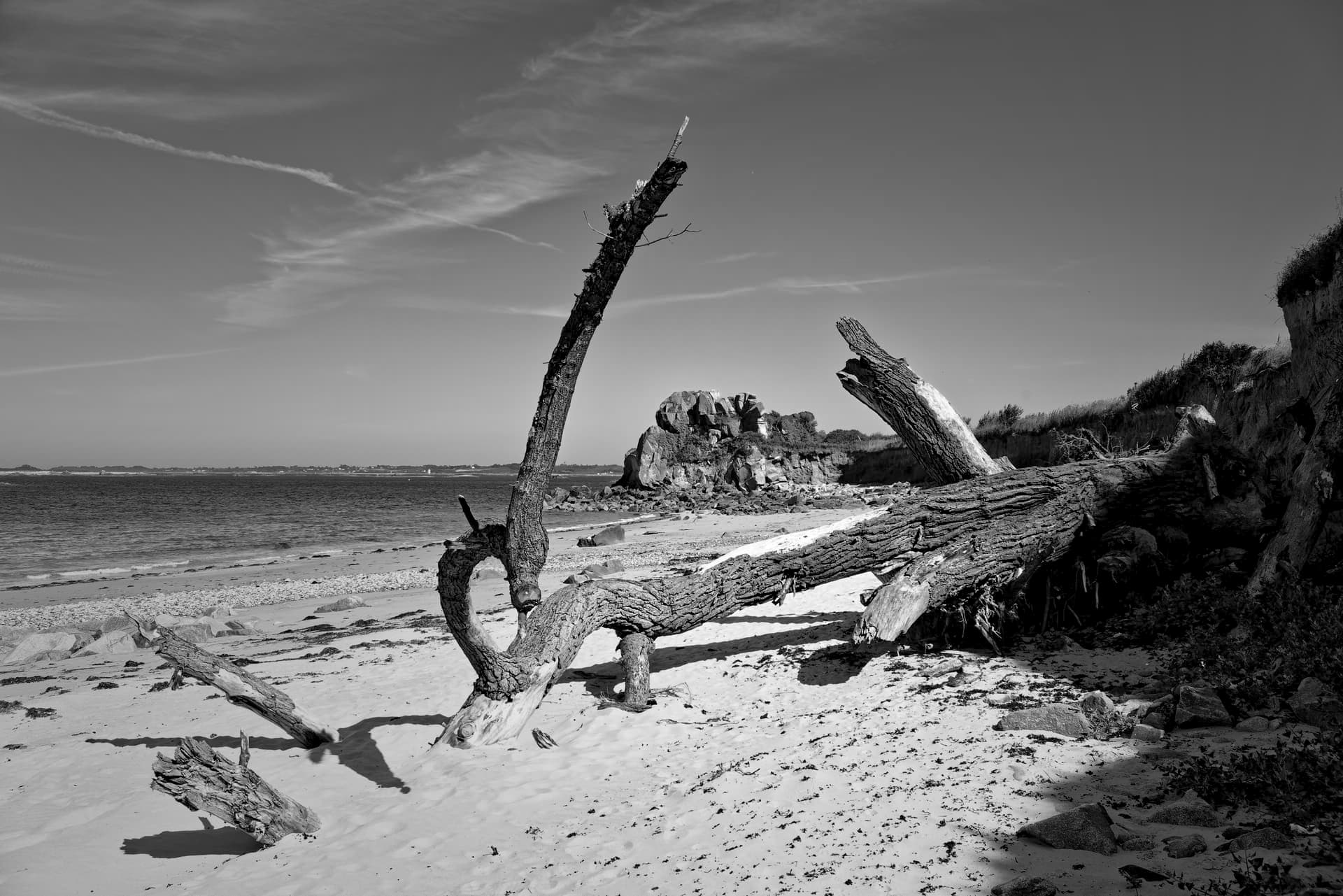
It’s not often that I ask for opinions on my work but I’d be interested to know what you folks think about my use of a red filter on this image, to accentuate the clouds.
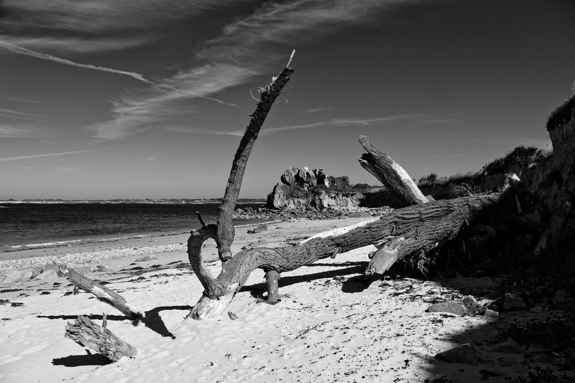
Without filter…
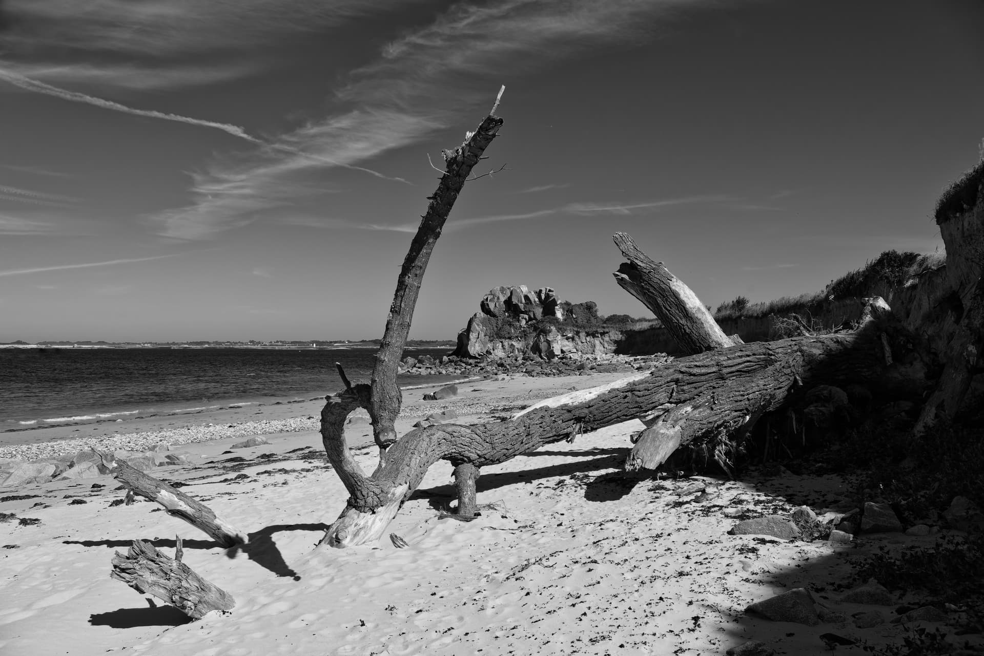
With filter…
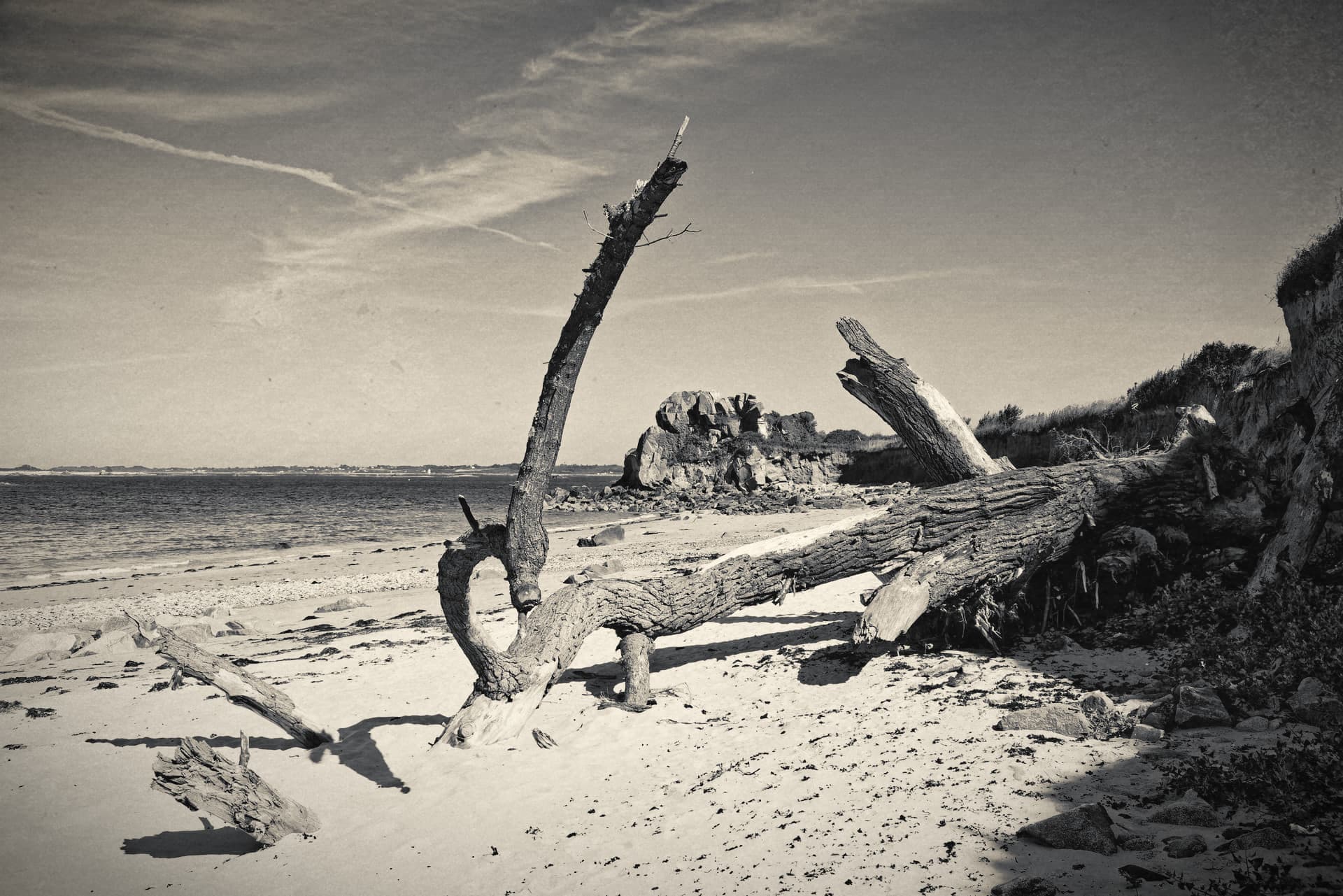
It’s not often that I ask for opinions on my work but I’d be interested to know what you folks think about my use of a red filter on this image, to accentuate the clouds.
Without filter…
With filter…
I find this sand a little too bright on the original, but the sky is little too dark on the filtered one.
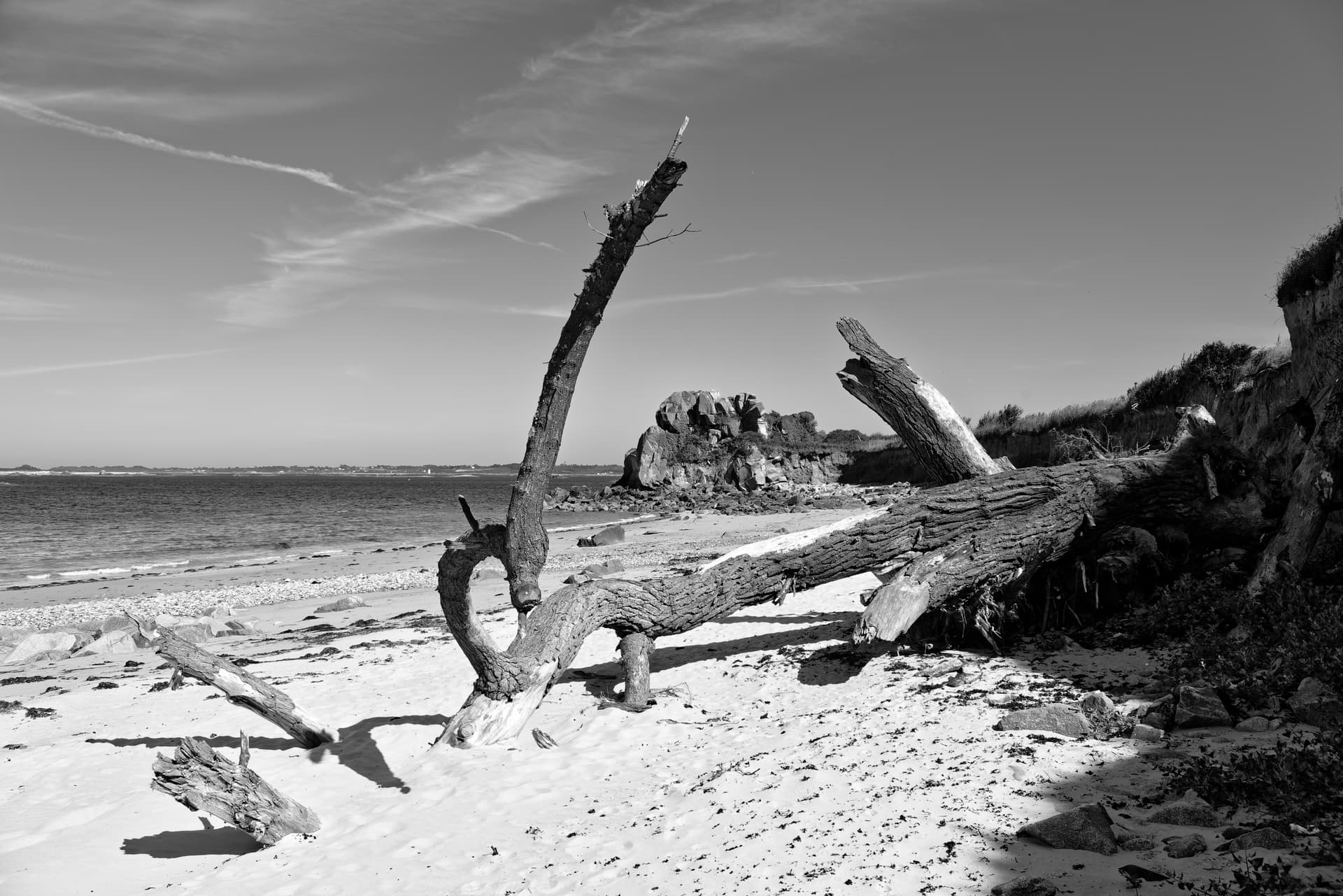
Well, that’s very helpful - not ![]()
I think I agree with you, sort of. My aim was to bring out the clouds but, obviously, the filter has also brought out more detail in the sand as well.
It’s a good job ì didn’t rush it straight to the printer. I shall have another play.
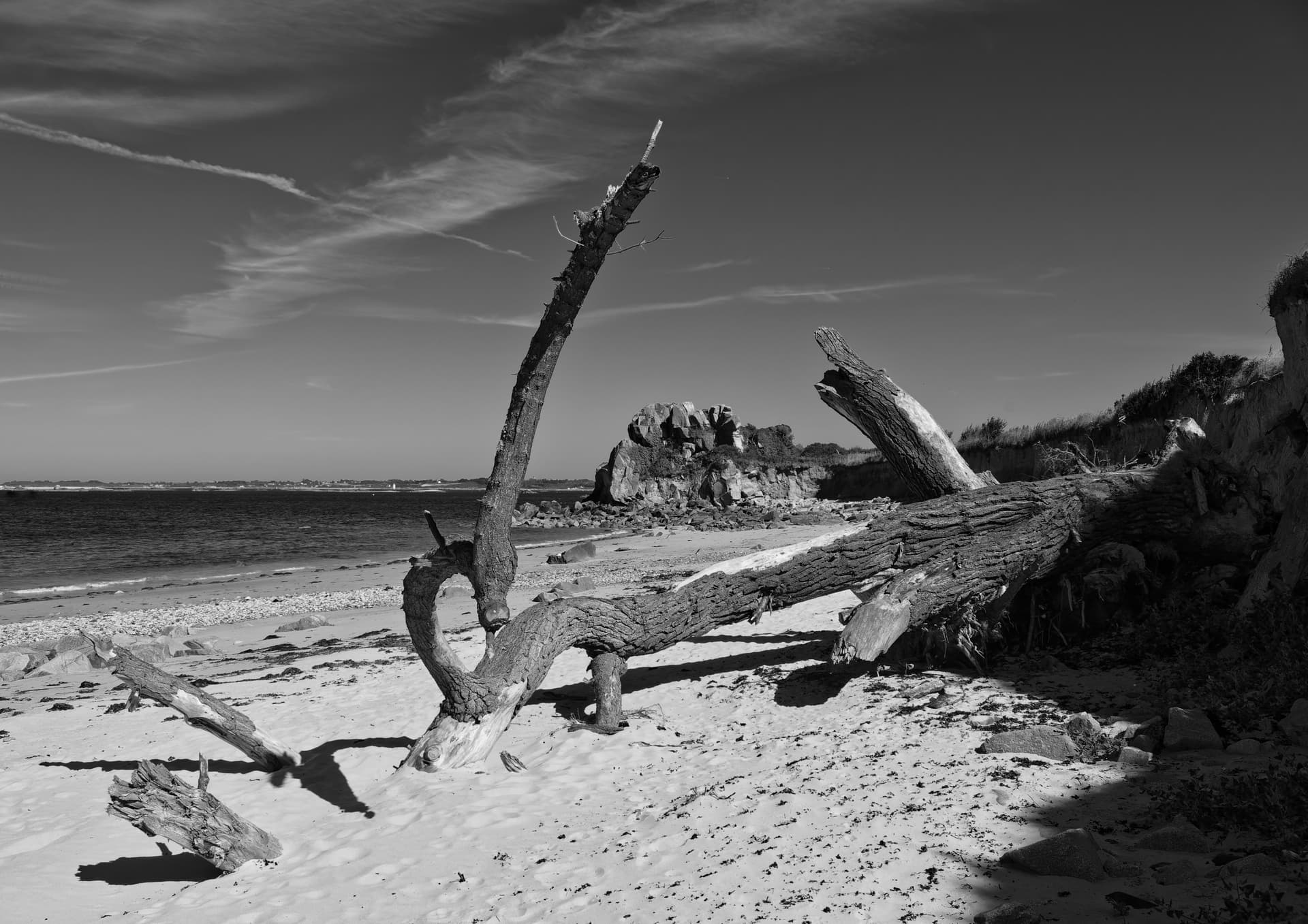
Well, here is another version…
Red filter 120 instead of 128. Steepened Tone Curve at the top to get more “bite” into the sand.
Although I get a horrible feeling I am going to have to print it to get the best judgement ![]()
Although I get a horrible feeling I am going to have to print it to get the best judgement
I agree that this is better. If I were stronger at Affinity Photo 2 I could show you how to de-emphasise the strong shadow on the rhs without taking the eye away from the tree. Not knowing Film Pack that (or indeed at all) well, if you can use a graduated filter - or several layers of decreasingly strong) filters, the job may be possible.
In my opinion, there ist more dramatic in the Image utilized by a red filter. I like accents that are different than normal.
Yes, better but as @Mike_Murphy has already noted, the dark shadow on the right is a distraction. Can you not open it up to restore the detail that’s there in the original unfiltered version?
Well, I can but, at least on my monitor, it starts to look a bit “mushy”…
Even at that I’m starting to feel uneasy, but that’s just personal preference.
Don’t forget, it was a very strong backlight coming from the other side of the dune.
Yes, but in the unfiltered version there is good detail that’s been lost in all subsequent versions.
But that’s not my problem with the dark shadow … more that its intensity distracts from what I understand is the target.
agree with @Mike_Murphy_1948 that the right side is a particular distraction. But I don’t see opening that up as helpful to the scene.
So what is the focus/theme/mood? After searching, I found the small rock cliff framed by the tree and sand/water most interesting. The high contrast, ragged rocks and tree on the seashore spoke to the ruggedness of the landscape, even on such a clear, calm day.
The red filters perhaps made the scene more dramatic, but the side elements were distracting.
Need to get the clutter out.
I agree with @stuck. I prefer the unfiltered version, but I think that the sand
needs darkening to gain a bit of the lost detail.
I found the red filter too dramatic. Have you thought of using a Yellow filter?
Here’s also more information on using filters with black and white images and film from ILford.
You’re right but I am trying to keep a certain “zing” and pulling too much out of the shadows tends to make it look like a poorly done HDR.
Hmmm. What do you see as the target?
I think you need to clarify that statement.
Thank you, I have been using coloured filters on LF B&W film for many a year, but the link may prove useful for others.
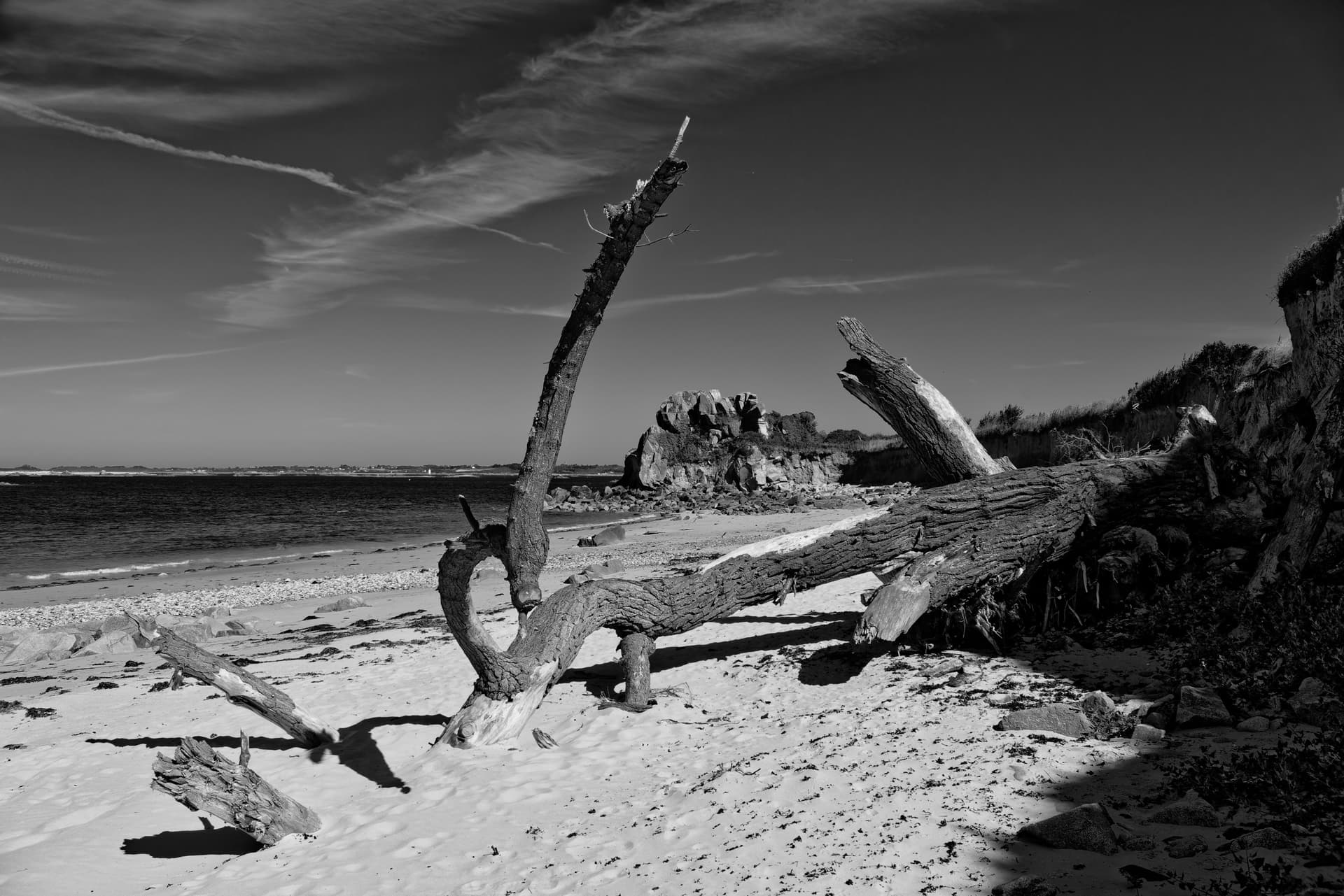
Another version where I have used a Luminosity mask on the dark corner with something I rarely use - micro contrast …
I would have been happier had I been able to use the colour filter as I would have used a graduated filter, just for the sky.
Without darkening the sky, to me it is a snapshot of something you saw walking on the beach. The filter gives it a mood of something you felt walking on the beach. It’s a very dynamic image, and the mood is uncomfortable. I admit I don’t really enjoy looking at it, and I find the unfiltered sky more pleasing even if less impactful. It’s a great image, if your intent is distress, or uneasiness as you imply. If the filter was just for the detail, not so much the mood, I don’t know. Those clouds aren’t all that interesting and just look like contrails or chemtrails depending on your beliefs.
If you remove the shadowy material on the right, there is too much negative space on the left, so I don’t consider it a distraction; it’s needed for balance.
Yes, much better balanced as @oldjstein said. I suspect the main reason for taking this picture is the nice framing of the cliffs in the distance. One trick I tried was to use my two L-shaped pieces of mounting board to see if any other shape, could improve your main subject. Every thing I tried just did not work. I like the way the buried part of the branch leads you into your main subject.
@Joanna – or something like that …
and focus on the fallen tree.
I don’t think the sky and clouds are that important and the very light sand without any interesting details on the left side is too distracting.
![]()
This is better, to my understanding that the tree - including whichever bit(s) of it is/are at the right of the frame - is the target. Even if some of it is beach rather than, as now appears - rootball.
Thanks @Wolfgang but my pet peeve is vignetting ![]()
Heheheh. Well, I’m getting there, a bit at a time