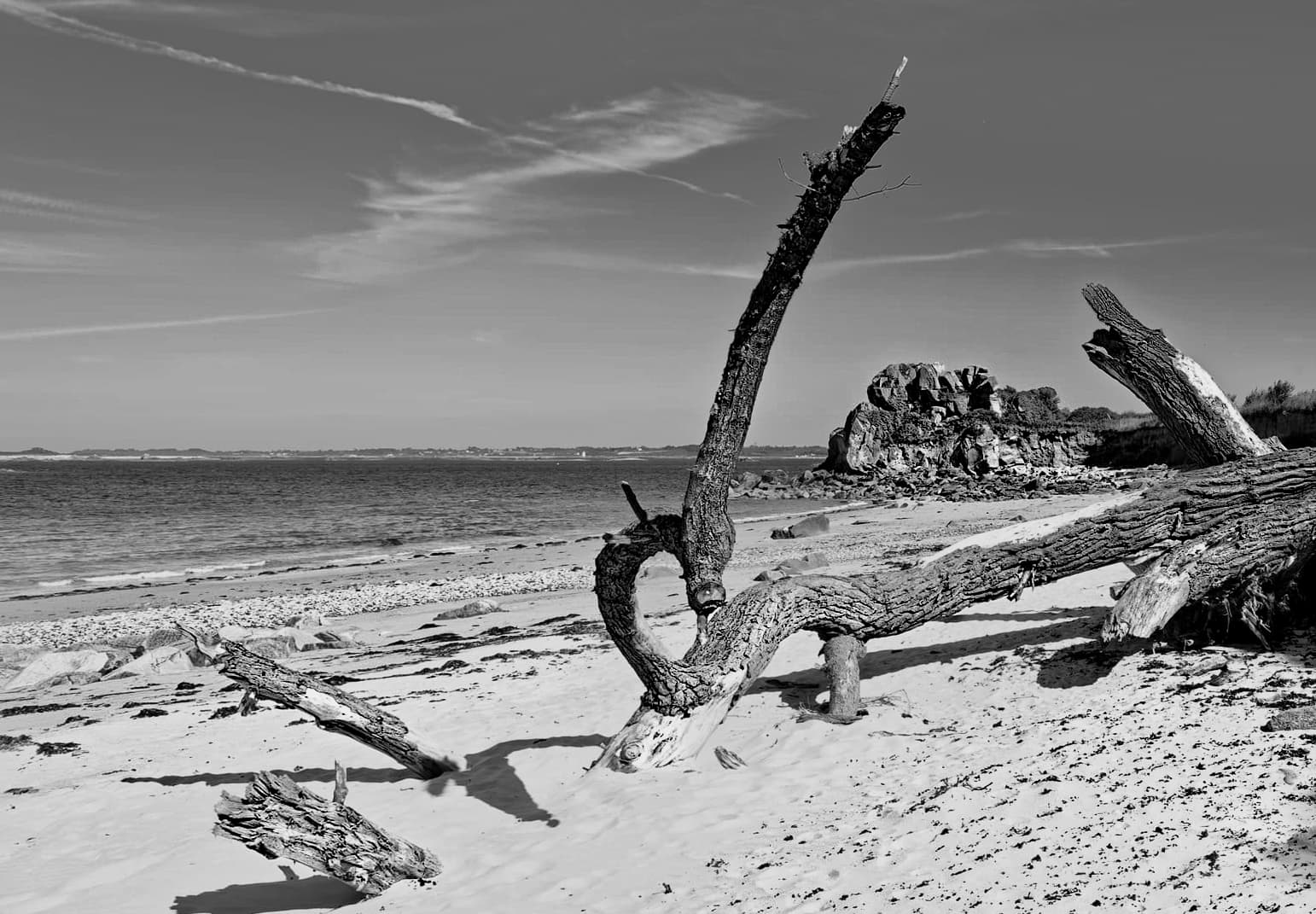
altered perspective and used clone brush to remove bulk of side distraction
Control line to darken the sky against the clouds.
Luminosity mask to lighten shadows a bit.
Brush to add “texture” to tree using a bit of ClearView.
a bit of overall tonal adjustments to “darken” the image.
not successful adding more “texture” to sand/pebbles or balance as the center of gravity is too far to the right.
This image reminded me of your weather-beaten boat image from a few years ago. By comparison, this image still feels “cluttered” and more of a “snapshot”.
Sorry Joanna, I still prefer your previous version. Your latest version. The sea does not look like the sea any more. The sand has lost a lot of its detail in the left-hand corner and the cliffs in the distance seem to jump out at me and trying to take over everything. Just my opinion.
At least I managed to finally unblock the right side.
I did try going back to the original and darkening just the sky but, whichever tool I use, I always seem to get a bit of a halo where dark meets light. Using the red filter globally and the paintbrush to brighten the right section really did seem to be the only way to avoid the halos.
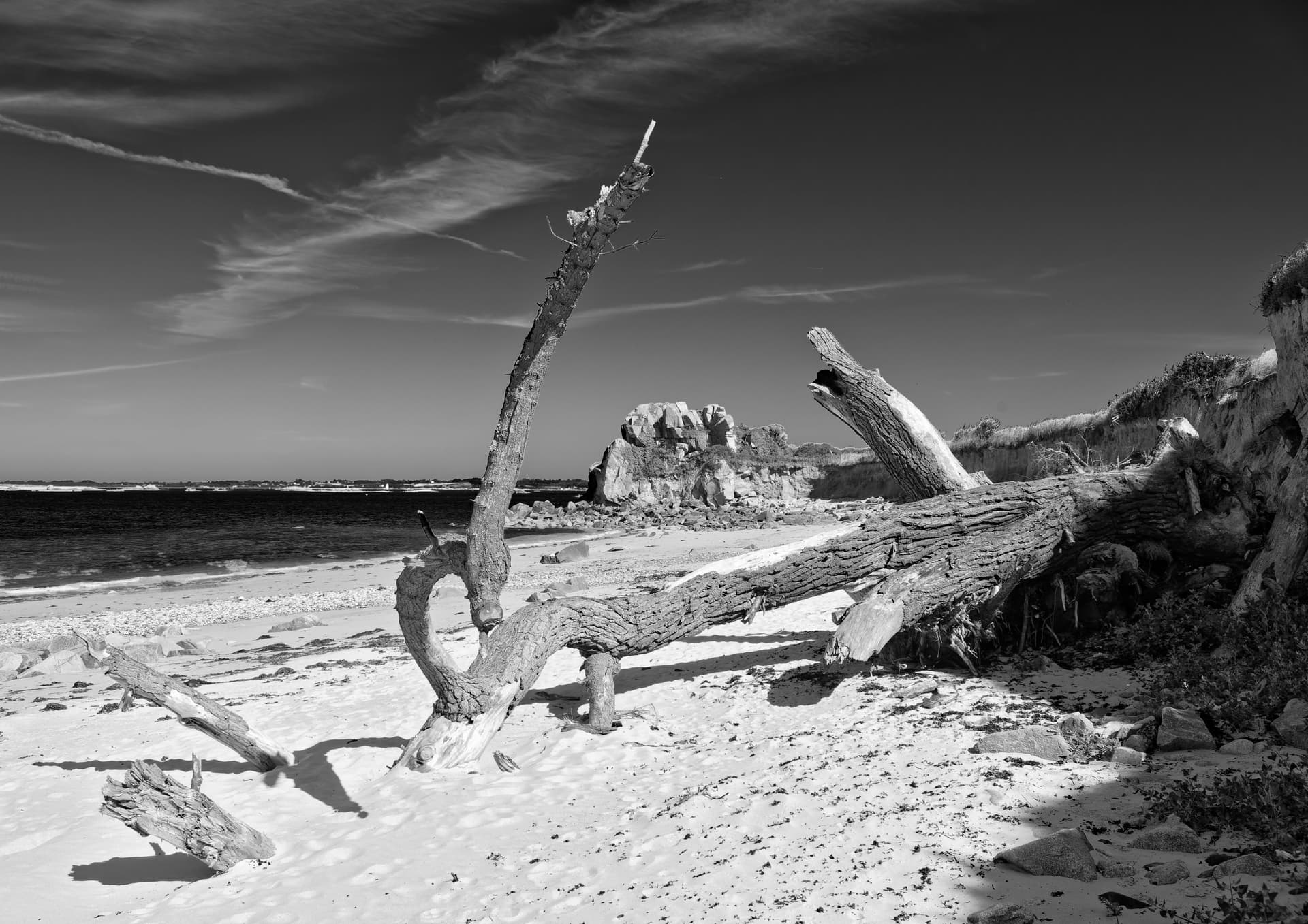
Yes. I can go with that one. Somebody said there was a load of clutter in the picture. Well, I cannot agree with that. To me, clutter is interesting and helps to add to the story that you’re trying to tell and I now feel that you are telling your story. Nice one.
My initial impression is that @Joanna has some hard-coded B&W processing coming from cameral Jazz concerts, while @Wolfgang and some others don’t use such connotations, or am I wrong? As a B&W illiterate, it’s interesting for me to watch…
B&W, by its nature is much more open to interpretation and individual taste.
Some think of it as an old-fashioned look, complete with all the crud that handling grainy film brings.
Others, like me, love the beautiful smooth and clean tones that we can get from high-res digital images.
To some it is a means of recording a subject, where the least possible post processing should be used, whereas, to others, it is a fine art form, giving a simplicity, elegance, grace and emotion to an ice of a subject.
I try to compose and frame my images in the camera and use the minimum post-processing, although the very fact of converting a colour image into a B&W is an art form in itself, not just a desaturation, as some see it.
The biggest change in attitude has to be learning how to use coloured filters after the event rather than in front of the lens, as is the norm with negative film.
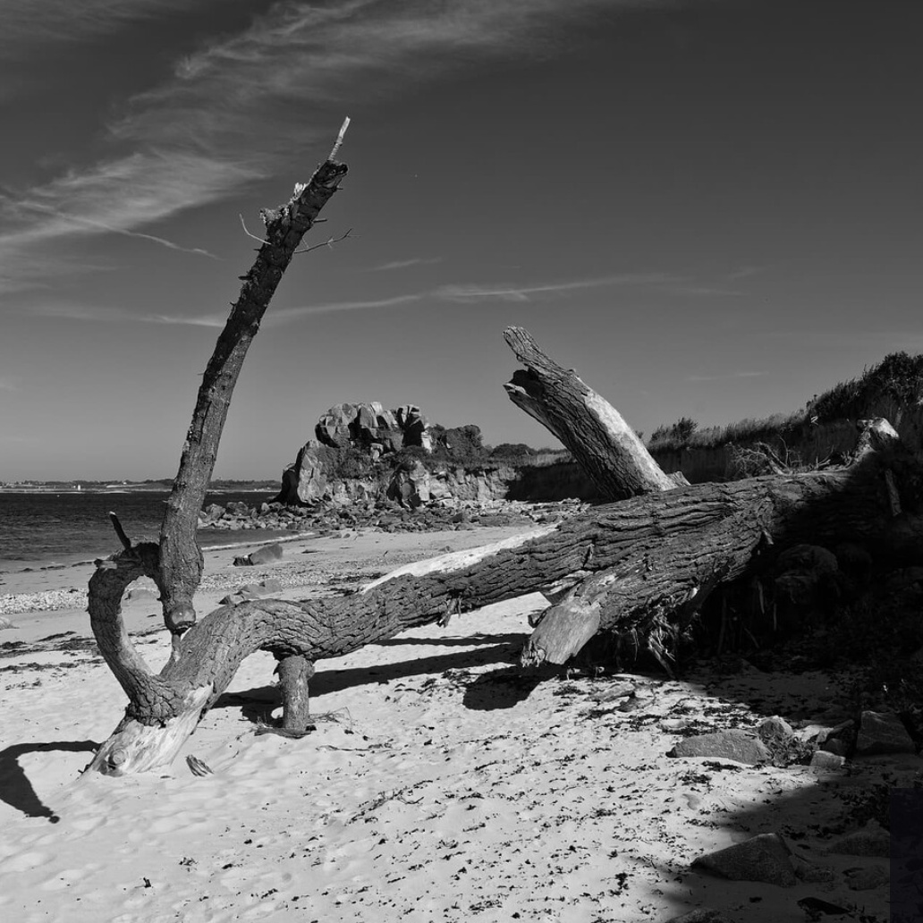
Well, I could tell you that I don’t like this criss-cross / jumble of lines, amplified by this strong contrast. But that’s a personal matter, and I didn’t mean to criticize other people’s images. Besides, I’m not a dedicated landscape photographer.
For the given image and subject of “Broken Trees on the Beach,” I thought to emphasize the fallen tree and decided not to sharpen the framed rock or emphasize the horizon line in order to (better) preserve the natural distance / 3D impression. The added vignette helped to keep the focus on the subject tree.
That is, to depict the vast landscape with a fallen tree on the beach, I might have tried taking a sort of panoramic shot, a little further to the left or from a different position, but as said …
Furthermore, it’s difficult (if not impossible) to successfully reinterpret a given grayscale representation.
Since I’m coming from PS, I primarily use Nik SilverEfex for B&W, which I’ve known since the Nik Software company days.
PhotoLab in combination with FilmPack has come a long way, but in my opinion, it still does not replace Nik SEP.
Note, I’m not a fan of mimicking historical footage, but start by using some of the film simulations offered (if not my presets) and maybe apply different renderings to separate foreground and background, for example … and then move on to the PS layers that I use for preparation and printing anyway.
For more you can contact me via PM … but I’m not on a mission, just using a different workflow.