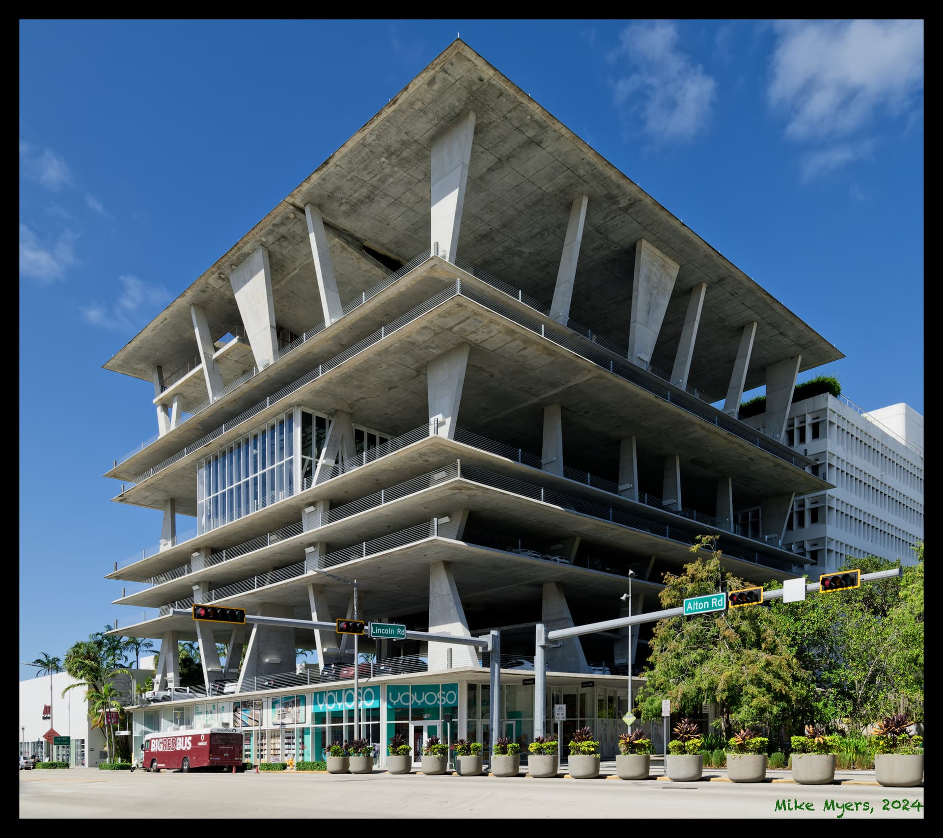
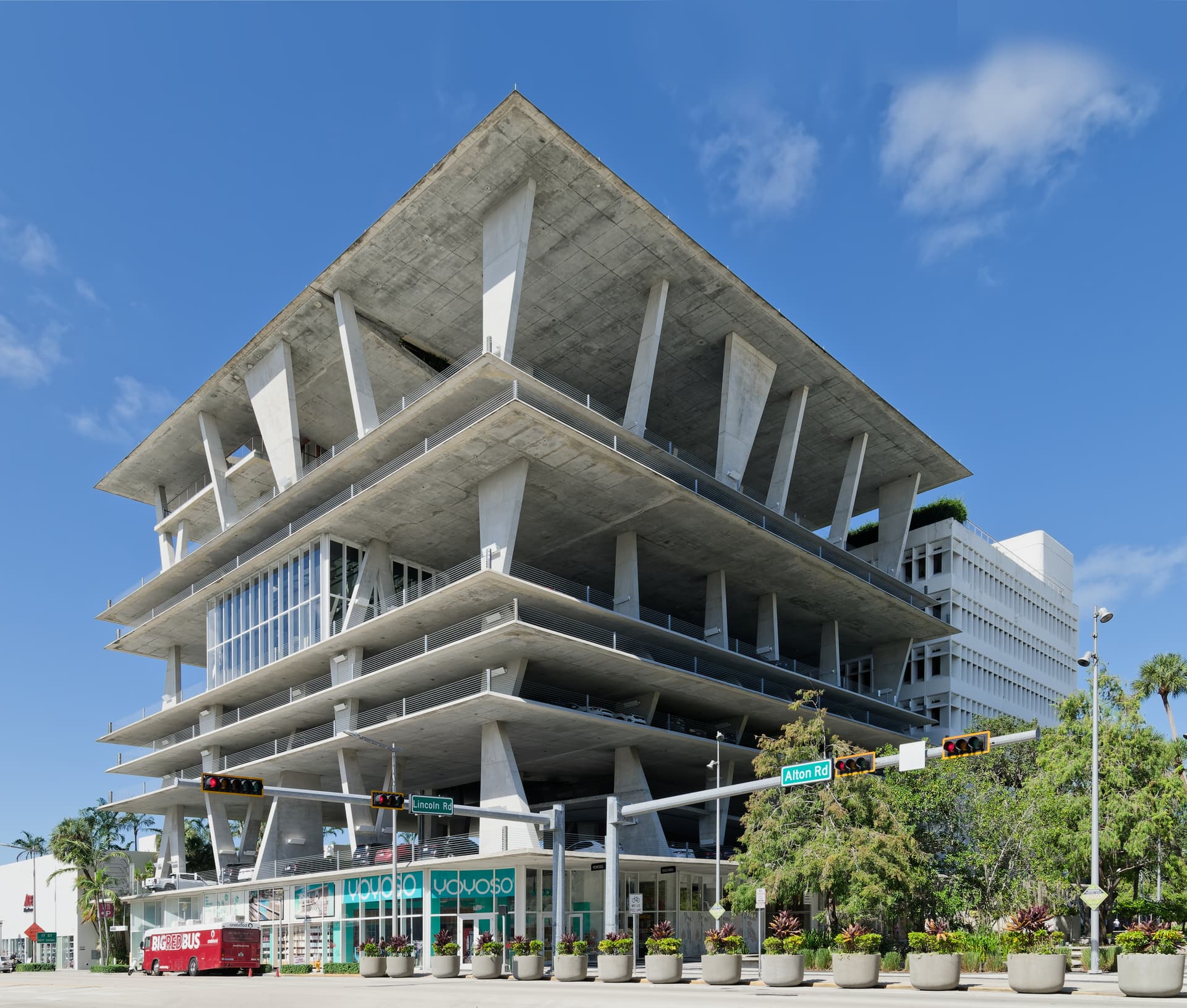
For a decade or so, I’ve been struggling to get a good photo of this Lincoln Road parking structure. While I did get photos, none of them looked as good as what I wanted. I tried to use my 35mm PC lens, but couldn’t capture the whole structure. Anyway, while going back to get a “better” photo of the movie theater, I looked up at this structure and loved what I saw.
So, first I struggled to get a good place to shoot from. I eventually found one spot I liked. Next, I wanted to avoid all the cars driving back and forth, and merging into Alton Road. There were cars and/or pedestrians all over. Eventually I found a perfect moment to shoot. Unfortunately, I had no way to get rid of the BigRedBus for blood collection, but I toned down the red; no worse now than the signs on the shop windows.
I used my D780, with my 24-85. Without 24, I never could have gotten it all in. Another plus for this lens, it’s lighter than my heavy 24-120 which was supposed to be the lens I would keep on my camera. I did adjust the colors a little, and I made the street signs show up better. I wanted a blue sky with fluffy white clouds, but I guess this was close enough. The line of huge “flower pots” is the city’s way to block idiots wanting to turn onto the Lincoln Road walkway and create havoc.
It’s a rare experience for me to go out to capture only ONE phot (although this time I also shot the movie theater), rather than coming home with dozens of images. It being close to 100 or so was another reason to get back home quickly - this location is walking distance from my home if I try to stay in the shade from buildings and awnings.
Comments, and Critics are welcome, and all of you are free to use my raw file and do as you wish. My goal was to capture one perfect photo of this beautiful structure, and do it better than all the other photos I’ve see before.
Imo, the car at left goes fairly unnoticed. Also, the wider crop adds an upwards curving line and the lamp post at right closes the image, all while letting the building have some context. The red bus has been moderated, but it still can be the cherry on the cake.
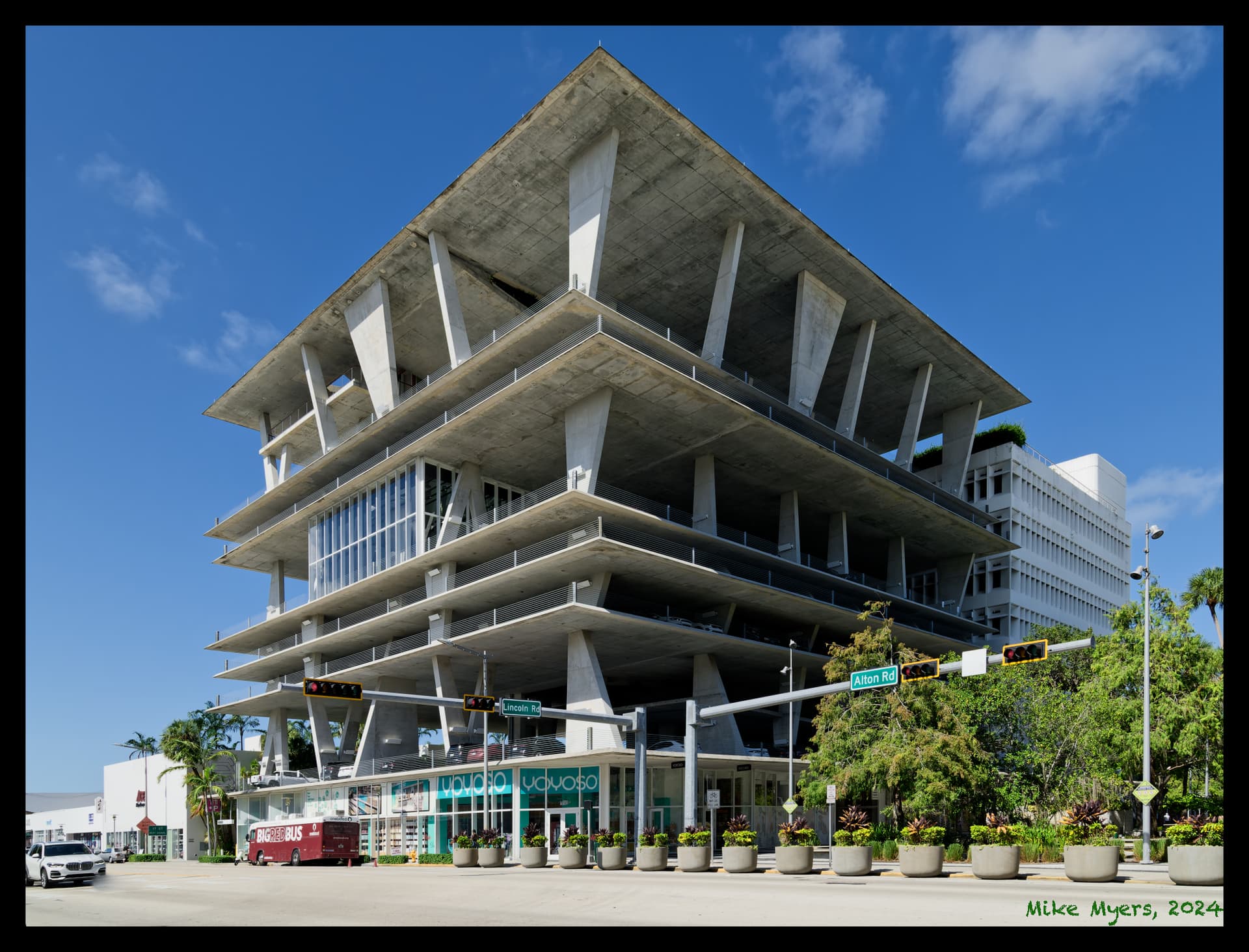
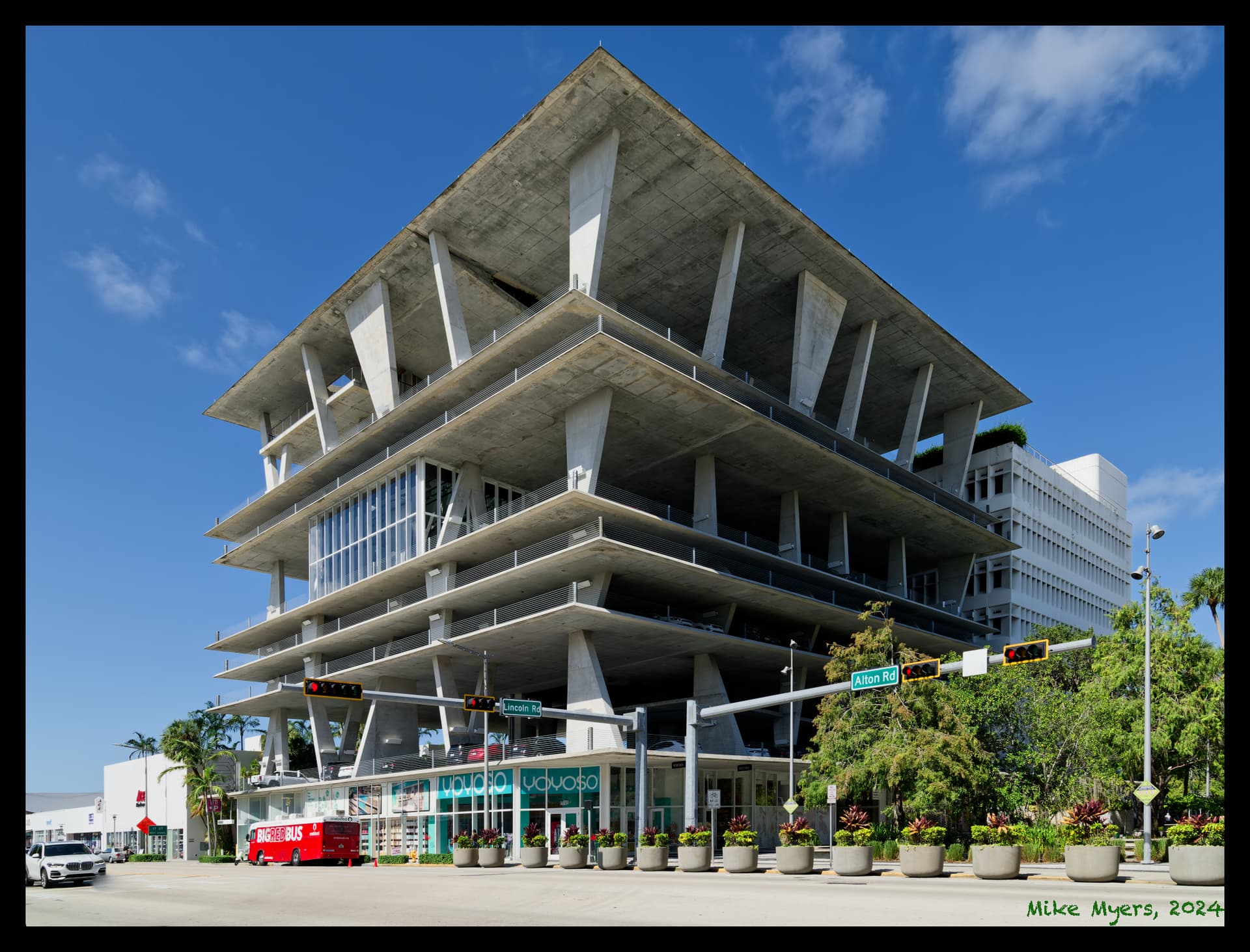
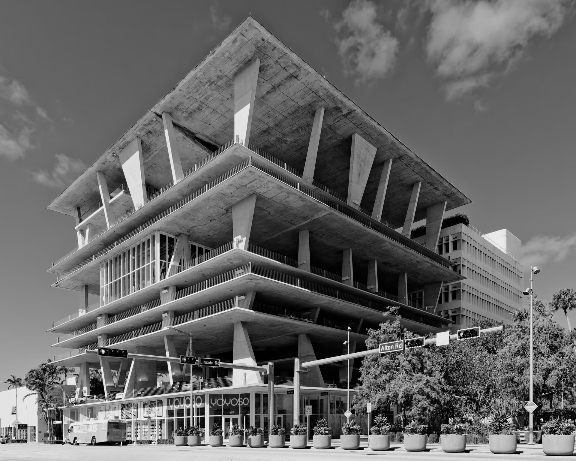
When I was editing, I decided against that, but adding the post and the car at the left gives the image some more life. Having made those changes, I think I need to add some more space at the bottom.
The original red is too obtrusive imo. Reducing it to something between that and your first take should be good enough. Your initial “dark chestnut” looks a bit too dull for my taste, the original red is too screamy and makes my eyes bounce between the bus and the building.
Most of the image is fairly neutral, except for the primaries i.e. RED=bus, GREEN=trees BLUE=sky. Making the red too dull unbalances the primaries.
The one thing I would have done is to allow for more space above the top of the point. Here I have used Affinity Photo 2 to extend the top of the image…