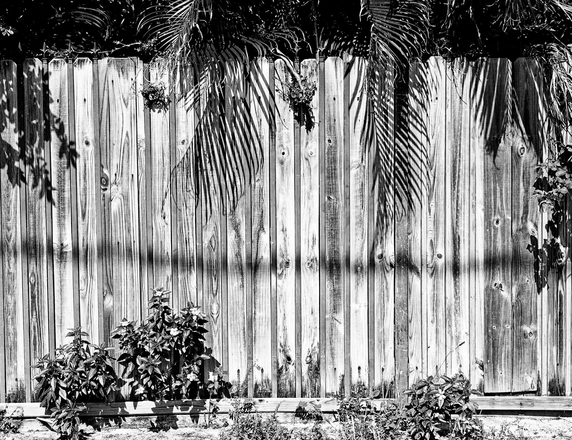
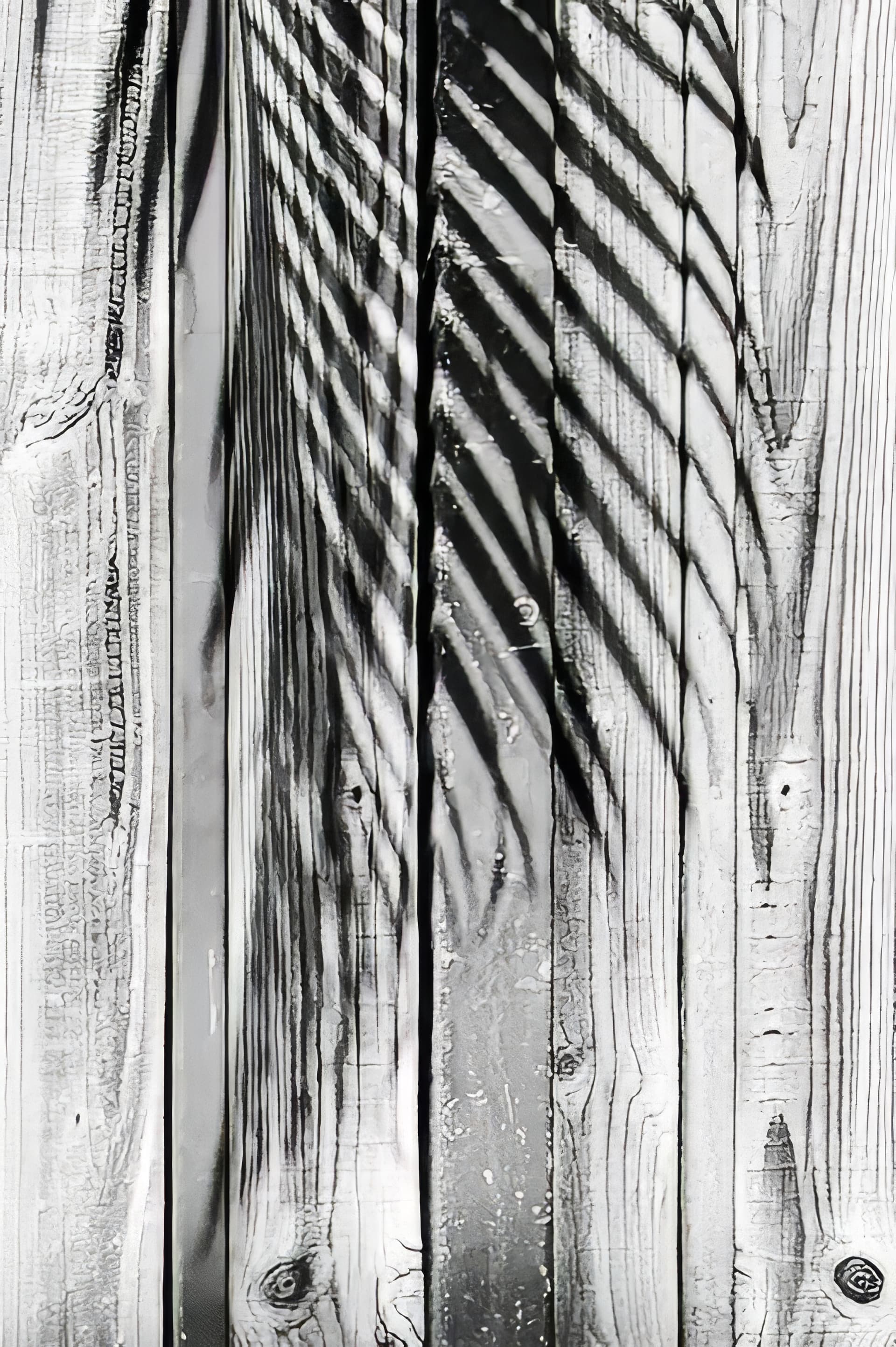
I don’t know where to start, but here’s what I was going to post before reading these new responses. I was going to correct my previous image, but instead I decided to start all over again with a new virtual image, and without reading the previous responses, word for word, create an image that I am happy with:
I tried to not use Clearview Plus, and to only use Contrast, but I liked what a small amount of ClearView did to the wood. Joanna knows how to do the same thing with the fine contrast controls, but I’m not that smart/experienced.
Again:
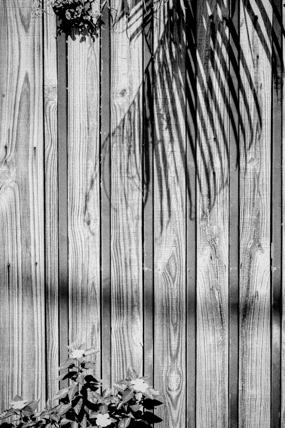
D3M_4316 | 2024-08-20.nef (14.9 MB)
D3M_4316 | 2024-08-20.nef.dop (39.8 KB)
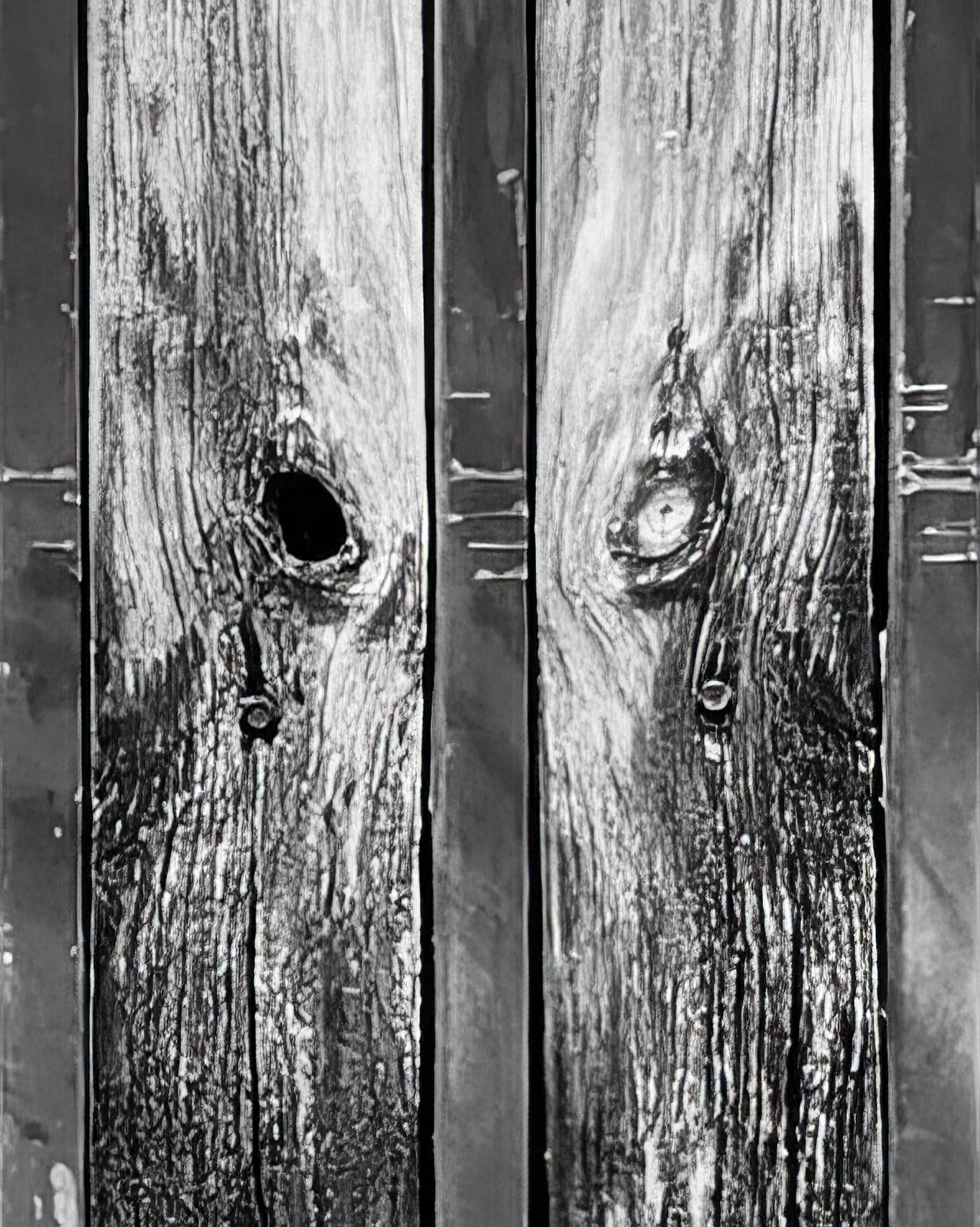
Next, a question for Joanna - yes, my D3 has 12 megapixels and my D780 has twice that, but regardless of which camera I am using, neither of those ideas will compare to what I can do simply by getting closer, and filling the screen with the detail?
You, and @herman are both right - no argument - but the best tool to improve this would be my feet. I hadn’t even considered getting that close earlier today, but now you’ve got me all excited about the possibility.
Anyway, the latest .NEF file and .dop file are posted above, and all of you are free to use them however you wish - if you have an idea, instead of hoping I will understand what you are thinking, just download the files and have at it. No matter what you do, I will NEVER complain; quite the opposite. Some people dump on me if I change their images - the reverse is NOT THAT WAY. I’d love to see how other people edit those scenes, and I’m always learning. Doesn’t mean I’ll agree, but I’ve got a wide-open mind.
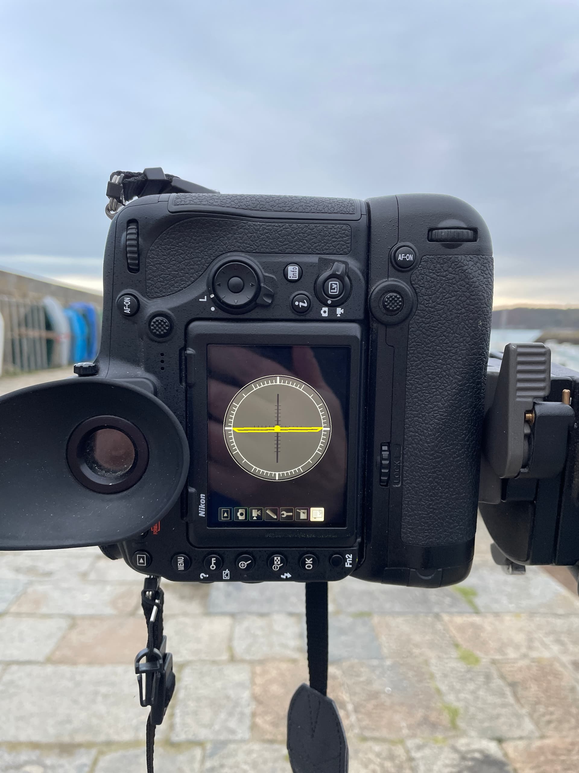
Not that it matters all that much, but when I want to take vertical images, the D3 is so much more comfortable than my D780. Because of all the weight, I know for a fact it’s easier to hold the D3 much more “still”. D780 has a ton more dynamic range, so that backs up Joanna’s advice. If I take the D780, I always have a zoom on it. For the D3, I limit myself to only a “standard” 50mm lens, and have to zoom with my feet. All silly arguments, when I know for a fact the D780 is technically more capable. The D780 has a gazillion controls on it, while the D3 has a small fraction of that, and with the D3 I find I can do just about anything I want without going into the menu system. I like lots of buttons (most of the time).
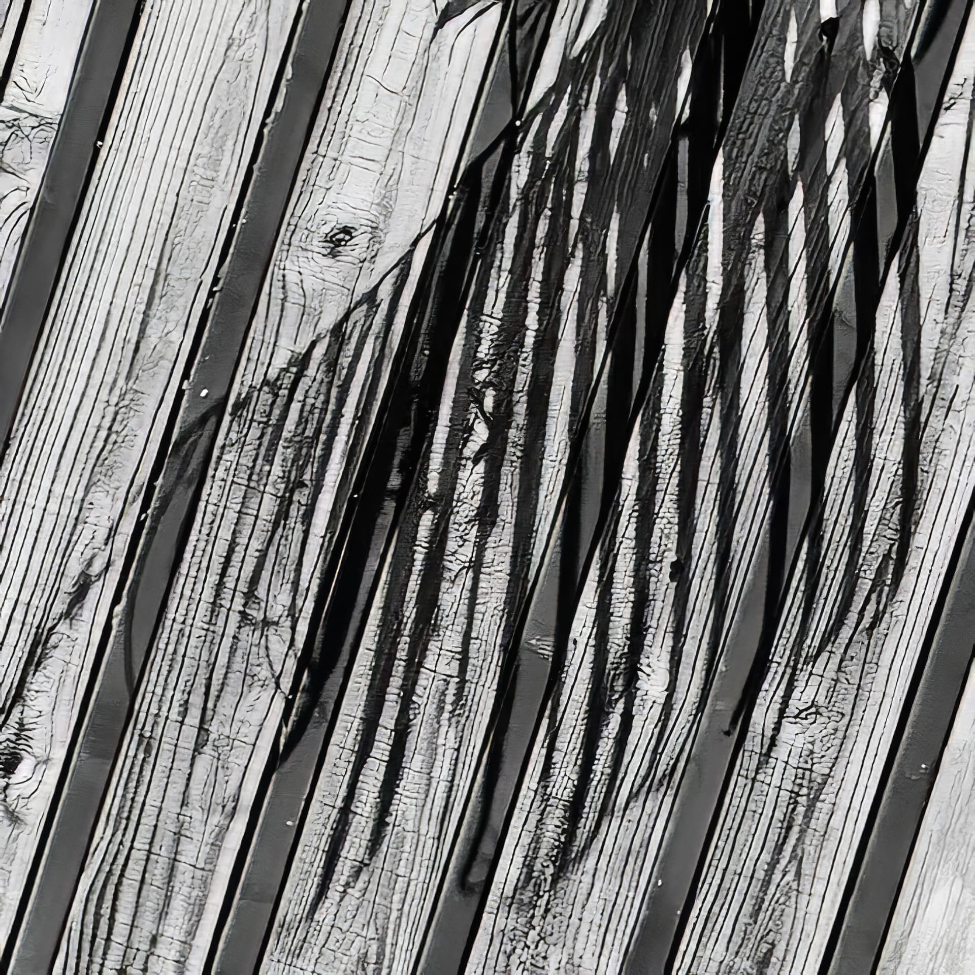
Anyway, back to the main topic. Does the image I just posted above come closer to what so many of you are suggesting?