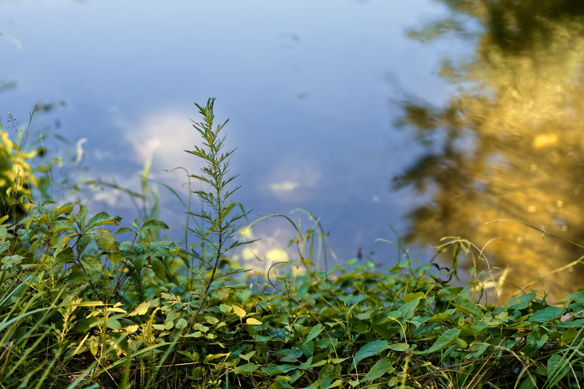
I captured this last Friday on what was another beautiful day here is central New Jersey, USA.
This image is of some wild growth on the edge of the Delaware-Raritan Canal. It was captured with my Voigtlander 40mm Nokton MF lens, designed specifically for Nikon Z and mounted on my Nikon Z fc.
I liked the way the light played on leaves and the water. The reflection on the right is of a large tree near me which, despite the gold-green color of the reflection, was actually a much darker green.
It was shot at f/1.2 to get as much separation from the water as possible. The lens is not as clinically sharp at f/1.2 as many modern lenses but it has lots of character and is sharp enough wide open for my purposes. Despite being an all metal and glass f/1.2 MF lens, it is small and light, weighing only 11 oz (315g). If I get the new Nikon Zf as planned it will be my go-to lens on that body.
Any comments or suggestions for improvement would be welcome.
The greens look too blue (and saturated) to me. The golden yellows suggest warmer light, but your current interpretation creates a more graphical impression.
I’d probably remove the "spot* left above the tall plant.
Thanks, I agree the colors are a bit oversaturated. The spot you are referring to as well as two other spots at first glance may give the impression that the sensor is dirty but are actually little bits of nature floating in the water that were blurred out at f/1.2. I will address the over saturation and remove the three spots which add no value.
Yes, and that is why I’d only remove the one I mentioned. If you remove them all, the water might look too artificial. Just try what works best for you.
Two thoughts - first, I don’t know what that yellowish thing at the right is, but to me, it’s annoying.
Second, I assumed the “blue” was sky, not water, and the thing floating in the water imitating dust spots (to me) are just as annoying as if they were dust spots.
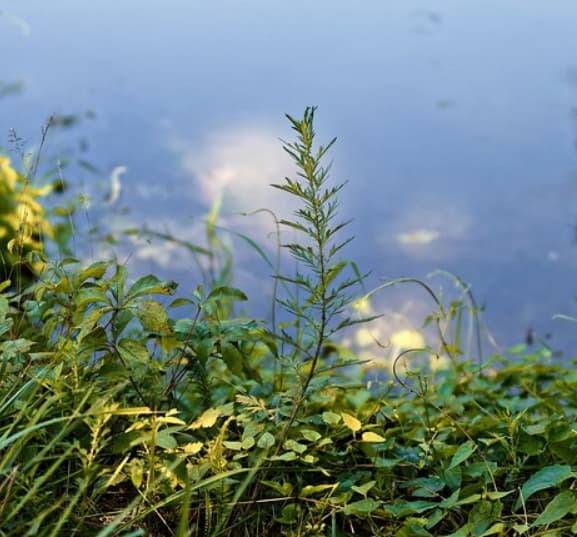
If I would have taken in, I’d concentrate on the left, as the (to me) most interesting part of the image:
Just my thoughts, and apparently nobody else feels as I do. The “dust spots” that aren’t, are just as annoying to me now that I know that’s what they are - but my eye “sees” a blue sky, even now that I know it’s water. In the cropped version that one tall centered branch becomes the subject of the photo.
If I had taken it, I’d be posting this cropped version - but maybe if whatever it is at the right had some more detail, it wouldn’t bother me so much…
If you read my original description and looked at the image more carefully you might have understood that the the “yellowish thing” was the reflection of a tree in the water. It was purposely left there to provide balance and continuity.
Your version of the image removes all the content from the right side ,including the entanglement of darker green leaves as well as the reflection and makes it more difficult to understand that this is about the edge of a body of water. It also removes may of the shapes, colors and textures I wanted to include in my version. The water, including the reflection of my original, has less detail because I captured it at f/1.2 purposely to blur it out.
By the way the light blue of the water is a result of the reflection of the sky. To me, your cleaned up version with the removal of visual cues makes it look more like the shot was captured shooting parallel to the ground with a blurred out sky behind it. It was actually shot at a very sharp angle pointing downward. Your crop may work for you, but not for me.
Perhaps, but to me, I didn’t read the description. T me, any image needs to speak for itself.
Maybe it’s a bad habit of mine.
More likely, it’s something I learned.
Maybe I’m not smart enough to properly “see” your image. My comment is only on what I see, looking at the image.
People who look at images are not likely to read explanations - my opinion.
Heck, I didn’t even see the blue as “water”. I felt like I was looking at a puzzling “sky”.
Good or bad, especially bad, I’d like to know what people think about my images, and if anyone thinks they are bad, or improperly composed, or whatever, I’d like to know that.
I apologize if what I wrote upset you. I was just commenting on what I thought I saw.
I decided a few weeks ago that I was doing things backwards, writing a lot, and then posting my photo. From then on, I’ve been posting the photo first. It gets to speak for itself. After that, I get to post my thoughts.
Had I read your words first, l may have reacted differently.
I think people look first, then read. What do you think?
Your reply tells me things that were not obvious from the photo.
To me, photos have to speak for themselves. ……just my opinion.
Most abstract stuff bores me. Most, not all. I love your abstract photos, and every once in a while I can capture one, but I don’t have the deep understanding that you and @Wolfgang and several others have. Maybe I got dropped on my head more than once when I was a baby? I just “don’t get it” the way others do. Maybe it’s all the years I spent at “drafting”. The photo I just captured earlier today intrigued me, but it was much too “complicated”. Simple things work better. I think. But I don’t know/understand enough to properly say what I think.
Whether my attempt was a success or a failure, my purpose was not intended as a depiction of a specific thing even though I explained in detail how I captured it. I liked the way light was playing on the water and the flora, and found the combination of colors, shapes, contrast and texture against the muted background of the bright blue water interesting.
Agreed. But does being “beautiful” the same as “art”?
It may, but maybe not.
I won’t argue with that.
So, what does an image need, in order to be referred to as “artistic”?
…maybe there isn’t any answer to that, as lots of “art” requires lots of “understanding” to create or recognize “art”.
Of course, some people are incapable of recognizing “art”.
I’m probably guilty of that rather frequently.
And, people may call something “art” simply because they don’t understand it.
Is this a good explanation:
…and how does one decide if something, in this case a photograph, really is or is not “art”?