Only having eyes on softwares standards would be a revolution I think.
This would make huge changes … Very good changes.
An other strange way to organize interface :
For some tools (v6.xx) “tool setting bar” is above main window, for other it is under main window …
Why this confusing approach ?
1 Like
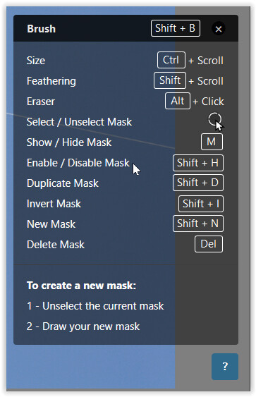
This hasn’t changed from PL6 to 7. Unless the mask is not brought up as visible, as you paint you will see the mask’s brush stroke and then it will be hidden – revealing the luminance change applied to the subject.
I usually paint at around 15% opacity / 100% gradient and as a side effect I also see the mask build up. It took some getting used to, but I would have preferred not to see the brush stroke of the mask on d+b.
All I can do is to toggle the ‘layer’ on / off
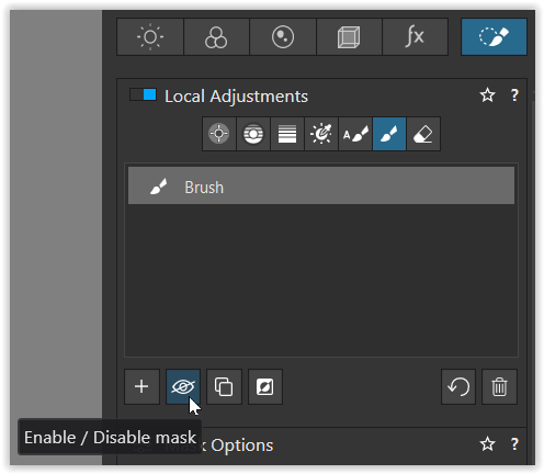
or hit the hotkey < Shift + H >
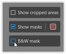
At least, we now can choose the mask’s color & translucency
and the B&W / grayscale mask to check …
1 Like
Agreed. I also advocated for this for years.
3 Likes
As an EA member I am not surprised this thread has appeared so soon. However…
Don’t judge its effectiveness so soon! There are tools from PL6 and earlier that I didn’t understand until I had spent some time with them and also, in some cases, read the manual closely or discussed in these forums.
If we all abandon software because it’s not completely intuitive in the first hours or days, then software as a whole will get worse.
My advice… stick with it for a month (assuming you use it often). See how you feel after that.
3 Likes
Of course, it is normal that when familiar functions and processes are changed, they are first perceived as “not intuitive”. It always takes a while to get used to it and to change the familiar processes.
But if you follow the discussion here, it is partly about objective usability criteria such as the inconsistent, invisible display of the status, which remains inconsistent even after prolonged use. This is not a new issue with DxO Photolab.
No one is saying that anything should be abandoned again, but it’s about making it better. Maybe even so good that it is no longer necessary to study a manual (which is always a good idea, of course, since the software is complex).
My personal experience with the new version is unfortunately that I find the new LA panel even after intensive use in the beta phase (after all, over a few months) quite terrible, the use is much more time-consuming than with the previous version (with which I edited yesterday once again a few hundred photos):
More time-consuming, because now more clicks and significantly longer mouse travels are necessary (on a 24 inch screen with 4K resolution), because the eye no longer has a direct view of the changes you make with the sliders of the LA panel, and because when used on the laptop, the LA panel simply takes up too much space.
But of course I realize that they won’t take it back, but I don’t give up hope that it will be optimized.
That’s why it’s good that this is being discussed now. In a month, users will have come to terms with it and - out of habit - accept the shortcomings.
5 Likes
I find in a day edits were taking much longer, which is to be expected. But the way you have to use local edits can’t speed up much due to the extra clicks/key presses as you say. I have been around long enough to have used DOS programs, some were amazingly advanced but come Windows 3.1 and Office and other mouse progrsms they were dead. The Office equivalent we used at work was far more advanced as a database and spreadsheet than the earliest Office but they went bust in months. Its ease of use that killed them, training costs went through the floor, and to make somthing harder to use is a big error unless you introduce something reslly major to makr it worthwhile and I dont think local edits changed use has done that They need to restore the ease of use that was there to say it is a good change
From my experience, it is exactly the opposite:
Software becomes worse because it is no longer intuitive. And it is precisely the first, spontaneous feedback that shows whether something is “intuitive” or not. This is an important criterion for tests in usability labs.
And as I said in my previous post:
If you wait too long, many users create workarounds (mental and real) for poor usability and the developers assume that everything is OK. I have experienced this so often and leads to the fact that these operating concepts are not further optimized.
And sometimes it is even the best solution to go back to an earlier operating concept, if you see that the new one creates more problems than originally thought. This is a courageous step, which I unfortunately only very rarely experience in practice. Here, even the most nonsensical innovations are often defended tooth and nail - or with arguments like yours - because they have already been implemented. How often have I heard in this context that the user will get used to it. They will, because they have to.
The new interface is a huge improvement in some areas though. Compare Photolab with Capture One and you will see some of the weeknesses in version 6 clearly. In CO all the same tools throughout that application works exacly the same whether used globally or locally. Remember the Color Wheel that was exclusively global in version 6.
The Control Point- system was even more of a boulted on system living in it’s own bubble than it is today. I like what they have done compared to how it was with the “floating equalizer”-interface that was often “on the wrong place” before. That paradigm was doomed as more and more functions get local. It just had to go.
I was more dissappointed they didn’t take the chance now to add what CO have had a long time: a “color picker” with a possibility to turn a pick into a layer. Instead they took away the local color picker. Yes there are work arounds now but the whole point with keeping it is maintaining consistency in the interface between global and local function and look and feel. As it is now it just adds to the confusion any change will create anyway.
The new “Luminous Mask” ought to have come already in version 6 together with the then new line tool. Stupidly enough it is not made available even in the Elite-version. Instead they do exactly the same misstake they did with Filmpack 6 and “Fine Contrast” - find a killer function people don’t want to miss and put it in Filmpack, so we get forced to buy and upgrade that too. Is it really worth all the badwill that causes??
Concerning different interface behavior between version 6 and 7 that some feels affects efficiency: I’m sure some of it is a piece of cake to fix but there will definitely still be a few that can’t be fixed really, since it comes with the abandonement of the “equalizer-paradigm”. That seems in fact be the real thing that divides the users opinion about version 7.
I also think we need to give it some time. We all have to rethink and relearn and I definitely think that the old paradigm was a dead old end that had to go sooner or later.
I think the new Luminousity Mask is one exampel of an improved and more intuitive interface. Now you have a dedicated function for creating a luminous lask. Before some users used the linear controlpoint in order to do practically the same - that was really a work around in a not so intuitive interface but it wouldn’t surprice me at all if some users will still continue to use that workaround they have got used to during the last year.
Almost all softwares that evolve in some way or another experiences som kind of “structural growth”. If I compare my first Sony A7r with my last camera A7IV the later has more than the double amount of functions and Sony has long been critizised for their menusystems.
Since I am a swede I know of a professor at Chalmers Technical University in Gothenburg that worked with usability and menusystems in computer program interfaces. His and his students research ended up in a recommendation that not use more than 7±2 alternatives on any menu level. On the other side avoid give a user just two alternativs (seems to create anxiety to choose the wrong one ![]() )
)
I went through the menues in my A7IV and founf that on the average Sony was spot on close to the recommended 7 and just with one exception they exceeded that norm. So what is there to complain about? The depth of the menusystem!!! It gets just deaper and deaper because it us the only way it can go! So that is how that compromise often looks. Another way is to automate a lot of camerafunctions and Sony has done that a lot too.
We have seen the same thing happen in Windows software too since the nineties. That’s why “wizards” was introduced already in the lat part of the nineties to assist users to perform more complex tasks and why Microsoft introduced “ribbons” instead of more traditional menues. Microsoft made extensive usability tests already then and they were kind of depressing. Most users only used betwwen 5-10 of the functions in Word or Excel. I would be surprised if that has changed 2023.
1 Like
My guess DxO will explain that the big LA button was not well integrated with the UI and more difficult to maintain. They may argue than integrating the HSL wheel will have been difficult with the LA button. I can accept that, but the way they implement the changes is pretty bad.
I fully agree with your comment about letting the developers decide. Either the DxO designers did not document the changes correctly or they did not manage the developers as required. I hope it is not “by design” ![]()
… and maybe DxO will come back with on optional CP in the style of Nik6 ( took them 2 years btw )
100% consent. Took me a while to understand what happened and how it now works and yes it’s a pain. But that’s my first impression. Maybe I get used to, but don’t think so.
With the “floating equalizer” I see completely different. From my point of view, this was not a dead end, but a USP of DxO Phtolab and this USP - for example, compared to Capture One - has now been lost (especially since Capture One does it much better with the editing layers).
One has apparently before loud user feedback no longer seen that the floating equalizer also had some advantages: especially by the spatial proximity of the tools (at the click point, grouped) the workflow goes much faster than with the new version. These advantages are now lost with the panel version, it’s now an approach like most comparable programs (LR, CO1 etc) which doesn’t mean it’s good.
I am firmly convinced that this USP could have been saved by further developing the “floating equalizer” through a redesign. Also for the problem with the “standing in the way” there would have been useful solutions.
But of course I know that this statement won’t change anything, the floating equalizer won’t come back, you have to live with this LA panel and hope that at least a few small things will be optimized, but even there I’m rather pessimistic. And of course I understand that they didn’t keep both options, that costs too much development effort.
I will certainly leave the 6 version on my computer. Especially for larger projects where it must go quickly.
1 Like
So, how would you include the Colour Wheel and, possibly, the Tone Curve, if that is added?
1 Like
This new design is more appropriated to make photolab evolve and add any relevant tool as local adjustment.
The old design was frustrating in many ways.
Of couse the floating equalizer has huge advantages too but the more functions you will try to “bolt on” to it the more obvious the limitations and obstacles will be.
In CO the same functions are available both in global (the background layer) and local layers. If you are an advocate of the “equalizer paradigm” you have to come up with a solution on making all Photolabs functions available in the equalizer or explain to a lot of users why just their favorite tools were left out.Why some still have to be controlled via ordinary terrible traditional menues in all those panels.
One solution will be to make the equalizer configurable, like most camera interfaces are today, so you won’t need all but just the relevant functions for you. Still incorporating the local Color Wheel in the “equalizer” might have been a “show stopper” for the DXO developers. I don’t think we chall underestimate these problems of handling an ever growing amount of functions, that will find their way into Local Adjustments sooner or later.
Before I was retired I have built user interfaces in quite a few applications I have built. One of these systems ( product information and pricing) was used in a billion $ Nordic Company for more than 15 years. After that many years there is bound to be parts of the system affected of “structural growth” that affect usability. So every system including the ones I built hade to be reconstructed from time to time and that goes for Photolab to.
Sometimes the long term gains are not all that obvious for the users when softwares are reconstructed but most of the times there are at least rational reasons for these reconstructions and paradigm shifts. Sometimes there are bottle necks that call for new thought and new solutions when they obstruct further development. I think the “equalizer-paradigm” was becomming an increasingly problematic bottle neck for further develpment of Photolab that had to go.
I’m absolutely convinced that the DXO developers made the right decision when leaving the “equalizer paradigm”. I think I would have done the same if it would have been my decision to make.
Would it perhaps be better to add local adjustment to any relevant tool?
For example, adding a brush option to the existing global HSL tool rather than duplicating the colour wheel for local usage.
And what if you need several layers (several masks) of this tools each with different setting ?
And what for other tools ?
I think a “unified” interface like we have now in 7 for LA is better for lot of things than having each tool with it’s own design.
Of course, I don’t have the time to think through all eventualities and processes conceptually, but it doesn’t seem that difficult to me:
For each of the LA tools a separate icon that works like a tab, tools that can be grouped in terms of content and space can be combined in one icon (as before) and then, when clicking on an icon, the complete display of the settings parameters for the tool or group analogous to the LA panel, but not with the vertical sliders as before, but exactly as in the LA panel. Would certainly have to work it out in more detail, especially as far as the ability to influence the masks is concerned, of course that too would have to be integrated into the floating element.
And I disagree that we need to have a consistent design for global and local settings. Locally, in the vast majority of cases, there is a different - just local - selection range. There the spatially closer placement to the selection area is simply more helpful.
But also the selection or the change of a LA Tool was so nice and easy to do in the old version (right click). At least they could have let us do that.
Now you have to move the mouse to the LA panel, select a tool and back into the image to set the position for the tool and then again back to the LA panel to make the settings, how cumbersome is that.
Right, I have the same experience, though not exactly annoying.
On a different note, I wish I could have a toggle on the individual enhancement for a mask, e.g. toggling contrast setting ON/OFF for that mask only.