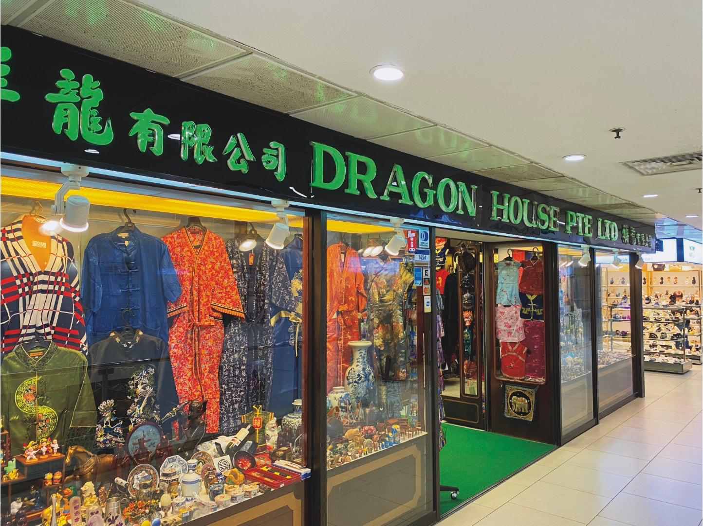
I am working on photos for a photo book. I previously created a book using the “hope and pray” method and it seems the printing company did me a great service printing my images not very different from what I imagined from the screen.
This time, with a little more forethought, I have downloaded their ICC colour profile and have been experimenting with soft proofing. I can clearly see the effect on the images when I turn on this profile and that is, I think, proving useful for judging brightness and contrast.
I was part way through editing a batch of iPhone photos (I have the original HEIC files) when it occurred to me I should maybe check for out-of-gamut warnings.
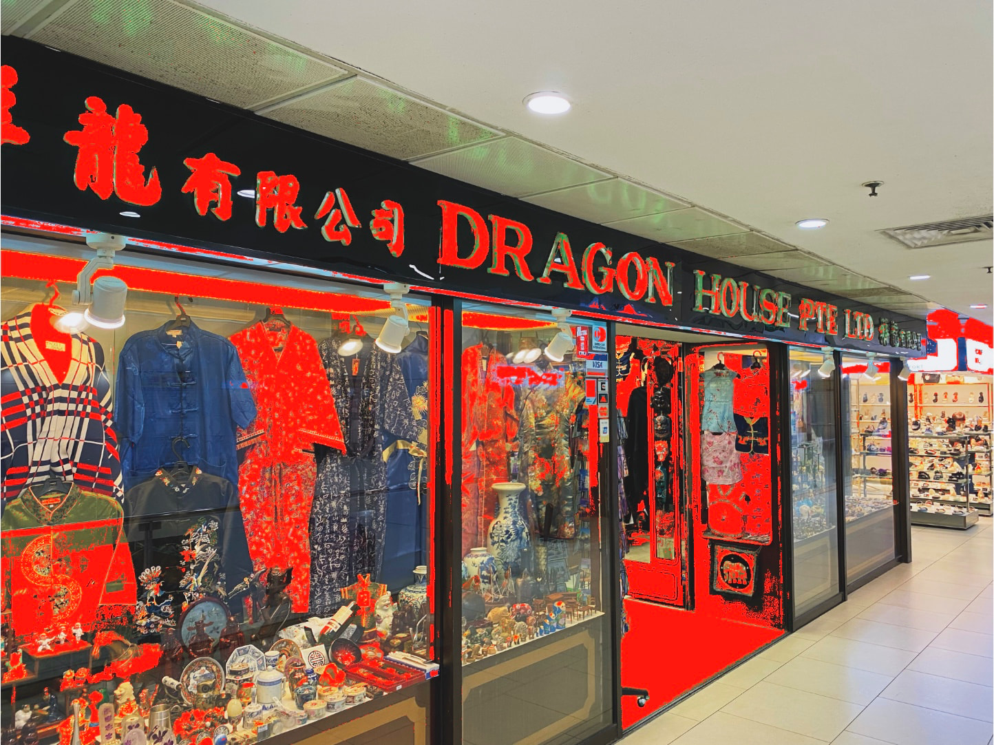
According to that, most of the reds and all of the greens are out of gamut.
My problem is I don’t know what, if anything, to do about it.
I tried playing with the HSL tool and I can certainly substantially influence the warnings. I also tried the channel mixer, but after playing with those sliders until most of the warnings were gone I ended up with a very desaturated image.
I understand that a colour ‘close to’ what I see should result if I do nothing, and I assume that the distance out of gamut is probably not huge, and that small areas would probably barely be noticeable. But that is A LOT of the colour in the photo claimed to be out-of-gamut.
What’s the smart move here? I’ve not dared look at any other photos yet. Coming from an iPhone they’re all pretty heavily saturated.
If it matters, when I’ve done the 20 or so HEIC, I have a whole bunch of RAW images to work on, too. Hopefully those are less likely to push the gamut so much.
Read the pixel values. You’ll see that the red oog colors are caused on the lower side values. If you’re satisfied with the result don’t bother further. Oog warnings can also cause when the channel is clipping thanks to color conversion.
This problem with saturated greens being out of gamut for the target printer appears rather often. If de-saturating them in the HSL panel doesn’t bring the colors in the target printer’s gamut or yields an image that is too de-saturated, then you should check whether your printing service offers another type of printing surface or paper, the profile of which giving better results when soft proofing.
What intent option did you try ? Perceptual or relative ? I always use perceptual. This option gives better results when a big part of the image is affected by out-of-gamut warnings.
What you are seeing is the original Out Of Gamut colours and when you turn off the OOG warnings you will see on the screen a simulation of what will be printed.
If the simulation looks fine to you then you are done. Do check out the Preserve Colour Details function and adjust it to get more detail in the OOG colours if required.
In my experience, DO NOT try and adjust your image to recover the OOG colours.
Make sure you assign the printer profile when you export your photos. If your book is produced using sRGB colour space then export your pictures in the sRGB colour space and your printer will convert to the printer/paper profile but your photos should come out well due to your soft proofing.
I have published four editions of our fish book and have always output to sRGB as requested by our printers and the results have been very good. We do ask the printers to allow us to print proofs so we can make minor adjustments before the final print run (the print machines allow colour adjustment to help match colours from previous books)
Note: make sure you inspect the proof prints under pure white light as the viewing environment/light dramatically affects how the prints look.
Hope this helps but if you want to discuss further then let me know.
Thanks Keith. I find this whole colour workflow difficult to comprehend.
I’m working with this company who do give guidance, but I’m still a little confused.
I am using Affinity Publisher 2 (not the new Affinity app which I’ve found has serious bugs in the layout mode). If I soft proof in PhotoLab, then output with the Blurb ICC profile as a TIFF, I still leave my Publisher document set also to the Blurb profile? I guess I do and it knows when exporting the press-ready PDF not to further convert the images which already match the profile.
Interestingly, I used Blurb for my first book and then used a printer for subsequent books as I started getting orders far beyond what I expected and needed to print large volumes.
From what I understand from your link on the workflow is to edit using soft proofing and their printers profile. Edit to your liking and ignore OOG warnings as long as you are happy with the image. You then export the image in the colour space of the printers profile (I.e. export and embed the printer profile).
You then bring those images into Affinity and finally create a print ready PDF as either RGB or CMYK.
Soft proofing is only there to SIMULATE what the final output would look like and gives you the opportunity to tweak your image to better fit the output profile. Try not get too technical and rely on your eye to tell you what looks good or not.
Did you try editing in the legacy working space? Wide gamut is of no use when your destination working space is so much smaller. It just causes a lot of oog.
Soft Proofing will never give you a good idea of how the final output will look like. It helps you detect where problems may occur and select which paper or printing surface will generate the less color shifts.
Nomally the image is send to the monitor through a colour exchange space. It’s conerted to the output color space. Either sRGB or the monitor’s color space.
With soft proof on the image is is converted first to the desired output you select in the soft proof box. And then to sRGB or the monitors color space.
With soft proof there’re 2 conversions and probably 3. But whatever you see is in the monitors gamut.
Normally the softproof profile is for a colour space that is smaller than your working and monitor profile so during the conversion to the softproof profile you will lose some detail and/or colour and this difference is displayed on your monitor to give you an indication of what it would look like as final output. This is not perfect but is helpful.
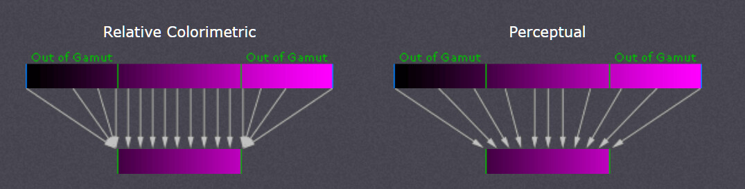
I doubt that. Here is a diagram showing what happens when converting from a larger to a smaller colour gamut.
Here is a diagram showing what happens when converting from a larger to a smaller colour gamut.
Just imagine if the source gamut is larger. More corrections.
Also the source gamut is divided in 16 bits. When the source gamuts is twice, just a number, as large then the steps will be twice as large. When the bit depth is constant.
The legacy color space is AdobeRGB. As long your destination color space doesn’t has to be larger just stick to that.
Which is much larger than output colour spaces one would normally use. The normal rule for professional colour grading is to edit in the largest colour space available then convert to output colour space for final delivery. The same applies to photos. Check out DaVinci Resolve for standard professional practice.
And the larger it is, the more problems.
AdobeRGB is a standard above sRGB. sRGB is 8 bit, AdobeRGB is 16 bit. AdobeRGB was needed for different output device had a larger gamut as sRGB. And to prevent posterization it was made 16 bit.
I’m still waiting of a reaction of @zkarj using the old color space. In my opinion he can archive the same colors without or much less oog.
using DxO’s wide gamut working color space does not magically add colors to the image in question. The only difference compared to DxO’s previous working color space (AdobeRGB) is that no colors extending beyond AdobeRGB are clipped, provided the image actually contains such colors.
And … if one is working on an sRGB-capable monitor, one should prefer using soft-proofing rather than “flying blind.”
Let’s take an image with colors that extend beyond, say, the sRGB color space, and you want to convert it to that color space.
In Photoshop, for example, you can choose between perceptual and relative colorimetric rendering to determine whether all the image’s colors are compressed and shifted to fit the destination color space, or whether only those colors exceeding its gamut are shifted.
In PL, for RAW files and linear DNGs, we have the “Protect saturated colors” slider (Color TAB),
otherwise in the Export window the “Preserve color details” checkbox – or the option to use “Soft proofing” with the ability to adjust the Preserve color details Intensity accordingly.
We can choose whether to retain as much detail as possible (provided it is present and worth preserving) or to strike a balance (desaturating less) or preserve as much color as possible in the process.
I assume you meant JPEG files, which have a color depth of only 8 bit, whereas TIFF files can have 8-bit or 16-bit – regardless of the color space.
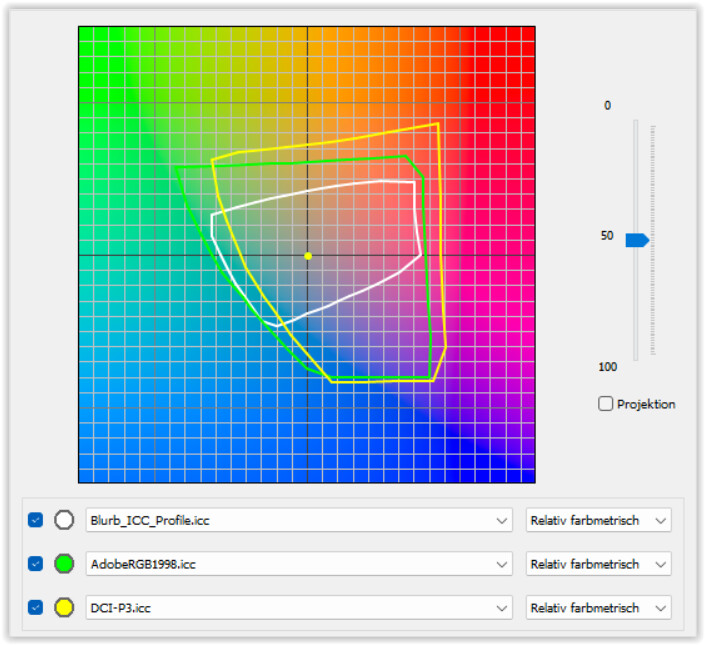
If @zkarj (“I’m working with this company who do give guidance, but I’m still a little confused”) uses this profile, then the red warning doesn’t surprise me at all.
The color gamut of this CMYK profile from 2007 is similar to a RGB profile for matte-coated paper I’ve used – significantly smaller than AdobeRGB or DCI-P3.
I vaguely recall trying to create my first photobook using Blurb, since it is “integrated” into Lightroom 5. However, I didn’t like the layouts, and handling CMYK data felt more like a workaround than a proper workflow. That might make sense for professionally publishing text and images, but I wanted a photobook with just some accompanying text.
In any case, I discarded that idea, chose a provider based in my country, created my own layouts, and uploaded sRGB files. The photobook software also allows for the creation of PDF files – suitable for use with a standard PDF reader – though not as preflight files. And yes, I made some mistakes, but that’s how you learn.
Most of my books have a portrait format of 21 x 28 cm or an almost square format of 27 x 28 cm. They are printed on matte or satin-finish paper and feature a lay-flat binding plus hardcover. When you open the square format and see an image spanning a width of 54 cm, the effect is truly impressive.
Honestly, if the photo books are intended for yourself or for family and friends, you should consider something simpler than what you are currently attempting. After all, the design process should be fun, too!
I’m talking about gamuts/color spaces. JPEG and TIFF are file formats. And AdobeRGB was also developed to make use of newer monitors with a larger gamut.
But what if we are working on a device or exporting for a device with a smaller color space? A much larger color space can create more problems than a less smaller color space. By example for me legacy=wide gamut + color rendering. One step more and still with some differences.