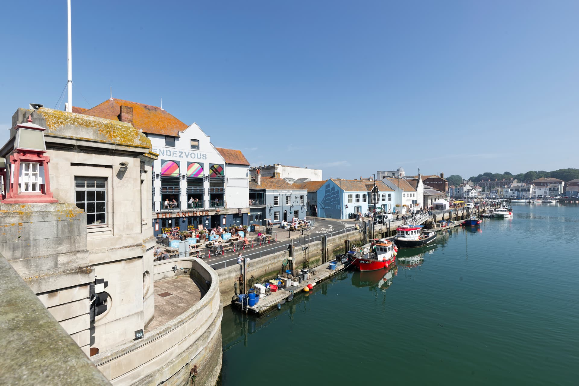
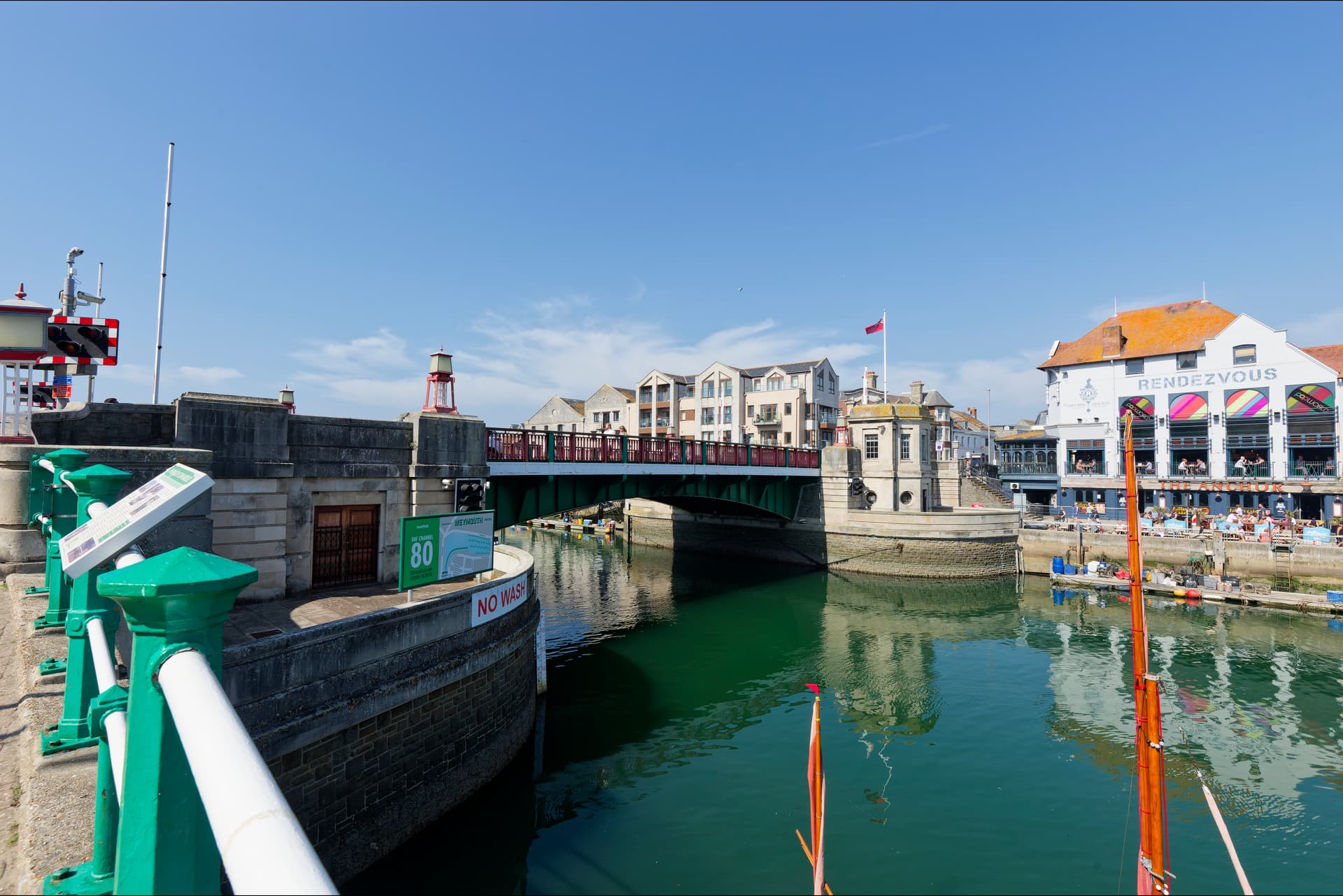
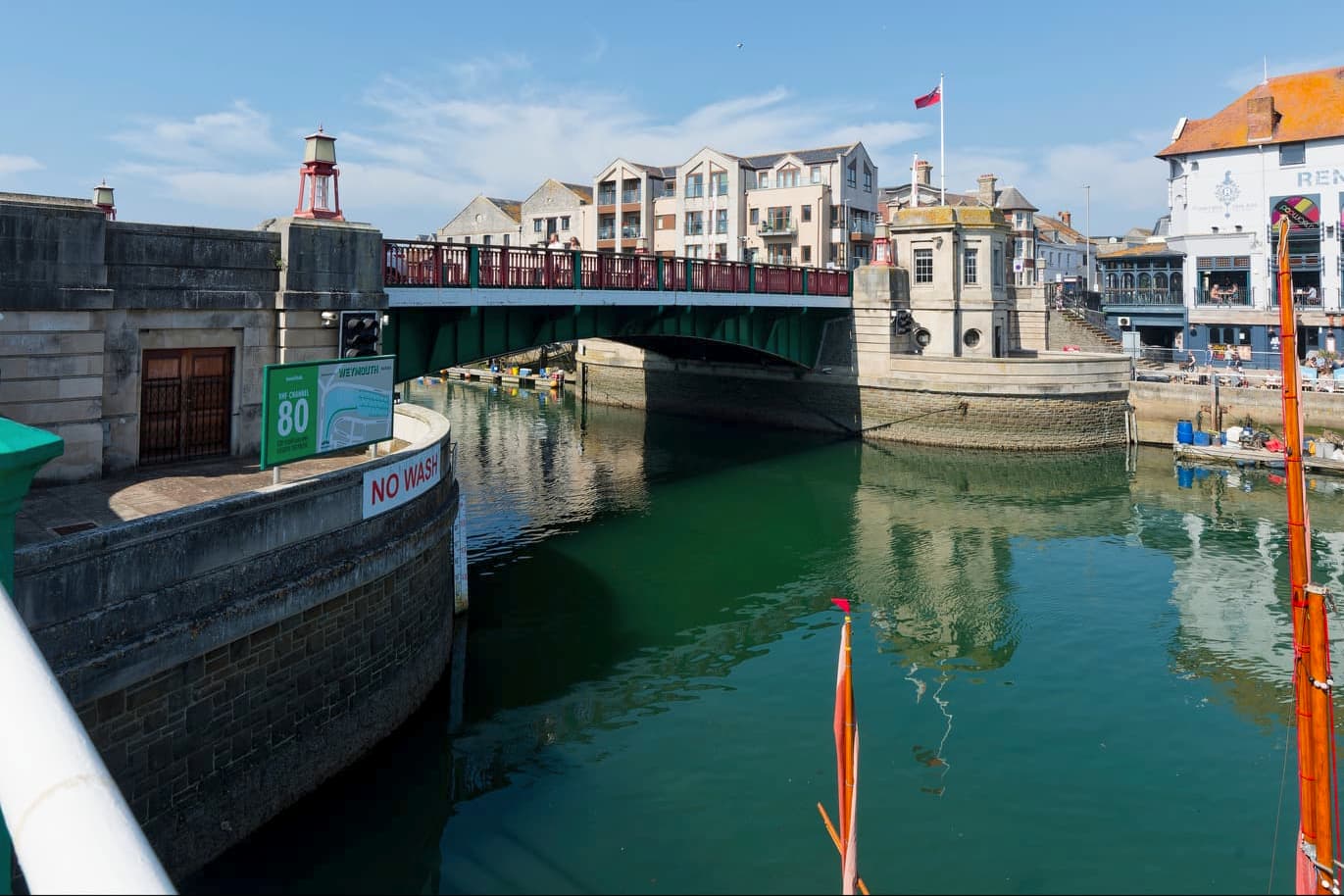
A couple of shots of Weymouth Harbour processed in PL7.8.0 (Build 254 Windows):
2 Likes
Personal viewpoint, as there is no “right” or “wrong”, but for me, you’ve confused both of them by what’s captured in the bottom left corner. That grabs my attention, before I can look at the much more interesting parts of both images.
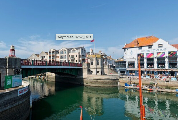
Not that I am any expert, but I prefer these screen captures:
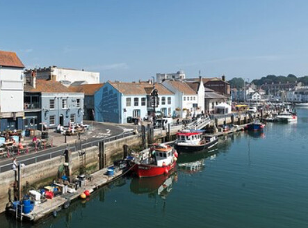
and
Such beautiful scenery - you are lucky to be there.
Love the colours!
I would have preferred to see the bridge open, perhaps from the pontoons on N Quay, though I accept there is a risk that masts will get in the way.
In the shot from the bridge, I would be tempted to crop, as Mike Myers I think is suggesting, so the far water horizon is on a thirds line, and laterally so as to get a vertical thirds through whichever of the boats to which you are trying to draw the eye.
HTH
Mike M (the other Mike M)
@mikemyers @Mike_Murphy_1948 Thank you for the feedback. I have only visited Weymouth on a limited number of occasions whilst on holiday, but may well have some images more suited to your tastes. Unfortunately, I have never been in Weymouth Harbour when the bridge has been opened.
I wasn’t sure how often it opened. AFAIK I have only been there once in my life, LOL! I imagine that the harbour is tidal, though, so it should be easier to predict times when it might be open … When I lived in The Netherlands, there were timetables to tell you when the bridges (some on motorways!) would be opened.
Felt bad about remarking on the composition, anyway, because I sense this forum is more about how we process our shots. …
Cheers
Mike M
I have only been to Weymouth 2 or 3 times whilst on holiday in Dorset, but it is well worth a visit. Just done a quick search on Google, and full details of when the bridge is lifted are on the Weymouth Harbour website. No problem at all with your remarks on composition, as I think they are just as valuable as tips on processing images.
Cheer,
Patrick
@mrcrustacean , about both pictures: good subject, nice strong colours. 90% of my panorama or landscape shots have a foreground, which I usually blur slightly. This gives the photo a depth or 3rd dimension. This is so important to me that if there is no natural foreground, I create an artificial foreground. Or my wife has to hold a branch in the picture ![]()
Picture 1: The horizon is in the centre. I once learnt that you should avoid this if possible. What you want to photograph must be dominated. I cropped the bridge pillar on the left a little. Here is my suggestion:
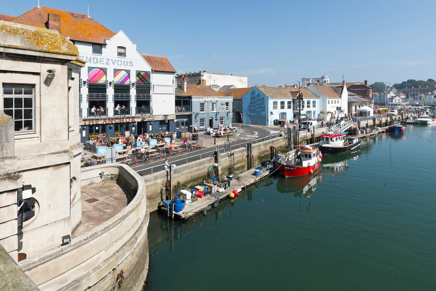
Picture 2: Here, too, the horizon is in the centre. I have cropped the picture a little, but this makes the deformations even clearer. This can best be seen in the sail mast on the right-hand side. However, I would correct the deformations in the RAW image.
For the top photo, maybe you could use masks in PhotoLab to blur the entire structure at the left, keeping the background sharper than the structure at the left?
I know it isn’t a boat, but the sharpest thing in the above photo seems to be what looks like the “bow of a boat”. It appears to me to be much sharper than the background, which I thought was the “heart” of this image.
I like this version much more than the original.
But, maybe if you focused on the left side of the image, and allowed all the distant stuff look less sharp? Please don’t shoot me, but since the background is less sharp, maybe make it all seem deliberate?
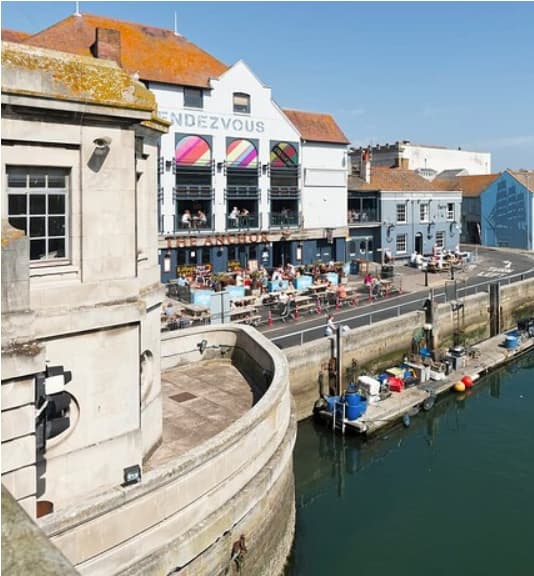
Mike having viewed the original raw file at 100%, I think you are correct that I focused on the left hand of the image. The image was taken with a Nikon D800, fitted with an AF-S Nikkor 16-35mm f/4G ED VR lens. The lens was set at 16mm, and the exposure at ISO 100 was 1/200th at f/10. When viewing the original raw file, as expected, most of the image is acceptably sharp. However using the hyperfocal distance may have resulted in a better image?
I also agree that cropping out the bridge does produce a pleasing result.
Curious, what focus mode were you in (AF-S or AF-C). For a scene like this, probably AF-S, as nothing was “changing”.
Does your camera focus when you push down the shutter release, or do you use Back Button Focusing?
What is Back Button Focus and Why You Should be Using It
Basically, you compose the scene as always, but the shutter release button will not tell the camera to focus. There is a button on the back of the camera, that tells the camera to focus.
There are settings in the camera, so it will only focus when you click the “AF-ON” button on the back of the camera. You also need to edit the shutter release setting, telling it not to start the auto-focus.
If you’re not already doing this, even if it “sounds” complicated.
- Compose your shot
- Press shutter release half way down
- set exposure,
- Press back button down to focus
- Fully press shutter release to capture the image.
Eventually it becomes a habit, and is much better than pressing the shutter button all the way to capture your photo, without you knowing what will be perfectly in focus.
At first, I thought this would be confusing. Now all my cameras (excluding Leica, which is manual focus) are done with BBF (BackButtonFocus).
Note: Joanna found a mistake in what I originally wrote, now corrected.
I got my mords wixed up
Are you sure you don’t mean the back button?
Re-wrote what I posted originally.
Thanks.
@mikemyers I have only used AF-C back button focusing for several years. I think the answer is to crop out the ‘offending’ portion of the image ![]()
By posting this image of the back of my camera here, Joanna will most likely suggest better choices. Anyway, here are the settings on my D780 for AutoFocus:
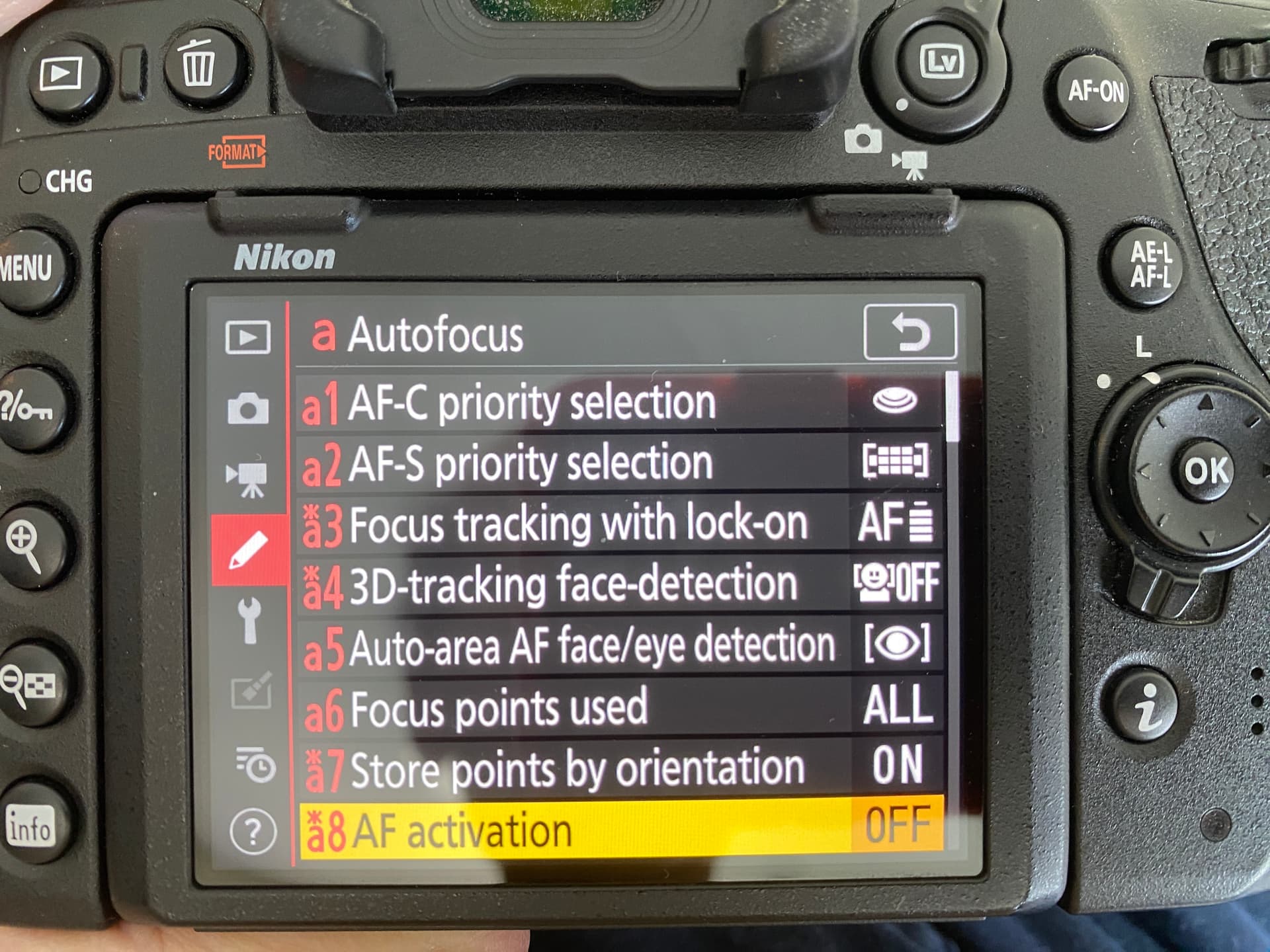
It has been this way for so long, I’m not sure I can even tell you the exact reason of why I selected them. Probably from this link:
https://www.youtube.com/watch?v=hR4CE162H8w&t=5050s
The link is for my D780, but a lot of it applies to most Nikon DSLR cameras. It’s a long video - you need to find the parts of the video for SETTINGS. This is only the beginning - there are a huge number of additional settings as you scroll down…
@mikemyers I see a topic derailing again ![]()
![]() ….
….
1 Like
I just ran your numbers through TrueDoF-Pro, which even takes account diffraction.
With a 16mm focal length, at f/10, it is very difficult not to get everything acceptably sharp.
Hyperfocal distance is only 1.73 metres, which gives everything from 86cm to infinity.
But even if you focused at 400 metres, you would still get everything from 1.72 metres to infinity.
Can you remember where you took the focus from?
I see no perceptible lack in sharpness worth worrying about. The only possible “problem” can be lens imperfection at the periphery, which the DxO lens module should help with.
If I may be a bit blunt (but not rude), this is typical camera club teaching to constrain members into turning out “standard” compositions to win competitions according to so called judges’ rules. Especially the dreaded “rule of thirds”, which Patrick has skilfully avoided.
One piece of compositional advice that I recommend above all is to lead the viewer into, and around, the image - something Patrick does beautifully in both these shots.
Of course, maybe it is the mast that is deformed ![]()
Taking an image that is virtually tack sharp from front to back and then massacring it with artificial blur is nothing short of sacrilege. As an experienced LF landscape photographer, I would be happy with Patrick’s framing as it allows the viewer to wander around the image, as if they were there. Your crop is “frustrating” as it stops me from seeing further up the river, which is a linear subject and requires linear framing.
The only parts of these images that are “less sharp” are the bridge parapet in the first image and the railing below the camera in the second. You simply don’t get blur with a 16mm focal length - see my numbers in my previous post.
@mrcrustacean I will repeat my congratulations on two superb images (as they are)
Maybe I need new glasses? To me, the structure at the left is sharp, and everything in the background is less sharp. I assumed that was due to where the camera focused.
Just look at the right end of the “structure” close to the camera, and compare the sharpness there to what is off in the distance. Click on the image to view it larger.
I haven’t thought much about the other photo. One at a time.
Not forgettng the image is extremely low resolution, so there are very few pixels
In NXStudio you can see the used focuspoints. Unless you recomposed you get the right focus point
George