I didn’t do what you thought I did - I manually selected the ISO and the aperture, and then I adjusted the shutter speed while looking at the meter readings. The shutter speed that matched the recommended exposure from the internal meter is what I left it at.
Yes. I will do it again when it’s sunny outside, and post here. My Nikon 50mm is reasonably new, made of plastic, and the last time I did a comparison my old Leica lens did better. But let’s not trust my memory - I will take a new photo, preferably in “normal” (not stormy) conditions, and you can tell me your opinion of it then. I “mostly” used this Nikon 50, unless I needed something different. Then I got the VR lens, so it would hopefully give me good results from 24mm to 85mm.
You were correct - the Leica camera likely DOES make changes to the captured file, to compensate for the lens being used!!! For me > OUCH!
Others have had a similar problem, because their camera thought they were using a different lens than what they actually had used.
You hinted at this, when you (or Wolfgang?) said something about the image being modified in the camera before I even uploaded it.
The solution, which I have now done, is to turn off the lens encoding setting in the camera menu.
While my M10 will not be providing correct information for coded lenses (that I don’t have or use), neither will it be providing INCORRECT information for the lenses I AM using, and most importantly the camera won’t be mucking around with my IMAGE and also the image data based on its incorrect assumption of which lens I was shooting with.
This is an image I just captured with my M10 with the new 50mm Voigtlander, with the lens encoding turned off. I have done nothing to the image in PL4, not even added the watermark, so there is no .dop file yet. Since PL4 doesn’t see any optical data, I assume PL4 hasn’t done anything at all to this image.
I am amazed when I view it at 100% - all the problems we have been discussing are gone!!! Even the fellow on the scaffolding with the yellow jacket looks good, and if I go to 200% he looks pixelated, as does everything else in the image. Back to 100% and the cruise ship looks great - but not if I bump it up to 200%.
I wish I knew all this long ago - I’ve been wasting your time uploading images that are NOT the exact image as captured by the camera, because of how the camera messed them up > GiGo.
(Now I need to go back to the discussion in the Leica forum, and point this out. I thought the only thing being confused was the EXIF data. Boy, was I ever wrong. I think it was Wolfgang who asked about this a while ago, but I never looked into it, since I was so sure it was not happening. Me bad.)
I was going to say your D810 before you beat me to it, and I don’t think 35mm would have captured that, and a 21mm with 90 degree coverage would have captured more, so I would guess 25mm?
The bottom image covers from a little higher than straight ahead, to a little less than straight down, so if you used your D810, I might have been thinking 21mm, but with all the vertical lines remaining vertical, I suspect your LF camera with a wide angle lens, and the lens lowered quite a bit from the camera - which might explain why the distant scene looks less sharp than the rest of the image.
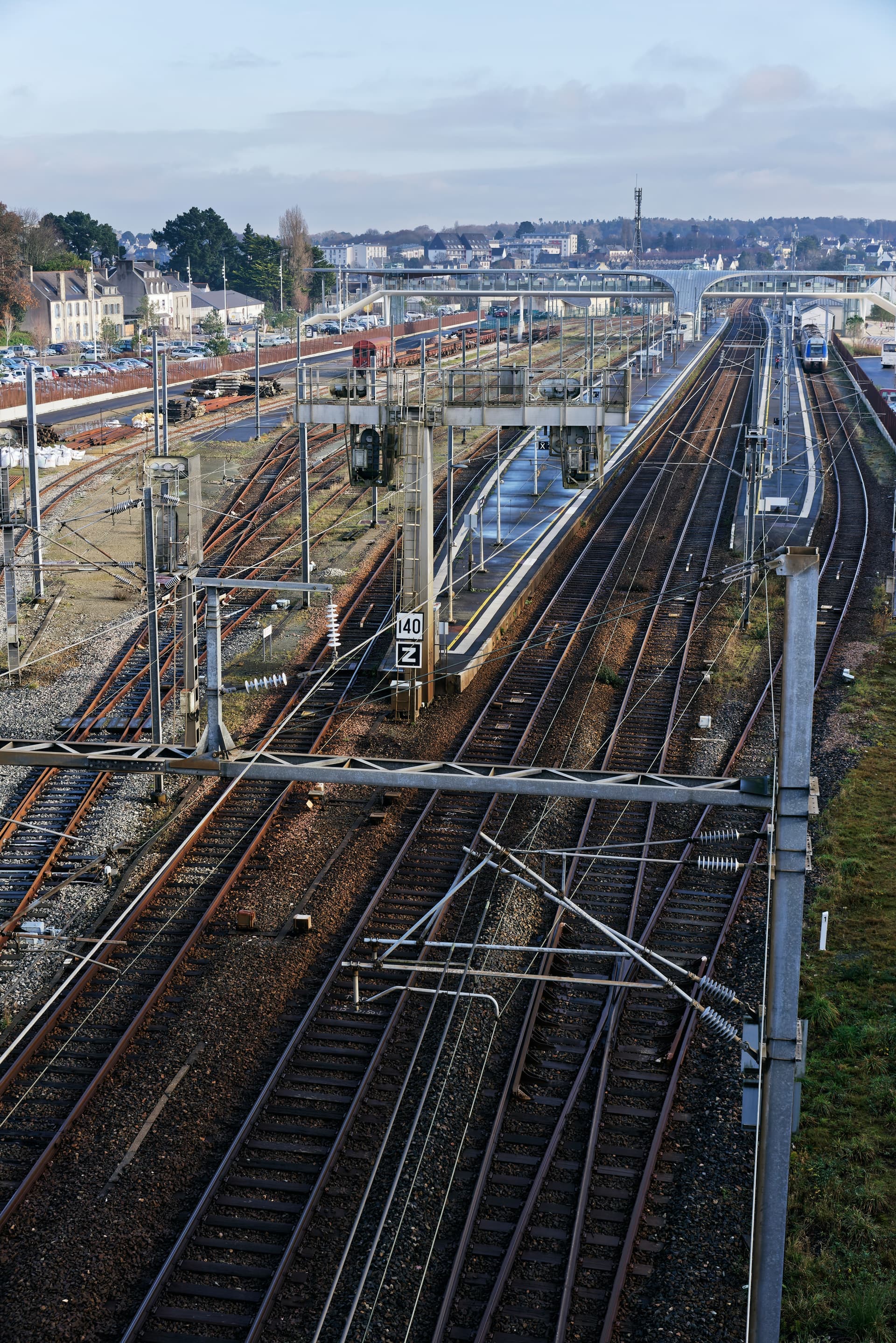
I’m also fascinated by the image, especially viewing it at 100%. I’m fascinated by most railroad related images, and this one shows the passenger area, the freight area, the wiring, and so on. To my eyes, something looks “wrong”, but I know it’s right - the spacing between the rails. On American railroads, the rails are closer together than what’s used overseas (wide gauge).
I do have a tilt-shift Nikon lens, non-AI, fully manual, which would work on my Nikon DF. It’s 35mm, and maybe it might capture an image like this - would be fun to try. To keep all the verticals vertical, you must have lowered the lens. …and if you could do that, a less expensive lens made for LF would probably work just fine. I think. ??
My camera was still set to 5600K for color temperature. Your jpg does look more or less like what I see looking out my window while sitting at my desk, but it feels much too blue. Long ago, I used to put it on “Auto”. What I ought to have used this morning was “cloudy”. I have no “feel” for what to set this at, but my camera seems to have captured a view that I feel is too “blue”. In DxO I would head for the tool to warm it up. What would you have done?
Well, actually, the first image was taken on a Nikon D200 (10Mpx DX format) with the AF Zoom-Nikkor 28-200mm f/3.5-5.6D IF, which is a relatively inexpensive all-purpose zoom that PhotoLab does wonders with. I used it at 28mm f/9 (42mm equivalent on full-frame)
The second image was taken on the D810, with the same lens. This time at 48mm focal length, aperture f/10.
Actually the gauge in the UK and most of Europe is standard gauge 4’8½" just like in the States.
Nope. No cropping, tilting, shifting or anything. Just straight out of the camera and tickled up a bit for contrast and colour.
The lens is long discontinued but used to cost around $500 new - I pick mine up S/H for about half that.
I know you love your Leicas but, honestly, bang for buck, I have always thought they were way overpriced. Added to which, I moved from 35mm out of sheer frustration with the fiddling little negatives that never had enough detail for the size of prints I wanted to make.
Nowadays, there are several makes of digital camera that surpass the Leica both in quality and price, and I can’t afford them either
But then, I have a beautiful Mamiya 7 II sitting in the cupboard, waiting for me to be enthusiastic enough to put a roll of film through it. Would I sell it? Not willingly. Maybe if I ever got to have a permanent darkroom and dedicated dust-free scanning area, it might see more use but, with a D810 to hand and no messy chemistry required, there is just no contest.
My camera hardly ever leaves 5600°K ±0. Colour temperature at time of shooting is basically irrelevant with RAW files. I use 5600°K because the unprocessed files tend to retain the feel of when I took it, but which I can change at any time in PL.
I completely agree. It’s been that way since the first M3 was released, and ordinary people couldn’t afford one.
B&H put an “open box sale” M10 on their website, before Covid interrupted the world, and I figured it was then, or never, so I bought it.
I think I actually paid around $6,000ish for the body, new, with warranty, and I knew that from then on, the costs would be going up, way up. I’ve enjoyed using Leica cameras ever since I moved up to an M2 from my Nikon SP rangefinder camera. Maybe all my experiences when I was younger keep me feeling so strongly for this kind of camera design. I still have my SP, along with an M3 (being cleaned and lubed) and an M2 which needs the same, but works.
For digital, I figured that I would use my Df forever, and I don’t see myself buying any newer Nikons in my future. I don’t see myself buying any newer cameras, period. Even my Fuji X100f feels like it was at the top of what was possible, and new newer ones use a touch screen which I don’t enjoy.
Were you in my shoes, which lenses do you think I should have considered?
I can’t argue against that. Better to use the same everything, and only change the camera/lens. I did that today, and that’s why today was so frustrating.
I took a photo with my D750 with 50mm, hand held, and I would grade it as maybe a 9.
I then mounted my M10 on a tripod, attached the new Voigtlander 50mm, and got “yuck”.
Repeat - same.
Used self-time, 12 seconds before exposure, same - yuck.
Used my 50 Sumicron, hand held, and got something good, but not better than the Nikon
Used the Voigtlander again, hand held, 7 shots, hand-held, and got all 7 results slightly better than the Nikon D750 with 50mm.
All I can figure is using the tripod inside my apartment, shooting out an open door, left the camera somehow free to “vibrate”, creating blurry images, and when I hand held it, it was stabilized and worked great. Just a guess, but what else could it be?
I was going back and for between returning the Voigtlander lens, and then thinking something I’m unaware of was wrong. Taking the camera off the tripod and getting better results than having it on the tripod is not logical - but this is a light travel-tripod. I’ve got a good, studio quality heavy tripod packed away in my storage room - need to get it out and test again.
All these were in the same dull light, with rain starting and stopping.
Summary - the best from the Nikon beat everything in terms of clarity until I hand-held the Leica with the Voigtlander lens, at 1/1000th, with my hands resting on the tripod, and viewing the image through the camera viewfinder, not the Visoflex. There’s no mirror to do anything, but maybe just the shutter firing caused the blur?
Nikon’s 50 prime lens ($250 new) worked very well. The Voigtlander ($999 new) was just a hair better.
On the other hand, I don’t want to be a pixel peeper, I just want the camera to work well, and I don’t really expect that many people to ever view my images at 100% size… but who knows.
I won’t argue with what you said, but If I put that $6000 towards other lenses, what camera would you have me shooting with? Perhaps Nikon’s D850? I don’t like the size and weight. What’s your suggestion? The D780 is essentially the same as the 750.
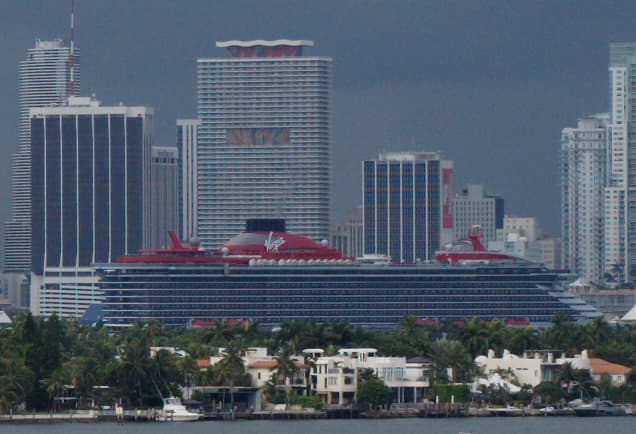
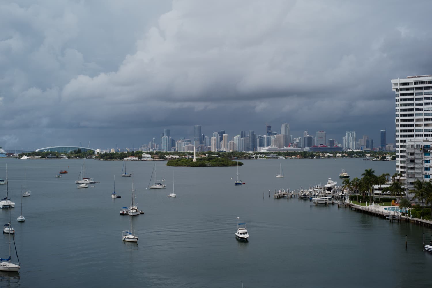
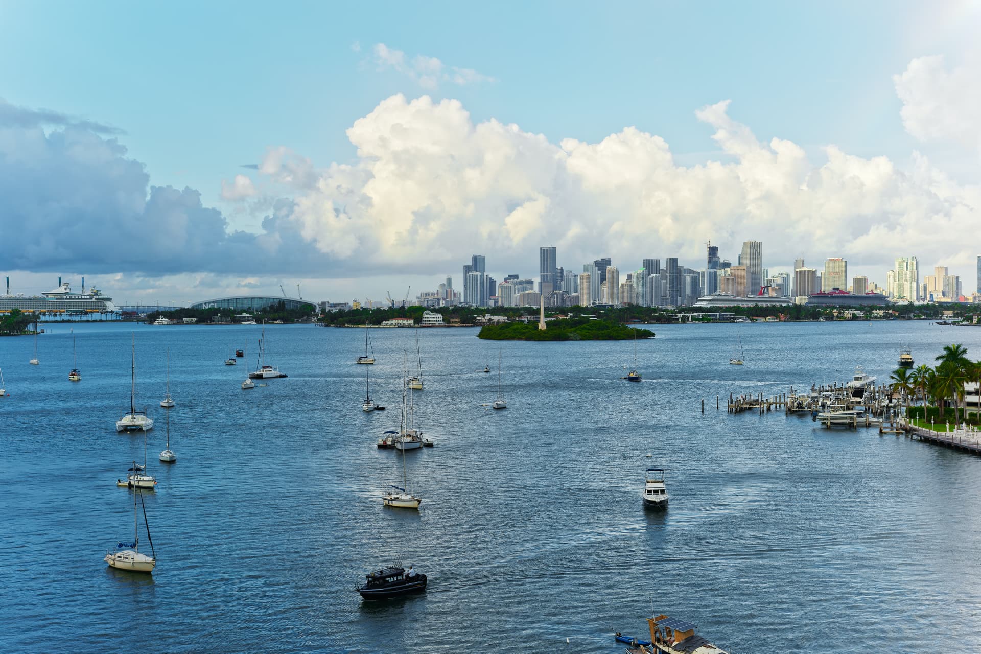
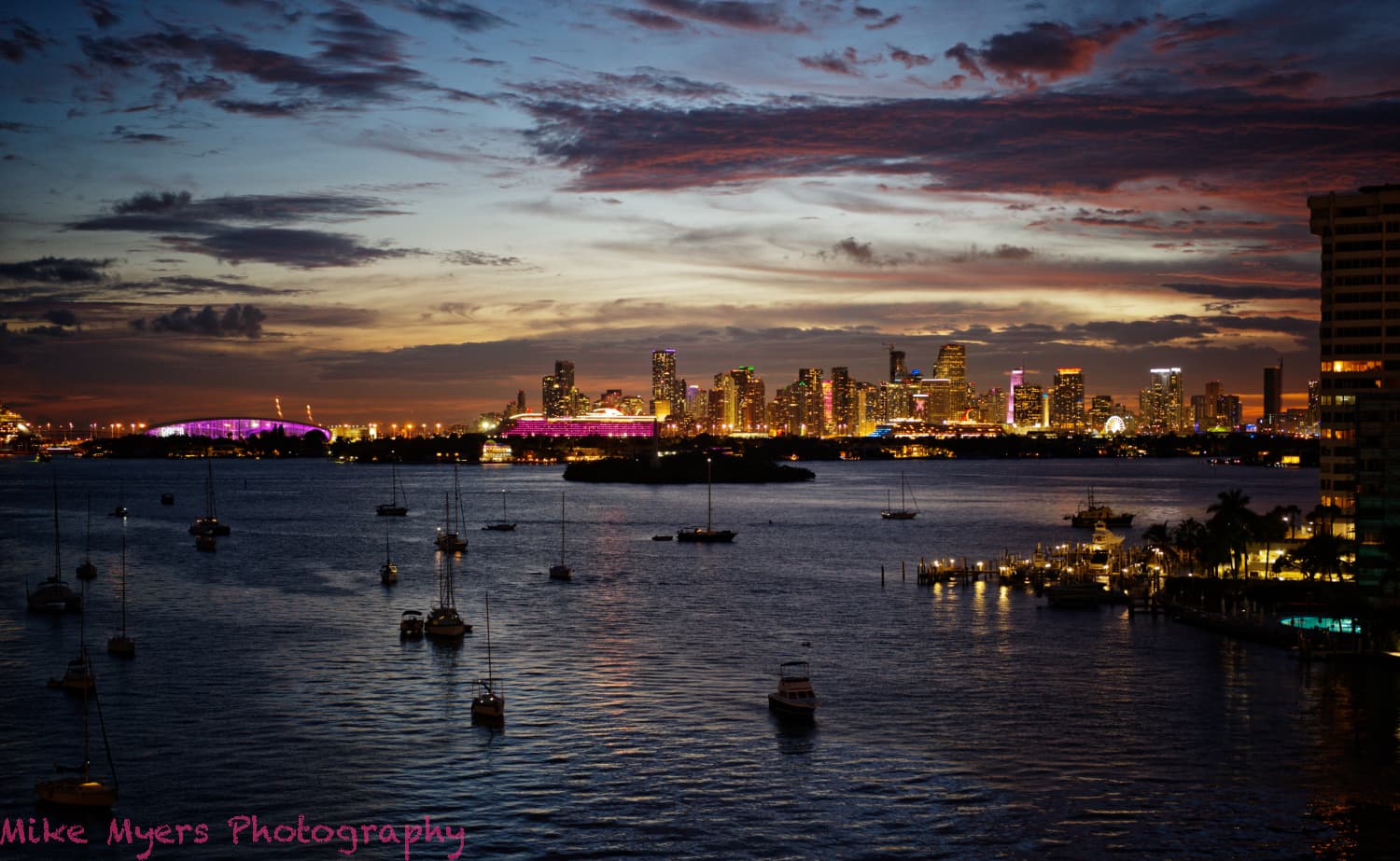
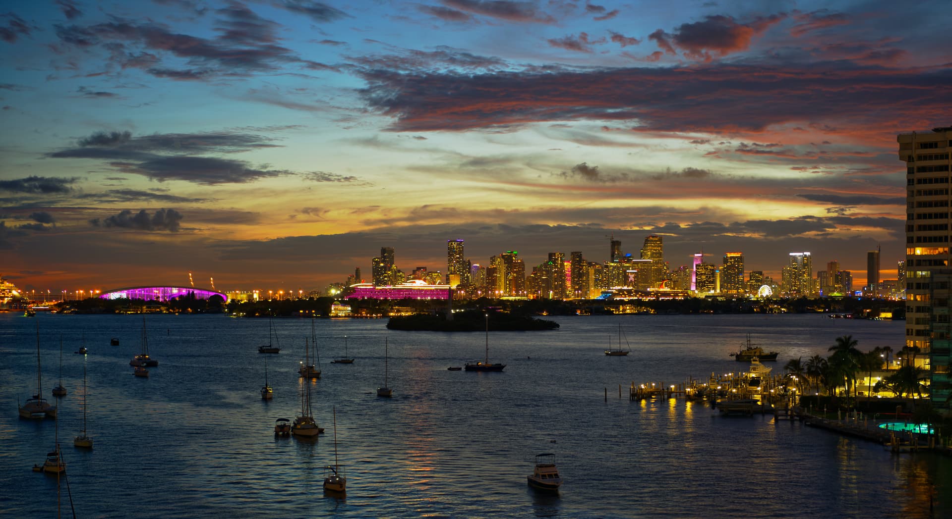
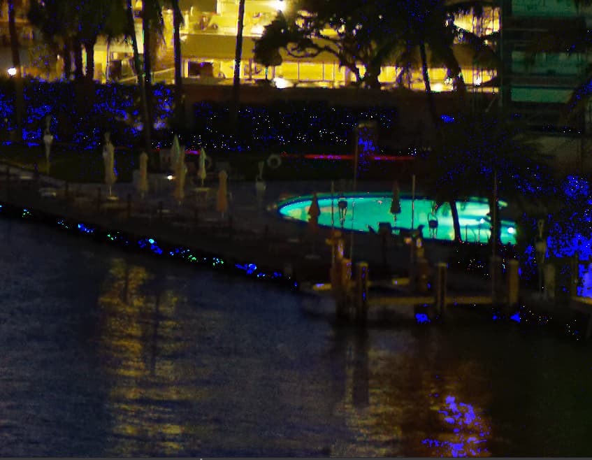
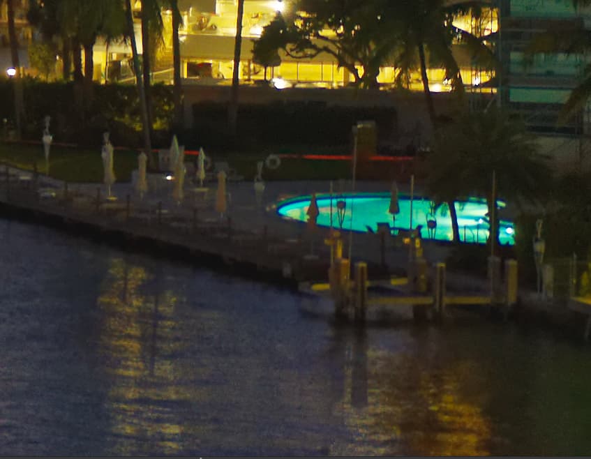
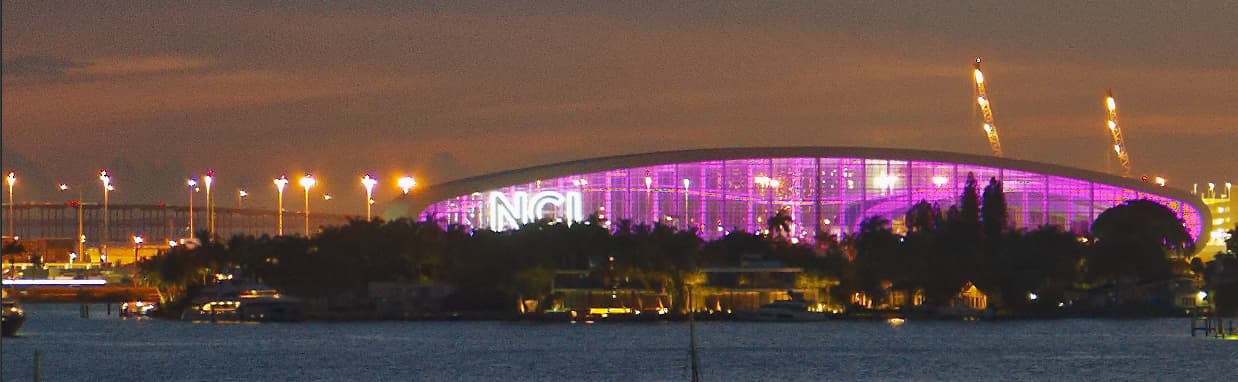
Tonight’s sky was rather strange. I took several shots with the Voigtlander 50, and then tried some close-ups with a 135mm lens - which I didn’t like. The purple ship (The Scarlet Lady, by Virgin Cruise Company) was sailing out, which was good and bad. I liked having multiple scenes to choose from, but since it was moving, the close up shots were way too blurry. I liked the reflection of the sky in the water. I lightened up the building at the right just a bit (I think Joanna will make it brighter). The whole scene looked too “blue” to me, so I warmed it up just slightly. I eventually got the histogram to fill the window, so very little should be pure black or pure white.
The sky isn’t what I was hoping for, but I guess it will do.
Since lens information was turned off in the camera, my camera and DxO won’t be fighting each other to correct it - they’ll hopefully just leave it alone for me (us) to do.
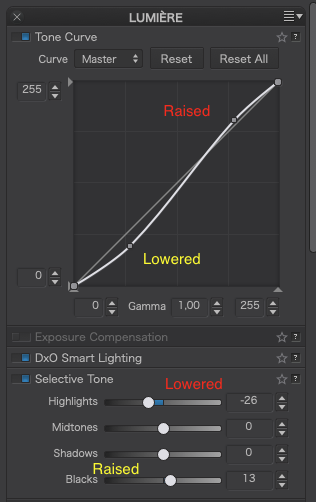
I used -14 for the highlights, but then raised it to -26 to tone down the lightbulbs and their glare.
I think that you have spent enough on gear, but if you feel differently, you could have a look at the Nikon Z series of mirrorless cameras… Nevertheless, cameras don’t matter that much for creating images. Cameras and lenses matter to pixel peepers more than to artists.
That’s a tough one. The D850 weighs only 6oz more than the D750 ( 2lb 0½oz vs 1lb 10½ oz) but the results are stunning. You already have some lenses that will work fine but, with what you would have left, you could buy some decent glass. And, as others have said, with Leica you are spending a whole lot more for not much better quality.
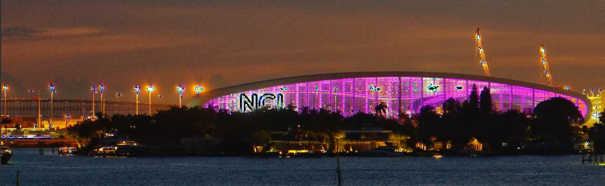
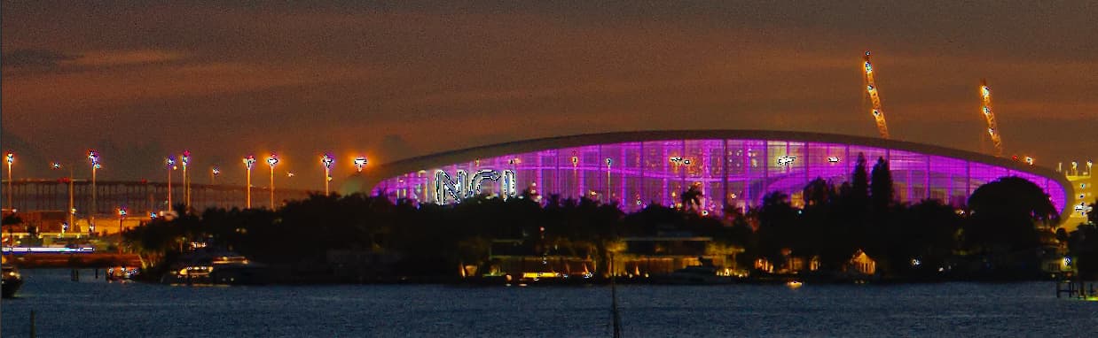
Now to your latest image.
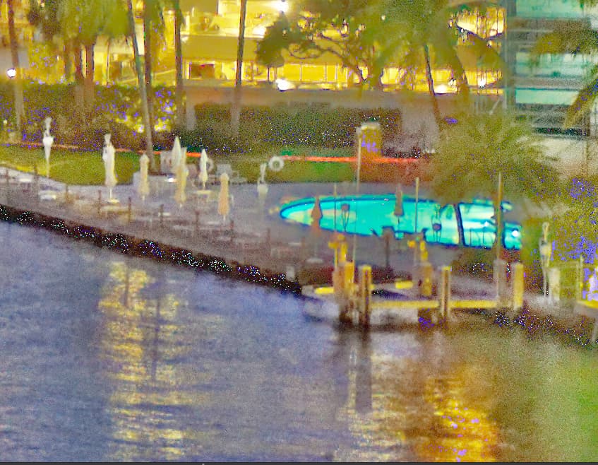
Straight out of the can, the level of detail is amazing. My only observation on that front is that, as with a couple of previous shots, it feels like the pixels are sharper than the detail, if that makes any sense. The Nikon sensor “feels” better (at least to me).
Nonetheless, I have reworked it to get even more detail out of it, although some of it is subtle and you would need to zoom in on the original to fully appreciate it.
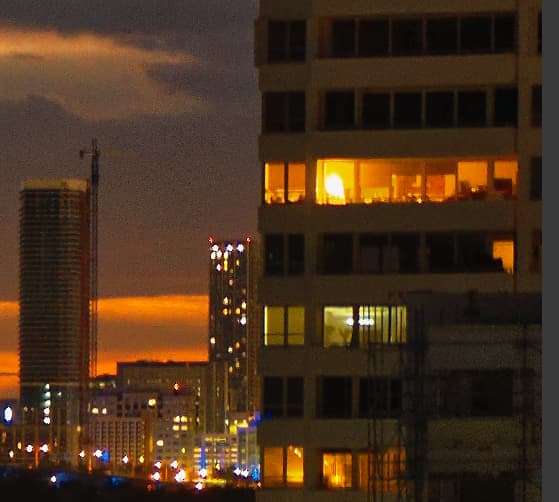
First, I must point out that, with a tad more unsharp mask, the windows on the building on the right exhibit remarkable clarity…
I definitely agree with the colour temperature - I just neutralised the Magenta to 0.
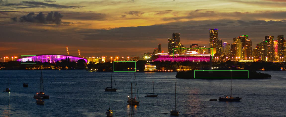
I added a couple more zones to the Smart Lighting to take account of both dark and bright areas rather than just the darker building. The way you had it, the building on the right as driving the whole feel of the image.
With Smart Lighting, it is important to mark the darkest (the islands) and the brightest (the bright white lights) to bring everything else into range. In this screenshot I have outlined the zones in green to make them clearer.
In reality, this shot was a tiny bit over-exposed and some of the brightest lights were starting to “overflow” rather than be clearly defined. I did the best I could with the tone curve to bring them back under control.
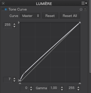
Your Tone Curve and Selective Tone setting were fighting each other, with one, partially, cancelling out the other…
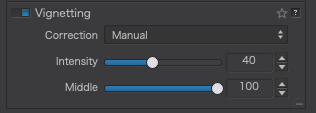
The Vignetting was overdone. If you don’t have a proper lens module, you need to pay more attention to this.
Stop using Micro-contrast unless you like grainy images. Use Fine Contrast instead and, only then, start with the different tonal ranges rather than blitzing the whole image. I remember you saying, way back, the you didn’t like the “crunchiness” too much sharpening gave to the water.
I added a little overall Vibrancy, which gently raised the overall coloration but had to use the HSL tool to avoid over saturation on certain strong colours like the accent lighting on the ship and some buildings. This takes some learning and really needs more explanation than I could do in this thread. Download my DOP and take a good look at adjustments I made, clicking on each of the coloured dots and looking at the sliders to see what I had to do to “tame” the over-saturation of certain colours. This is how I got the pink deck lights on the ship to be less “blown” as well as the red/orange lighting on the top of one of the buildings. All this work is done in coordination with the shadow and highlight warning signals on the histogram palette to see where the blown/blocked/over-saturated areas are. Don’t worry about this too much for the moment, it’s really getting to the “niceties” rather than the essentials.
I raised the unsharp Mask intensity to 200 to make things that bit clearer - necessary because the Lens Sharpening is not available for the lens.
I tightened the crop on the bottom to avoid the distraction of the reflections in the bottom right corner.
For Local Adjustments, you need to look at my version to see what I did and where but I will point out that, for the NCL building and the ship, I used Auto-masks instead of Control points to limit the spread of the adjustments, and I added two offset graduated filters to the sky to give more accent to the colours in the upper sky than to that part between the buildings and I erased the graduated mask where it covered the right building. I also added a graduated filter on the water to increase the saturation of the reflected sky and soften the sharpening on the water.
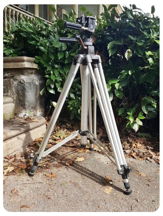
I have a much, much better tripod, larger, MUCH heavier, and I’ve used it now for maybe half a century. I bought the larger and smaller tripod as a “travel tripod”. It was probably a waste of (not too much) money. This bothered me last night, and I went searching for where I had put my good tripod - found it, and I will use it from now on.
Yesterday was so frustrating - I used the Nikon, hand-held, resting against a door frame, and got excellent results. Then, picture after picture from the Leica got me one good shot (hand-held) and ten or so garbage shots with no detail. I finally held the Leica in my hands, and rested my hands on the tripod, and that worked, and I found the quality I was hoping for. I also tried my very old Leica 50mm Summicron, which couldn’t come close to the Nikon lens, even in the center of the image.
My current thoughts are that using my Nikon, hand-held, but stabilized against the door frame got great results. Using the Leica, with the self-timer, on the light tripod resulted in crap photos. The best Nikon photo had more contrast (edges) which made things look sharp. The Voigtlander lens gave me an image I like best, but the Nikon, for 1/4 the price, was just about as good.
Maybe later today or tomorrow I will make another comparison test, using my good tripod. (I need to order another rubber foot for my tripod, a “Bogen 3040 with the adjustable head”. Here’s a snapshot from the web:
I need to learn how to use my new tripod - the Bogen is too big and heavy for a travel tripod, although Ansel Adams probably would have thought “essential”, not “too big/heavy”.
Thanks - you’re right - and by wasting all the time with my “toy” tripod, it was still a good learning experience. That it can easily fit in my suitcase is good, but only if I can learn how to stabilize it better. Maybe my building “vibrates”, and the tripod amplified it? I dunno…
I have never used “unsharp mask”, and I know nothing about it. I’ll do some reading later today. I can see from your image that it helped, somehow - I need to look into this.
Your example above is worth 1,000 words. At the time I did that, I didn’t know how “smart lighting” worked, and put the “box” on the building. I didn’t realize I needed to also put boxes in the darkest areas. I did notice the effect you described - as I adjusted the smart lighting, the entire image started to change, as you described - I was surprised, but thought this must be the way it’s supposed to work. Wrong. Now that I understand, this will be a MUCH more useful tool.
Too bad I can’t “right-click” on this tool, and get to see the description you just posted. PL4 should use this concept in a lot of places.
Regardless, I think I now do understand, and I can see where this can be very useful. One more giant “plus” to PL4.
What is the proper way to use these? I remember first adjusting the curve, and then “fine tuning” with the individual controls? I’ll have to check your .dop image and see what you did. You made it obvious that what I did was counter-productive, raising and lowering with the two tools, fighting each other. Is it better to use the “tone curve” OR the “selective tone”, and if I use either, to leave the other alone?
I have one month in which I can return the Voigtlander, but as you put it, Leica prices are just way too high. I will write to Stephen Gandy at CameraQuest, the distributor for Voigtlander lenses, and ask if anyone has created the proper data on this lens, that I could feed into PL4 - and I guess I should also contact DxO, and see if they already have useful data for a Voigtlander 50, that I could try.
Stupid mistake on my part - I must have been tired. I meant to adjust “Fine”, not “Micro”. Me bad. Won’t happen again. From now on, when I’m finished with an image, I will go down the full list from top to bottom to look for mistakes like what you have mentioned.
I will put this off for later. I’ll be visiting my brother next week, and I’ll have a good bit of free time, and since right now I don’t even know where to start on this, I’ll both read more about it, and see if DxO has a “webinar” which will explain it.
I don’t understand “unsharp mask”. One more thing to read about and learn. At this moment in time, I don’t know what it is, or does.
I can see I will be spending a lot of time learning from your version. I think I’ll stop taking and posting more photos here, until I have learned what you’ve done, and learned the tools that as of this moment I know nothing about, such as “unsharp mask”.
Added later - I’ve just downloaded your .dop file, and I can switch back and forth between what I did, and how you improved it. Wow!!! Yesterday I liked what I did - but I never realized that what you did was hiding all the time inside my image. No comparison. I need to learn enough so I can “think” like you. Maybe I should edit an image, then stop, and an hour or two later return to to it, and maybe then I will be able to see for myself how to improve it as you did.
Going back and forth, the single biggest change is the way you’ve warmed up the image, which made for a much better sky.
I cropped the bottom, and you cropped a lot more, and your way keeps what’s important, and cuts off the “excess”.
What I did looks like I used a vignetting tool, and the middle is bright, but the “corners/sides” are dark. I think you’ve shown me how you corrected that - I remember being aware of it, but not knowing what to do to adjust it. Parts of my image are so dark, there is no obvious detail, but in your image, it’s all there.
In my image while I thought the city looked good, it looks more natural in your version. Mine looks too “harsh”. Yours looks more “real”.
I know there are more things you wrote about, but these are the ones that stand out the most to me, switching back and forth.
There’s the line that a building depends the most on its foundation. If the foundation is wrong, everything that follows will not be good. In this case, I now feel that the original image was “solid” enough to allow you to make all those changes, and get a good result. Maybe from now on I will bracket, rather than just using the histogram for exposure, as I did. The sky once again is what “makes” this photo, and while I thought my version was OK, making it warmer as you did brings out the colors SO much more nicely. Wow…
It is Saturday evening, and no new photo to post. I’m still trying to catch up with the previous discussion, so I can do these things on my own.
I took some time off to wander around the net, and the Leica forum, trying to find data on the Voigtlander lens that I could submit to PL4. I didn’t find that, but I did find this technical review of the Voigtlander lens I bought:
This makes me wonder what I should do with my other lenses. Probably nothing for a while. I remember thinking long ago that a photographer most likely needs only three lenses, normal, wide-angle, and telephoto.
I purchased an adapter last year that would allow me to mount a Nikon lens on a Leica. This may allow me to mount my shift lens on my M10, as I can now (need to confirm) mount it on my Df.
What I need to do the most, is stop thinking about equipment, and get back to thinking about the quality in an image. Thanks to everyone here, especially Joanna, I am learning the tools, but unless Joanna can replicate her eye, and send it to me, it might be a long time (if ever) before I recognize the needed corrections as she does.
ADDED LATER:
Joanna, this link leads to a discussion of what you were telling me about how the Leica may or may not modify an image to correct for lens errors - but it goes way beyond that:
Unsharp Mask sharpening is the “old fashioned” way of sharpening when we didn’t have PL’s lens sharpening which, I am guessing, is a similar mechanism but based on parts of the image that the lens module identifies as needing more sharpening than others rather than a blanket sharpening. If I remember correctly, Photoshop can do similar but you need to manually mask the areas you don’t want sharpened - something you can also do in PL by applying a local adjustment mask for sharpening.
Our club photo knows only too well my stock answer to many questions is “ça depend” (it depends)
And in this case, ça dépend - on which you feel more comfortable using or whether you feel a combination would work better than one on its own.
Take the example of your latest image
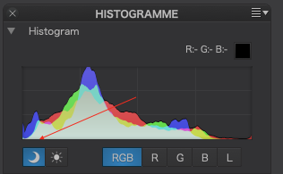
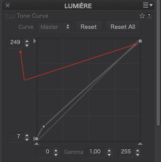
In the bottom right corner, there is an area of blocked shadow detail, revealed by switching on the “warning lights” in the histogram palette…
Zooming in that corner, we get blue markers showing where the exposure is out of range…
If I use the Selective Tone palette, raising the Shadows and Black levels (both to 100) to try and get rid of the markers, so those parts are no longer under-exposed, I get…
… with the rest of the image virtually unaffected but with the under-exposure markers extinguished.
For everything other than these “edge cases”, it is very much down to personal preference as to which tool gives you the desired balance of tonality and contrast, although, for control of contrast, the tone curve wins hands down. You really need to play with the tone curve, adding extra points and moving them to see what effect it has. The width of the tone curve graph is equivalent to the histogram width and the steeper a part of the curve is, the more contrast in the related part of the histogram.
For subtle “global” changes, you might find the Selective Tone sliders more useful - or a combination of the two, as long as you realise when you are reducing one and raising the other that you might not need to do both.
I very much doubt it. DxO have their own labs where they create their lens modules and it would mean Voigtlander having to create data that is compatible with PL, which, it has to be said, is unlikely to attract them.
I also very much doubt that is ever going to happen. DxO would need hands on of the lens and camera in order to do the necessary tests and, even then, I can’t see them doing it for such an esoteric combination.
That is the beauty of RAW files. But it is also the problem with viewing them and processing them.
With an amazing RAW engine like PhotoLab (no they are not paying me to say that), you can reach into the extremes of the 14-bit data recorded in the RAW data and either compress or extract, depending on terminology, that into the 8-bit images that most monitors are capable of viewing.
This is typical of a properly exposed RAW image.
Don’t bracket - it’s not necessary unless you are planning on combining images in post-processing. Get it right in the camera instead.
With B&W negative film, I can use the Zone system to compress 14 stops of dynamic range into a 10 stop negative in such a way that it will print onto 7 or 8 stop paper - basically, exposing to avoid blocking shadow detail and adjusting exposure, development and printing to manage the highlights.
And there is an equivalent for digital positive images, sometimes called ETTR (expose to the right), where the aim is to perfectly expose for the brightest highlights, so they are not blown and leave the shadows to fall where they will.
I ran a series of tests on my D810 (with 14 stops range) to determine exactly how far I could go in exposing highlights without blowing them and it turns out that, if I zoom in and spot meter, with the camera’s built-in meter, the brightest area, and the set the exposure compensation to +1⅔ or +2 stops, the highlights are retained and that then gives me more latitude for shadow detail at the shadow end.
I would highly recommend you run the same kind of tests on your cameras because, when the “negative” is perfect, processing is so much easier.
Not forgetting that physical graduated filters work equally well with digital cameras as with film cameras and, if the difference in exposure between foreground and sky is greater than the dynamic range of your sensor, you can bring it in range with a grad filter.
Here’s an LF shot that demonstrates using a 2 stop ND hard grad to bring the sky down to within the 5 stops range of Fuji Velvia 100 film…
Now, that was for 5-stop film think what you can do with a 2-stop grad filter on a 14 stop sensor - that gives 16 stops of range - and without bracketing!
Seriously, stop trying to make use of older 35mm equipment. My mum used to say “you can’t make a silk purse out of a sow’s ear”. Unless you can find a modern tilt/shift lens, that DxO supports, you are going to end up with exactly the same problems as you’ve already experienced with your Voigtlander lenses.
Instead, learn how to use the ViewPoint tools to do the work for you.
…no underexposure warning. Instead of black, the “underexposed” pixels are dark grey and will not necessarily show anything than noise. Reducing white to 249 instead of 255 does not add info, it simply makes whites a bright grey, but it removes the warning.
Highlight and shadow warning thresholds are set by the software, in some, the user can adjust the levels as needed. While highlight and shadow warnings are helpful (e.g. for printing), I’d not understand them as “absolute”.