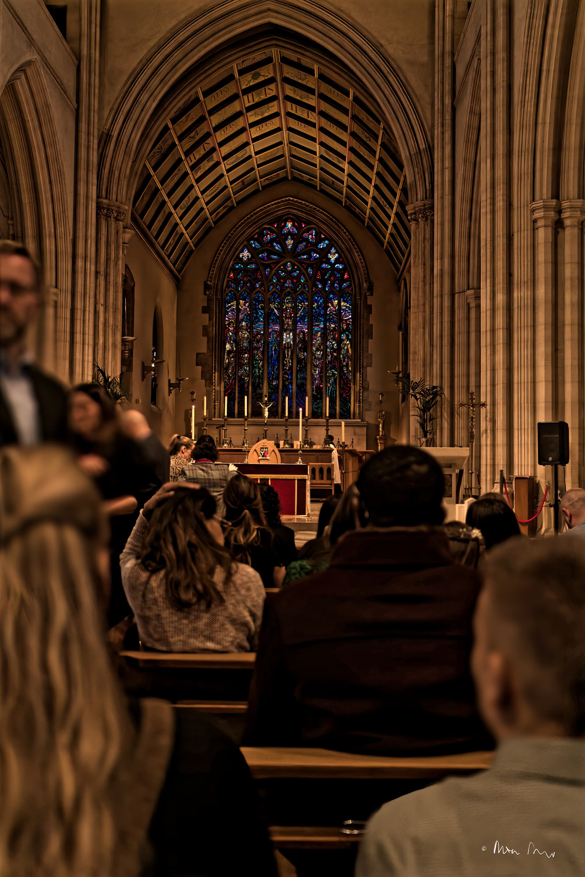
Yesterday we were in St George’s cathedral, Southwark for a confirmation. It was quite dark, and it was some time before I noticed that my camera was set with ISO=100. So the first frames were very very dark. Dumb, I know, but I find it hard to adjust the viewfinder to suit my progressive glasses.
Still, using Joanna’s recipe:
DXO Smart Lighting
Contrast + different levels of contrast for midtones and shadows
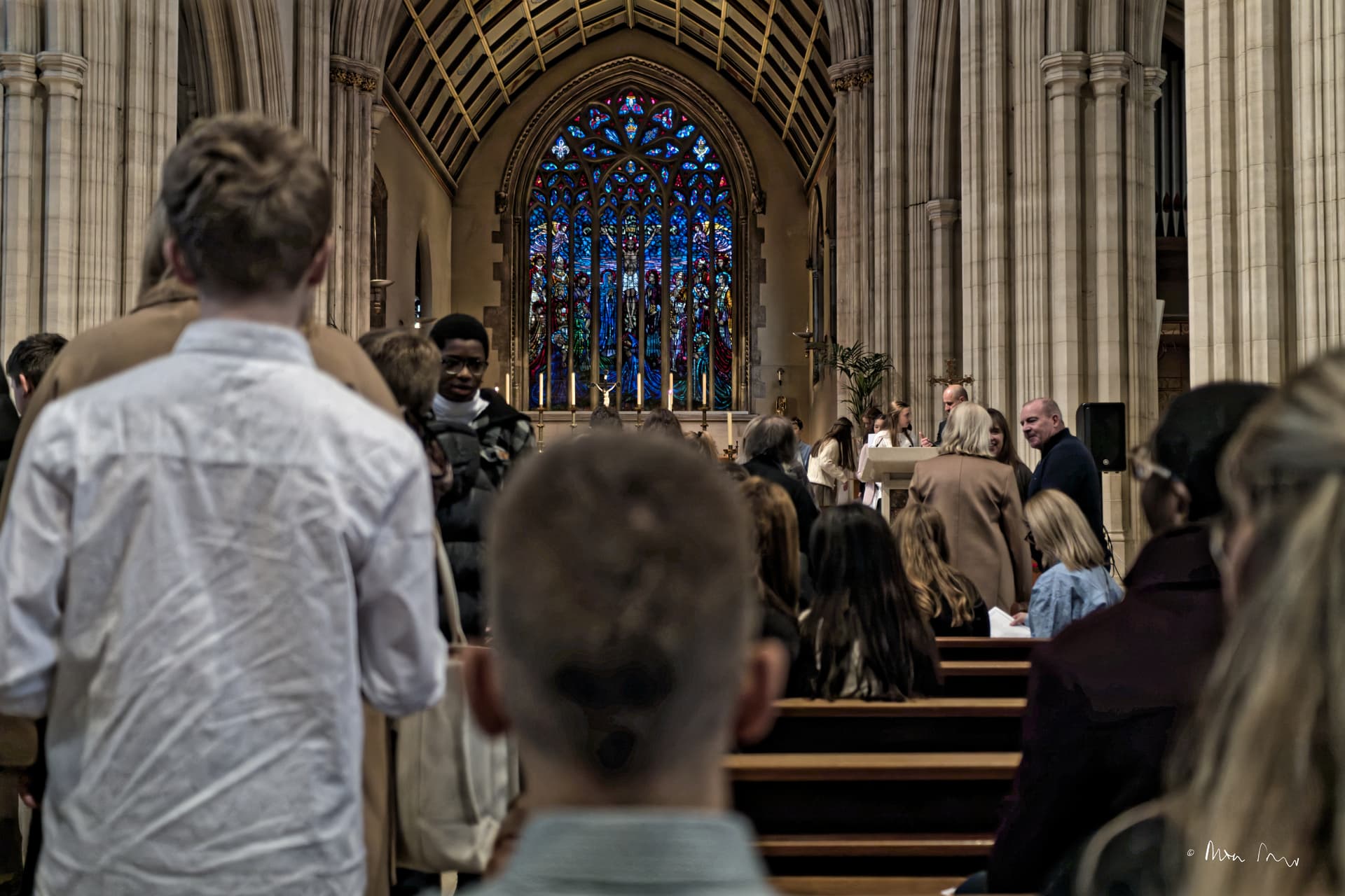
I always forget one thing: White Balance! The cathedral was burned out during the Blitz, and rebuilt with Portland stone, so the true colours are more like this:
This is where aesthetic and atmosphere don’t necessarily match “reality”. Otherwise known as artistic interpretation, it’s entirely up to what the photographer wants to convey. Unfortunately, there are “purists” out there whose jobs in life are to point out that their “truth” is the only one that matters.
Absolutely right, Joanna. Both my brother and I were internees at Downside in the 60s/70s (he is 5 years younger), and we both saw the George Gilbert Scott designed nave of the Abbey church when (I walked in/he saw the photos). So to us, as survivors of a George Gilbert Scott structure, and might I add, of an earlier Pugin structure like the pre-Blitz photo target, the whiteness of the Portland stone is key. Had he been there (I didn’t see any other Downside survivors) we may be the only people to whom the shade (there, I’ve said it! White is not a colour.) matters.