Yup. To my mind, that’s one of the biggest “dangers” of the preview screen. A lot of people setup things on the camera to give them a pleasing image on the review screen (which is a jpeg image created by the camera) even if they are shooting RAW.
However, what you see there can bear absolutely no resemblance to how a finished RAW image can look after processing. So you end up shooting for this or that WB only to find that, when you see the image on a screen that is bigger than 2" diagonal, it really wasn’t anything like that at all.
I use the review screen mainly for checking composition and to find out that I just exposed at such a low speed that I’ve got movement blur ![]() I learnt a long time ago that it bears as much resemblance to the finished picture as does a colour negative, complete with its orange substrate, or a B&W negative.
I learnt a long time ago that it bears as much resemblance to the finished picture as does a colour negative, complete with its orange substrate, or a B&W negative.
I use 5600°K because I can then instantly tell if the subject was “cool” or “warm” with relation to “daylight” when I shot it.
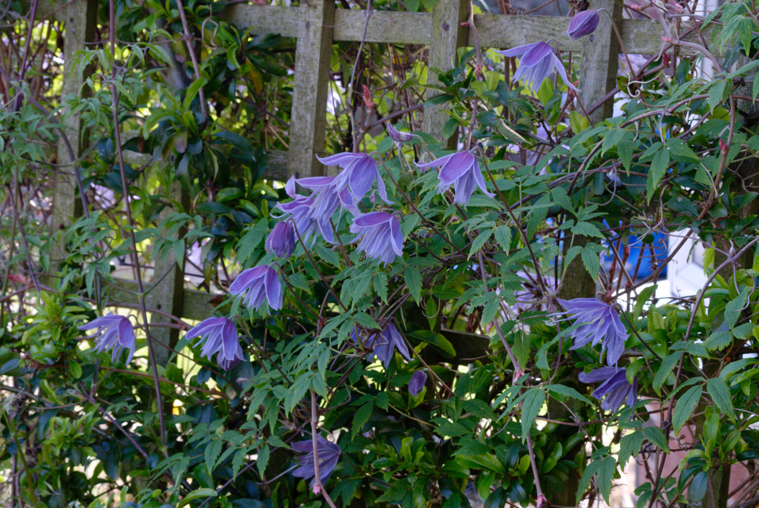
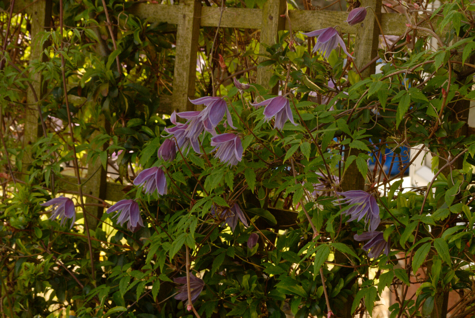
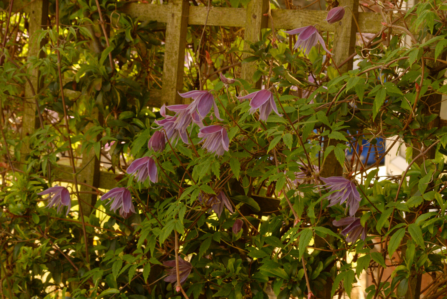
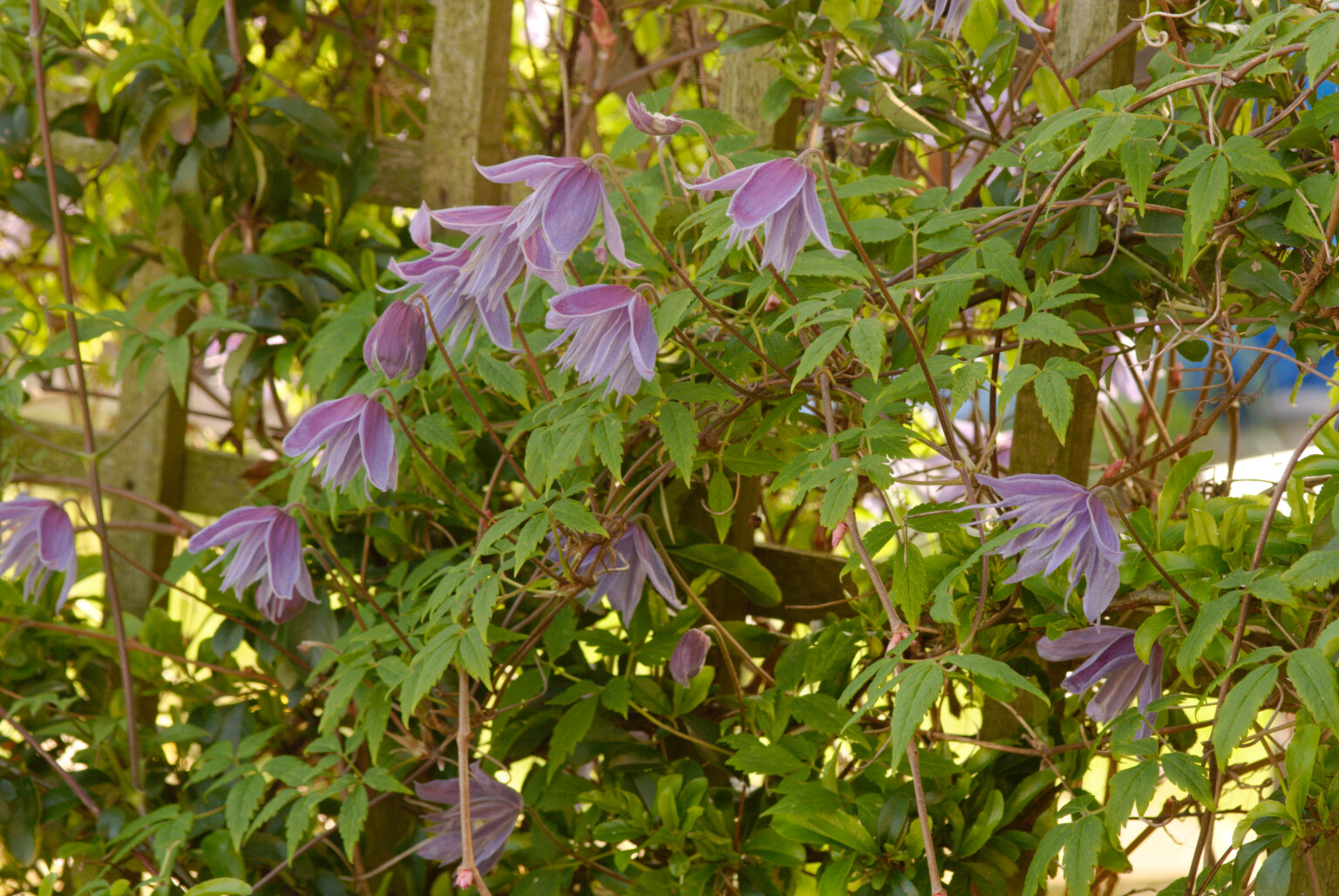
Here’s a series of shots of some Clematis flowers that I shot through different colour correction filters to simulate the light at different times. The question is, what is the right WB and how would I go about measuring it either in the camera or in post-processing?
Had I used either auto-WB or the Preset Manual, I would still not be certain of getting it right, due to the amount of green light being reflected from the surrounding foliage, not to mention the red brick building behind me and the fact that I was in north-facing shade. So that’s a bit of extra green, red and blue to take into account.
In this case, I would possibly be best walking away from the immediate vicinity of the subject, into a more open area where I could see the sky behind me, and using Preset Manual mode to establish some kind of “normal”.
Or I could simply shoot at 5600°K and adjust it to taste later ![]()
Which is why I never bother with auto-WB - there’s just too many factors that can contribute to the camera getting it wrong.
Learn to mistrust the review screen ![]()
That’s the general idea.
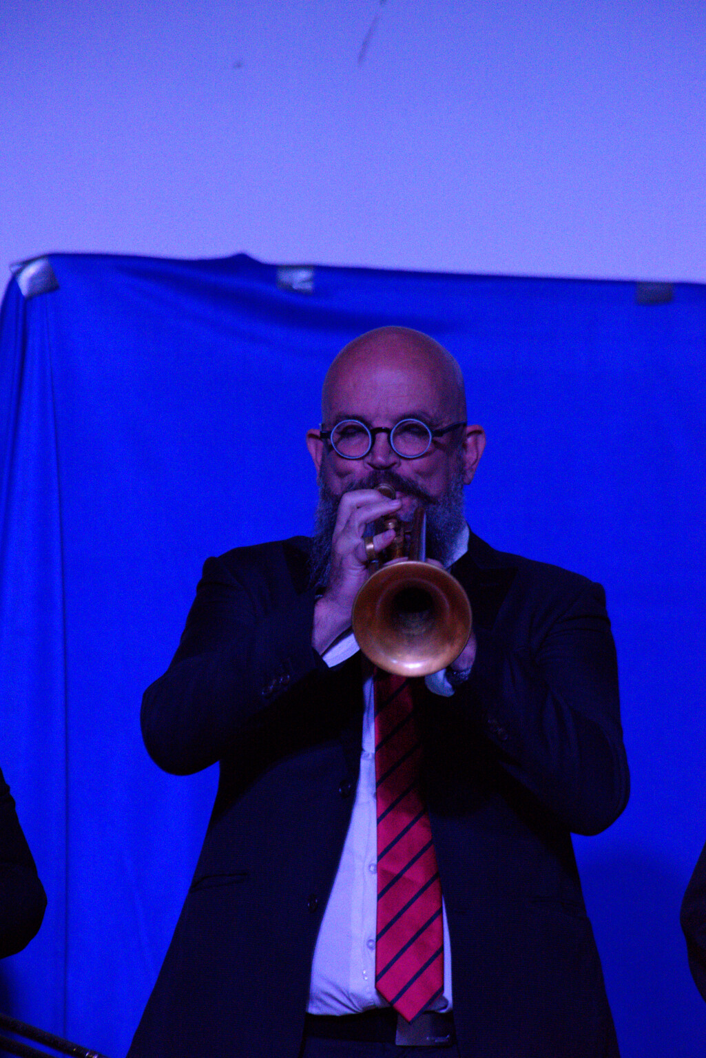
Adjusting for a dominant colour where you have complex and/or mixed lighting that can change - think things like concerts where colour accent lighting is used and you want to avoid having to change every image in post-processing. e.g. (unadjusted)
You’re right, it is part of my workflow and it has made my life easier for many years ![]() But, of course, others may work differently.
But, of course, others may work differently.