Understanding Selective Tone control

I see that I’ve run into a topic that’s been discussed in several other posts and at great length. However, I believe this post may add some clarity to those.

The purpose of this post is to help you understand what the Selective Tone sliders do and why you might want to consider using the Tonal Curve as an alternative.

NOTE: I’ve included a summary of the extensive discussion at the bottom of this post. There are other alternatives besides the Tone Curve.

If you want to vote for a change in behavior, go to the first post listed below. If you want to discuss how you would like the Selective Tone sliders to work, go to the first post below. If you can add clarity to how the sliders work, why they might work the way they do, or how to work around any limitations, feel free to add to this post.

The other posts are:

Understanding Selective Tone

I’ve attached a file with 11 strips ranging from pure white to pure black in steps of 10% luminosity. Load this file into PL and apply the “No Corrections” preset. Now, by making changes to the various tone sliders and watching the Histogram, you can see how each slider works.

Luminosity 255-0 in steps.tif (1.1 MB)

Set Black to -100. The rightmost three strips are now black and all other strips are somewhat darkened except for white. This is what I would expect and duplicates functionality that can be done better with the Tone Curve.

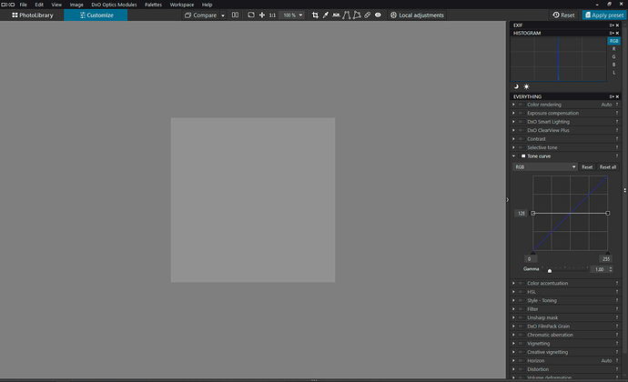
Now let’s reset Black to 0 and set Highlights to 100. This works almost the opposite of Black: white stays white, black stays black and all other values are lightened. However, the leftmost strips do not turn completely white, so there is a little asymmetry. This setting might better be called “Whites”.

On the other hand, -100 Highlights and +100 Black do not work even close to symmetrical. -100 Highlights shifts tonality down much more than +100 Black shifts it up. I’m not sure why DxO chose to do this.

The Shadows slider seems to influence everything from 10%–90% luminosity. I have always had the sense that the Shadows slider lightened up a lot more of an image than I intended and have resorted to using a local adjustment as a workaround. Now I can see that I wasn’t imagining things.

The Midtones slider is closest to working as I would expect, although it appears to lower luminosity more than it raises it.

A Bug

Set Highlights to -100 and Blacks to +100. Leave the other two sliders at 0. One would think that each strip would be a solid shade of gray, but this is not the case: the edges are darkened on one side and lightened on the other. I have no idea why, but this seems like a bug.

UPDATE: This appears to be a deliberate local contrast effect and not a bug. Lightroom/Adobe ARC do something similar.

The Tone Curve

The Tone Curve control offers an alternative to Selective Tone.

Sliding the lower left handle in the Tone Curve to the right is much more powerful than lowering the Blacks slider. Sliding the lower left handle up is not the same as raising Blacks slider, however; you can imitate raising the Blacks slider by adding a control point somewhere near the lower end of the line and raising it. Sliding the lower left handle up is a bonus effect that cannot be done with Selective Tone.

The upper right handle in the Tone Curve works has the similar advantages over the Whites slider.

By adding control points, one can adjust any ranges one wants to use for shadows, midtones and highlights. I just wish I could make the graph bigger and get numeric feedback for any control point, not just the endpoints.

As I’ve started shifting over to use Tone Curve, I’m finding I’m getting better results than with the Selective Tone control.

There’s a big draw-back to this workaround: Selective Tones are available as a local adjustment and the Tone Curve is not. Giving the current user interface for local adjustments, I don’t see it getting added anytime soon.

Update 11/9/2019: Summary of Thread

This is a summary of various workarounds proposed to the limitations of the Selective Tone control.

  • Use adjacent Selective Tone sliders to limit some tonal changes. For example, if you raise Shadows, you might lower Midtones.
  • Use Selective Tone for fine-tuning. Make the initial changes using other LIGHT tools: Exposure, Smart Lighting, Clear View, Contrast, Tone Curve (already mentioned).
  • Tip: Try using Smart Lighting on highlight and shadow selections and then user Exposure to adjust tonality.
  • Tip: (From Tom Niemann) Use Exposure Compensation to get midtones reasonably correct. Then invoke Smart Lighting to retrieve blown highlights and unblock shadows. Once that is done you can use tools such as Selective Toneand the Tone curve to fine-tune these areas.
  • Tip: (From Tom Niemann) Use Exposure Compensation to shift the histogram to the left so there are no blown highlights. Then raise the Shadows in Selective Tone, and increase contrast using the Contrast sliders in the Contrast tool.
  • Tip: Set the black and white points with the Tone Curve.
  • Tip: Adjust the gamma value in the Tone Curve.
  • Use the Lightness slider of the HSL “All” channel to alter global contrast (doesn’t work in PL3).
  • Try starting from a low contrast camera profile.
  • Adjust tonality using local adjustments (so as to limit the affected areas).
  • Do the main body of work in PL and the final tonal changes in some other image processing program. Freeware such as darktable has extensive tonality control.

Other notes:

  • The tones affected by the selective tone sliders do not match ACR or Lightroom’s sliders; values cannot be transferred over.
  • PL uses AdobeRGB as its internal color space.
  • The histogram (and the RGB value it displays) are based on the color space for the monitor (or sRGB or Adobe RGB, depending on the selection in Preferences/Display).
13 Likes

Thank you for sharing a nice demonstration of how these adjustments work!

I find it helpful to think of the Selective tone sliders as working in tandem with one another, rather than separately from one another. For example, if I don’t want lowering Highlights to affect too much of the tonal range, I’ll also raise Midtones. If I want to increase contrast in the shadows, often lowering Midtones is the right adjustment - since it acts most strongly on the mid-to-lower parts of the grayscale. If I want to generally brighten the image without affecting near-white and near-black, I’ll often raise Midtones a bit and maybe adjust the neighboring sliders a bit to compensate for the effect on shadows and highlights.

It’s also interesting to use your demo image to observe the effect of each of the contrast sliders and the Exposure compensation slider. These also interact with the Selective tone adjustments, of course.

I’ve come to like the overlapping interaction of these sliders. Sure, it’s not always the desired behavior - but understanding this and making good use of local adjustments help a lot.

Your test image also demonstrates that parts of an image marked as overexposed or underexposed (near max black and near max white) won’t necessarily be adjusted by the Selective tone sliders, but can be adjusted in other ways. I would like to understand this behavior better. Is this what you point out as a possible bug?

4 Likes

I agree and I had started to explore that approach.

But let’s say I adjust the Shadows up. I might need to lower the Midtones to compensate. This might leave me with some midtones that are too dim, requiring further compensations until I’ve run out of controls.

The Tone Curve is a better solution except that it is very tough to get the fine control one needs. The graph is pretty small and small changes to the curve can make significant changes to the image. As you mention, the Contrast control is another option. Using them all might be needed in some cases.

No. The bug I pointed out is that, given a pixel with a particular tone, I would expect a tonal change to that pixel to be independent of any neighboring pixels. For my strips, for example, I would expect a change to affect every pixel in the entire strip the same way. This is not what happens.

On one hand, there’s an optical illusion which makes the strips of gray appear non-uniform. However, I do see in the histogram’s color picker that the RGB values start to vary by small amounts near the borders between strips after making Selective tone adjustments. The adjustments must be using an algorithm that looks at neighboring pixels - like adjusting microcontrast does. A plain Contrast adjustment, for example, doesn’t have this effect. Hmmm.

Correct, it’s a real effect. An Unsharp Mask is another tool that creates this kind of effect.It’s interesting that Photolab is applying some sort of “sharpening” to tonal changes.

2 Likes

Exposure compensation and Smart lighting likewise introduce this change. It’s as if a bit of extra microcontrast is being applied. It’s even evident in the shape of the histogram. The only tonal sliders that don’t do this appear to be Contrast and the Tone curve adjustments. The effect is noticeable even at 100% zoom level.

I only have one other test image of this kind to use right now. I tried this with a very gentle but rapid monochromatic ramp from ~0-255 - it can’t be noticed there. Also not noticeable when there are transitions from one color to another. I suspect it’s an attempt by PhotoLab to preserve fine details when compressing the tonal range in some part of the histogram.

2 Likes

hy at first thanks for the explaination and example tiff.
(at first i am not , totaly not very good at color grading or any other color luminosity saturation gamma things, i just play around until i find my thing i hoped for.)

i believe in LR/ Photoshop the white’s , midtone’s, blacks sliders are mask’s which equal powered are on the area of the luminosity and if you push midtone up to max it becomes a white range.
( i think i remember this from an other post.(also a great color grading/ edit guy (@sankos if i am remembering wrong mea culpa :slight_smile: ) who is hoping for a color proofing tool in side PL))
Photolab has somewhat overlapping area’s called highlights
midtones
blacks
And with the selective contrast slider (Filmpack elite) you can make the contrast lower or bigger.

The Tone Curve has a 100% luminosity control from 0 black to 255 white, you can reverse, make a 100% black white conversion. (it’s can work as a blacklevel tool for clearview purposes to “add polarisingfilter” ) Much more powerfull.

did some fooling around with your testtiff. using selective tone tool, contrast tool and tonecurve tool

I don’t know if what you say is better or DxO’s aproach of less big influence of the sliders and a separate tone curve “sledgehammer” tool.

i did a feature request to link the tone curve and other luminosity/contrast sliderstools by having a Dotted line who is given the actual changed tone curve caused by the selective tone control and the advanced contrast sliders.
So you see the change you made in that dotted line in the tonecurve Then it’s a information tool and a powerfull selective tool.
You can then set up a quick S-line in tone curve and use the selective sliders to fine tune wile seeing the effect on the dotted line if you lower contrast the S- curve got less pronounced in the dotted line.

2 Likes

I just learned I can open JPGs and TIFs in Adobe Camera RAW, even in my ancient Photoshop CS6. Neat!

I loaded the same test image. Because this is CS6, I have tonal adjustments just for Blacks, Whites, Shadows and Highlights—no Midtones. Here’s what I observed.

  • -100 Blacks: 0-30% → 0%, 40% → 10% and everything else scaled down evenly 100% → 100%.
  • +100 Blacks: 0% → 0%, 10% →15% and everything else scaled up evenly to 100% → 100%.
  • -100 Whites: 100% → 100%, 90% → 80% and everything else scaled down evenly to 0% → 0%.
  • +100 Whites: 70-100% →100%, 60% → 90% and everything else scaled down evenly to 0% → 0%.
  • -100 Shadows: 10% → 5%, 30% → 15%, 60% → 58% and the rest unchanged. It also “smears” the solid strips into gradients.
  • +100 Shadows: 10% → 20%, 20% → 40%, 60% → 61% and the rest unchanged.
  • -100 Highlights: 100% → 95%, 90% → 80%, 60% → 55%, with the same kind of “smearing”.
  • +100 Highlights: 60% → 65%, 70% →80%, 90% →98% and the rest unchanged.

Notes:

  • The controls are more symmetrical, but not exactly. Minus Blacks and plus Whites are very close opposites.
  • The shadows and highlights are more limited in scope. They aren’t exact opposites. They also turn solid tones into gradients.

It may be hard to picture. If you have Photoshop or Lightroom, you may have to try it yourself. More recent version may behave differently from my old CS6.

If you were thinking that ACR and LR tonality changes are easier to control or just different from PL, you aren’t crazy. You can’t transfer the values from Adobe to PL, not even roughly, and get the same results.

2 Likes

One should remember that when we talk about the Basic panel controls in Lr / ACR, the Highlights and Shadows sliders do not just move those tones around, but have edge-detection / local contrast enhancement (similar to the Clarity slider). If you want to know more about that, go ahead and watch George Jardine’s free video tutorials on his blog. If you prefer reading, then this article explains it quite well (page 2).

PhotoLab’s Selective Tone tool doesn’t do local contrast enhancement like Lightroom’s Highlights/Shadows sliders, so the results will never be similar, even if the sliders affected the same tonal areas.

When using PhotoLab’s Tone Curve to control tonality one must remember that increasing contrast in there will also increase saturation, so possibly some negative Vibrance/Saturation slider values may have to be applied.

When talking about tonality control in PhotoLab one should not forget the importance of the camera profile because they not only control colours but also have a basic tone curve embedded in them (the default and the camera-based profiles have quite a contrasty curve). If we want maximum highlight recovery it’s better not to apply a too contrasty base curve because then Selective Tone or Smart Lighting have to undo some of the highlight contrast imposed by the camera profile.

Hy, good to see you back.
I am curious about how you evaluate the new HSL tool.
We have now more possibilities in b&w conversion, color replacement and tonal adjustment.
This means that the user needs to be aware of the working of the algorithms.
The why and the how so to speak.
How is the selective tone , advanged contrast and such work with (or against for that matter) smartlighting, clearviewplus, HSL, tonecurve.

I can play around and watch what happens but the theorectical background is a bridge too far.
(thanks to your efforts to bring some light in this area in colorprofiles workspaces and color proofing and such i start to “see” more and more.)

2 Likes

I haven’t tried PL3 yet but I definitely like the new HSL tool on the basis of what I’ve seen in various videos. Changing the underlying colour model from HSL to HSV (I suppose) brings a long awaited improvement in this area. The user-defined colour ranges give us more precision as well, so that’s good.

The Luminance value in the new HSL should also be much more useful than the old Lightness control – it can actually be useful in shaping the tonality of your image, in addition to the traditional tonal tools.

Back to the topic of this thread – personally I use the Selective Tone tool as a finishing touch. The heavy tonal lifting is usually done by Smart Lighting and Exposure sliders. As someone suggested above – whenever you move one slider in one direction, the adjacent slider should probably be moved in the opposite direction to moderate the previous move and to build some local contrast along the way. As noted earlier, the Tone Curve could replace much of the functionality of other sliders but it’s too small for very precise moves, so I’d welcome some improvements in this area as well.

2 Likes

Yes i use the contrast sliders and selective tone sliders both at the same time as fine tuning tool.
When i am correcting highlight i am using smartlighting box selecting and exposure correction to establish a base. from there i use highlight slider in tone and contrast at the same number like -20 which give less artifacts then only -40 on tone. from there i use the blacks and shadows to lift the lower parts a bit. (smartlighting is great but pushing too high causes fainted doll images so i always use the “facebox” methode to select the part i want to be “helped”.)
clearview/ advanced contrast sliders as in fine contrast helps to rebuild contrast in the image.

The tonecurve i use little, it does a lot fast and good in the proper hands but it’s very difficult to master the minimal adjustmentmovements.
That’s why i would like a switch tab in the Histogramwindow where the tonality of the image is presented as a tone curve like you can create in tonecurve tool.
And as i just discovered you can change colors also in the tonecurve tool.
So not only contrast/tonality as one luminosity kind of way but in balance of RGB also.
Gamma and luminance slider arn’t the same i think (experimenting with a tone curve who has LRGB and Gamma and contrast center and a visible sub line of toneadjustments.)

So conclusion there are many ways to Rome and thus many ways to get lost and mis-adjusting something you just did change somewhere else causing stacked adjustments which can be conflicting to each other. That’s why DxO’s manual’s and tutorials should be go more in depth of each tool and there overlapping adjustment controls/algorithms.
so you can understand and decide more which approach in DPLv3 is best for this of that image.

2 Likes

Hi, Sankos, and thanks for your info. If you read my OP, you’ll see a section titled “Bug”, which may, in fact, be a feature. PL does sharpening/local contrast to the adjustments. However, the sharpening/contrast is not as great as I see in Adobe Camera RAW (ACR). Also, it looks like ACR applies this extra touch just on the Shadow and Highlights sliders, not the Blacks and Whites, which is also different from ACR.

The conclusion remains: ACR (and presumably LR) work very different.

I should note that “local contrast” is just an unsharp mask with a large radius and small amount. PL looks more like it’s sharpening and ACR looks more like it’s enhancing local contrast.

2 Likes

Agreed. My experience is that none of these companies want to reveal their exact algorithms. You have to reverse engineer them.

It would be easy to get into a discussions on changes to PL to make it work better. I appreciate that people have been sticking to analysis and workarounds in this thread. Hopefully, you have created a topic in the New Features forum for your suggestion.

I looked for a thread there, but couldn’t find one, so let me point out that, if you want a curve that shows how the source tonalities are mapped to the final tonalities, it may be impossible. Because of things like sharpening and local contrast changes, there is not a 1-to-1 mapping which such a curve would need. Even if you limit the curve to just the Selective Tone control, it appears to include some sharpening/local contrast.

I understand your intent, but I don’t think it’s possible. If you want to discuss this further, consider posting a new thread.

Quick reference of all workarounds mentioned so far:

  • Use the Tone Curve instead. But while the Tone Curve control provides a lot more flexibility, it is tough to make small changes with it. It is, however, pretty easy to use for stretching or reducing the maximum tonalities (by adjusting the endpoints).
  • Use Smart Lighting.
  • Use Clear View.
  • Use Contrast and Local Contrast.
  • Try using the tonality slider in the new HSL (I have yet to try this as a replacement for Selective Tone).
  • Select a less-contrasty camera profile as a starting point (interesting suggestion!).
  • Adjust the tonality using Local Adjustments (so as to limit the affected areas). Control points might be useful to both limit the area and limit the affected tonalities, but they have their own problems.
  • Use Selective Tone last. Try using adjacent sliders to compensate (although I noted problems with this approach above).

Did I miss any?

If you have Photoshop or Lightroom, one additional workaround is to use PL just for lens corrections and noise reduction and then ship a DNG to the Adobe application.

2 Likes

I did communicate this on a different level, and i understand your answer.
Before we discus new implements for better tools we need to understand the present tool behaviour. The video i placed where the sub curveline was shown was contrast tool alone.

What is very good is set smartlighting boxes on dark and highlight spots and then use exposure comp to level the exposure. On both ends smartlight is lowering highlight inside the DR or lift shadows when lowering exposure. Powerfull combination , you can use smartlighting as a highlight shadow leveling and general exposure as actual centerweighted exposure.
Works a bit like idynamics in auto mode of panasonic. It lowers the contrast level and lifts shadows wile lowering exposure.

2 Likes

Ah, yes, you are right. One normally doesn’t notice this in everyday usage, but your greyscale ramp image is good to discover things of that nature.

So here is a summary of my observations on how tonality tools work in PhotoLab 2:

  1. It’s interesting that the PhotoLab RGB readout under the histogram shows the black strip [RGB 0/0/0 as seen in Affinity Photo and Lightroom] as [RGB 2/2/2]. It looks like a bug to me.
  2. The white strip [RGB 255/255/255] is reported correctly.
  3. None of the Selective Tone tool sliders alters the black and the white point values. This is unlike in Lightroom, where [-100 Highlights] changes the white point L(a b) value to 96.4%.
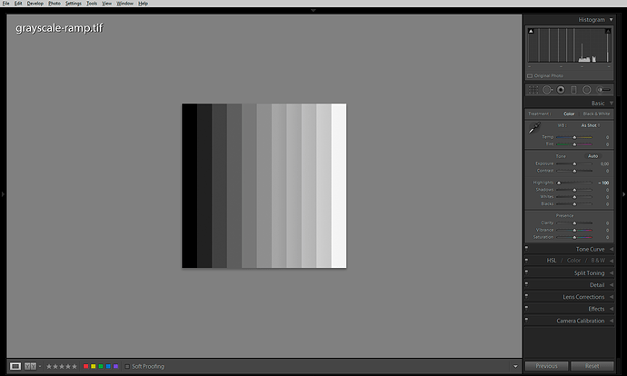
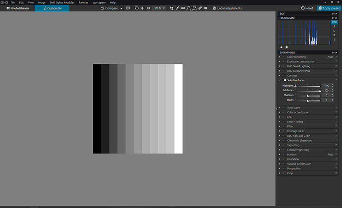
  4. Lightroom’s [-100 Highlights] is more or less equal to PhotoLab’s [-100 Highlights; +100 Midtones], see the screenshots:
  5. The screenshots above also illustrate how Selective Tone sliders modify local contrast in addition to global contrast. Note the thin vertical lines in the histograms get lower and fatter as a result of the local contrast manipulation. Other tools simply move the thin vertical lines around.
  6. PhotoLab’s local contrast effect is applied by the Selective Tone tool, as well as the Smart Lighting and ClearView Plus tools. The Contrast slider and the Tone Curve do not do any local contrast enhancements.
  7. Lightroom’s Hightights/Shadows/Clarity sliders apply stronger local contrast corrections (prone to haloing) and as far as I remember are not just HiRaLoAm using the simple USM/Gaussian-blur-based filtering, but make use of Laplacian pyramid.
  8. PhotoLab’s Microcontrast slider looks like a straightforward HiRaLoAm – you could simulate it by using the Unsharp Mask tool with something like [50 Intensity; 5 Radius], etc.
  9. A typical “HDR-like” setting in Lightroom [-100 Highlights, +100 Shadows] can be simulated in PhotoLab by moving all four sliders [-100 Highlights, +100 Midtones, -30 Shadows, +100 Blacks]. Settings like these are prone to haloing, though, because of the local contrast enhancement hidden behind the sliders.
  10. To get the greycale ramp perfectly grey, you need to use the Tone Curve Black/White Output triangles (the Y axis) and move them to 128 on both sides of the curve.
  11. Tone Curve’s Gamma values above 1 build a Shadows contrast and compress highlights but do not cause highlight clipping (Black and White points are not clipped). Gamma values below 1 create highlights contrast at the cost of clipped Blacks.
  12. The Contrast slider behaves like a typical S-shaped Tone Curve, i.e. it also affects saturation levels in addition to global contrast.
  13. In PhotoLab 2, the HSL tool has a Lightness slider which can alter global contrast when the All Channels options is selected. Maximum values of Lightness clip to Black or to White (there’s no shadows/highlights protection). This should be different in PhotoLab 3 because of the different colour model used by the improved HSL tool.

As far as a practical application of the above, see e.g. Thomas Niemann’s pdf file, which has some good suggestions on the second page.

6 Likes

ok i have found an other simple trick to push things inside the colorspace you work in and you don’t need to use the selective tone sliders too much:
See my video’s, i use tonecurve and show that color accentuation, contrast and selective tone are much less useful for containing the colors inside shown by the moon and sun blinkies when out of gamut of sRGB and that colorrendering profile does need to be adressed too.
Clip one clipping is actentuated by colors i was fooling around to see if contrast, selective tone , saturation protection, and stuf like that does things in the blinkies of oversaturation and blown part wile using the protection of tonecurve lift and lower the 0-255 to 4-245.
using tonecurve to correct this shows that i can use great amount of contrast pushing the image to “pop” with out blowing the gasket.
combination with color specific HSL correction

In words: when you have clipped colors in the bottom ,oversaturated, or blown by too much luminance i can resolve this quick by using the tonecurve.
Only thing i am not sure of yet, have to test it, if i just cut off data or “push it inside” by changing the numbers.
But it is fast and interesting to change highlights and blacks which fall of the chart.
(i hope a real colorspace knowing guy can help out to explain what i am seeing on my screen.)

My conclusion is that my huelight profile isn’t calibrated inside v3 yet :wink: and that the generic renderings profile works better in this situations to keep the hue,saturation,brightnes inside the sRGB gamut. (did i used the correct therms/words to describe my finding?) please correct if not to keep it clean.
Second conclusion the sliders in selective tone and contrast arn’t not that powerfull as i first thought and more to see as a sort of fine tuning. I tried to use smart lighting and exposure centerweight correction to recover those blown saturated blinkiespots but HSL and tonecurve did it much faster and less destructive to the rest of the image colors.
Stil i am thinking that i make a mistake in thresholding blacks and lowering highlightvalue due direct cutting of image data wile the sliders are pulling stuf more inside by selective recovery.
I was convinced that color recovery in color rendering by intensity and protection saturation colors much more did in “recovery” “helping”
I really hope that this kind of managing and using of color related tools in the palletes gets much more describt in detail in the user manual or webinairs/tutorials explaining each tool how to use in which way and it’s restrictions. Because fooling around does help finding tricks and workarounds but getting a contructive logic way of working you through image issues to get the best out of it need some technical background.

Yes, I think that would be very helpful. I’ve used tone curve mostly to deal with overexposed highlights (starting before PL3). But a better understanding of alternatives and their pros & cons would be useful.