Tip: Making best use of PL4's new Workspace Category Filtering feature

PL4, with its many options for organizing palettes and for filtering images, has me reconsidering how I use the software. I see these filtering options as largely benefitting new users but also expanding what’s possible for experienced users like me. So here’s what I’ve been playing with today:

(a) I have my workspace configured with metadata and global light-related palettes on the left, other palettes on the right, in custom sets. Very little of the original organization has been kept in my custom workspace. There is a certain logical order to all this which I’m used to. And while I wait for certain abilities to be added or refined, I keep most of my palettes expanded and only a few that I hardly ever use compressed/closed.

(b) I’ve marked a few tools that I adjust a lot (or think I will adjust a lot) as favorites. These are situated at opposite ends of the palette stack on the right side of my custom workspace. After making initial geometric adjustments, I select the Favorites filter and adjust Color Rendering and Instant Watermark to my liking. By far, these require the most trial-and-error in my present workflow. Then I deselect the Favorites filter and move on to the adjustments on the left and the color refinements on the right. If I don’t want to go hunting for something, I select the palette filter that I think includes it. Sure, the tools are organized a bit differently here than in my custom workspace - but it’s another way to get at them.

I suppose yet another strategy I could consider is to create multiple custom workspaces and switch among them as I work. Not what I prefer, but it’s great that PhotoLab will let me do this.

2 Likes

Of course, no complaints about your solution at all. My thoughts were entirely directed at the functionality itself, which just seems too unfinished to be branded as a major new feature.

If the new palettes were configurable then it’s pretty much Capture One’s tool tabs, which I find very usable. I find DxO’s existing palettes equally usable, so I’m happy with either. But now they’ve tacked on these new searchable palettes instead of integrating the search with the existing palettes, which is an odd choice IMO.

Guys,

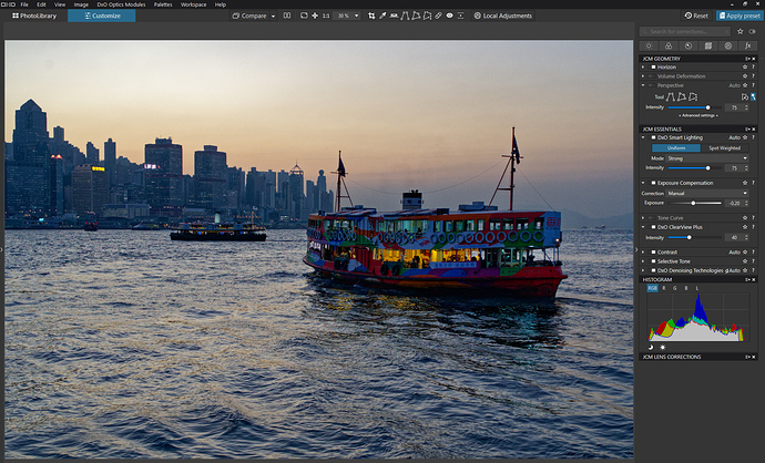
We are eager to see how you customize the Customize tab :slight_smile: so feel free to paste here your screenshots to make things even more obvious for everybody!

Alex

thank you!

For my part, I now use the tabs that look a bit like lightroom’s solo mode:

it’s very fast, the tools are well grouped and very efficient!

suddenly I drop my personalized pallets

The Solo mode in PhotoLab is planned for some 4.x version.

Alex

2 Likes

The standard layout is MUCH too cluttered for my liking - especially as the position of tools on the palette “jumps” around so erratically for each different category selection, which I find too confusing.

I’ve found that a simplified layout, as explained above, is much more effective …


John M
2 Likes

So out of the top of my head.

  • my made order of appearence in my custom palettes are based on usage level and combined use. Aka contrast (advanged) and selective tone are one tool for me and are seated next to each other. In selective button mode they are separated. Irritating.
    Local adjustment tool list is seated right on the top so when i use localadjustement i open the tool to see the list and commands and close it when i am done.

The buttons should work as " hide everything except" and shift the tools to a tid row.
Not pop up a new screen/workspace.

  • That everything is opened is ok. Then i can keep things closed in my custom workspace to compres toolspace. When i want HSL i just tab color. And can start right away.
  • favorite would be a powerfull tool if it keeps my order of appearence to quick hide and show other tools i not need al the time in my customworkspace and it can do the same for the selective tabs.

I have more idea’s about improvements but that needs some visual support and i am out the door right now.:blush:

Alex: When this is introduced; please make it an optional Preferences setting.

John

1 Like

I don’t really see the point of the buttons at all. Who is going to select a button containing at most 7 tools and then go to the search field to find one of them? If I’m going to select a button then it’s going to be faster to just select the tool under it directly, and if I’m going to search then I would rather search all tools so that I can access something I rarely use (eg. Exif Editor) without needing it in one of my existing palettes.

If there must be buttons then I at least want to be able to control their number and content so that I can organize them in a way that’s sensible for me. The search is at least something new, but the buttons are just another way to organize tools. Some will prefer the existing palettes, some will prefer the new buttons, and some will find ways to make use of both, which is probably a necessity as long as not all tools are behind buttons.

Personally, I’d prefer to be able to configure the buttons away entirely and just have the search be over all tools, and for there to be a keyboard shortcut that takes me directly to the search field, so I don’t first have to mouse to the search field before I can start typing. I’m still not sold on the search though. Switching back and forth between keyboard and mouse is not that efficient, and there’s no escaping that there’s much in this kind of application that can’t be controlled entirely from the keyboard. (And even if it could, the number of shortcuts would be too many to remember.)

1 Like

I think the categories and search make PL much more approachable for new users. They were frequently confused by the standard palettes and the seemingly duplication of tools.

I think I will continue to use my custom palettes and slowly see how the categories and favorites could be useful for lesser used tools.

That’s exactly how I’ve approached this new feature, Christian … as detailed above

John

John,

It will be an optional mode: you are free to use it not. Probably, it will be accessible from the palettes’ context menu only. It’s still being discussed.

Alex

1 Like

Give a chance to CTRL + F when the Customize tab is open :wink:

Alex

Thanks, but not documented in the manual (that I can see) and does nothing on Mac I’m afraid. (PL 4.0.0.42 on Mojave 10.14.6.)

Still, even if it’s coming, this alone won’t win me over.

Hello John,

I am sure that this new organisation of the working space is well suited for new comers in Photolab, because this is the organisation we find in most softs. As a user of DxO soft for long (since Optics Pro 8), I do not like very much this new organisation especially for one reason: even if we keep the tools selected by Dxo for each tab, we cannot re-order them in a tab and/or remove those we never use. To get that, we have to go back to the former working space of Photolab 3, that is possible with no tab selected. OK if we can use the stars to make a selection in a tab (we cannot re-order) but in my point of view, this is a wrong solution: we have stars every where…

To be honest I am not very happy with this update. Regarding development of photographies, we have DeepPrime as new comer but when you compare the result with Prime, I really wonder what is the added value. A “Pipette” has also been added in the HSL tool, a feature awaited by everybody, but this pipette do not places the selected color of the image on the wheel, it only selects the range of colours of the wheel where the selected color is. I wonder what DxO team had in mind by doing that, but I am sorry: this is ridiculous. We are not color blind and if we want to change the color of a red or a green we do not need a pipette to select the right range of color on the wheel.

Regarding the development of photographies that’s it. When you see all the things DxO should add to improve its soft it seems to me very poor.

I did buy Photolab 4, but I will keep working on Photolab 3 because nothing really new on photolab 4 regarding the development of photographies and because, at the time being, I prefer the working space of Photolab 3, more simple, clear and customisable.

Pierre

1 Like

I’m surprised you don’t see the very significant improvement DeepPRIME has over PRIME. It is not subtle. With regard to the Color Wheel pipette I’m also surprised you don’t see its advantage. The range of colors changes depending on what area you are selecting. As an example, If you select select several areas that are yellow, the color range it selects may be different for each one. You can do that manually of course using the desaturation method, but it takes more effort.

Mark . .

4 Likes

Eye of the beholder, but I’m also not overwhelmed. I do see a difference, but I can’t say I’ve yet found an image of my own where I think it makes a practical difference except at 100%.

That said, I feel the same way about PRIME. I’ve found that when I’ve wanted it I’ve had to dial back the strength to avoid banding (in some cases) or artifacts, and the result at less than 100% is not so superior to HQ that it’s worth the time required to iterate though export/examine cycles before arriving at the destination. That’s the big drawback for me, not being able to preview the entire image except in little pieces at a time.

I would rather have seen more fixes/improvements in the UI. Not much of a selling point for newcomers I know, but it gets old having to live with them over multiple releases.

I hope you know you can custom create your own?
At this moment the only real different you can’t change is the search window and tab buttons for groups.
Buying v4 and not using it is a waste of improvements in image quality.
Deepprime is for shadows in low iso also a value.

Please give it a try. :blush:

If you don’t see the absolutely vast difference in noise reduction between HQ, PRIME and DeepPRIME I’m assuming you don’t capture a lot of high ISO or otherwise noisy low light images and probably don’t extract fine details from deep shadow areas or crop heavily. Either that or you among those who don’t find noise very annoying or distracting.

Mark

1 Like

A bit of both. Certainly very high ISO and heavy cropping isn’t isn’t my norm, so that may well explain my reaction compared to yours.