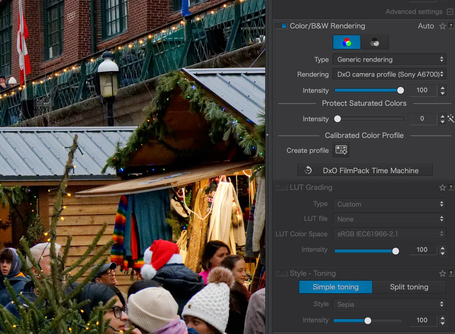
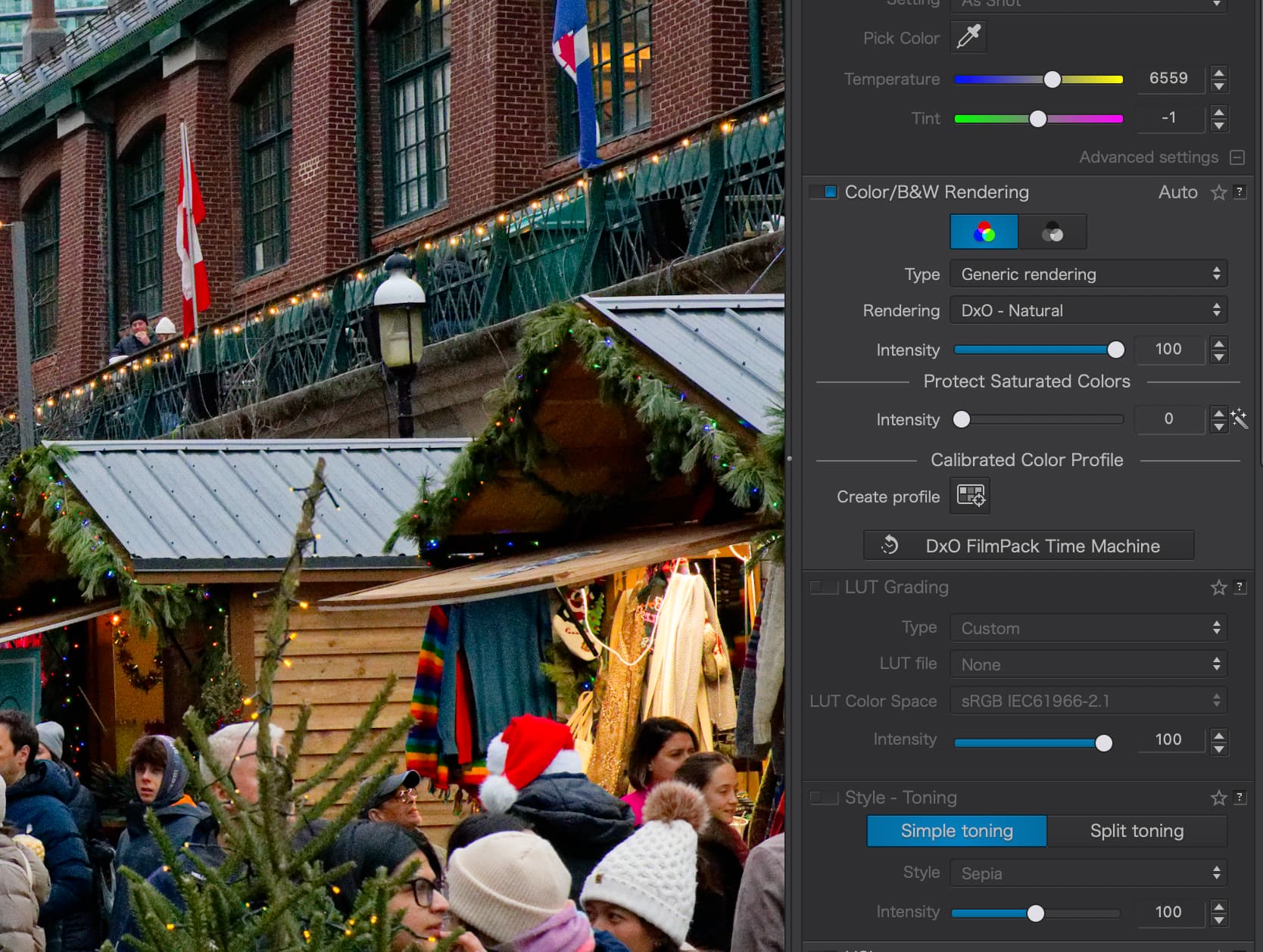
I recently picked up a Sony a6700, and this is my first time working with Sony color science.
Right away, I noticed something I’m struggling with in DxO PhotoLab. When using the default DxO Camera Profile (Sony a6700) with Generic rendering, reds tend to look quite orange. On the other hand, when switching to DxO – Natural, the reds appear heavily saturated and almost too intense.
Look at the hoho-hat below, I think it illustrates what I’m trying to convey.
I’m coming from Fujifilm, where the colors feel much more restrained and predictable, so I’m wondering whether this is simply an adjustment in expectations or if there’s a better way to tune Sony colors.
Has anyone had success creating their own presets for Sony sensors, specifically dialing in reds so they look more natural and less aggressive? I’d be curious to hear how others approach color rendering, HSL tweaks, or profile choices for the a6700.
I moved from the Canon 6D to R6 and found the colour science troubling different and awful through PhotoLab.
Workarounds include:
Protect Saturated Colors - You might want to try this for your red hat. It’s very red and the above option may help take the edge off if you like everything else about your chosen color except that.
Pick any color rendering - Yes, this is an option. You don’t have to adhere to your cameras true color science. If you prefer literally anything else - use that.
“Steal” DPReview’s color chart and create your own profile - Head to this link and save the studio scene color chart in the “Image Quality” section of their review. Then, in PhotoLab, navigate to that saved image and then click the “Create profile” button found towards the bottom of the Color/B&W Rendering section of the menu in your screenshots. Select “Calibrate ColorChecker Classic” under the Chart Type and place the relevant colors over each other in the tool that opens after that. Save it with a memorable name and you should have a calibrated color chart for future use.
That last one is a bit of a faff to set up, but it does provide me with a good baseline of colors for my R6 versus the other options. Be sure to check your white balance too.
Normally, a sample image is captured of a colour-chart using the camera to be calibrated … So, how is using the DPReview standard image supposed to help ?
As a user of Sony a6000, 6400 and 6700 after moving on from canon 5Ds and 7D2 I have always had a degree of red problems. I take a lot of garden flowers using macro. Red poppies and others can be tricky with both Sony and Canon with DXO. I have used Huelight profiles but though DCP use was enabled it was done so only in really part. There is no fixed location to put the profiles, and you can’t pass the images to anyone else to open unless they have the profile in exactly the same place as you. With out that the dop will block the image opening! As its so limiting I have used them less now. But I do find the Protect saturated colors works quite well and it normally automatically adjusts between 2 and 15. The other useful one is Spot Weighted Smart Lighting. I find as you move them/it about you can vary the intensity of the dreaded red with a use often of the selective Tones. The new manually selected AI enables further changes. But yes red is the sod and has been with both makes of cameras and all of their cameras I have used.
Thank you folks, much appreciated. I’ll try to tone down the saturation, specifically in the reds. I’m usually nervous about playing in HSL as it sometimes get people skin way off.
I have defaulted to using a “camera body” rendering as the simplest way to go with a back catalogue of various cameras. I go for Camera Body - DXO1. Seems to work OK with Nikon, Olympus, and Panasonic cameras. Can’t speak for Sony.