Slight Color differences between DP3 and XD2s results

Umm. Denoising involves finding pixels that don’t “fit” and changing their colour to better match their surroundings.

So, by definition, denoising changes colour. Different denoising algorithms will make different colour changes. Seems like a simple explanation to me.

How anyone perceives the colours… well that depends on so, so many factors.

3 Likes

@zkarj Too simple surely, when the denoising algorithms come from the same developer with the intention of being part of a family of denoising algorithms and where, allegedly, they are intended to offer different levels of denoising that utilise different levels of resource consumption.

Being selfish, for a second, my case of the “added”/“enhanced”/“unwanted” addition to my Autumn/Winter/Spring images of trees/woodlands caused comments when I posted them that I was mistaken, that the camera/lens combination was unsuitable etc. etc.

No notion that the XD2s algorithm might be wrong, which indeed it is, as shown by the revision that is DP3 and indeed by simply applying the loupe we have

and a comparison similar to the one below of the wildfowl image between DP3, XD2s, afn2 and tpz.

@swmurray My concern about your image is that although I was coming down on the side of DP3 being at fault and the colour elements added by XD2s were correct/more accurate, I used Affinity 2 and Topaz to work on the images and they provided me with a conundrum

I don’t know what this bird is so cannot look up any library images but I would suggest that the DP3, afn2 and tpz images are more similar and the XD2s image is the odd one out!?

Wilson’s Phalarope - Phalaropes tricolor


Screenshot from US Fish and Wildlife Service, but bird plumage is variable.

Going back to denoising/CA removal processing…
The link shared above shows several similar examples of color shifts in bird plumage, all at the light/dark edge. DP3 removed the “warm red-orange colors” in these transition areas where XD2s did not. In my pixel peeping, I did not find cases where other colors were removed in a similar fashion.

The goal of my pixel peeping is to compare the two denoising results for the preferred feather detail. As expected, DP3 results show softer luminous noise/detail and a consistent scale of color softening for most areas. (“Scale” referring to the width of pixels affected.) However, these areas of red-orange (warmer) colors stood out as a loss of color detail since the affected scale of color (pixels) is broader than the luminous noise affected. For the images I could compare, this also seems limited to these red-orange tones rather than all color tones. I was unable to bring the two results closer together with the tuning sliders.

@swmurray The goal of pixel peeping I understand only too well, a classic trope to trot out when someone wants to put down a comment because it exposes an “unhappy” truth is that the author has been pixel-peeping!

However, with respect to your image plus other examples of the Wilson’s Phalarope e.g.

the amount of orangey coloured border on display appears to vary as you stated.

Given the apparent differences between DP3 and XD2s in this case, I tried to look at what other packages made of your image, keeping any edits to a minimum and with Topaz just letting it do its own thing.

Given that I currently accuse XD2s of actually adding purple fringing to my images I would typically pin the badge for wrong colours on XD2s except in this case it appeared to be DP3.

But I feel that the outputs from Affinity 2 and Topaz seems to be closer to DP3 than to XD2s so I would then favour DP3 as being correct and that fits better with the image above but then I discovered

with a much more prominent “fringe”.

Returning to your image, this is what ACDSee manages

and comparing ACDSee to DP3 to XDS2 to Topaz we have

@swmurray Next time you want to find differences please do me a favour and pick a bird that does not have some ambiguity with respect to its plumage.

:grinning:

Humor aside, the birds in DSC07879 and DSC078851 would likely not have the reddish tone at the black/white edge, whereas DSC01702 would.

And Photoshop’s denoise retains the reddish-orange tones. :man_shrugging:
Like people, perhaps the denoise tools are going see what they want to see.

Again, thank you for looking and your perspective.

@swmurray My perspective is move from wildlife to flowers but don’t take any pictures of “naked” trees in Autumn, Winter or Spring because DxPL will make a complete pig’s breakfast of them!!

2 Likes

No, I think not. Perhaps inconvenient for you, but I think my science stands up to scrutiny.

Also, the differing algorithms are not just about being more or less heavy on resources, they explicitly offer different results — one with more detail than the other.

@swmurray I must apologise for my testing which failed to do what I have traditionally done which is to go back at least one major release of PhotoLab and see what it used to do.

That is particularly pertinent in this case because both DP and XD have undergone “upgrades” DP to DP3 and XD to XD2s.

Sadly, DxPL have taken the easy path of deprecating what might have been some people’s go to feature/function with some bright new shiny version and with noise reduction that appears to open up a “can of worms”, more memory required more artefacts or less detail etc…

So let me add DP and DP XD to the equation (amended to provide the same colour space)


and the loser is … DP3, by 3 counts to one.

@zkarj I am puzzled by the “inconvenient” bit and stand by my statement that colour should not be changed, certainly not as dramatically as in this case

I sort of agree but is that really the case here.

My concern is not this particular case but any “subtle” or not so subtle change can make a profound difference to the image, in this case “profound” only if you pixel peep but in my case, with the trees, not so difficult to see.

Bought with the use of more resources, i.e. time and processing power.

In this case the lower “powered” model seems to remove colour, in the case of XD 2s it preserves colour in the case of the Phalarope and actually adds colour to my images of trees.

Ultimately the training of the models needs to encompass more varied images or the compromises that the implementers need to make need to be (re-)evaluated.

How many other “mistakes” are there in the algorithms, sorry AI, going undetected?

Can I just point out that any editing is to the editors liking and would generally be far more dramatic than what can be “seen” comparing different denoising routines.

I fail to see the point of discussing something that almost nobody would even notice! No photo will be an exact replication of the actual subject because there are so many variables in the whole process from capture to final output.

So, if you don’t like a particular adjustment (denoising routines included) then don’t use it. Additionally, if you don’t like the results of a particular app then use something else.

3 Likes

Thanks for that, I was just about to mention it … and use whatever works best for you.

2 Likes

@KeithRJ You and others considered that there were no discernible differences but as it transpires there are, if you look hard enough and use the magnifying capabilities of software more than somewhat, in this specific case.

In my examples the problem is obvious and DP3 has been touted as a potential solution/improvement to issues with CA.

My contention is that the NR model used in DP3 certainly helps with CA, in truth XD2s is actually adding to an existing problem so that shouldn’t be hard to improve on it, but it appears that the same model is actually removing colour in the case of the OP’s image.

What other colour “issues” is it resolving/removing? Is this the tip of an iceberg or actually just a random chunk of ice floating about?

It should neither be adding to a problem nor subtracting from the image, in an ideal world, but if issues are simply ignored then a foundation model may well go on to become something bigger and the problems are perpetuated, possibly even magnified.

The PhotoLab reputation is for class leading handling of optics and excellent Noise Reduction. I would suggest that the reputation of the latter item is currently “tarnished”.

and obviously you won’t complain if one of your images doesn’t turn out the way you expect?

It’s not that I don’t like it, it is because it is flawed and it is a critical part of the product.

I chose OpticsPro a long time ago because I like the fact that I can stop and start editing at any time that I want and resume later. I own other products but they don’t have that particular feature.

Why should I go elsewhere when an issue could be resolved by the “manufacturer”, who won’t resolve any issue if it is not reported and discussed or if no-one notices and reports any flaws in the first place.

If there is no point in discussing the issue then I don’t understand why you are posting in this topic.

Plus if you can’t see what I am complaining about with added CA then …

@Wolfgang :disappointed:

1 Like

@BHAYT and …

As I have already explained here … there are visible differences and they exist here too … (your enlarged example).

These color differences, however minimal and especially in different programs, cannot be the distinguishing factor between a good and a bad image. For those who care so much: Use the program/settings that achieve the desired result … it’s that simple.

Bryan, you’ve (already) shown how XD2s emphasizes chromatic aberrations, while DP3 doesn’t. But that’s quite different from the OP’s example, which shows an extreme crop (fortunately in the center of the image, which usually yields better results than the edges).

… no reason for a storm in a teacup.

1 Like

@BHAYT,

Brian, Thank you for taking the time to look back at previous PL versions and other software better show the differences between the DP3 and XD2 algorithms.

Since the differences were obvious at 100% zoom using the loupe too, and directly affected the subject’s color tone, I was curious to better understand why the algorithms were different. (As PL does not present proper details to the screen until at least 75% zoom, a comparison of denoise algorithms at 100% zoom seems reasonable.) Your feedback and the exchange helps me better analyze these issues going forward.

For the other posters. Sorry if this curiosity and effort is too “trivial” for you. Carry on with whatever algorithm you choose. Personally, I’ll keep comparing algorithms to see which best presents my photos. I am glad that DxO is offering choices and working hard to improve them.

And that is exactly why DxO provides different algorithms. They are designed to balance noise vs. detail (and more) - and if you find what to choose and how to set it, you’ve been well served.

@swmurray Had I looked back to the earlier versions immediately I would have come to the conclusion that, in certain circumstances, DP3 is a “double-edged sword”, or “a curate’s egg” (good in parts), much quicker.

Sorry for the delay and the extra column inches in the topic as a result!

Each to his own, but it is odd, if a topic is too “boring” then other users generally simply ignore it. But then perhaps I have been “overly zealous” in my investigations, if it is possible to be overzealous when investigating anomalies!?

My concern was, and still is, whether this is an isolated “feature” or one that may manifest itself with other images and, if you look at the Beyond Compare snapshots below just how many differences exist

Wishing to preserve my apparent “reputation” for “nit picking”, I compared the zoomed in images with Beyond Compare and then zoomed out and did the same thing.

Varying the “Tolerance” in Beyond Compare to see how and where the image variation(s) starts.

I am sure there are even more “nit picking” techniques available, but this one of the better ones I feel, or it would be if I hadn’t made the video on my 4K monitor so it is huge!

So no Video but the following instead, just in case anyone is interested.

The comparison of the zoomed out image is interesting because of the widespread location of differences, most of which are simply “impossible” to see.

@platypus but I am not sure I have ever seen a reference to colour being changed/suppressed or whatever you want to call it, albeit that could be covered in the general “detail”!?

Regards

Bryan

Denoising hast to deal with R, G and B pixels/areas to derive whatever original value seems to hide under all the random RGB changes. Now, if one channel points to green in one algorithm and towards red in another, the differences we’ll get will have a different colour.

In theory we think “Dirac”, but here, we’re talking RGB (or RGGB) plus X and Y (space) coordinates and depending on how the image is analysed and de-noised, differences can appear not only in rendering of detail (luminance transition) but also chroma transitions.

If we take a simplified look at the chain of processing (for transitions) …

  • ORIGINAL IMAGE
    • add error due to fixed pixel locations
    • add noise/error due to statistical character of light (photon noise)
    • add noise/error due to real-world electronics (amplifier noise)
    • add noise/error due to quantisation (there is no “12345,6”, only 12345 or 12346)
  • RAW IMAGE
    • de-mosaic and de-noise
    • correct lens distortion (adds noise due to fixed pixel locations)
    • apply CA and colour corrections, LUT and whatnot (noise due to quantisation)
    • etc.
    • export
  • EXPORTED IMAGE

… we can easily understand that every slight change in one of the steps alters the necessary action to be taken (e.g. in the part set in bold print) to produce EXPORTED = ORIGINAL which, BTW, is impossible except for a (tiny) chance meeting of that condition.

We’ve gotten used to accepting some loss of apparent detail as a price for less noise, and I think that we have to get used to differences in colours in and around fine detail as well. If we need to be sure that the result matches reality, we need metadata, e.g. drawings, paintings or descriptions of the object. Adding a colour reference can help, and would be awkward to administer to swimming ducks or soaring eagles :wink:

@BHAYT,
Thank you for sharing the Beyond Compare example! I’ve used that software in the past for sorting folders and duplicate files, but didn’t realize what it can do with images.

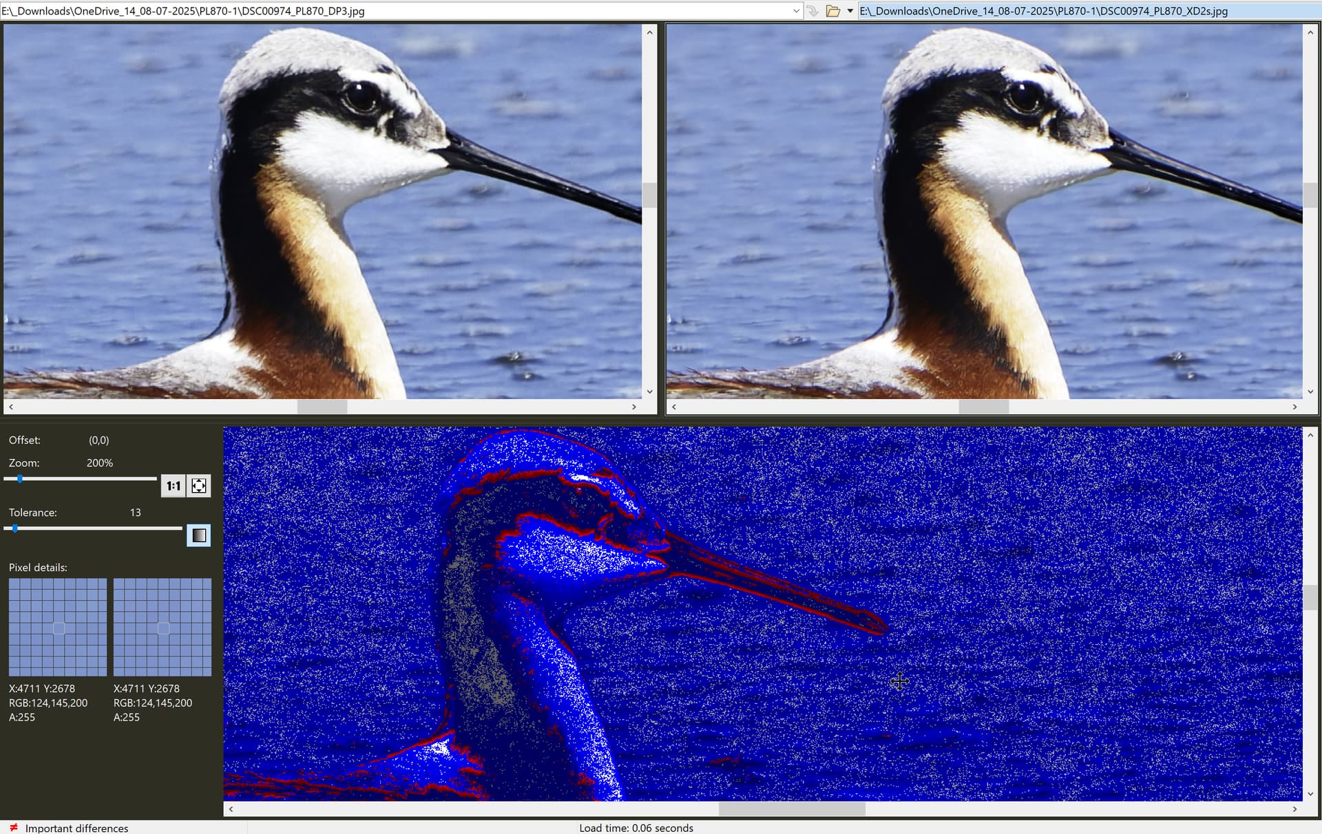
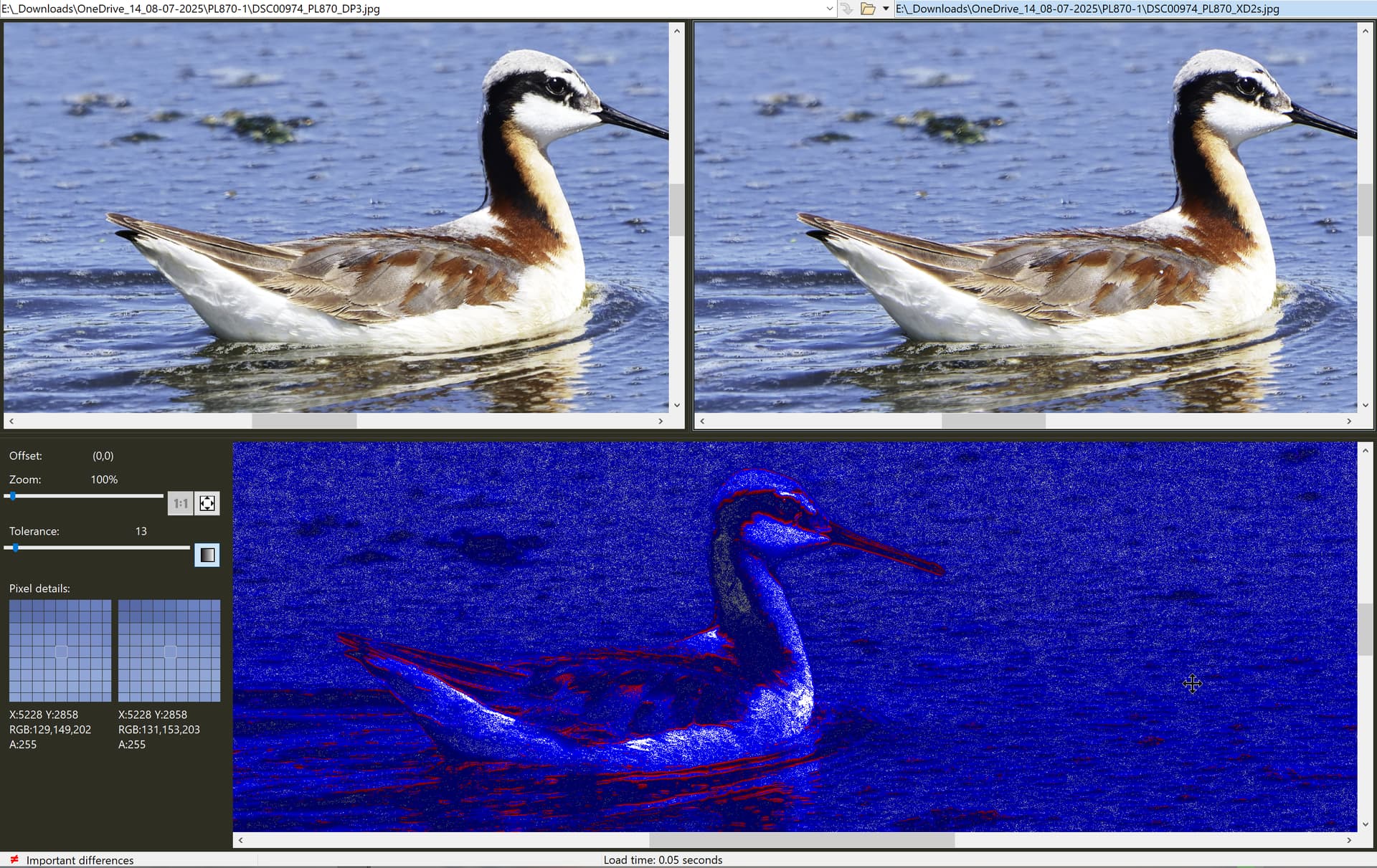
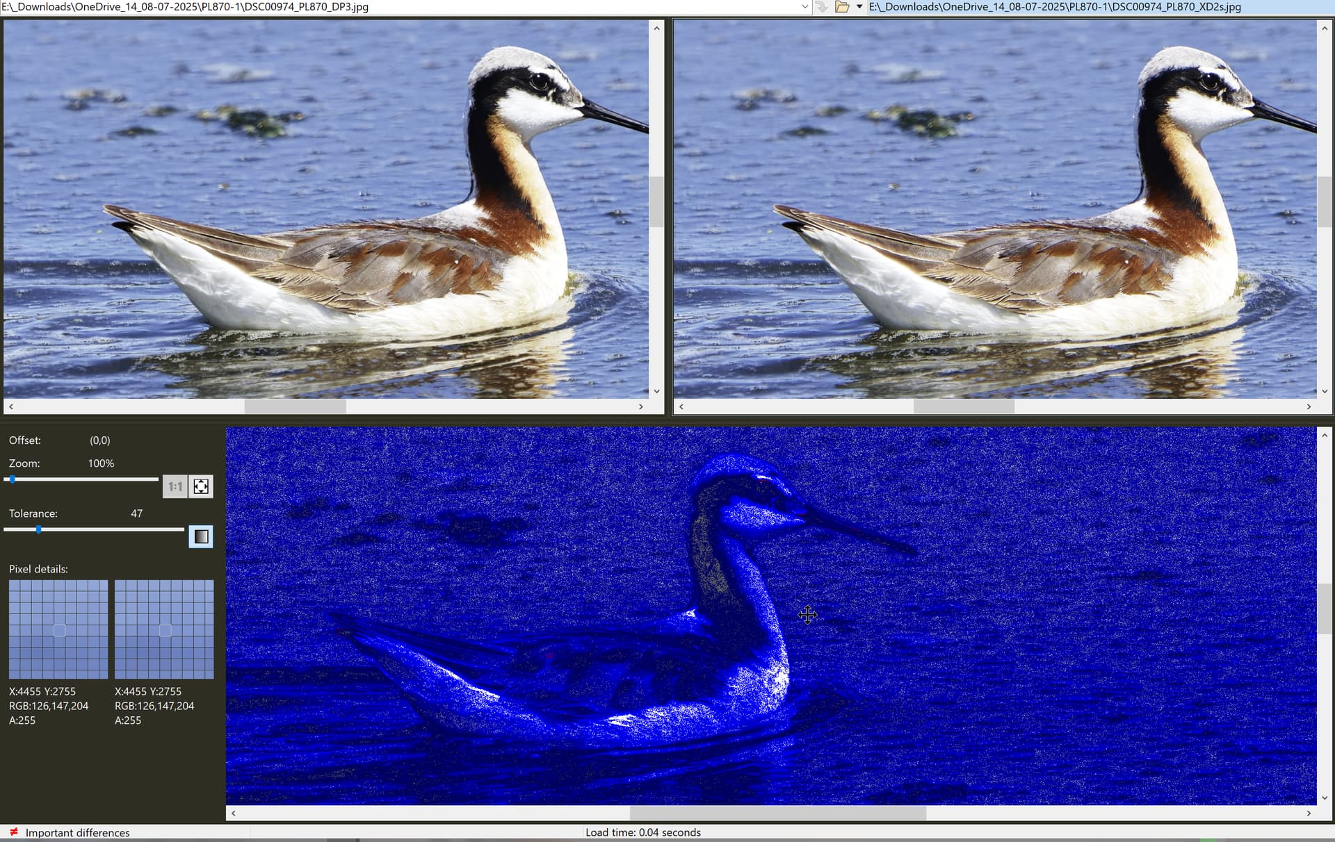
@platypus I have used it in the past to identify if one image output matches another and where it may differ. With different noise reduction schemes then some of what you see is the noise but shown as a difference between the images.

Typically I use it for text and the tolerances are at the left hand side of the screen, i.e. no tolerance whatsoever.

I forgot to use it earlier, which was another silly error, the video I recorded showed BC starting at a tolerance of 76 and moving quickly down to the lowest tolerance and then going back up the scale one step at a time.

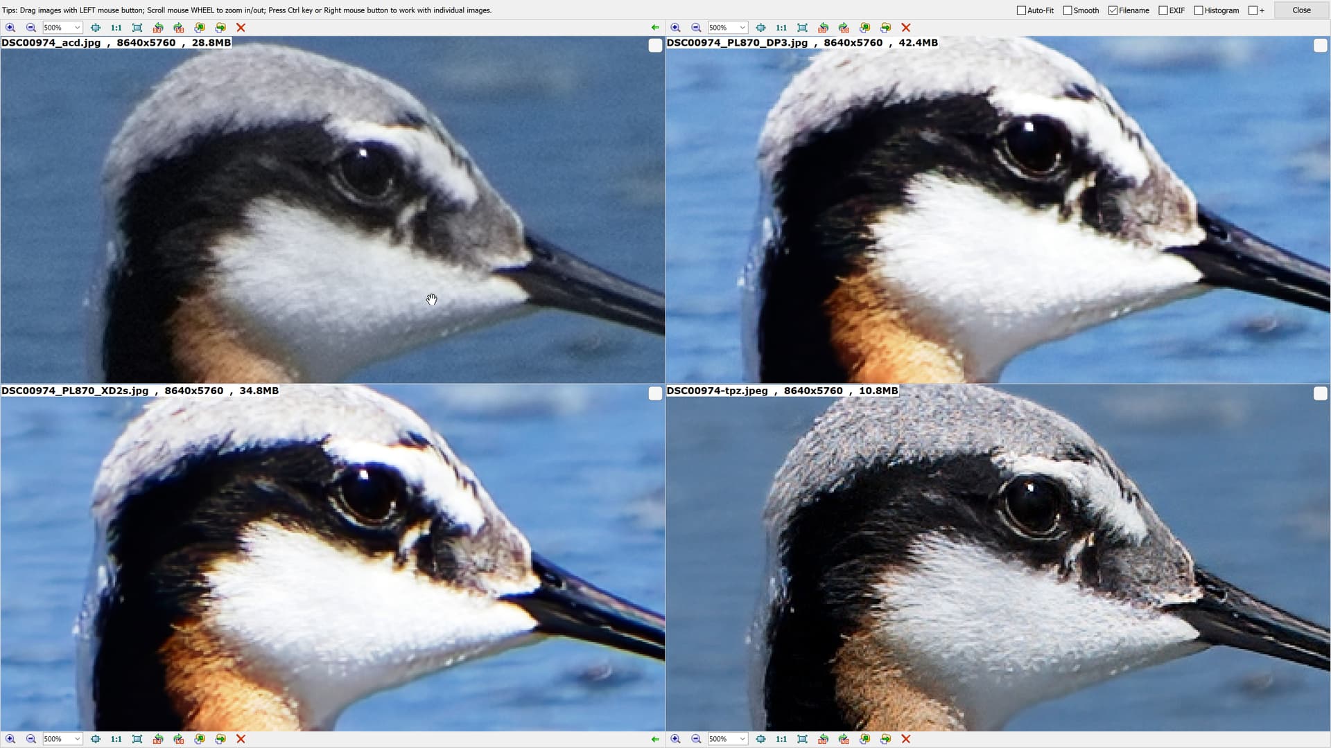
What it shows, in this case, is the “loss” of colour that you, I and some other users saw (@Wolfgang ) and also the differences that we can’t see (and “what the eye can’t see the mind shouldn’t worry about”).

It is just a another tool that can be used to verify a “hunch” and not needed on a routine basis.

@platypus I know that you are also a Beyond Compare user and thank you for your description of the denoising process.

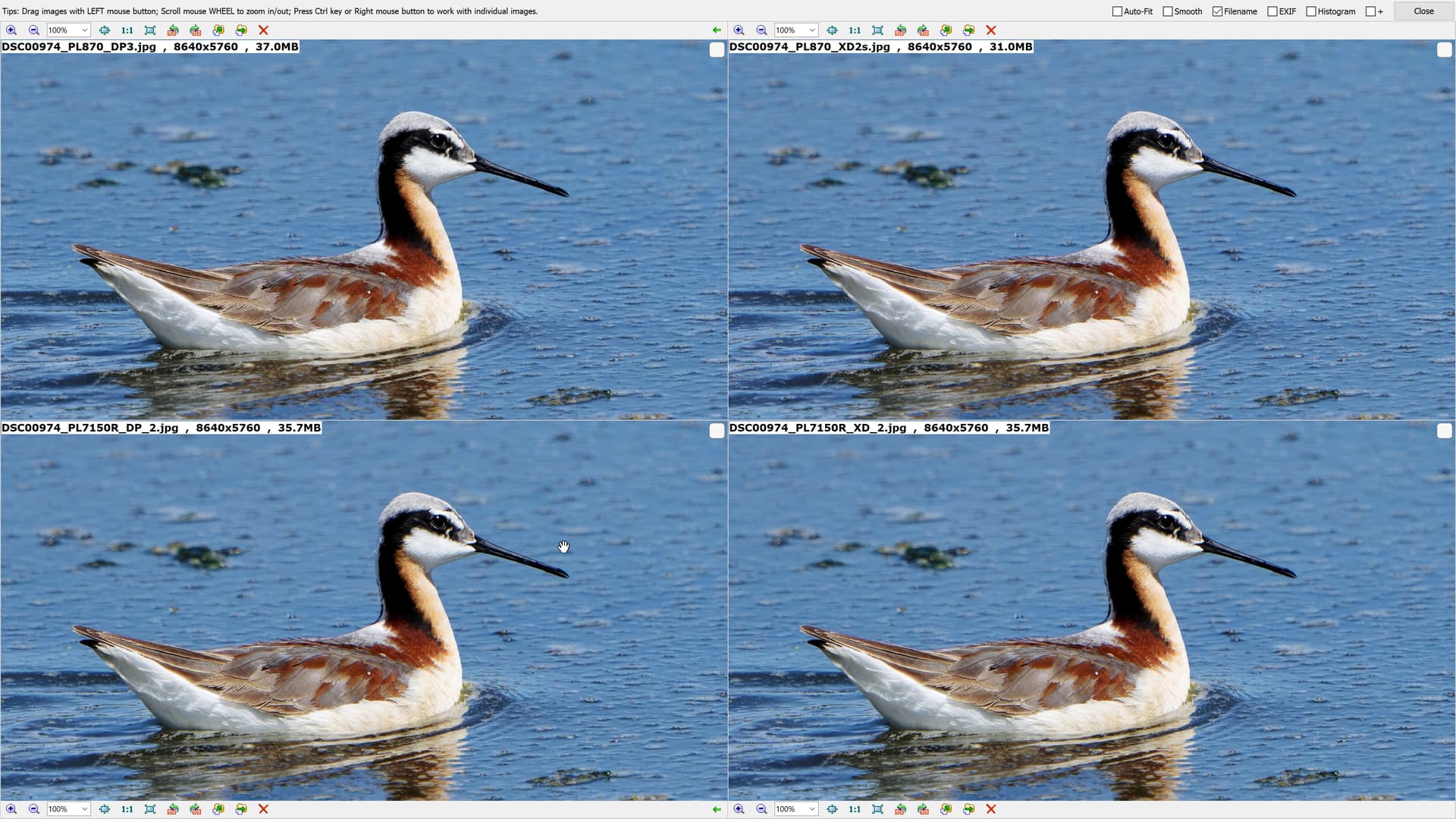
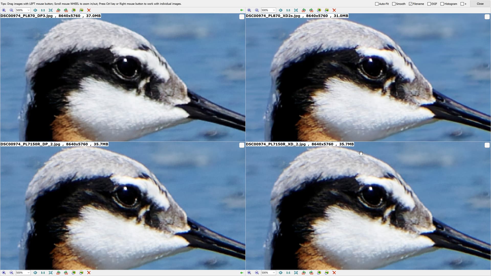
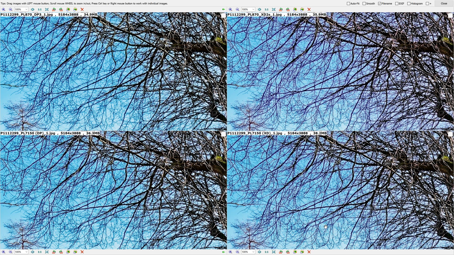
But that doesn’t change my suspicion that rather than provide a better CA tool for the user, the current one is lamentable (in my opinion) but how a better CA tool (which is definitely needed) that is going to counter the fact that XP XD2s is actually adding CA to the image I am not sure.

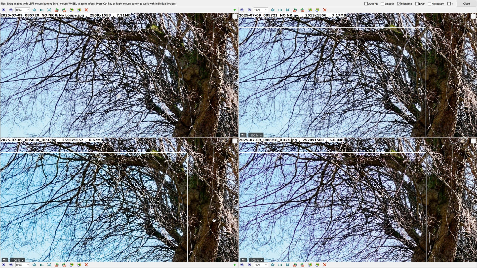
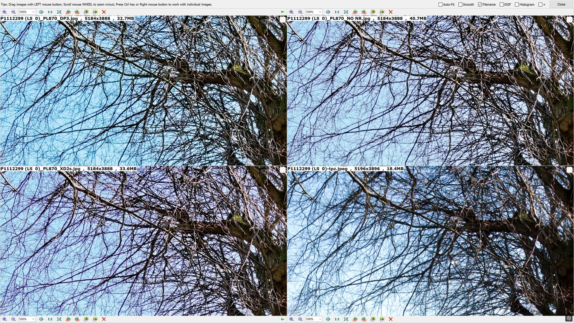
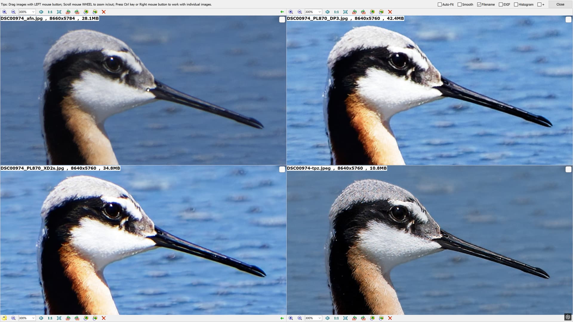
From what has been written it appears that the DP3 de-noising model has been trained to reduce CA, whether that is lens CA or the CA that the XD2s model was adding is unclear.

My suggestion is that the loss of the colour fringe in the OP’s image is actually “fall-out” from the revised noise reduction model in DP3.

AI models are the result of training, typically on vast number of images but can such images “bias” that training, intentionally or unintentionally.

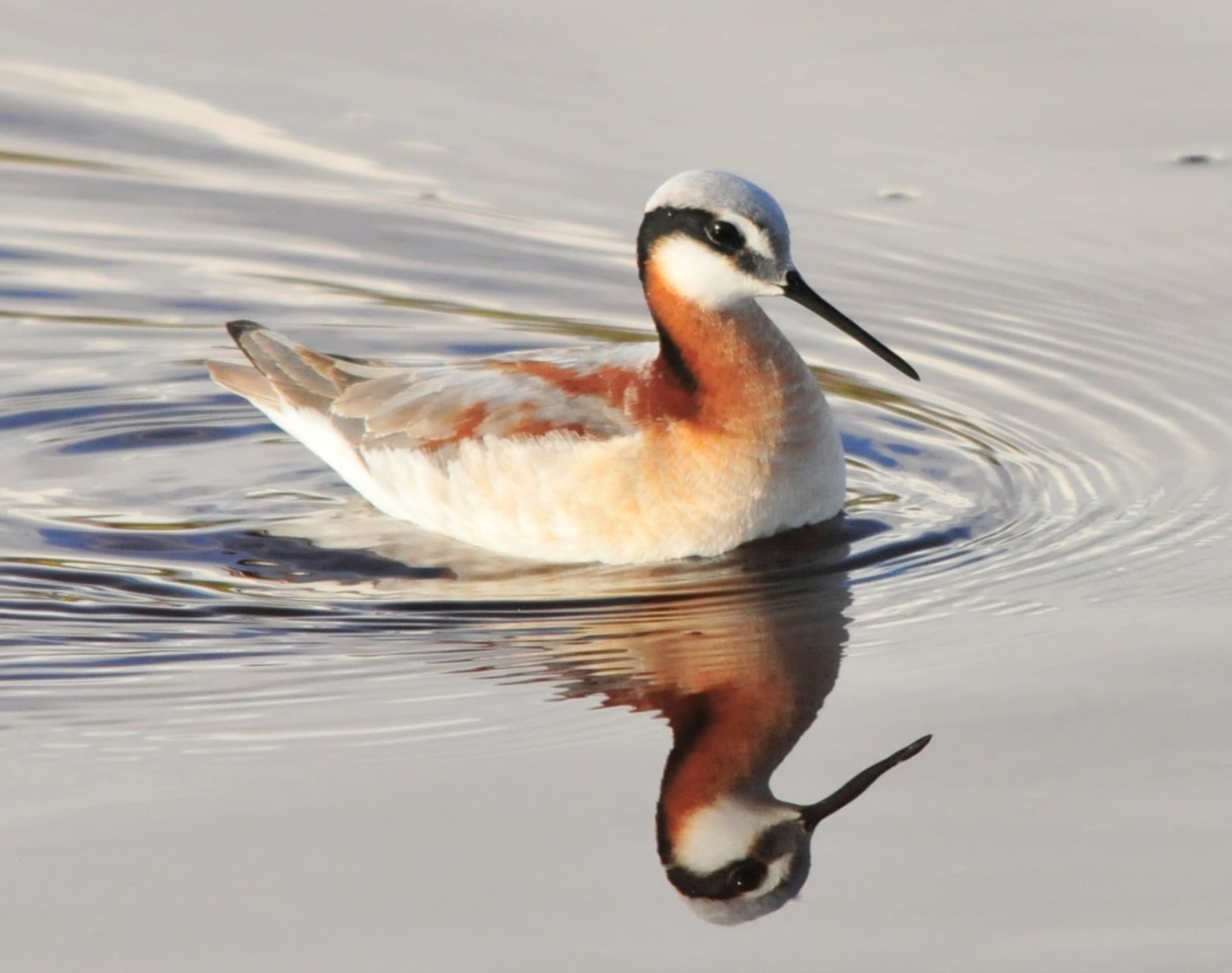
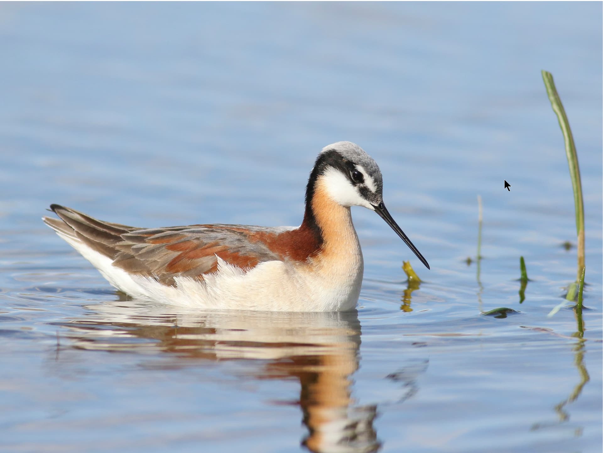
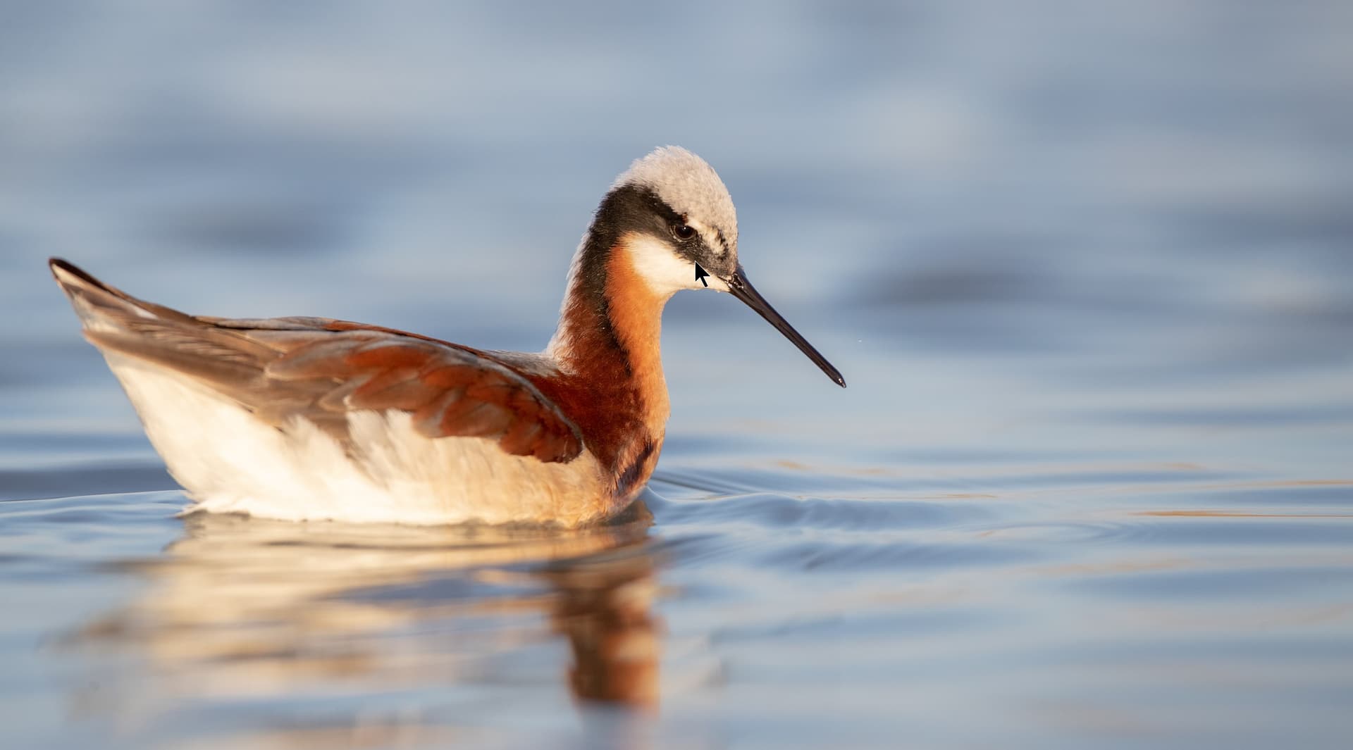
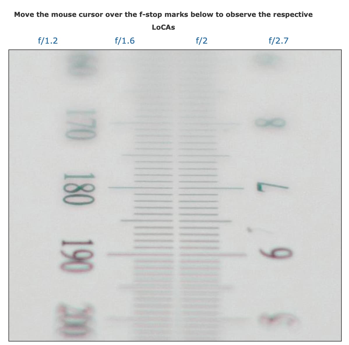
If we are to pursue this line of inquiry any further we need some images where reddish fringes occur naturally and see what DP3 does to them.

I do believe it is a bug created by the intent of DP3 to resolve certain issues in XD2s and XD didn’t do a much better job either but adds less CA to my images

Lateral CA is easily corrected by PhotoLab - if a suitable DxO module exists.
Longitudinal CA are harder to correct and if DxO manages to correct LoCa, that would be quite something. On the other hand, edge transitions can show as unwanted colour fringes. They appear in local adjustments mostly. Now, if DxO combined NR with LA, we could get a combination of fringing that is both added and removed. Whatever.

Lenses can produce LoCA, usually when they are fully open.
Here’s an example copied from photozone.de

Anyways, I accept colour differences (this OP topic) as result of processing and a starting point for something that we might call “manual correction”…

:wave: