Simulate iPhone 14/15 screen when editing

Thanks for the reminder about Dell Display Manager, I used it long time ago but forgot to install it back after upgrading to Windows 11, seems quite convenient in some cases.

Though, a problem with my monitor (Dell S3221QS) is that it doesn’t have gamma control, and that’s what makes the biggest difference between my phone and the monitor. (It was being asked for by someone on Dell’s forum but was officially declined its implementation via any future firmware updates).

I am guessing it is possible, maybe the software that comes with Calibrite/X-Rite alike will offer similar feature? I am considering getting one of those calibrator, while I kind of believe it is a bit unnecessary in my case. Though I often print my photos online, not sure if it will be helpful for that.

I have Calibrite and it doesn’t. You also need to consider, for paper printing, that the screen luminance needs to be kept low (around 80cd/m²).

I print for other photographers and camera club members and the biggest problem I encounter is that their screens are ridiculously bright, for reasons previously discussed. This means that they will print very dark unless they are completely re-worked on a calibrated screen.

Do yourself a favour, get a good calibrator for your screen and get used to how different it might look for other apps. It won’t take too long until you get accustomed to it and you will find you have to do less work to get everything right, especially for printing.

2 Likes

Thanks for the advice, given all that I have invested and how I find myself committed to post-processing all photos I took, a calibrator seems a purchase I won’t regret.

It´s not a problem today to have several calibrations for one monitor and switch between them. I have three but uses normally just Display P3. The others I have mostly as references. The real problem I think is that many users over time lose control over what ICC is embedded in the files, since there often isn´t a very easy way to figure it out - and that is the case in Photolab too. Image Properties info in Photolab isn´t good enough really:

The info “RGB Format” is nothing that makes me happy because it just have too low “resolution” to be useful in this case.

I have said it before. I think it ought to be a good feature to get a function like Epson has given us in Epson Print Layout, their printing application. Here we just need a “mouse over”, to find out what is embedded in the files.

I am pretty sure the reason why I see far too many far too reddish portraits of people in the evening papers I read, is that the photographers have had Adobe RGB as a default color space in their cameras instead of sRGB.

Absent a new monitor, I would suggest a workaround as follows. Make global edits on your iPhone or iPad using something like RAW Power. Export a full-sized TIFF with an embedded Display-P3 profile for some local editing in PL if needed (nothing heavy handed). Export from PL with the embedded Display-P3 profile. Not perfect but should work for many images.

Yes, that might be your way to go …


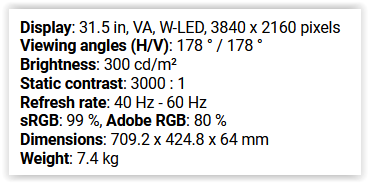
You indicated your monitor model (Dell S3221QS) and I checked for the specs
grafik

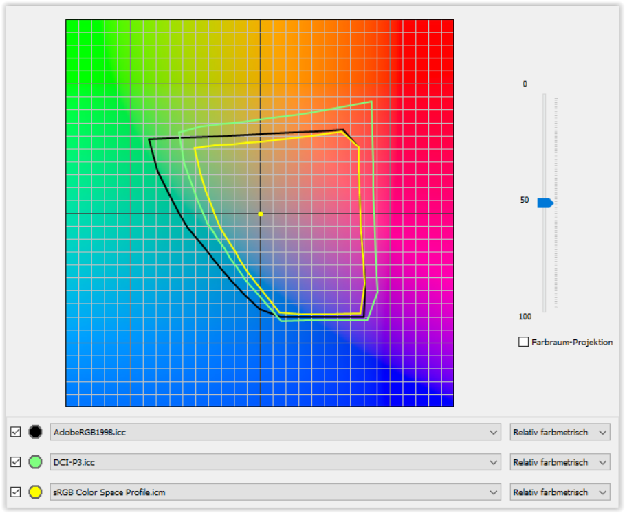
For an overview have a look at this graph, which shows 3 color spaces at mid luminance level.

Now, the mentioned mobile device might come with a colorspace closer to P3 than sRGB.
While the mobile … most properly is not calibrated, you can try to set PL6 to
Screen Shot 10-22-23 at 03.28 PM

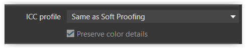
and softproof to Display P3
grafik

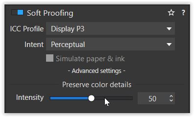
before you export to P3
grafik

While your monitor might not be able to show the complete P3 color space / range,
it might suit the presentation on the mobile device (better). – Simply try it out!

For printing via a printing provider you might need to control / export in sRGB color space,
as often that’s what they use. Just check their informations.


Apart from all that, for consistent color experience there is no other way than to calibrate your monitor.
The resulting monitor profile is then registered as your system profile and read by all color management capable applications.

Don’t hesitate to ask further … :slight_smile:

1 Like

Thanks a lot for the detailed explanations and suggestions, guess it will take some time for me to digest. As also suggested by others, now I am more convinced getting a calibrator would be a good starting point.

1 Like

I did a double take reading this. :joy:

As already explained …

  • The calibration settings are stored in the hardware calibrated monitor, that is one has to change the color space / ICC profile at the monitor side.

  • Setting the Windows Color System to something else does not trigger the hardware calibrated monitor, so that things get out of sync.

… XnView as I have described are reading the ICC of the images by default but can also be configured to lean on the system ICM-profile of the OS. …

In XnViewXP (checked that version and some other applications) the Preview is color managed,
but not the “Thumbnails”. So one has to be careful when comparing …

You write even before about that just the previews and not the thumbnails are color managed in XnView and that I have to be very careful generalizing that for both types of images.

I can assure you I have tested this from left to right, in and out and from to back to the front. I´m not one of these persons that answer “four” on the school question: If you shoot one bird in a tree where five birds are sitting. How many are left? My answer to that would probably be none since the presumed four still alive might just have flewn away when they got scared of the bang. … or it might even be five since there would be a possibility that the shooter might have missed and scared them all away.

It seems very difficult to discuss these matters no matter how careful I try to give you all the variables in this case. You wrote:

" * The calibration settings are stored in the hardware calibrated monitor, that is one has to change the color space / ICC profile at the monitor side.

  • Setting the Windows Color System to something else does not trigger the hardware calibrated monitor, so that things get out of sync."

I have never said that “Setting the Windows Color System to something else does not trigger the hardware calibrated monitor, so that things get out of sync.”

What I have said is that the setting in Windows Color Management can get out of sync with the settings you select on your hardware calibrated monitor. When I calibrated my Benq 270SW i first calibrated it for sRGB, then Adobe RGB and last Display P3. When I did that the calibration program for the monitor updated the internal LUT-table for each calibration and I programmed them to the three buttons on the monitors “puck” but that is not all. It also wrote three different traditional monitor ICM for Windows (just another name really for an ICC-profile for Windows Color Management

The last profile was P3 so the last active ICM was the P3 ICM. Then when I switched to for example sRGB on my monitor with the puck the Windows system got out of sync since switching the monitors profile did NOT update the Windows ICM and what happened then was that all the old legacy applications like XNView got handled in a wrong fashion IF I had configured it to lean on the monitor ICM instead of the ICC-data in the images.

BUT it also got screwed up when looking at XnView default. If I for example as I now do, use the monitors LUT-profile for P3 and look at my testfiles below the only one that will be OK and in synk with the previews colors is the P3 thumbnail. For all the others, the fact that my monitor is in P3, will affect how Adoeb RGB, Prophoto and sRGB will look. You can test that changing the hardware calibrated monitor to use another LUT-based profile instead and then you will see slight color shifts in all the previews since what you see is a mix of the monitors color bias on top of the effect the images embedded ICC gives when XnView renders the images.

I don´t know what source you have got for your statement that the thumbnails shouldn´t be color managed. I think the person who wrote that information has been sloppy in his testing and haven´t carefully enough managed to “rebuild” the thumbnails when switching between “default setting” and "system profile (Windows Color Management)

The tests I have done shows the opposite. Let me also make it VERY clear that this is a setup for test. So, unlike an IRL-situation all these test-timages use exactly the sama base RAW data when exporting the JPEG- files. None of the files have been dressed for a special colorspace. The same file has been saved with in turn Adobe, P3, Prophoto and sRGB-ICC-profiles. That gives them all a slightly different look when XNView reads and interpret the various color profiles when rendering the thumbnails.

Below is the profile the Benq calibration program creates and saves to Windows in parallel with writing the calibration to the monitors LUT-table.

I will now show you the two main different setting you can use in XnView. Default will make the application to ignore the Windows ICM and use the embedded ICC in the images for the rendering instead. Please note: it is exactly the same JPEG-file in all four images - just the ICC differs. XnView is definitely reading the ICC and the images reflect what is in the look of the files. If I select one of them - in this case the P3-file I will see that the image in both the thumb nails and the preview looks completely the same. My monitor is also set to use the LUT P3 profile.

Now to the next case. Still the monitor is in P3-mode when opening XnView to change the configuration. I select the image folder with my images. I then open the “Tools” menu and select “Settings” - “General” - ICC. In that ICC-settings screen I select “use ICC profile for monitor”. If you do it will pick the current active ICM in Windows Color Management - the ICM for your monitor - in my case the one for Display P3.

Now the trick is to just select another folder temporarily and then switch back to your image folder then select “View - Rebuild Thumbnails”. If you have succeeded with that “refresh” you shall see a green progress bar at the XnView-application lower right corner. When the process is ready, you will see that all your thumbnail images has changed to match the system ICM. All thumbnails in my case are now rendered in P3. It might be the case that your informers have failed to update this properly. Thus believing the thumbnails are unmanaged.

I have hard to interpret this in another way than that XnView handles these example images colors as expected.

I don´t know why this discussion has been so smitten by misunderstandings and from time to time even full of attempts of calling me ignorant and all sorts of others pretty derogatory additions (in Sweden especially) when I have tried to discuss the deviations and anomalies I have seen with my own eyes when testing these things but maybe people just have had very hard to get out of the square of the general idea, of what a good printing workflow ought to look like. BUT that has never been what I really tried to discuss. I just wanted to understand why my applications behaved like they did and the key problem was really the problem with the Windows ICM that is not switches in sync with my switching of my monitor.

Now I feel I understand exactly why things are happening in Windows and the applications I use for image development and management, which gives me a better possibility to configure them so they work as I want them to do in my Display P3-workflow.

Maybe another problem was that it is impossible to discuss things like this with users that are not accustomed to Photolab and XnView and the other applications that I use. Sweden is a small country very heavily centered around industry standards and in Sweden very few uses anything else than Adobe RGB when printing and Lightroom and Photoshop when working with images. With that said I thank you all here that have been constructive and helping me to understand especially the things revolving around the color management of Photolab…

I will try to spare you with color management this complex and deep in the future. :slight_smile:

Wolfgang I have really tried to read quite a few posts at XnView about color management problems, there are some issues even with XnView and color management discussed there. One thing that have seem to have been a problem is that when saving an image in XnView and the “use ICC profile for monitor” is on XnView have exported the “monitor ICM” to the files especially when batch processing images. I will be surprised if they wouldn´t fix that pretty swift since they seem to be pretty open to user input according to the extensive discussions between XnView and the users and the lists over all the corrections made is the various versions.

1 Like

@Sandbo
If you want to be able to develop your images so they look good on your Iphones that use the color space of Display P3, you ought to get a monitor that is able to display the color space Display P3 fully and nothing else. Then you will be able to develop your images properly in Photolab for your Iphones.

Let me make it clear: What I have tried to explan earlier around my testing of special images with different color spaces and embedded ICC-profiles are an exception used to help me analyse anomalies I found in my own setup.

IRL I would have developed everyone of these images with the corresponding calibration of my monitor (except ProPhoto since no monitor can match such a wide color space) and when developing the Adobe-file with an Adobe calibrated monitor or the sRGB-file with the profile for sRGB on the monitor both the Adobe-, sRGB- and P3-fikes would have look very similar if developed by the same user. Not at all like my test images which intentially were made the way they were just to make them stand out as “indicators” when I used them in my testing.

It mightv also have been this that confused some people when reading what I have tried to explain.

Managing and setting up a workflow for printing and displays of your preferences is nothing most people ought to have any bigger problems with really, as long as they manages to stick to a consistent color space throughout the whole workflow. It’s not more complicated than that when it comes to preparing images for a certain monitor profile despite what people might tell you.

Concerning printing, you will also at least have to use an ICC-profile that the manufacturer of your paper recommends for the printer you use. If you do that you will probably be pretty satisfied with your prints as long as you calibrate your monitor properly according to the ambient light in your room where you work. A daylight lamp is also required when checking your prints against what your screen displays.

Just keep it consistent and simple! P3 calibrated display, develop and export with Display P3 and then look at your images with Iphones or Ipads with Display P3 which happens to be default on those devices.

1 Like

(I’m using a Mac, not Windows, but this is just an overview of monitor calibrating and profiling in case it helps anyone.) Perhaps it will help clarify the fundamentals.)

Hello

There does seem to be a bit of confusion, or at least uncertainty here, and as usual, a lot of it comes from not using the correct words for your intended meaning. (Or, I just misread what I ran across here… )

-Regarding your monitor, there is calibrating AND there is profiling. (These are often done by the same software/hardware, with the calibration first, followed by profiling.) They are not the same thing.

Calibration is getting the brightness, and gamma correct. By correct, I mean that the R, G and B, when given equal numerical values, should produce a shade of gray, with no color tinting at all.

So, Red 128, Green 128, and Blue 128 should give you middle gray, while 200,200,200 would be very light gray and 60,60,60 would be very dark gray. Thing is, your monitor is different from every other monitor in the world, and it’s extremely likely that those perfectly matched numbers are off by a bit. The blue may be a bit stronger, and leave a blue tint, or the green or red could be too bright or too dark. The process of calibration then uses your hardware puck to read known values of various shades of RGB and make an adjustment to those colors so that your monitor will put out a true gray tone, and not one that is “almost” gray, when presented with equal RGB values.

Obviously if your monitor is not “gray balanced” then everything else you do on it will be equally out of shape.

So, part one is that you MUST begin with a calibrated monitor.

Calibration is an adjustment of the device itself - in this case your monitor.

Next, we profile the monitor. It’s quite similar, but instead of aiming for a correct, un-tinted gray, we aim for known COLOR values. The software will put up a long sequence of colors, in various intensities (luminosity) then read and record the results.

The software knows (since it’s generating those color patches) what the value should be, and compares it to what the hardware actually reads as shown on your screen.

(How do we know those reading-numbers are valid? Because we -calibrated- the monitor in step one, above.)

Unlike making an adjustment of an actual device, profiling measures results.

And, just as we expected variations from the ideal when calibrating, we expect the same when reading known colors. A patch of blue that should be 76, 135, 201 may actually read 78 134, 204 (too red, not green enough, and overly blue).

The profile does this for from 10’s to 100’s of colors, according to your settings when you run the profile. (Yes, more patches equals greater color fidelity.)

That resulting table of numbers is your monitor’s -profile-. (I’m oversimplifying here, but that’s basically it.)

If you’re following along closely, you can see that if you make a profile using a bright monitor, the color-number readings will be different from the same profile made from a monitor with the brightness turned down.

So, last but not least: DO NOT change the brightness or any other settings on your monitor after you have calibrated and profiled your monitor! These are controlled by knobs, buttons, sliders or whatever on the -hardware- that is your monitor. The -software- you are running (including the image profile) has no way to make physical changes to your monitor, so leave it all alone!

An sRGB image from a friend will look correct on your monitor, as will an AdobeRGB from your own camera.(** see below) You have finally got it to a place where it can handle anything that has a profile embedded. If you have a workspace mismatch between the image and Photoshop, PS will ask if you want to switch to the image’s workspace. (The answer is “yes” 99% of the time.)

That’s the whole point of going through all this in the first place! The CMM (Color Management Module) will take the profile from the sRGB image, and using the PCS and your monitor profile, show you what your friend saw when he sent it to you. You don’t have to do anything more but to open it up in a color-managed application, such as Photoshop.

Do not even consider trying to edit and/or print an image from monitor that has not been calibrated and profiled, unless you enjoy sword-fighting with Zorro.

Do not ever set your monitor profile to anything other than the profile you just so painstakingly created. Absolutely do not set it to sRGB or AdobeRGB, as that would be like taking a nice full basket of ripe apples, and replacing the contents with rocks.

  • Notes and caveats

Obvious caveat #1: your monitor has to have a gamut that can display the full size of the working space. Virtually all devices can display sRGB accurately. Spend more money for a “wide gamut” monitor, and you can see not only the sRGB, but the Adobe RGB space as well. Other monitors have different working spaces. If you are working to make prints, you probably want AdobeRGB since it was designed to bridge from the digital domain to the CMYK of printers, and also offer a more nuanced color range. sRGB is ideal for digital display, such as the internet. DCI-P3 is best for video.

JPEGs usually have an embedded colorspace profile for the image. Usually sRGB, but others could have been used. Raw (“raw” not “RAW”) files do not exist in a color space, and so do not have embedded profiles. (Well… some raw files actually embed a sRGB jpg image in the raw data, and that may have a profile attached, but a raw file is a file, not an image.)

You can convert “down” from AdobeRGB to sRGB pretty successfully, but not from sRGB to AdobeRGB, since there is no way to magically “upscale” the sRGB gamut.

Monitors come with different bit-depths, and a 10-bit monitor will show more (not wider, but more nuanced) colors than an 8-bit. This most obviously appears in dramatically reduced banding in transition areas, such as the sky. In a better-than-average world you have a 10-bit, wide-gamut monitor.

** Profile conversion

The monitor profile all by itself is not useful, because in fact, it takes -two- profiles to work with images: the one for your monitor and the one from the image file. And to get them to work together, there is a place where they meet: the “Profile Connection Space” (PCS) which is an idealized colorspace that includes the range of human vision. To make things work, so that a given image appears correctly on a given profiled monitor, the monitor profile-numbers point to a given color in the PCS. Then that same color is pointed at by the profile-numbers from the image (sRGB or ARGB or whatever). The monitor profile will be off by thus-and-such, while the image file will be off by this-and-that. The Color Management System (CMS) does the necessary math to make the Just-so Yellow RGB values in the image translate to new RGB values in the monitor so that the yellow appears identical.

and…THAT is why you don’t want to change your monitor profile or otherwise re-adjust your monitor.

Yeah: to some extent at least, this stuff is rocket science…

Color Management for Photographers - A Simplified Guide - ViewSonic Library (for beginners)
https://color.org/ (for not-beginners)

2 Likes

Hi @Stenis

simply make sure your monitor color space is in sync with Windows Color System,
as every color management capable application relies on it.


About color management capabilities …

( A ) Monitor set to calibrated Native / 6500K
with → corresponding profile in WCS

.
Thumbnails in PL6 PhotoLibrary
.
each exported & converted from original ProPhoto.tif
to 1-ProPhoto, 2-AdobeRGB, 3-P3, 4-sRGB.jpg


( color management does its job = the pics appear similar )

.
XnViewXP


( mirroring → WCS )


( the row of thumbnails shows up very different,
but both previews appear similar, while the preview from the sRGB pic clearly shows less saturation )

.

( B ) Monitor set to calibrated sRGB / 6500K
( the corresponding profile in WCS changes to sRGB )
.
Thumbnails in PL6 PhotoLibrary


( color management does its job = the pics appear similar )

.
XnViewXP


( mirroring → WCS )


( again – the row of thumbnails shows up very different,
but both previews appear similar, while due to the monitor setting now with lesser differencies )


for more … and I used this test picture (allow download or see → here … )

Thanks again for the suggestion of using the Soft Proofing function.
May I misunderstood how it works, it seems I cannot observe any changes in the photo when I toggle the Soft Proofing On or Off, nor did anything changes as I switch between the ICC profile. The background did go from grey to white, but nothing really changed on the photo itself from what I can tell.

I do see a difference in exported photos as I export with the option suggested above, “Same as Soft Proofing”.

Is this the normal behaviour? I was hoping the Soft Proofing function will show me the results before the export.

Update: I am guessing my monitor simply didn’t support that good enough? I tried setting the Soft Proofing to anther color space, Rec. 2020, there is a very faint change in the shadow, so I guess this feature is indeed working just that I can barely see it.

Well, your monitor is limited to sRGB and a subset of AdobeRGB. – Still, try to show you the effect …

I’ve set my monitor to calibrated Native / 6500K
(which in case of my screen is a combination of AdobeRGB and P3)
and use an original pic in ProPhoto color space
.

.
Now with softproof to sRGB ( → mouse at the right)


while the overall appearance seems similar, the color patches show the differencies

… in the area, indicated by the read overlay ( → mouse at top left )

.
.

Changed my monitor to calibrated sRGB / 6500K
with the very same pic in ProPhoto color space
.

.
Again with softproof to sRGB ( → mouse at the right)


while the overall appearance seems similar, the color patches show the differencies

… in the area, indicated by the read overlay ( → mouse at top left )

.
The blue overlay ( → mouse at top left ) shows the area,
where the pic’s color space exceeds the monitor’s color space ( = set to sRGB ).

.
.
Should you notice the second set of screenshots to look more saturated than the first ones,
that’s due to the Forum’s presentation.

2 Likes

Thanks so much for your detailed reply again, it’s eye opening to see how color configuration is making all these differences.

1 Like

Lots of great advice here about the advantages of a calibrated display as part of a color managed system. Your initial concern though was about disparities between what you are seeing on your computer display vs what you are seeing on your iPhone. So yes, some of the imparted wisdom here will help, maybe a lot, but you must be realistic too.

Your iPhone out of the box is a color managed device and factory calibrated to provide a very accurate white point and color. iPhone to iPhone display uniformity is also outstanding. Yes, your Dell display can (and should) be improved in this regard and is worthwhile calibrating for lots of reasons. But it’s in a different league. You can expect a better match, but it will not be perfect.

If you need to be more exact, as I mentioned in an earlier post, edit on an iPhone or an iPad - or shell out some significant cash for a higher-end display. In any event always embed your ICC color profile, either sRGB or Display P3 will do, and your iPhone will display your edited image accurately.

Finally, remember that we have absolutely no control over how bright someone else sets their iPhone display (dim to searing) or their ambient lighting. That can matter a little or a lot. And we tend to be our own harshest critic. Family and friends are far more forgiving and usually thrilled just to get a nice photo from time to time.

3 Likes

does it come with an individual certificate showing calibration test results as measured by lab grade spectro-radiometer ? I guess not … so BS

Seriously? They are more than accurate enough in this context, and I think you know that. If you disagree, better let DXOMARK and Andrew Rodney (TheDigitalDog) know. I don’t own a lab grade anything.

yes , old geezer does not own a spectroradiometer to test properly and what he “seen” he can’t post any link to … and for DxOMark I did not see any relevant test with dE2K ( and any other dE like 94 for that matter ) numbers in their tests ( please point me to the numbers )

PS: this an example of what I am talking about =

display serial number, which spectroradiometer was used, what test delivered , supplied with a sold display ( now clearly Apple can stick something like this with an expensive iPhone / iPad sold, may even in an electronic format if they want to save on paper but they don’t … no need to wonder as to why such thing is absent - it simply does not exist

no certificate from manufacturer simply means no individual calibration test was done , that’s it