Reworked using Joanna's relighting method

To test my understanding of the luminosity curve vs exposure adjustment discussion in the Palazzo Ducale thread, I have attempted to apply Joanna’s tonal method to a frame I took some years ago in the Hieronymite church in Lisbon.
Original Frame:
DSC02340.ARW (23.8 MB)
Contemporary development:


Now:

And the DOP file:
DSC02340.ARW.dop (10.4 KB)
I confess I don’t know enough about the DOP file to know whether the “correction reset” I applied last night will have deleted the edits I made the first time around. And that this time I had Prime XD2 for added whiteness, which wouldn’t have been available in 2015 when I took this shot.
Still, it looks like an improvement. C&C welcome.

Greetings. You haven’t yet got the hang of Smart Lighting :wink:

The only rectangle you placed was in the lower left on the (neutral) floor…

… and, for some reason, you blew the highlights to bits with the Tone Curve.

What you should have done, was to draw around the highlights and deep shadows or areas with wanted detail…

… then use the Tone Curve to remove any blown highlights and blocked shadows.

Here is an exported JPG of my attempt…

Don’t hesitate to ask more questions if what I’ve done isn’t clear.

Oh, and here is the DOP with my version added…

DSC02340.ARW.dop (32,0 Ko)

4 Likes

I think I now know how I did that [use of the passive must be avoided, :LMAO]. I thought I had placed the rectangle for the extreme highlights on the RHS of the window frame, high up on the left. One of my myriad difficulties with this technique is zooming in enough to mark only the extreme of dark or light and being able to find the other extreme. And yes, that’s even with the zoom/move window visible. In this case I felt that blowing out the windows was permissible, because what really caught my eye (this was the first time; have been back a couple more since) were the reliefs on the pillars. I’d only dug up the picture recently to prepare my brother, who like me suffered a surfeit of French Gothic at school, for his first visit to Lisbon.

Still, it looks as though I am going in the right direction. There’s more in both our versions than I got back in 2015 …

You really don’t have to be that precise. Smart Lighting actually works better if you mark the highlighted area “in context”. That then gives the algorithm a better idea of whether it is just a spot or a more gradual change. See the areas I have marked - all done at fit-to-frame magnification.

Blowing highlights is never permissible and only rarely necessary. Although you managed to over-expose a couple of the windows and a couple of sunlit areas, most were recoverable to some extent. And don’t forget marking the deepest shadows is just as important to the algorithm as the highlights.

Look again at the areas I have marked

Thanks for that lesson, Joanna!

Spot on as always!

Thank you @joanna.

Could you perhaps walk through your thought process for each of these adjustments?

Following is my descriptive understanding… Please correct as needed. It’s not meant to be such a recipe, but simpler way to write it up.

  • Review of photo shows is overall dark so needs overall brightening. There is a couple of good humps in the shadows part of the histogram and nothing much in the brighter half of the histogram. There are blown highlights. So, there is room to move the humps up.

  • Exposure correction is out since this would further blowout the little bit of highlights.

  • Smart lighting is an option as it is designed to preferentially adjust shadow tones as a sort of a “fill flash” without overly affecting lights (per manual). Try global, and/or choose a dark area of interest with enough tonality variation to allow the tool to grab a representative range of shadows to adjust. Preferably, limit strength to “slight” so as to not overcook the contrast. Play around with the area selection to see what works best. For this photo, the tool does fill light, but the photo still needs more boost. Note changes in histogram as well when adjusting the photo to review tonal ranges affected.

  • Skip Selective Tone tools as they are too broad and may not affect the specific tonal ranges requiring adjustment in this photo.

  • Next go to the tone curve to further brighten the darker part of the image. Choose a point that represents the brighter side of these shadows then drag up to taste, focusing on the whole range of tonal values to adjust (shadows). Note that the shadows have a 2nd small peak in the darkest region that could us an additional bump up. Tiny adjustment there. Next adjust the black point and white point ends to remove the blown highlights and underexposed darks. Note, this is similar to, but more powerful than the Levels adjustment available in many other programs.

  • Next, review the bright ends. Not many, but the areas around the windows appear a bit “washed out”. So restart the above sequence for these brighter tones. In this case, small “Smart Lighting” adjustments appeared to work Again, the areas selected included a broader range of tonal values for the algorithm to work with to get a better result.

  • Review overall image again and tweek settings to balance image.

  • Next with the white balance to compensate for the lighting to taste, etc.

Does this describe your thought process adequately for these adjustments?

Thanks!

Greetings

OK. You asked for it :wink:

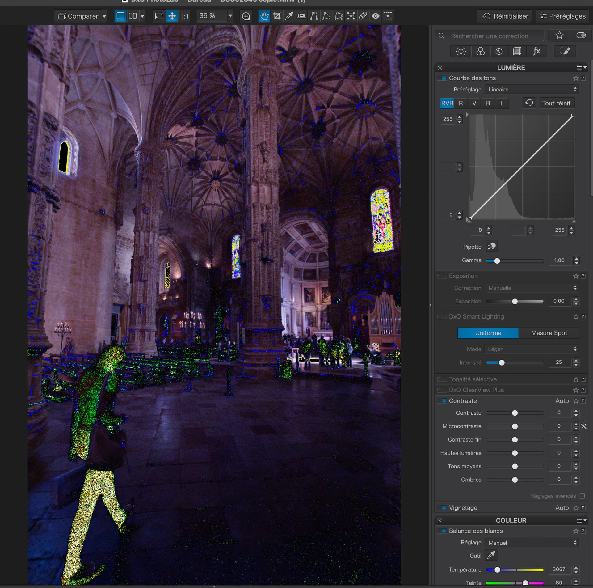
Let me start by saying that I never use the histogram :smiley: It is based on the JPEG rendering and I would rather trust my eye on the image.

Personally, I never use the global setting as it “guesses” too much globally.

Or do what I do and ignore the histogram :wink:

Another tool I rarely use, especially where there are smooth graduations, as the sliders can invoke “steps” and they are far too “broad brush” and interact too much with each other.

Not really :grinning:


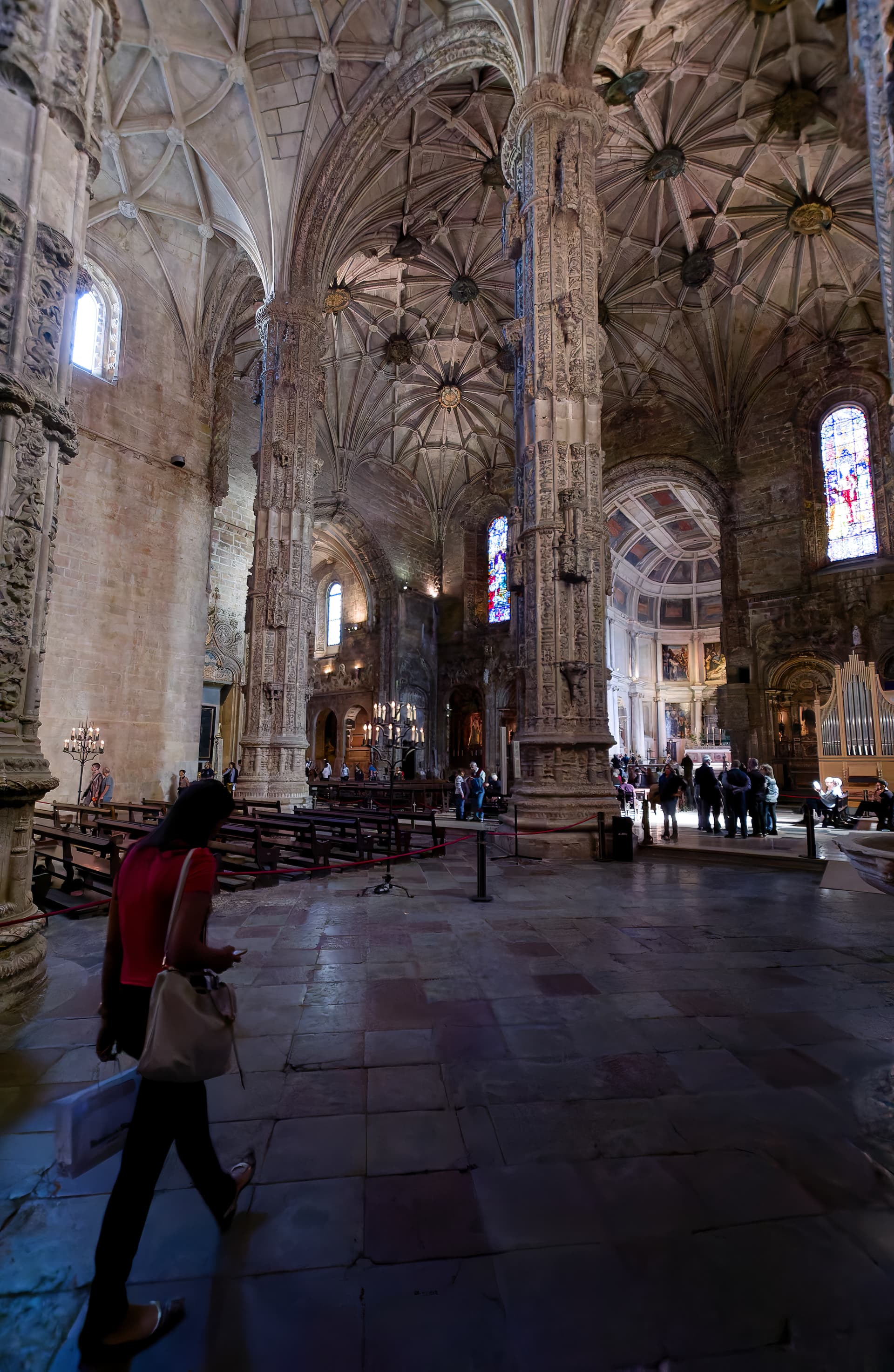
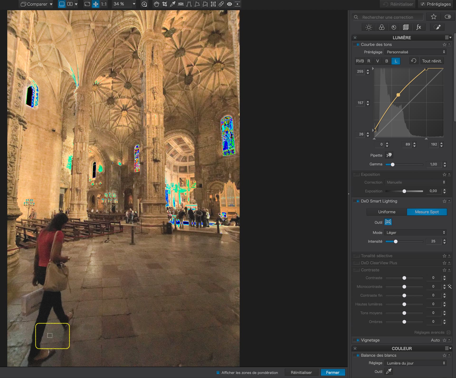
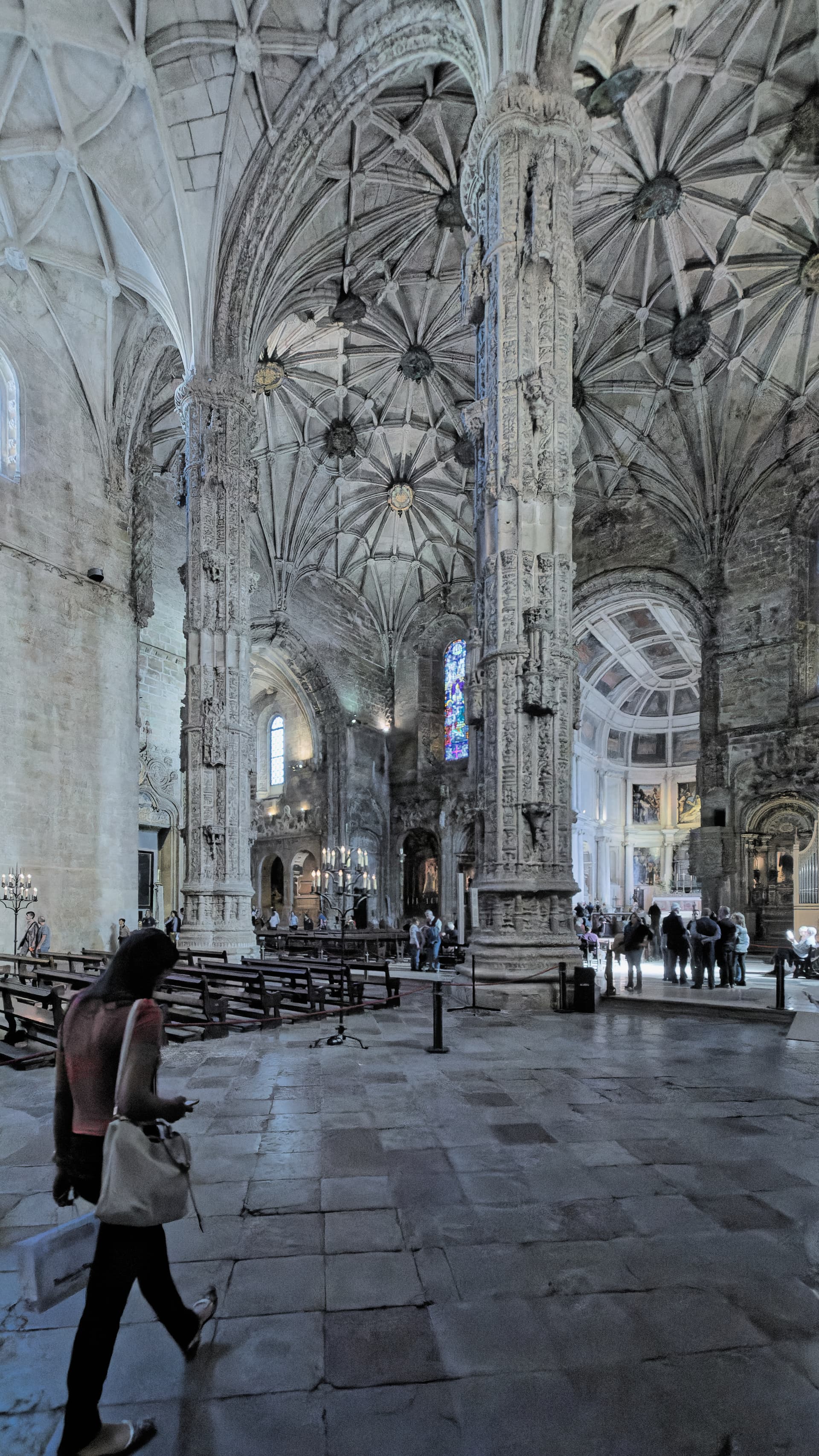
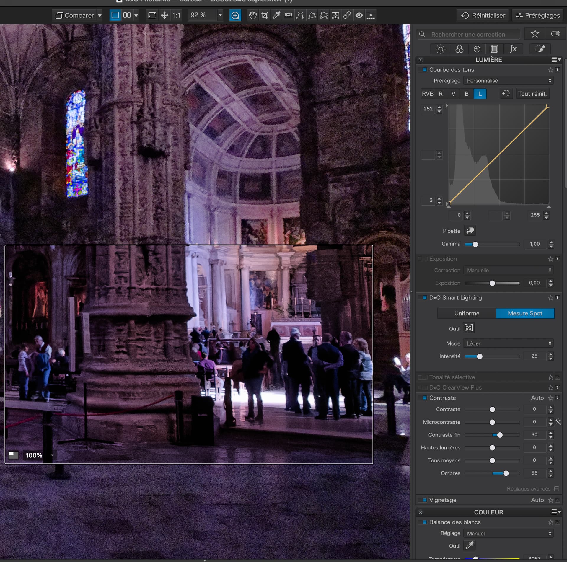
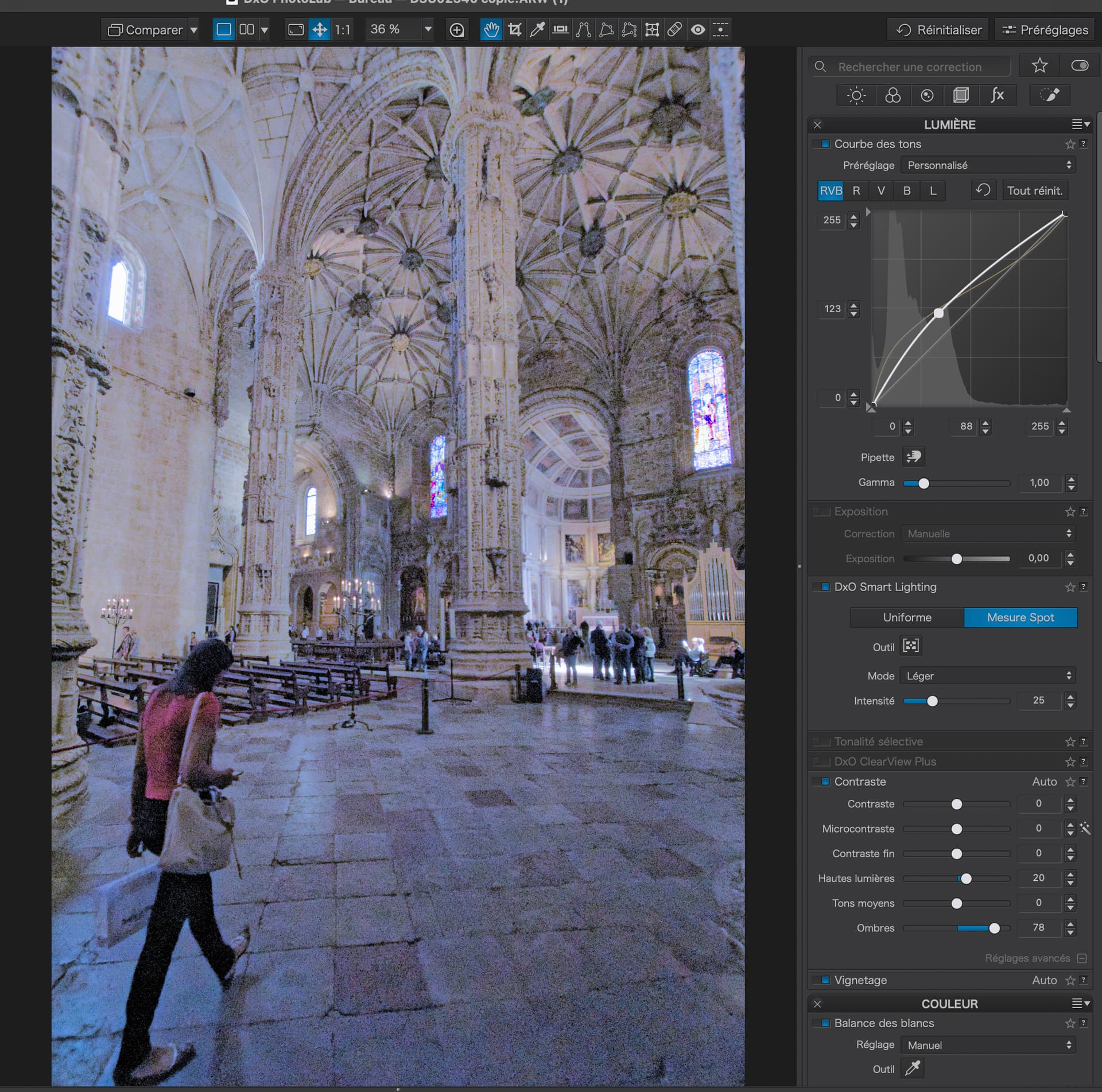
In this case, I started by establishing a decent colour temperature - in this case, I used the organ pipes, which I know to be usually a neutral grey metal. And then I start tuning the light levels by turning on the under/over exposure warnings…

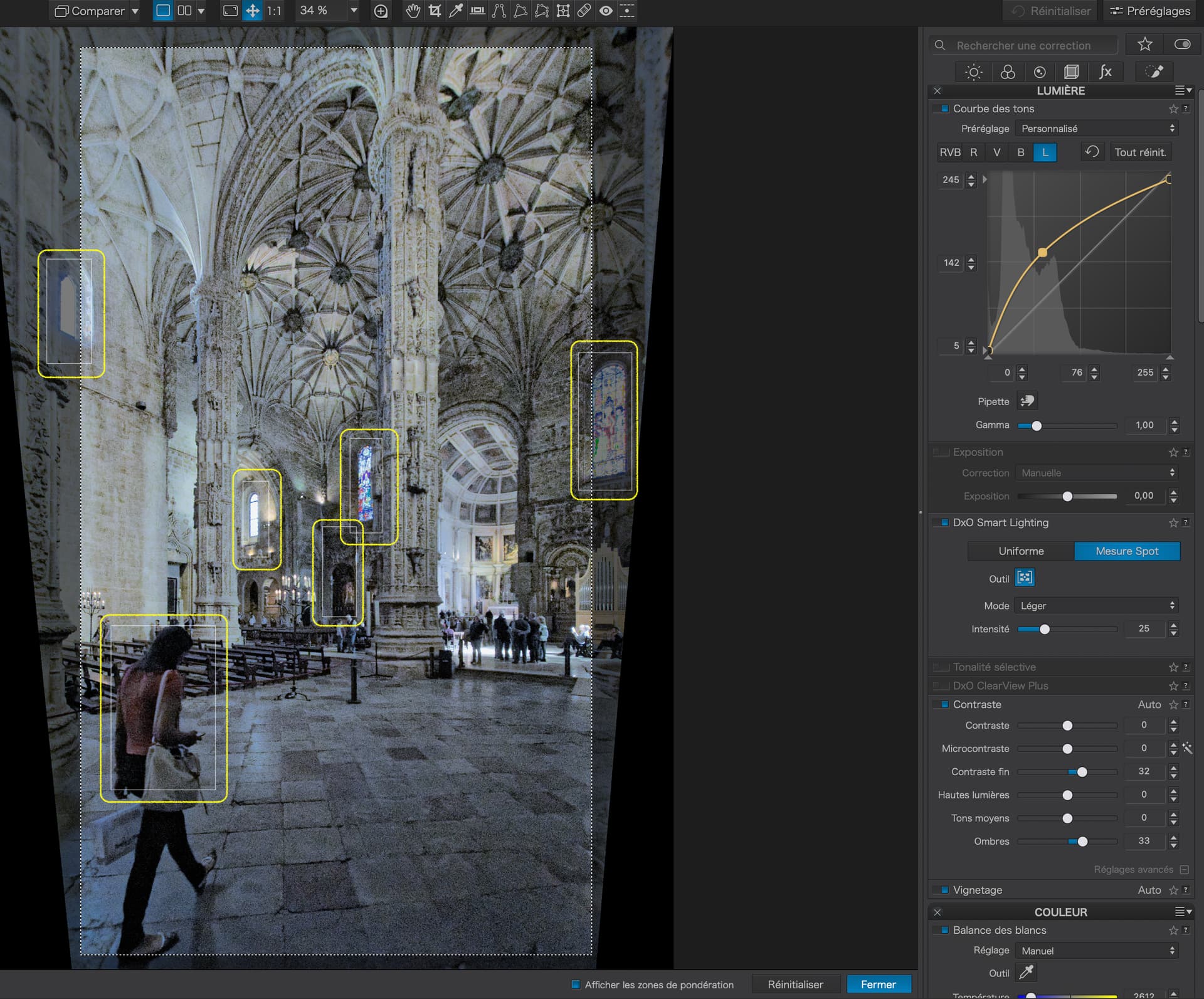
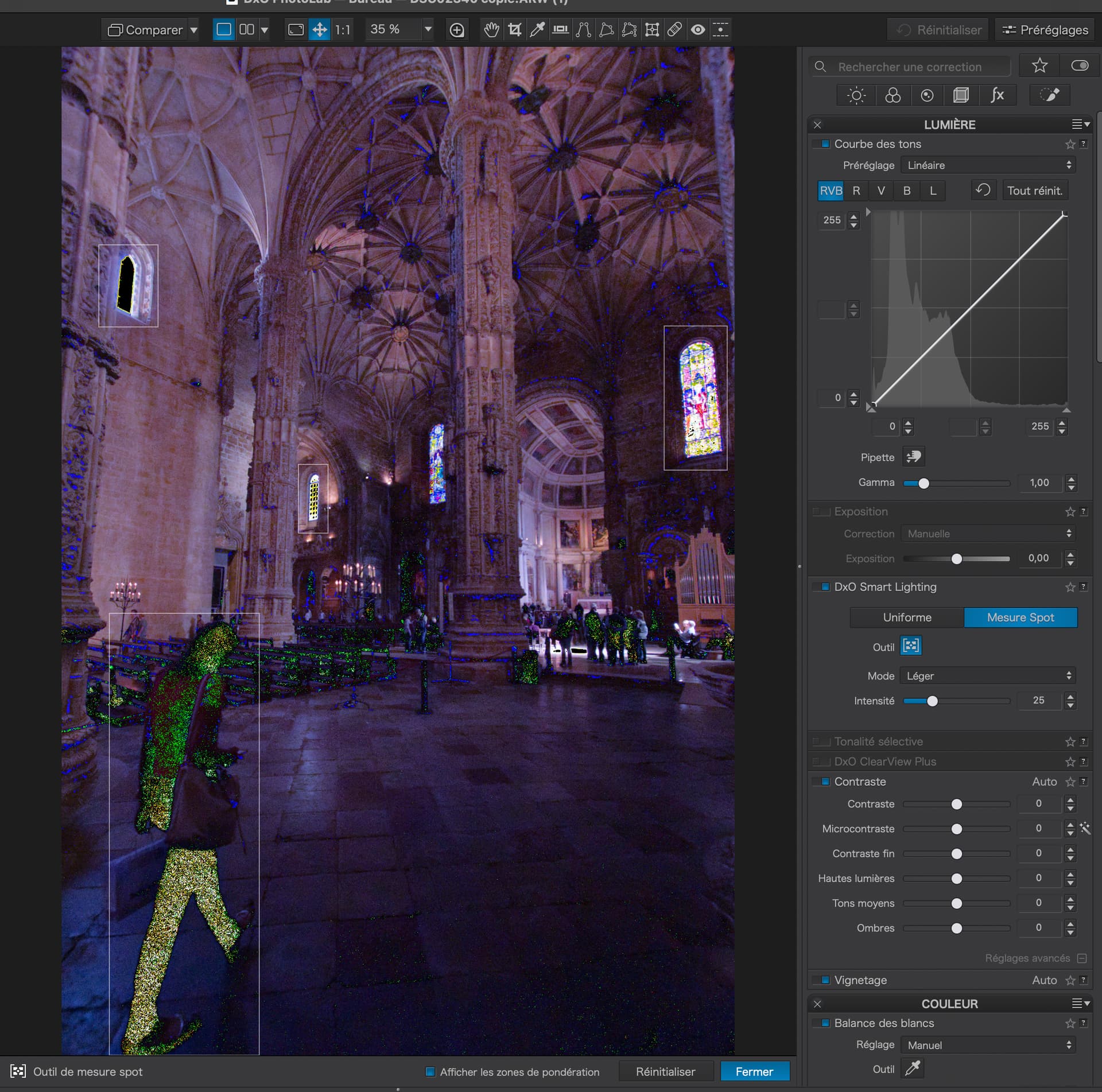
I then establish Spot Measure Smart Lighting zones around the darkest and lightest areas. This helps me see where I need to establish the black and white points for the Tone Curve…

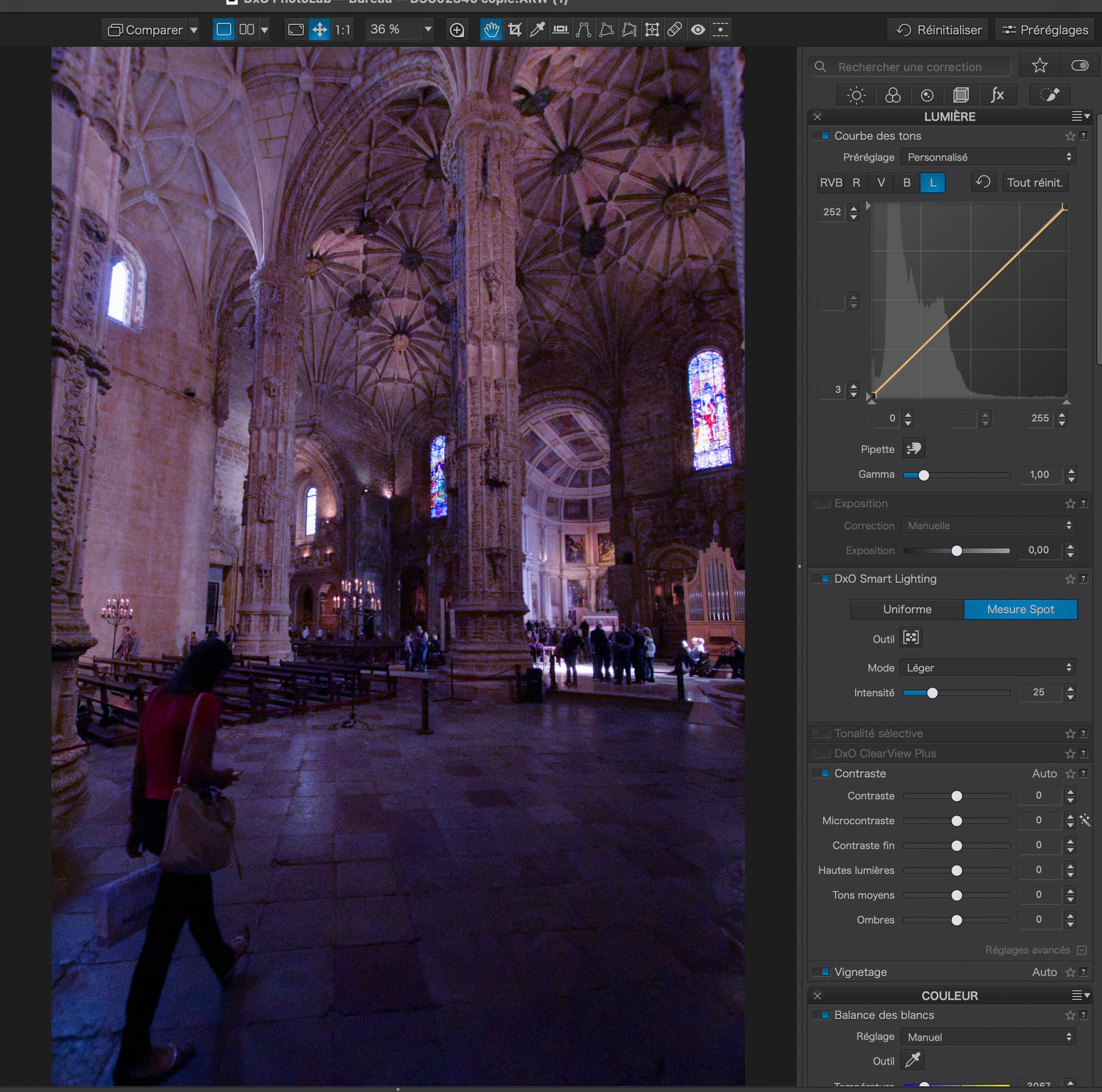
Now, I adjust the ends of the Luminance Tone Curve, upwards for the shadows and downwards for the highlights, until the warnings are extinguished…

In this case, I only needed to move them by 3 points, which, from experience, tells me the highlights were not completely over-exposed and I should also be able to retrieve shadow detail.


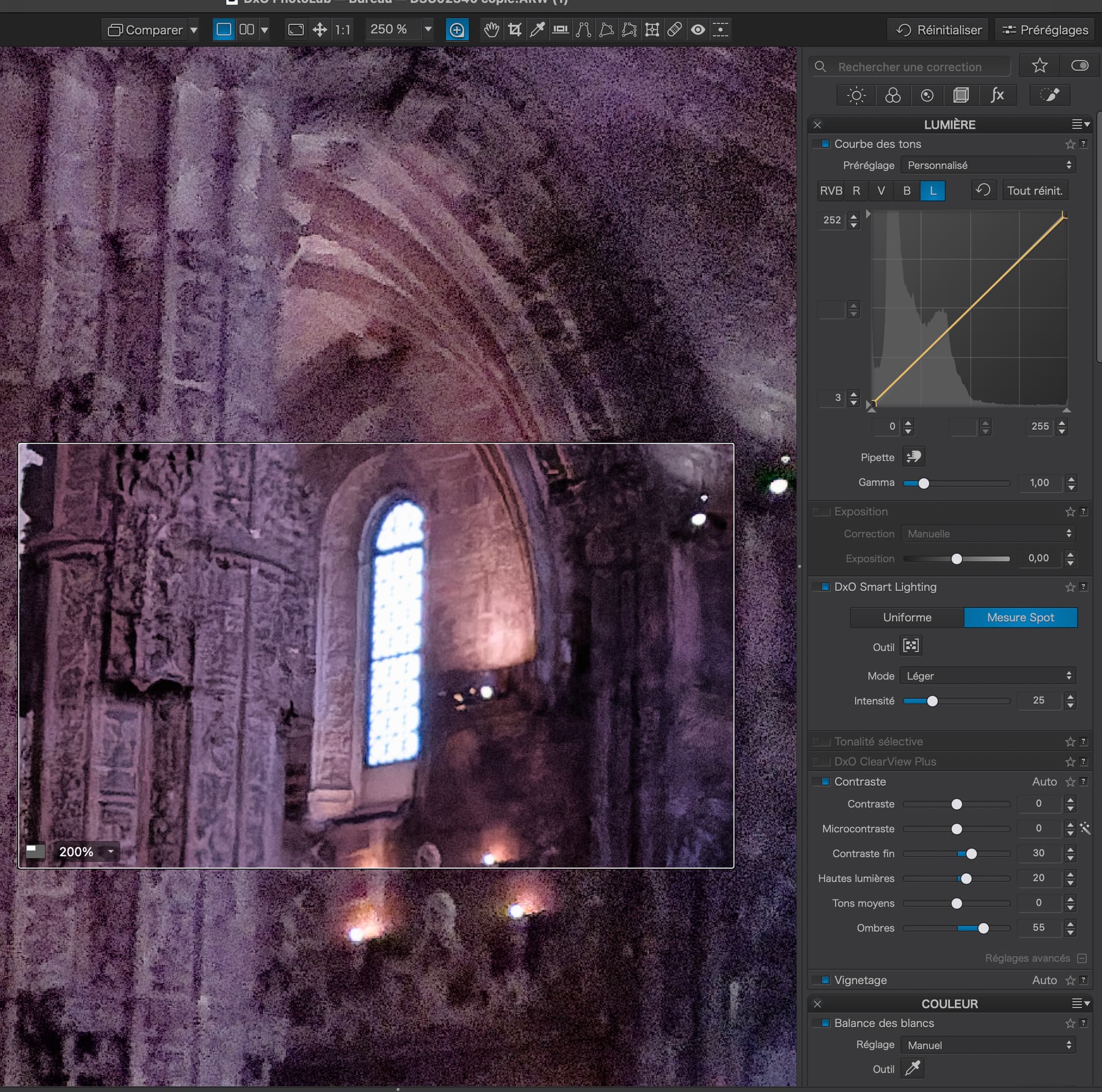
Next, I adjust the Fine contrast sliders to bring out detail in the deep shadows…

and, to a lesser degree, any recoverable highlight detail…


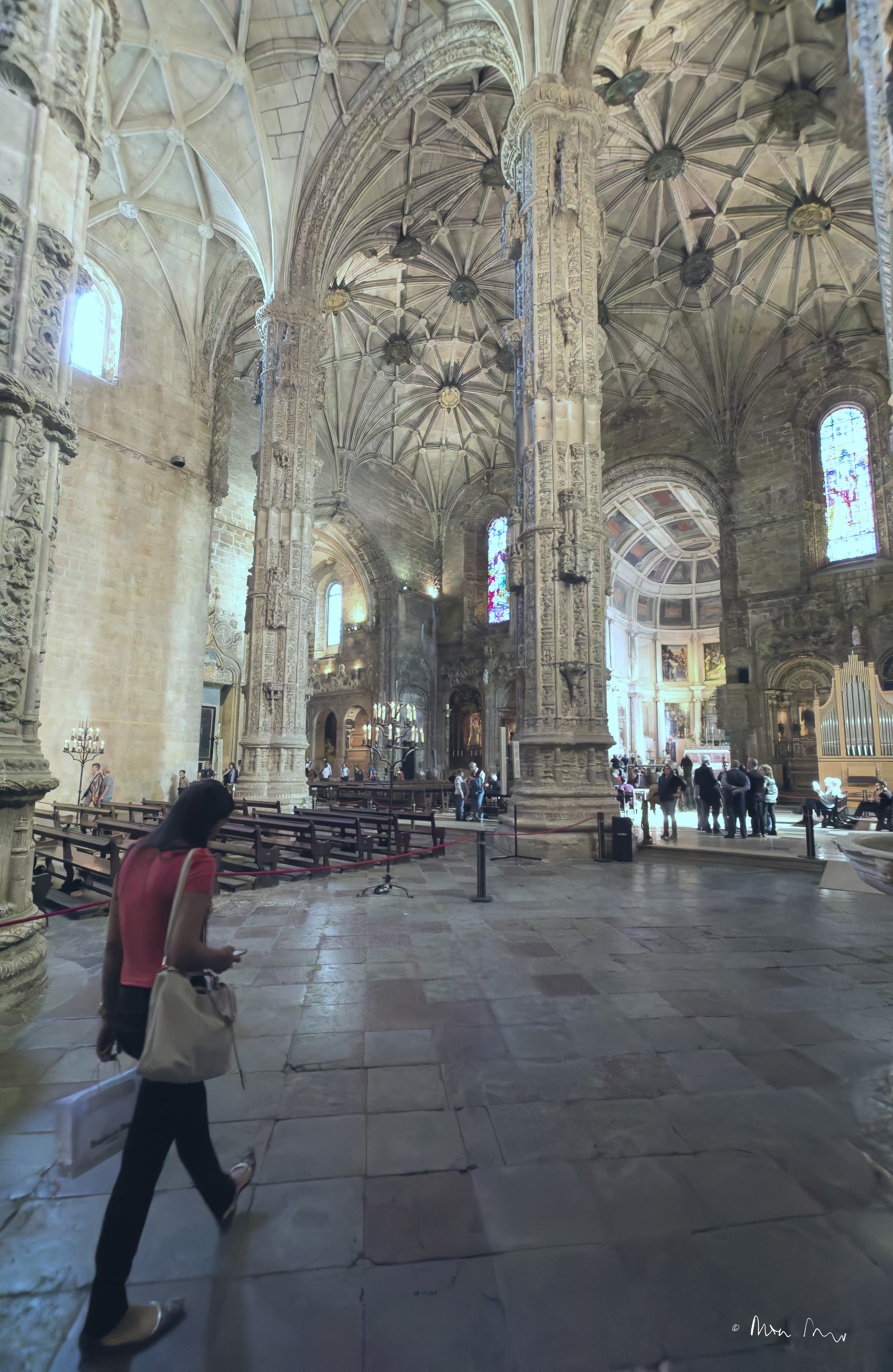
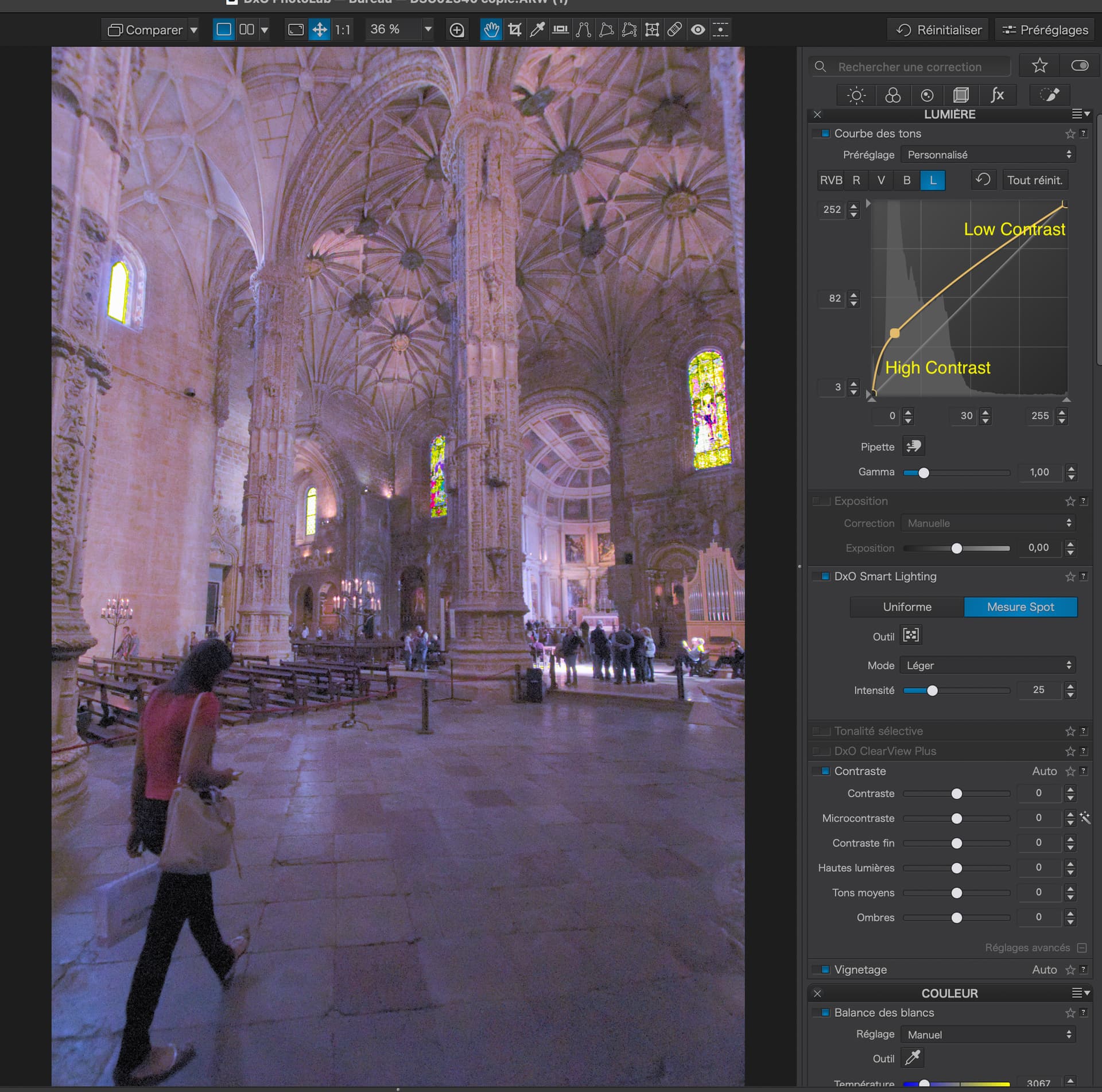
Now comes the fun bit of establishing a decent Tone Curve.

Here’s a couple of examples of how not to do it…

Not forgetting that, not only does the curve alter the Luminance, it can also drastically affect contrast in “flatter” parts of the curve.

In this version, I tried this shape…

… to bring down the highlights a bit and boost levels and contrast in the shadows.


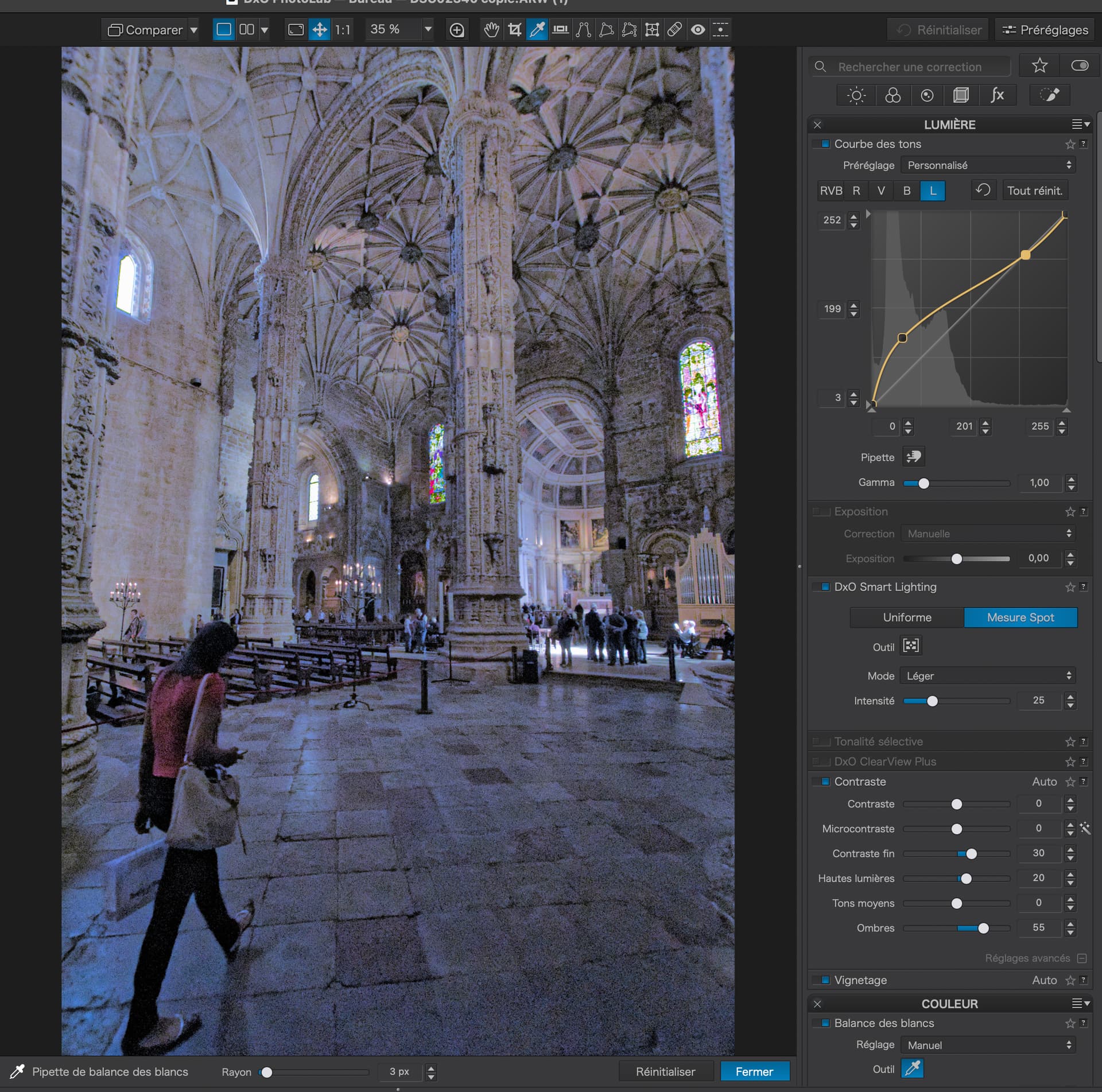
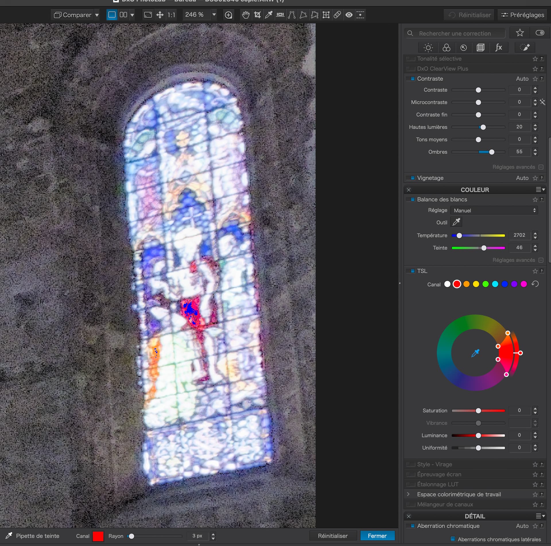
Don’t forget to check the Gamut warnings…

… and adjust with the Colour Wheel where necessary…


I’ve just this minute discovered a very useful idea. Now that we have both an RGB curve and a Luminance curve, we can actually create two curves with different accents…

I need to play more with this but, in this image, it seems to help.

I think you mean to use the clipping tools in the bottom left corner of the histogram window. At least, that’s one of the measurements I used when reprocessing my frame. I still ended up with some clipped shadows on the woman tourist’s trousers, but she is neither the subject nor my wife, so IDGAF about that.

WRT the white balance, anywhere I put the pipette seems to give me more of a pink glow than I remember, even with the church’s southern exposition on a sunny November morning. I tried a white haired tourist on the right near the altar rail, and the foreground tourist’s handbag. Both gave me a result closer to the colours I remember. But “des gouts et des couleurs. …”

That’s where I had misunderstood your method. Or at least, the first point …

Now that you point it out …

This thread (and its predecessor) are developing into the material for a valuable HOWTO article!

1 Like

@joanna,

Thank you! Had a guess you don’t follow the “standard” tool sequence of working from top-to-bottom as recommended in my initial PS/LR education.

Will certainly try to better comprehend what you are presenting here, so some initial impressions, again subject to correction.

Color balance before tonal balance, especially for extreme shifts, makes sense for the different luminance responses, and saturated colors might be better balanced. I’ll have to consider this when knowingly making any WB shift, not just when the initial balance is way off.

Your use of Smart lighting to affect white and black point adjustments is new to me. I’ve used Smart Lighting primarily for dark shadows (fill light) or overly strong contrast areas and have not noticed changes at endpoints. I’ll need to look to understand that more.

Fine contrast in the shadows has been very useful for me but have always applied this after the other tone adjustments. I’ll see how reversing this order is helpful for me.

My usual attempts to get “creative” with RGB curves adjustments generally resulted in failure, so I’ve stuck mostly to the sliders or limited “standard” shapes. However, this new Luminosity curve seems to give me much better results and I’m growing more confident. I still use the histograms’s movement and shape as reassurance that I haven’t made a mistake. Perhaps it is too much of a crutch.

Again, thank you for the additional processing details.

Thank you @Mike_Murphy_1948 for starting these two threads.