Rainy Day Photo

I went for a walk down Lincoln Road, with my M10, stopped at the local Apple Store, and then noticed some “statues” on the other side of the road. I walked down to them, and just as I was photographing them, it started to rain, really hard, for 90 minutes or so. I went into a small alcove where I was sheltered from the rain, and for 20 minutes or so I attempted to capture a few images of the scene, expecting to edit them in B&W.

The goal was a "rainy day photo on Lincoln Road, Miami Beach. I wanted everything in the photo to be clear, but I wanted the statue to be the most clear. I was hoping to make it obvious how hard it was raining, but the only proof of that is the water splashes on the ground. I also took some close-ups, shot at f/2 to blur out the background.

I only brought my 50mm f/2 lens, Voigtlander APO Lanthar (purchased to replace my decades-old Leica Summicron 50). Zooming was not possible, and walking out into the rain was something I wanted to avoid.

L1004835 | 2024-07-11.dng (29.6 MB)
L1004835 | 2024-07-11.dng.dop (13.7 KB)

Here’s the scene, in color, after I “reset” the processing, straightened and cropped:

Interesting that to me, the color image (no editing except straightening and cropping) looks so dull and boring.
Something I need to remember for the future, is that I should have opened the aperture for the image to f/2, and thrown the background out of focus - Joanna pointed that out. It would have taken me one minute, and maybe that image might have looked better.

I can say for certain though, that if I was only shooting this in color, I doubt I would have liked the image - but in B&W, with a few PhotoLab edits, I like the image.

Excuses - didn’t bring a longer lens, didn’t change my position (rain), and even in B&W, I’m not all that excited by the image. Maybe it’s a photojournalism image of Miami Beach Lincoln Road…

I also want to add that every time I edit an image in B&W in PhotoLab, I get more used to how to do so.

This too - no editing:

So why are you sharing this photo?
What is your subject? Ss it the statute, or the rain?
Why the cluttered surroundings and why the large DOF? None of these elements or technique choices seem to match.
Why should we spend any time looking and commenting if you don’t spend any more time or effort than this to create the photo?

I can’t say for certain but I think the main subject of the B&W version is the rain and all the components of this image are seeking equal attention from us, even though the seahorse takes center stage. I actually like it.

Mark

The title is “Rainy day on Lincoln Road, Miami Beach”

There is no individual subject? Why do people think this is mandatory? Look it up on Google. The subject is everything in the photo, the background, the tree, the statue, the rain, and the water splashing on the pavement, everything I wanted to include.

I spent a lot of time, and perhaps a dozen images to capture what I wanted, and then to make it look the way I wanted in PhotoLab. It’s not an “art” photo, it’s a “location” photo, and everything in it contributes to the final image I wanted to show.

Suggestion - read this article, to the end. I’m not trying to create an image the way you seem to feel is best, I’m creating an image that shows what I am thinking, and my entire image fits together the way I wanted it to. Camera settings were set accordingly.

Good reading, for a fresh viewpoint on images:

Does a Landscape Photograph Need a “Subject”? - Photo Cascadia

You don’t need to “like” it - it’s likely not how you do things. Maybe people expecting “art” will find it quite boring.

Yes. That fits what I was thinking as I was trying to capture this image, then at home correcting “mistakes” until it looked like what I posted here.

Joanna, you might not agree, but I’m curious how you feel about the page I linked to. You work very hard to show something as the “subject” of your images, which is your choice of course, but there are other choices. I wanted to show Lincoln Road (famous place) differently than most photos show, and the heavy rain gave me the opportunity. I thought B&W made the image stronger. On the close-up shot, I used your suggestion and set the camera to f/2, but didn’t want that for this image.

This is good read. A lot packed in for composing landscape photos. I agree with her.
But you missed the entire point of her article.

Meaning: What a Photo is ‘About’
Those deeper levels of appreciation ultimately involve interpretation, the process of deciding what an image is about, which involves more than just recognizing a subject within it. Contrary to what the term “subject” implies, a main compositional element is not necessarily the source of a photo’s meaning. Meaning emerges out of the organizing principle that governs an image as a whole, not merely from any single feature within it. In other words, what a landscape photograph’s various features collectively suggest is ultimately what the photo is ‘about’. If a photo depicts a rainbow over a dried lakebed with arcing mud cracks in it, the photo is not simply about one of those two features or the details within them; the echo of the rainbow’s form in the mud cracks indicates a relationship between the rainbow and the lakebed, and therein lies the potential for identifying meaning, however anyone wants to interpret it.

And…

What they need is to hold the interest of the viewer, and that is most likely to happen when an image conveys a sense of intention. An ordering principle such as hierarchy can get a viewer past the point of looking for purpose and onto deeper levels of appreciation. The age-old term “subject” has earned its place in so many discussions of composition because it attempts to identify what is probably the most common method of creating order. Clearly the term has its shortcomings, but the ideas behind it are relevant for many photographs and are worth salvaging. I hope that reformulating those ideas through the connected concepts above may help more photographers to appreciate the value in the ideas and may help to prevent misunderstandings.

And…

As with any compositional decisions, the time for conscious analysis of these concepts may not be while you’re out in the field, rushing to catch some spectacular light. An instructor once said to me when I was in art school, “Creativity is a messy place.” We don’t always arrive at our best ideas by thinking methodically about them, and compelling compositions don’t always result from stopping to ponder the full implications of our decisions. Nonetheless, analysis is extremely valuable when selecting images for editing and when tricky compositional situations present themselves in the field; if creative instincts alone are not quite bringing about that ‘Aha Moment’, a bit of analysis can help to point the way forward. Also, thinking about composition helps us to internalize ideas about it and to draw upon them later subconsciously.

Notice how all the elements in her photos combine to form a unified whole to support the “primary point of interest” (her term, not mine). These various elements are each purposely in the image, not randomly placed, or “just because they were just there”. That is composition 101 and the “organizing principle that governs an image as a whole”.

Read her article again and see how she describes each photo. Her first image is called "Pearly Gates. The sunburst is reaching out to the flowers like Michelangelo’s Creation of Adam, with the mountain partially obscuring the sun in an ethereal way as if it is the “gate”. For her, this mountain is the primary point of interest drawing viewers into her photo “world” to a shared experience. And, the conceptual “meaning” is used as the title.

Restating from her article…

Contrary to what the term “subject” implies, a main compositional element is not necessarily the source of a photo’s meaning.

So, going forward, let’s use her term “primary point of interest”, or PPOI, to refer to the physical element in the photo instead. A photo could be “about” a physical PPOI; but can also be “about” a concept with the physical elements as representative actors (mountain = pearly gate).

IPTC also defined “subject” as what the photo is “about”; AND they included many conceptual terms such as “race relations” “education”, “car racing” and NASCAR in their controlled vocabulary for Subject. When you used IPTC metadata for racing did you only include the car number, and driver in the “subject” field? Or did you include the event, car racing, and other hierarchical terms as per the guidelines?

So, based on her guidance in this article, landscape photos need to draw the viewer in with a PPOI, and supporting elements to be effective. This PPOI may include a group of interacting objects if they have a visual relationship to one another that conveys “meaning”. She also talks about the “organizing principle” of the photo elements together which show what the photo is “about”.

Back to your rainy day photo…
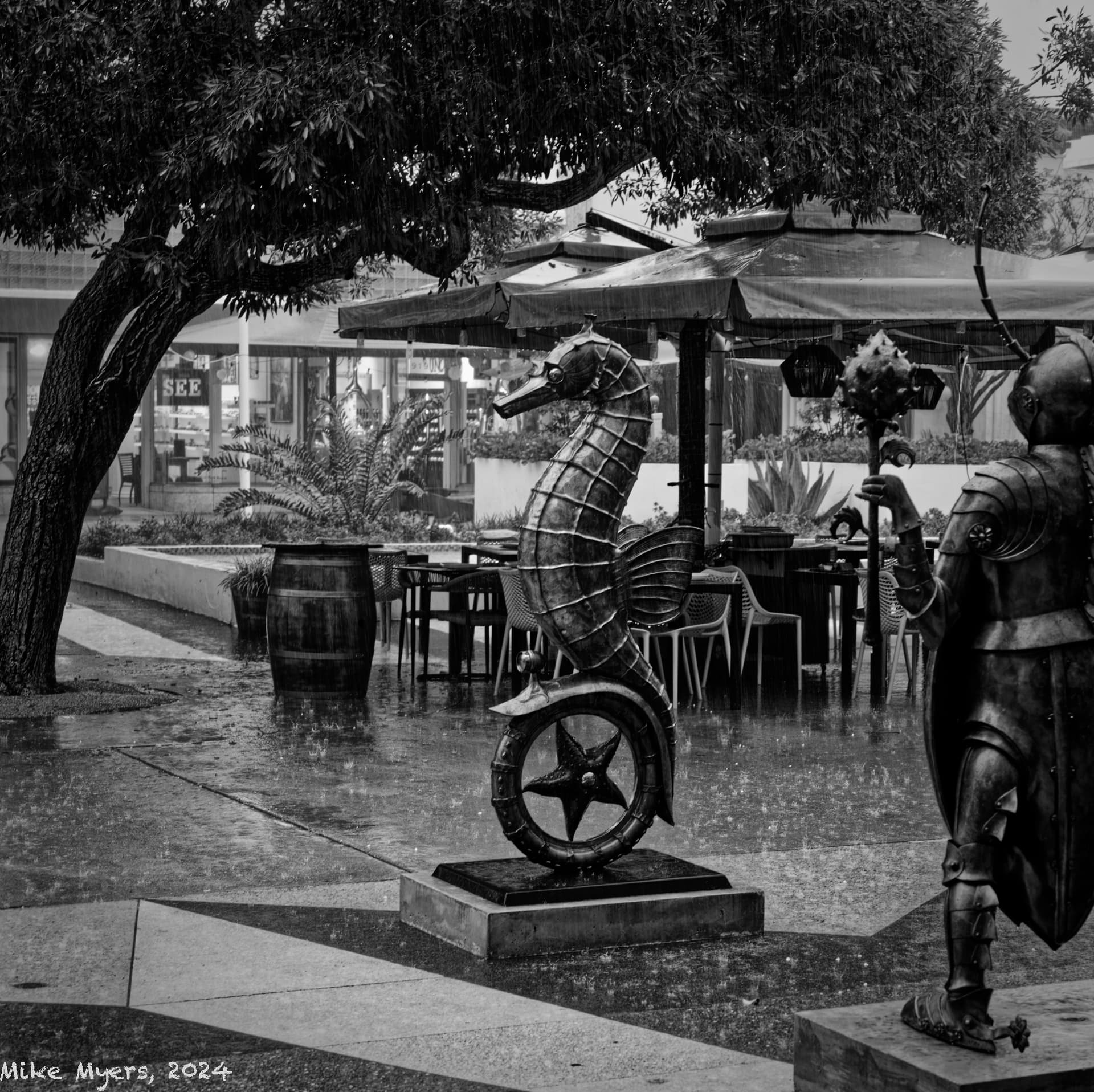
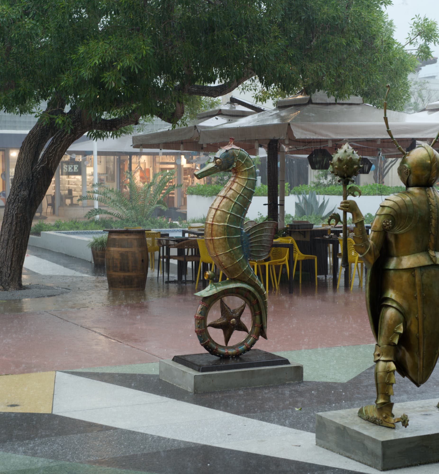
Your rain photo does not show a clear PPOI as several elements have similar focus and dominance of the scene; nor does the collection of objects in the image show any identifiable relationship or other “organizing principle” to convey “meaning” as a grouped PPOI. Hence, there is nothing to draw the viewer into the scene, discern “meaning”, or otherwise identify what the photo is “about”.

What comes across to this viewer is a perhaps the random emptiness of the place - no people or activity, just a deserted place. Just guessing, but perhaps that emptiness or loneliness is what the photo is “about”. Perhaps your intended PPOI is the empty “negative space” between the statues and other elements in the photo.

In your hydrant photo, the “meaning” of “character” showed through with your PPOI and we were able to work towards that “meaning” and what the photo was “about”.

So, what do you want this rainy day photo to “communicate”? What is it’s “meaning”? What is the photo “about”? Defined broadly, what is your “subject”?

1 Like

I thought the article was very interesting and thought provoking, especially for those who don’t do much landscape photography.


The main problem I have with your Lincoln Road image is the visual confusion, with little or no separation or flow between the various elements. For example, the fins on the seahorse seem to be connected to the pole that is supporting the canopy. And the B&W might separate the elements better but then the “knight’s” arm and mace ends up supporting the same canopy.

I can see what you are trying to get at but I think what you are trying to convey is not easy to portray in such a mono-tonous way.

Here is an image I took of our local market in Plestin-les-Grèves…

There is a lot of hustle and bustle but, when I took a “normal” shot, it was just a bunch of people standing around. So, I tried a long exposure (30secs). So, I got separation of people from stalls but it’s still just a bunch of white blocks with a blurry mass. Does it tell a story? I’m not sure it does.

Whereas, if I shoot a series rather than a single “catch all” shot…

… things start to get more interesting. Except, of course, it is not just a food market and, even with five interesting photos, I still can’t accurately portray the whole market in anything less than a small book.

What do you think of trying that series approach (but not a whole book) to Lincoln Road?


Or, how about some character studies?

1 Like

I couldn’t have put it better. Nice try but, see my other post for further ideas.

As I said in my reply, “communicating” a large but confined area is always going to be difficult and what Mike did was to provide a “bunch of stuff” without any particular composition.

Well, bingo! That is the type of image I wanted, and I love your image! The subject - to me, it’s “the market”, in its surroundings. I wish I had a place as beautiful as that to go to in Miami Beach - ain’t gonna happen. But in this photo, no matter where I look, my eye gets drawn to the huge sign in the front. I wish the tables up front were as clear as the background, as that’s whatI would want to see. For a photo of the market, this is what I would have shown, but with that huge sign not being so bright:


I don’t understand why the closest tables in the lower middle appear to me to be out of focus, which was probably on the beautiful structures in the background - but your photo, as shown, actually IS of the beautiful buildings, and the market is secondary.

Life around you is >>>SO<<< beautiful!!!

Maybe f/128 ? :slight_smile:

The only two ways I can think of to improve the composition are:

  • cropping
  • composition
    Without wanting to get both myself and my camera drenched from the rain, there wasn’t much less, as I wanted to show the whole scene.

I got what I wanted, but it’s not a very good photo, and if I find myself in the same position again, other than a wider angle lens, I don’t see any options that were possible (assuming I didn’t want to go out in the rain). Oh well. I liked the photo when I took it, and now I’m thinking it just “didn’t work very well”.

Essentially, it’s a “snapshot”; there were no people for the same reason as for me, going someplace out of the rain. That would be an explanation I guess, but I was stuck in one place out of the rain, too. That’s what my photo shows, a deserted area, in heavy rain, no people, just the “objects” in that particular place and time. It’s not “art”, and all the thoughts and ideas in the article we are discussing no longer applied. I couldn’t change the lens, or zoom, or move to another position to shoot from. An hour before, it was sunny, the street was packed, and my goal was to take a photo of one of the statues, which I did, but which nobody here would care about. As I was trapped for an hour or two, I felt I ought to capture it in a photo, and all I could do was adjust the composition slightly. In reality, the photo is nothing more than a snapshot, and I didn’t think color would add anything useful. Perhaps I was wrong about that - maybe color would have improved it… the raw image is in color, so that’s still an option. Even if it breaks all the rules/suggestions, I wanted to capture it anyway.

What would you have done? Noplace else to go, no umbrella, only the one 50mm lens, and not being able to change my viewpoint… would you have taken the image anyway, and if so what might you have done differently than what I did?

Same image, but processed for color. To me, it doesn’t even show the rain as well.

Unavoidable fact of having to tell motorists not to drive through the street. And, added to the white trucks and canopies, another reason why I prefer my idea of a series on the stalls.

Not possible when folks are walking in from of them over a 30 second exposure. Not forgetting that, without people, this scene would be fairly dead.

Wrong! it is of the market in the main street.


I will repeat - “whole scenes” like this are too complex for someone who doesn’t know them to figure out what is what and where, especially without separation.


Nope.

Aha!!! Those ghost like things are really people!! And a 30 second exposure. That explains a lot that I wasn’t aware of, or thinking of. But you just wrote you wanted people in the photo, but until now, I didn’t recognize those shadowy shapes - two looked like blurry people.

Can I ask why a photo taken in daylight needed a 30-second exposure?

Because I wanted them to appear blurred

1 Like

Are you happy with what you got? If Helen hasn’t already seen this, please ask her, without explaining.

Well, it satisfied the Town Hall who chose it as one of their tourism posters that are posted around the community

I would not have taken a photo. Would you have taken the shot if you were paying for the film and developing? If not, why now?

Be intentional. Pre-visualize.
If you still feel the urge to find something to photograph lean back into the composition and/or mood as described in the internet article you linked. The crop of the seahorse seems to have some interesting reflections…

If it’s raining that bad go home and purge all your “snapshots” since they clutter up your computer.