Post photos edited in DxO PhotoLab

To quote from the opening page for these DxO forums:

Welcome to the DxO PhotoLab forum! In this section, share your feedback, ideas, questions, and photos processed using DxO PhotoLab.

Until now I have been posting my images in one of the existing threads, mostly the “Off Topic” threads. Then they get buried under a gazillion other posts. I suspect DxO would prefer a place for lots of people using their software to post some of their results. I guess there is also a concern, that others will copy those images. Something to think about before posting full-size images.

My own opinion is I get the most useful feedback if I post the original image, and the “.dop” file showing the changes I made using PhotoLab.

(If anyone wants to edit, or add to, correct, or delete anything I just wrote, please send your suggestion before “tomorrow”, June 30th in the USA. and I’ll revise this text.)

I have always enjoyed posting images in this forum, and I enjoy the feedback even more. Starting tomorrow, I’ll start posting images here, rather than letting them get lost in the “Off-Topic” threads. DxO has some ideas for the future, that may replace this thread. Not sure when, or if, that might happen.
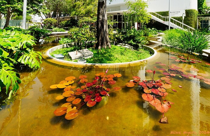
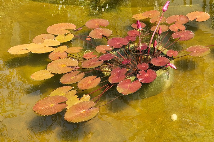
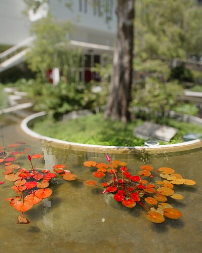
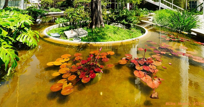
I’ll start this off with an image I took two days ago. It’s from my Nikon D780, with a Sigma 14mm lens. The lens provides a lot of distortion, which helped me capture what I wanted, a photo of leaves floating in a pond, with just enough “reality” in the background to show it’s a real image. As captured, I didn’t like the full image, but I did get everything I wanted in the finished version - cropping, and distorting the image so vertical lines still looked vertical. I also started playing around with the colors, making them match my imagionation (sp) rather than what was in front of me. I wanted some of the vertical lines to actually look that way. I rarely use the HSL tool, but this time it was necessary.

Maybe people will like it, or maybe they’ll be disgusted and dizzy. It is what I wanted to show, so I’m guilty (or take credit). I usually want my photos to look like what the camera captured, but thanks to someone in this forum, after her trying to get me to “think outside of the box”, PhotLab started to feel like modeling clay.

When I used to struggle to do things like this in Lightroom, I always failed. PhotoLab has the ability to take what I thought, and show that in the edited image. If I tried to do this in any other image editor, I don’t think I would have been satisfied.

780_5763 | 2024-06-28.nef (34.3 MB)
780_5763 | 2024-06-28.nef.dop (18.2 KB)

Anyone who wants to do so is free to download the original, and give it a try. I’d love to get feedback from others, even it’s to say I really screwed up.

I’m sorry Mike but, what on earth has a distracting background like this got to do with “reality”?

There is no one subject - it is just a mish-mash of “bits”.

How this has turned out is nothing to do with the software used and everything to do with not composing the image around a subject.

Here is my version based around the only worthwhile frameable part…

1 Like

Mike, imagine you had a 36 film cartridge and only one shot left. Would you have taken this picture then?

1 Like

No Comment

Q: What’s the unique selling proposal of PhotoLab?
A: Ease of use (if you still see well)

@Joanna 's use of f/10 is not meant as a cure-all.
Here, a wider aperture could have helped.

1 Like

@Joanna a bit harsh I feel.

Maybe not a good picture to post but I use my camera to chronicle a visit to wherever I happen to be.

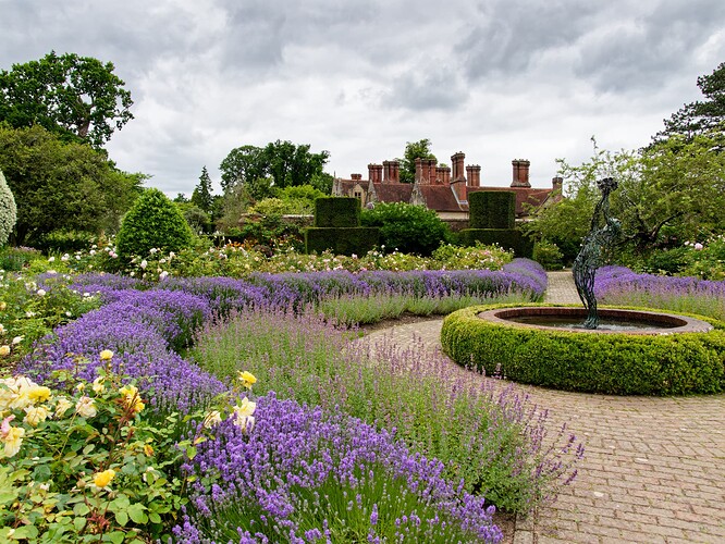
Last week it was dodging other visitors when a child minding visit to Hastings was also used as an opportunity to (re-)visit some Gardens, i.e. Merriments, Great Comp., Pashley Manor, Great Dixter and Borde Hill on the way home.

My wife was “disappointed” with the pictures of the pond at Borde Hill for obvious reasons

The second image was the one that my wife saw!

Can you correct the “angle” of the pond without losing the rest of the photo?

P1126102.RW2 (23.1 MB)
P1126102.RW2.dop (10.5 KB)
P1126111.RW2 (23.1 MB)
P1126111.RW2.dop (10.8 KB)

Absolutely not :smiley: But, in this case, I guess Mike was going for the ultra-wide angle shot, not realising that, at f/5, with the 14mm lens, he would get everything from 1 metre to infinity.

In fact, to get what you simulated, he would need to open up to somewhere around f/1.8 to restrict the depth of field enough to “push back” the background.

But, @mikemyers, here is where you have to stop “guesstimating” or basing everything you take on some kind of general rule.

Having said that, for your lens, for that shot, you would need a very wide aperture.

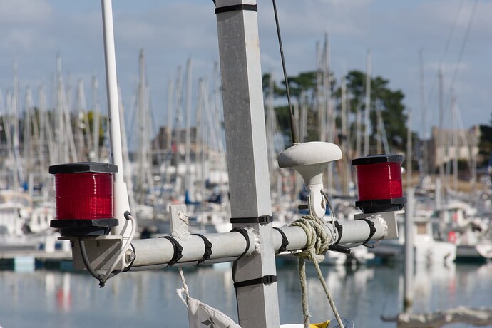
Here is a shot where I needed to use f/22 in order to get things right…

Why? because DoF depends on three factors - focal length, aperture and subject distance.

Here, I deliberately used a 200mm focal length and “zoomed” with my feet to get the framing right. Then I estimated the length of the spar at around 2metres and my subject distance at 10metres, fed those numbers into a DoF calculator and ended up with a DoF of 2.25metres.

What you see in my image is everything that I saw through the viewfinder, with no cropping, reframing or rotation.

It’s not the most artistic of images but it was primarily taken to demonstrate control of DoF for a course.

Once again, you seem to be taking photos without considering whether you are using the right tools and settings for a particular image.

Some might say but Mike has be trying to get the hang of non-journalistic photography for several years now and, since he used an ultra-wide angle, I have to assume he was going for the artistic - which requires a bit more thought and effort


.

in this case, perfectly acceptable shots that would go well in their visitor guide.

Easy-peasy :stuck_out_tongue_winking_eye:

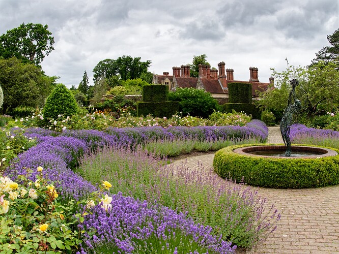
Viewpoint’s Volume Deformation tool - diagonal mode - maximum correction (200) - constrain to image.

@Joanna Thanks!

It reminds me to frame for image “loss” which I tend to neglect. I was on the minimum of 12mm (24mm) so I needed to move back a bit to get more of the image so that I could lose some for image correction!

PS:- I tried image deformation but didn’t apply enough “welly” to make a significant impact on image 2.

Yup. I’ve been bitten too often when doing architectural shots and forgetting that I wasn’t using my LF camera with movements.


Just a couple of pointers on the second shot, which could well apply to the first too.

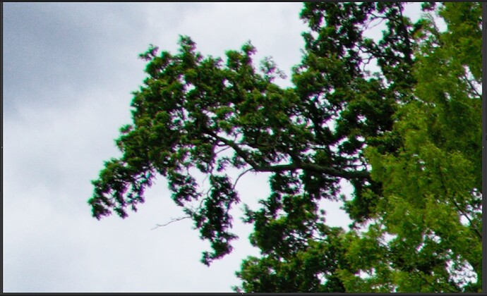
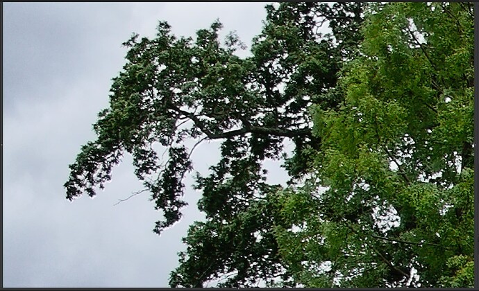
You didn’t use Optical Corrections or Chromatic Aberration, so you ended up with this…

Whereas, with those tools, I got…


Also, I used a Control Line instead of a Graduated Filter, which means that the adjustments for the sky don’t affect other things like the tree tops.

And try to avoid using ClearView Plus at all. use the four Fine Contrast sliders where possible but, for local adjustments, you are better off using Micro-contrast, like I did in my version of the sky.

Here is your DOP, with an extra virtual copy for my version…

P1126111.RW2.dop (27,0 Ko)

The biggest mistake I made, was not posting the title for the image, “One of the creative ponds on Lincoln Road, Miami Beach, Florida”.

From now on, I’ll be sure to post a title. The photo I posted took a lot of walking each way, closer and farther away to get what I wanted in the image. Your image is nice, but it leaves out all the things I went to a lot of trouble to include in my photo.

Perhaps I should have used different wording:
“a photo of leaves floating in a pond, with just enough “reality” in the background to show it’s a real image.”

Maybe I ought to have cropped it more, but I deliberately decided not to. I figured anyone looking at it would have their eyes do what mine do - go right to the leaves in the foreground.

Perhaps:
a photo of a decorative pond on Lincoln Road, Miami Beach Florida

For the image to work as I intended, those “bits” are part of the scene. I tried to crop them out, but then it was a meaningless photo of the pond and leaves, nothing to give any indication of where it came from. Maybe I should crop it more, and re-post later. I tried, but didn’t like it. After what you wrote, I’ll modify it.

I took another photo over the weekend, that will possibly be more to your liking:

I can explain, if anyone wants to know the background of this image, and how/why it was captured. It is intended to be “art”, and in no way photojournalistic. I found it by accident, then struggled to capture an image.

Back to the pond photo:

All the “tricky” things I tried to do to get the effect I wanted, might have been possible in other editors, but I wouldn’t know how.

Also, why is “not composing the image around a subject.” bad? Usually that’s a good idea, but everything in my image WAS the subject.

Anyway, after thinking about what you wrote, maybe this is more like what I should/could have posted. I saw this on my screen, but it looks strange after decapitating the image…

Unless I needed to save that last shot for something else, yes. Several photos that I took before this - no!

Well, I wasn’t “going for the ultra-wide angle shot”, the only lens I brought with me was the 14mm Sigma, and I was deliberately looking for scenes that I though would work well with the lens - many did not. I deliberately left my other lenses at home.

I’m not sure if you should consider the lens to be 14mm, when you see how much I cropped the image. I would have gotten closer, and made use of the full image, but didn’t want to. I thought about depth of field, and figured pretty much everything was going to be in focus.

There’s probably a lot of stuff I didn’t think about, and all my earlier photos with this lens were trash. I took the images anyway, but I don’t like the way they turned out.

I’m confused about this - many years ago, I was using Micro Contrast, and I think I remember you suggesting Fine Contrast would work better for me. Forgetting all that, can I ask you:

Why and when to use MicroContrast vs. Fine Contrast vs. Contrast?

I remember comparing them, and not seeing that much of a difference.

That makes absolutely no difference to my perception of the image. To my mind, If an image needs a title, it’s not worth showing.

In sixty odd years, I have never heard another photographer talking about needing enough “reality” to make an image work.

Instead of cropping, why didn’t you…

  • frame it tighter?
  • use a longer focal length?
  • approach the subject more?

Well, if you expected the leaves to be the subject and folks to be attracted to them, why bother including all the surrounding “stuff”?. Even you didn’t expect folks to be as interested in that.

Quite honestly, a pond is a pond is a pond. The fact that you took the shot where you did is hardly the most important factor.

If you are planning on “making the whole image the subject”, then the whole image must interesting, coherent and work together to lead the viewer’s eye around the image. Your “image” is a collection of separate “bits”, which neither lead to each other nor make a cohesive composition.

Nooe. Still the same problem, just a tighter crop.

Well, you shouldn’t have used the lens you did. Wide lenses cause distortion and give a perspective that makes it obvious that one was used, nômatter how you crop it.

And that’s your problem. You might as well have taken it with an iPhone. There is no craft or aesthetic about it. Even @platypus effort with fake blur looks better.

That’ll be because it was the wrong lens for the subject matter. See what @BHAYT used his for for a great example of playing to its strengths.

…because I didn’t want to - I wanted to capture the image I posted.

Once again, we see things differently. Quite likely, your way is preferable, but for better or worse, this is one of my images that I enjoy.

I guess it’s time to move on.

I always learn a vast amount of technical things from you, but I suspect that most people in this forum post their images for one of two reasons - either they like their image, and want to show it, or they want to learn something from the replies that usually follow…

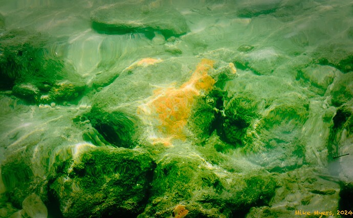
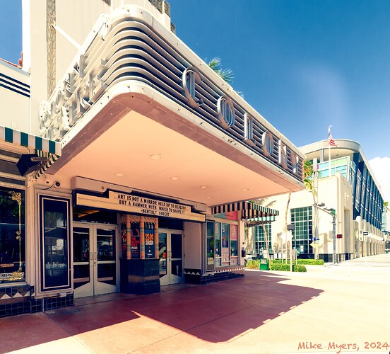
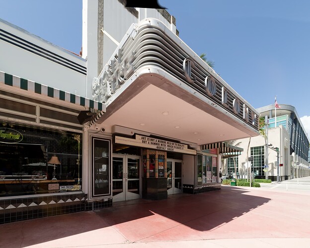
This is the other image I posted earlier. I was specifically thinking of you when I captured it. I guess it’s a combination of “abstract” and “photojournalism”, using a lot of things I learned about PhotoLab to edit it into what I wanted to show. It may or may not look like a “real” image, but I found something that I wanted to capture, found the one vantage point that worked, and captured a long series of images hoping one would look like what I occasionally saw. There is a story behind it, but since you seem to think that an image has to stand by itself, no captions, no explanations, I’ll post those later, only if anyone cares.

It does appeal to me, because I saw it with my eyes, so I know it is “real”, but maybe it will just look like finger-painting to others…

What I care about is that I knew/remembered/understood how to change it from the raw image into what I posted here.

I like the billboard on the theater:

Art is not a mirror held up to reality,
but a hammer with which to shape it.

Because of all the efforts many of you went through to see things differently than a photojournalist, I think those words define me at times. This photo is one of those times.

Same 14mm Sigma, across the street from the pond I had just photographed.

780_5765 | 2024-06-28.nef (29.2 MB)
780_5765 | 2024-06-28.nef.dop (16.6 KB)

1 Like

It was an extraordinarily beautiful day today in central NJ, USA. My wife Wendy and I spent the day at our favorite location for capturing images of unusual subjects, Grounds for Sculpture in Hamilton founded by the American artist Seward Johnson.

I took a lens that I have owned for over a year but have never used on an outdoor shoot before. It is by far the most inexpensive AF lens I have ever owned or used. The TTArtisan 27mm f/2.8 auto focus lens was only $149 new when I purchased it last year on Amazon. It is one of many inexpensive Chinese made lenses available today, most of which are manual focus only.

When I go out to shoot I only take a single lens with me, which is always one of my wide angle primes and usually is one with manual focus only. I find prime lens limitations very exciting because it forces me to see and frame the world differently than I could with a zoom. Today was an experiment to see what I could capture with this very inexpensive 28 mm AF prime lens mounted on my crop sensor Nikon Z fc.

There is a PhotoLab lens profile for this lens which addresses vignetting, lens distortion, chromatic aberration, and lens softness corrections making this inexpensive lens far more useful than if a profile for it was not available.

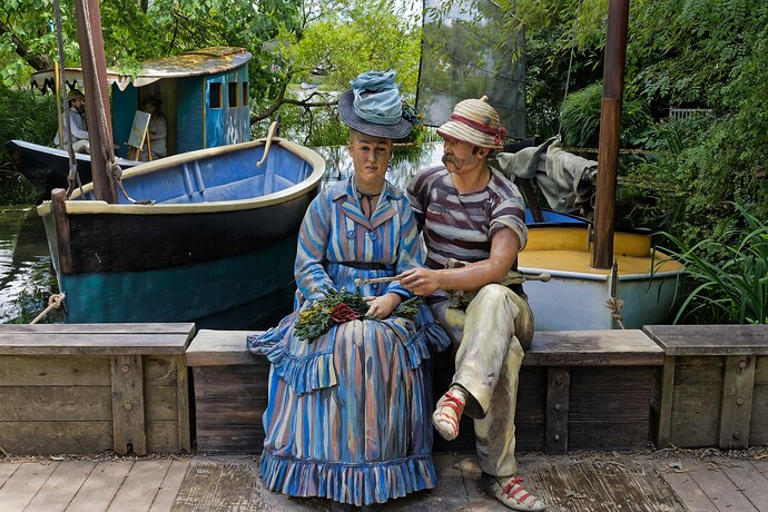
This shot of ‘Sailing the Seine II’ was captured on the narrow bridge designed specifically for it. I was one step from falling backwards into the water on the other side. Happily, this couple was extremely cooperative and held their pose as long as I needed them to, and even longer. :laughing: It was shot at f/8 and processed in PhotoLab 7.7.2.

Mark

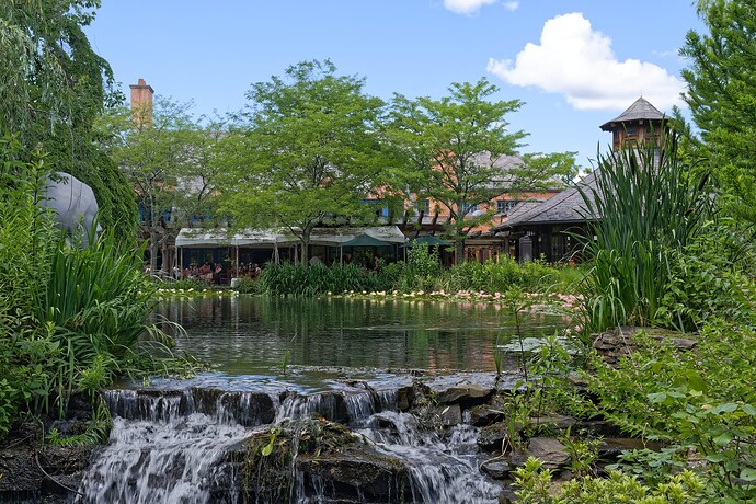
This is what I would have fallen into with just one more step backwards. :face_with_raised_eyebrow: It is not nearly as dangerous as it looks and I would not have landed anywhere close to the waterfall. I believe I may have posted a similar shot of this restaurant from the same vantage point several years back when I was still a Canon shooter.

2 Likes

Good old Bertolt Brecht. Do you know him? He had to flee the US in 1947. Just like Charley Chaplin.

George

2 Likes

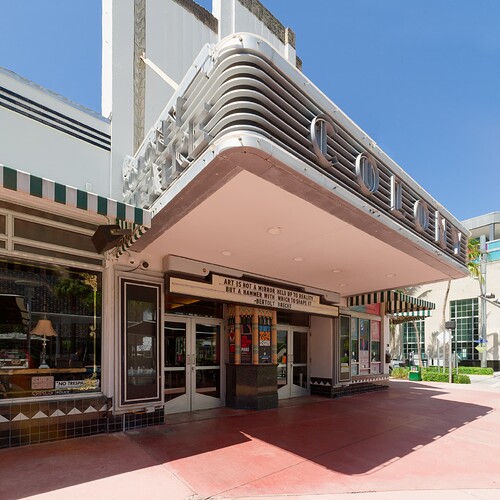
I like the idea behind this shot, with the dynamism of the canopy surging forwards. Now this is what wide lenses were made for.

Nonetheless, might I suggest the you go back and take it again, with a framing that accommodates the top of the beautiful Art Deco facade?

I had a go at “repairing” the top to hide the angled crop because you hadn’t quite left enough space around for perspective corrections.

Whatever you do though, I am still in two minds whether to include the building on the right, the corner of which echoes the Art Deco design of the theatre, but which would increase the proportion of the image taken up by empty sky. Or to keep the width framing that I suggested and frame it 4x5 portrait to include the top of the facade.

Maybe you could try both, but don’t forget to allow space, especially at the top, for the perspective corrections. What do you think?


Here is a version, with the sky filled in and framed 5x4 landscape, but I didn’t want to bother repairing the top of the building as I’m really hoping you will take this again with a higher framing…

Overall though, we both like what you are trying to do :smiley:

Helen suggests you might like to try doing a series on the Art Deco buildings of Miami?