@Joanna , I guess this could be b&w candidate. What’s about a try?
Hi there. We have tried it and weren’t happy with the result. I can post a version either later tonight or tomorrow morning.
Would be great thank you very much. I guess, you have a better chance to be successful than I have. However, for me this is a good training session. I’ll share my result(s). Best in 2025!
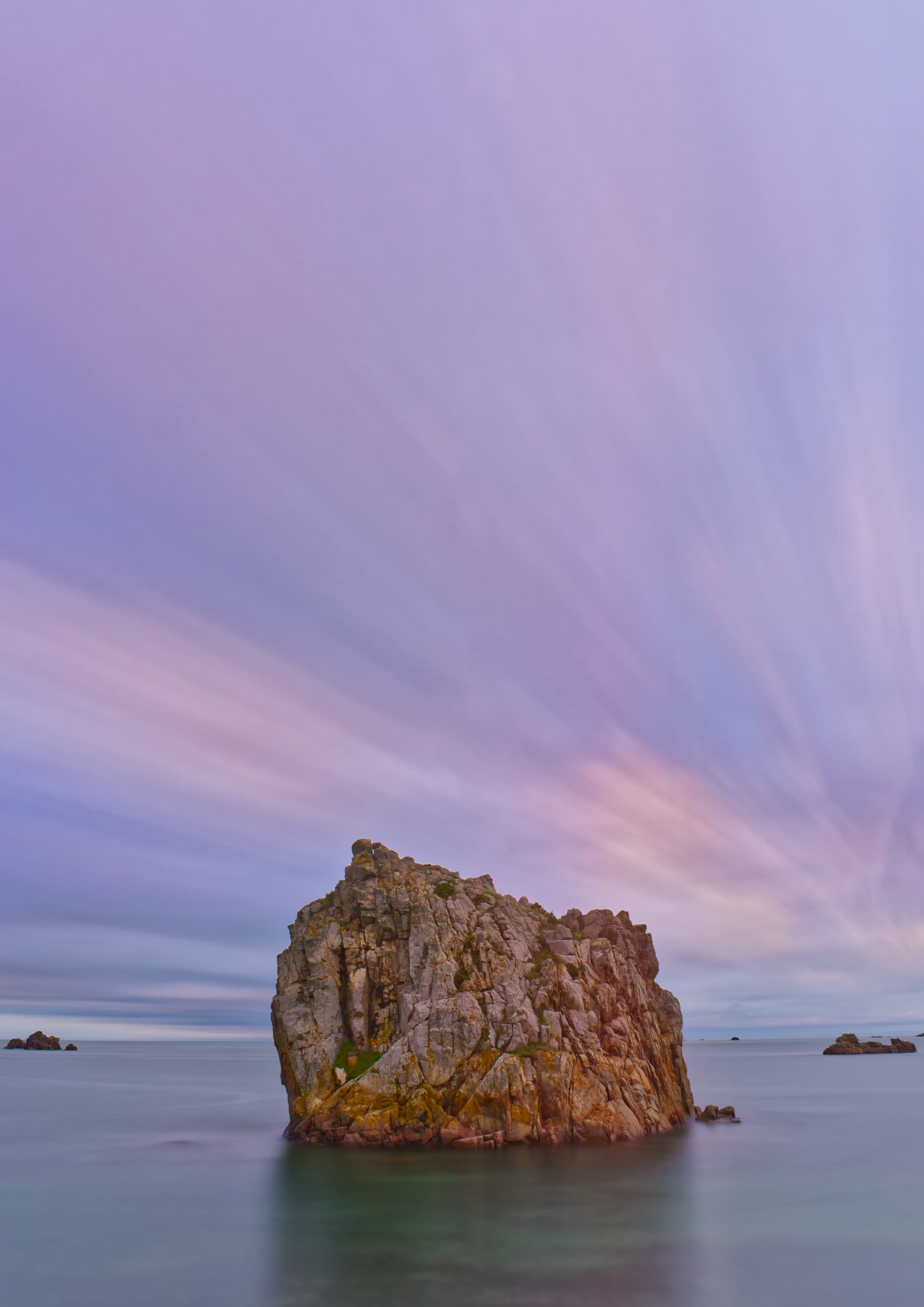
Well, here it is…
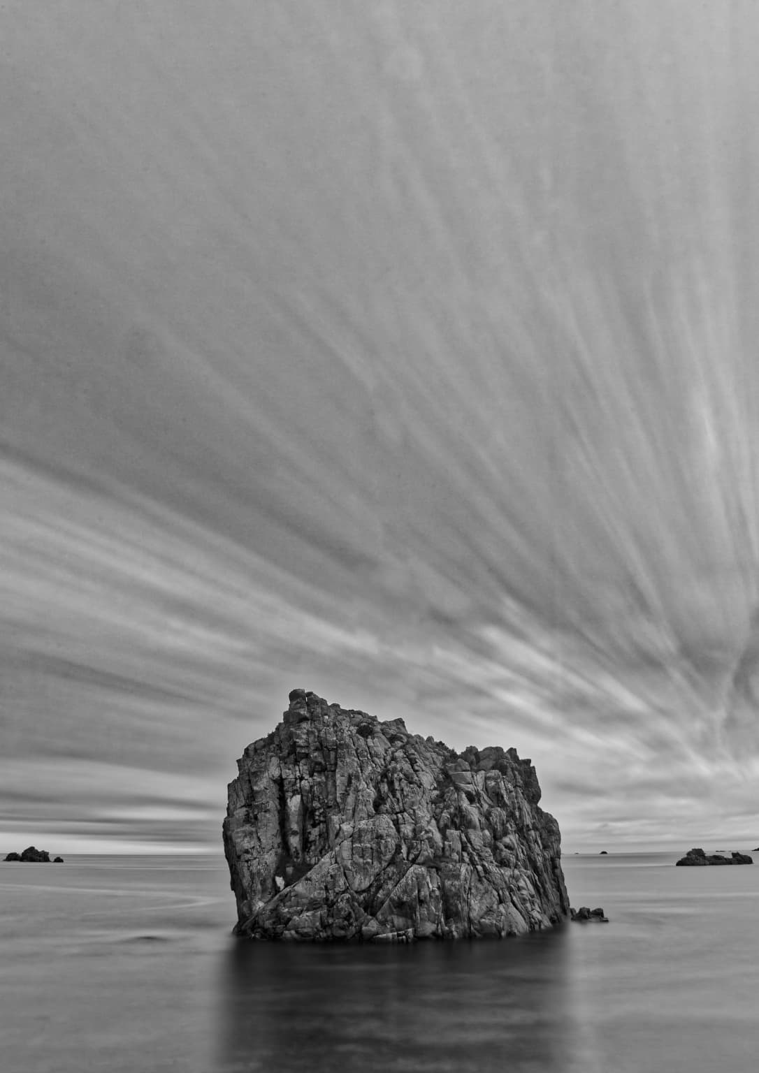
To me, it just doesn’t work. There just not enough tonal contrast between the texture of the rock and that of the sky.
Same for me, the colour version is superior.
you’re right, the b&w version looks flat and is not working. However, A good try.
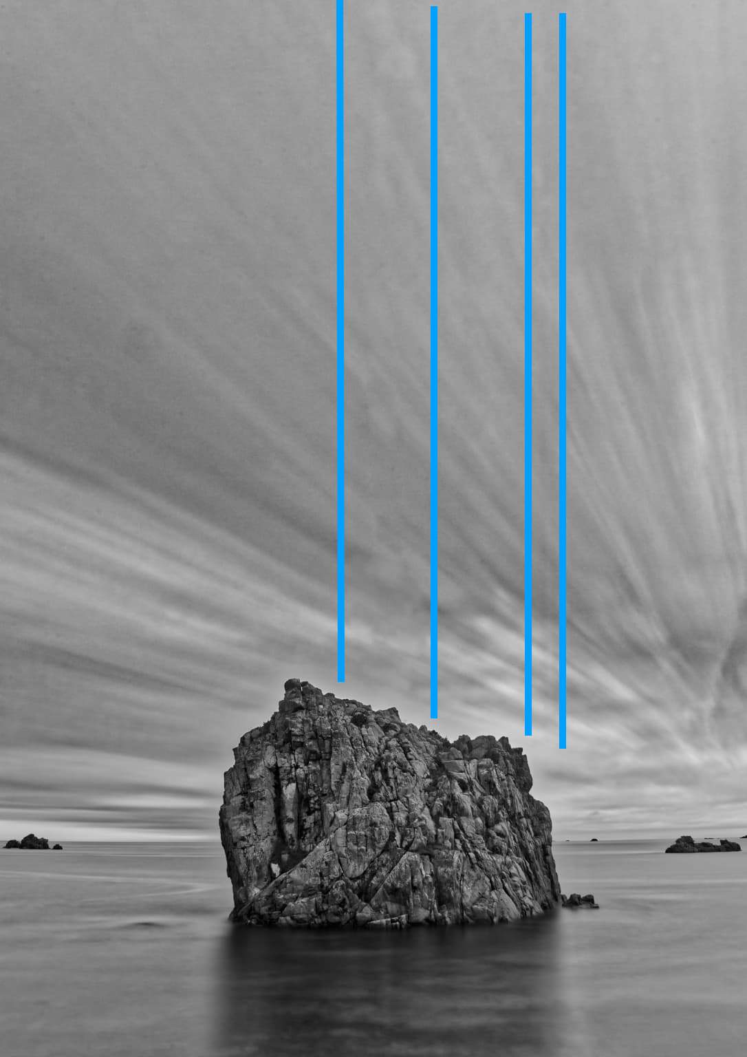
Hello @Joanna, I’m only curious: I see two vertical regions where the cloud structure is slightly shifted.
It’s less obvious in the colour version. Any explanation? I believe, it would work better with the rock as the only subject (in b/w). The other rocks appear as distraction to me.
This has something to do with cloud movements becoming more obvious when they change position in relation to the upper clouds - or something like that. If you look at the colour version, the cloud colour changes and is more acceptable than the tonality changing.
It is certainly one of the factors that convinced me that colour was better.