Yay! Someone who gets it! 
 Maybe it’s a Southern Hemisphere thing.
I have been following this thread and always liked your idea so thought I had better talk up and support you 
Not sure about the southern hemisphere thing though 

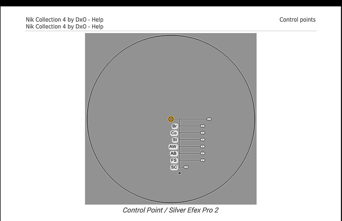
Well I hope the PL design team are willing to take a look at control point tree again, considering from what I can find in old manuals for Silver fx, they went from an unobtrusive collapsible tree
Then decided to…
When really, it would have been best to keep both, like the original Nik software.
And then, PL does the following???
Because why? It’s less annoying than it was in Silver fx?
Like Keith, I’ll speak up too …
Yes, your suggestion makes a lot more sense - - However, even with that approach it’s unintuitive; not something anyone would naturally think of to try unless they already knew about it !
A far better approach would be to provide consistency with all other sliders - just as @jch2103 surmised above, and as has been a well supported request that’s been outstanding for ages … OR, to completely revamp the slider UI for LAs, and relocate them to the palette; as has been mooted for almost as long !!
John
John, I agree except for one big proviso: only if the sliders could be controlled by the keyboard arrows. I keep my controls on my second screen and I would hate it if I had to pull my mouse, and my eyes, all the way over to my second screen for every control point adjustment. Across the board, consistently-applied keyboard control would be great.
Besides that, there is no harm in also having the less intuitive mouse control if it has its gear shifts in a sensible order. I’d definitely use it then.
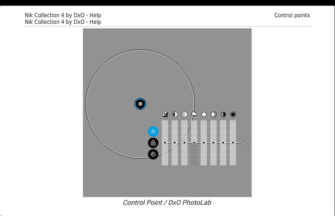
I totally agree with you! That simple monoline slider is way less obtrusive; much more sensible. Would people be complaining about how obtrusive the control points are, and asking to move them to the side if they weren’t made of those unnecessarily wide bars? Who wants to bet those ridiculous wide bars come down from the marketing team who said they want it that way so it can be obvious in their marketing pics?
@John-M, what do you think? Would you feel the control points are unobtrisive enough if they looked like that Silver Ex one?
The problem is not just how things were/are but, how to accommodate further adjustments, e.g. the colour wheel palette, into a floating equaliser type thing.
And I hardly call the original Silver Efex Pro control convenient - where is the zero point for when you want to apply a negative adjustment?
As it stands, I often have to hide the control point/equaliser in order to see what the effect has done to an image, which then means I have to show them again before I can make a further adjustment.
I rather like the idea of using pipettes, as found in control lines, instead of the “big circle” to denote where the selection point is. What is more, for a control line, or even a gradient, why do we really need a “big circle” at all if the sliders were transferred to the side bar?
@Joanna On windows, if you move your mouse cursor to the top toolbar then all the control points/lines etc. and the equaliser are hidden. If you then click and hold on the compare button you will see the image without any local adjustments. I use this regularly to compare the before and after affects of local adjustments or just to see what the image looks like with all LA controls hidden. Not sure if Mac is similar so please let us know.
Ah, yes, I’d forgotten about the idea of adding the colour wheel palette. I don’t operate on that level so I’d forgotten about it. Either way, moving it off to the side will only work for me if I have keyboard control so I can keep my eyes on the area I’m editing.
Re the original Silver Efex Pro control points, I was referring only to its more minimal monoline design and comparing it with those needlessly fat, obtrusive sliders PL currently has. The dot is also too big. It all looks to me like some marketing person decided it made for a clearer marking graphic.
After 2 weeks using PL5 I’m really impressed overall and flowing smoothly, thanks to the help from you people and DxO techs. Cant say there’s anything missing in my workflow now. I can even laugh now, every time I see that clunky funky control point, but it’s a nervous laugh, like when you tell someone it’s okay they opened the darkroom door. You hope they’ll catch on.


