That’s not the point. The loupe renders correctly, indeed.
But we want and need to judge the color balance of the image in its entirety, not on a small portion with the loupe.
That’s not the point. The loupe renders correctly, indeed.
But we want and need to judge the color balance of the image in its entirety, not on a small portion with the loupe.
But you have to consider interpolation at different scaling.
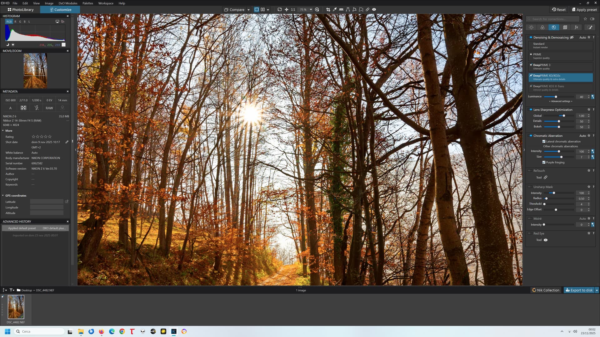
If I look with the loupe, there are no colour casts.
Joanna made a point about interpolation, but I have to say that although I understand the individual words, I am not ‘sufficiently qualified’ to understand the point she’s making.
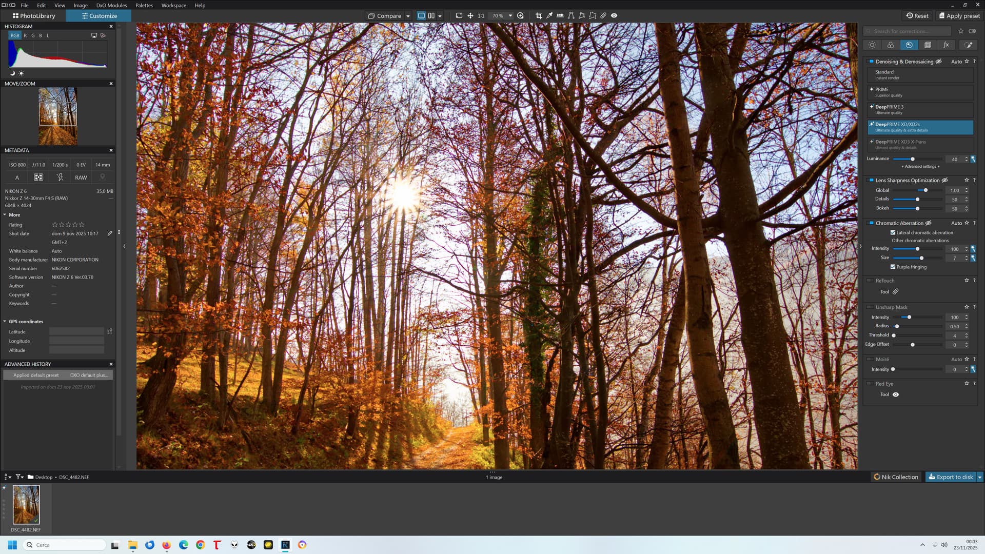
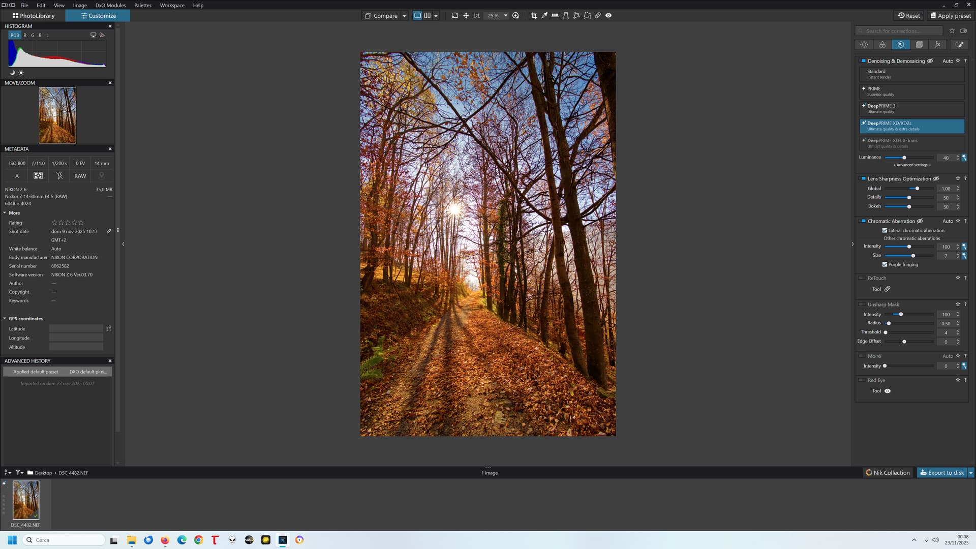
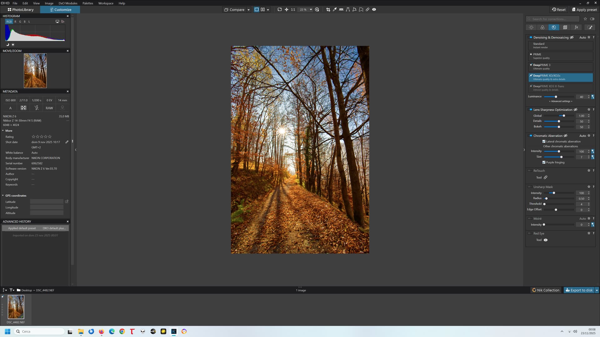
Different interpolation will surely affect perceived sharpness and detail, but no difference in interpolation can justify such a difference in colour balance:
PL8 75%:
PL8 70%:
I can no longer show the same example with PL9 since my trial period is expired and I don’t intend to pay for the upgrade until this is fixed, but the behaviour was the same (except that the threshold was 55% instead of 75%)
Hi Luca
I accept the logic of your suggestion. However, if this has been an issue with Photolab ‘for years’ then will my holding back from making the annual upgrade realistically going to make much of a difference?
Best wishes
Malcolm
It will make a difference only if many of us will stick to this “strategy” and keep opening support tickets mentioning “no upgrade until you fix it”.
In the meanwhile, it still is an excellent SW (IMHO the best, in what it is meant to do), apart from these “quirks”.
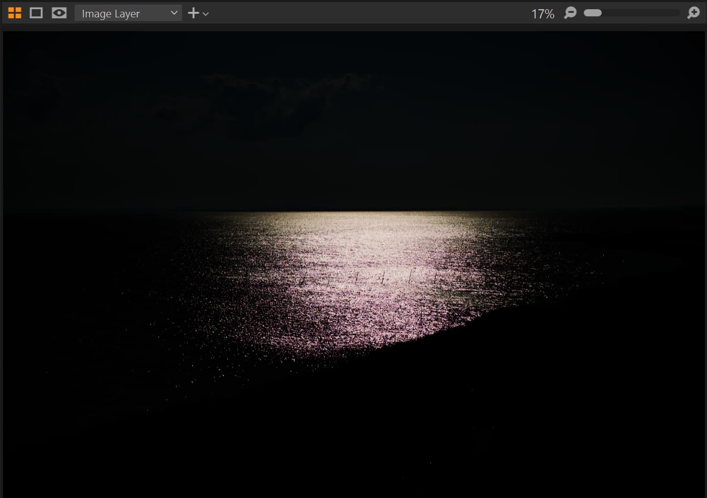
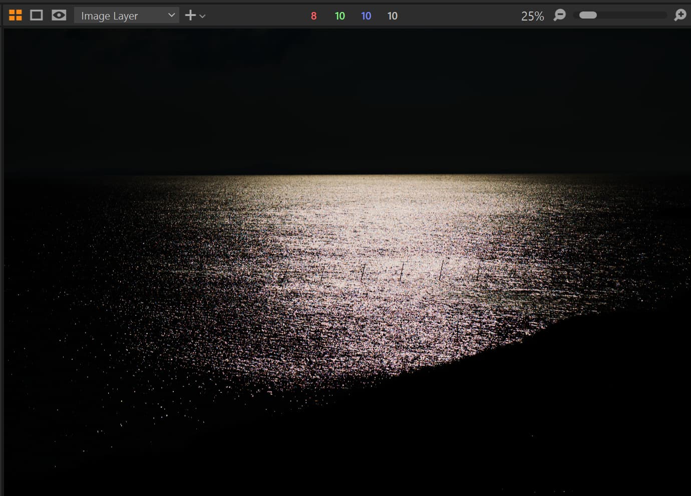
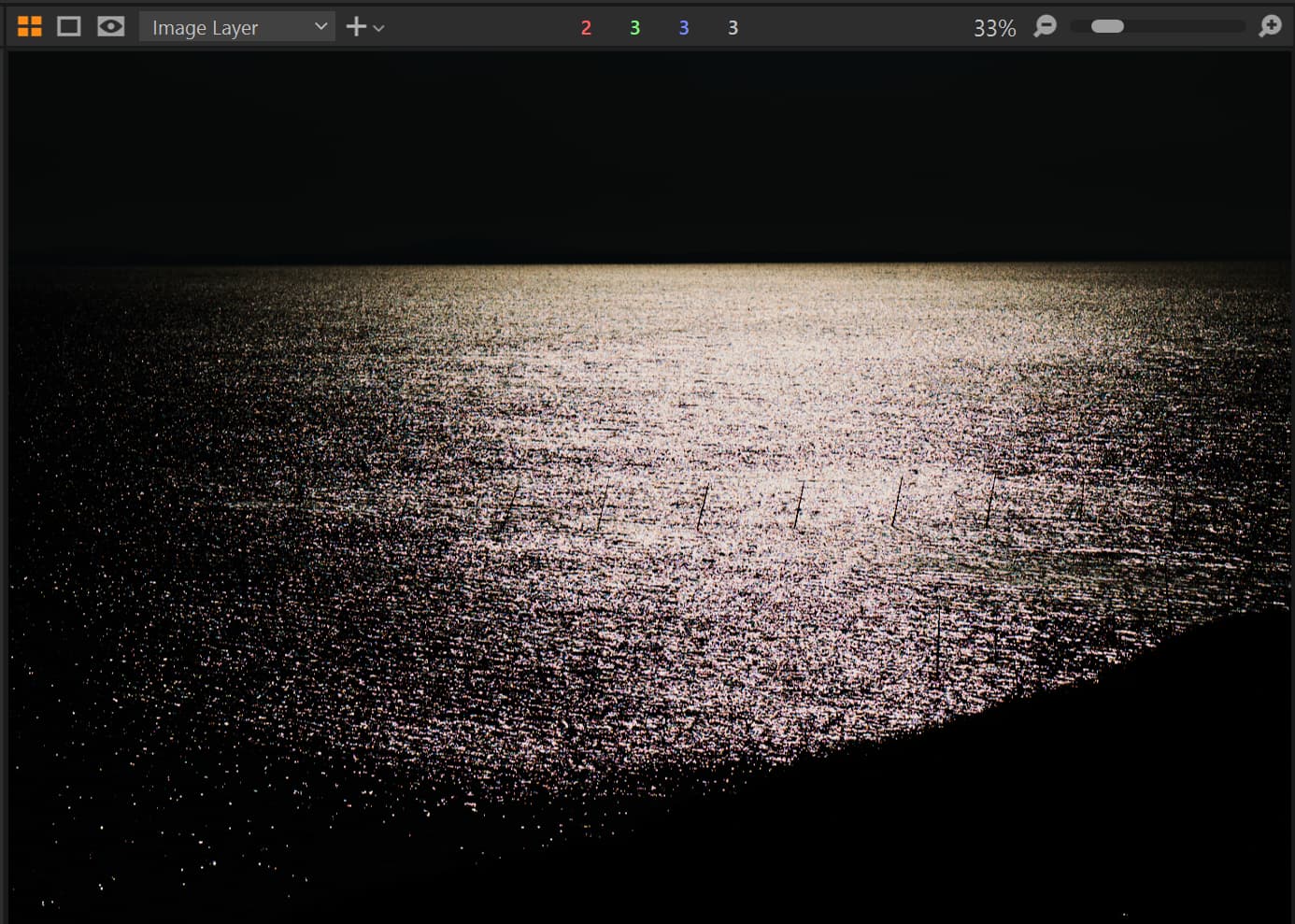
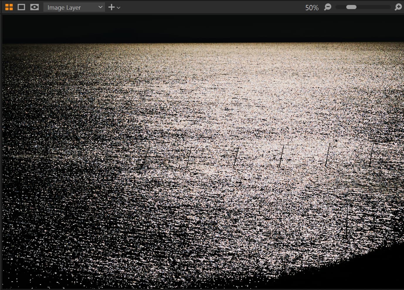
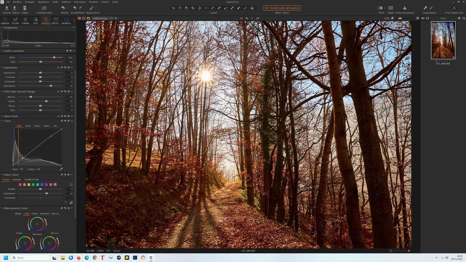
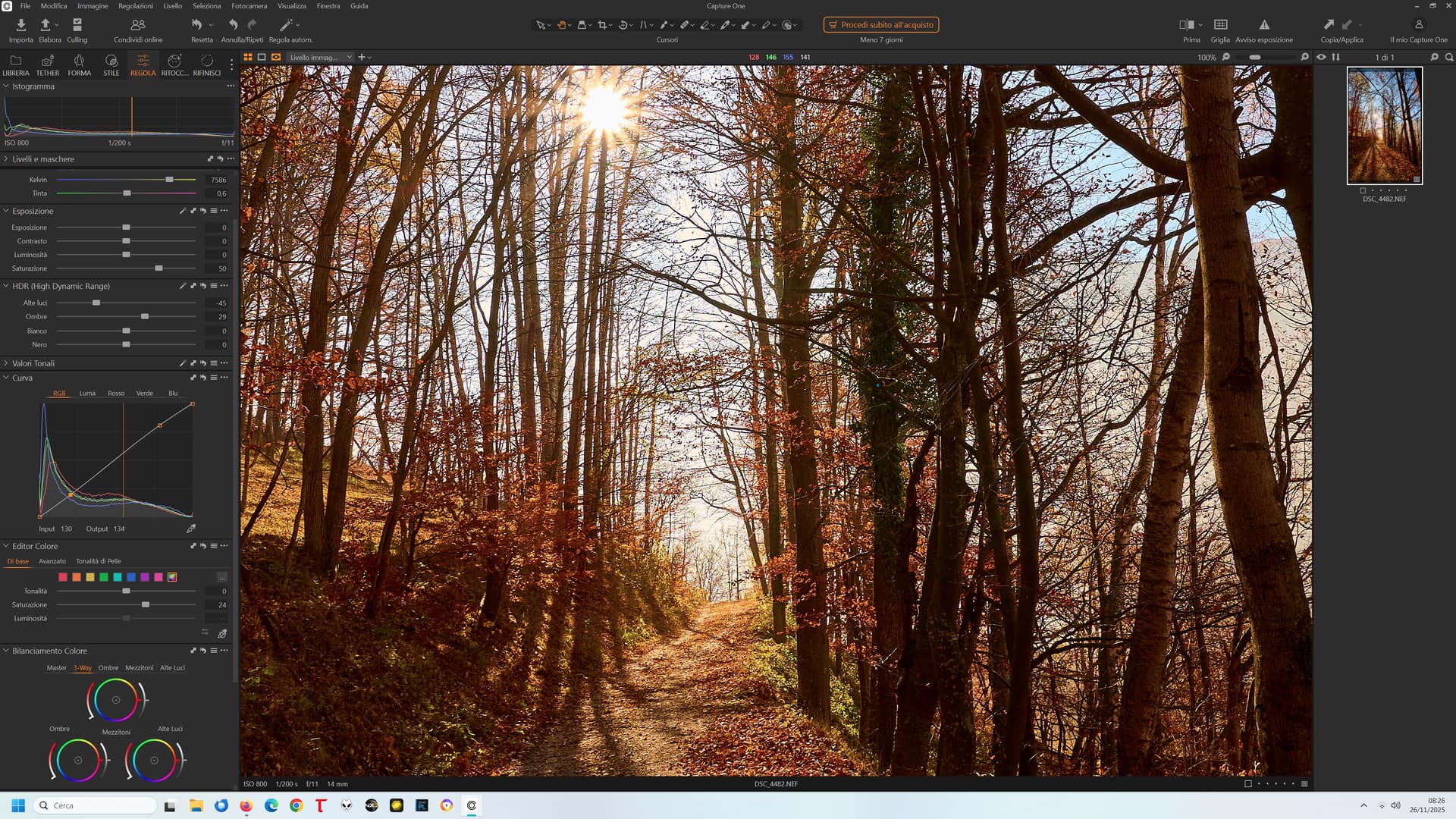
One more example, this time from Capture One 16.7.1, at 17%, 25%, 33%, 50% zoom levels. To make the effect more pronounced, exposure correction was set to -3 but the difference is seen also under “standard” editing corrections. Sun reflections were blown out in RAW, 0.6% in R and B and 1.6% in G1 and G2 channels. Colors become “true” only at zoom level 50% or larger.
17%:
25%:
33%:
50%:
Interesting! When I had tried Capture One a couple of years ago, I hadn’t noticed pronounced color shifts in my images. At least, not as noticeable as in PL.
(I didn’t like Capture One’s interface and workflow, but that’s another story)
Neither did I, with sane DR range and “correct” exposure. However, when some raw data is blown-out, like sunlight reflections in this case, similar artifacts can appear on the boundaries of blown-out spots with (most?) rescaling algorithms.
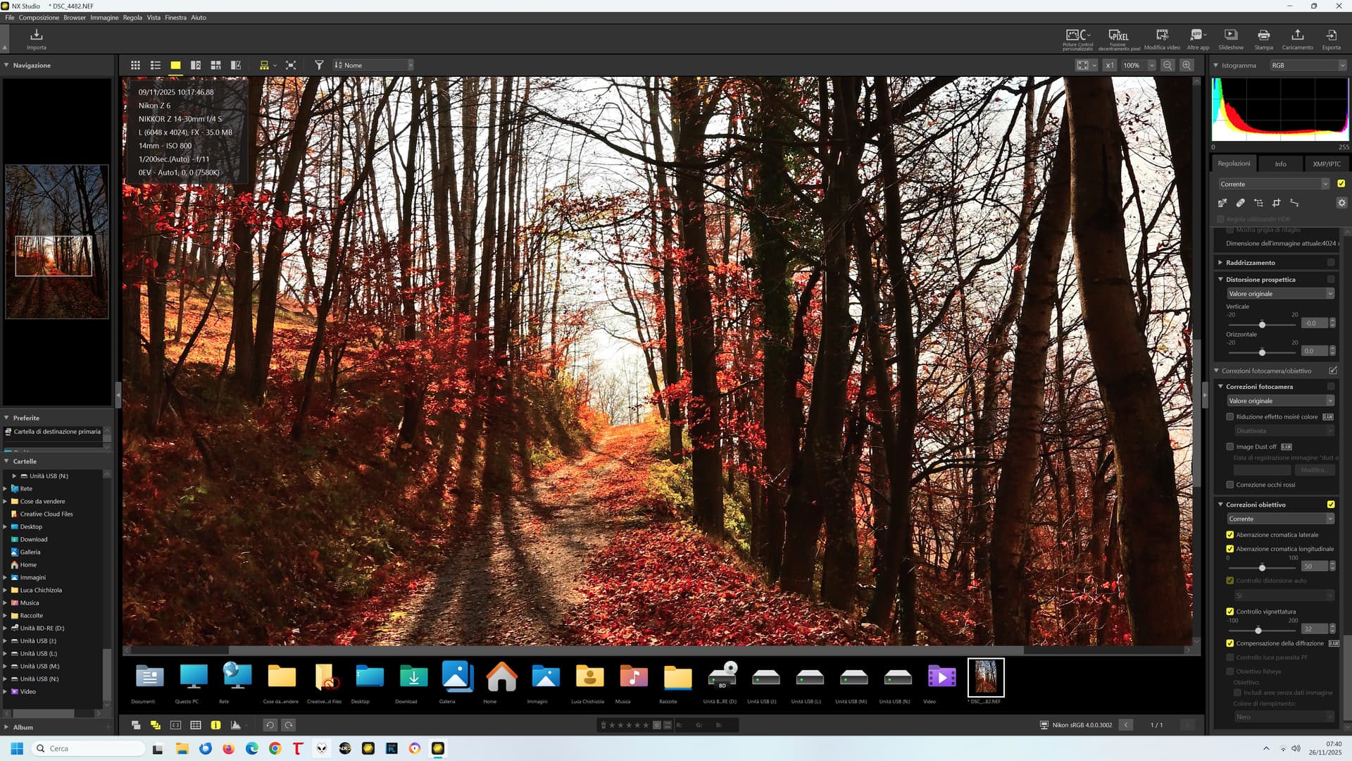
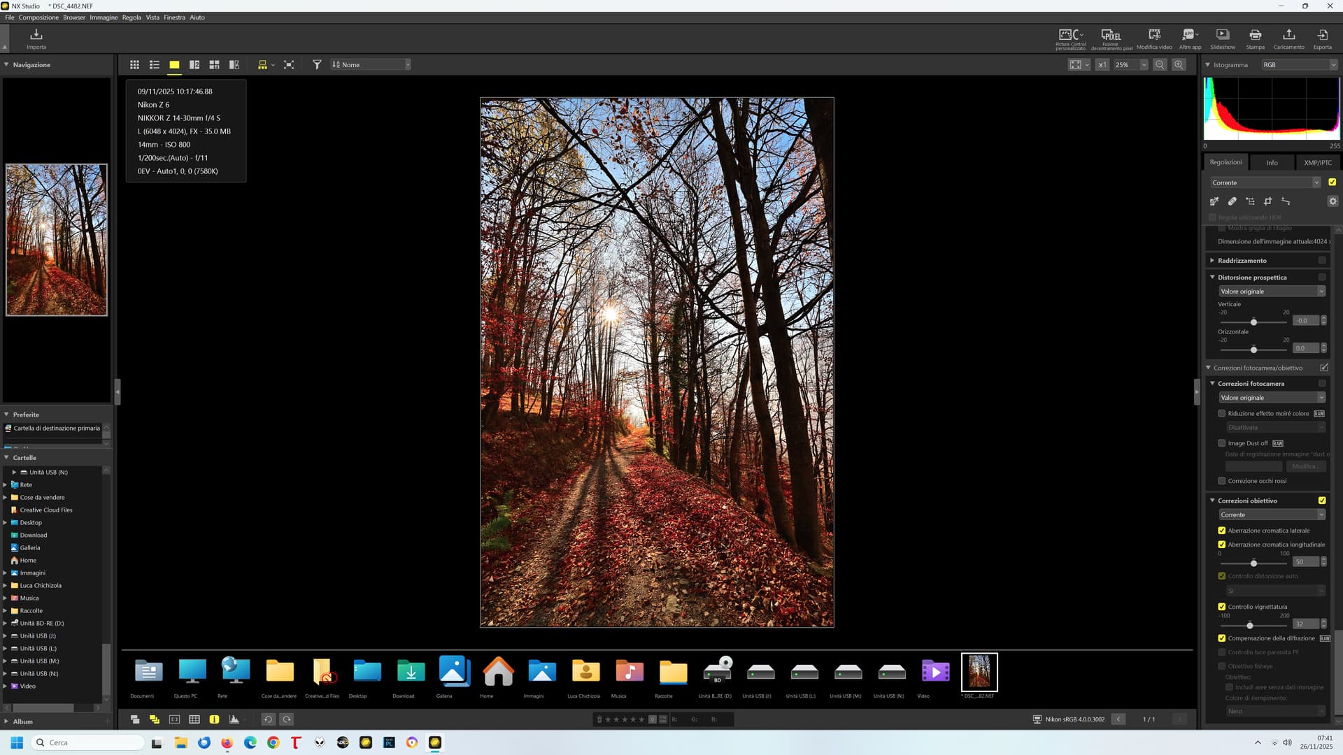
On the other hand… the humble NX Studio:
100%:
50%:
25%:
No significant differences at any zoom level.
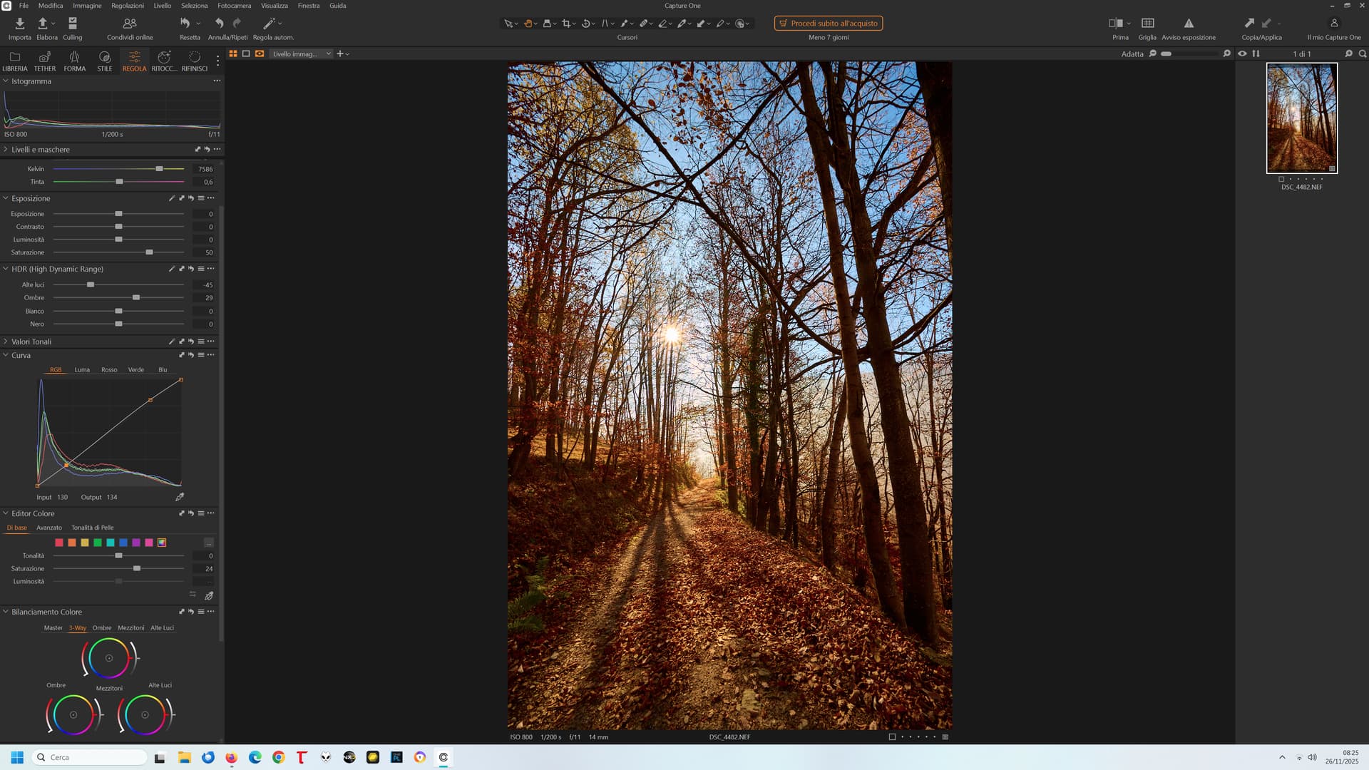
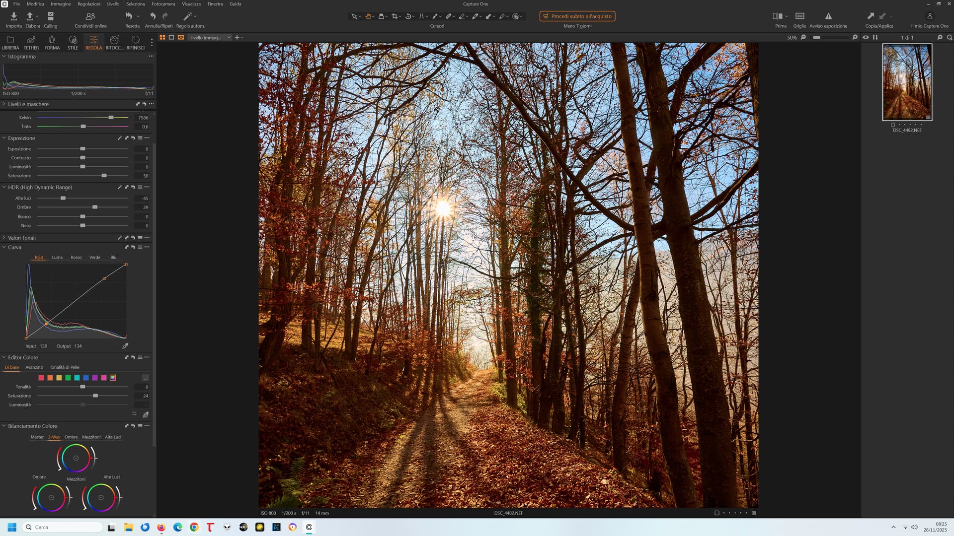
I re-downloaded the latest version of Capture One:
33%:
50%:
67%:
100%:
No big differences across zoom levels!
So, in the end:
NX Studio: the worst speed performance of the three (very sluggish), good ease of use, the worst colours (to my taste), but no issues with zoom levels
Capture One: best performance, good ease of use, very nice colours (to my taste), good flexibility and options, and (almost) no issues with zoom levels
PL: good performance, great ease of use, the best colours (to my taste) and best flexibility (many options to play with, again the best), atrocious issues with zoom levels
PL really comes out as the worst in preview fidelity at some zoom levels.
Not the only place that PL stumbles on colour. With the Legacy colour space, PL8.5 (which is months ago now) broke the rendering in the Customize filmstrip and PhotoLibrary, both on Mac and Windows. It was finally fixed on Mac in 8.10 and 9.2 (I think it was), but it’s still broken on WIndows. They seem to have made an attempt, but the rendering went from oversaturated up to 8.9 to undersaturated in 8.10. ![]()
I can confirm that, colors in NX Studio 1.10.0 are very stable at any zoom level for the same example I’ve posted (except for the pinky thumbnail, but I don’t care about it).
I would add “which happen for certain types of photos, e.g. shot against strong light sources or with some spots blown-out in RAW”. Landscape photographers in particular should take care. For event photography the problem is rarely seen (at least in my case).
Absolutely. The issue is almost not noticeable with sports photos (and I take a lot of them) except for a minor change in perceived saturation, but very noticeable in the majority of landscape and nature photos especially with fine detail and high contrast (and alas, I take a lot of them too). Not only “against strong light sources”, but also simply when there is fine detail with bold colours (like small red flowers against green leaves or grass).
Ironically, color accuracy is particularly important for landscape and nature photos! More than for PJ work or reportage!
Just FYI regarding PL 9 ( didn’t you mention that your trial version has expired? ).
With some landscape photos of this type, PL 9 displays seemingly random colors depending on the zoom level (tested at 25%, 28%, 33%, and 50%). However, color reproduction was stable from 51% onwards.
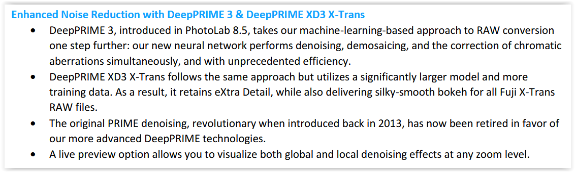
But after activating DeepPrime 3, the same file no longer showed this chaos at 50% and below!
In this context, the following statement in the readme file is interesting …
It’s possible that DeepPrime 3 corrected some colors that were ‘detected’ as chromatic aberrations at any zoom level. – However, I do not have suitable images to verify whether this correction maintains the color reproduction you desire.
@Wolfgang, I don’t think DP3 is relevant in this case.
DP3 does better job indeed for CA and some specific moire corrections. However, the OP problem is not about CA (you can’t get visible CA problems in the image center, or am I wrong?). In case of blown-out spots in all RAW channels, where on their boundaries you have only G1/G2 blown-out, you can get in previews pink/magenta artifacts after WB correction, whether you use DP3, XD2s, or none (G1/G2-channels being usually most dominating). Somehow PL gets rid of those in exports or +51% previews (probably like C1, didn’t check). The raw file I’ve used in the example above was for Capture One (just to cool down those who think C1 has perfect preview colors), but quite similar artifacts appear with PL, regardless of NR used. On the other hand, NX Studio previews looked the same at all zoom levels, although the thumbnails were also “pinky”. My example was shot with Z8 (45mpx), ISO64, with preview captured on 4K monitor, btw.
To summarize my opinion, the problem may happen with photos having some small details blown-out in raw. I’m not an expert, so maybe someone with deep knowledge of CFA, sensor, demosaicking, and rescaling algorithms can explain it in more scientific terms. The interesting thing here, is that in some similar cases you may also get greenish casts in addition to magenta. Anyway, full resolution exports don’t show these artifacts.
I had tried it when my trial version was active, and it’s not as simple as that: I had shown an example in which, with DP3 active, the magenta shift was not present at any zoom level… but a greenish one was (between 25 and 50%)!
Enabling DP3 in previews only changed the colour of the artifacts…
Think to have found them and further down.
@Wlodek also mentioned …
… In case of blown-out spots in all RAW channels, where on their boundaries you have only G1/G2 blown-out, you can get in previews pink/magenta artifacts after WB correction, …
Re-visited some images with RawDigger and could see where the various channels were clipped due to exceeding the (available) dynamic range. I’m wondering if this is responsible for unexpected color casts.