Assuming you have calibrated your screen, I don’t have much of a problem viewing your images here. They don’t look too dark.
However, to my eye, they do look a bit “dull” or “flat” so I’ve taken your images and reworked them slightly, not because of any screen difference but because I wanted to show you some different ways of editing them to give them a bit more life. Of course you may not want that effect so feel free to disregard the overall appearance but take a look at how I achieved it in case it comes in useful.
If I were you I would create a new folder and copy the files plus my .dops, so that you don’t confuse PhotoLab’s database by conflicting different .dops.
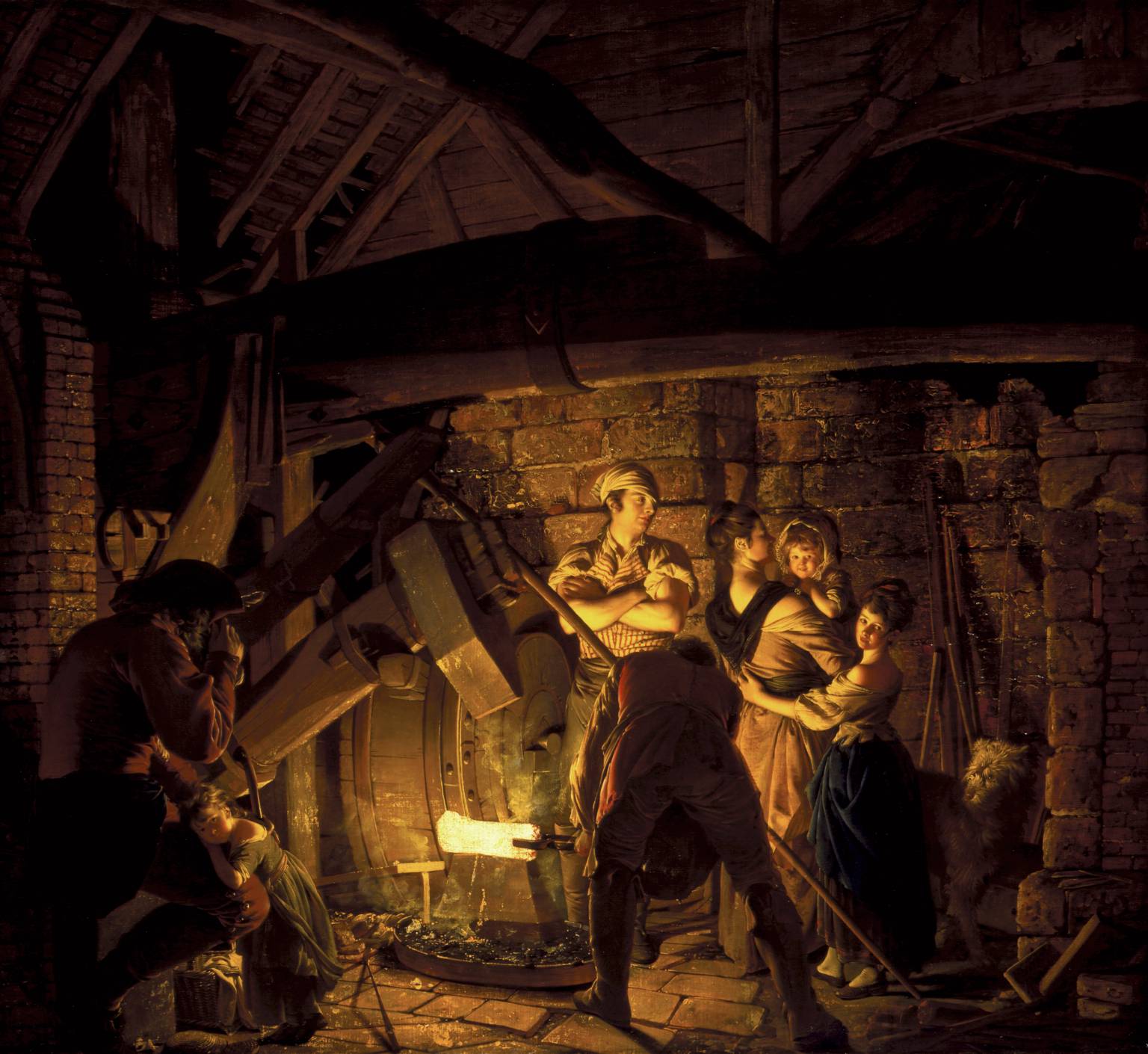
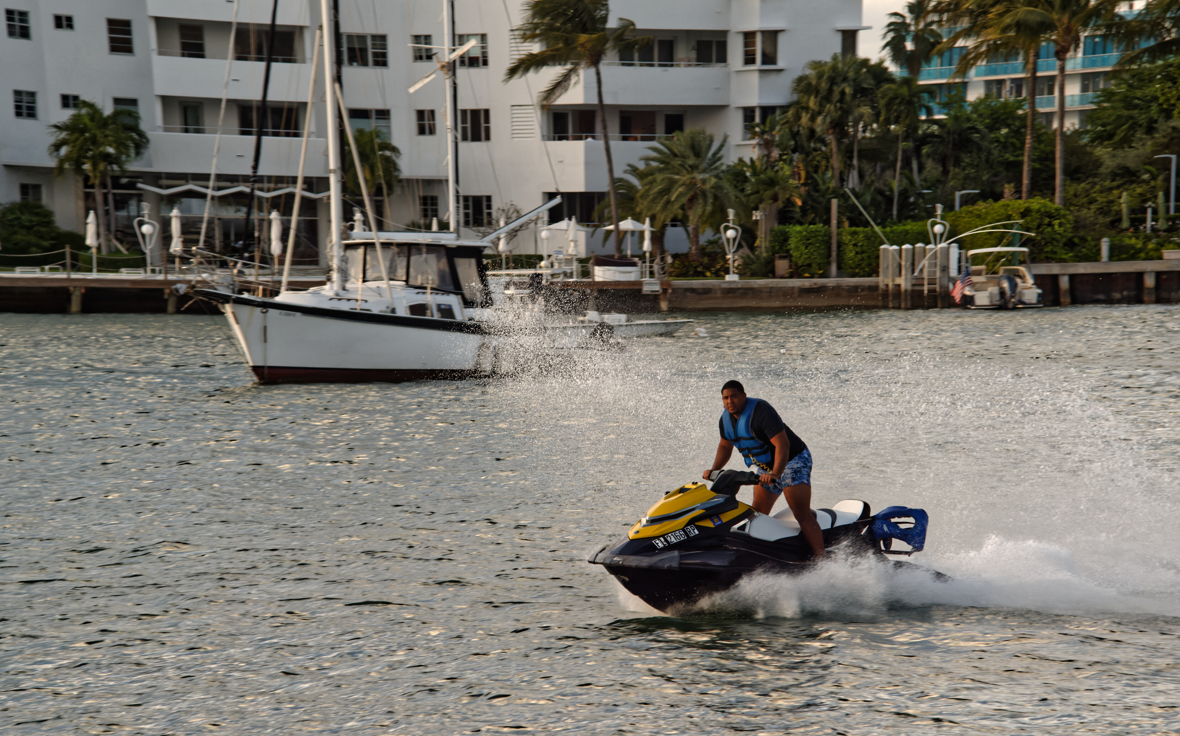
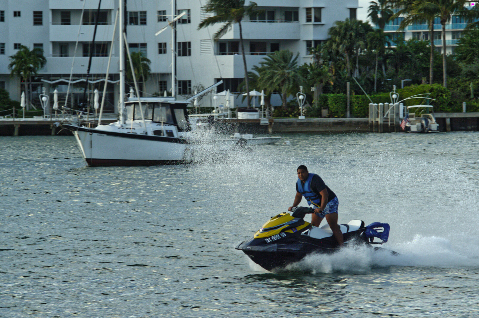
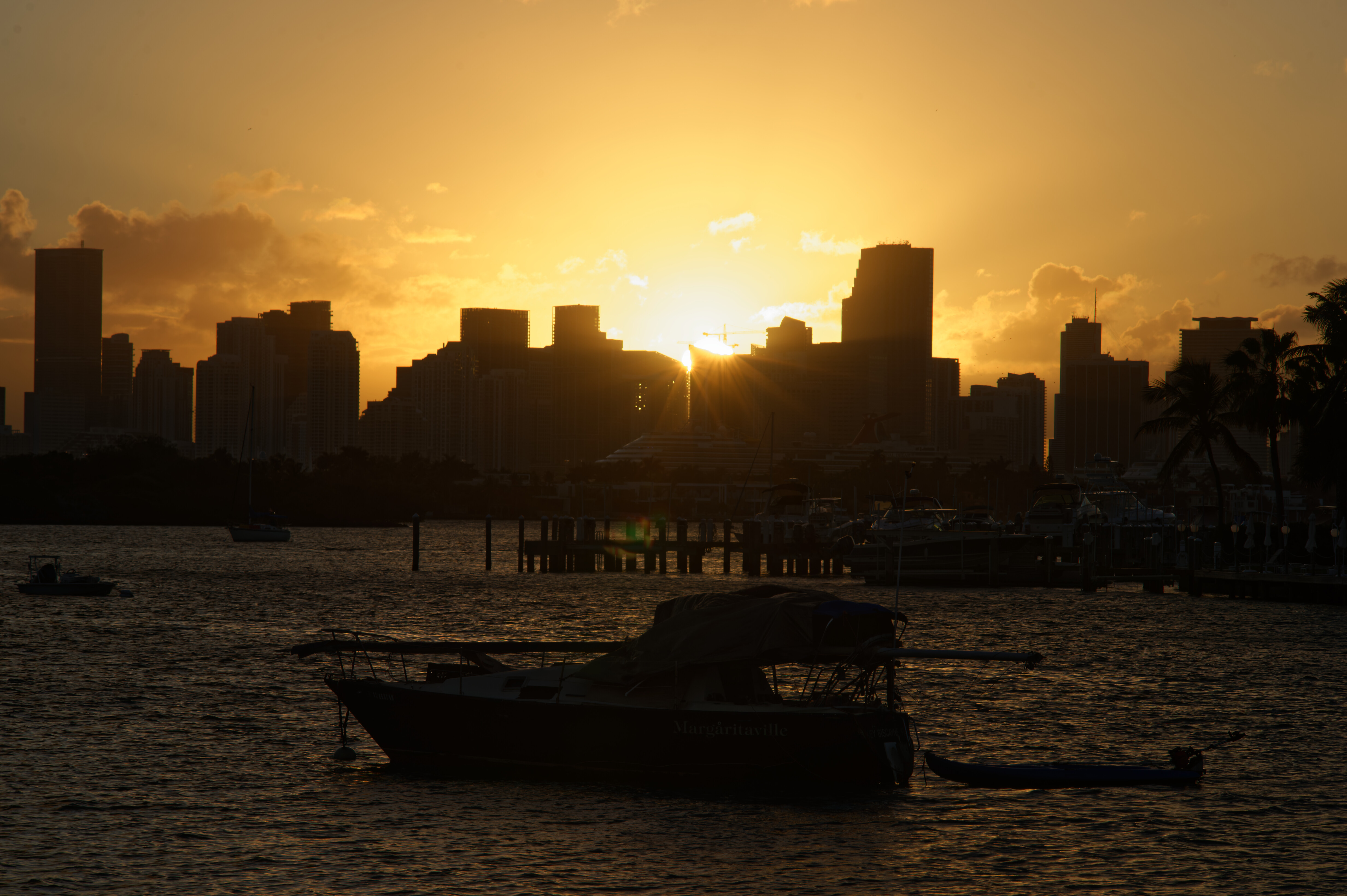
Here is a jpeg export of my version
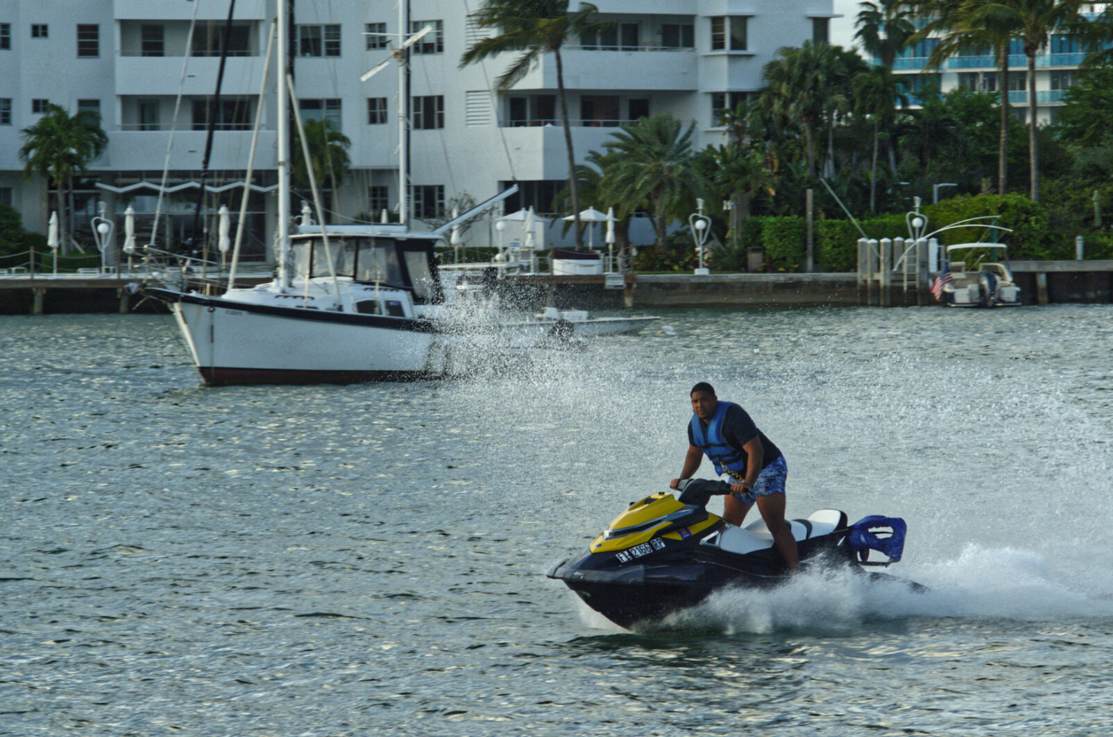
And here is the .dop file, which contains both your and my versions.
_MJM2242 | 2020-12-29-Biscayne, boats.nef.dop (40,9 Ko)
With this shot, I noticed that unedited, it looked too dark and that you had added 1 stop of extra exposure to compensate for under-exposure in the camera.
With my version, I haven’t added any exposure compensation! Instead, I started, once again, by using the Spot mode smart lighting tool (medium intensity) to establish the darkest and lightest areas that I wanted to have detail…
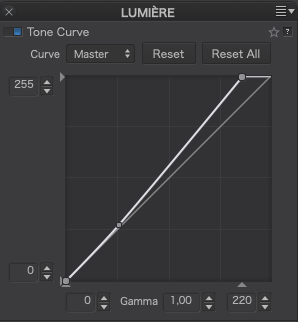
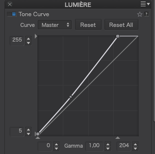
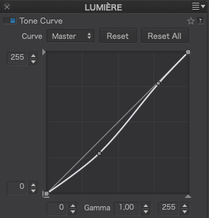
Then I modified the Tone curve to better “fill” the histogram, placing the brightest point as near to the right as I could without provoking the over-exposure warning
This then gave…
Rather than being brighter (by adding exposure) but still flat, this technique has brightened it by adding contrast.
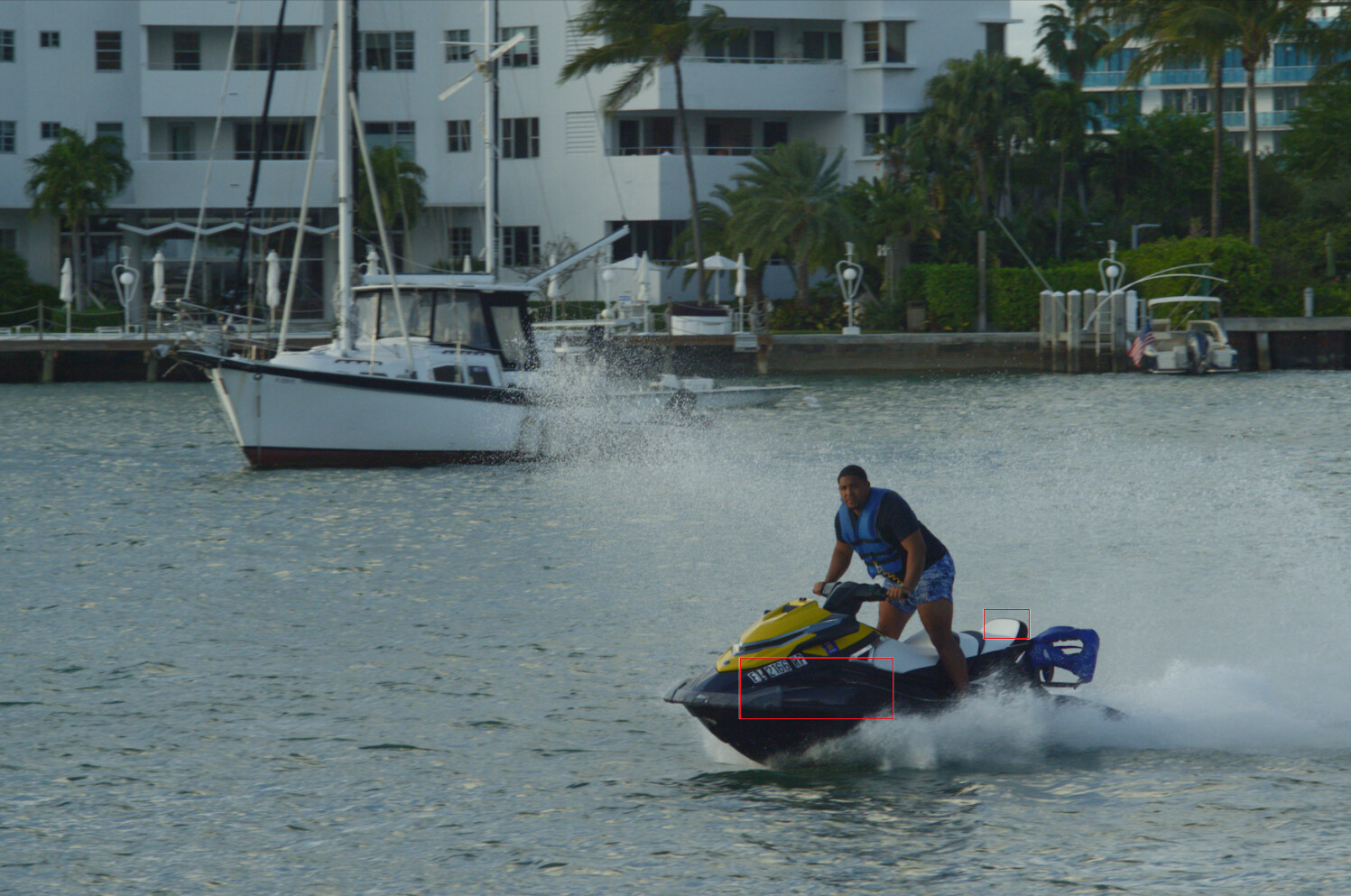
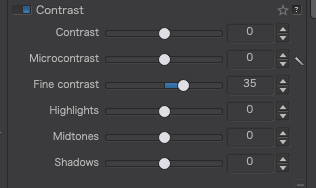
Instead of using ClearView Plus to add detail, I tend to use the Advanced Contrast palette…
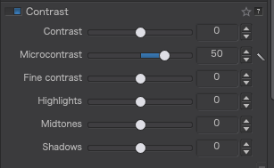
This allows me to choose the type of detail and whether it affects the whole image or focuses on the highlights, mid-tones and/or shadows.
It doesn’t seem to make much difference in this screenshot but on the full-sized image it is as detailed as using ClearView Plus, but subtler.
Finally, I set the white balance to the same as you have it, to give the finished result you see in the first jpeg of this post.
By the way, for some reason, the distortion correction palette was activated and set to Barrel/100. To start with, this didn’t appear to be altering the image from no correction but, when I deactivated and re-activated it, it did show up as pincushion distortion. This seems like a minor bug in PL but you just need to be aware of it in case it does alter one of your images.
If you click on the image in the post, it will fill the browser window with a dark grey background 


 ) and ticked off all the items. In the meantime I bought a new Eizo EV2456 (sRGB) calibrate it and the 2 monitors looks very similar in greytones and colors.