Do you know something? In all the years of posting images on forums and galleries, nobody has ever said that my images are too bright. When I first calibrated my screen (years ago) I thought it was way too dull, but then I got used to it and now think the “average” screen is blindingly bright.
This is difficult to achieve because you can’t swap brightness like you can a screen profile. You would need to get out the device and re-measure the screen every time.
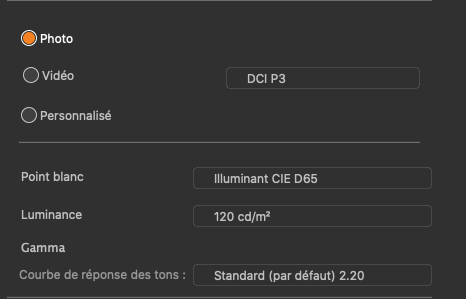
The numbers you see are not instructions, they are simply their idea of what constitutes their Photo preset. It is not necessarily what is best for everybody.
My setup is…
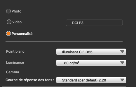
80 of course ![]()
![]()
But seriously, I think that your use of two different luminance levels on your screens is causing visual confusion. If you set both screens to the same luminance level, you will lose any idea of too dark or too bright.
When I use my camera on a bright sunny day, I need to raise the brightness of the screen on the back in order to simply see anything at all. But then I need to remember to reset it to 0 for most of the time. I would never dream of judging the brightness of an image by what I see on the back of the camera; I just use it to confirm the framing and composition. Because I know that what I am seeing is a jpeg rendering, I therefore know that it is a waste of time judging exposure, which, because I have metered the scene to be within limits, is going to be correct enough to give me the opportunity to adjust in PhotoLab.
However, when I am editing my images at home, I know that it is useless trying to adjust the screen to compensate for too much light and so I adjust my environment to allow me to see the calibrated screen properly. As I said in an earlier reply, even having bright objects within eyeshot whilst editing will give you a false sense of how bright things should be on the screen.
Nice ![]()
Even better ![]()
Mark, what luminance is your screen set to?
With most full range images, the first thing I edit is the Smart Lighting and I tend to use the Spot Measure mode. here’s a screen shot of where I placed the measuring zones (highlighted in red)
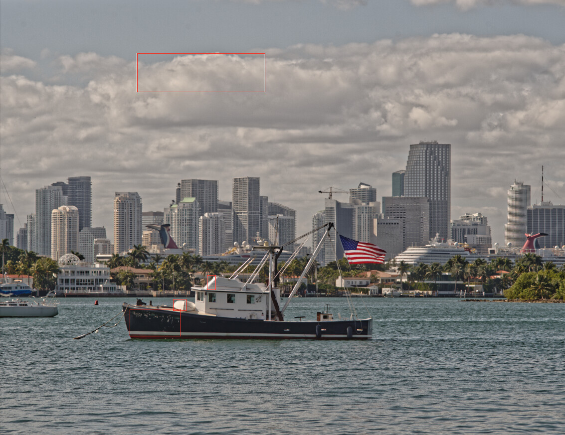
Note that I include a zone for the brightest and darkest areas where I want discernible detail. In this case, that the skirt on the bridge and the font-side of the hull.
Not necessarily - as long as you know how to master the light ![]()
There’s an old saying - you can please some of the people all of the time, you can please all of the people some of the time but you can rarely please all of the people all of the time ![]()
In summary, from my point of view, adjust your editing environment to avoid bright light rather than messing around with two monitors of disparate brightness ![]()
If you really insist on increasing the luminance, perhaps try 100?