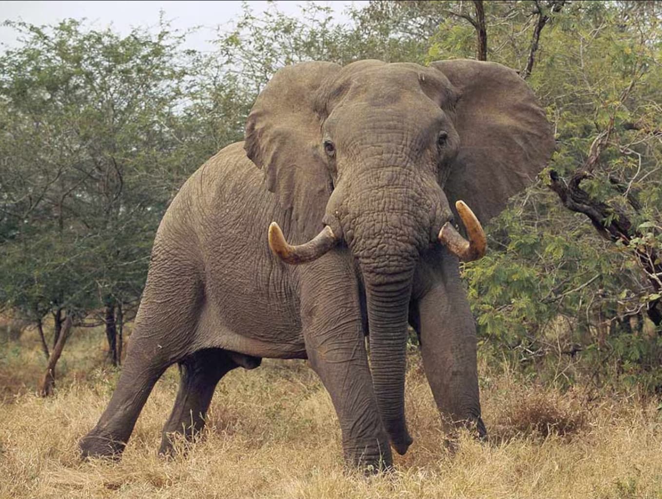
I, for one, prefer the first image, but I’d prefer it even more if you used some of the PhotoLab tools to make it more appealing.
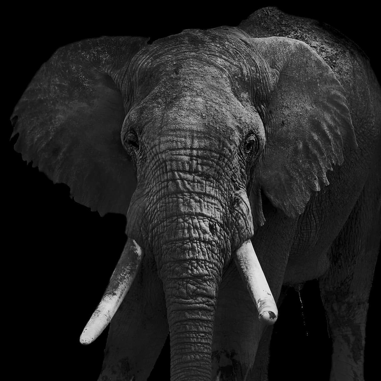
The second version looks like an interesting bit of “artwork”, but nobody looking at it will feel the relationship to a real elephant as they will with your first image. I know you know (and Joanna knows) how to make that first version more appealing, simply by changing the settings.
Of course, this is mostly personal preferences, along with your goals. My ideal photo would be something like what is printed by the National Geographic Magazine. But I would prefer the whole elephant, without a plant growing out of its head.
When I do take photos of elephants in India, I get the whole elephant, and it’s surroundings, and if I wait long enough and follow it, I get photos of the elephant interacting with its surroundings. But that’s just my own personal preference, not suggesting others do the same thing.
As you point out it is about preferences and I certainly will not argue with you regarding yours. However, I guess I’m a nobody looking at it who feels a much more emotional reaction and a much stronger relationship to his fine art rendition with the distracting background removed.
From my perspective, for any photograph to be truly successful it needs to grab me and pull me in.
The first image is just another nice image of an elephant in the wild, (or semi wild), one of thousands, and not particularly interesting or different in itself. It can be made to look better using various tools in PhotoLab, but in the end it is still the same image which doesn’t distinguish itself from so many other similar ones.
However, the second version is much more striking, and highlights the important elements of fine art photography for me, including line, shape, texture, contrast, light and shadow.
In the end, I think the first image is nice but is not particularly inspired, while the second version is very nicely rendered and much more involving than the original.
We see things differently and knowing your very objective view of the world, I don’t expect that you will agree with me.
Not that I know how to do it, or will ever get the opportunity to do so, but to me, this National Geographic image is as good as it gets.
The emotion, the realism, the adrenaline, and everything else are off the chart.
The other two images don’t do anything for me, or to me. They’re just snapshots to me. I can understand that as “art”, things are different, and the fact that I don’t get it means I’m lacking in things that others understand and feel. There’s also “GiGo”.
I do “get” Joanna’s art images usually, so I’ve got some of the right brain cells in my head, but not enough of them. You guys are lucky - I’ve got something similar to being “color blind” where I don’t see/get things that others do. Not much I can do about it, except try my best anyway.
It is a very nice photo but due to publication standards it is probably entirely or almost entirely straight out of the camera. The issue I have with this image is if the goal is for it to represent “reality”, the flat colors tones and lack of contrast makes it look like a SOOC jpeg rather than a live elephant. There is very little emotion or adrenaline for me. just a nice photo of a standing elephant.
Mark
… boring documentary photo, with far too much background to distract from the principal subject. And there is no focus differential to separate the elephant out.
Possibly for your photo-journalistic taste but did you look at the other images in the same series? To me, they were neither good documentary nor art.
@Stenis it’s not perfect but I really like what you were trying to do with your rendering.
@mikemyers this is what I call a stunning wildlife photo, by my good friend Hervé Joly…
Photography is who I am, through what it expresses. See beyond your everyday vision. Take your time and live the present moment as a precious gift that must be protected and respected.
My highlighting of the most important aspect to photography.
Technically speaking, I guess I understand your thoughts, but I’m surprised you can’t “see” what I see, even if it’s not your favorite kind of photography.
I suppose you would have asked the elephant to move a little, but that movement might be to end your life. More seriously though, the background is what was there.
I doubt I could ever have taken this photo, as to me, the elephant, looking right at me, might decide at any moment to kill me.
I’ll agree with you that had it been possible to get the elephant to pose, a photo more to your satisfaction could have been captured, but even though you and I can’t agree on “reality”, the things you mention are irrelevant to me. Have you ever been on a safari? If so, can you please post a few of your photos?
I think you are right - the only editing was probably limited to cropping. The National Geographic insists on a lot of standards, to the best of their ability. I’m pretty sure that the flat colors and lack of contrast are due to that’s what was there - no editing allowed. I doubt it was a jpeg image though - anyone good enough to capture this image, for the National Geographic, was far more likely to be shooting in RAW - I know there is a page somewhere of what restrictions that magazine has for submitted images. I’ll try to find it again.
I prefer your version. Cropping, and many small adjustments. I can see many differences, but I don’t have the right words to describe them. You “smoothed” the elephant’s skin in a way that makes it more natural, along with the highlights that somehow look better. You did something to the eyes, too, but I don’t know the right words to describe the change. Your view is more enjoyable to look at. Being centered helps, and the more clear “left ear” and “right tusk” somehow balance themselves from the way you’ve cropped the image.
Gee, I am too ignorant - I don’t know how to put into words, what I feel.
Now that DxO has expressed an interest in what I’m still calling the “PhotoLab Cafe”, does anyone have any suggestions for me to pass on to the team at DxO ? I want to send them my reply no later than this coming Friday, June 14.
I tend to doubt that. Real life doesn’t look like that. Frankly, after additional thought, to my eyes it looks more like an unedited raw file which often have flat colors with low contrast and no sharpening. It is somewhat interessting but it is not a particularly exciting photo.
I can’t imagine what about it gets your adrenaline going, but if it does, be careful because @Joanna’s contribution of the wildebeest photo might send you into cardiac arrest.
The resource that was PhotoJoseph needs to be recreated, likely with new hosts/presenters.
User-curated/created training content is fine, but having a professional (2, 3, more?) who has the time and resources to create comprehensive on-topic material is an enabler for many users to find their own successes.
Revised version -
“I’m pretty sure that the flat colors and lack of contrast are due to what was captured by the camera.”
If I don’t do anything tricky, I mostly assume that my camera/lens/settings in RAW mode do a pretty good job of capturing what I was looking at.
If you have a better way to do this, I’m all ears.
I’m aware of most things that can distort the image into something very different from what the photographer will remember seeing - for example, an ultra-wide-angle lens, or a filter, or perhaps using infrared light, or selective composition to include or exclude important things. I think we all do things to create the composition we want to share. But deliberate deception, if discovered by the magazine (or whatever) would put an end to future work with that magazine. Their reputation is on the line.
Regardless of any of this, apparently to you, Mark, that photo looks deceptive, but to me it looks “real”. Maybe you, and I, and everyone else in this forum is getting too used to “edited photos”. I know I am. My RAW images usually need a bit of editing to look like what I remember seeing
…a lifetime ago, things were different. After developing my film, the shop handed me a stack of prints, which were supposed to be what “I saw”. Only after I set up my own darkroom, did my printed photos start to really look like what I photographed.
PhotoLab makes this easy.
For better or worse, it can make my photos look even better than what I remember.
That is a very personal statement - to me, that image is extremely exciting, the raw power of that elephant, and what it is likely to do next.
The main thing is not the photo - it’s your reaction to that photo, vs. my reaction. We each see the same photo, but apparently we have extremely different reactions to that photo.
No they don’t. A RAW file is a block of data read from the sensor that knows nothing about what you were looking at.
All RAW files have to be interpreted to transform them into a visible RGB image, which then needs adjusting to make it look like you want it to look like. There is no default interpretation, apart from the embedded JPEG, which the camera constructed according to the menu preferences you selected in camera. It is not a definitive rendering, just a suggestion.
Of course we are and so are you because you never get to see an unedited RAW file because it is not visible without interpretation, whether in camera or in post processing.
I completely agree with that. But as @Joanna, other posters, and I have pointed out, cameras, no matter how good, are still flawed devices which only are capable of rendering an approximation of reality that does not come close to what we actually see with our eyes. One of the advantages of using PhotoLab is its abilty to transcend camera limitations to get the image closer to what we actually saw.