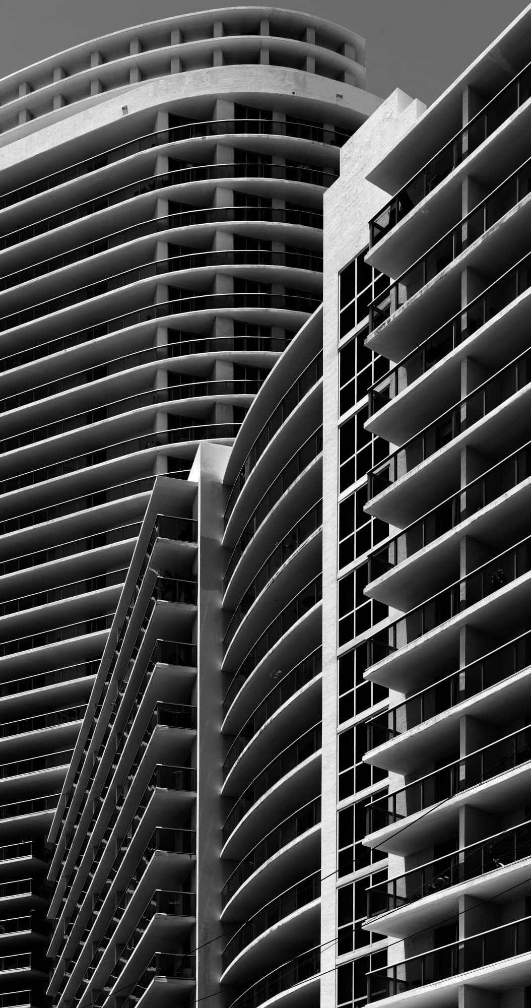
OK. After not having touched the editing on this image for nearly six years, in the light of comments about lack of clarity, I decided to pass it through Topaz…
Even better.
Fascinating photograph,
Very uniform - you planned this out very well.
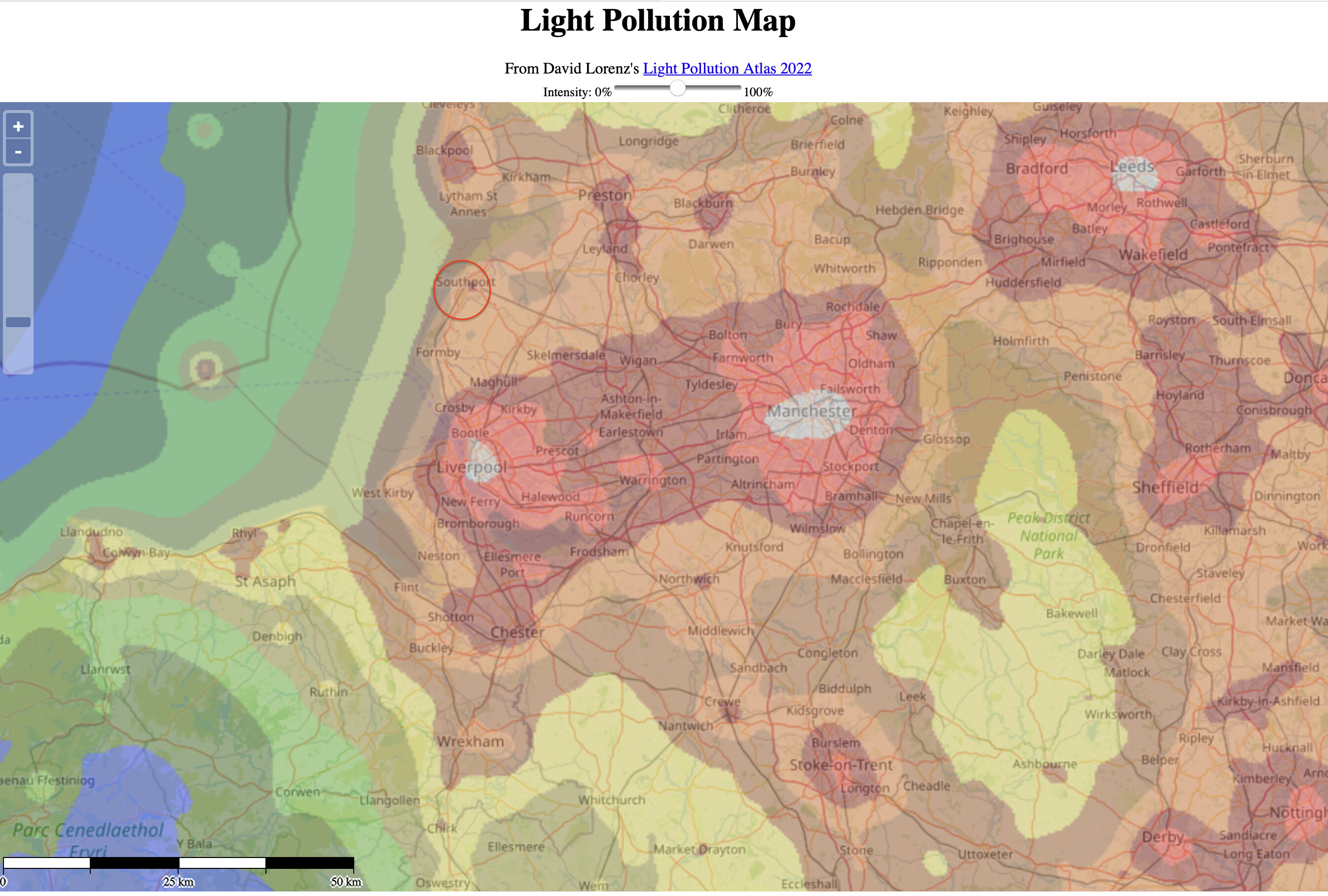
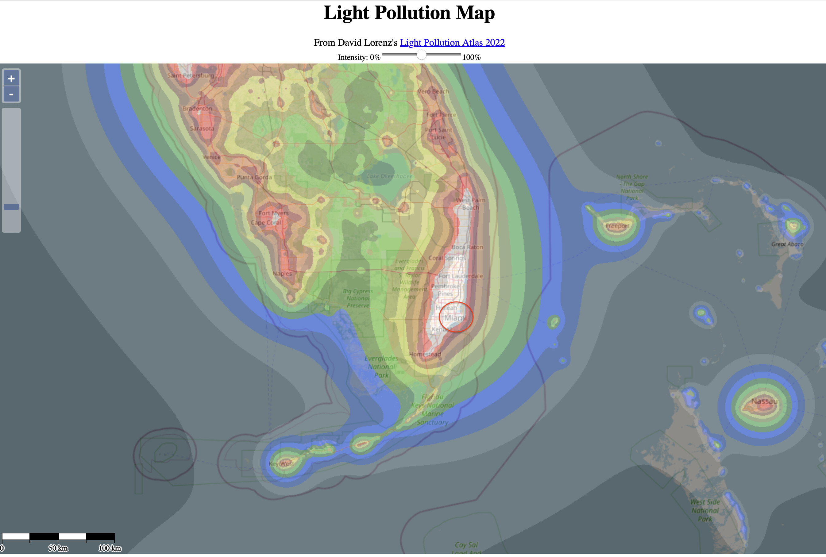
Nice that you had just a ‘black sky’ for a background. If I tried this, in Miami Beach, it’s probably too bright to get a similar effect.
Thank you very much.
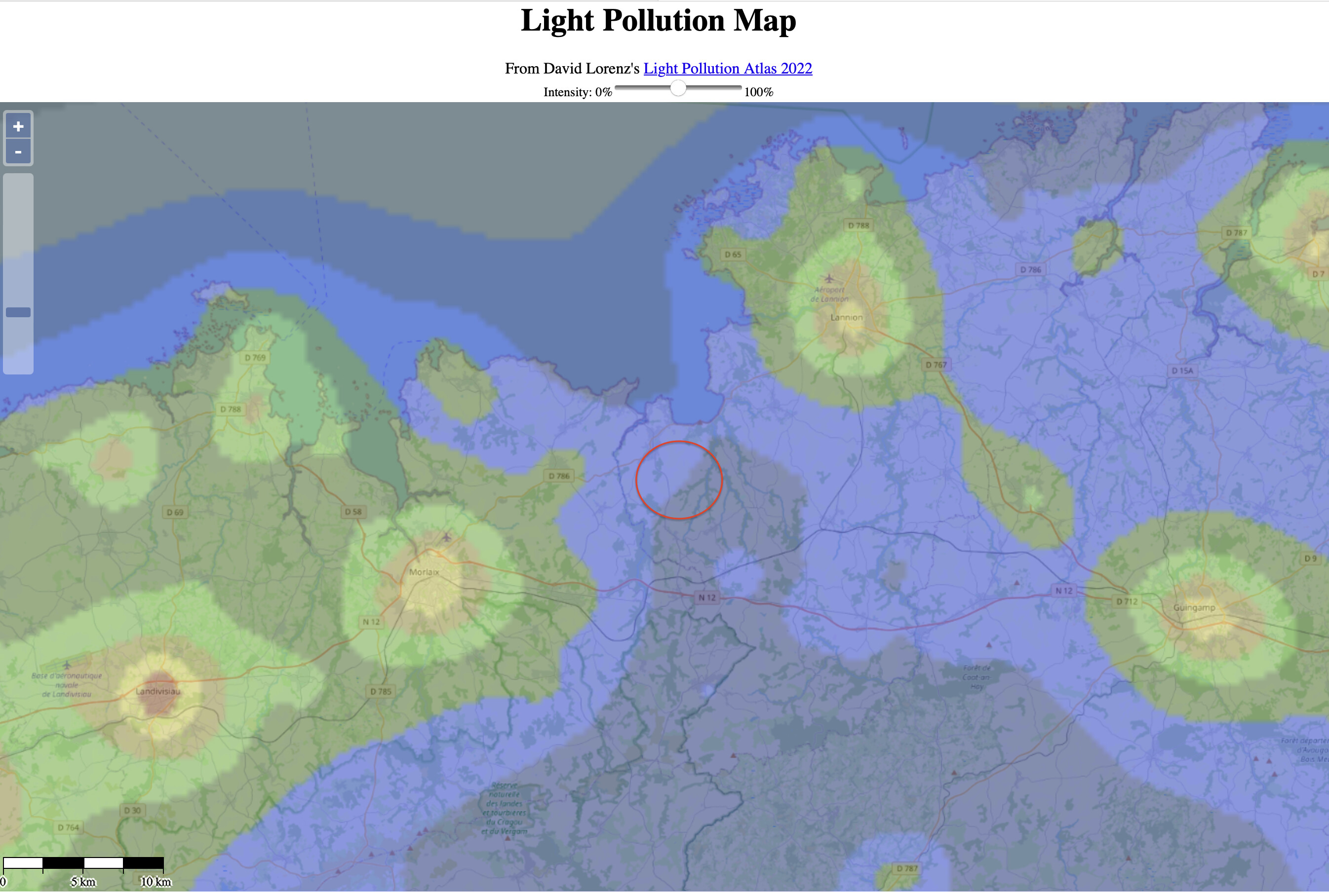
Where we used to live was about 25 miles to the north of Liverpool…
Where you live…
Where we live now…
Yes. But I have a feeling, if others hadn’t done the hard work first, they might not have bothered.
Sure, to add AI-support and even generative AI like in Photoshop now will get easier and easier as Microsoft and others are adding better and better support for that in Visual Sudio as just one example.
What I love about PL is the ability to do most work on the RAW image, without having to create an intermediate file like Adobe has to do
Agree to 100, TIFF is not fun at all and there is a lot of issues and obstacles around DNG too. I also prefer to be able to do it all in one place as far as that is possible. It is nothing to have when we sit with say 500 images from a session but I sometimes use Silver Efex Pro for B&W despite the intermediate TIFF.
Here is a video with what was new in Photoshop when these news were new about a month ago:
The text is translated from the Swedish site Fotosidan and an article written there by Calle Slättengren
" Adobe’s AI engine Firefly is getting more advanced in a beta version.
Adobe has updated its AI engine in Photoshop. Right now, most of the new features that arrived on Tuesday are in the beta stage, but a full version should be released later this year. The updated version is more advanced than the previous Generative Fill. Generative Expand and Generate Image. You get more options, it’s easier to affect images selectively. Even Enhance Detail should be more effective than before."

Still there is people saying that AI will not be able to replace humans because everyone of us is sooo… special and still there is people that are getting upset as photographers when old dear Photoshop turns into an artificial image generator forgetting that Photoshop never was a tool only for photographers.
As long as I remember Photoshop more have had a profile for producing pre press originals for printing too. Excuse me if I´m not using the right or accepted concepts here but I hope you will understand me despite of that. I think we will see a lot of “hybrid” or “composed” images from now where we will have no chance to distinguish between the parts that origins from photographs and the ones that are added by generative AI.
I wonder what the more nihilistic guys in the parallell tread about “Intelligent Masking” will think of this development in Photoshop. I wonder if the nihilistic belief that nothing in the world has a real existence will be able to apply on the tools and the products of these tools in Photoshop too. For me this is very real now.
It is just some day since Elon Musk said something like “no one will have a job…”, well, we well see about that. His Tesla is in deep shit in Sweden and some other European countries too, when they in their complete arrogance think they can establish their labour market world order without meeting any resistance
I never got around to asking you which image is stronger, with, or without that beautiful curved top? Maybe I should strive to show both, equally as strong? I’ve always thought until now that the strongest photo shows only one “most important” thing in the image. Including the curved top means I can include the beautiful blue sky…
1 Like
I used what I’ve already learned, and forced the various tools to create what I visualized.
I was going to use Film Pack again, but I tried the built-in presets, and found one that did more than I intended - but with a black background, I think it’s effective. Not so much surrounded by white.
I thought I wanted to bring out the “texture”, and accomplished that, for better or worse. I’ll keep it.
I feel that this is what I wanted, but “on steroids”. I guess I do like this version the most, because the lower part of the image over-powers the top. Now the top is “icing on the cake”. ![]() I doubt I’d have even thought of this, but for Joanna’s earlier post about the beautiful rounded top. …and I wanted the slanted line at the top right to run into the corner.
I doubt I’d have even thought of this, but for Joanna’s earlier post about the beautiful rounded top. …and I wanted the slanted line at the top right to run into the corner.
780_5124 | 2024-05-23.nef (30.6 MB)
780_5124 | 2024-05-23.nef.dop (28.0 KB)
The larger I view it, the more I like it.
The almost (but not quite) vertical lines create a debate in my brain, as they try to look “wrong”, but they spring back to looking “correct”. They are very deliberately NOT perfectly vertical. The end result is a battle in my brain for what I think I am “seeing”.
Someone should explain this phenomenon better. I did it on purpose, but it was just an educated guess…
The horizontal balconies in the middle don’t have the same length. That’s for the vertical lines are equal but on a different distance. Different distance means different magnification.
George
I already posted the above set of original images, with no manipulation, and Joanna edited the image you’re referring to, 780-5124, and I manipulated it for my posted image a few hours ago.
I suspect the reason for what you are writing, is all the manipulation to get the desired end result. I have no way of going up to the various floors, and measuring the length, but I’m pretty sure they will all be the same. The goofy editing I did probably is what s making you think that, which is very understandable. But, the original image, without the manipulation, won’t get the end result I was after.
Download the original image, and feel free to edit it however you wish. Maybe you will find a better way, that I’m not yet aware of. I suspect I don’t correctly understand what you are writing though. It can also be because the original dimensions are not what you expect, but I’ve got no control over that. Unless the building was designed incorrectly, those balconies must have the same length, and I suspect they have the same vertical spacing (but obviously, I can’t prove it). Do you want me to take another photo, from a different angle?
How to remember what I want, when I’m under pressure…
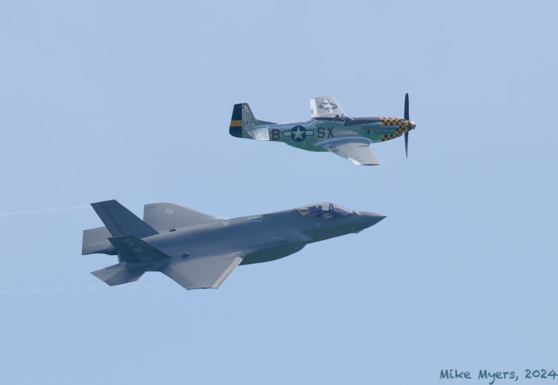
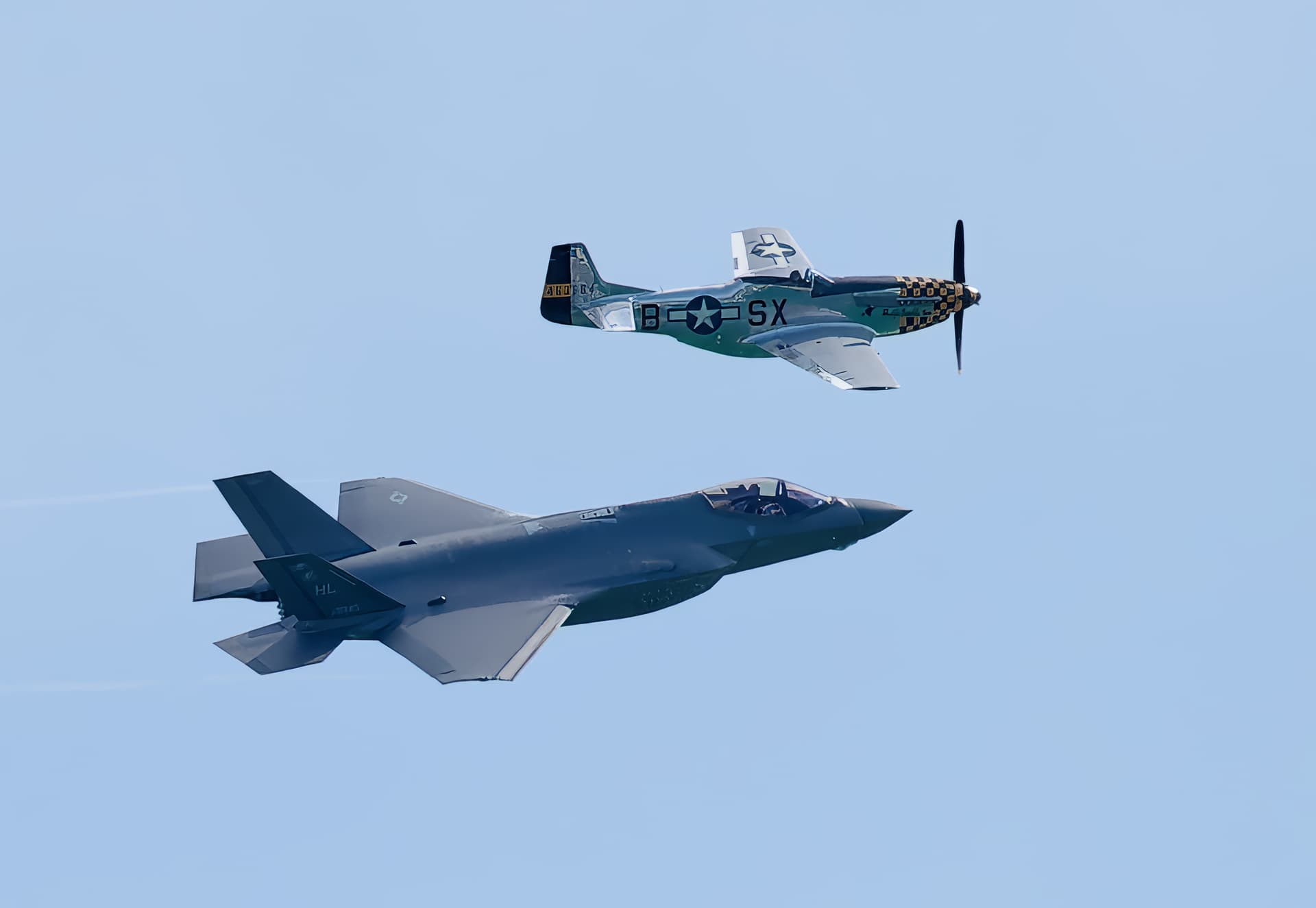
Today is Memorial Day in the USA, and in Miami Beach, where I live, various military planes have been putting on an exhibition over the beach, flying just under the speed of sound, and performing what I’ll call acrobatics. From my balcony, they were much too far away to even consider taking a photo.
Then two planes came out, side by side, a modern jet aircraft, and an old fashioned propeller aircraft from World War II. They were side by side, wingtip to wingtip, as they flew around. I grabbed my camera, with what I thought were reasonable settings, and got ready. They flew by me twice - and each time I captured photos. I didn’t care how high the ISO got, but I wanted well under 1/1000th to show the spinning propeller. The exposure needed adjusting, and I changed the shutter speed (mistake). All this time I was watching them, enjoying the show. If I had enough brains, I would have been watching my camera settings, but I was transfixed by this beautiful show right in front of me.
Show ended, they flew off, and I headed for my computer. The D780 had been in high-speed-burst mode (I learned from that too, as it filled up my buffer too quickly!!!), but I was pleased that I got two images I liked. At the moment. Turns out the camera was using 1/3000th of a second, freezing the frozen propeller blade, but with no sense of “blur”. One photo looked much too sharp, and my favorite was fine, except I failed in my goal of wanting a blurred propeller blade.
I need to learn to concentrate on my CAMERA, and not on the SUBJECT. I thoroughly enjoyed watching the planes, but I didn’t accomplish my goal. Oh well, there is always next year.
780_5186 | 2024-05-25.nef (28.2 MB)
780_5186 | 2024-05-25.nef.dop (13.8 KB)
I’m also telling myself that this is yet another reason to buy a longer lens, and 400mm is not enough. I think I need 600mm minimum.
Anyway, you can all have another laugh at me, for failing to do the one thing on the top of my list, blur the propeller. I also wish I had a more interesting background, but that wasn’t to be. Eventually I’ll get this right, or at least better.
Another attempt, which I didn’t like:
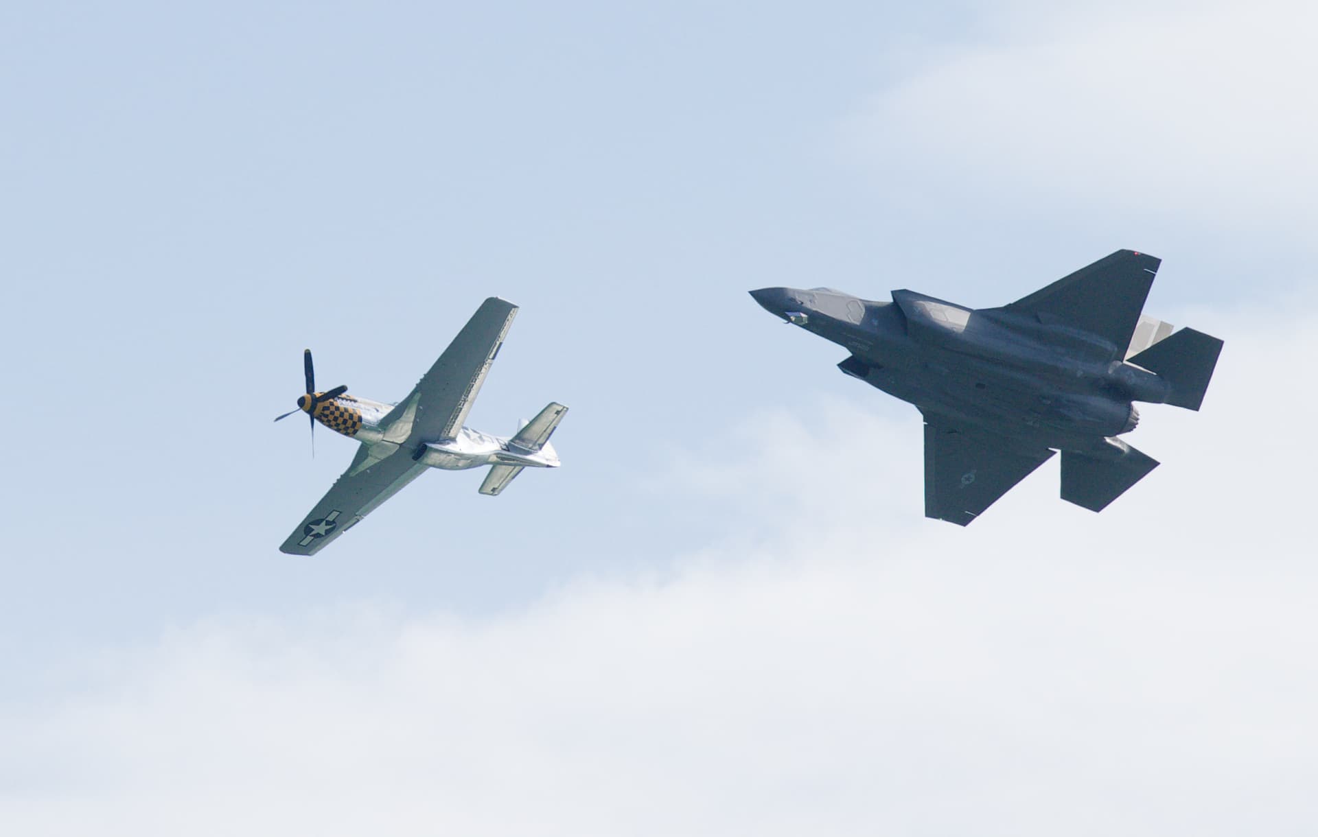
I’m only posting these to tell my sad story. I could finish editing, but why…
BEFORE PUTTING CAMERA IN GEAR, PUT BRAIN IN MOTION.
This is the part I reacted on.
This is my answer. Bold added later.
And this is your reaction on my post.
What is equal in 3D is not equal in 2D. The size of verticals change in 2D but the orientation stays. The horizontals change their orientations too. They point to the vanishing point. That’s why the upper balconies in 2D measures different and might give you a feeling that the vericals are not vertical.
But I understood you changed subject already.
George
Sorry about the shutter speed Mike but otherwise the first picture is really good I think. I really love the Mustang. I think it is one of the most iconic propeller driven fighters there is.
I think we still have one machine in working condition in Sweden.
I also think we far too often get stuck on details we are not satistied with and fail to appreciate what really is good with the picture ![]()
I worked a few years with aeroplanes and fright engineer was my first profession.
Here is what MS Co-pilot in MS Edge found out about the Mustang and i’s engine:
The North American P-51 Mustang was an iconic American long-range, single-seat fighter and fighter-bomber used during World War II and the Korean War. Let’s delve into the specifications of this remarkable aircraft:
- Design and Development:
- The Mustang was designed by a team led by James H. Kindelberger of North American Aviation (NAA) in response to a requirement from the British Purchasing Commission. Initially, the commission wanted NAA to build Curtiss P-40 fighters under license for the Royal Air Force (RAF). However, NAA proposed a more modern design, resulting in the creation of the Mustang.
- The prototype NA-73X airframe was rolled out in September 1940 and first flew on October 26 of the same year1.
- Engine:
- The Mustang was initially designed to use the Allison V-1710 engine without a turbosupercharger or a multi-stage supercharger. As a result, its high-altitude performance was limited.
- In mid-1942, Rolls-Royce replaced the Allison with a Rolls-Royce Merlin 65, a two-stage intercooled supercharged engine. This modification significantly improved the aircraft’s performance at altitudes above 15,000 feet without sacrificing range1.
- Key Specifications (P-51D Mustang):
- Crew: 1 (Pilot)
- Wingspan: 37 feet
- Length: 32 feet
- Maximum Speed: 437 miles per hour
- Cruising Speed: 275 miles per hour
- Maximum Range: 1,000 miles
- Engine: Packard Rolls Royce Merlin V-1650-7 (1,695 hp)
- Maximum Load: 2,000 pounds of bombs or ten 5-inch rockets
- Armament: Six .50 caliber machine guns2
The P-51 Mustang’s combination of speed, range, and firepower made it a formidable aircraft that played a crucial role in achieving Allied air superiority during World War II. Its legacy continues to captivate aviation enthusiasts and historians alike! ![]()
![]()
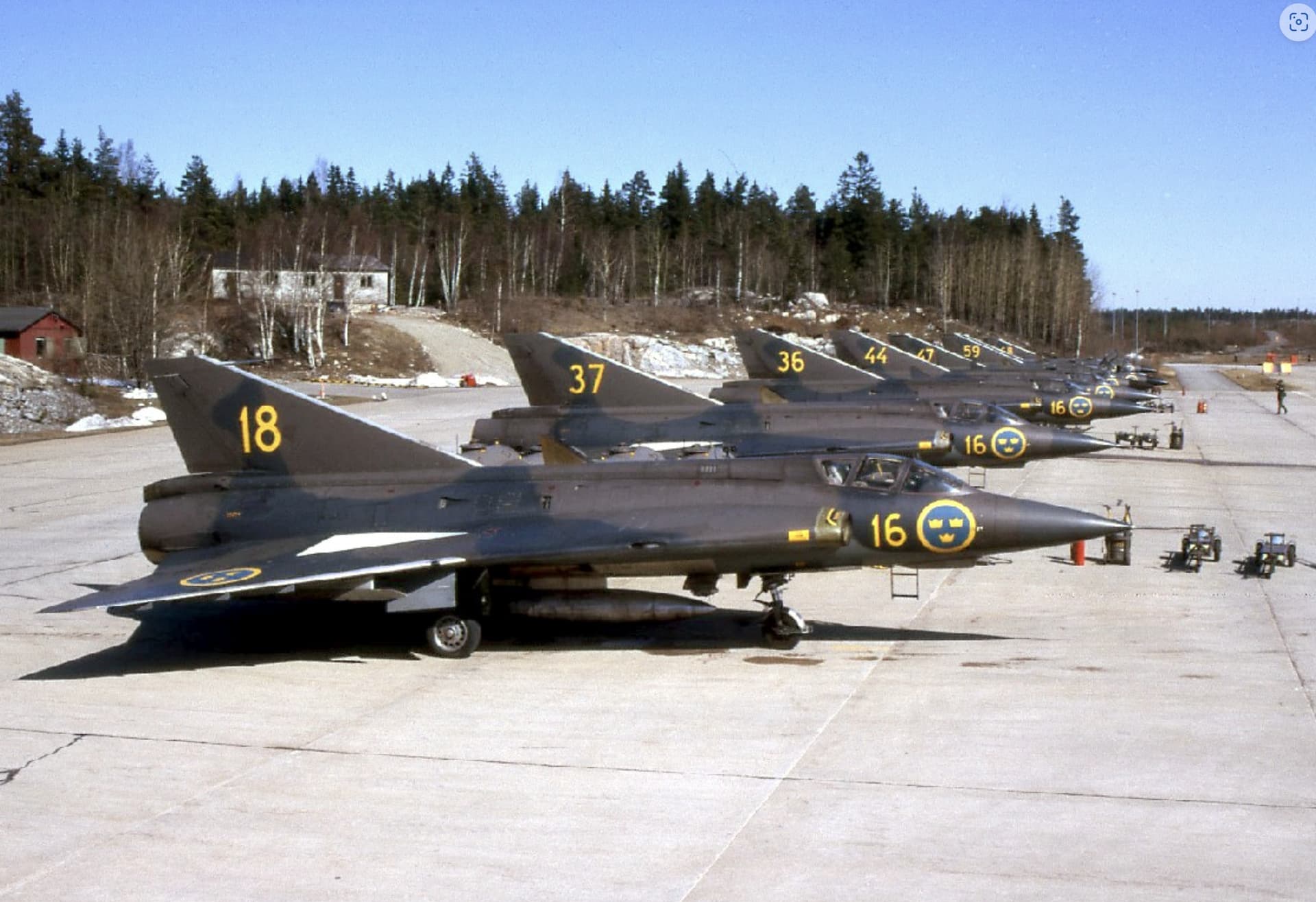
Here a picture from the Swedish Air Base F18 with some of the J35 “the Dragon” fighters that I used to serve when making my military service that was part of my education.
Even J35 was a very iconic sort of one of a kind plane with it´s “double delta” vings.
One specialty we have had since these days is that both this plane and the current JAS J39 Gripen is that they can use almost any long high way to start and land which makes it very hard to wipe them out since it will not be enough to destroy our air bases. So it is a very decentralized system.
And there is our problem. As you say, Photoshop was designed as an image “creation” tool that “could” manipulate photographs and, as such, it raised the hackles of certain “traditional” photographers who feel that the taken image was sacrosanct and not to be manipulated. Completely forgetting that film photographers had been manipulating images in the darkroom for as long as photography existed.
At the moment, when we use PhotoLab, we use AI to calculate how to de-noise an image and, it would certainly be useful to have AI selections in certain circumstances.
But where I personally draw the line is generative AI, when it is used to provide image material, as shown in the video you linked to. This is nothing short of theft, as it draws from images others have published on the internet and appropriates them without any regard for copyright or reward for the original author.
Once again, as you mention, this might be useful for the graphics industry, when producing “artwork”, but should have no place in images presented as photographs.
To me, PhotoLab is much more a photographer’s tool than an artist’s tool. Something which doesn’t preclude the creation of an artistic photo of course.
2 Likes
The problem with the concept of theft when it comes to deep learning and genertive AI is too identify what and from whom a certain picture element was stolen. How to do that??
Which, if you have a FilmPack licence, include film emulations from FilmPack…
The problem being that you have cropped too tightly to the top of the building. It needs more space to “breathe”.
Here is a DOP with only my version, so you can see what I did. Save it, along with a copy of the original, to a separate folder to avoid confusion.
780_5124 | 2024-05-23.nef.dop (13,5 Ko)
I used the Fuji Acros 100 preset with a red filter to darken the sky.
And here is a jpeg export…
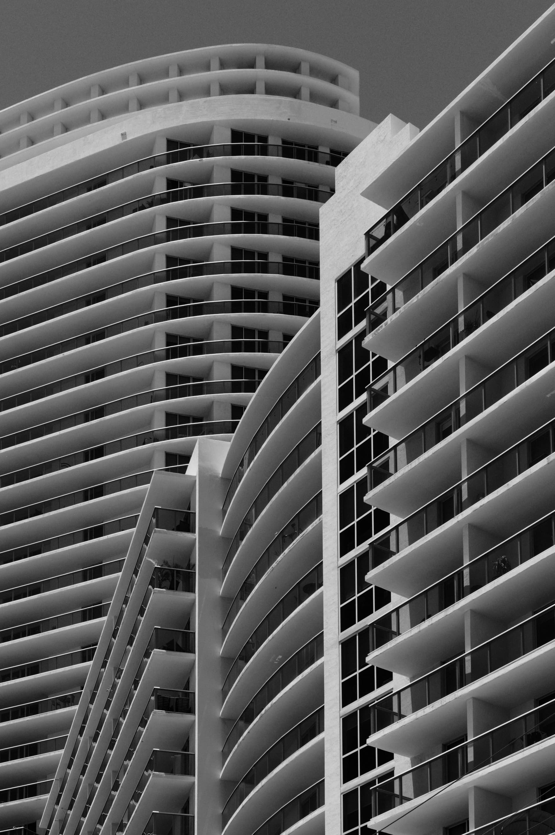
And, yes, the “non-vertical” lines are a fact of this kind of image. They add to the drama.
It’s all to do with perspective and viewing angle. If you tried to follow strict geometric rules at this kind of angle, you would end up with a building that didn’t look right.
With a clear blue sky and full sunshine, you want a lower ISO to force a slower shutter speed.
Once again, I come back to the principle of not having to change the exposure for every shot under the same lighting.
The guidance for photographing a moving subject is to use twice the reciprocal of the focal length as a minimum speed to avoid shake. For your image, this means a speed of 1/500 sec.
Using an equivalence calculator, this gives me 1/500 sec @ f/10 ISO 250.
By the way, what is your fascination with using f/8?
Wrong! You need to concentrate on setting your camera before concentrating on the subject. It’s not a case of one or the other.
On the other hand, you could always get Topaz Photo AI…
Here is the full size (3780px x 2608px) result…
780_5186 | 2024-05-25_DxO-topaz.tiff.zip (45,7 Mo)
The real problem, is I don’t understand what you mean. What are you saying here, and how does it relate to how I am manipulating the photo?
I’ve twisted and stretched my image in a way that Joanna has discussed, in great detail.
I feel like a 6th grade math student walking into a class in Calculus. I am completely lost, and neither understand what you are writing, nor how you feel I should make use of that information as I edit the image.
No, I didn’t change anything, I also discussed other things, (which I feel I actually do understand). My whole life has been based on “multitasking”.
Will now go back to reading the other new posts since last evening…
Don’t worry, you’re not on your own. @George takes a very technical approach to all sorts of things, which can be useful, but only if you understand that level of technicality. My approach is much more experiential, with the minimum technical ![]()
Two images to compare…
Joanna, my predicament is that while I do like your adding more “breathing space” above the image, your version visually cuts off what I feel is the heart of the image at the bottom left.
Your image is “prettier”, but it loses the reason I captured this view in the first place, the “angled” area at the bottom left. If I take my latest view, and decapitate it, removing the top 1/4 of the image, I’m back to my starting point. Trying to add the top of the building deserves its own image, just as you have done.
That brings me back to this view, which is still by far my favorite:
I loved reading what you wrote - and yes, my eyes were on the Mustang, the other plane was just “fill” to me. Joanna is right that maybe I should find a way to enlarge the image (Topaz, or PhotoShop). A longer lens would have been the best idea - eventually I will have one - but 400 may not be enough.
I had the camera set ahead of time, but then I changed a few things while following the planes, and my 1/1000th shutter went to 1/3000th, not 1/500th which I really should have used. Perhaps next year I’ll get it right, third time being the charm. The heart of the photo is (to me) the Mustang, and that was getting my full attention when they got closer.
Now I need to go back and read everything you posted, in detail. Add this to the huge list of things I know nothing about.
@George, first, I apologize for my reply, but I didn’t, and still don’t, understand what you are telling me. Please think of me as a 6th grade student, and tell me in simpler words what you mean, so I will hopefully understand. I don’t understand, and I don’t get your main point “Different distance means different magnification.”
What I do understand, is things closer to me appear larger, and if they’re further away, smaller. But I don’t know how to apply it to my photo, especially after I destroyed any resemblance to “reality” by stretching the image as I did, to keep the vertical lines closer to being vertical.
I’d like to know and understand what you meant, and probably everyone else in this forum understands perfectly, but for whatever reason, that eludes me.
I would especially like to know what you want me to do about this. Maybe you can edit the image yourself to “fix” it, and then point out what you’ve done - and why.
Please.