You don’t have to qualify it with the D780 before Live View, in fact you don’t really have to qualify each and every image you post referencing that it was shot with a D780 even if captured through the OVF, unless there is some specific relevancy for doing so.
You also don’t need to differentiate between capturing an image using Live View or through the viewfinder in general unless there is a darn good reason for doing so, like when comparing two virtually identical shots of the same subject, one taken in Live View and the other through the viewfinder…
For most of your images there is no relevancy at all unless you’re discussing specific features of that camera and how they specifically are affecting your images. If somebody cares about the camera, they’ll ask.
Once again, this thread, which you created, is about enhancing images in PhotoLab. The camera body used is relatively unimportant unless you’re trying to to make a specific point. Please do not forget that this is not a general photographic website, but a site dedicated to the products sold by DxO.
Just because on the internet there are other people making the same error as you doesn’t make it correct.
Because the light where you were wasn’t actually much warmer than 5600°K.
According to the EXIF data, it was only 17h28, so this is hardly into the evening.and sunset for you was at 20h03, which isn’t going to warm the light enough to worry about. In fact, as the sun starts to set, the blue of the sky to the east tends to counteract any warming from the west, plus the water reflects the blue of the sky. Finally, it is “contra-jour” and that always means any light reflected onto the subject tends to be cooler.
Didn’t I just say that I left my camera at 5600°K all the time?
But the water appears a turquoise colour and you eyes are fooled into seeing things surrounded by different colours.
Absolutely nothing. It would simply show it as had been taken at 4500°K and leave it up to you to decide whether that suits your purposes or not.
That’s up to you but, as you noticed, it affected the wake on the boat, causing a peculiar colouration.
For the umpteenth time, I would have taken the shot at 5600 at then adjusted to suit in post processing.
Yes, and since you told me to do that, so have I, but my question was about warming the image up in PhotoLab. Obviously a bad assumption on my part, but the color of the water looked more accurate after the change.
I have configured default settings, and that is one of the changes I made. (But I was wrong to even think that the Kelvin setting has no effect on the RAW image.) Point taken, and learned.
Well, I agree with that - bad habit from the bird forums, where most people want to know those things. I’m curious as to what camera people use as well - perhaps a bad habit?
Agreed, although I don’t think the camera used is “unimportant”.
Gee, well if I refer to it as “D780 Live View”, everyone will understand. Seems that for a DSLR everyone starts out thinking that “Live View” is just what it has always been. Most people don’t know what Nikon even did with this camera. Anyway, two extra word won’t hurt anyone, and for people who do care, they will understand.
I can’t agree with the above. After reading the things that Joanna posted about the capabilities of the D850, for images processed in PhotoLab, that has resulted in a huge change for how I take photographs - and how using old camera gear is hurting my potential results.
I suspect that most people in this forum, viewing images from one of us, would like to know what photo gear was used. Or, from my own point of view, while I will never, ever, catch up with Joanna (using her as an example) image quality from old cameras makes it even more impossible to even try. All my cameras are pretty much put away, other than the D780, if there is any chance of posting the result here. Years ago, I didn’t think it mattered.
I wish more people here were posting images, for many reasons, but I doubt it will happen. Perhaps I am the only one here who actually WANTS critical feedback, good or bad.
One last point - after re-reading, and a lot of thinking, I now understand that the 5600K setting has zero effect on a raw image. I should have realized that before. Of course, that makes me wonder why I should set it to 5600, or just leave it at “Auto”. Since I’m only shooting raw, it doesn’t matter. I should have known that. One more mistake.
Curious if I can create an image that Joanna won’t complain about or modify.
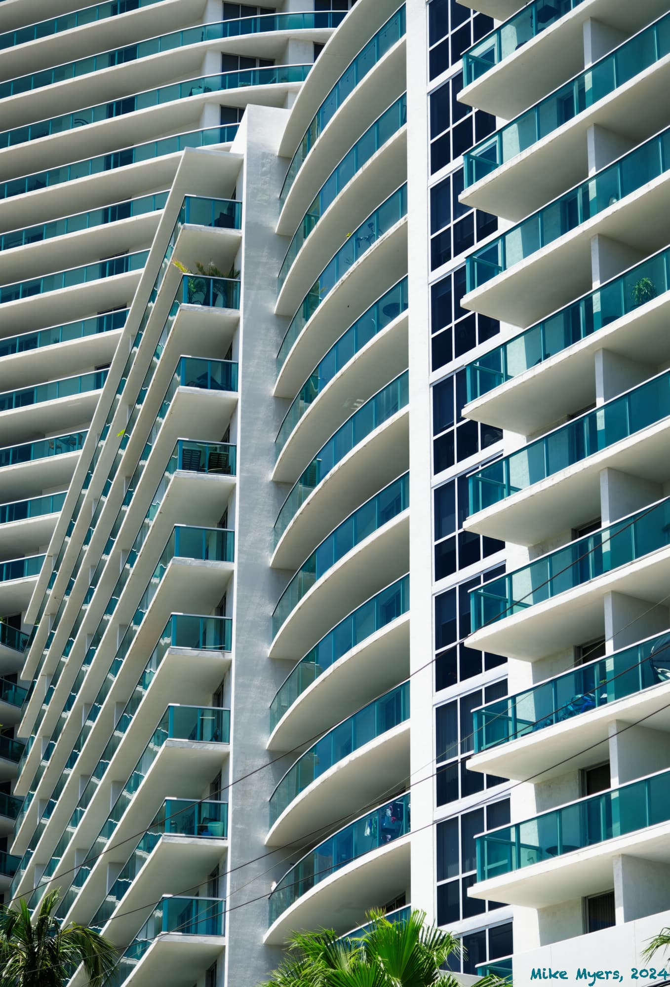
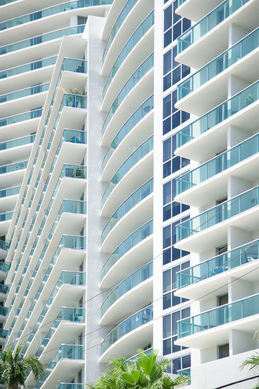
Today was over 90 degrees, very uncomfortably hot. I decided to walk down to the local bagel shop to buy a few, and brought my camera with the too heavy 24-120 lens mounted. As I was walking, I tried to empty my mind, and not “think”, just pay attention to the world around me for anything that might grab my attention. I only took four images total, and for my favorite I only took one exposure. I expected to work with PhotoLab to make the creativity stand out. I wasn’t paying attention to camera settings, only the composition. I didn’t mess with the colors either - what I see here looks like what I saw with my eyes, including the way the lines appear to be distorted.
For better or worse, here is the end result. My question for @Joanna is “other than the watermark which I know you hate, is there anything wrong that needs to be fixed?”
I know I could have more fun with twisting and turning and straightening (or not), but in my mind I like the end result just as it is now.
Yes, everything I did, was done in PhotoLab, but after my previous experience, I didn’t mess with most of the settings this time. For reasons I don’t yet understand, the camera wanted to expose it brighter than I might have done in full manual mode - maybe because I left Auto-ISO turned on. No need for that.
If anyone wants to give it their own interpretation using PhotoLab, go for it!
Added much later - after my bird photography, and then setting up the camera for D780-LiveView, I turned off “image review”. Bad idea. Had I left it “on”, I’d have tried to figure out why the camera selected what I feel was “underexposure”, and adjusted it until I was happy.
Another point, the camera used ISO 100 because of me, but after re-considering, there is/was no need for that.
Final thought - it was very enjoyable to turn off my “thinking”, and just search around me for unusual patterns or compositions that I could capture. I got so involved in this, that I lost track of where I was going - to the bagel shop. And final-final thought, anyone who has been reviewing my .dop files has seen how many PL tools I typically use. Not this time, if something didn’t look “wrong”, I left it alone. I think PL is supposed to be a tool, but lately it has become very much more enjoyable. …and the 24-120? It is absolutely loaded with distortion, but PL understands, and corrects. Fun day, today.
Maybe I just got lucky.
Today was the first time doing this was almost “easy”.
I was looking up, down, right, left, and not at where I was going.
It was fun. Literally.
Not sure if I can do it again.
I’m always too “serious”.
Not today, though.
…and the bagel with cream cheese, Lox, and onions, was delicious!
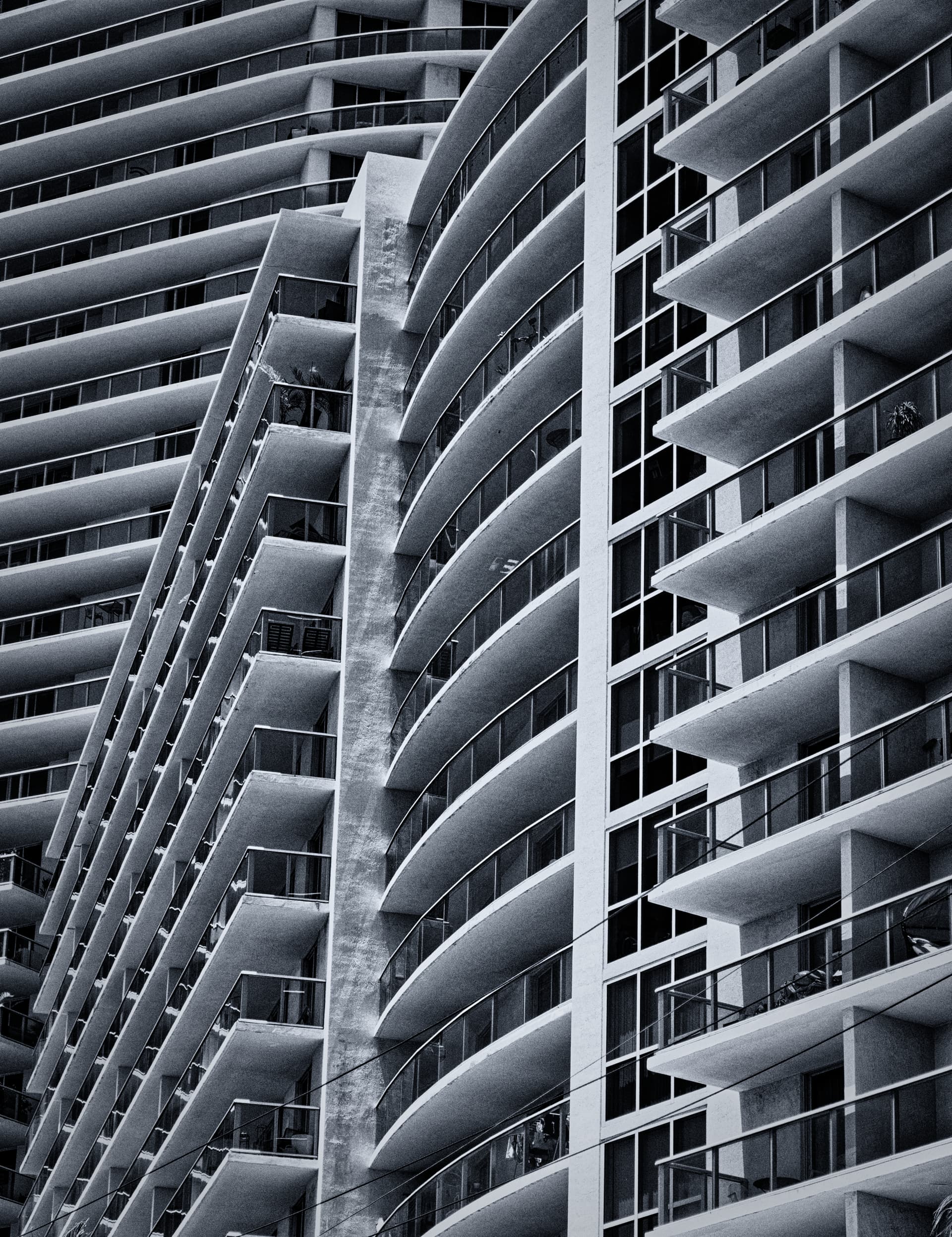
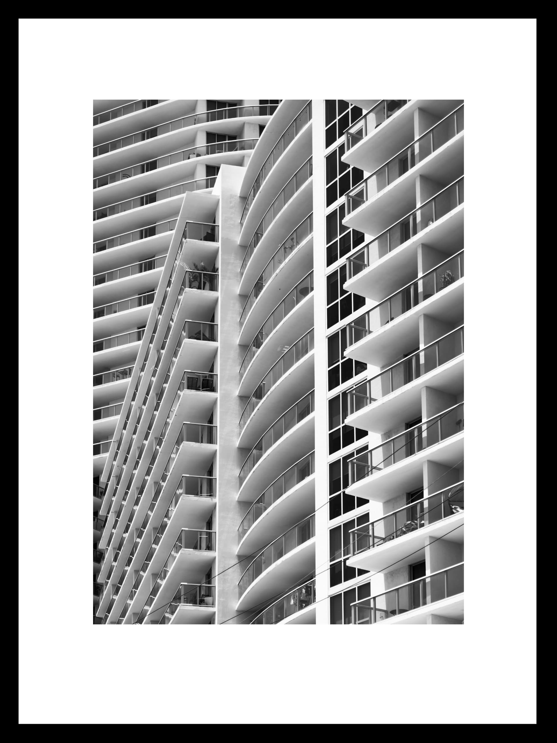
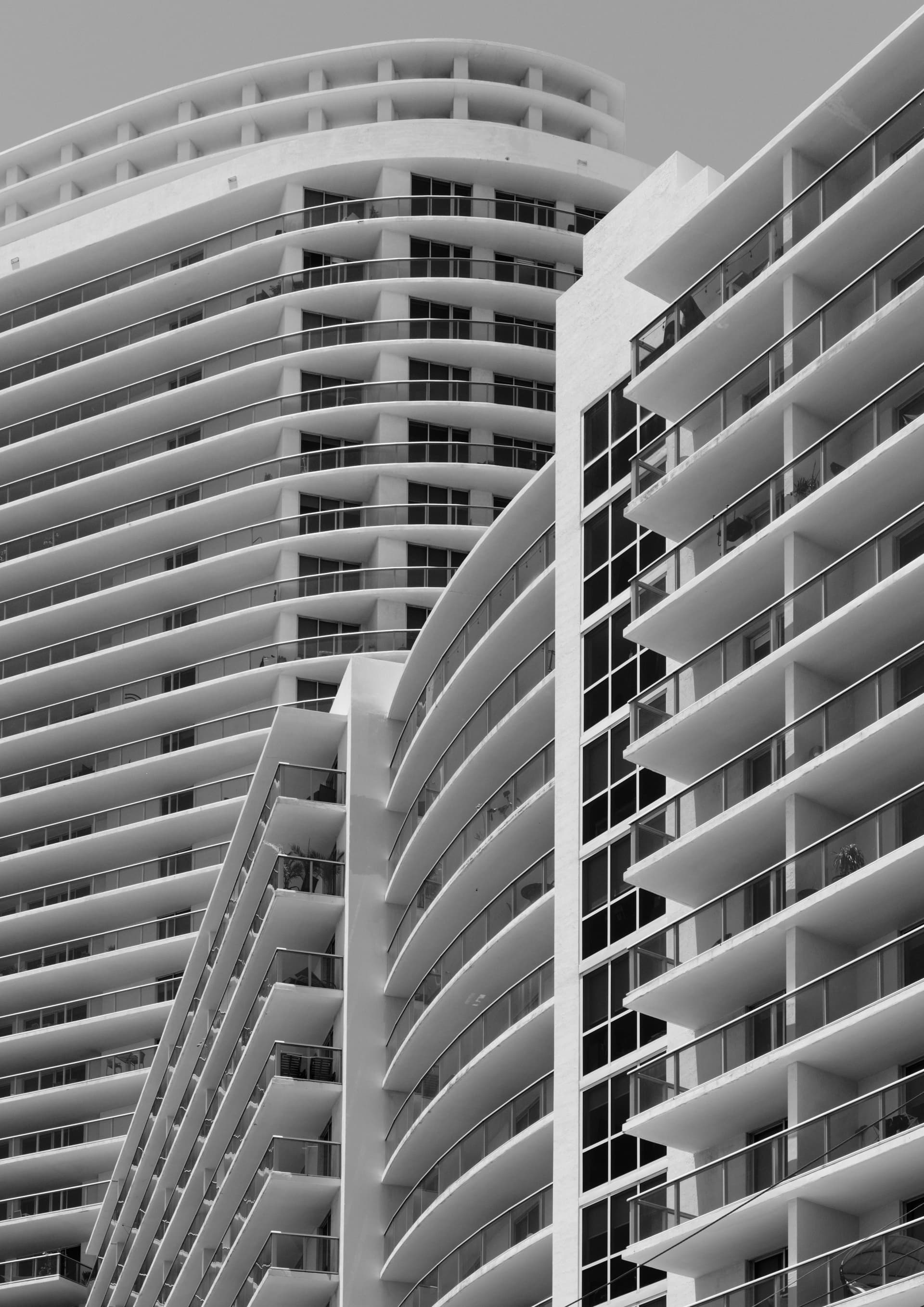
While it is clearly one or more similarly designed buildings, that is irrelevant. All that matters are the relationships of the lines, shapes, light and shadow, and the textures created by the cascade of balconies. That is more important than the actual subject. You might want to convert it to monochrome and play with adjusting light and shade.
Here is a B&W example of your image processed quickly, in PhotoLab 7 (and Silver Efex Pro, which I rarely use), just to show you a different way of seeing this image. With a little more thought I would most likely have processed this differently but I am going to bed shortly and I am just posting this as an alternative for you to consider.
Wow!!! Mike, what can I say! This has to be the best abstract image you have ever presented here
On first viewing, there really isn’t anything serious, apart from the reframing to exclude the palm trees at the bottom and your dreaded signature, which draws the eye away from the beauty of the rest of the image. Please stop using it.
This is fantastic. Now you’re starting to “make” an image, rather than just taking it.
From this point on, all I am going to talk about are my ideas on how you could “refine” things, but they are only my ideas.
@mwsilvers has already done the most important thing, which is to convert it into B&W, as it so obviously deserves.
To my mind, you went from slightly over-exposed to a tad under-exposed but, that depends on the contrast you want to achieve.
You definitely needed to remove the palm trees and signature
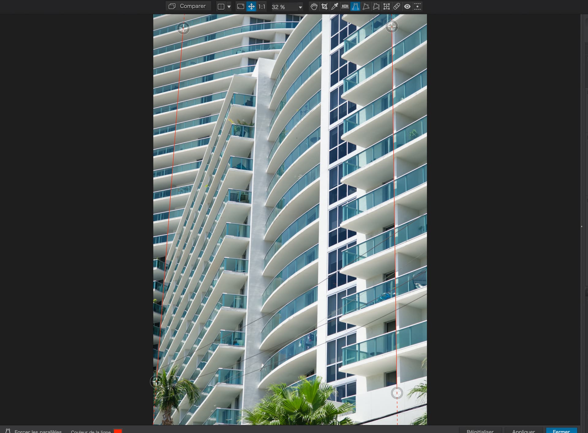
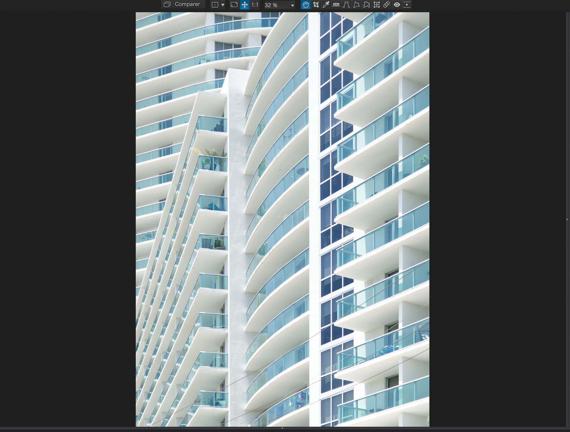
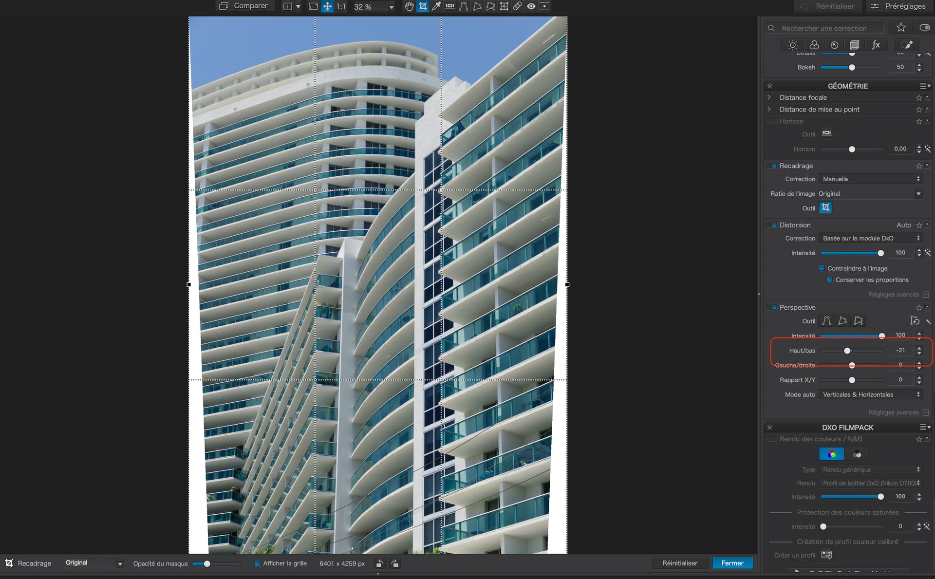
You rotated the image to obtain vertical lines and the effect is perfectly acceptable. But I had a go at using the Force Parallels and Perspective tools to achieve, in the first place, an “architectural” view, where all the verticals are, well, vertical…
I used the framing for A2 paper, which matches that of the images I am currently printing for exhibition. Yes, this image would make a great wall hanging in an office, especially matted to fit a 60cm x 80cm frame.
The only problem with making the verticals of a building, taller than a couple of storeys, truly vertical is that it gives the illusion that the sides are parting company as they go up…
Thanks; I hadn’t even considered that. I may re-take it at a different time of day, yes, for B&W, and maybe make some other small changes. I was looking for “strange views” to capture, and this view hit me over the head - in like, wow!!! I only took the one photo. I can repeat this any time, of any day, when maybe the lighting will enhance the effect.
Whatever you did, it brought out the “texture” in the middle “column”, which I was trying to understand last night, before I got too sleepy. That adds to the photo, the way you made it so prominent.
Then I read Joanna’s comments, and changes she wanted to try.
Just one question on something I’ve noticed, but never understood. I use the tool to “force parallel” many times in the past, but while I can verify that the tool worked perfectly, visually something looked “wrong”. Then I discovered that I didn’t use this tool as I thought was intended, I could create lines that APPEARED parallel to my eyes, even though they were not actually parallel.
I’ve wondered about this for a very long time, and without understanding it, I used the parallel lines tool deliberately incorrectly, such that to my eyes, it appeared properly. I have never understood this, only the need to do it if I wanted my image to look “correct”.
Reading that this is “a well known phenomenon”, it is probably worthy of discussion here - along with any advice as to how to use the parallel lines tool to get the best visual results. For me, it’s always been “trial and error”. I ought to have asked about this years ago. It would be great if PhotoLab had an option to make this adjustable, rather than my “trial and error” process.
There was nothing “strange” about the view. One of the reasons I shoot mostly with fast prime wide angle lenses is that it forces me to see and frame subjects differently than I might If I had a zoom lens mounted. I like the unpredictability of shooting that way.
As a result, some days I capture very few images I really like. But, even if I end up with only one or two images that really satisfy me, I think that is better then capturing fifty so-so images that don’t excite me very much. I know I lack the artist’s eye but I keep trying.
To be clear I am not talking about vacation style snaps which are just intended to record memories. I capture pleanty of those.
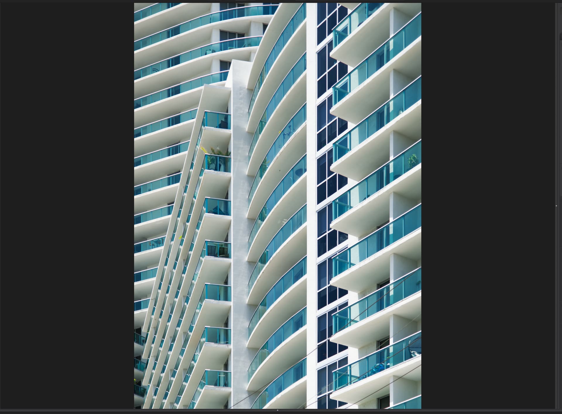
I love this mocked up version, but one quick thought. There is “tension” in the vertical lines. Something about them is “annoying”. Yes, they are “vertical” - I just tested - but something “feels” wrong. Maybe this is due to the question I posted earlier, that even though they ARE vertical, they don’t “feel” vertical. Maybe this is for the reason you alluded to, or maybe at the extreme right, the image is no longer “vertical” and that is causing my discomfort. I can’t say for sure. Something is “pulling at my brain”, that it doesn’t look completely natural, but of course it is NOT natural, because of perspective.
Going out now to re-take the image, higher ISO, higher shutter speed, and f/10.
Joanna suggested different settings, which I used. Shutter around 1/1000th, Aperture f/10, ISO closer to 1000, and to also take images showing more of the surroundings.
Of the images I captured, here are the 8 most appropriate images, but at least one image includes a person looking out over the railings.
None of these have yet been opened in PhotoLab, only PhotoMechanic so I could delete the images I thought had no use.
I will select my ONE image that I prefer, and edit it later today. Right now I want to sit back and enjoy my still warm bagel.
I’m repeating myself, but I’d like advice on how to deal with the “well known” issue that if I make all the vertical “lines” perfectly vertical, my brain does not accept the image, but if I change the lines to just a little non-parallel, my brain thinks everything is perfect. Joanna, you wrote me about this - any advice for how to do this the “best” so people view it properly, even if it isn’t technically perfect?
Would be nice if PhotoLab allowed me to adjust this, rather than constant trial and error.
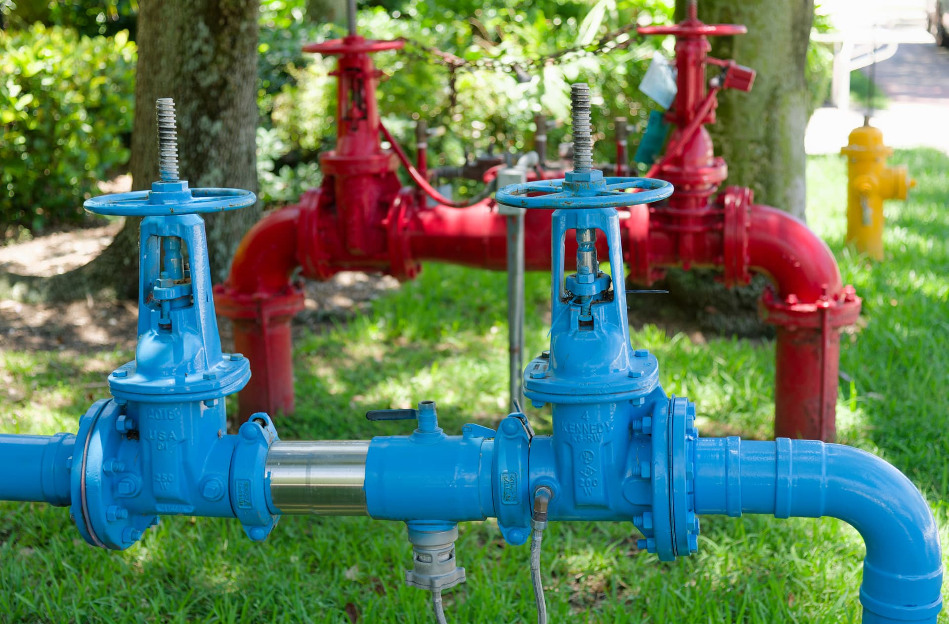
One more image - I’ve been trying to capture this image literally for years, but I was never satisfied. Today is the first time I was able to capture it in a way I enjoy. Oh, and it almost hurt for me to not leave my bright yellow watermark at the bottom left, matching the yellow in the fire hydrant… Focus (lack of) and depth of field are deliberate. I like the precise and machined look of the pipes, over such a random, blurry, backdrop.
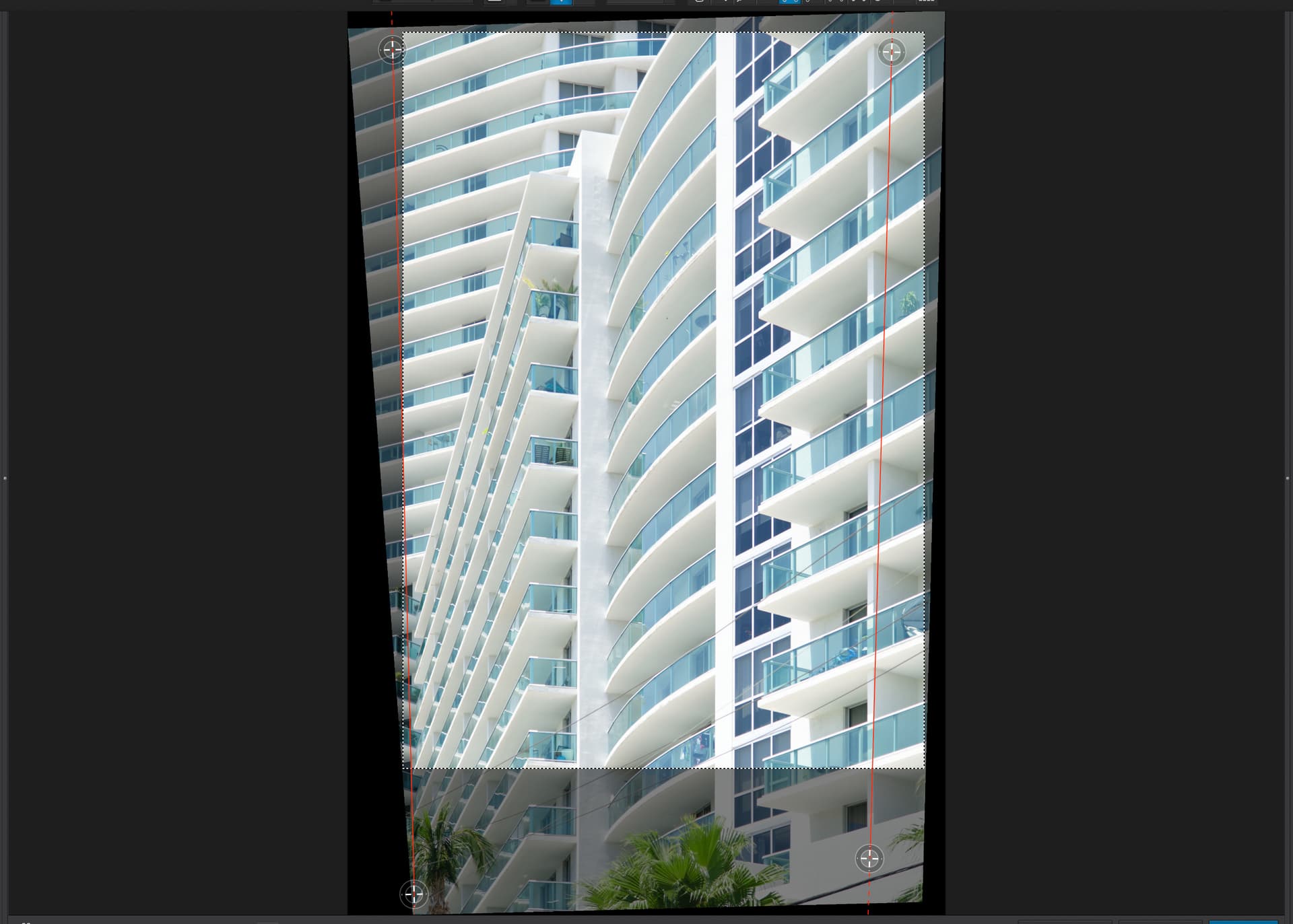
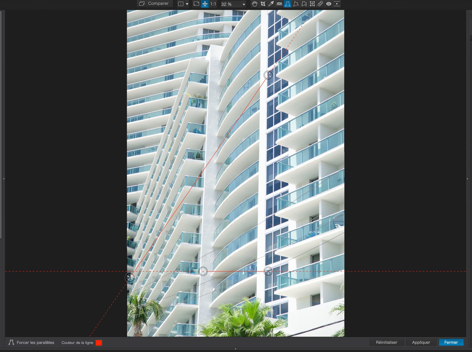
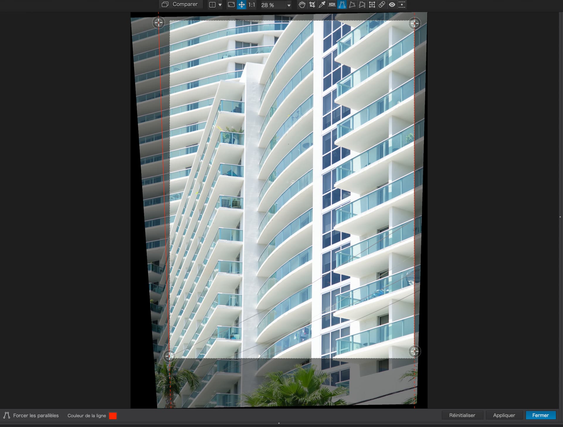
The first thing you need to do is place those lines against something that is neither horizontal nor vertical, but that you want to be truly horizontal or vertical.
So, for this image, I started by dragging one of the handles on of one of the lines to the bottom left of the image, roughly in line with the edges of the balconies…
By moving the handles like this, I am “marking” the vertical “line” in the image to be vertical when the tool is applied.
Next step is to do the same with the right side of the image. First, I drag one of the handles on the other line to the top of the vertical divider between the balconies…
This leaves you with two correction lines which PL, will use as guides for the straightening process, which happens as soon as you press either the Apply or Close buttons…
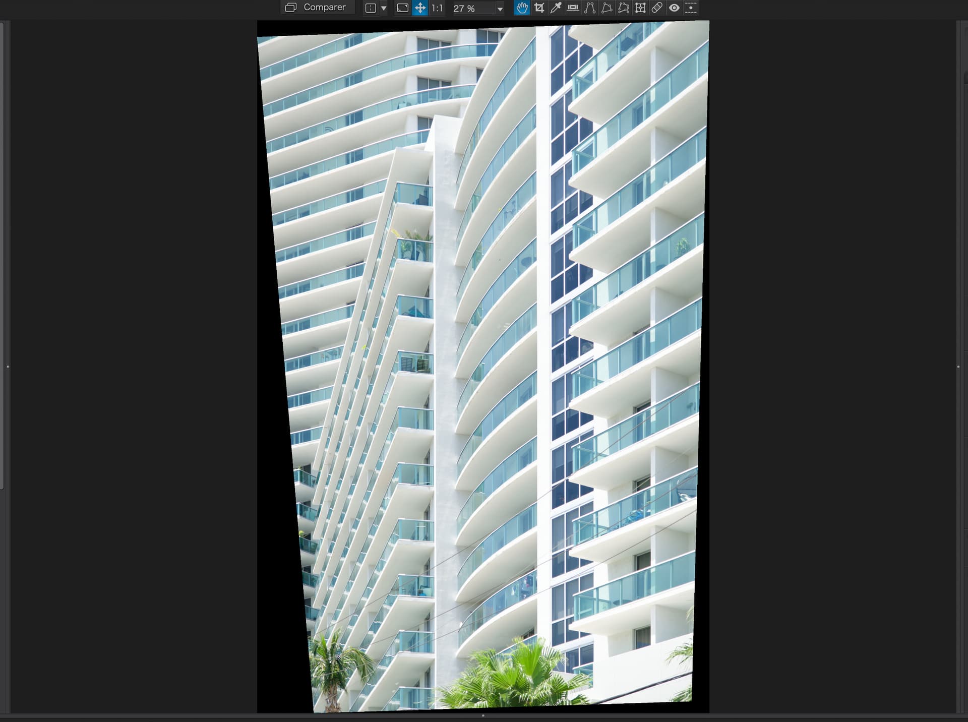
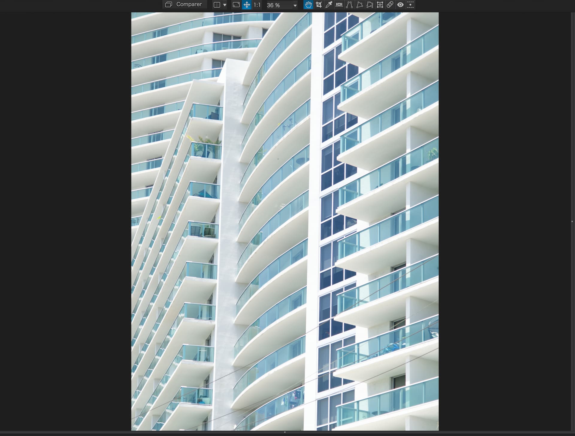
In making the verticals vertical, this has compressed the bottom part of the image horizontally, so the width needs to be expanded to compensate, using the aspect ratio slider in the Perspective palette…
I measured the distance between the two sides of the centre building on screen, before doing any perspective adjustments, at about half height, then adjusted the width at half height after applying the perspective corrections
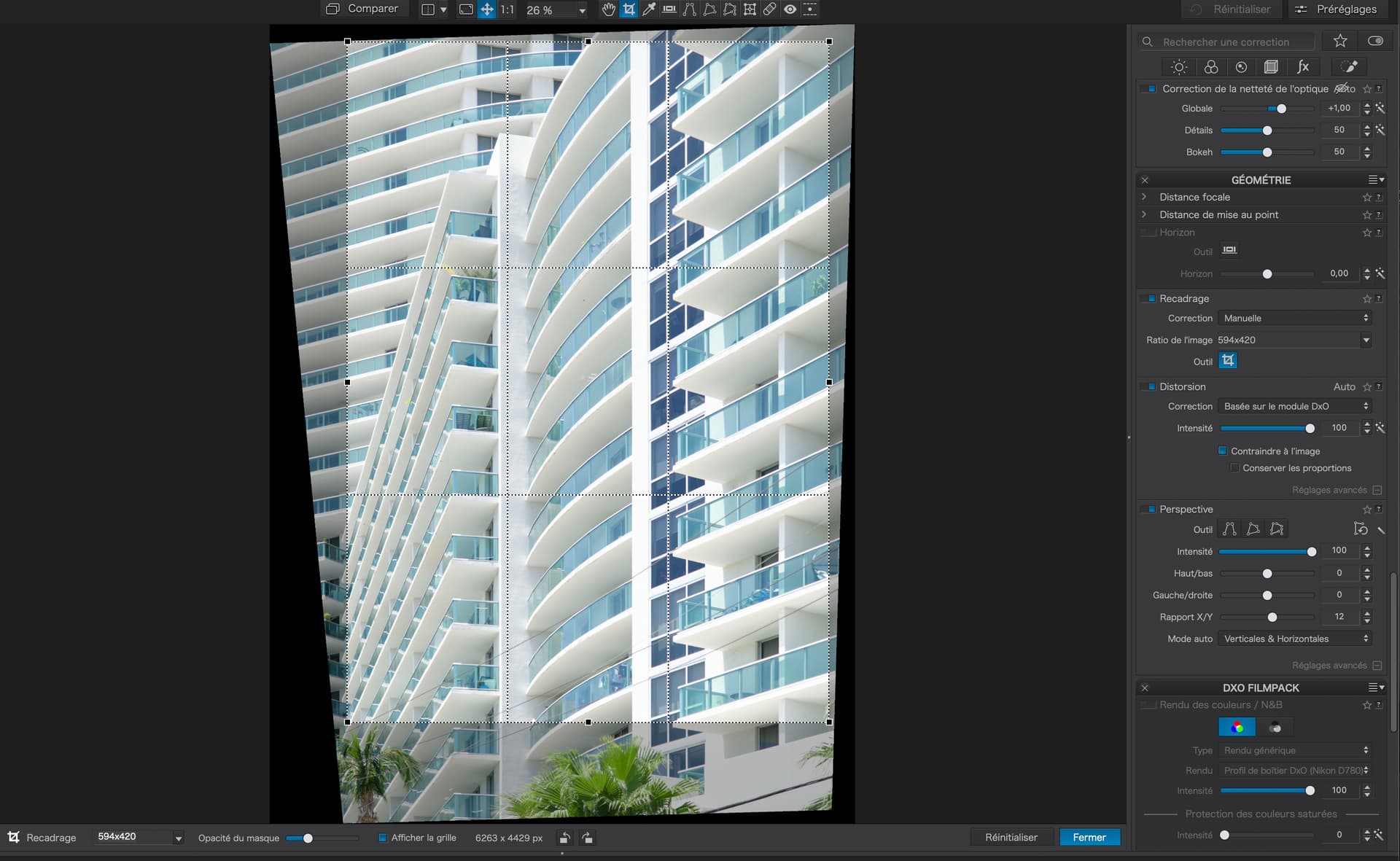
Now, activate the cropping tool, choose a frame size (as I said I use the ratio for A2 paper, which is 594 x 420) and adjust the framing so the the palm fronds are not visible but the frame is within the bounds of the image…
To deal with this, you need to reactivate the force parallels tool and move the top of one or both of the lines outwards. Here, I have only moved the left side because it appears to lean out more than the right side.
Don’t forget, if the building edge appears to lean out, you need to move the line out in order to “catch” that line and bring it in. Remembering all the time that you are correcting an illusion and this isn’t measurable. You need to use the empirical (suck it and see) methodology until it looks right.
Joanna, when I look at this image, my brain is trying to tell me that it isn’t “square”, the top of the image is wider than the bottom. I’ve proved to myself that this is not the case, but while the right edge of the image appears to be vertical, the left edge is screaming at me that it is leaning towards my left. I’m sure this is because of all the slanted lines at the bottom left.
I feel like I used to feel while walking through a house of mirrors, where nothing was what it appeared to be. It makes me feel dizzy/uncomfortable.