Hi everyone, been letting life get in the way on my photography/ processing for what seems like months (has it really been that long ) - nice to see not a lot seems to change and good to see regular faces still around.
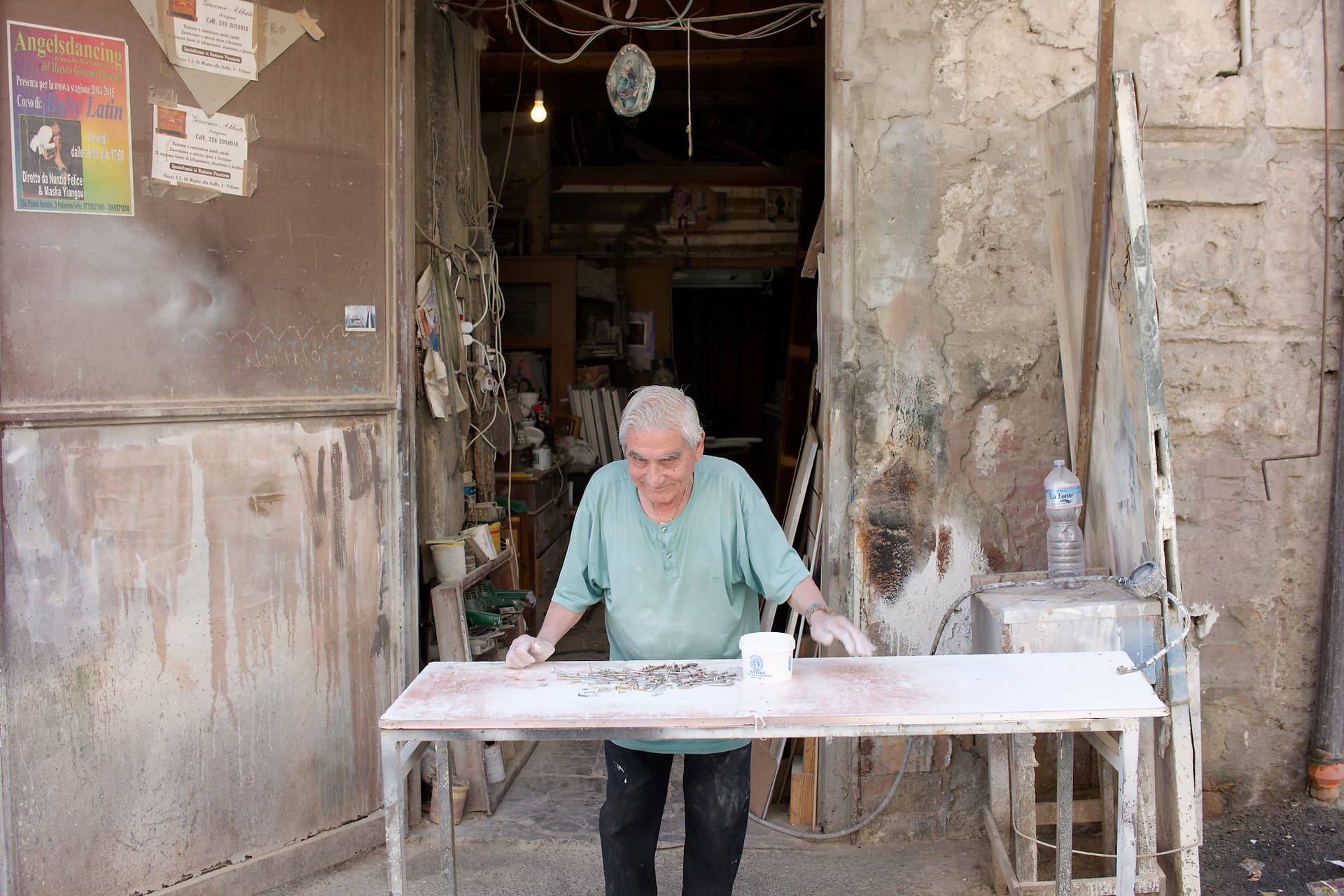
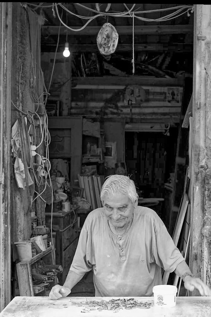
Picking things back up again and have revisited some images from my trip to Sicily in 2019 - started with trying to squeeze something out of this image and struggling for artistic inspiration.
Anyone care to have a try at improving it? I feel there’s more in there than I’ve been able to envision. I’ve tried to use a few PL7 features I’ve not spent much time with before so would appreciate any advice on how I’ve applied them. RAW and DOP also attached. You’ll need FP for the film emulation I think.
Hey, welcome back!!! I think most of the original gang is still here.
I’d love to see what some of the more experienced people come up with, but can you please say a bit more about what is going on? I see all those bits and pieces on the table (screws and nails and…), but I don’t recognize anything they go with/to. I love the fellow at the table, and the “walls” around him, but I’m mostly lost. The color in the walls and his shirt does help me, and all the “stuff” inside the room behind the guy, but I have no idea what I’m seeing… Oh, and I also like all the detail when I “zoom in” to your image.
It’s known as an environmental portrait.
It doesn’t need explanation. Just take the time to explore the image and let your imagination run. What you see will not necessarily be what others see.
How on earth can you be “lost” with such a lovely potrait?
I think we have to stop beating up Mike on these topics. It appears he is genuinely incapable of understanding or enjoying images that diverge from his rigid expectations and definition of “reality”. That would explain a lot.
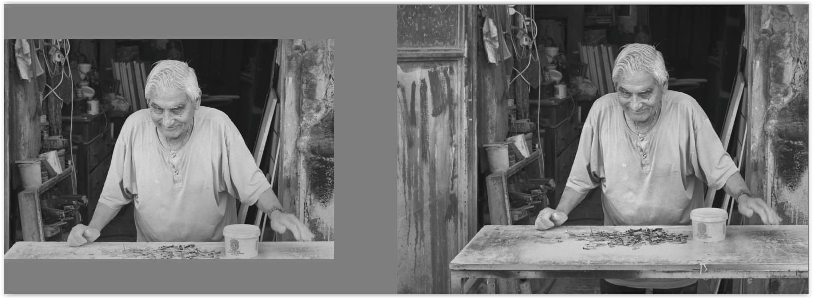
The perspective you have chosen together with his posture pulls the viewer into the picture and the table not touching the door on his right allows (invites) the viewer to have a look inside. – So much for the idea.
Since you ask about PL’s tools – Tone Curve, Smart Lighting → different Spot weighted, different Selective Tone, different B&W film … and a few more local adjustments to give it better tonality/3D.
Play with the settings to see what they do and have fun.
Wolfgang
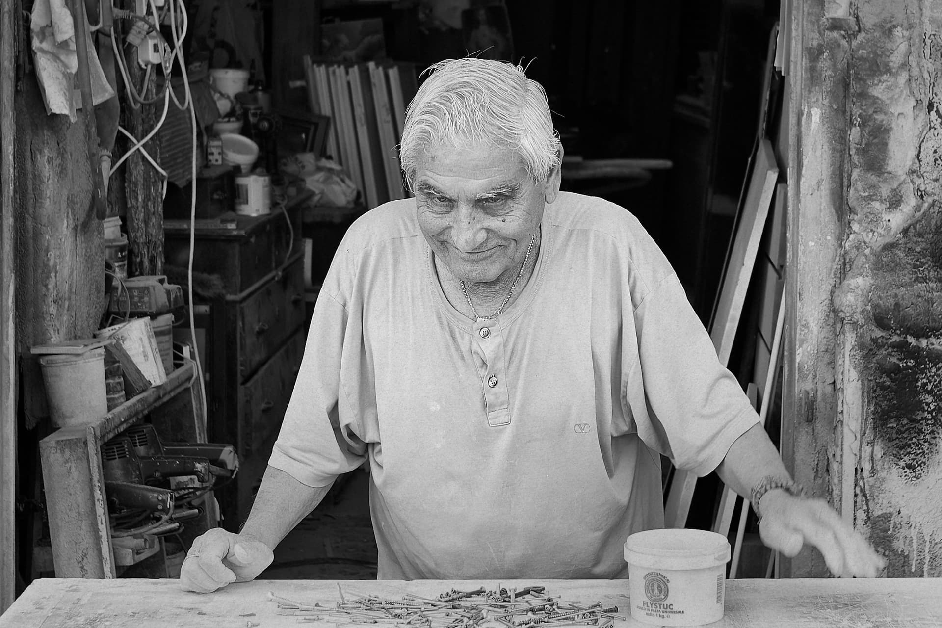
Very nice. The result is very different than the original. I think I like it more then the color original due to its primary focus on the man and especially his face. I am always amazed by how often color distracts us from really “seeing” important elements of an image.
However, I also like the original color version but for different reasons as the main focus for me in that version is the environment around the man.
I use auto-ISO in A priority mode. I have set the minimum shutter to something that works for my lens and shooting scenario. (In fact these are saved as recallable settings). For example; a 24-70mm lens shooting landscape the slowest it will go is 1/60. After that it pumps up the ISO. I choose the Aperture based on creative decision (bokeh or maximum depth of field) and the camera does the rest. I check now and again that the ISO’s are within a manageable range. On that point I did some tests a while ago and as a rule of thumb if the image is going to be in print I aim to not go higher than 800 ISO. Things may be better on the latest cameras. But for social media and online I just let it go to maximum ISO. (This is for landscape / travel photography).
Thank you, I like what you’ve done I was going to open it slightly out from the just the man, hence the repair I did to remove a quaint (but distracting) card posted on the wall
It is just an environmental portrait with interesting elements, as @Joanna pointed out. It is an older man behind a table in front of what is apparently some sort of business. Regarding the various elements, there is no real need to understand anything else.
I know you have a lot of difficulty conceptualizing images that have elements without enough context for you, but there is no particular reason to know what is going on here. That is just a bunch of random hardware on a table. Perhaps it is a fixit shop or some other business, or perhaps not, but it is immaterial. The hardware on the table, and especially it’s potential use, is a tiny and unimportant element of this image.
Can you provide us with more detail as to why you are lost. Can you try to explain why you need to know specifically what is inside and what exactly you mean when you say you have no idea what you are seeing? What is it that you need to know or understand and why? I really want to understand why you seem to struggle so much with photos in ways that most of us don’t. Understanding that may help all of us communicate better when we’re discussing specific photographs.
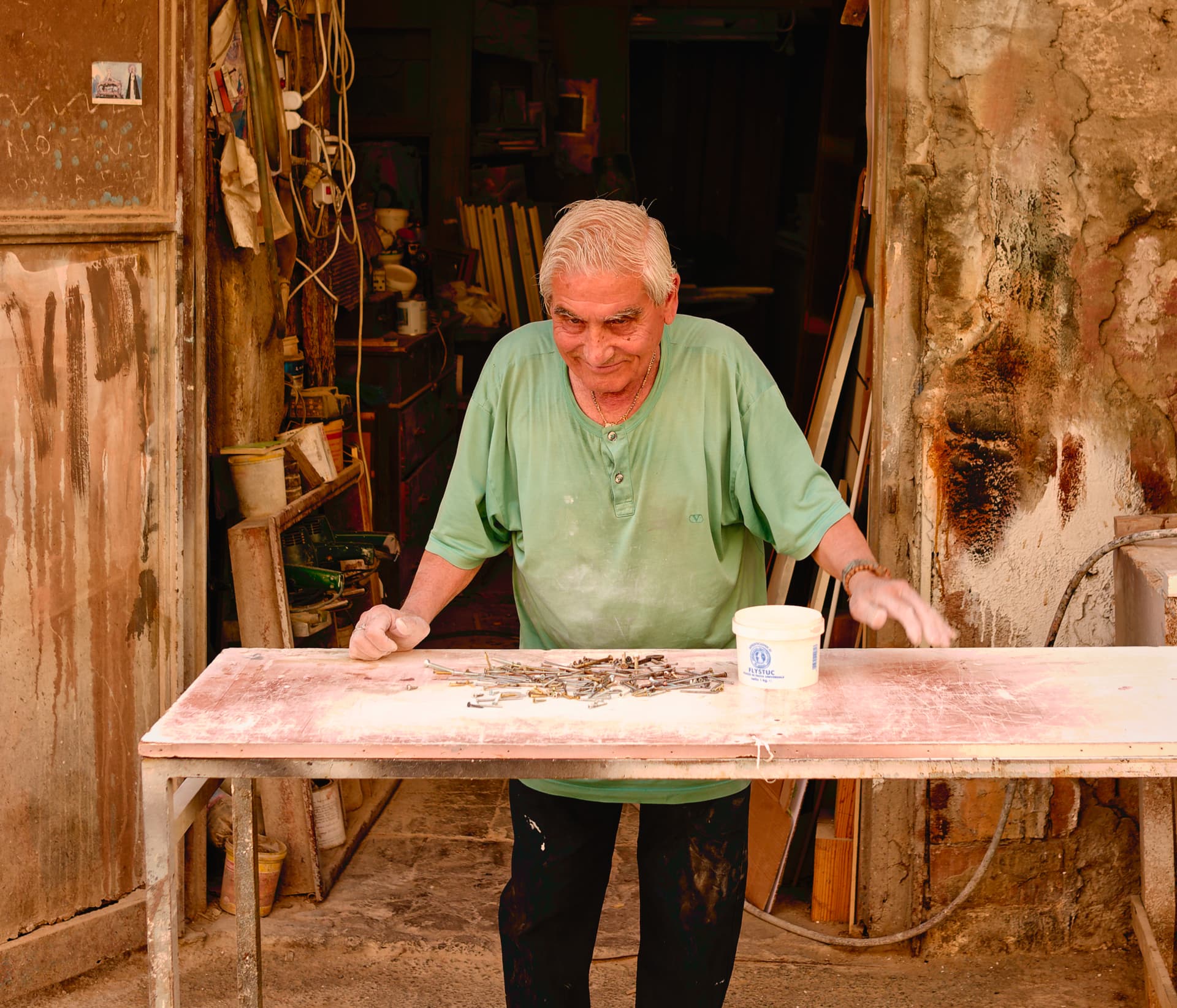
Mike. I take it you have never been to the Mediterranean? If you are so interested in reality, then you would know that shadow light there is bright and not at all warm-toned, like you have portrayed it. This is due to the almost cloudless blue sky lowering the colour temperature, especially of shaded areas.
When attempting to edit someone else’s images, you really need to explain why you made the choices you did, especially when they are so drastic.
The elements that caught my eye are the man’s mischievous smile and the unknown “treasures” in his shop. I hoped to draw these out.
I love to peruse old workshops like I did as a kid in my grandpa’s shop. Lot’s of “treasures” to find. So, I imagine the man’s smile is a response to the question: “What’s in your shop?”
The shop clutter is part of the charm, so I brightened this part of the background. B&W seems to help draw these out and add to the “mystery”. I choose portrait crop to bring these elements together framed by the door’s frame. I didn’t see much of interest in the walls/doors other than as an entrance into this world of hidden treasure/mystery.
Now, that is a very interesting take. My only thought is that you might like to leave a tad more spice to the right of his hand on the right of the frame?
Agree that’s probably a bit tight. I wanted to get close enough to bring out the smile, but still include as much shop as possible. I rushed it.
Two asides. I could imagine adding perspective to make the shop seem deeper, adding to the mystery, but I don’t know how without distorting the man or pincushion effects.
I’m also weak with PL’s local adjustments to selectively bring out the face and the shop items in a natural way.
Perhaps others can help danielfrimley with these tools.
I tried asking questions, but didn’t get any useful information.
This was the question, and not knowing anything about it, I edited it as if I had taken it myself in some mysterious place in some different country, but with my camera, trying to imagine what the resulting image might have looked like.
Joanna, since you know the lighting, feel free to make those settings in my .dop file more appropriate if you wish to.
You are right though, I’ve never been to the Medeterranean, and as Mark wrote “It is just an environmental portrait with interesting elements, as @Joanna pointed out. It is an older man behind a table in front of what is apparently some sort of business. Regarding the various elements, there is no real need to understand anything else.”
So, I wondered what kind of photo I might have created with my camera, and what the scene might have looked like.
My image didn’t come from “reality”, it came from my imagionation (spelling on purpose), and I was having fun, enjoying working with the image, until I got rudely interrupted by dinner, that is…
Thank you, I agree with you and tried that early in the editing but couldn’t make that work without flattening the picture and losing the sense of depth, brightening the background brought it forward. I will have used a global tone curve, did you use a local adjustment tool at all?
I tried a 1:1 crop, sort of a favourite ratio of mine, but couldn’t frame it quite well enough for it to stick. There was some cursing in my mind about where I’d stood when I released the shutter and the angles it left me
Thanks @mikemyers, as others have said the picture has no purpose, intent or deep reason, it’s just interesting “stuff” to me. I’ll look at your DOP for sure, a bit warm overall for me on first glance but I couldn’t make colour work as well as black and white whatever I tried so your edits interest me
There is a lot of defined detail in there, I know you’re a Leica man, this was taken with my APS-C CL and a lens that has full module support in PL. It’s a fantastic camera, lens and editor combo - really, really malleable