Now, that is a very interesting take. My only thought is that you might like to leave a tad more spice to the right of his hand on the right of the frame?
Agree that’s probably a bit tight. I wanted to get close enough to bring out the smile, but still include as much shop as possible. I rushed it.
Two asides. I could imagine adding perspective to make the shop seem deeper, adding to the mystery, but I don’t know how without distorting the man or pincushion effects.
I’m also weak with PL’s local adjustments to selectively bring out the face and the shop items in a natural way.
Perhaps others can help danielfrimley with these tools.
Nope, never been there, know nothing about it.
I tried asking questions, but didn’t get any useful information.
This was the question, and not knowing anything about it, I edited it as if I had taken it myself in some mysterious place in some different country, but with my camera, trying to imagine what the resulting image might have looked like.
If anyone cares:
20190616_105358_00119.DNG.dop (17.2 KB)
Joanna, since you know the lighting, feel free to make those settings in my .dop file more appropriate if you wish to.
You are right though, I’ve never been to the Medeterranean, and as Mark wrote “It is just an environmental portrait with interesting elements, as @Joanna pointed out. It is an older man behind a table in front of what is apparently some sort of business. Regarding the various elements, there is no real need to understand anything else.”
So, I wondered what kind of photo I might have created with my camera, and what the scene might have looked like.
My image didn’t come from “reality”, it came from my imagionation (spelling on purpose), and I was having fun, enjoying working with the image, until I got rudely interrupted by dinner, that is…
Thank you, I agree with you and tried that early in the editing but couldn’t make that work without flattening the picture and losing the sense of depth, brightening the background brought it forward. I will have used a global tone curve, did you use a local adjustment tool at all?
I tried a 1:1 crop, sort of a favourite ratio of mine, but couldn’t frame it quite well enough for it to stick. There was some cursing in my mind about where I’d stood when I released the shutter and the angles it left me
Thanks @mikemyers, as others have said the picture has no purpose, intent or deep reason, it’s just interesting “stuff” to me. I’ll look at your DOP for sure, a bit warm overall for me on first glance but I couldn’t make colour work as well as black and white whatever I tried so your edits interest me
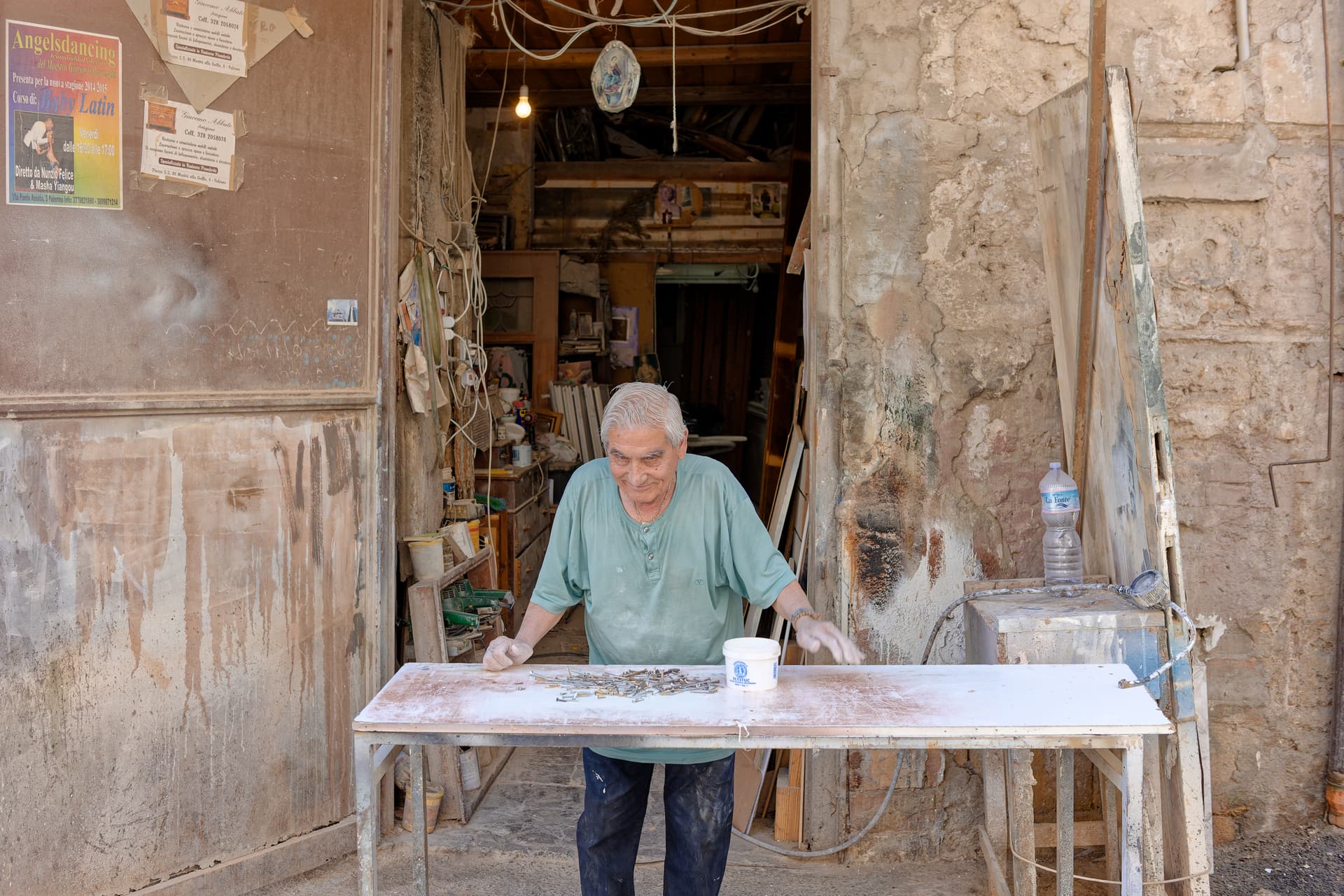
There is a lot of defined detail in there, I know you’re a Leica man, this was taken with my APS-C CL and a lens that has full module support in PL. It’s a fantastic camera, lens and editor combo - really, really malleable
I tried to make the color version a bit more interesting without altering the colors or brightness too much. It is slightly warmer than your version. I didn’t crop. I preferred to keep all the background elements which I felt were just as important to the overall image as the old man. I also raised the shadow detail in the shop using spot weighted Smart Lighting. I used some fine contrast to bring out more detail and texture. I also adjusted the perspective and horizon a bit. I tried to keep my edits fairly subtle. Let me know what you think.
Mark.
1 Like
That’s great, thank you for the food for thought. You’ve managed to keep back of shop, front of shop and man in front of shop defined without losing the depth, I struggled with that. I shall take your suggestions onboard
1 Like
If you are interested, here is my version of the .dop file. It may be a starting point for further edits. Don’t forget to copy your DNG to a different folder and copy this to the same folder. You don’t want to overwrite your original .dop file. If you don’t have a FilmPack license you won’t have access to the four Fine contrast controls.
Mark
20190616_105358_00119.DNG.dop (14.2 KB)
1 Like
Thanks @mwsilvers , will do. Yup, I’m happy with the process and am licensed up ok
Well, after a bit of cogitation and consideration of the other versions submitted, here is my version…
My inspiration started with @swmurray’s portrait version, which used the workshop doorway and cables as a “frame”. But the question arose as to whether this was too “environmental” and not enough “portrait”. I found myself distracted (pleasantly) by wanting to explore the contents of the workshop - I too love the interiors of old buildings and all the “stuff” that has accumulated therein.
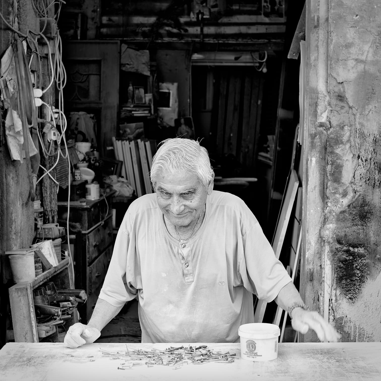
Starting from there, I thought I would try making it more about the man, in his “environment”, so chose a square framing and placed the head roughly central.
I too, tried to increase the detail in the workshop interior by using the Fine Contrast sliders, especially the shadow and mid-range, and quite aggressively, for that and the highlights for the man’s clothing and hair.
Here is your original DOP with my version added…
20190616_105358_00119.DNG.dop (50,2 Ko)
One thing I will mention is that you used a grain emulation as well as the film emulation, but they were for the same film at default values. This isn’t strictly necessary and doesn’t have any further effect. The idea of the grain tool is for when you want to use the grain of different film.
But, overall, I must say I rather like the basic idea of the image.
2 Likes
I see several attributes in this image related to this person: old doors, even with stained glass, several sanding machines, a tube for compressed air, a sign wit some saint, very common in Sicily and all kind of other attributes. He probably is working with plaster looking at his hands and the table. @Joanna called it an environmental portrait. I wouldn’t crop it to much. For me none of the crops are an improvement.
George
1 Like
Which was, kind of, my point. To my mind, you could happily do both crop or not and still get a lovely image. I would be hard pressed to say which is “best” - I think they are "just “different”
1 Like
For me, @Joanna’s version makes a portrait out of a tourist snapshot and focusses more on his expression, while the 1:1 ratio makes the image more calm. I like it very much ![]()
1 Like
@JoJu ![]() “tourist snapshot”, I’d forgotten how straightforward you could be, it’s refreshing
“tourist snapshot”, I’d forgotten how straightforward you could be, it’s refreshing ![]()
I use 1:1 a lot, it’s a favourite of mine, but the way you’ve handled the background is much better than I managed when I tried it - will review your (and all other) edits with interest, thanks all ![]() . In particular curious to see how similar effects are achieved in different ways, with different tools. You’ve all skinned the same cat in a similar way but, I’ll bet, beyond the first pass standard edits you’ll have done it individually. Fine contrast vs individual sliders, sliders vs curves, FP, targeted local adjustments or global subtlety etc.
. In particular curious to see how similar effects are achieved in different ways, with different tools. You’ve all skinned the same cat in a similar way but, I’ll bet, beyond the first pass standard edits you’ll have done it individually. Fine contrast vs individual sliders, sliders vs curves, FP, targeted local adjustments or global subtlety etc.
I also agree my initial question is wrong, not “improve” or “best”, but “different”
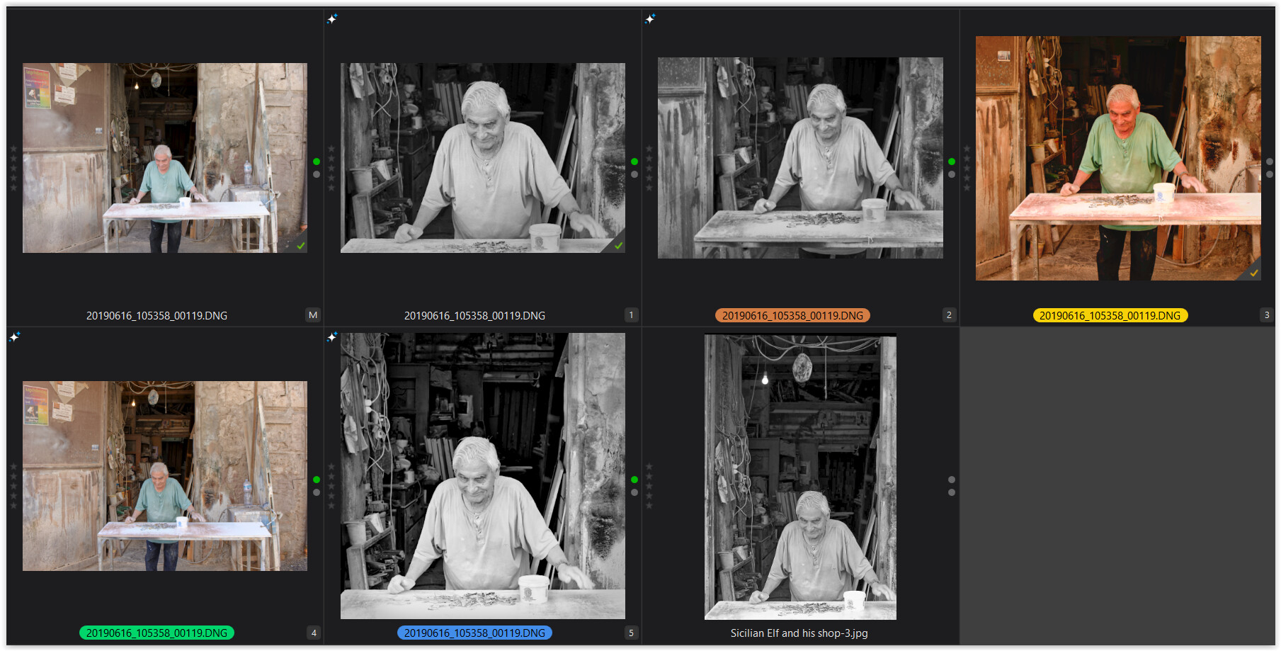
When you use virtual copies, it’s easy to compare different versions instantly …
to make up your mind (even after a few days of “rest”). ![]()
to add
just did so and even added the PL6 version (yellow label) by MikeMyers
how to
-
with PL7 running I created a new testfolder and copied everything done so far
(your master file M, your B&W VC1, my B&W VC2) into this new folder -
kept PL 7 running !!
-
then downloaded the next dop-file in chronological order
and (using a file manager) copied it over the existing dop-file -
upon subsequent checking, I found that the PL 7 library was updated
and added new thumbnails -
repeated downloading and checking …
-
swmurray’s jpg-file is shown sorted at the end
.
Checked which thumbnails appeared as duplicates and deleted them.
To put a thumbnail in a different order, just copy it so it will be added at the end …
1 Like
It might be interesting to put all these different interpretations in one group, to show how differently we all think, given a common starting point.
I know one thing - I didn’t have any “goal”, as I started to edit the image, I also kept changing how much/little of the original image to include. I never “settled”, as I simply ran out of time. I can see lots of fascinating interpretations now. As to my own version, if I were to change it now, I’d keep my crop, but make the colors a little less intense.
I’m curious as to your thoughts, now that there are so many versions of your photo to compare. I’m curious as to what you were thinking, the moment you captured the image. Did we help, or just tear apart what you hoped to capture?
Not so much forethought or planning involved in this case as it happens - I was strolling through a back street, rounded a corner, there it was. I thought that looks interesting so took the picture.
All the contributions thus far help, grist to the mill in extending my knowledge of the capabilities of PL