Off-Topic - advice, experiences and examples, for images that will be processed in PhotoLab

after investing some more effort with Local Adjustments instead of overall contrast …


VC2
.
than later simplified as a new (enhanced) version

VC3 → 780_0723 2023-05-07.nef.dop (881,6 KB)

Based on the same ‘idea’ as with the gremlin in the tree, I reduced the attention (dimmed the whole pic) to then bring it back on the two pipes … guiding the viewer’s eye.

I’m confused. I renamed my original .dop file, then copied your .dop file into the folder, then added the “vertical bar”, but I still don’t get to see your revised image. I’ll try again later tonight.

In the meantime, what has changed is that the two pipes look very similar, but everything else in the image has gotten darker, so it doesn’t show up very prominently like before. It’s interesting, but it doesn’t look as “natural”. I thought the trees and the ground added to the image.

I’ll have to think about this some more, maybe review it tomorrow. Right now, when I view the two versions side by side, I prefer the original - maybe if the trees and ground were darkened a little less, that would work better for me.

Now that everything is working at my end, I agree - I do prefer your version.

In the attached screen capture, how can I compare VC1 with VC2? Is this possible?
It wants to compare a Virtual File with the Master (original).

What is the best way to compare all of your settings (VC2) with my settings (VC1) ?

In the menu that you show dropped down, simply choose the version you want to compare the currently selected image with. Then press the Compare button.

Good morning – you are up early!

Check the newer dop-file, which contains your coloured (M)aster, your B&W version (VC1), my first B&W trial (VC2) and my newer B&W (VC3)


M, VC 1 - 3 (without the jpeg-export from VC3)

.
When choosing/highlighting the VC3 version, then I can compare it to any of the other versions.

Screen Shot 05-10-23 at 10.32 AM 001

→ By default “No corrections (with geometry)” was chosen, which when you don’t change
e.g. to compare with your VC1, falls back to … , in this case to the (M)aster. ←

[ should work the same on Mac / see @Joanna’s reply ]

@mikemyers

Just did an experiment … :slight_smile:


While your B&W version (VC1) is based on
grafik
and the Channel mixer
.
I used for my B&W versions (VC2 + 3)
grafik
grafik
and the Channel mixer (different settings)


Copied the VC3 version to a brandnew VC4,

  • where I changed from HSL desaturation to B&W Film Fuji Neopan Acros 100

  • and readjusted (“reduced”) Highlights, Midtones and Blacks
    for the background as well both pipes.

Interestingly, the VC4 outcome appears stronger / contrastier,
which means (maybe) more likeable – while important to fine tune the settings.

VC4780_0723 2023-05-07.nef.dop (1,3 MB)

This made it more clear how to do the comparison. It wasn’t “intuitive” Maybe DxO could simply allow us to select which two versions we want to compare.

Now, while I can see the differences in the two images, is there any way to view the settings for both, simultaneously?

I see @Wolfgang has added more - I’ve got doctor’s visits for today, but will do as he suggests late this afternoon or this evening.

What I would like to do, but I don’t think it is possible, is to have two windows for PhotoLab, one of them opening my image (VC-mike) and Wolfgang’s image (VC-wolfgang) and go down all the settings looking for differences. For that to happen, PhotoLab would to simultaneously open both files, allowing me to scroll down the right. column of both versions, looking for differences.

Plan B is to just look over all of Wolfgang’s settings, searching for things that I don’t remember doing.

I did have an opportunity over the past two days to take some new photos with the D780, unlike what I had done before, but I don’t plan to move on until I’m satisfied I understand how Wolfgang created his rendering.

This you can’t, but – with Local adjustments active, you can toggle between VC1 vs VC…
while watching the settings.

  • It just takes time until those settings appear. PL has to re-compute each version.

  • The direct comparison works different. Both chosen versions are computed – keeping the resulting pic in the memory to then be compared instantly.

OK, and I’m pretty sure I understand. I liked my versions, but I like your version the most. It’s more pleasing to my eye.

I spent Monday with my friends from Colorado who were visiting Miami, and we went out sightseeing on Tuesday. I got some more photos of ships coming into the channel, to be unloaded at the huge unloading cranes, but while they showed interesting “stuff”, they weren’t anything to write home about. We then went to a section of Miami named “Little Havana” because of the huge Cuban influence. In the car, returning home, I saw this amazing (to me) view out the window, and since we were stopped I got the image I will post below. All the bits and pieces came together. I think it would be a shame to make it B&W, so here it is in full color, with all the “props” around the chicken just where I would have wanted them, if I had a choice.

I feel strange about capturing photos like this, as the creator of the sculpture should get the credit, not me, but I got lucky, and was able to capture the image from the perfect spot. I think. There was a camera crew there at the time, filming a commercial, but all their stuff fit just the way I wanted it!! It makes the image a little more mysterious, with the guy, the light stand, and the huge white reflector. Nikon D780 of course.

Apologies to @Joanna - any image that allowed me time to think, was shot in (M)anual mode. Images taken from a moving car went back to (P)rogram mode, as I didn’t have time for anything other than composing and pressing the shutter button. I’m not as fast as you at making adjustments as the lighting changed.

780_0831 | 2023-05-09.nef (29.4 MB)
780_0831 | 2023-05-09.nef.dop (16.0 KB)

Hope you will check out, why and what cause(d) the difference. Understand and experiment …


We then went to a section of Miami named “Little Havana” …

May I suggest to go back to there, take your time and try with more carefully crafted pics – to then work on them.

Certainly - with any new .dop file I replace my existing .dop file with the new one, usually with PhotoLab closed, then re-start PhotoLab and try to understand what you did, and if I’m lucky, understand the “why”.

Unlikely to happen - I doubt I could ever even find the place, and if I did, the best viewing angle is from the middle of the street. I thought it was a nice “grab shot”, but not worth all that effort.

Instead, I will post a different photo I’ve been trying to edit for two days now. It started out looking hopeless, I got it to almost work, then gave up on it and started another VC and worked on that, but didn’t like those results, went back to the original and made some big changes. It not only looks now like what I wanted, but it may look too much better.

It’s of a huge container ship, that was pulled into the harbor area, where three workboats turned it end for end, then positioned it up against the huge unloading cranes. Around 2/3 of the way through the turning process, a Miami Beach Ferry came across it, while three of the workboats (tugboats?) were in the image. The sky looked awful, but with enough experimenting I got It to fit. I also played around with the colors.

It is certainly not a “photojournalistic” image, and some of the tools may not have been properly used, but at this point, I don’t want to change anything - the potential mistakes make the image even more dramatic. Again, Nikon D780 with 24-120 lens. Some of the buildings, and the unloading cranes are probably no longer realistic, but the way they’re all centered around the ship makes for a more pleasing image. I thought I wanted to put some blue into the sky, but it didn’t look right. The white balance was set for the ferry.

780_0779 | 2023-05-09.nef (29.7 MB)
780_0779 | 2023-05-09.nef.dop (32.7 KB)

Mike, I will not furthermore pestering you …

But YOU have to experiment YOURSELF to ‘get it’.
Just looking at a version is not enough.


Your new pic from the cargo liner misses a clear separation between middle and background.

  • When you cannot take the photo from a better position, you should edit it differently – not by adding general contrast. Separate the buildings and ‘unloading cranes’ from your subject (e.g. haze instead of darkening, contrast …).

While the harbour is busy, for an enjoyable pic you need to show the many details better ‘organized’.

1 Like

I’m sorry Mike, but I am going to have to be blunt and say this may be one of the worst treatments you have ever applied.

I agree with @Wolfgang that you have fallen into the trap of photographing a ship with the same tonality as the background, especially on the right, where the ships superstructure gets totally confused with the container cranes.

Everything just looks “mushy”

You have also tried to use a Control Line, with absolutely no regard as to position, gradient and Selectivity. It just looks like a very badly positioned graduated coral filter. The whole idea of Control Lines is to allow you to select areas without a gradient. The gradient is only there for rare occasions when you need to blend in slightly.

Look at the Control Line I created for the sky…

See how I have adjusted the selectivity sliders to include the sky only, without anything in the foreground. Notice how I have added a negative Control Point to the same mask to exclude some bright containers just below the bridge. I also added a second negative Control Line to the same mask to exclude the ferry superstructure and other bright bits…

Then I added a separate Control Line to lift the darker area of the ships’ hulls…


Finally, I removed all your spurious adjustments and just set the Smart Lighting; a much simpler Tone Curve and just a tad of Fine Contrast.

Reduced the saturation on the sea with the Colour Wheel, because it was looking too strong and reset the Colour Temperature to 5600°K.


You still seem to be throwing tools at images with enough consideration that their effect on one part of the image might be OK. And you need to review what we have told you, like how much effect a Control Line’s gradient has and doesn’t have.

780_0779 | 2023-05-09.nef.dop (52,0 Ko)

@mikemyers you may want to play with the warmth from “front to back”, without leading lines it looks a bit flat to me - a colder background and a warmer foreground might help with depth

1 Like

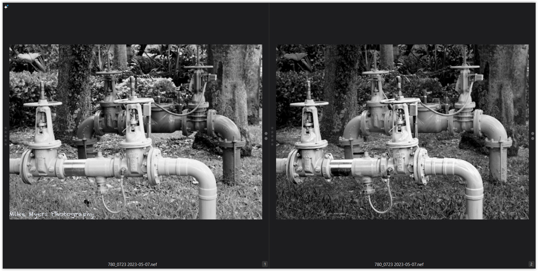
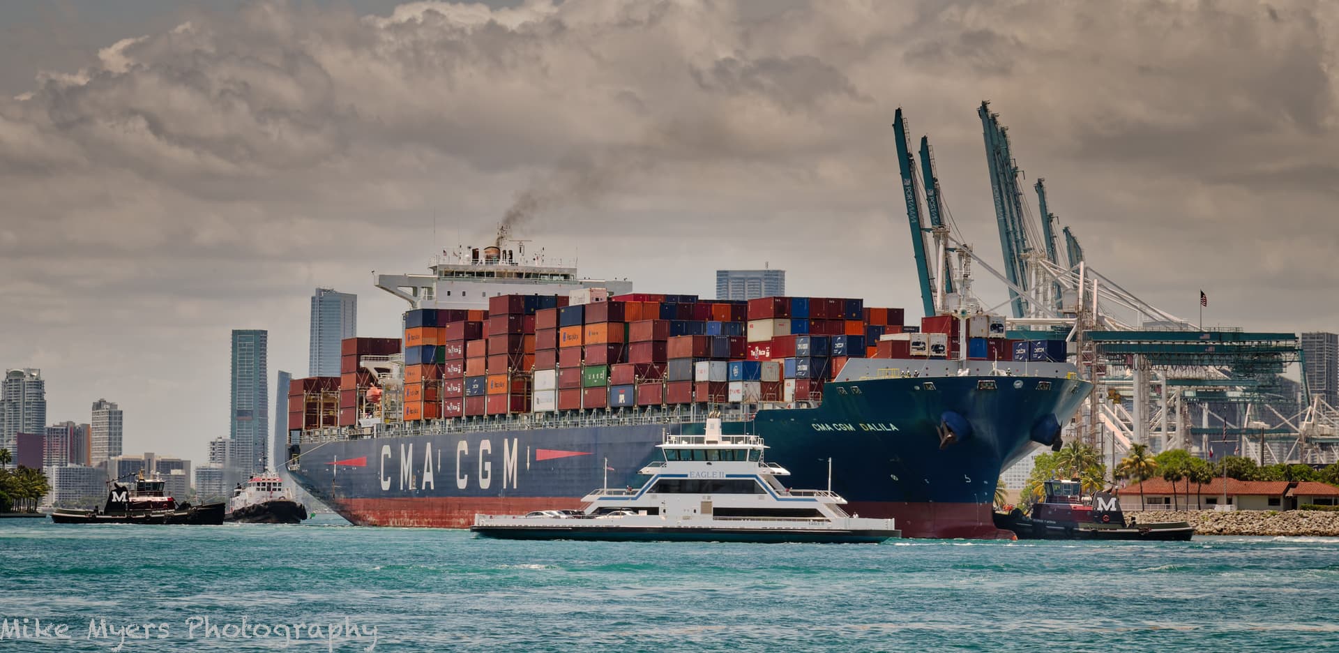
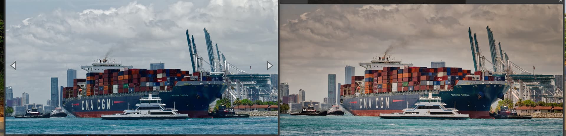
I’m very puzzled about something. In terms of skill, and how PhotoLab was used, and which adjustments, I don’t doubt for a second that your interpretation is far more correct than what I did. Here is your “finished” image compared with mine:

I prefer your sky much more than what I did, better color, looks more natural, and so on.

but

I prefer the ship, especially the cargo, along with the land off in the background more in my version.

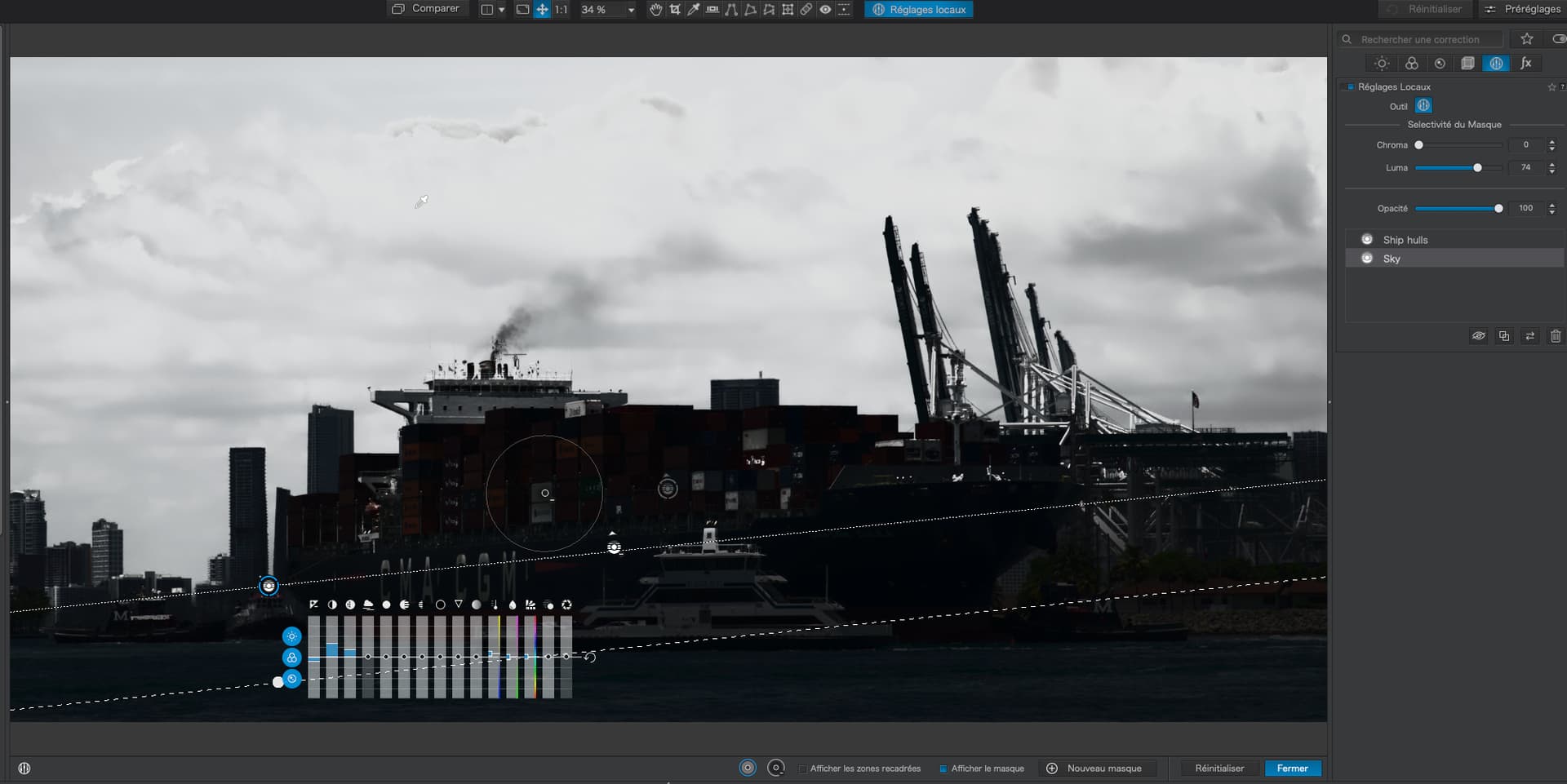
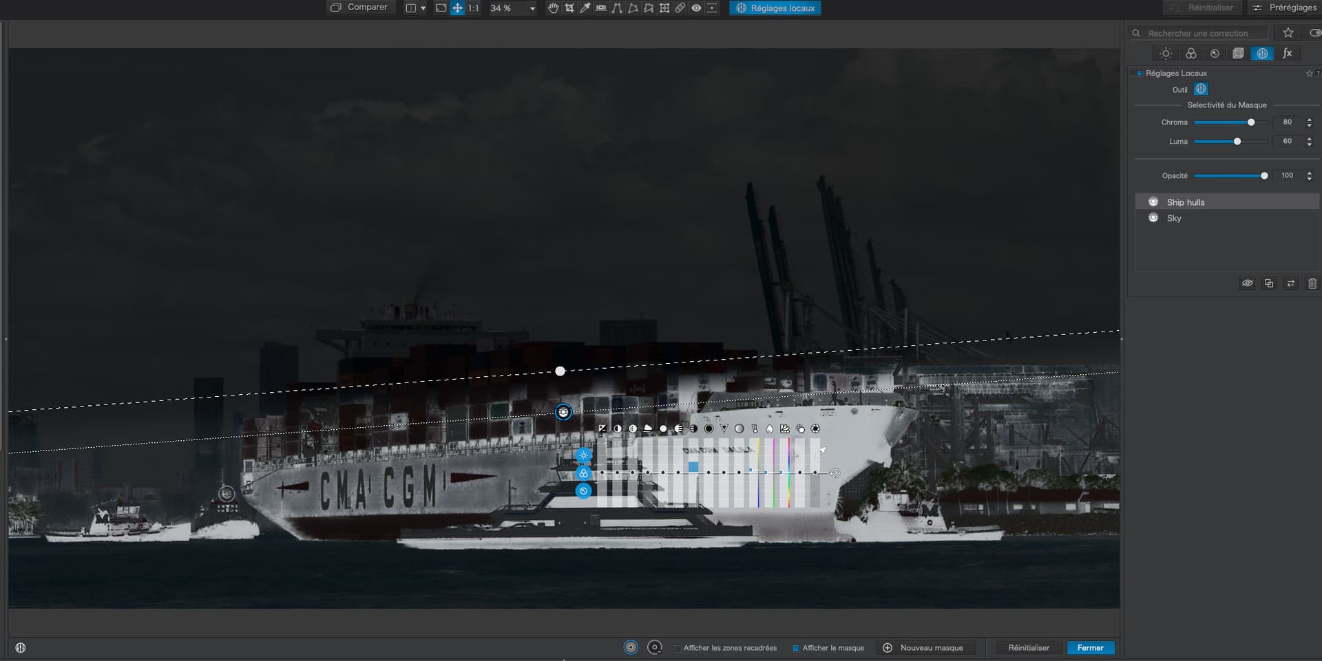
I obviously screwed up on the control line, and have been struggling for the past hour to create, on my own, exactly what you did. Eventually I will download your .dop file and see for myself what you did, and how/why it works. Maybe I’m just slow, and maybe this is over the limit of what I am capable of, or maybe I just don’t understand yet (certainly true) and there is no way I will be able to use this control line stuff until it becomes as obvious as most of the other controls.

I hope you and Wolfgang can consider my “but”. Excluding the sky, everything else looks better in my version, to me. In the image I just captured, with the two images side by side, even in a small size, my image looks like what I saw, while your finished image has too little separation between the ship from the rest of the image.

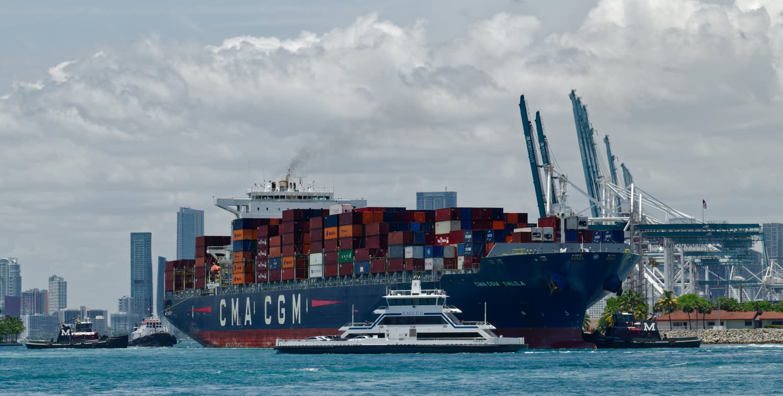
Today is not a very good morning, for completely unrelated reasons. This image doesn’t help, as maybe it’s hopeless. As Wolfgang suggested, there was no other place to stand - were I to move to my left, I’d need a boat. If I were to move to the right, the view was blocked by trees and people. I was telling myself to forget it, and put away my camera, but I don’t listen to myself. So I captured the image anyway, and forgot about it until much later.

More later - I need to make breakfast, and take care of some other necessary things today.

That’s another thought, and sure, I will try, but I have a very strong desire to delete the image and move on. I thought that after I did what I did,I could bring back the sky, and I would be satisfied. I think the best satisfaction I am capable of right now is the key. Fortunately (or not) I’m too stubborn about things like this. I think there is a real photo hidden in this mess, just waiting to escape.

Sorry Mike,

To me it looks like a print out from a web offset printer poster in a container shipping outer office for potential customers.

2 Likes

Why do you use the word “sorry”?

Joanna is one of the experts here at PhotoLab, meaning regardless of how I feel about her image, it is most likely reasonably well edited, while my image had none of that - I was trying lots of things, one after another, until I got a “look” that I liked. The only thing I needed to do on my image was to put some blue back into the sky. It’s probably a matter of “GIGO” (Garbage In, Garbage Out). So nothing can be done to this image to make it good, enjoyable, and acceptable.

I ended up being frustrated at how I couldn’t make it into what I wanted it to be, but the more I look at it, despite the gray sky, I like my version. On the other hand, I don’t “enjoy” the properly edited version, and I certainly don’t enjoy the “out of camera” version.

I now have a VC that is back to the original, and I am (slowly) trying to repeat what Joanna did, after which I will likely do what I did to bring out the colors.

Question - if I completely accept what you wrote “a print out from a web offset printer poster in a container shipping outer office for potential customers” - why does that make it “bad”? Ages ago, I remember advertising posters for ocean liners, and those were supposed to make the ship look beautiful and appealing to potential customers. My version does not look “realistic” (which I’m sure all of you agree with) but it does look like a photo I would gladly hang on my wall, even if I didn’t get any blue into the sky.

More later - I will be going back to replicating what Joanna did, and eventually I hope to get the same result, just for learning, and I first need to refresh my understanding of control lines.

As I have said before. You do your pictures for you. I remember many years ago I said to a person, you should always listen to your advisers. But if you think they are wrong. You should do what your heart tells you is right. I say the same to you. As far as I was concerned, your image was very much like from a web offset. Very flat with no depth to it which spoilt what could have been a good picture. But that is my feelings and if you consider me to be wrong. Then I respect that.

Like you, I have struggled with control lines and thanks to @Joanna. She has helped me with her very elaborate tutorial in her previous postings so thank you very much @Joanna.

One of the advices I have taken, both from @Joanna and @Wolfgang is to keep on experimenting till you get it right, which I’m sure you are doing as well so keep up the good work.

I sit here thinking I was down near the port entrance, and took a “nothing-special” photo with a good camera, good lens, and reasonable camera settings. So if it was starting off as nothing special.

Then it never looked good during editing, and by trial and error, and constantly re-doing things, well, you see what I ended up with. Tonight I will try to improve it, but the example from Joanna, which is most likely more correct, doesn’t look like what I wanted. My version is close, but maybe a bit too colorful, and the sky is pretty rough.

Regarding what you wrote, my heart wants something between what I did, and what Joanna did. Joanna’s version I would delete. My version - well, I’m too stubborn to give up yet - and I ALSO REALIZE I NEED TO LEARN HOW TO USE CONTROL LINES BETTER.

Chances are I will go back to the original, and start all over, doing what Joann suggested, the way she suggested it, and then to bring out the colors again.

If I wanted to pick numbers that added up to 93, there are a huge amount of possibilities to get to 93. Maybe to be easy, 90+3. But when people look at my answer, that’s all they want, not all the details. (Here of course it’s different - I want to know ALL the details.). :slight_smile: