Off-Topic - advice, experiences and examples, for images that will be processed in PhotoLab

You probably already knew I would like it, and I do. The speedboat adds a lot to the image, and is where my eye went pretty quickly. The crane off at the right “closes” the image.

If I were taking it, and if I could have, I would have zoomed out to get the whole ship, but then the boat and crane would have been lost.

Oh, and perfect timing too!

The only change I would suggest is lightening up the rear of the ship a little - there are all these shapes, but without zooming in, I don’t understand what they are - and when I do zoom in, I’m still not sure what they are. I doubt if anyone other than me would care.

Finally, since I now know how to do so, I would have brought out the sky a little more.

Going back and forth between the two images, it’s difficult for me to see any “color” in the top image. The B&W image shows the detail better around the “outside” areas. That’s probably exactly what you wanted, so I like both, and the “color” image a little more than the “B&W”.

I would enjoy it more if you brought out a little bit more of the detail in the outer parts of the image, not enough to take away from the center, but enough so I could see it better.

Thanks for your comments. I understand how the sky might have been confusing. While it had been a bright, sunny and cloudless day, this image was captured at 3:45 p.m. on December 30th. Sunset was only an hour away and the sun was low in the sky. The shaft of light hitting the stone wall came from the sun filtering through an opening in the trees. At that time of day there was not a lot of light coming directly from overhead. Perhaps the film type I used gave the appearance of a grey sky but I made no changes to it.

The creation of shadows was due as much to the fairly dense surrounding trees as to the angle of the sun which may have also confused things a bit. Of course, as you can imagine, in summer with the sun that low in the sky and leaves on those trees that entire area is in deep shadow.

I am taking your comments, as well as others, into consideration. I will attempt to re-work the image to address them which will hopefully improve it to some degree. If I’m satisfied that I’ve addressed everyone’s comments I will repost it.

The danger, of course, with modifying a “finished” image is that it still might not meet everyone’s expectations, and even worse, may no longer meet my own. That is always the risk.- :slight_smile:

Mark

Yup, that’s Agfa film alright! Took me right back to my first job, working in a camera shop, and getting customers’ prints back from the lab. personally, I really don’t like the film look and I’m struggling to see sculpture instead of a typical overgrown ruin of a Breton cottage

Having said all that, the exposure is superb and would take several interpretations. My only little suggestion is to apply a Control Line over the sky and drop the colour temperature a tad to make it a bit bluer.

1 Like

I must say, this time, I prefer the colour. It is so subtle and brings out some of the details better in my opinion.

Nicely composed. Just a tad flat in tonality for me.

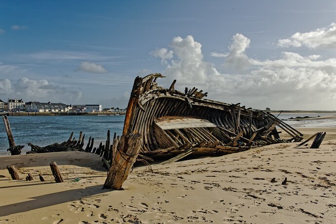
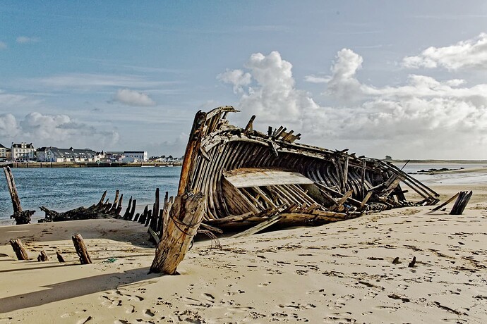
Just did a 200km round trip to Le Magouër to get a few shots of some abandoned wooden boats that have been there for years, but are now starting to disappear faster than they were.

Here’s the most difficult one to expose, to cope with the bright sky and the shadowed areas inside what’s left of the hulls…

2 Likes

Maybe I should consider changing the film type I’m using or just warm things up myself. I liked the look of the Agfa but perhaps it’s too red. I will also attempt to make the sky a little bluer, but I need to be careful not to overdo it. At that time of the day the sky was not a bright blue. I’m considering pulling a little more detail out of the deep shadows, but again I don’t want to overdo it. However there is a lot of detail in there. The darkest area is actually an opening where you can walk through the structure which curves around, although you cannot see the curved area from that angle.

Mark

You’re right. I couldn’t get more tonality in it. But in yours it could.

Is there a reason to drop old boats there?

George

I like to have opposites in an image.

George

Because that’s where they ended up ?:wink: And they attract tourists.

1 Like

That’s funny, I can just imagine the owner’s decisions. “Should I take my no longer useful boat to a breaker’s yard or should I just dump it on the beach so future tourists can spend the next 50 years taking pictures of it’s decaying hull”. :smile:

Mark

I imagine some, and perhaps most, were wrecked offshore and the tides brought them in years or decades ago. In years past those areas may have had very low populations and wrecks here and there on the beaches would have cost much more than it was worth to remove them.

There were a number of similar wrecks for decades on the New England shoreline in the United States. Most have been removed over the decades since they are potentially dangerous to the ever-increasing population using those coastline areas.

Mark

You are right. I just tried a couple of presets in Nik SilverEfex to get an idea and it looked better, but for a nice graphical solution the lamp (still being the subject) is to small & the walls are not necessarily interesting, while I also don’t want to pull (too much) attention to the sides.

I actually like the juxtaposition between small boat and the large ship. The tonality almost seems like black and white with spot color here and there. That spot color look may pull the eye away from what I believe.is the main area for focus, the small boat which looks like it is about to cross the wake of the cruise ship. I don’t believe the little bit of color adds anything. Perhaps you should consider reworking it in monochrome.

You might also want to consider cropping into a square and eliminating much of the right hand area to allow greater focus on the very small boat in relation to the huge cruise ship.

Mark

Hello,

Been following this specific topic for quite a while now.
Tastes and differences aside, was a bit sceptical this topic getting ‘de-railed’ due to persistent arguments back and forth. However, I got actually a bit exited by all this and made me think a bit more ‘different’ actually.

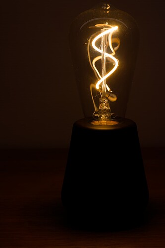
No, no toothbrushes and surely not 500 of them, but here’s what I did. Just a simple light bowl in the dark on a table, clean and no fuss. Kinda funny looking at things this way.


IMG_0175.CR2 (24,2 MB)
IMG_0175.CR2.dop (10,2 KB)

Learned my humble Canon 77D a bit better by doing this.

Regards,
Jeroen (Netherlands)

My thoughts - would look better to me if It was lower in the image, as it does look like a “table light” and not one that hangs from the ceiling. Fascinating how you captured the image!!! I think, but I’m not sure, you show the outline of a glass “globe” that would surround the lamp, but that’s maybe just my imagination. I don’t think I’ve ever seen a “bulb” like this before, but I think it’s beautiful in a very unique way.

Welcome to the discussion!!!

Added later - aha!!! I looked at it full size, and so much more showed up. Lovely image! Most of what I like so much is hidden in the smaller view. :slight_smile: …or my eyes are worse than ever…

My pictures only have to meet my expectations. :smiley: sometimes low ones, other times I try to challenge myself. If somebody else likes them too, fine. Except the ones I take as commission for others. But then I try to find out before, what the other person wants. Interestingly you were going for Agfa-filmlook. I didn’t like their products when I was shooting film, they were often more grainy than I was used from Fujifilm or Kodachrome.

Hi welkom to the discussion.
About your image.
What you could do as improvement is:
1 zoomed i see dust and dirt on the bulb. On purpose or just forgot to clean? :blush:
2 if the bulb is the only subject, darken the foot with local mask by lowering exposure value after masking so the bulb is floating and place it centrered in the middle.
3 to give the bulb purpose you could set up the lamp as the “moon” and place kids toys as “earth life” underneath it. Like a toy car.
Then play with perspective to give it the propper angle.
(if you have viewpoint you can use that toy perspective tool, or just use the lineair mask and force some blur in to it to get the DoF feel right.)

A PhotoLab question - How best to take B&W photos with a “color camera” to be processed in PhotoLab. I watched a video last night from the Leica Red Dot Forum Channel:

https://www.youtube.com/watch?v=iDsav-rp1NU&t=6750s

It’s a goldmine of good information about both Leica’s Monochrom cameras, and B&W photography as it relates to color. It reminded me of things I used to know, and things I had forgotten all about.

The Monochrom cameras only record in B&W. There are no separate channels. All the information goes to one channel, and it allows shooting at ISO speeds that sound outrageous and get wonderful results.

I only got to watch the first part - need to watch the rest and then watch it again so I better understand.

While watching, I was wondering if there is any way to take a “normal” camera, and come closer to what the Monochrom does. Specifically, two things I was wondering about:

1 - What would be the appropriate settings on a “normal” camera to capture the best image in B&W - knowing that the “raw image” will still be a color image, and it will need to have the colors removed.

2 - In my old B&W photography, I might put an orange filter on the lens, and maybe even a red filter, to deepen the “blue sky”. The video suggested that is not possible with a color camera. I suspect that is because the color camera has three “channels”, and while one channel will be affected by doing this, the other two won’t.

If I won the lottery, maybe I would buy a Monochrom camera, but short of that, they are way too expensive.

What I’ve already done on my M10 and D780 was to show the B&W image in the camera, and the ‘jpg’ previews. That’s easy, but I don’t know how useful it is, if at all.

Any suggestions? (If you have time, watch the video - lots of good information there, most of it “general” and not about the Monochrom camera.