Off-Topic - advice, experiences and examples, for images that will be processed in PhotoLab

Well, there is a bit more to the story.

What you have seen from your older lenses might be good enough to please you now, you might be pleasantly surprised to see what more modern lens designs might do with the D850 if it were possible to adapt them to it (they can’t, unfortunately).

The camera and lens companies say that the shorter lens-to-sensor distance of mirrorless vs DSLR designs, plus the larger diameter lens barrels allowed by redesigned (bigger) lens mounts, makes lenses very much easier to design and optimize. That means better sharpness, less coma, and fewer aberrations for the same or less design effort and manufacturing cost. All good, right? Throw in VR to make hand-held photos even sharper and it gets even better.

And… even better lenses will be needed in the future. The megapixel race has given us incredibly good sensors in terms of definition and dynamic range, and that coupled with sharper lenses has pushed the quality of small format photography so high that I’ll wager that the output quality of small format now matches or exceeds that from the 6x7cm cameras of the film era. And the quality will relentlessly keep getting better and better until the theoretical limits are approached as they have been with current microprocessor technology.

Watch out @Joanna, your big Ebony is going to be even more obsolete before too much longer!

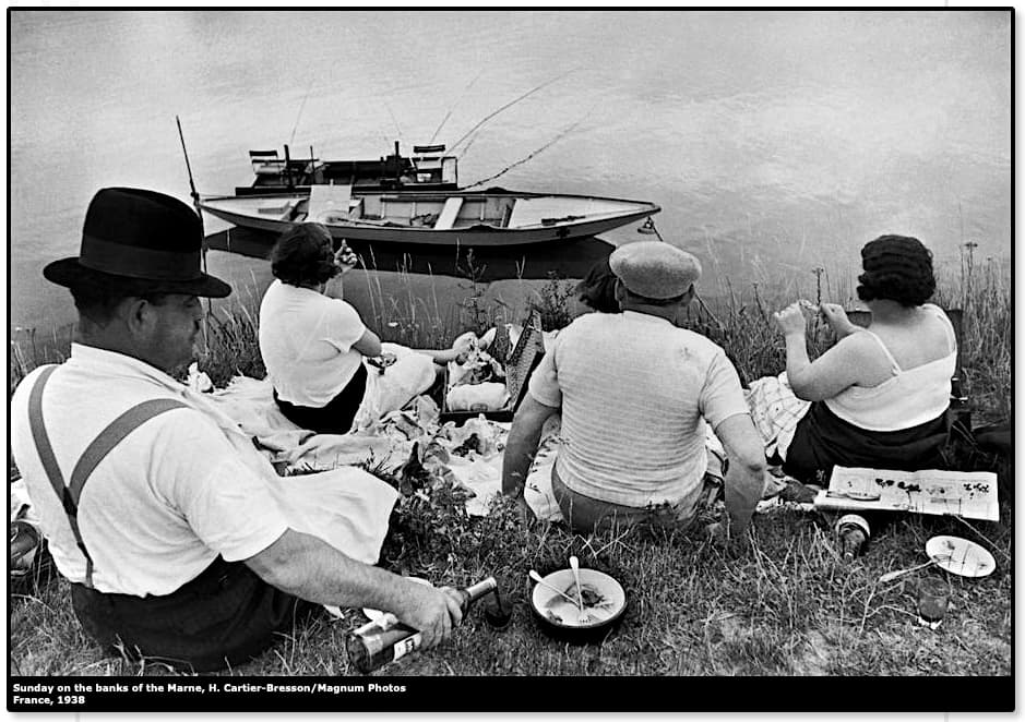
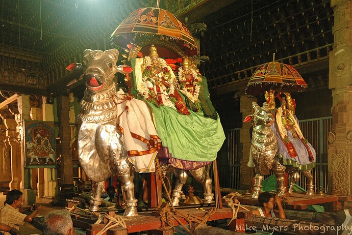
Regardless of the label, I’m happy. Is it a photojournalistic shot? How about the one from HCB? Does it matter?

The point of posting it here, regardless of what kind of photo it is, was to show that I don’t need the very latest high-tech photo gear - that small Lumix was all I needed. By the way, it wasn’t any “place” in particular - we were driving across India to the west coast, going to Ft. Kochi, and passed this ox-cart on the way. I saw it as a great opportunity to get a photo I might love. My eyes are usually “open”, looking for scenes begging to be captured with a camera.

I’ll never be an HCB, but I can do my best, learning how to improve at the same time.

I’m quite used to the D780 and M10, both of which are being used in (M)anual mode, and neither of which has auto-iso turned on. The Df is quite different, and always takes me a few minutes to re-learn. Why do I enjoy shooting with it? Because I enjoy it:
https://ricksreviews.org/blog/2022/03/13/nikon-df-review/
I have put it away as of yesterday, and probably will leave it alone for a long time.

That leaves two cameras, one of which I love (M10) and one of which is perfect (D780). The M10 has the aperture on the front, the ISO on top, the shutter speed (also on top), and has an indicator in the viewfinder if my exposure seems reasonable to me.

You feel so strongly about it that I’ll leave auto-iso turned off. Most of the time, ISO will most likely be at 100 or 400, and ignored unless necessary. Aperture will be set for depth of field. Shutter will be set for a range for what I feel is appropriate, and adjusted if necessary to get a proper exposure (unless I change the ISO first).

I mostly use either the DSLR or the rangefinder - with DSLR everything is as you say, and with the rangefinder, the lens is set on the aperture ring, and focus is manual. For distance photos, I don’t use the rangefinder, if for no other reason than I don’t have long lenses for it. Still, on special occasions, I might well use one of the other cameras. My M8.2 is the only camera I own that can shoot in infrared, and I’ve got an itch to shoot film every so often. I haven’t done so in a year, but I still want to…

Very confusing, and it’s not important really. It is what it is. I don’t see distortion in my images, and mostly use better lenses. The 24-120 I’m curious about, but again, it is what it is. PhotoLab takes care of it for most of the lenses I’m likely to use on my Nikon, and most of my lenses for my Leica are prime lenses, and are mostly free of distortion.

No, I bought a 50’ or 100’ roll of Kodak Plus-X and loaded my own cassettes. I rarely used anything else. For color, I don’t remember there being many choices, and the choice was usually Kodachrome or Ektachrome. The only times I did something different were when I wanted minima grain or very high speed, but that was pretty rare. I mostly stuck with my bulk film and loaded my own cassettes.

I don’t picture much of a difference in grain between 100, 200, 400, and 1,000, maybe not enough to worry about when our new cameras can go to 5,000, 10,000, 20,000, and so on using PhotoLab to control the grain at the higher speeds. Now that I’ve learned about “dynamic range”, that changes everything and there is a lot more to think about. If I was going to make a huge enlargement, then maybe I would need to consider this more carefully.

I know you’re right, but I can’t see any physical differences in images exposed at 100 or 500 ISO. I guess with my old cameras, that would have been a LOT more important.
Thanks - I guess I’m out of luck with my old lenses, or at least the ones that need big corrections. I wonder why they don’t - many people might find that very useful.

1 Like

Ed, that’s just part of the story - there is more…

The D850 is so big partly because it needs room for the mirror. What happens when we eliminate the mirror? Some lenses can be mounted closer to the camera, and get smaller, along with lighter… but not all. I don’t think this would make @Joanna’s 300mm lens any shorter.
https://www.youtube.com/watch?v=mMhnsarpZWA&t=52s

…but it certainly means the lenses for my rangefinder camera can be much smaller and lighter.

Not very many photos that I set up to look artistic. This comes closest.
Huge “still life”.

You’ll have to forgive me for being blunt but… It’s not a still life and it’s not “artistic” - it’s just a record snapshot with the highlights over-exposed.

The idea behind continuing this thread was to allow folks to improve their skills, both with their cameras and with PL. It was not to simply share old shots, unless they demonstrate how to use PL to improve an image.

Due to your stated desire to move from photojournalistic (record) photography to something more artistic, some of us suggested you take your best camera (D780) and attempt to make new images that will lead in that direction.

It would be good if you could make a New Year resolution to follow that path :blush:

2 Likes

I read this page yesterday, to try to get a handle on this:
Find your truth in fine art photography

Since it was cold and wet and nasty outside, I went looking for photos I’ve taken up to ten years before that met that criteria. I guess the one I picked wasn’t good enough.

OK, your challenge accepted: New Year’s resolution to capture Fine Art Photography with my D780.

(This is in addition to the photos I enjoy taking, not instead of.)

(I suspect we have very different ideas about “what is artistic”, but so be it.)

Did you choose this photo after reading OR would you choose the photo now?
Can you explain what you did to ‘set it up to look artistic!’?

[ not that I want you to spend time on it – don’t think it’s worth it with horrible light, no composition … ]

1 Like

Be warned, this is an article promoting Adobe products for far more creative post-processing than you could achieve in Photolab.

Since you are surrounded by buildings, try looking for photographs on sites like https://www.saatchiart.com/photography/architecture.

In general, “Fine Art photography” tends to be quite complex to achieve and usually needs Photoshop, Affinity Photo or the like (even I don’t profess to have mastered it).

Stick to “Artistic”, as in composition, framing, colour theming or B&W. But, I really believe that you need to overcome your phobia of still life, because there is a rich seam of art photos that can be made on a tabletop. And you can do it without spending vast amounts of money - lighting can be as simple as a torch. Think long exposure in a darkened room, illuminating different aspects of your objects - it’s called light painting.

It’s no good looking up articles on “how to do” art photography - you need to see what other photographers do and take inspiration from them.

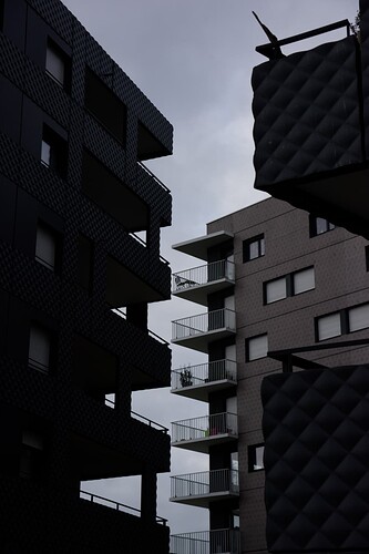
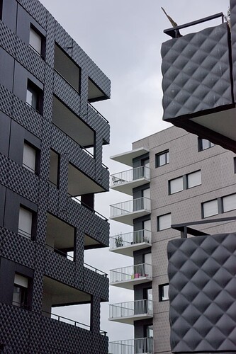
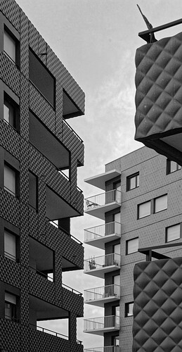
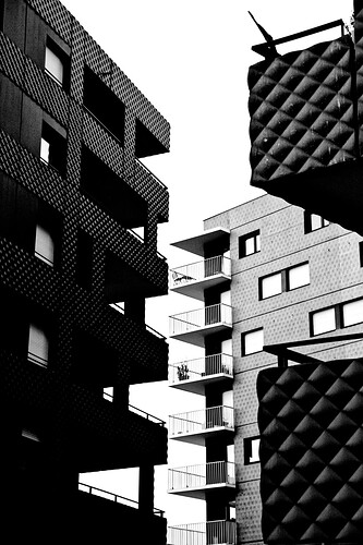
For architecture, here’s an example of a shot I took of some buildings in Brest:

SOOC…

Straight colour…

Straight B&W…

High contrast B&W…


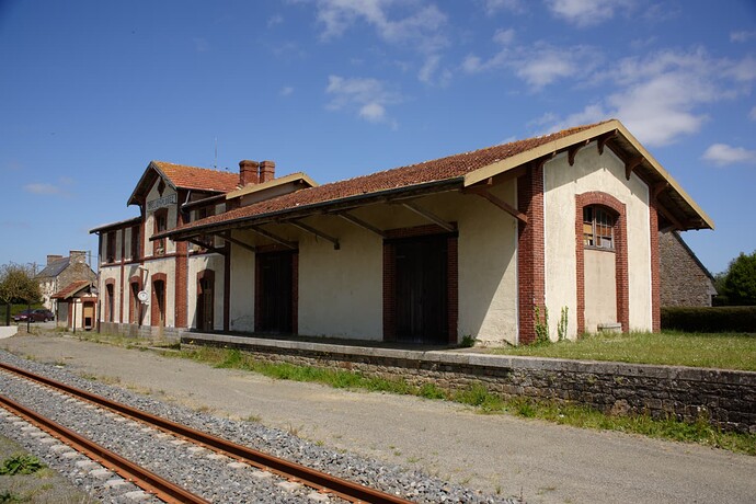
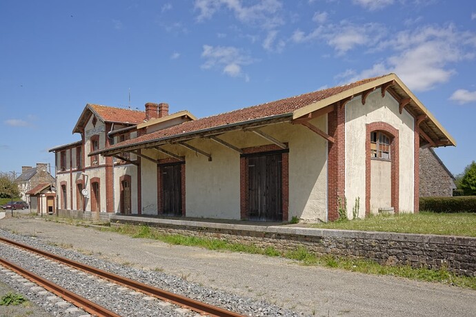
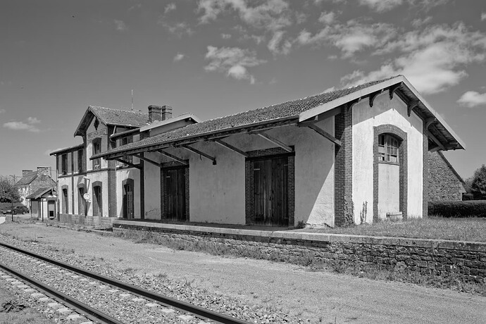
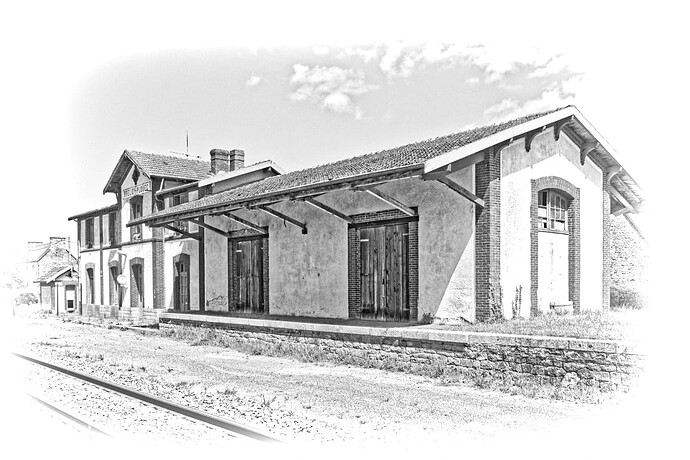
The station at Brélidy-Plouec:

SOOC…

Straight colour…

Straight B&W…

Engraved preset…


The yacht basin at Perros-Guirec:


The key is/are composition, geometry, symmetry, isolation of the subject, control of depth of field, textures - and a few more things that you need to discover.

Yes, I read the first half of the article, then went looking through old photos to find something that would enough like art that I would be happy to hang it on my wall. I guess it doesn’t matter the this was the only spot I could shoot from, that the lighting was already set up, and the composition to me looks great. Obviously, I’m in no position/condition to explain, and I’m unable to put what I felt into words. So I’ll cross this image off my list, along with ALL the images I have stored on my photo drives.

I don’t see anything in the building photos, and never would have taken this photo. It doesn’t look like “art” to me, and the perspective “feels” very annoying. The second one from the top “straight color” looks better to me than the others, but it “feels” very unsettled.

I like the second and third photos, but don’t see this as being much different from photos I take, which is probably why I like it. The close-ups at the yacht basin look to me like snapshots. The last one is pleasing, but I “want” to see more on the sides. I like it because I can relate to “rope”, not because it is “art”.

Think of this as a music recital where I am supposed to give my feelings afterwards. I would be lost. I don’t know enough to have any opinion, let alone a good opinion.

To better put this in perspective, suppose you asked me to post my thoughts in German or French. They would be awful, and probably laughable.

Maybe I don’t understand “art” well enough to create something “artistic”.

If the buildings Joanna posted the photos of are supposed to be “art”, I don’t see how or why. And the photo of the train station - I like that kind of photography already.

The one that comes closest to me as being “artistic” is the last one, the “Engraved preset”, but I suspect a computer created that.

It is much easier to talk about PhotoLab than it is to talk about what is “art”. I suppose we all have our own ideas about “what is art”. Like music, or food, we all have our ideas as to what we “like”.

Despite all this, I will still try to capture an image with the D780 that you all accept as “art”.

Photography is a craft rather than an art. Art is not created by mastering a technique, no matter the technique. Art comes with the scene, comes with abstraction and differentiation between contributing elements of and accessories to the scene.

Art is subjective and can be highly political, people were labeled crazy because of what they showed or how they showed it.

I think we should stick to the craft part of it all and focus on mastering the craft, specially the one of using PhotoLab.

6 Likes

Compare photography with communication. You choose a commonly understandable ‘language’ to give the viewer the chance to see and feel what you are telling.

You put your intention into the pic (otherwise you wouldn’t take it) and use some rules / techniques to express and visualize, what triggered / inspired you, what you want to show. With endless possibilities, make sure the viewer gets interested … to further explore your pic.

Which means, you guide the viewer’s attention with brightness vs dimness, contrast vs dull, sharpness vs out-of-focus, colour vs moody, warm vs cold … to bring up the subject, and if necessary explain through context. @Joanna showed, how to isolate / bring things ‘to the front’. It’s not about to like the examples.

Try the ‘easy stuff’ before mastering more than one subject (correlating in size / importance … )
see → your example

While the user forum is not an explicit image platform to present and criticize images, we can exchange thoughts … and how to handle things in the software, to support what we captured.

don’t forget – have fun


… remembered an interesting pic, where you were ‘right in the story’

All I did was to enhance the subject (microcontrast / vibrancy) and decrease the attention for the fourth boy. … So, you can do it.

2 Likes

I like the way you improved this image, but @Joanna’s going to come back and say it’s just another photojournalism photo, like my other photos.

PhotoLab made it easier to make this image look good, and you’ve made it look even better with things I never noticed or thought of.

It is possible to make a wild animal into a pet, but at some point in the future, for inexplicable reasons, that “pet” can turn on its owner and tear the owner to pieces, or worse. Translation: I may eventually able to create “artistic photos”, but after over 60 years of photojournalism, deep down inside me I am a photojournalist at heart. Another translation - having a tiger or chimp as a pet is a terrible idea…

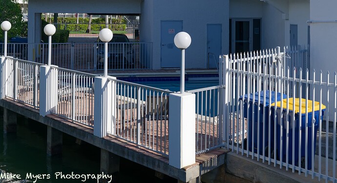
I was very much in the mood to try again today, but I doubt any of you will accept this image.
Walking to the food store, with my D780 and 24-120, I saw all these shapes and couldn’t resist.
I also tried B&W, but I love the yellow blanket next to a blue blanket… Nowadays, those two colors go together… Ukraine… I must have been in a “daze” or something, as I didn’t see the reality, just the fence weaving around in a strange pattern which I was attracted to. The “reality” in the background looks like another world, totally alien and detached from my photo.

780_0358 | 2022-12-27.nef (28.0 MB)
780_0358 | 2022-12-27.nef.dop (14.5 KB)

Interesting. I would call this “graphic”. You have a good leading line from the bottom right, texture of the railings and a repeating highlight of the lamp globes.

Personally, I felt that colour detracted from the graphic nature of the image and I found my eye being drawn away from the lovely pattern of the railings to the two separate areas of the background and the bin lids.

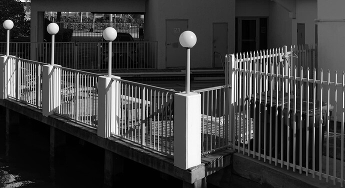
So, I tried a straight B&W…

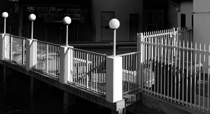
… which lessens the distraction of the colours at the two ends of the image, but, I still found the background distracting from the strong main subject of the railings. So I increased the contrast a bit and darkened the background and the reflection on the water…

Don’t get me wrong, to my mind, this has to be one of the best “art” images you have produced in terms of composition and graphic content. My suggestions are just to give you ideas further away from absolute reality.

Now you may not agree with the final “extreme” graphicism of the last version but, amongst it all, there are one or two techniques for helping guide the viewer’s eye.

780_0358 | 2022-12-27.nef.dop (69,7 Ko)


Oooh, now that is contentious :stuck_out_tongue_winking_eye: I could argue that both ways against the middle but this is not necessarily the best place.


Definition from Helen…

Photography is a craft that, at its highest level, can produce a work of art :sunglasses:

1 Like

The yellow just happens to be the secondary colour to blue. Hopefully you know your primary and secondary colours.

I opened up my notepad and covered the yellow bin. That took away the distraction at the bottom right which just left the distraction of the background in the top left-hand end.

As @Joanna has done. It cries out for black-and-white.

I’m afraid I cannot agree with @platypus. To me it is both. I most certainly agree with Helen.

Incidentally @Mike. I don’t know whether you have tried this but I often open one, sometimes two or even three notepads and coverup parts of images to see if they can be improved. I wonder if you have tried it.

This is saying it more precisely…even though I doubt that art level can be reached without a decent subject.

Setting up a decent subject (or finding one) can help to promote a photographic reproduction to art level, but I don’t consider it as part of photography. It can be part of an art project, in which photography is the tool - and therefore a craft.

But that’s a never-ending discussion.

Again, what do you want to show?

  • is it the illuminated fence … the graphical element what @Joanna ‘pulled out’
  • the fenced property, where the bin is even better ‘guarded’ than the pool … story telling
  • the colourful foreground …

Realizing about the bright shining through background you could have tried to dim it / take away some attention to not distract from your subject. And with closer inspection you would have noticed (realized) the repeated foreground pattern (two fences, tree trunks ‘mirroring’ the concrete lamp posts) … all about ‘safety’.
– Instead, you spend time to put your name badge onto the pic.

Thank you. I like the version I posted, and I like your end result. As a “graphic” I prefer your version, but it’s no longer a “photograph”. That’s OK… Next time I will try both ways.

I think photography can be either, or both.

Helen is right, in my opinion, but that is only one of the ways for photography to produce “art”.

Yes, I “know” that, buried away in my mind, but I never think about it, even when I should.

“Distraction”… To me, those “distractions” add to the image, but @Joanna’s end graphic is certainly better without them. My brain is wired to sometimes see “distractions” as one part of my image, based on what they are and how they affect the image. I did crop away what I considered irrelevant “distractions” at the top of the image. I also considered B&W, but I liked my end result in color. I agree, to hang on a wall, in a frame, Joanna’s version is preferable, and far better than mine.

Very complicated discussion… I saw the “shape” of the fence, and tried to find a good way to capture it.

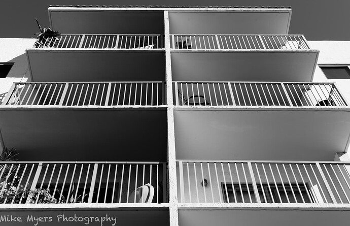
I took a different photo at the same location, looking up, but didn’t see it as something worth posting here. For reasons that I can’t explain, I still like it: