Off-Topic - advice, experiences and examples, for images that will be processed in PhotoLab

Well, thank you! I may never get an image that satisfies you, but that wasn’t my goal, which was processing the image properly in PhotoLab. That alone is progress for me.

You are correct - I never even considered guiding the viewer’s eye, and if I had done so, I have no idea where I would guide the viewer’s eye to. I think all the bicycles make a “pattern”, and that “pattern” was the heart of the photo, and what I was thinking about during editing.

I went for a short walkabout with the D780 today - will check out those results this evening. I even tried to capture a different view of the same bicycle stand. Maybe shooting from a different angle will accomplish your suggestion of “drawing the viewer’s eye into the image”. With any luck, I’ll complete that this evening.

As @Wolfgang says, the composition is not that great but I thought I would just share an alternative B&W treatment. Using my favourite Fuji Acros 100 film, Smart Lighting, an orange filter and a different Tone Curve…

DF1_3204 | 2023-03-19.nef.dop (50,1 Ko)

I certainly prefer your version over mine - the way you changed the shades (because of the orange filter???) your version fits together much nicer. The .dop is copied over, so I can study how you did it - especially the tone curve, which is opposite compared to what I did.

Looking at your version now - where does it show that you used the orange filter? Shouldn’t it be under “Color Rendering”? Until now, I’ve never tried to use a color filter… how is this done?

I’ll post my newer image later tonight. It definitely “leads the viewer’s eyes into the image”, but it still has some rough edges to be fine tuned.

Here goes - it does what @Wolfgang suggested, but it reminds me of looking into a trick mirror…
I think I dis-like it, as it makes me feel uncomfortable looking at it. It doesn’t look real, it looks like something out of a bad dream.

First time I’ve gone into the HSL tool, while viewing the image in B&W on my screen, and adjusted the blue color on the bike frames.

I opened the lens pretty wide, as I only wanted the closest bike to be in focus. I got what I wanted, but now I have second thoughts.

Long before Wolfgang said what he did, I took several different photos from different angles, then took this image from slightly different viewpoints. I did get what I wanted (or so I thought at the time). Tonight, I kept cropping away parts of the image to keep it “focused” on the central part of the image.

It bothers me that there is something “disturbing” about this latest version. Maybe it works too well?

780_0733 | 2023-05-07.nef (30.3 MB)
780_0733 | 2023-05-07.nef.dop (18.9 KB)

Just wondering if you ever got your question answered.

I’m wondering about what you wrote, which I quoted. Even if you do need to manually clean the sensor, I’ve never read about anyone using a suction device to do so. Presumably you don’t want anything to touch the sensor. Seems to me that unless the dirt is really stuck in place, the hand-held “rocket blower” is the ideal tool, and with the lens opening facing down, once the dust is dislodged, it should fall down and out of the camera.

BUT…

My D780 seems to have the same settings as your D850. It came from the factory programmed to do clean the sensor at Startup and at Shutdown. To me, that means that if dust does get on the sensor, as soon as I turn the camera off, the sensor cleaning will get rid of it long before it gets “stuck” in place.

@Joanna, if you’re seeing this, is this the way your D850 is configured?

Aha! Figured out how you did it.

I started here:
https://forum.dxo.com/t/black-and-white-conversion-color-filters/11596

…which sent me to “DxO FILMPACK”, and found the section for filters, with your orange filter listed.

Now that I understand HOW you did it, I will try it on my own, maybe with a red filter for a black sky. … done! Works just like if I was shooting film! Thank you again.

PhotoLab is starting to be more and more enjoyable. Scary enjoyable.
A little knowledge is a dangerous thing.

Sadly, all of this would be useless if I ever buy a Monochrom camera - if I do that, I’m back to using real filters again, which fortunately I kept from a lifetime ago.

Sorry for the diversion - between so many of you in this forum presenting unknown features, and me being excited about trying them, this is wonderful!

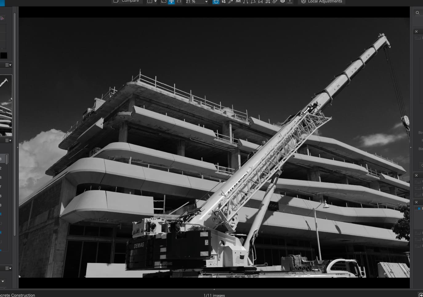
Oh, and don’t pay any attention to the above image - I just wanted to test the red filter idea. Photo is no better than it was before, but it had a blue sky.

I went out to buy bagels a few days ago, and look for things to photograph while on my walk, or perhaps it was more like I wanted to go “hunting” with my D780, and figured I’d get the bagels at the same time. Regardless, I had no idea of what I wanted to photograph - I was just “hunting” for something that intrigued me. I noticed these two blue and red water pipes, and they seemed interesting. I eventually found a viewpoint with an acceptable background, and deliberately focused on the closer pipe, setting the aperture so the rear of the photo would be less sharp.

Using the PL tools as I’ve recently learned how to use them, I eventually got exactly what I saw, and the photograph I wanted. On a whim, I figured I would also try B&W. That was more difficult, but I’m now puzzled as to which version is “better”. The obvious answer was color was better, as that’s why I noticed the photo to capture it, but looking at them now, the non-color version is something I would prefer to hang on my wall.

I’m beginning to understand why @Joanna and @Wolfgang seem to prefer B&W images. Maybe they leave more for my imagination to deal with - the color version just shows blue, red, and green. The details are there, but my brain doesn’t really notice them - while in B&W, my eyes enjoying the whole image more, because there is “more” that I see than just three colors.

780_0723 | 2023-05-07.nef (29.8 MB)
780_0723 | 2023-05-07.nef.dop (30.2 KB)

Mike, you are interpreting way too much!


This afternoon I messed around with your file
( unfortunately you didn’t fully photograph the first bike )
to find out, what might be interesting.
.
VC1 → 780_0733 2023-05-07.nef.dop (75,4 KB)


the Blue City Bike


BTW – the 24-120mm / F4 is not so well suited, when to capture something with a small(er) field of view with a shallow depth of field. → In these cases I use a real long focal length or go with a prime, that can open really wide.

(ed)

after investing some more effort with Local Adjustments instead of overall contrast …


VC2
.
than later simplified as a new (enhanced) version

VC3 → 780_0723 2023-05-07.nef.dop (881,6 KB)

Based on the same ‘idea’ as with the gremlin in the tree, I reduced the attention (dimmed the whole pic) to then bring it back on the two pipes … guiding the viewer’s eye.

I’m confused. I renamed my original .dop file, then copied your .dop file into the folder, then added the “vertical bar”, but I still don’t get to see your revised image. I’ll try again later tonight.

In the meantime, what has changed is that the two pipes look very similar, but everything else in the image has gotten darker, so it doesn’t show up very prominently like before. It’s interesting, but it doesn’t look as “natural”. I thought the trees and the ground added to the image.

I’ll have to think about this some more, maybe review it tomorrow. Right now, when I view the two versions side by side, I prefer the original - maybe if the trees and ground were darkened a little less, that would work better for me.

Now that everything is working at my end, I agree - I do prefer your version.

In the attached screen capture, how can I compare VC1 with VC2? Is this possible?
It wants to compare a Virtual File with the Master (original).

What is the best way to compare all of your settings (VC2) with my settings (VC1) ?

In the menu that you show dropped down, simply choose the version you want to compare the currently selected image with. Then press the Compare button.

Good morning – you are up early!

Check the newer dop-file, which contains your coloured (M)aster, your B&W version (VC1), my first B&W trial (VC2) and my newer B&W (VC3)


M, VC 1 - 3 (without the jpeg-export from VC3)

.
When choosing/highlighting the VC3 version, then I can compare it to any of the other versions.

Screen Shot 05-10-23 at 10.32 AM 001

→ By default “No corrections (with geometry)” was chosen, which when you don’t change
e.g. to compare with your VC1, falls back to … , in this case to the (M)aster. ←

[ should work the same on Mac / see @Joanna’s reply ]

@mikemyers

Just did an experiment … :slight_smile:


While your B&W version (VC1) is based on
grafik
and the Channel mixer
.
I used for my B&W versions (VC2 + 3)
grafik
grafik
and the Channel mixer (different settings)


Copied the VC3 version to a brandnew VC4,

  • where I changed from HSL desaturation to B&W Film Fuji Neopan Acros 100

  • and readjusted (“reduced”) Highlights, Midtones and Blacks
    for the background as well both pipes.

Interestingly, the VC4 outcome appears stronger / contrastier,
which means (maybe) more likeable – while important to fine tune the settings.

VC4780_0723 2023-05-07.nef.dop (1,3 MB)

This made it more clear how to do the comparison. It wasn’t “intuitive” Maybe DxO could simply allow us to select which two versions we want to compare.

Now, while I can see the differences in the two images, is there any way to view the settings for both, simultaneously?

I see @Wolfgang has added more - I’ve got doctor’s visits for today, but will do as he suggests late this afternoon or this evening.

What I would like to do, but I don’t think it is possible, is to have two windows for PhotoLab, one of them opening my image (VC-mike) and Wolfgang’s image (VC-wolfgang) and go down all the settings looking for differences. For that to happen, PhotoLab would to simultaneously open both files, allowing me to scroll down the right. column of both versions, looking for differences.

Plan B is to just look over all of Wolfgang’s settings, searching for things that I don’t remember doing.

I did have an opportunity over the past two days to take some new photos with the D780, unlike what I had done before, but I don’t plan to move on until I’m satisfied I understand how Wolfgang created his rendering.

This you can’t, but – with Local adjustments active, you can toggle between VC1 vs VC…
while watching the settings.

  • It just takes time until those settings appear. PL has to re-compute each version.

  • The direct comparison works different. Both chosen versions are computed – keeping the resulting pic in the memory to then be compared instantly.

OK, and I’m pretty sure I understand. I liked my versions, but I like your version the most. It’s more pleasing to my eye.

I spent Monday with my friends from Colorado who were visiting Miami, and we went out sightseeing on Tuesday. I got some more photos of ships coming into the channel, to be unloaded at the huge unloading cranes, but while they showed interesting “stuff”, they weren’t anything to write home about. We then went to a section of Miami named “Little Havana” because of the huge Cuban influence. In the car, returning home, I saw this amazing (to me) view out the window, and since we were stopped I got the image I will post below. All the bits and pieces came together. I think it would be a shame to make it B&W, so here it is in full color, with all the “props” around the chicken just where I would have wanted them, if I had a choice.

I feel strange about capturing photos like this, as the creator of the sculpture should get the credit, not me, but I got lucky, and was able to capture the image from the perfect spot. I think. There was a camera crew there at the time, filming a commercial, but all their stuff fit just the way I wanted it!! It makes the image a little more mysterious, with the guy, the light stand, and the huge white reflector. Nikon D780 of course.

Apologies to @Joanna - any image that allowed me time to think, was shot in (M)anual mode. Images taken from a moving car went back to (P)rogram mode, as I didn’t have time for anything other than composing and pressing the shutter button. I’m not as fast as you at making adjustments as the lighting changed.

780_0831 | 2023-05-09.nef (29.4 MB)
780_0831 | 2023-05-09.nef.dop (16.0 KB)

Hope you will check out, why and what cause(d) the difference. Understand and experiment …


We then went to a section of Miami named “Little Havana” …

May I suggest to go back to there, take your time and try with more carefully crafted pics – to then work on them.

Certainly - with any new .dop file I replace my existing .dop file with the new one, usually with PhotoLab closed, then re-start PhotoLab and try to understand what you did, and if I’m lucky, understand the “why”.

Unlikely to happen - I doubt I could ever even find the place, and if I did, the best viewing angle is from the middle of the street. I thought it was a nice “grab shot”, but not worth all that effort.

Instead, I will post a different photo I’ve been trying to edit for two days now. It started out looking hopeless, I got it to almost work, then gave up on it and started another VC and worked on that, but didn’t like those results, went back to the original and made some big changes. It not only looks now like what I wanted, but it may look too much better.

It’s of a huge container ship, that was pulled into the harbor area, where three workboats turned it end for end, then positioned it up against the huge unloading cranes. Around 2/3 of the way through the turning process, a Miami Beach Ferry came across it, while three of the workboats (tugboats?) were in the image. The sky looked awful, but with enough experimenting I got It to fit. I also played around with the colors.

It is certainly not a “photojournalistic” image, and some of the tools may not have been properly used, but at this point, I don’t want to change anything - the potential mistakes make the image even more dramatic. Again, Nikon D780 with 24-120 lens. Some of the buildings, and the unloading cranes are probably no longer realistic, but the way they’re all centered around the ship makes for a more pleasing image. I thought I wanted to put some blue into the sky, but it didn’t look right. The white balance was set for the ferry.

780_0779 | 2023-05-09.nef (29.7 MB)
780_0779 | 2023-05-09.nef.dop (32.7 KB)

Mike, I will not furthermore pestering you …

But YOU have to experiment YOURSELF to ‘get it’.
Just looking at a version is not enough.


Your new pic from the cargo liner misses a clear separation between middle and background.

  • When you cannot take the photo from a better position, you should edit it differently – not by adding general contrast. Separate the buildings and ‘unloading cranes’ from your subject (e.g. haze instead of darkening, contrast …).

While the harbour is busy, for an enjoyable pic you need to show the many details better ‘organized’.

1 Like