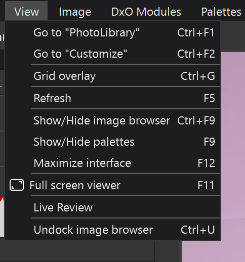
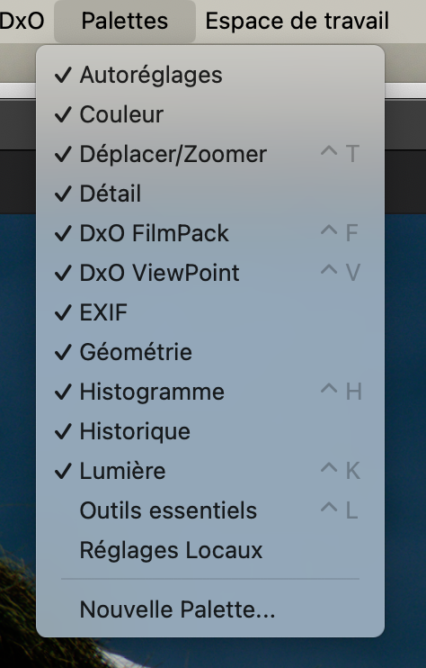
Has anyone noticed there is a complete duplication of the palettes menu…
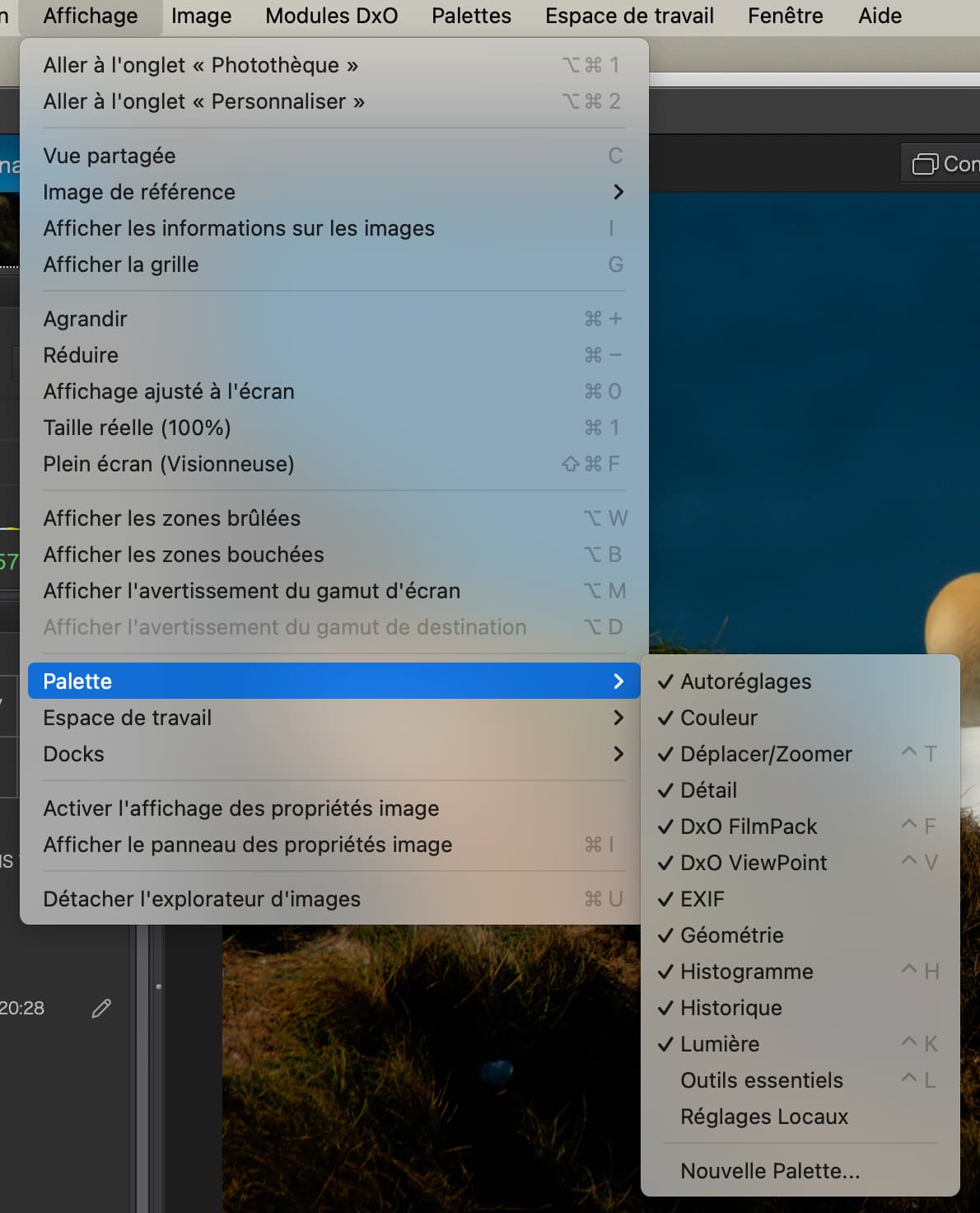
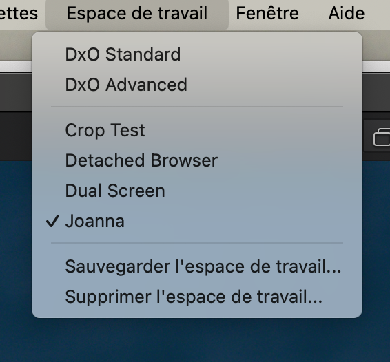
And the same applies for the workspaces menu…
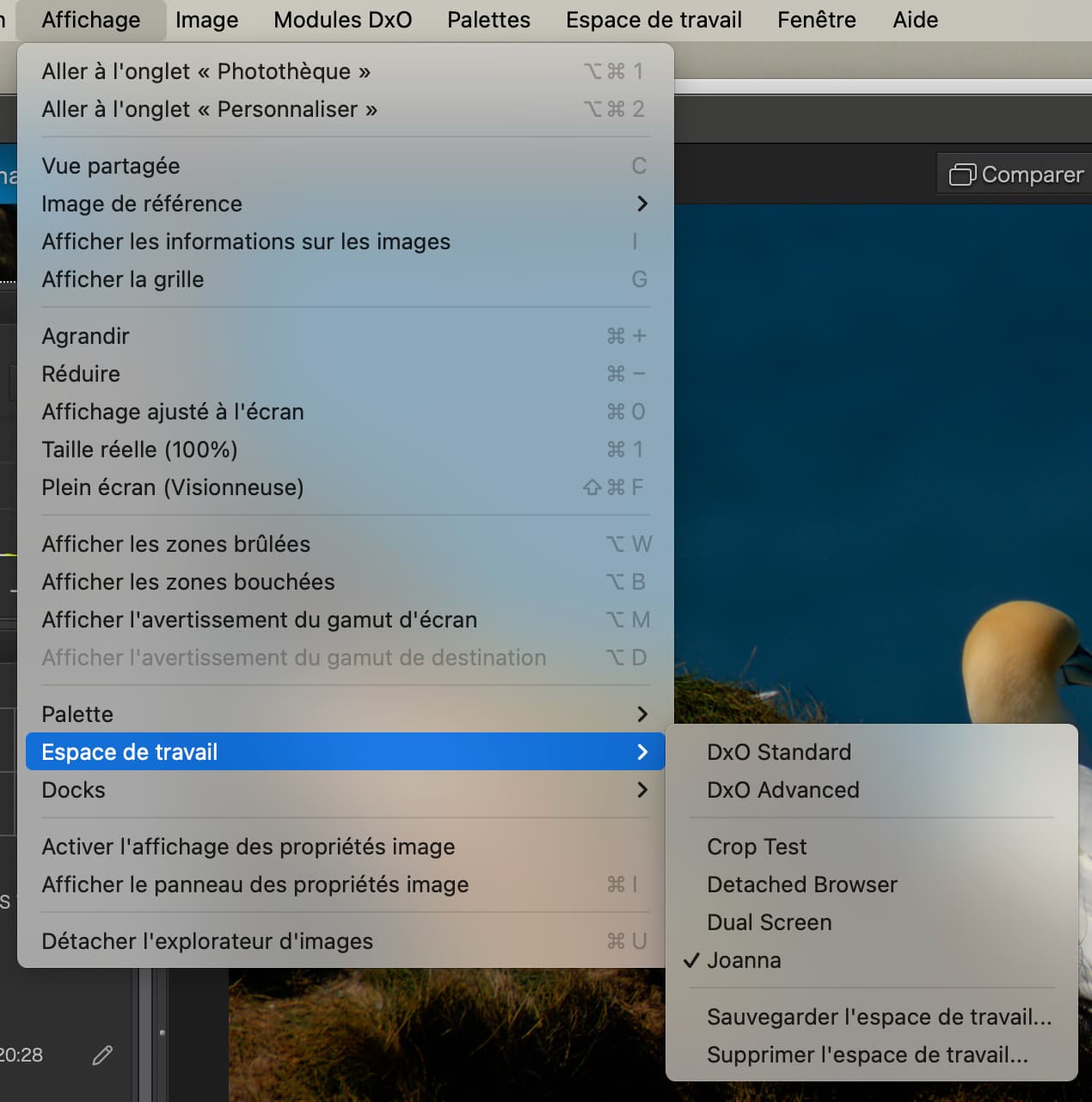
Since the View menu items require one extra click, are they really necessary?
Has anyone noticed there is a complete duplication of the palettes menu…
And the same applies for the workspaces menu…
Since the View menu items require one extra click, are they really necessary?
do they really hurt?
Duplicate menu items are fairly common. Two entries in the menu, another in a context menu. Its been in previous PhotoLabs and I’ve seen it e.g. in Lightroom.
For reasons of logic, the palette and workspace main menu items could be removed, they’re not used that often under normal editing conditions, once the workspace has been set up, that is.
There is something like an optimal mix of number of main menu items and sub-items therein. When MS Office introduced the ribbon instead of classical menus, many people hated it and had to get used to the new way. In many cases, it can make sense to NOT change an established appearance (remember macOS Tahoe UI) and let users keep their way of getting along.
For what it’s worth, the View Menu in the Windows version does not have any duplication of the Palettes or Workspace menus.
Mark
Oh how I long for the day when I can teach the same app for both platforms.
That is not likely to happen. Looking at the View menu you provided and using my limited understanding of French, it appears that the Mac version has a number of features which may be useful but are not available in the Windows version. Some of the missing features from the Windows View menu may be available elsewhere.
Mark