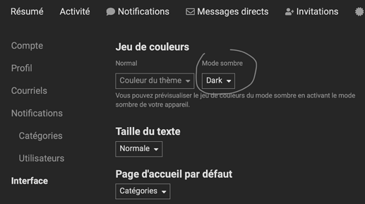
Maybe I just can’t find it and turn it on, but I think the ability to choose a dark color scheme for this forum would be a good idea. 
For MY eyes, the light theme works. Thanks. I do see my kids liking dark theme and small fonts and so I recognize that, but at 60 with cataract and other things, BIG FONTS, Black on White Serif fonts are probably more useful. I would always argue for options.
Hello,
It’s a question to @Jules. Please, have a look and reply.
@Roguemd, please, do not worry. Even if this option exists, it’s optional and switched on individually.
Thank you,
Regards,
Svetlana G.
If this option exists, it should be optional. It’s obvious. I know many who prefer dark application schemes. I’m one of them too. Looking at the (even good) monitor 27", which shines the entire surface in white, is not very pleasant. And, in the end, for a slightly different reason of course, Photolab itself is “dark”. 
Might already be shipped with the forum package.
Else for the admin: https://meta.discourse.org/t/allow-users-to-select-dark-light-theme/60857
Dennis,
In the settings here you can choose BIG font if you need.
Thank you, I didn’t know. The good news is I don’t yet need the LargEST option
Haha great news 
I, too, would very much like a dark theme. These all-white pages can be very bright, especially at night. I suspect I have trouble sleeping sometimes because I like to browse here after work and forget to turn on a blue light filter. 
TopazLabs uses this same forum software. Why is there a dark theme available there, but not here?
The all-white is blinding at night.
Most computers have a setting for screen brightness, why not just turn it down? macOS has something called Night Shift, which automatically makes the colours warmer and night and less likely to prevent sleep.
There’s also the consideration that too many people don’t calibrate their screens, probably because they never need to print their pictures in a calibrated workflow. Most screens are delivered with an eyeball-searing level of brightness around 120 cd/m², whereas, in a calibrated workflow, you should really only be using 80 cd/m²
It’s obvious. But the dark theme is better for many also on good, calibrated monitors (I have one). ![]()
Besides, we do not always browse the forum on monitors used to work with photos.
If that were optimal you probably wouldn’t be seeing this configuration popping up like mushrooms.
BTW, “blue shade” option is a poor substitute for a dark mode.
Just discovered this thread – and no, I don’t like it ‘negative’. It strains my eyes.
BTW, this forum is unlike a photo editor, where one might prefer darker tones.
So, I suggest it as option.
Wolfgang
Maybe something like this ?
@sgospodarenko We never received a public response for this topic here.
Lately I have been playing around with as a Discourse forum administrator and by default there is a dark theme shipped with the latest version.
We might sound annoying but it would really help us night owls to spare our eyes a bit.
Could your admin please have a look about this ?
Thank you.
Good morning @m-photo,
Thank you for the info about the latest Discourse update. Well, it’s not me but @Jules can do everything about administration.
Let’s wait for him to reply.
Thank you
Regards,
Svetlana G.
I just checked, we are running 2.7.0.beta3
So not sure you have already the functionality in your productive setting -at the same time dark theme is not a recent topic-.
For your information it looks like this:
Admin panel
User panel
120 cd/m2 is not eye searing nor what screens are delivered with. Most screens are delivered with 300 cd/m2 (new screens should go to at 400 cd/m2). Ambient light affects what is the right level of screen brightness: 80 cd/m2 only works for image processing in a room without windows with the lights turned very low. I.e. a dungeon. Large publishers and newspapers used to have such areas and rooms for their image and graphics departments but not many wish to sit in them now.
Discourse forum should certainly support dark mode and in particular the ability to follow the computer. I’ve started to use dark mode at night but don’t like dark mode at all during the day. It’s possible to have both, and automated on Mac.
Specific suggestion. User preferences:
Theme:
- white
- dark
- follow computer
I’d chose option three. I would be very unhappy to have all dark all the time and probably couldn’t be bothered to switch back and forth manually. I.e. adding a manual switch means I’d just use white all the time. A manual switch would help those who do like dark themes. Default could be white.
NO dark colour scheme by default please.
I can’t read white on black – hurting my eyes!


