Currently, the only 2 colors in DPL that are user configurable are the image background colors in normal mode and soft proofing mode. That’s not enough.
I do know that having the possibility to select among 2 or 3 themes or even getting a user configurable skin mechanism is just a dream (I’m trying to be realistic), but I do think that just a few new options could make the UI much easier to read.
The palette title colors (currently pure white on pure black) are too distracting/agressive. Making the background and text colors configurable would help make these titles less tiring for the eyes.
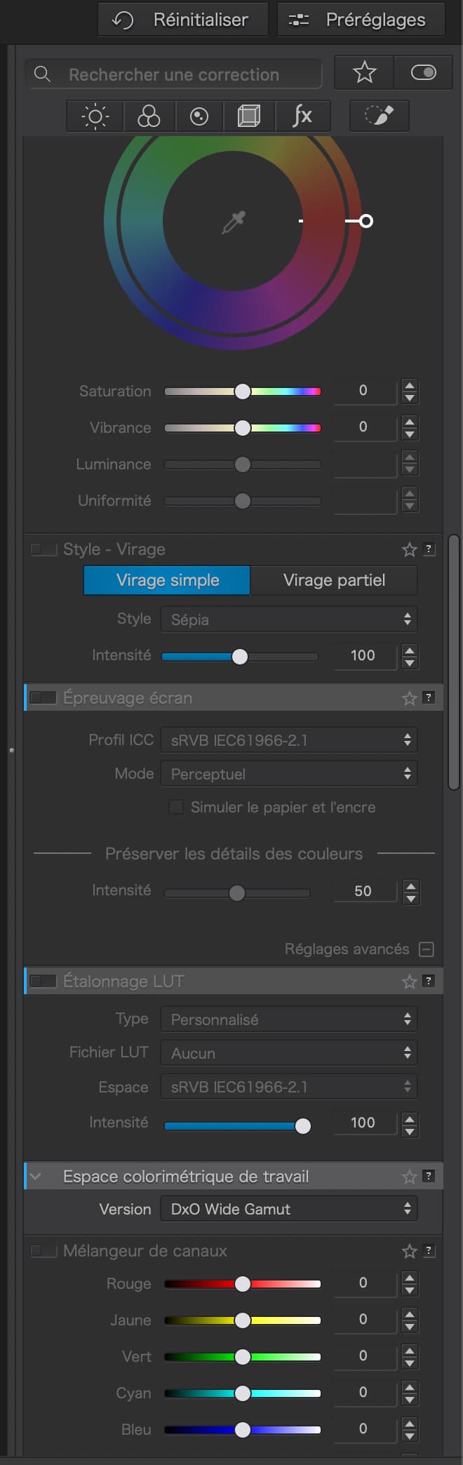
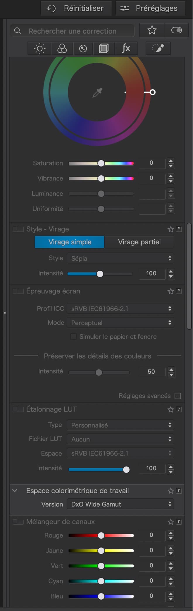
The sub-palettes colors (e.g. Exposure, Contrast, HSL in the Light palette) behave as follows :
When the palette is disabled, everything (text and background) is grayed (same gray).
When the palette is active, its title and the names of the settings it contains are all white (i.e. highlighted). OK but they all share the same gray background. This is confusing. There no visual break in the whole panel clearly separating the sub-palettes.
When the palette is inactive, they still share the same background but the setting names remain white if an image is selected.
This behavior is not consistent and the settings background should be different from the palette’s title background. This would make the whole panel much more readable especially while we are still waiting for solo mode (I know, I’m stubborn).
Implementing these options is not a big deal. Just a few options to add to the Preferences dialog allowing to select the color (or at least the gray level) of titles and setting names and a few lines of code to make the display take these options into account. That’s not a big effort.
I have just seen 2 systems running DPL 8 and the same version of Windows. On one of them, the sub-palette titles have a gray background clearly separating them from their contents. The title bars have a blue vertical bar on the left. The other system still has the old DPL 7 style as described above.
Oh, yes, the user interface was made by and for young people with 20/20 eyesight and many a post was made about improving the UI and hence UX for people with less than 20/20.
Somehow, many apps provide system UI dependent appearance on Mac. Whether such a change is easy to implement or not, I can’t and won’t say because I have no idea about the boulder to which DxO is chained right now…
I’d settle for even less. Just to be able to choose the level of contrast of the interface would be enough, with some intelligent presets. I can barely read PhotoLab 7 palettes.
It’s improved a bit since I’ve disabled font smoothing. Disabling font smoothing can be done on the command line but there’s a very nice GUI which at least reliably gives the status of font smoothing. Font Smoothing Adjuster.
Here’s how to remove font smoothing in terminal:
Disable font smoothing: defaults -currentHost write -g AppleFontSmoothing -int 0 Reset to default font smoothing level (medium): defaults -currentHost delete -g AppleFontSmoothing
This small tweak makes text much more readable on a retina (2:1) or native resolution (1:1 pixel). If you are running a 4K monitor at 2560x1440px, the difference is less striking, as there will be some font smoothing due to the non-native resolution. It’s still an improvement if you find sharp text easier to read, especially in a low-contrast environment (PhotoLab).
Doing this on Windows gives an even more ugly result.
For me, the main problem is that there’s no clear separation between the title bars of palettes and sub-palettes and the areas where the various settings are displayed. Same background everywhere. When multiple palettes/sub-palettes are opened (solo mode again, sorry), this makes the whole panel look aggressive and messy (especially pure white text on pure black background).
Photolab is now supposed to be a mature product where such problems should no longer exist.
I think that DxO ist targeting technical perfection and does not waste a lot of energy thinking about UI and UX or even about a corporate UI design. It all feels like a lot of bottom up development - and that some top down guidelines could help to improve readability and hence usability and user experience.
The text rendering and font-smoothing algorithms on Windows and macOS are totally different. I haven’t used a Windows machine enough in the last twelve years to know what the best settings are to improve the DxO PhotoLab interface on Windows. The Disable Font Smoothing really does work on macOS, particularly on high resolution screens (most screens these days).
Perhaps a Windows expert will stop by and drop a similar tip but for that OS in this thread.
Pat, you’re not the only person on this forum. I’m not personally trying to help you but to help whomever I can. I had no idea your question was about Windows or macOS. My solution does help people with macOS and fading eyes read the PhotoLab interface much better.