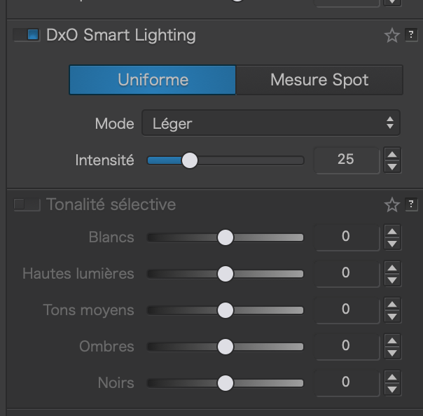
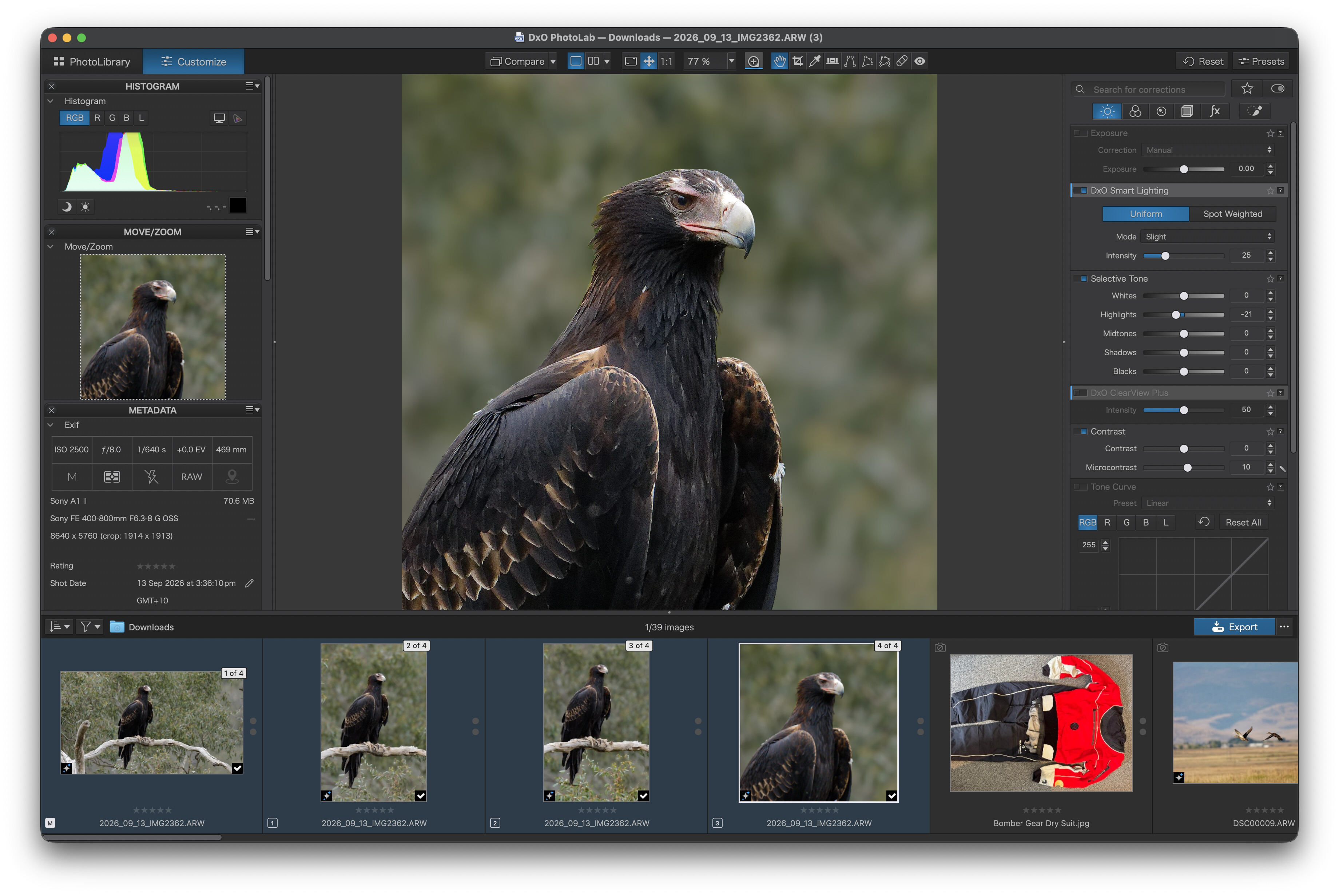
It seems that the contrast of the font in the palettes is now worse since upgrading the OS.
I cannot read the grey font with even the brightness at 100%.
Anyone else have this, or any idea how to improve it?
It seems that the contrast of the font in the palettes is now worse since upgrading the OS.
I cannot read the grey font with even the brightness at 100%.
Anyone else have this, or any idea how to improve it?
Not here. MBP 14” M5 from 2026. Same with MBP 16” M1 from 2021. Everything is fine.
With the new OS Golden Gate DXO PL10 is launching within 3 to 4 seconds, which is the half of the old MacOS.
Interesting. I am using a Mac Mini M4 with an external Viewsonic monitor. maybe that is the problem. is there a way to provide a screen shot?
No problems with my M4 mini and Apple Studio Display 27” and PL 10. Check the video cable connection.
Thanks, I’ll try that
I have a BenQ 27” monitor on a Mac Mini M2 Pro with no issues.
Thanks all. what brightes settings you have for the monitors? I keep mine to less than 50% so editing the photos produces result. Not a dark image.
Thanks again to all. I have found that the display reverted to Adobe RGB from the calibrated settings. The grey font is still not easy to read but now the same contrast when using MacOS 26.
I do hope that DXO will address this soon.
No issue with my MBP M1 and Studio Display.
Note that if theme is not selected, small labels are not easily readable.
From reading the posts above in this thread, imo this doesn’t seem like a DxO issue.
One feels this is either related to MacOS and/or the calibration of your monitor. Have you tried resetting the settings of your monitor and installing a default colour profile for it in MacOS?
Yeah, I had to reduce the resolution of my monitor a bit to make the fonts a bit larger. Old eyes plus bad glasses.
That is correct, I reset thr display to what it was in MacOS 26 and that fixed it. Thanks
Agreed, but that sort of destroys the reason for having a high resolution monitor.
Yes and no. What would you do with a small low-res monitor? PhotoLab needs some space as defined in the requirements? Example: PL on a 13in MacBook Air runs smoothly but PL’s low contrast UI is still a pain to use. When I reduce the screen pixel dimensions, PL gets more usable but doesn’t always stay within the screen’s limits.
Off-topic general comment on PhotoLab UX and UI:
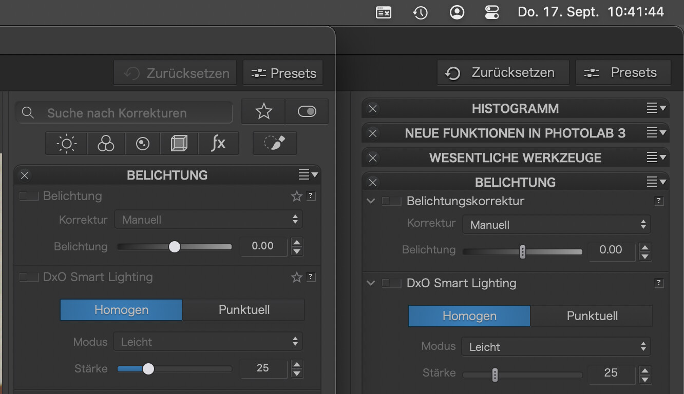
With all the bells-and-whistles features of PL, it remains harder to use than necessary. I’d be very happy if they adopted a more easy to read UI. Here’s how PL10 looks vs. PL3
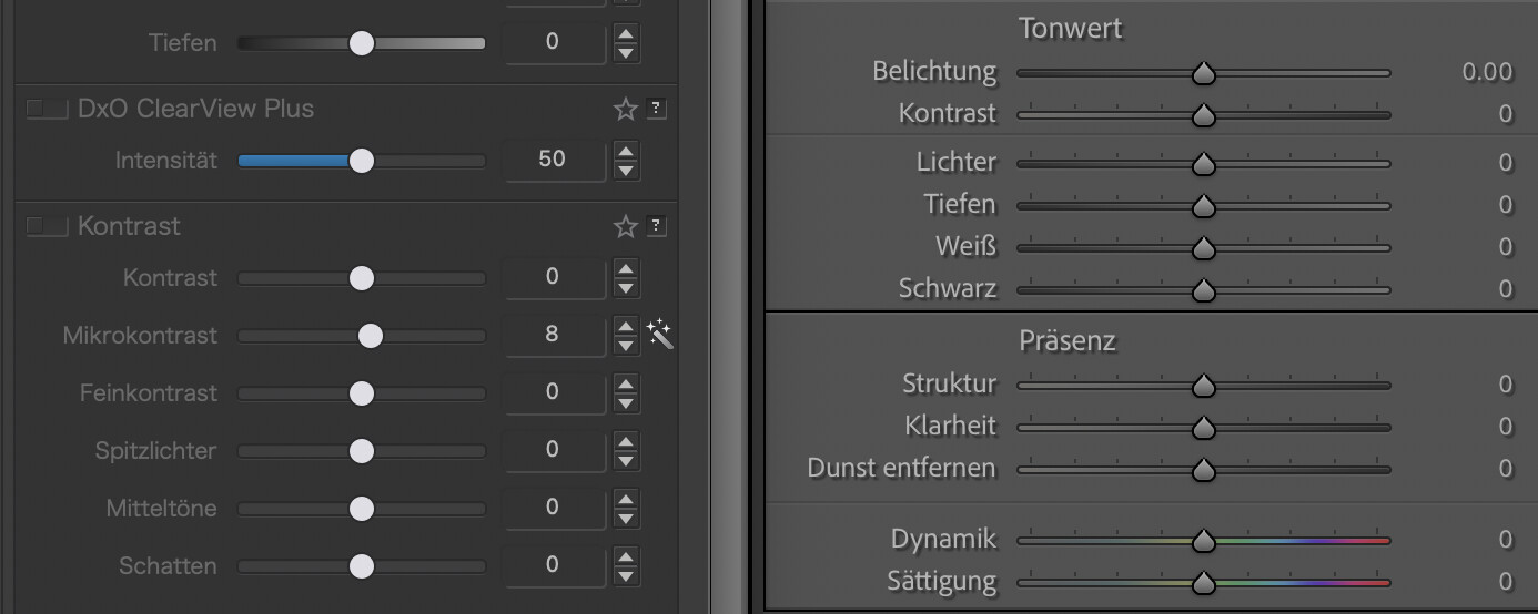
And PL10 vs Lightroom Classic: