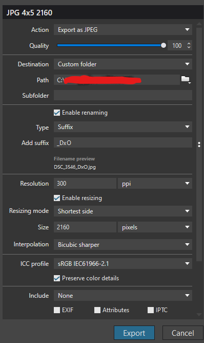
In the past, I’ve found that checking the “preserve color details” box on export gives noticeably better colors. But in this case, this one photo was looking desaturated compared to others in the series. I unchecked the box and re-exported and it looks better, though still not as good as the preview image. Has anybody else seen this where “preserve color details” would make things worse? And any other tips to improve the result here (I’m using 100% quality jpg).
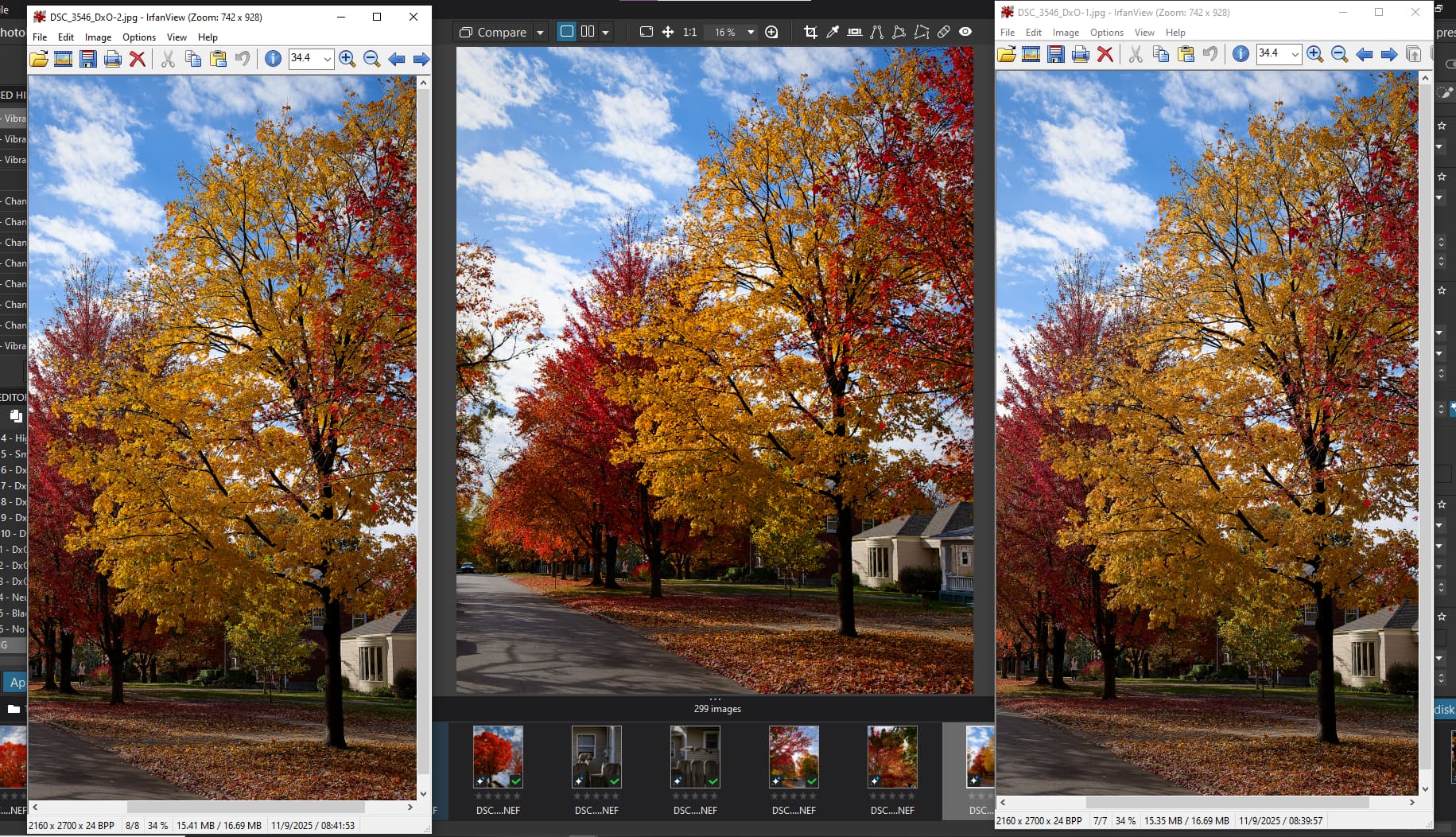
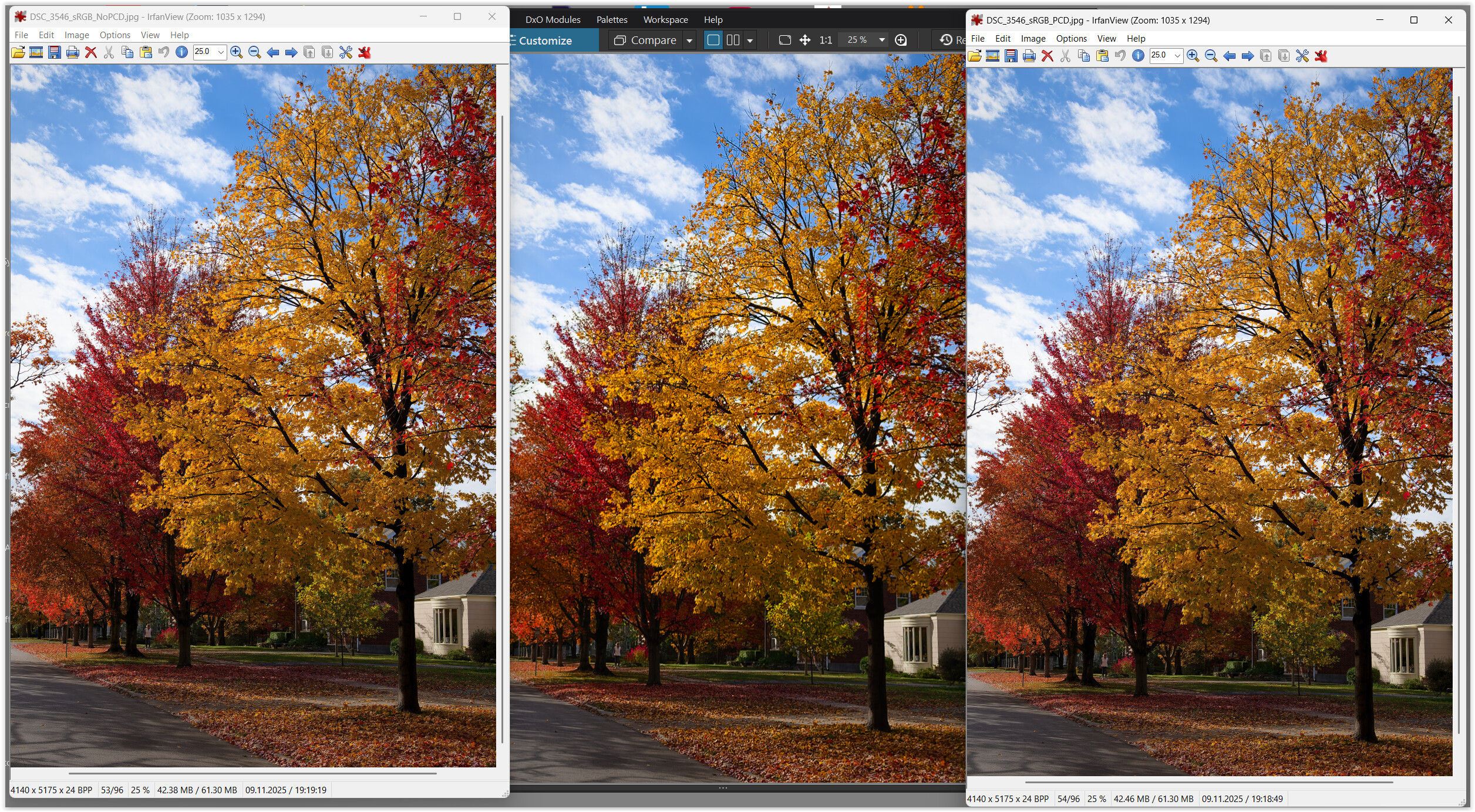
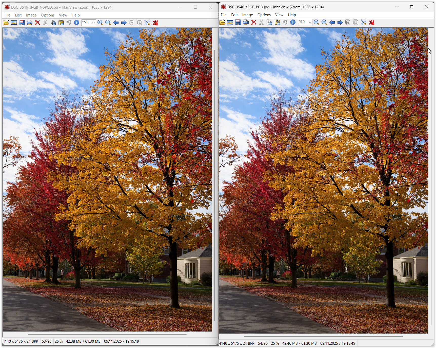
This shows the jpg w/o preserve on the left, and the jpg w/preserve on the right and the DxO preview in the middle. (Edit: after taking the screenshot and uploading and viewing the post it fails to capture the more dramatic difference I see on my screen, but hopefully you can see it if you look on your own screen with the original)
Model Explanation: Cramming colours of a wider gamut into a narrower SRGB gamut moves colours towards the white point, where perception of colour is lost.
Consequences: Depending on how this compression is done and observed, we get or don’t get colours as seen on screen. In order to be as close to WYSIWYG as possible, colour management must cover all steps of a workflow which includes hardware and software alike.
Check out the user manual and other posts mentioning wysiwyg and soft proofing. This will take some reading time, but the information should all be there.
Check your Windows settings, monitor calibration and checkboxes of PhotoLab and see what you get when you turn soft proofing on and off and check/uncheck the boxes in colour tools covering all steps from import to export.
Thanks for the reply. I realize that there’s going to be compression and at some level you’ll have losses. My confusion is how the regular preview in DxO can make the image look as desired on this basic narrow gamut device, but then an exported copy looks much worse on this same display. In other words, why can’t the export at least match what is shown in the preview when it’s the same display in both cases? It just feels like something tripped up in the export processing. I had 10 images of similar colors, all exported the same way. 9 of the 10 match the preview and the 10th looks like you slid the vibrance or saturation to -20%
Some side-remarks only, as I agree with @platypus.
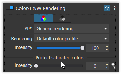
The DOP file supplied has ‘Color/B&W Rendering’ button disabled, which means Neutral rendering will be used, less vibrant than camera profile. Disabling ‘Color/B&W Rendering’ is equivalent to setting ‘Intensity’=0 for camera profile, afaik (please correct me if I’m wrong or not precise enough). The above assumes you have enabled ‘Automatically use camera rendering if supported’ in Preferences–>General.
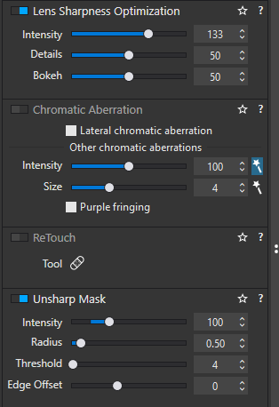
The photo is an interesting example of what difference ‘Enable high quality preview’ can make. It also provides an example of a problem with magic wand for the ‘Size’ slider in ‘Chromatic Aberration’ correction (CA wasn’t actually needed and enabled in the DOP file). If ‘Enable high quality preview’=OFF in Preferences–>Display, preview is at 75%, and CA->Size=9 (as magic wand sets), then upper right corner looks OK. However, if preview is set to 80% or more, some yellow and red leaves get desaturated, probably as what they would look in the export jpeg. With ‘Enable high quality preview’=ON you’ll see what you’ll get at all magnifications. Btw, there’s a second threshold in PL9 for preview zooming at around 25%. There are some related topics in this forum, e.g. by @BHAYT. To summarize:
‘Enable high quality preview’=ON for WYSYWIG at any magnification
Beware of Chromatic Aberration’ magic wand for the ‘Size’ slider – it may cause unwanted color shifts/desaturation. Perhaps stay with 4 in your presets (may depend on the camera/lens).
The following is highly personal and depends on the target audience, so don’t pay too much attention.
For your photo, I would not use ‘Unsharp Mask’, set ‘Lens Sharpness Optimization’ ‘Intensity’ slider to 70 or 100, and check if using ‘Bicubic’ would produce “better” results than ‘Bicubic sharper’ when exporting rescaled jpegs. Sharpening can desaturate some colors, if there’s a lot of small, contrasty detail and may change overall brightness perception. Case dependent.
Recently I’ve started to use jpeg exports at 75% instead of 90% previously used. Files are smaller and in most cases there no visible difference, when viewing on PC or smartphone. Big prints is another story, when I use 100% all the time, just to be safe. Near contrasty edges between smooth areas some gelly-like or other jpeg artifacts may appear at lower quality levels, so I just check such cases manually, if time permits.
EDIT: Corrected ‘upper left corner’ → ‘upper right corner’
One question, your response seems to suggest that CA correction is enabled and/or having some impact on the image.
I rarely use CA, so it is in the default no-correction setting. I see what you mean about the “wand” being turned on, but if the overall CA switch is in the off position none of this should matter, right?
Yes.
I’m also rarely using CA. I’ve enabled it just to experiment and noticed weird behavior in the top right corner, if used auto CA ‘Size’. Looks like bug.
tested your image on my Mac and found some weird effect. Here’s how:
Engage CA Correction and check its first box
Create 2 virtual copies
Switch the box off in one of the VCs and/or change CA width
→ with one VC, saturation in the upper RH corner changes depending on box- and width setting. With two VCs, the effect is not related, sometimes saturation changes, sometimes it doesn’t, sometimes, the change happens in the other VC. Looks like some crosstalk in the database… weird!
Addendum: None of my (Canon) test images shows such an effect. It might be related to the red channel. Red is most easily saturated and delivering off-red export.
I suppose it depends on what you mean by “monitor.” Don’t expect DxO to participate in forum discussions or troubleshoot issues reported here without being provided a test case and instructions through the support system linked to by @platypus. However, they do actively monitor general activity, read discussions to some extent, and respond to administrative needs such as flagged posts.
This, as said many times, is the main cause of the difference in saturation between preview and export.
The rendition of colours, especially yellows and reds, is COMPLETELY wrong at zoom levels below 75% (in PL8 and earlier) or 55% (in PL9): they look much warmer and more saturated than they actually will be in the export.
In PL9 they made a slight improvement, but still it hasn’t been fixed completely by removing that limit. And since your example was at 16% zoom…
I have written to the support to ask them why they changed the limit for correct colours in the viewer to 55% instead of removing it completely and allowing for correct colours at ALL zoom levels, and their reply was like “yeah, maybe some day we will do it, maybe not, depending on how much we care about it”. Since it took some 6 years to improve from 75% to 55%, I guess they will finally do it in PL15.
The strange thing is that change in color/sharpness above 75% also has a bottom boarder. Somewhere around 25%. The bottom boarder depends on the window size too.
What is completely unacceptable is that the customer service still pretends to ignore the issue, and replies with vague standard suggestions like:
As a first step, please make sure your system and drivers are all up to date: Uninstall and reinstall PhotoLab 9 if needed.* Update your GPU driver (NVIDIA RTX 3070) and ensure your OS is fully updated. In Preferences → Performance, set AI acceleration to Auto or select your GPU directly.
Between this stubborness in acknowledging issues, and the AI Mask fiasco, I will NOT give DXO my money this year.
Thanks for the link, I had in mind your posts below it.
Although it’s off-topic, the OP photo provides an example where CA corrections may span more than expected. Photos with a lot of tiny details may heavily suffer.
It’s harder to see, but yes it’s there. Just checked it with PL9.2:
If ‘Enable high quality preview’=OFF, I can the difference while zoomin 25%/28% and 75%/80%, while for ‘Enable high quality preview’=ON the "jumps are at 25%/28% and 50%/55%.
With PL8 the “crossing point” was 70%/75%.
Didn’t check that, as I always work in full screen mode.
I have 4K monitor, use mostly Z8 (45mpx) raws, but often have to crop a lot.
@Wlodek, @platypus & …
Using high chromatic aberration correction settings can affect the colors depending on the image (I’ve seen this before). Sometimes it works wonders and sometimes it’s too aggressive.
@OzarkNerd
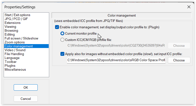
If I set the screen to AdobeRGB or Native and compare it to a Virtual Copy where soft proof is set to sRGB, I can clearly see/preview the limited reproduction of the smaller color space and “less dynamic”.
.
However I’ve taken screenshots with screen set to sRGB to better fit the Forum’s rendition (it does not support color profiles)
However, I would recommend performing the comparison within PL, as programs tend to display colors somewhat differently.
.
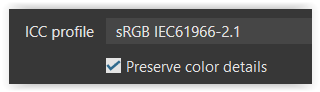
About Export + Preserve color detail …
PCD is intended to help preserve details in highly saturated colors by generally desaturating them to a certain degree – a quick / simplified solution, so to speak.
If color is more important than detail, just disable this option.
Maybe check and play with …