@Wolfgang
I think you can get as many opinions about images with so much black as mine examples as there are spectators. Histogram freaks might get dizzy too! 
I really like your image just above!
@Wolfgang
I think you can get as many opinions about images with so much black as mine examples as there are spectators. Histogram freaks might get dizzy too!
I really like your image just above!
@mikemyers
My point is that with the extremely AI packed and smart system cameras we have today we can finally fully concentrate on framing the images we want to and in exactly the perfect moment too. There is not any contradiction at all as I see it today between the tech and a total image focus. The technology has finally freed us more or less completely from needing to care at all about the technology itself when trying to catch “the moments”.
I don´t need to care about anything else than the aperture normally because Auto ISO Minimum Shutter Speed and image stabilisation gives me a break from worrying about having my camera set to a too long shutter speed for the actual lens focal length and the current conditions - and if I really have too I can easily counter any possible problem with the conditions too just by overriding. Even if I have a flash the flash zooms to accomodate for the present focal length if I have a zoom on. With the best sensors today together with Topaz or DXO Deep Prime there is no need to be afraid of the dark either anymore despite you forgot your stand at home.
The fantastic hierarchical Real Time autofocus does the rest. And there are people with camras that manages 30 exposures a second so they have even better possibilities than I have, to catch the real moment and get the perfect timing. The best AF-systems manages to set focus in really poor light down to -4 or even -5 EV which is absolute rediculous compared just how it was just a few years ago.
I dont´t see any contradictions between tech and image today at all and if you still do, just “dumb your” camera down if you like but then I guess you might be better off without any modern tech at all. But I also have no problems to identify situations where the new tech makes taking some pictures and catching some moments that just couldn´t be taken or catched before without some specific tech and that´s not just about the image quality. One obvious for me is taking images of young children that never is still.
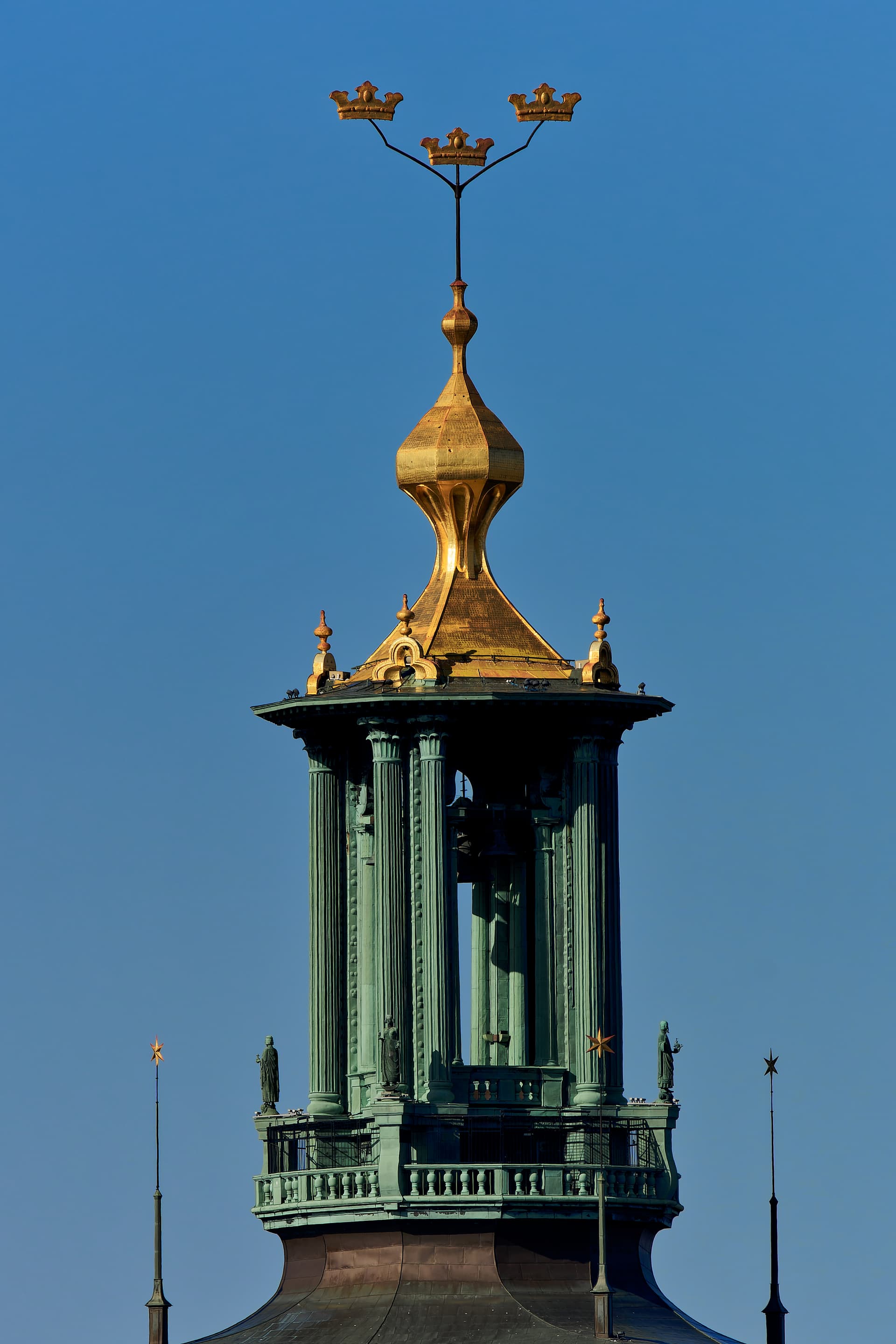
Click twice to enlarge for detail!
If you do you can see the pattern of the gold leaf sheets!
This image of the City Hall of Stockholm (where they celebrate the Nobel Prize winners every year) is taken handheld from a distance of 700 meters at 500mm with Tamrons new 150-500mm lens from one island (Södermalm) to another (Kungsholmen). It would not have been possible to catch with this quality with my 10 year old Sigma 150-500mm because of a much more inferior stabilisation. Even Photolab helped of course to bring out the details.
Next year the City Hall will turn a houndred years and I will also give you a pair of old historical images from when my fathers old school mate (the inventor) Calle Forsberg gilded the tower
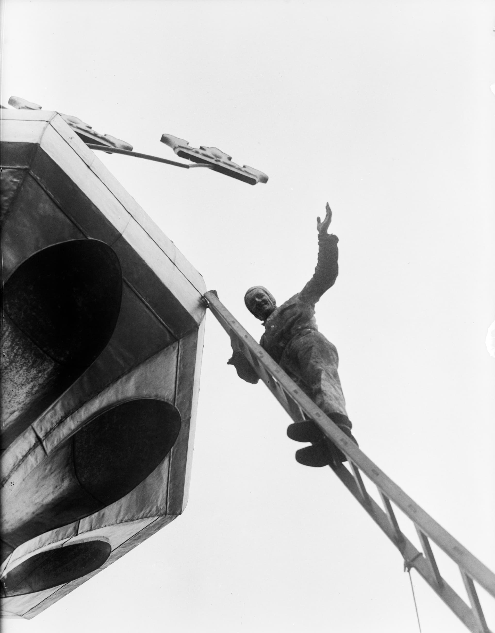
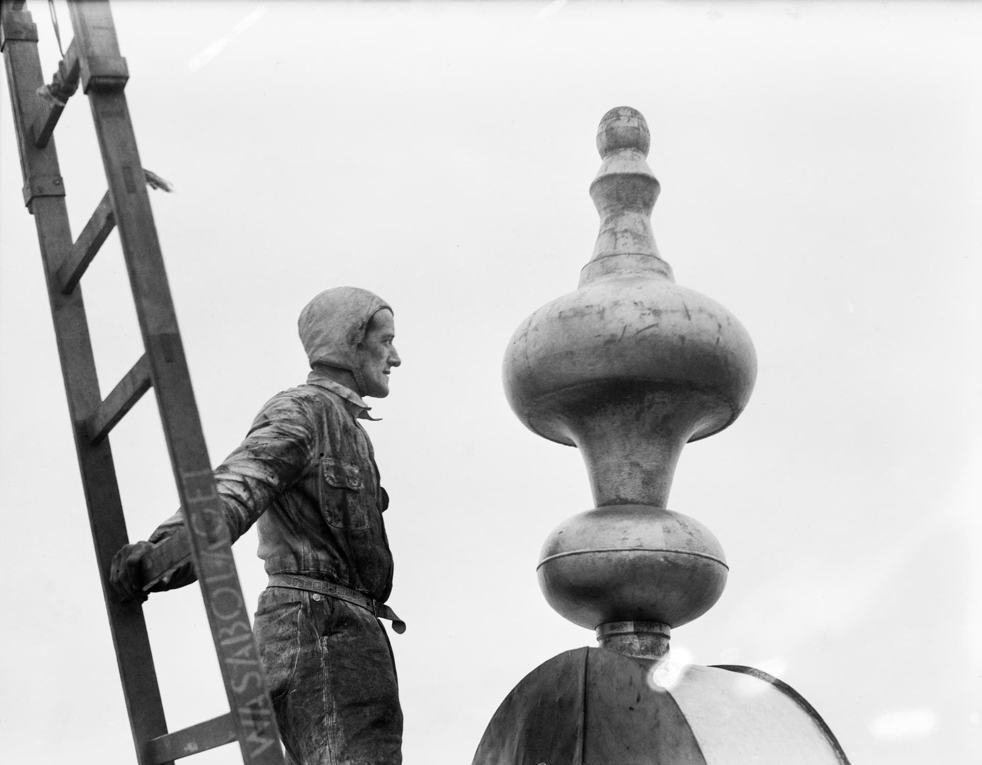
scepter and the crowns of the City Hall 1938, the first time they needed to maintain the goldfinish of the tower. The crowns are about 2 meters wide and 1 meter plus high. Please note the ladder and the complete absence of safty lines! The old images are from the City Museum of Stockholm and taken by an unknown photographer from a newspaper called Aftonbladet (the evening paper).
I think this guy is in the same class as the famous construction workers that built the skyscrapers of New York. The City Hall is about 100 meters high. I guess it helped that the job was well payed. He got about 350 U$ per hour in todays money value which was very well at that time and still is for many. But the competition was not very hard for that job.
Here you get an idea about the dimensions. I guess he used quite a lot of gold leafs to complete the job.
Link to images of the construction workers of New York
I’m not going to say that any of us are “right” or “wrong”. What you wrote, for better or worse, is probably true, in your photography will likely capture a well exposed and sharp image when you capture a photo, but to me, that’s not what is most important. Framing the image, where you stand, how much or how little you include, and “capturing the ideal moment” - for me, these things are far more important, and technology can’t do that. With your 30 frames per second, you can get a few hundred frames to select the best “moment” out of all of them. Is that better than using your eyes and your emotions to take an image at the best time to capture what you want to show? Me? I watch people’s faces, and without even thinking, my shutter finger captures an image at what I hope/think/feel is the best time - which doesn’t always work, but most of the time it does.
No computerized camera setting will help you select the best spot to take your photo from, and how much to include in the image, and what things you should exclude.
By the way, when I look at the perfect photo of the tower you posted, I realize I can see all the details in the gold leaf, but my eyes go to the dark area in the center of the image, and I can’t tell what’s there, so I zoom in, and I still can’t tell. I think there was something inside that tower that you wanted to take a photo of, but there is no detail there. To me, that’s the “heart” of the photo, with everything else wrapped around it, but it’s all just “black”. Technically, it might be a wonderful example of what this camera and lens is capable of, but what I think of as the “heart” of the image is lost.
…but from what you wrote, about the gold, that was likely your purpose in taking the photo, and if so, why not zoom in much more, so that becomes the purpose of the image, and people like me don’t get “distracted” by concentrating on other things in the photo? It is YOU who gets to control that, not me, or any other viewer, by creating an image that draws the viewer’s eye to what you are trying to show?
I see a guy standing on what appears to be a rather unstable ladder. For me, as a viewer, that is nothing like what I remember from those old photos of construction workers building the skyscrapers in the 1930’s. Not knowing what is “outside” the frame of the photo, it looks like the fellow is maybe 20 feet above me, on a ladder that looks to me like it’s not safely positioned. What my brain is thinking is now how high up the fellow is, but how unstable the ladder looks.
I don’t have a massively fast continuous shutter rate, preferring to try and capture what I think is the best moment, rather than basically shooting a video.
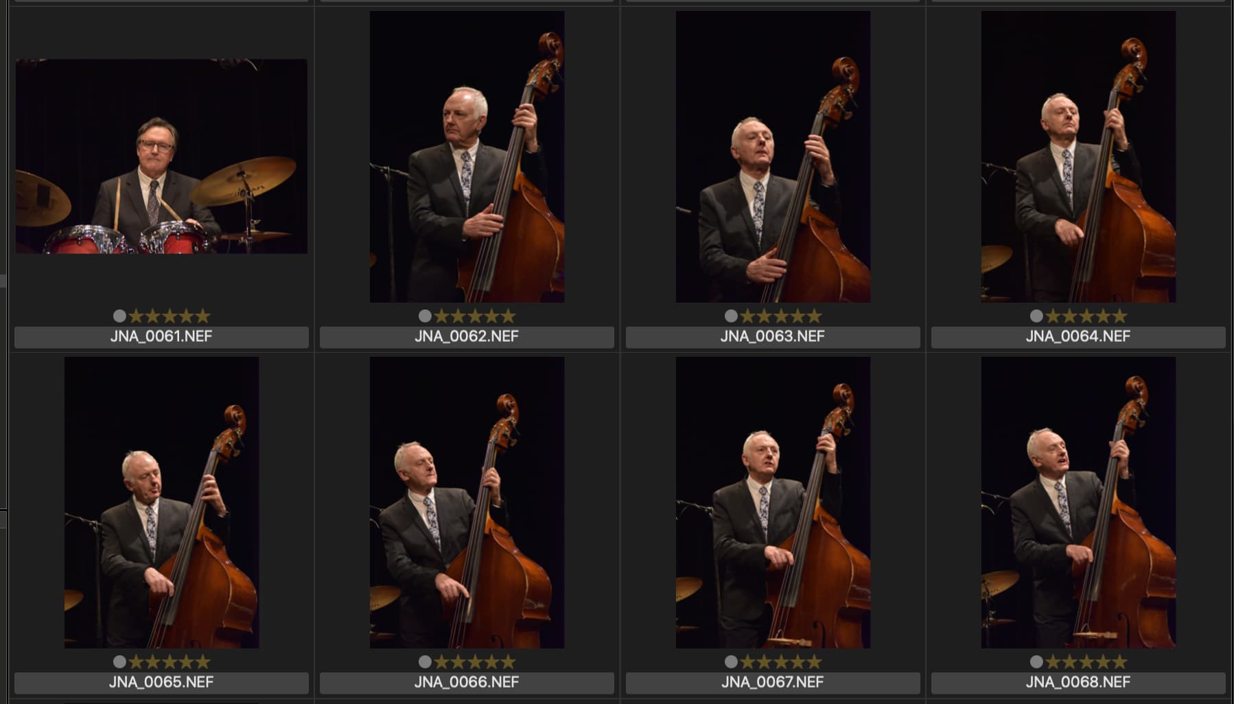
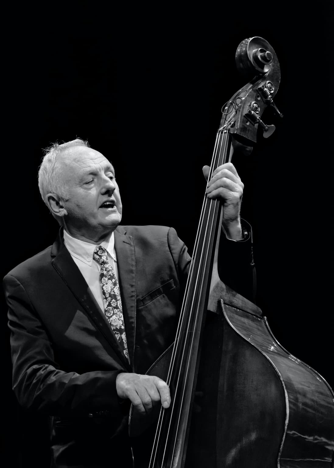
My biggest challenge is to try and capture a musician/singer looking like he/she is actually playing/singing.
In this series of shots, it took me seven attempts to get the final lovely shot of my good friend Pikey Butler, looking like he was both singing and playing, even though he was doing both in all the other shots. He used to be a member of Sparks, a charting band from the 80s but now he lives here in Brittany and plays and sings Jazz, Doowhop, Blues, etc. with various ensembles.
I’m going to pretend that I was the one who took these eight photos, then reviewed them on my computer.
0061 - boring. No.
0062 - he is playing, not singing, and looking into somewhere far away. No.
0063 - he is playing and singing - nice, but I don’t like the expression. Maybe.
0064 - eyes closed. No.
0065 - playing only. No.
0066 - playing, but not singing. No.
0067 - playing, singing, looking past the audience. Yes!
0068 - playing, singing, mouth wide open, eyes closed, awesome expression. Yes!!!
I like 67, but like 68 far more.
All are technically perfect, with the black non-distracting background. I liked 67, but 68 is far better.
No computer software on the camera could have analyzed like I just did up above. You got 6 technically nice shots, one really nice shot, and (to me) one perfect shot with by far the best expression.
Thank you. 68 is the only one I would consider worthy of printing. Normally, I would ditch all the others but I tend to need them as examples of how not to take photos for the courses I teach.
Actually, having rediscovered it, I think I’ll B&W it and, possibly even print it.
Oh, by the way, I now have an A2 format printer (16½ " x 22½") and, using Canson’s Baryta Photographique paper, we are now getting some stunning B&W prints that are hard to distinguish from darkroom prints, as long as they are behind glass. We really wanted an A0 size (33" x 47") but 1. it costs too a few thousand Euros - 2. a set of inks costs another two thousand Euros and 3. we really haven’t got the room to put it.
Curious - did you stop at 68, or are there even more?
I bet he flat out loved that photo!!!
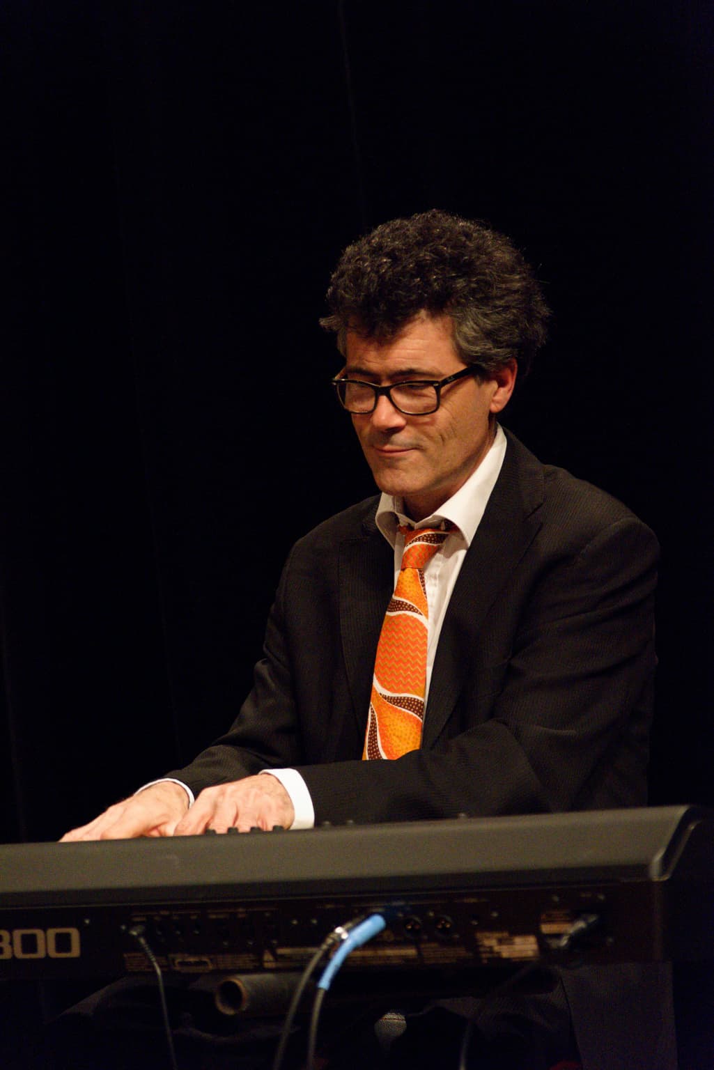
That was the last shot in that sequence, the next one is of Sylvain Duthuillé on keyboards - and keyboard players are still a kind of subject that I find difficult to not look like he was just posed.
Here is the next shot, straight out of the camera, no processing at all…
Addenda
Here’s a more “finished” B&W version of that final shot of Pikey…
I know why you cropped the left, and the bottom, but to my eyes, now it looks “off balance”, and “less stable”. I like the original more, and I like the color. With what you and @Wolfgang have taught me about masking that might be a better answer for the left side. Also, to me, and my eyes, what you cropped away at the bottom was a nice “base” for the photo. It stands alone, nicely - but the cropped version looks to me like, well, a cropped photo. I miss all the beautiful tones in the instrument - dull gray makes it much less interesting, to me. Finally in color, his right hand looks natural. Without the color, it looks like he somehow got something onto his hand and fingers.
The original, looks very “stable”. In the cropped version, as I look at it, he’s falling off to the left, and the instrument is falling off to the right, the “stability” is gone. …I prefer the original, right from the camera, but you could mask and tone down the “distractions” at the left.
If I have to pick, I still like #68 the most, but I also love #67. I enjoy seeing his eyes I guess, and he is more “upright” with the instrument leaning more to the side. I like both images. I can no longer say for sure which I prefer…
You still miss the whole point i think. Poor tech, poor skills or total lack of helpful tech might get your camera disturbing you or at least obstructing you when trying to focus on framing and composing what is of intetest for you. In short you risk to miss the moment, fuck up the timing because you try to manually adapt to a situation INSTEAD of just concentrating on setting the timing perfect. That us the dilemma and nothing else.
You don’t get better timing conditions not having tech support to support you but you might very well miss the moment standing there turning your wheels, focusing rings and god forbid walking around in your menu swamp.
There is no choise necessarily to be made between how "little to include
Yesterday’s version was quickly done and, as happens sometimes, after reflection, does look as you described. What is interesting is that, normally, the cymbal and mic stand could be said to be distracting but, in this case, there is something about the vaguely triangular composition it lends, that “stabilises” the whole thing.
The question is, if you hadn’t seen the colour version, would you still have “missed” the colour?
For me, there is something about using B&W and I am in the process of building a collection of such photos, with the possibility of a book or, at least, an exhibition. Now that I have my A2 printer and finding the superb quality of its B&W printing, and inspired by the work of a dear departed Jazz photographer and friend, I am even more inclined to work in B&W for portraits such as these.
I know what you mean, but for this shot, I found that the eyes in 67 seemed to lead me out of the picture, wanting to see where he was looking. Whereas, in 68, it feels more self contained and helps to lead the eye around within the image.
Here is the “full” version in B&W…
Let’s just agree to disagree. For me, powerful photos have nothing to do with the technical details, and everything to do with capturing “the perfect moment”, along with expressions, composition, framing, and what is included/excluded from the photo. I’m not saying you are “wrong”, I see/feel/think differently than what I think you are saying. Also, it all depends on the purpose of the photo. Sometimes all that detail can be the whole purpose of a photo, in which case what I am trying to explain is irrelevant. To me, the expression on a person’s face is far more important than any of the technical stuff… again, that is “to me”.
Certainly, I agree, and if that’s what you mean, I agree with you. But I think a $50 camera is as capable of capturing a good image as a $5000 camera. The camera doesn’t matter. It’s the twelve inches behind the camera that matters. …to me.
Agreed completely, and “self contained” is good, along with his face pointing towards his left hand. I like both, but I like 68 slightly more. For that matter, the detail at the bottom of the image also makes the image look more “self contained”, like a “border” or a “stop”. It pushes my eyes back into the face and hands.
I now like the B&W, and also the Color version.
I think this write-up fits right into our discussion:
For some time now, I have been in Colorado, capturing many images of things that are new to me. PhotoLab has been indispensable, as that is how I do all my processing, and I super-glued the RAW setting into the camera so it is always “on”.
Several things have changed. For starters, the only camera I brought was my repaired D750, with all the original settings except for “focus”. I used to have one single red square in my viewfinder, and that is where I focused, automatically. Somehow my settings got changed, to where I have lots of small red squares, usually on top of what seems the most important part of my image - I decided to leave it that way for a while, and see how well it works out. I’ve learned to like it, a lot. If I don’t have time, I press the back button for focus and confirm that it is correct, and take my photo. Very fast, and the camera seems to know what is most important in my photo automatically, not costing me any “time”.
Next, I learned to set my exposure control on “A”, or perhaps “S”, depending on what I was shooting. When I was short on time, I started getting under or overexposed images, because of my lack of attention to this. As a test, I decided to leave it in P mode by default, only changing it to S or A when I needed to so so. That put an end to my improperly exposed images, as the camera always seemed to find an acceptable setting.
My good friend Susie has a nice collection of Nikon gear, and when my 24-85 lens wasn’t adequate, I used her lenses (wider, and longer). She bought a 120-600 Tamron which I also used, and fell in love with. I guess I’m eventually going to have to buy one. The lens I used the most was her 70-300; I would have brought my own, but all I took with me on the plane was a carry-on bag.
This article has nothing to do with my photography on this trip, as I just found it this morning, but it puts into words a lot of how I felt taking photo out here:
https://petapixel.com/the-decisive-moment/
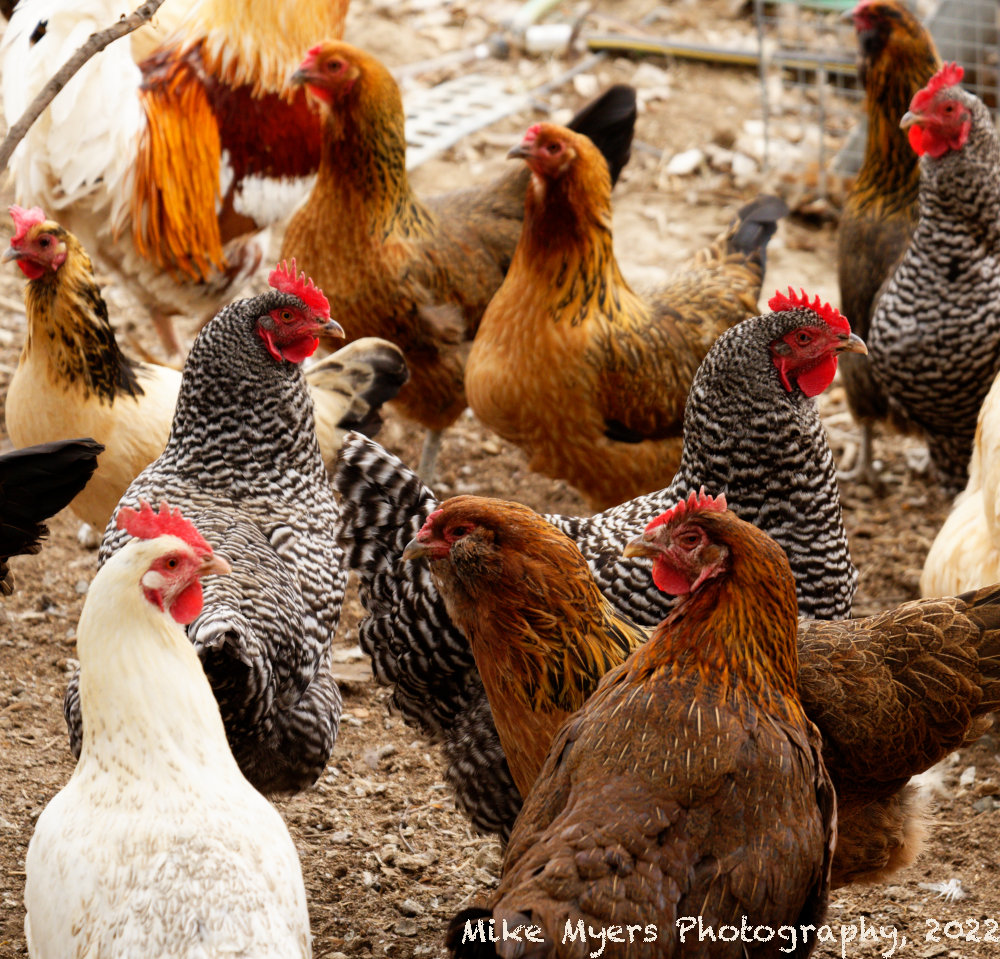
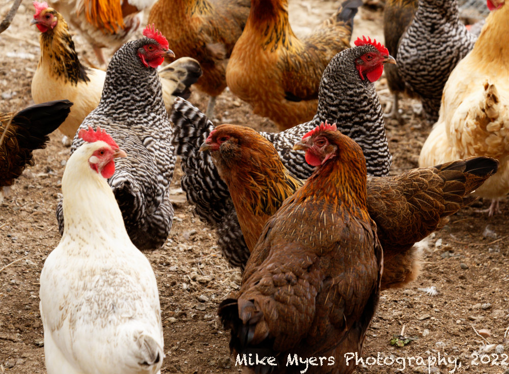
Since I’m not looking for so many other things while using the camera viewfinder, I am much more so concentrating on composition, trying to keep the photo I want within the boundaries of my frame lines. I’ll post just one image here, taken during a visit to a chicken farm, with my goal being to capture a single image of “the chickens”, something that would show them in a natural environment, hopefully interacting with each other:
MM2_1178 | 2022-04-24.nef (30.1 MB)
MM2_1178 | 2022-04-24.nef.dop (12.6 KB)
Between Blue Herons, Osprey, Goats, Sheep, Buffalo, Horses, and so much more, I’ve captured more interesting subjects than this, but this was more difficult than the “better” subjects, because of where the chickens were looking with their eyes, and how they moved as “a flock”, not individually.
I’ve fully fallen in love with my D750, and my 24-85 worked out as my most useful lens. If I was offered an even-trade for a mirrorless camera, I’d say no. I enjoy the optical viewfinder far too much to even consider a change.
I need to read the article I linked to on composition slowly and carefully, and maybe I can learn how improve over what I do now.
Welcome back Mike.
Make yourself comfortable, I’ve got a few words for you ![]()
![]()
That’ll be one of the multi-zone focusing modes.
Except, by letting the camera decide, your shot of the chickens is possibly one of the worst you’ve yet shown.
It decided to set the speed to 1/640 sec and I don’t know whether you set the ISO to 800 or let the camera do that as well. So you froze the action without too much noise but the camera then decided to get a reasonable exposure, to open up the aperture to f/6.3 - which, with an 85mm focal length, promptly limited your depth of field to a mere 17" (assuming you were focusing at about 10ft from your subject).
Hence, you have a perfectly exposed image of one or two sharp chickens with the rest all blurred.
A lot of times, Cartier Bresson’s decisive moments were arrived at with a whole lot of preparation and, sometimes, arranging and set dressing.
Sometimes composition can take multiple visits to a location or time spent observing who’s moving where and how fast - then setting up the camera to capture the moment the next time it comes around.
I have just had a session with our next door neighbours (in their eighties), trying to take a portrait of them that is reminiscent of the famous American Gothic painting by Grant Wood. It took me about half an hour or so to find a possible backdrop of a wooden shed and an old Eucalyptus tree. I posed my subjects and took a couple of shots but, although the trunk of the tree is wonderfully gnarled and dark, the principal branch at head height is quite smooth and bright. So, even, though I went as far as printing a proof, I am going to have to go back and do it all over again without the tree in the shot.
And, even then, the wife doesn’t like posing all that much and she has a “crooked” smile that is fine in passing but will not look at all good in a print on the wall for several years. So now I have decided on the backdrop and framing, my true decisive moment will be when she smiles, but not too much - so I may have to shoot a burst of images and choose the best. Added to which I am using my 85mm lens at f/1.8, in order to throw the backdrop out off focus enough, but that means that only about 5" front to back of their heads will be sharp, so I have to keep an eye on whether they move their heads forwards or backwards too much.
I can’t use back-button focusing because I am using a tripod and a remote release, so that I am not hiding behind the camera and can communicate and chat with them easier.
So, for your next decisive moment - take your time and, whatever else you do, take your camera out of P mode!!! ![]()
With your depth of experience with so many great cameras I’m surprised you are content letting you D750 make decisions for you. A, S and P mode are all semi auto modes. P mode allows you to tweak aperture or shutter speed, but not both at the same time. However, if you don’t tweak the P Mode settings you are effectively capturing your images similarly to using full Auto mode. The big difference between P Mode and full auto is that with P mode you can select the focus points or groups you want to use as well as have control over some other settings, but if you don’t modify anything, aperture and shutter speed is similar to full auto. I am also surprised you seem unaware of your camera’s various focus point modes and when it is best to employ them The D750 is an excellent camera but I think a better understanding of all its features is call for…
Mark
The reality is even worse than what you wrote. I did set the camera to 800, and the focus was on the front two/three chickens. I got what I wanted, a few sharp chickens up front, and the rest more and more blurry. Maybe if I crop the image differently, it will be more apparent what I did, and why I did it.
If what I did is a mistake, was an on-purpose mistake. But if everyone sees it the way you do, then it was a bad idea.
More importantly, my frustration arose from taking photos of animals that were rapidly moving, into areas of different lighting. My main goal was focus, and the camera seemed to be doing this just fine.
So, for exposure, I have M, A, S, and P.
I certainly don’t have time to use M, as by the time I’m ready to capture the photo, the critter(s) have moved. If I use (A), I will have captured the depth of field I wanted, and the shutter speed will vary. In this case, it didn’t seem to matter much, once I set the ISO to 800. Or, I could have selected an appropriate shutter speed to capture a sharp image as the animal moved, and based on what the camera did, the depth of field would vary. For most of my photos on this trip I have used (A) or (S).
So, in this case, when I set the exposure to (P), I found that the images looked like what I wanted - so I left it there. Most of my concentration was on “timing”, capturing the animals at a perfect moment.
Which leads me to my question for you - if I’m trying to do too many things at once, I’ve learned that my results are not very good. Is it really that bad to let the camera make what I consider the less important choices, while I concentrate on timing/composition, on a non-static image?
For my buffalo photo, I considered everything, and then concentrated on timing and to a small amount, composition. It was easy, and I got what I wanted. With chickens, and sheep, and lambs, and goats, maybe I’m just too old - I don’t have even a split second to spend on shutter or aperture - I either use settings I hope will work, or let the camera do it for me, which seems to work better for me. If I set the camera to (P) mode and select a reasonable combination of aperture and shutter, the camera starts with my settings, and only changes something if the lighting changes… I select the starting point, but the camera is free to change something if necessary. I know you all feel this is a bad idea, but my mind is free to concentrate on “timing” and “composition”, as in exactly when to capture the image.
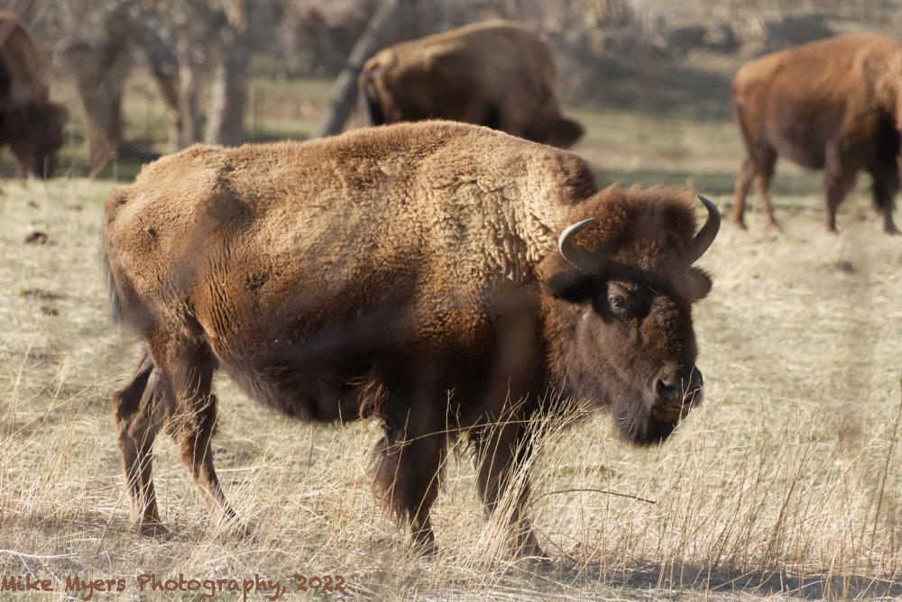
One of my early “wildlife” photos on this visit. There is a small herd of wild buffalo that roams on a good size piece of land, and the day I shot this they were closer to the fences than usual. There is one heavy-duty fence to keep the critters inside, and another fence to keep outsiders out. Unfortunately there was also a line of weeds and plants making it difficult to even see the buffalo clearly, let alone capture a photo.
I found the best spot I could, and moved the camera around so I had a fairly clear view of the head. For a short time, the buffalo raised its head, and may have been looking at me, which is when I grabbed this shot. Out of 40 or 50 images, it’s the only one I liked.
With a 300mm lens I knew the background would be blurry, and I hoped the shrubs wouldn’t ruin the photo. To be truthful, I was struggling to keep the camera and lens still. I doubt the photo will ever win an award, or anything close, but I also doubt I will ever capture a better photo of a wild buffalo in my lifetime.
MM2_0486 | 2022-04-17.nef (32.0 MB)
MM2_0486 | 2022-04-17.nef.dop (13.6 KB)