Personally, for the name being “Natural”, I find the color quite saturated, it is very close to vivid. I find it a bit too much as a default setting.
The Portrait settings could be useful, they each have some color cast, more greenish or more pinkish.
For portraits in general, at first I found all settings too strong, but then I noticed that the default preset also activates clearview=10, contrast=10, different selective tone settings and sharpening=1. Personally, I find this too much as a default settings and especially unpleasant for skin tones, but luckily this can be changed.
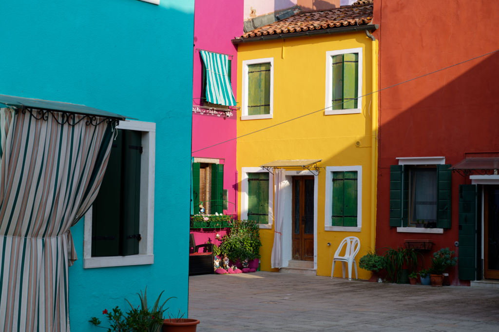
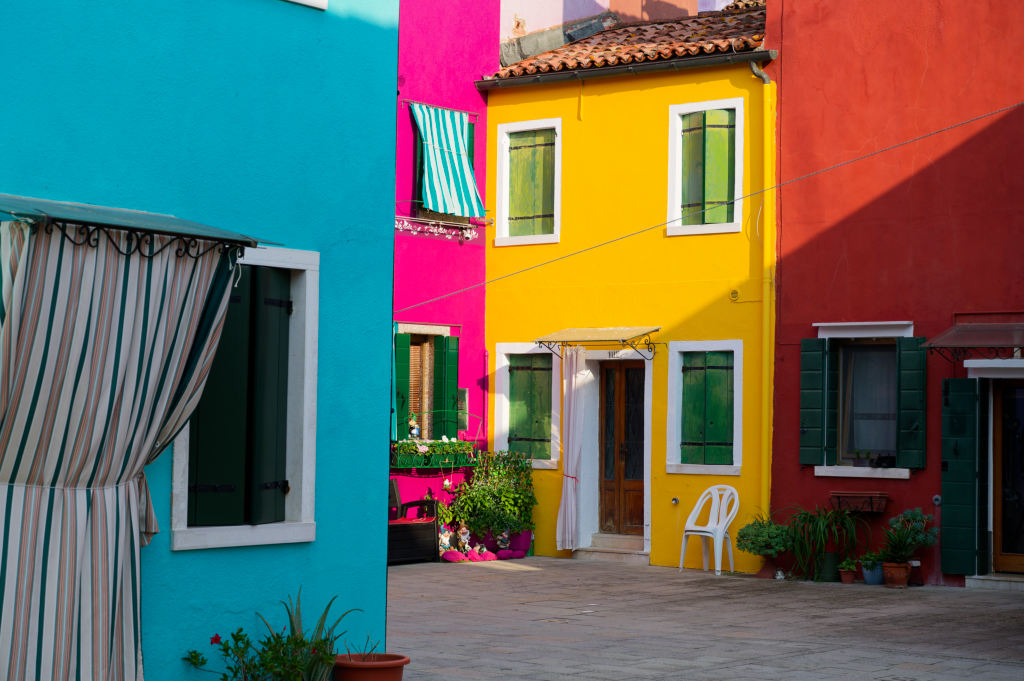
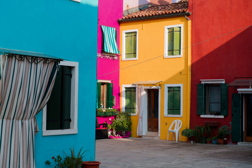
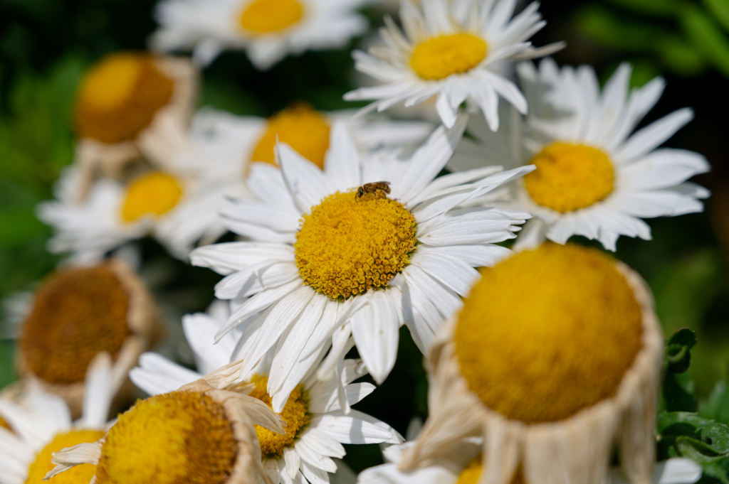
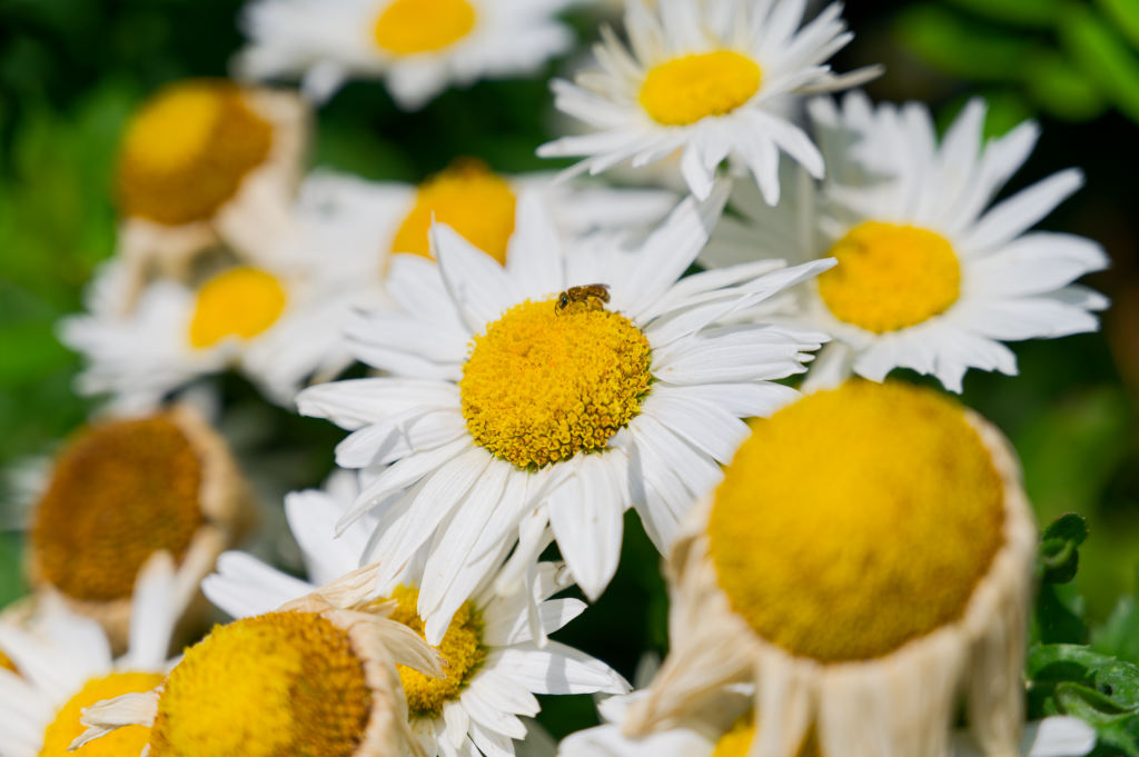
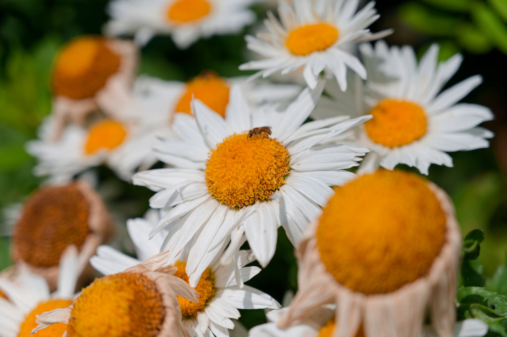
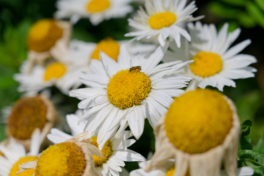
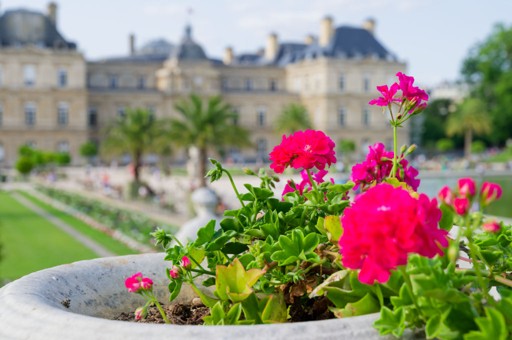
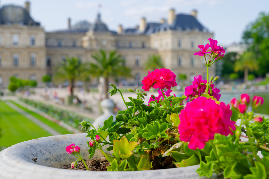
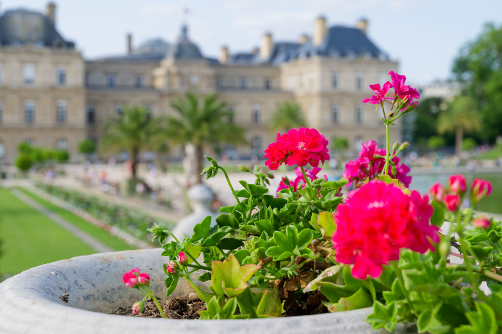
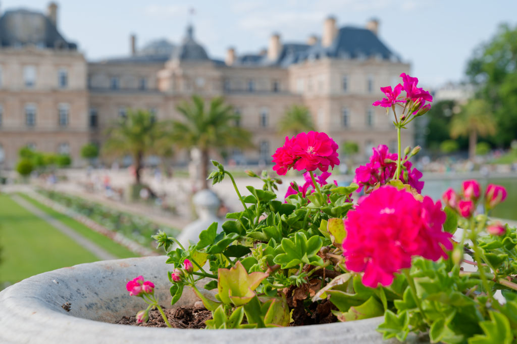
They are though motives to judge upon as they are basically only four color photos.
This is very challenging as profiles will have problems showing their subtle changes.
The saturated colours swallow the differences that you’ll more easily see with quieter images.
Some of the renderings almost completely correspond to renderings present in earlier versions of PhotoLab, except for the label they carry. You can easily find the ones by creating virtual copies and apply renderings, save the .dop files and then see what the names are in the newer version.
I set my default to neutral. This helps to see the headroom, e.g. in highlights that tend to go overboard in other presets.
I add some more images. I agree that those colors are already very strong, but I feel like with those profiles, it is very easy to saturate the colors too much. Depending on the image, the Natural setting can however be a good preset for an already finished image that does not require any more editing at all. It is definitely quite punchy.
I just used the soft-proofing function for the first time, and you are right, the Natural, Vibrant and Vivid profiles render almost all colors of the first picture out of gamut. With Vibrant and Vivid I am not surprised, but also Natural seems to be quite saturated. In the picture with generic profile, the colors are mostly in gamut, except some parts of the blue wall on the left.
They seem quite different to me, which ones are the same? I did not use PL6, so maybe I missed something.
That seems to be a good start. I have almost the impression that the generic profile is even more neutral than the neutral profile though. There is no really flat profile existing.
They’re all more saturated than the Legacy Neutral color, neutral tonality I’ve been using since PL1.
They should have provided direct equivalents to the Legacy renderings, to make it easy to migrate to Wide Gamut without having to find a new starting point. I don’t particularly want a new one.
Srgb, since that is the only space that everyone will see in their browser. Maybe those profiles are optimized for bigger color spaces? It could be, but then it would be quite specialized.
The working colour space makes quite a difference…but older presets you might have created translate
The neutral preset in DPL7 is very similar to e.g. the ones in DPL5 and earlier, except in those cases with highly saturated colours. Still, trying to recreate older defaults is probably a lost cause and might limit the use of new features like e.g. LUT.