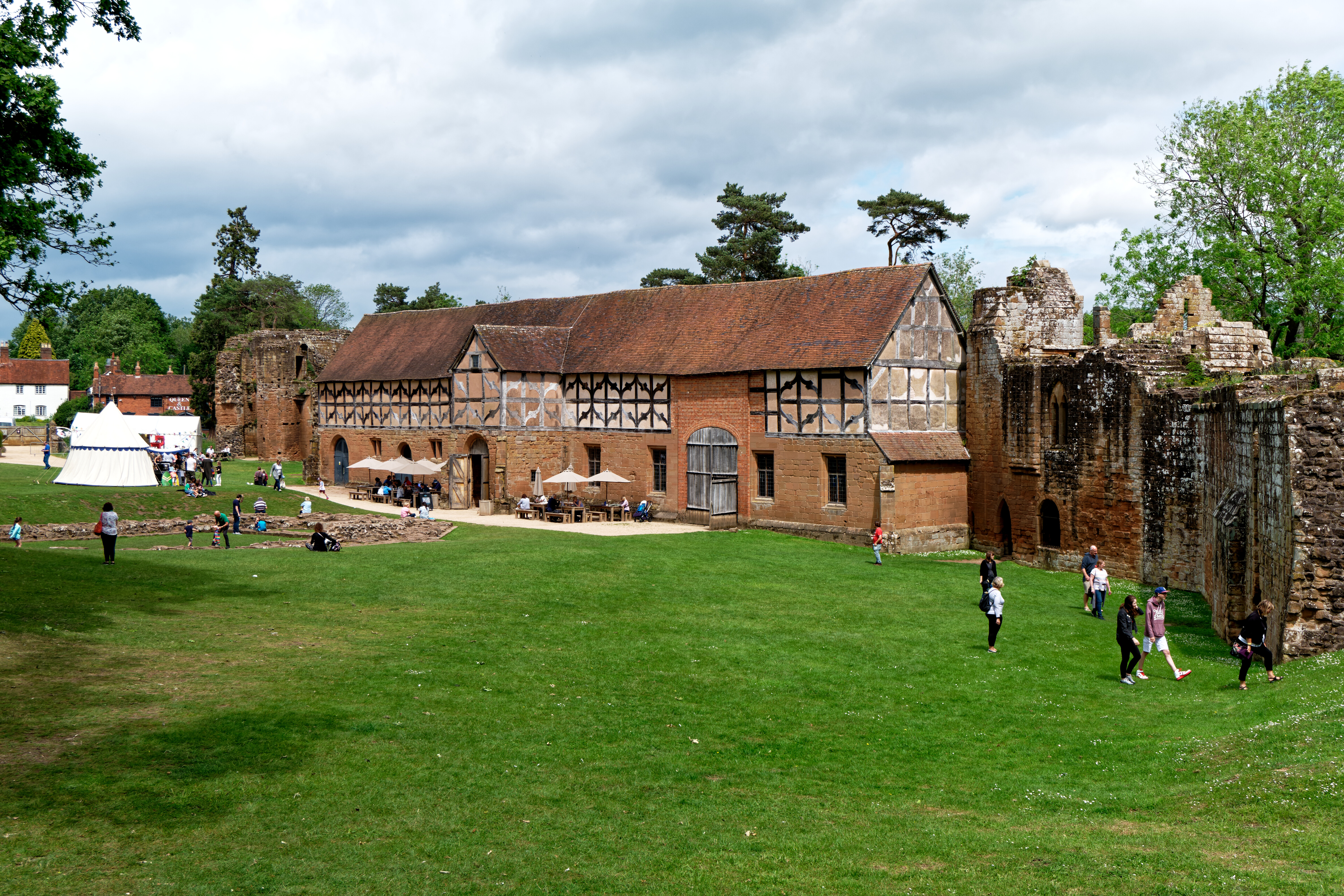
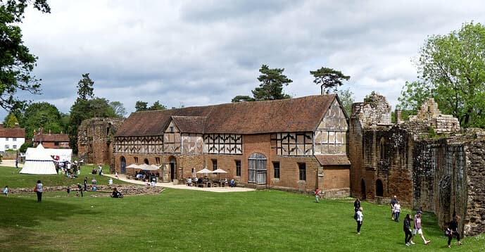
Attached is an image I have just worked on in PL5, it is derived from a raw (raf) file. It was a bright day, sunny but with cloud around. To me the image still lacks a little “sparkle”. It may just be me but tips/advice would be helpful and appreciated.
It is hard to describe but think of a bright sunny(ish) day and that lovely bright light that hits the image. In Luminar it would probably be something like a tweaked golden hour filter and in ON1 the sunshine filter. Lr just seems to catch it with auto adjust - or at least it gets in the ball park. I think Mark has just about got it right .
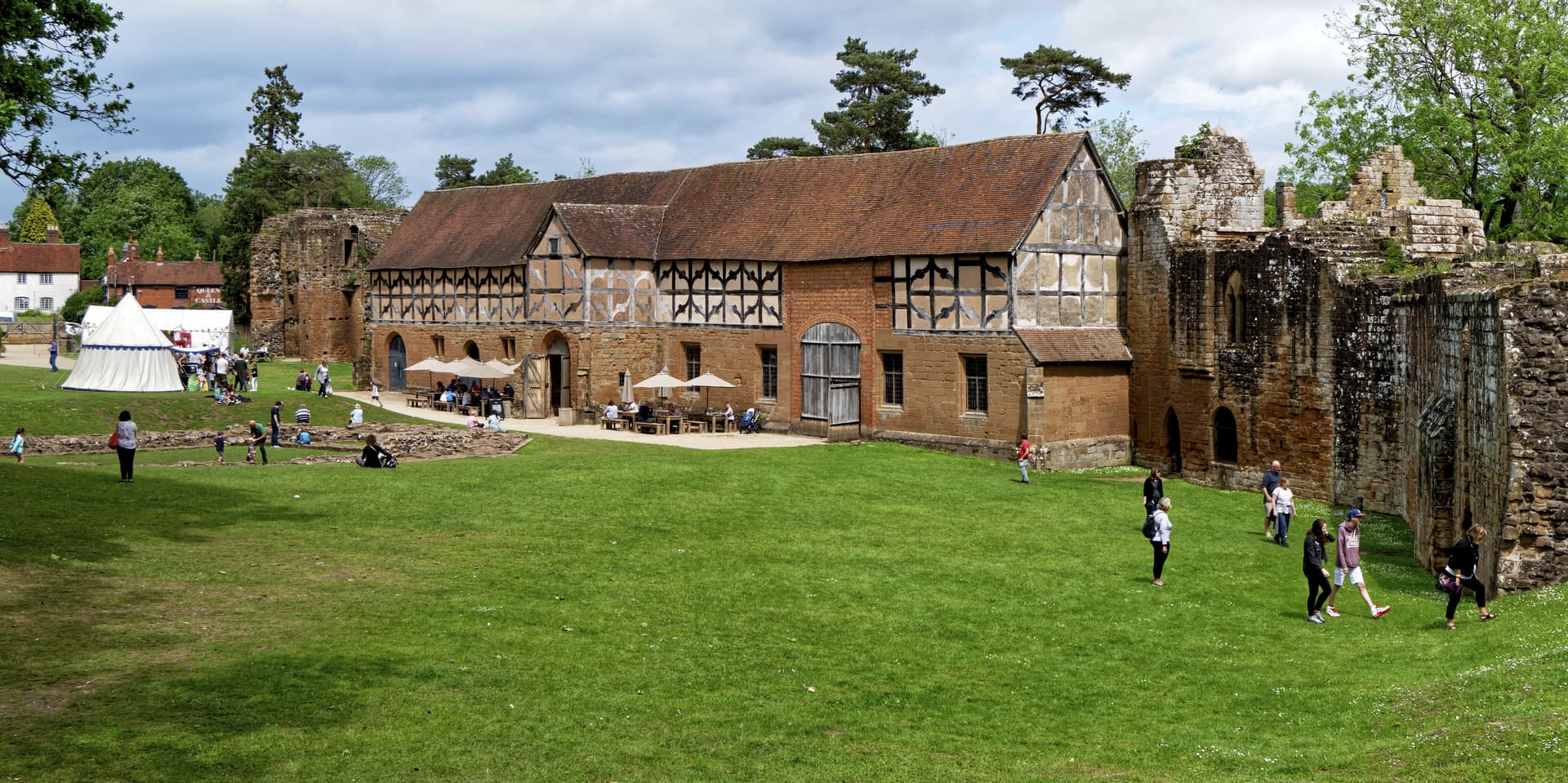
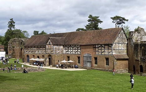
Okay, you like Mark’s saturation boost. I’d also add Wolfgang’s highlight. recovery (tent).
Sparkle feels more subtle than increased saturation imo. If you look at images you like and list their properties, you’ll get to know your preferences in a way that helps you to get that look. Writing things down or speaking them out loud will help to refine the perception.
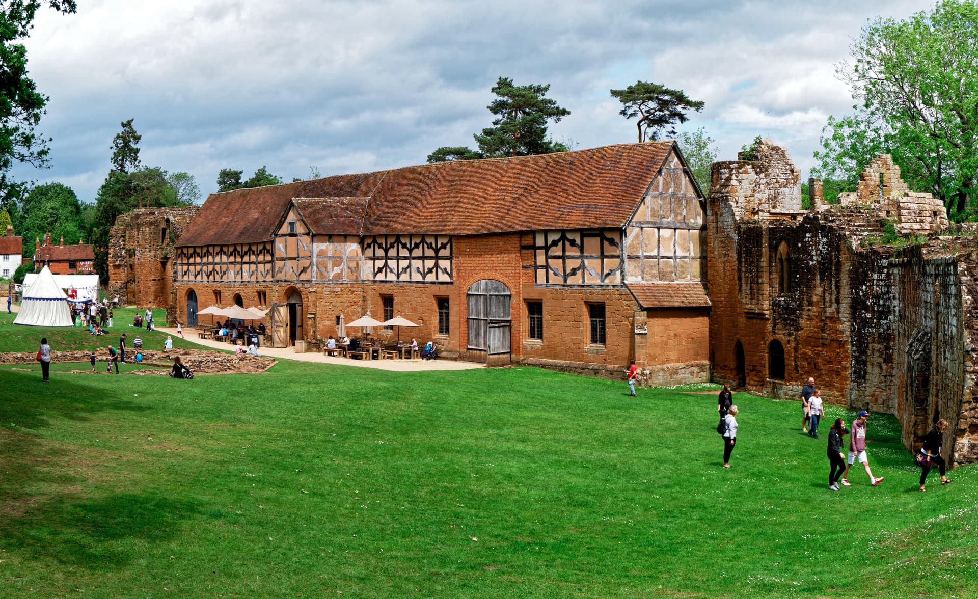
Incorporating both @platypus and @KeithRJ suggestions as well as my previous corrections. You could of course do better working with the original RAW file.
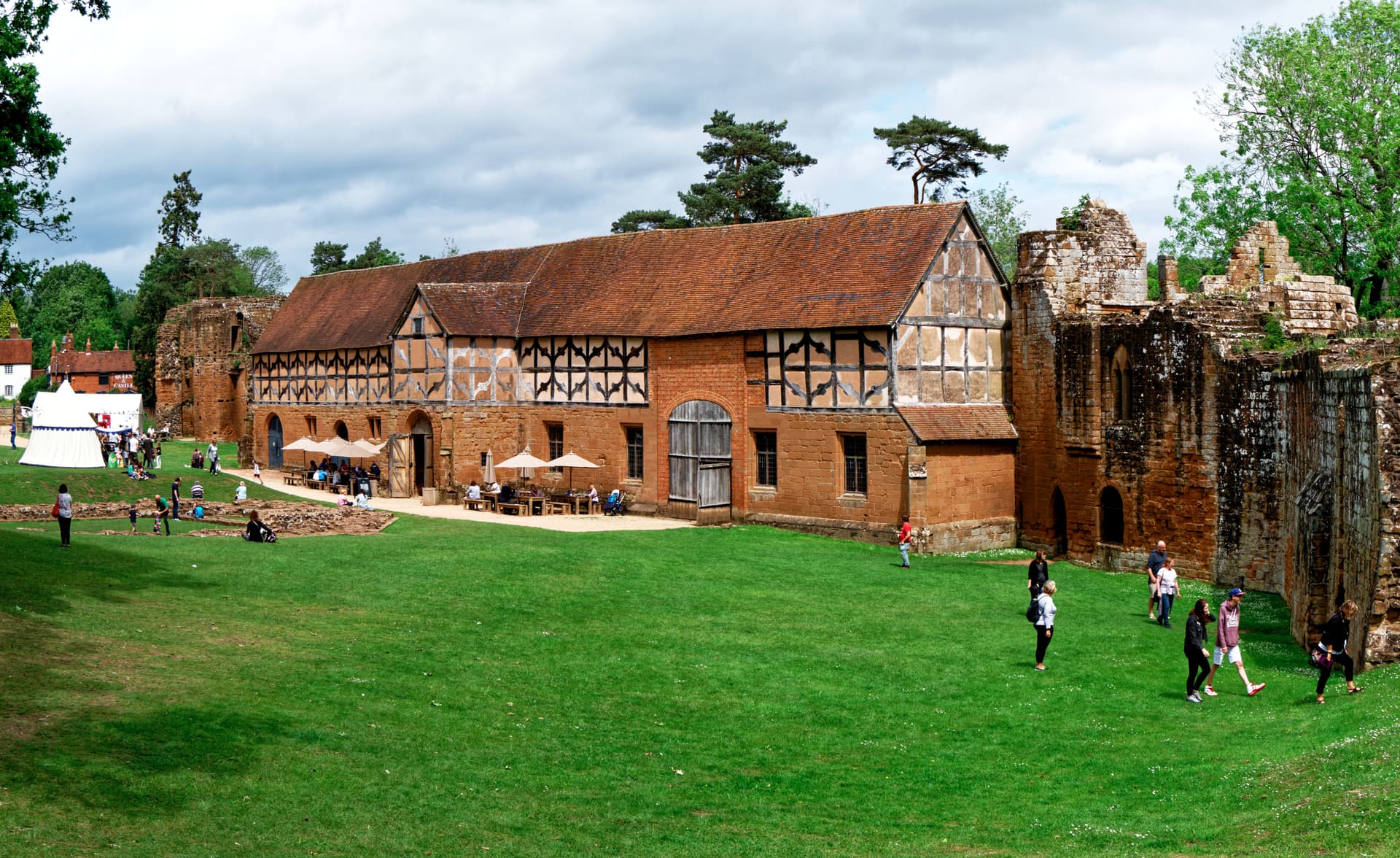
Something I like to try with images like this is apply a color filter (one of the FilmPack features built into PhotoLab if you have the right licenses). Mauve might be my favorite, at about 25% intensity. I think it looks good for this scene, making the sky a bit less cyan and making the people on the grass pop more (the grass becomes a little darker and less saturated). I think a slight boost to the midtones helps, too.
My immediate sense was that the bright, saturated grass foreground overwhelms the subject in this case. I’d start with cropping out as much of it as possible so the interesting building can come to the fore.