Title says it all.

I like them. You might want to do something about the background in the first one. Perhaps less space above her?
2 Likes
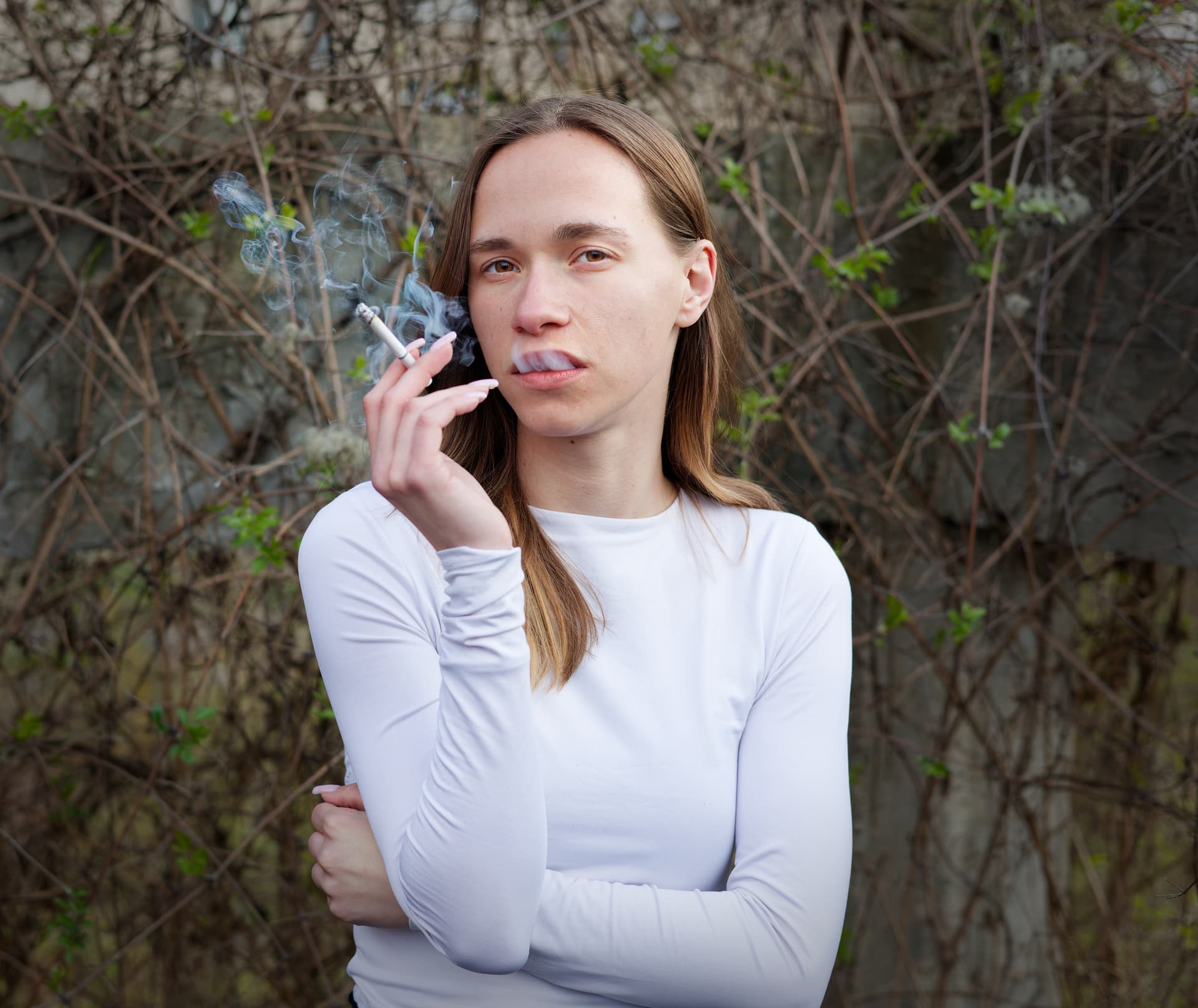
Thanks. Regarding the background, I framed it with the idea of matching the semi-triangles on the left. Cropping from the top would destroy that composition. But maybe it’s not worth it and I should just hone in on the model?
The triangles draw my eye. Personally I’d remove them. Its up to you
1 Like
Thank you for the input. What you’re saying makes sense, and I do want to follow advice - it’s why I created the thread - but honestly, I find the semi-triangle composition just as interesting as the girl herself.
I think of it as an “environment portrait”, albeit a shallow DOF and staged one. (Somewhat ironic considering I shot that with the RF 100/2.8. Not what one would consider an “environment portrait” lens).
Really, the second photo was my attempt at a straight-up portrait.
Personally speaking, the cigarette and smoke ruins this as a portrait.
1 Like
That smokey exhalation is the whole point of the picture, though. It’d be boring otherwise.
I’m not doing beauty photoshoots, I’m interested in people as they are.
Also personally speaking – I don’t smoke (never caught the habit), but I don’t mind people who do. The whole western aversion to cigarettes is very silly. It’s a minor vice, just like drinking.
It’s not just the smoke. It’s the smoke going from her mouth into her nose. It remembers me of dracula. Not natural or suggestive anyway.
George
Not one to comment on photos too much as photography is a form of art and different pictures talk to different people. However, two things of note for me are:
- The first picture is skew and for me it is distracting. You need to get the horizon level. The triangles formed behind her and in the distance align with her pose so for me this is great with the column holding the picture together. But with the column leaning it feels wrong.
- Agree with George, the smoke is not complimenting a younger person as smoking is no longer a fashion statement. If the model was an older person such as a worker in a factory, then it would be more aligned with the story you are telling. Also, try to soften the background as this tends to lift your model as a busy background pulls your eye away. This can be achieved a little in post processing or if you don’t have a fast lens (low f stop) the get a bit of distance between you and the model and the model from the background.
Otherwise, keep shooting and have fun.
As an ex-smoker, it is v natural (if we mean realistic!). It may be no prettier than the inside of my lungs (and it’s 15+ years, not boasting); but if it is what the artist wanted to show …
On the triangles, I like the idea, but wouldn’t it be preferable for them to be less sharp? Once one has exhausted the available natural DoF, the OP could have manually focused a bit in front of the subject, so as to push them into the unsharp background.
1 Like
Well, I’m an ex-smoker too. What I see is smoke coming out of her mouth without being inhaled and collected by her nose. She is breathing in through her nose. One can’t breath in through her nose and breathing out through the mouth at the same time. It looks to forced.
George
Except @LStoev has already said:
meaning the model in alignment with the story being told, the story of a young lady who smokes.
Personally speaking, I still don’t like it but now that I understand the intention, it makes sense.
1 Like
What is most appealing to me is the model’s expressions. The body positions, eyes, mouth and hair all seem to fit for the two very different moods. The gritty environmental portrait composition is great.
Distractions for me are the uneven horizon and amount of background detail in image 1, and the way the smoke obscures her expression in her lips in image 2. The hand position and cigarette tell this part of the story.
Here’s a quick attempt at image 1’s background.
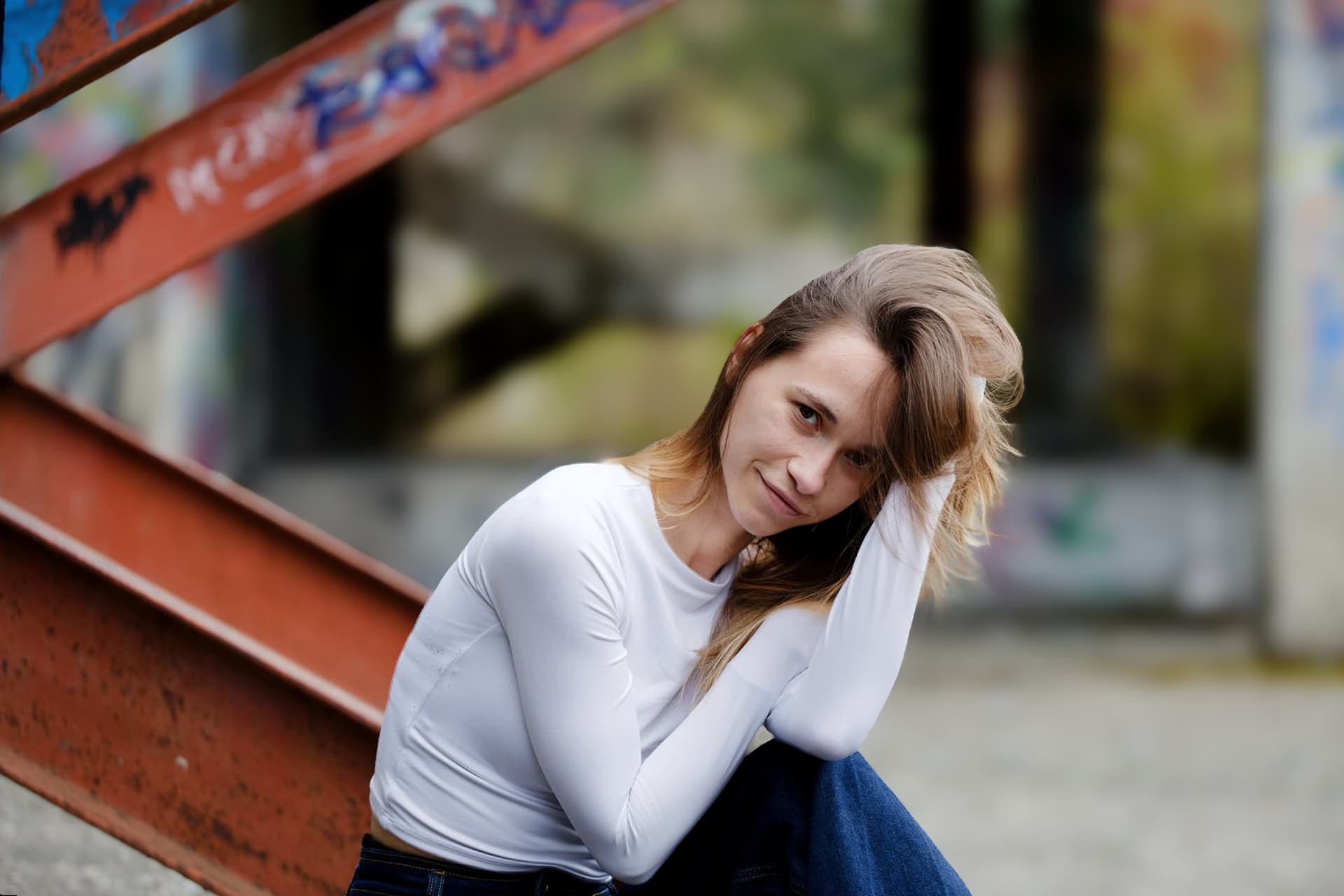
Removing the smoke to reveal the expression in her lips in image 2 would be more difficult.
1 Like
@swmurray, I agree wth your suggestions for the first image which was good and becomes better as the post on the roght disappears…
@lstoev I am not convinced by the second one: looking at it quickly at first glance, I thought she had big teeth (smoke) and I can’t take it out of my mind now.
And maybe the light direction is not accurate for that second portrait, it flatttens her face
1 Like
Thank you for that. (I’d have provided RAW and .dop, if I knew you’d go to that effort).
I had 2 thoughts in the span of a few seconds:
- Background is indeed better and less distracting (Also agreed about the right side).
- Bad artifacts on the edges of the metal, though, right on the OOF transitions, and that’s even more distracting to me.
You’re on the right track, though, I’ll see whether precise masking can smoothen the background without the bad edges (no offense meant, you had to work with a small jpg this forum resized).
Also agreed on the model, will make sure to relay to her the positive comments. Anyway, thanks, I got what I needed from this thread.