Filling the Histogram

Sometimes pictures can be low contrast and with very little dynamic range, which means they can look dull and flat…

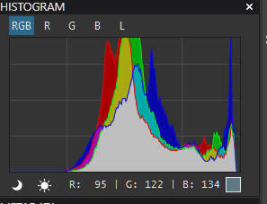
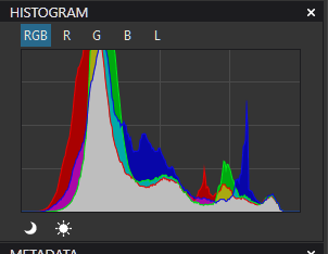
If you look at the histogram, you will see that either one or both ends have “spare” space; in this case, the highlight end…
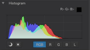
Capture d’écran 2021-01-01 à 09.44.24

PhotoLab seems to provide three methods of “filling” that wasted space to give us a wider range of tones, which we can then exploit to raise the contrast.


1. Move the high point of the tone curve…
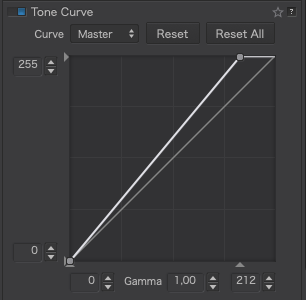
Capture d’écran 2021-01-01 à 10.00.43

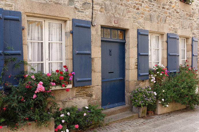
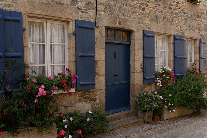
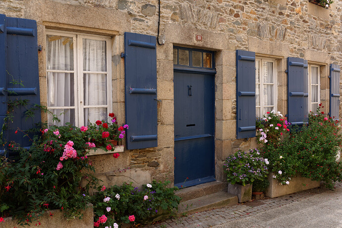
This is quick and easy to do and you can determine where to place it by switching on the over and under exposure warnings and watching for when the highlights start to blow. This is the result…

The first highlights to start blowing were the little white flowers.

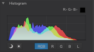
The main problem with this method is that it makes the tone curve steeper and, thus, reduces the width of the tone curve available for manipulation.

And here is the histogram…
Capture d’écran 2021-01-01 à 09.44.33


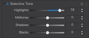
2. Adjust the highlights selective tone slider…
Capture d’écran 2021-01-01 à 10.07.49

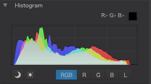
Doing this better fills the top end of the histogram but, this time, the tone curve remains full width, making it easier to manipulate it should the need arise. The difference between this and moving the tone curve is that the range of tones are not distributed in the same manner and give a slightly different feel to the image, which might mean having to bend the tone curve as well to manipulate the contrast.

In this case, the first highlights to blow were the small pink flowers in the foreground. This is the result…

And here is the histogram…
Capture d’écran 2021-01-01 à 09.44.58


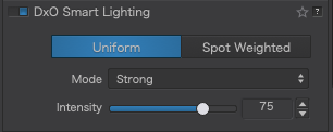
3. Use Smart lighting

Capture d’écran 2021-01-01 à 10.17.55

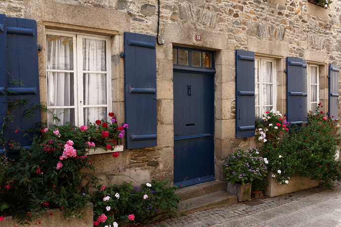
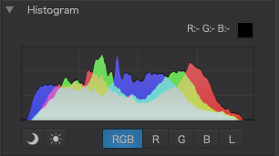
This really is magic. Even in the Uniform mode, it really does seem to know how to maximise the histogram without any fear of either blocking shadows or blowing highlights. All you need to do is decide on the intensity of the effect you want. This is the result of using Strong…

Now we have a well adjusted tonal range and the tone curve remains at full width, making manipulation easier.

And here is the histogram…
Capture d’écran 2021-01-01 à 09.45.06


There really isn’t that much difference in the effect that these different tools have on the image and, what difference there is is subtle.

I would be very interested to see what others think, your preferred method, or any other method you use instead.
11 Likes

Happy new year.

Or activate the highlight clipping tool and adjust the exposure slider. Then you know directly how much you could have correct the exposure when taking the picture.

George

1 Like

Interesting. I didn’t include that because, in “filling” the highlight end, changing the exposure also “empties” the shadow end. With this image that is not so important but it also means having to re-establish the “black point”

1 Like

Hi, and best wishes for 2021
In my experience the smart lighting gives me sometimes strange colors, especially in the greens. So there are pictures i use it, others i simply put it off, and use curves (using some dots and having nice curves, no straight lines)or the gamma. I find highlights slider not precise, and it seems to have impact also on midtones. Other cases i just translate exposition as George says, but of course it is not selective.

After adjusting the exposure I correct the image with the tone curve. Lowering down the blacks and eventual lifting up the whites. Or just changing the tone curve somewhere in the middle. It all depends on the image, and what I used last😀.
I mostly don’t feel well with the selective tone sliders.

George

1 Like

not always.
using this as test image:
video click here

This shot has a brutal lack of blacklevel
afbeelding
ETTR is applied i think, it’s a dxo how get i it right image. (this shows that ETTR isn’t always the way to go to make it easier for your self in post.)

After some pushing and pulling i got this:
afbeelding
trying to pin black to left is difficult if there isn’t any “black” video

So my standard aproach to handle the image in post is:
having some basic “presets” turned off.

  • exposure comp, in centerweighted average auto mode.
  • Smartlighting spotweighted,(no box means uniform) slight 25%
  • clearview plus 15%
  • auto crop unconstrained
  • horizon auto
  • perspectieve auto 85%
    and 18% vibrance (to match “vivid” in jpg of g80.
    played with some colorrendering presets DCP profiles but the general generic rendering handles more a general toning.

From this point i start turning on and off my “presets” to see if it’s going the right way.
most of all: using more tools a little does a better job then one much.
a form of “homing in” aproach.
video
I had smartlighting (slight) on in default as a kind of first correction but it’s not always a “improvement”.
but sometimes it’s quite powerfull:video

Peter

1 Like

@Man, yes smartlighting in higher levels does strange things in the toning of colors.
I use it with boxes in black area and white area in combination with exposure correction. Mostly 25%.
Then it act’s as a flexible black and white point. Moving exc up white get’s supressed so you don’t push white in clipping.

Selective tone does have alot of overlap. Which is a good and bad thing.

2 Likes

I find it depends on the image. Last night, I was working on some older photos that were taken in very low light. Several weren’t exposed correctly, but had the composition I wanted. So how to fill in the right end of the histogram? I tried a few things like you did, Joanna, and found what worked best for me was to raise Smart Lighting to around 50, then highlights, and then either shadows or blacks - whichever keeps the contrast between light and shadow reasonable.

I think I would make the same choices for the image you provided as a test case. Raising only the highlights as much as you did (to 78) left the contrast too high (shadows are still underexposed), while Smart Lighting set to Strong raises the shadows and highlights nicely but keeps the contrast too low for my taste. I notice you didn’t suggest leaving the image like that, but rather, suggested Smart Lighting as a starting point for “making manipulation easier.” I think that’s a good approach, as long as colors are well preserved. Simply lowering midtones a bit after this (or applying some ClearView Plus, which usually lowers midtones in flatter parts of the image) would reach the result I like. There might need to be some manual lifting of the highlights after lowering midtones, as these ranges do overlap in PhotoLab.

Adjusting Contrast sliders after Smart Lighting can also yield some nice results - but I usually keep those adjustments small.

Smart Lighting can fail when the image is severely underexposed or when film emulations are used. (By design, the latter alter the histogram in a way that Smart Lighting doesn’t notice and therefore can’t correct). So sometimes adjusting Color Rendering sliders and settings is very helpful.

1 Like

I’d like to thank the “pros” for these conversations. This is the information gleaned from years of experience that’s not in the books. Again, thank you.

2 Likes

Thanks for the useful tips. However one thing I find is Smart Lighting often does little-to-nothing on my shots. I am assuming this is because of the actual lighting present in the shot. It’s one thing to have an image with the full gamut of tones from dark to light, but another thing if you photograph coal on snow*. This is one thing I’ve always found odd about focusing on a balanced histogram — the assumption that the scene has all light levels present. A night or very low light scene will naturally exist to the left and a snowy landscape to the right.

However, I do use the histogram as a primary tool to understand what leeway I have when I am trying to fix lighting, along with the clipping indicators.

*No, I don’t photograph that — haven’t seen coal since I was a kid — but I think it gets the idea across.

This is a very interesting discussion, Joanna - Personally, I use your #2 & #3 methods … and I’ve learnt to do so until it “looks right” to me (to the point that I don’t bother with the histogram much at all any more !).

John M

Thanks for your video, Peter - - I always find it “enlightening” to watch how others use PL.

Your use of Smart Lighting reminded me of a gripe (annoyance) I’ve long had with this tool; in that, often, I want to compare the affect of SM Uniform versus SM Spot Weighted - BUT the intensity settings are not “sticky” … I have an outstanding UI improvement request here, for this issue.

John M

Would you not create a couple of temporary virtual copies and compare those?

True, but the first image in aperture mode and shot a “normal” exposed in the middle by watching histogram, not ETTR, the scene i used for first video would be more spread. higlights where possibly still nearclippingpoint due snow. but the gras and shadows where darker more near black.
a wider histogram to begin with. i think, i wasn’t there.
That one was compressed by exposing ETTR. (which everyone would do by the way if you stood there to capture the top and bottom as good as possible, but in this case the “lower anker got drifted”)

Smartlighting does two things:
compress DR in highdynamic scene’s to get rid of clipping warnings. (contrast is low.)
expand DR in low dynamic scene’s to gain some nuance , to be seen in histogram as getting wider more spread.

I suspect it uses the algoritm of selective tone sliders in automatic mode together with contrast and gamma level.
By using two or more boxes to give away which objects ,part of the Dynamicrange, you want to effect you can control the effects better.
And even only effect a part of the histogram.

1 Like

In some ways, the title I gave this thread could be construed as suggesting that the histogram should always be full - something which is certainly not the case.

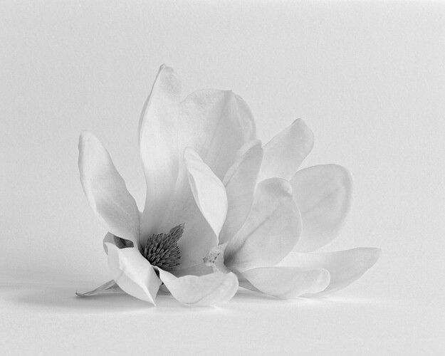
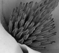
Or is it? Take the example of this image…

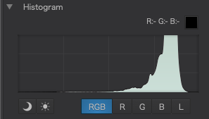
… and its histogram…

Capture d’écran 2021-01-02 à 11.07.49

This was made, quite deliberately, as a high-key image so, understandably, there are very few tones in the first half of the histogram and the image appears as we would expect.

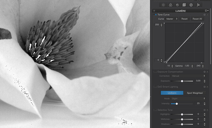
However, if I turn on the over and under exposure warnings, I only have to move the ends of the tone curve sideways by a couple of points…

… and both the under and over exposure warnings start to flash.

Especially surprising for the shadows end but, if you look at this section of the flower…

Capture d’écran 2021-01-02 à 11.15.26

… in more detail, you find that there are indeed tones that are virtually black, despite the apparent absence of such tones in the histogram. It’s all about the scale of the histogram, where there are simply not enough levels to show such small quantities of a particular tone.

In fact, despite its appearance, I have completely filled this histogram :nerd_face:

2 Likes

Fabulous counterpoint @Joanna.

Virtual Copies are very useful when you want to preserve a particular “state” before moving on to more detailed corrections … BUT, I find them to be next to useless for comparison of subtle differences - because the time it takes to (re)render ALL corrections when switching between VCs exceeds my mental picture of the previous result !

John M

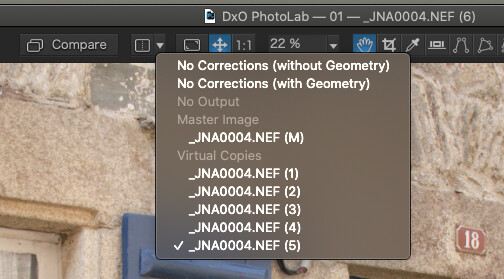
Hmmm. I don’t get any lag on my Mac. For comparison, I choose one of the virtual copies, then I set the comparison drop-down to another and simply hit the Compare button.

Capture d’écran 2021-01-03 à 09.22.50

3 Likes

That’s really interesting, Joanna - I’ve only ever thought to switch between VCs via the Image Browser - not via the Compare; and I’m most surprised (indeed, curious) to find that the latter is much faster … tho, still not fast enough for me to make a satisfactory mental comparison.

Which suggests that either your Mac is much faster than my PC - - or my mental picture dissolves too quickly :slightly_smiling_face:

John

Thanks again for the second useful tip today :wink: Works like a charm and you pass by the lag when completely switching. I mostly only compare to the original, (pressing “D”), but knowing this now is a game changer. Will use it for sure more in future.
https://help-photolab4.dxo.com/en/using-virtual-copies

1 Like