As a new user of Silver Efex pro I was hoping to get some constructive feedback from this group about some of my recent edits of taken in Porto. Also if anyone is aware of a good book on using Silver Efex pro (or even a general technical book on digital black and white) please let me know about that too.
Thanks
Pete
A6700614_Nik_DxO.tif (2.7 MB)
3 Likes
Hi and welcome here.
Based on the examples you showed, I think you know how to use effective black and white!
some links – in no particular order, and some quite old
( that said, pay attention to the concepts the moderators are teaching … )
→ https://www.youtube.com/watch?v=s_W3MloPmh4
→ https://www.youtube.com/watch?v=ySFE3cURA20
→ https://www.youtube.com/watch?v=8sDQAuHtTc4
→ https://www.youtube.com/watch?v=M6EKTFpHg3E
→ https://www.youtube.com/watch?v=JoLqyX1nCFw
→ https://www.youtube.com/watch?v=BXF3VLP7I0E
→ https://www.youtube.com/watch?v=31y3h_3Wxj8
→ https://www.youtube.com/watch?v=XDhXNGH6pqY
→ https://www.youtube.com/watch?v=JsHqPJ8OazY
→ https://www.youtube.com/playlist?list=PL8DO7Z7OkVNVquI4YFwhsCDsNQ1lr6cLQ
have fun,
Wolfgang
1 Like
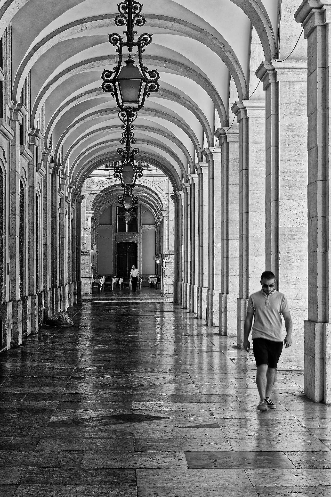
In the second image there are quit strong halo’s in the wires. You might have overused some tool.
Further nice pictures.
George
1 Like
These images are technically good, but “worked,” meaning that they appear to have been processed or treated by some computational process. And this is fine, depending upon what you’re after here. If you’re aiming at (re)creating analogue film (and subsequent processes, such as silver halide printing out, etc.) then I’d decrease the amount of “sharpening” such as the Clear View slider and/or the Structure Adjustments you may have programmed in NIK SilverEFX. And this is a matter of personal taste (or intended use).
Examine the upper right-hand corner of Image #3, perhaps some kind of distortion in the sky area?
1 Like
I appreciate the insights on those Silver Efex edits of Lisbon - especially the comments about halos and sharpening techniques. By the way, while exploring apps for photo previews and annotation, I came across a fax app that surprisingly doubles as a basic image uploader with markup tools. It’s not a primary choice for editing, of course, but in a pinch it lets you sketch, send, or annotate screenshots before diving into Silver Efex for final styling. Thought it might be a quirky little productivity hack!
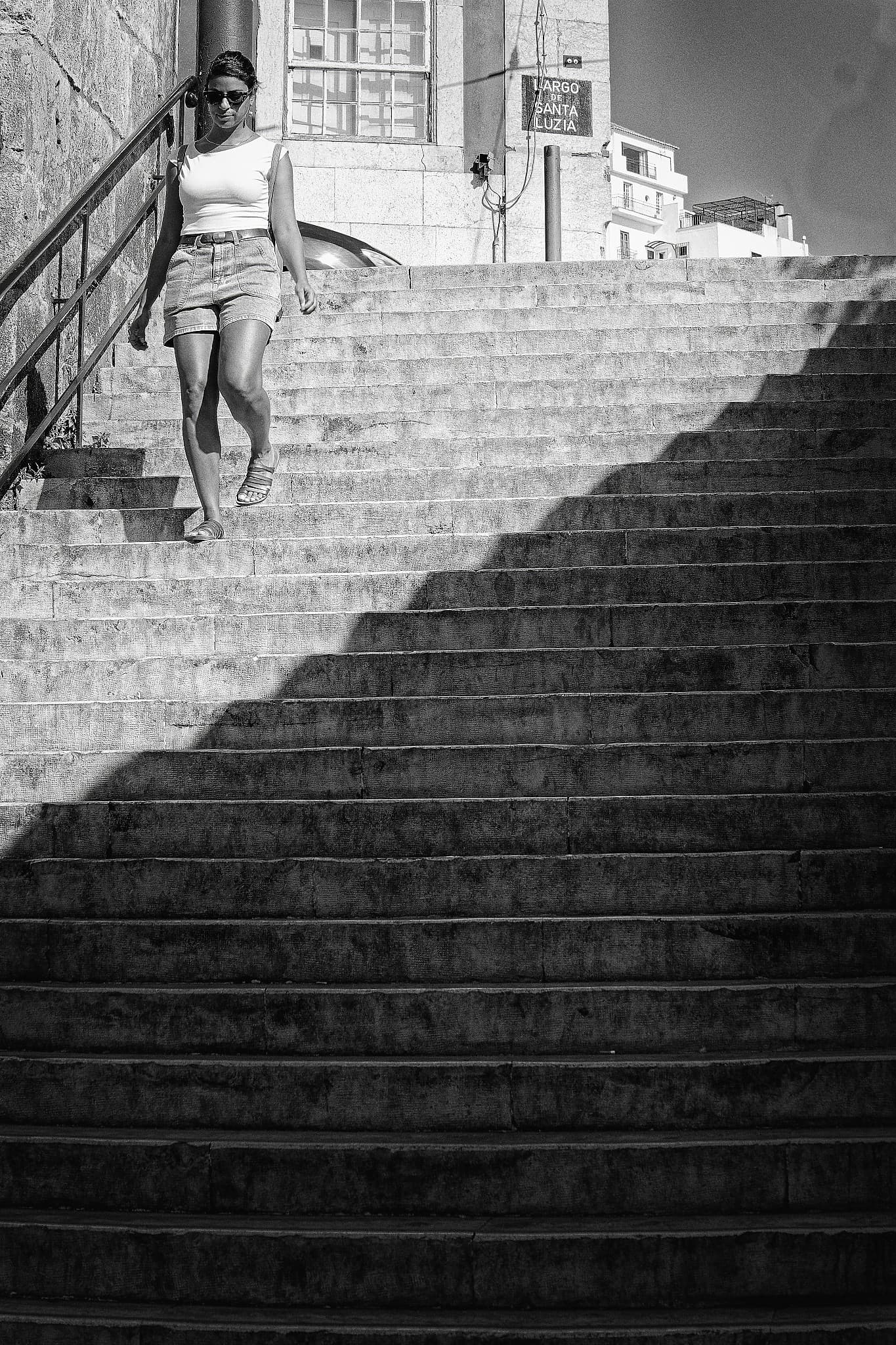
Your line of shadow on the stair steps is so amazing! How it separates the photo into a region of light and a region of dark, and how it zigzags, is so artistic!
1 Like
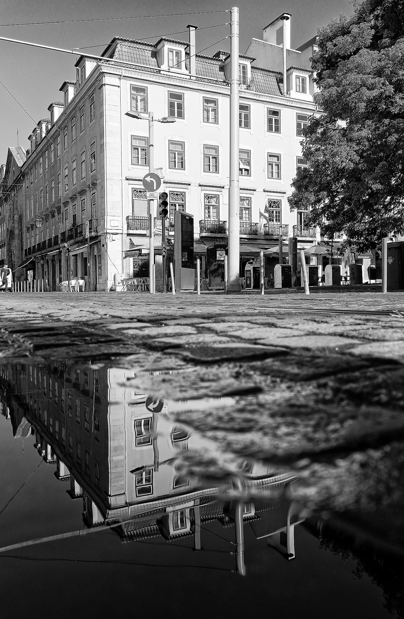
I like the toning, looks perfect to me. But imho,… it’s overdone in terms of sharpness. Viewing on 4k monitor, maybe on FullHD it looks better. Halos (some local contrast) can be disturbing. On #3 the right-upper corner captures too much attention. On the other hand, nice examples of breaking composition rules to get the harmony. And those minor details, like two people in #1 and in/out-focus reflections in #2. Note that I’m B&W illetarate.
BTW, how much was done in the initial processing, before feeding Nik?
Thanks all for your feedback
Thanks for information
Having a second look, I like #1. It’s music, to put it short.
I love your photography. I find your choice of the tonal qualities to be fine. Over time, we all develop a style or look to our images that reflect our point of view. Black and white can be used effectively in so many ways, I personally enjoy strong blacks with a snappy (bit of contrast) gradation in tone, showing many shades of gray including a pure white. Sometimes I’m drawn to the warm tone aesthetics of black and white, but the cold tone is equally pleasing. Since most of us see the world in color, the tonal qualities of black and white aren’t perceived as true or false. Your choices work well, as others mentioned, a bit over sharpened.
This author seems to have good value for his books and may be a good read since you inquired. Black and white
Checking out the “Feedback on Silver Efex Edits of Lisbon” thread on the DxO Forum, users focus on tonal adjustments and avoiding over-sharpening in black-and-white photos. This careful attention to detail is similar to how a fasting and wellness app like Wellness-App (https://wellness-app.com/) helps users monitor and balance their health routines. Just as photographers refine their edits, people can fine-tune their wellness habits for better results.