Editing high dynamic range images in PhotoLab 5

Thanks for recommendation, the articles of George Duvos are by far the best I read about this.

BUT:

To me this diffraction thing is merely an academical discussion in full-format or APS-C, most of our lenses are sharpest at F5.6 to f9 (very bright primes already at F4). The usual loss of line-resolution between F8 and F11 is about 10% and from F11 to F16 another 15-20%. Even at the best lenses. So to get best optical quality it is mostly recommended to use F5.6-F8 (despite depth of field is not sufficient or some lens-flaws are not mitigated such as Coma, Flare, Vignetting, CA, corner-sharpness when needed and others of course).
I only use F11 in Macro-photography and only when necessary.

1 Like

Yes, I also would have tried with some heavy ‘vignetting’ like this – to ‘focus’ on the sun, which here is ‘framed’ by the skyline and the cloud’s blanket, while the reflection on the water leads to it.

The downloaded file looks good on my wide gamut display (80 cd/mÂČ).

There is a web page for everything! Here’s a page to predict how beautiful our sunrise/sunsets are likely to be:
https://sunsetwx.com

Since I’m not likely to see anything spectacular, I spent this afternoon, and will spend this evening, using my Fuji X100f. Since DxO was nice enough to provide (beta) software for Fuji, I feel I ought to give it a try. I’ll probably shoot it the same way I’ve been shooting my Nikon.

I like the effect, but it’s darker than I prefer, at least on-screen in the forum. I’ll try very hard to create a better image for a starting point.

Please understand my versions of your images not as something better or worse, but as an incentive to leave the trodden paths and go wild for a change.

Here’s the boring backyard original:

Mike, don’t judge pics from the forum’s representation. Before downloading them they are ‘illustrations’ without colour profile (= no need for text). – Judge them, when you upload to smugmug et all.

Totally understood - knowing what I did to create the image, I find it fascinating to see how others interpreted the same starting point, the raw image.

Wolfgang, I mostly judge things when I view them on my calibrated 27" ASUS display. Still, I get a very good idea of roughly how things will look, when I view images in this forum on my ASUS. I agree - for an accurate representation, I need to download the relevant files.

During the daytime, my iMac is much brighter than my ASUS, but if I have to edit something in the daytime, I get a better result if I do the work on the iMac. It’s that, or put in new shades and make my living room much darker. My solution is to do most of my work at night.

(Now I’ve got a new “toy” to work with, a damaged 2018 iPad Pro. If I’m traveling, and not taking my laptop, that’s how I’ll likely be communicating in a while. I bought an image editor for it, that was designed for an iPad, not something ported to the iPad. I have no idea how that will work out.)

I will admit to declaring thread bankruptcy given there were 46(!) new posts since last I read it. But on the question of minimum and maximum apertures, my answer would be “it depends”. On a lot.

My most common shooting situation involves aircraft and a 55-300mm lens. I’ve stated the numbers before but DOF is going to be huge no matter what, so I choose one that I have tested to be the sharpest for the lens. On the older model I was using until recently, I and some other users decided that was f/11 and so the lens rarely moved from f/11. A newer model I now have seems to perform very well at f/8 so that’s where it stays.

I’m fortunate to have a fantastic sensor and usually do not shoot in low light, so I shoot Aperture priority and leave the camera to decide shutter and ISO (up to 6400). Job done 99% of the time for these types of shots.

My other lenses are a whole different ball game. My 90mm f/2.8 Tamron macro
 well, why have a f/2.8 macro if not to use it at wide apertures, even if that presents challenges?

Having watched PhotoJoseph’s webinar on PL5’s new features, once again I sort of thought I understood, but the way Joanna describes things, I not only know “what” the tool does, but how to use it effectively. Big difference.

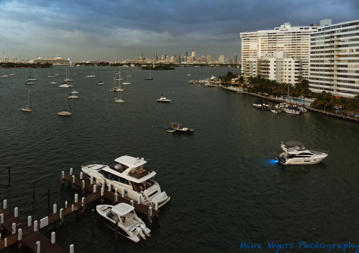
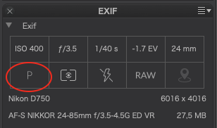
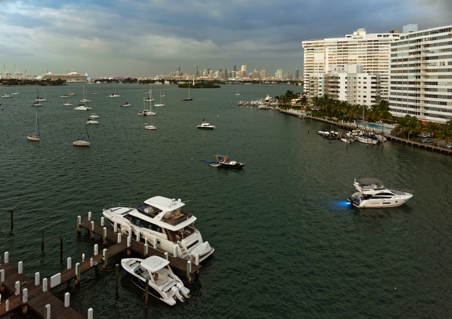
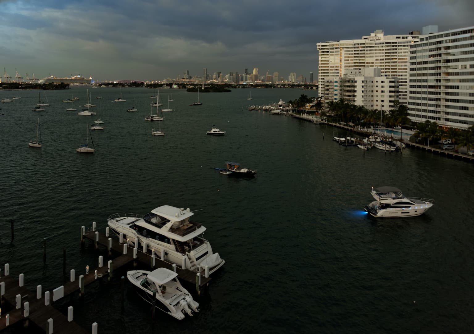
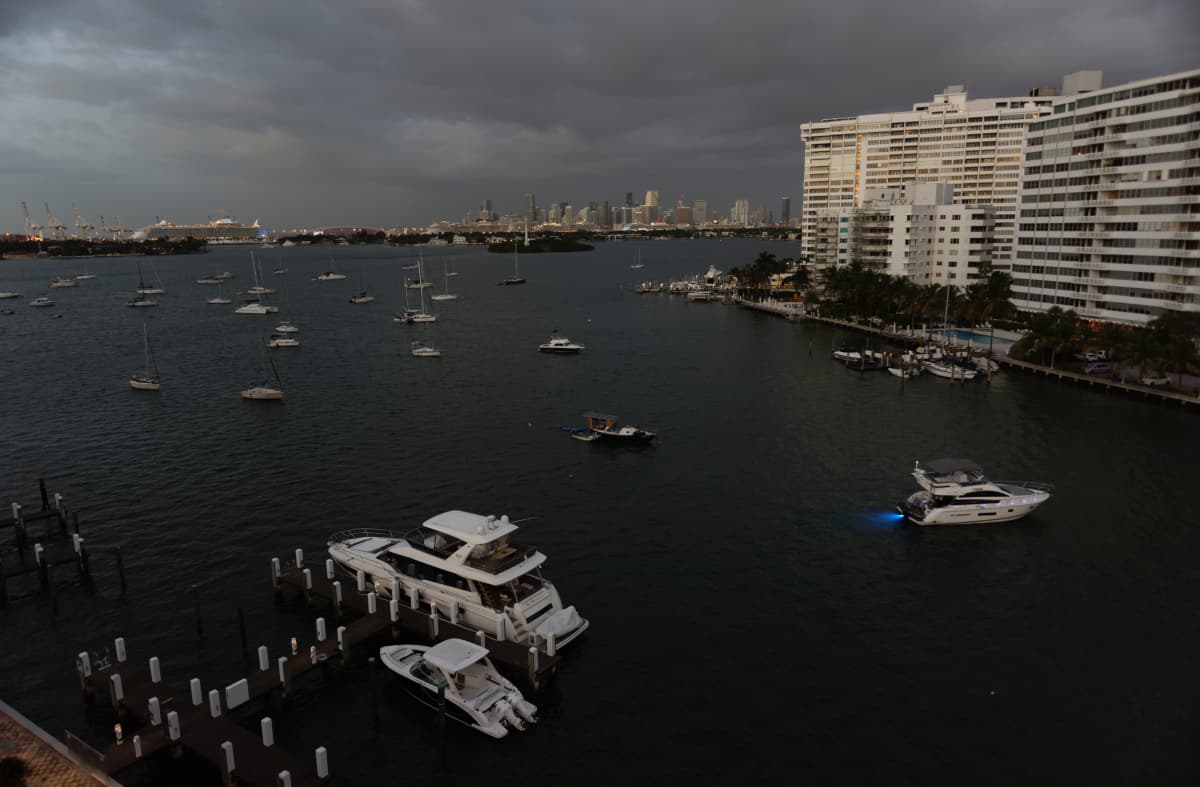
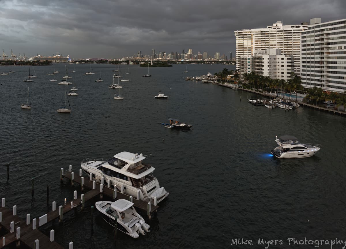
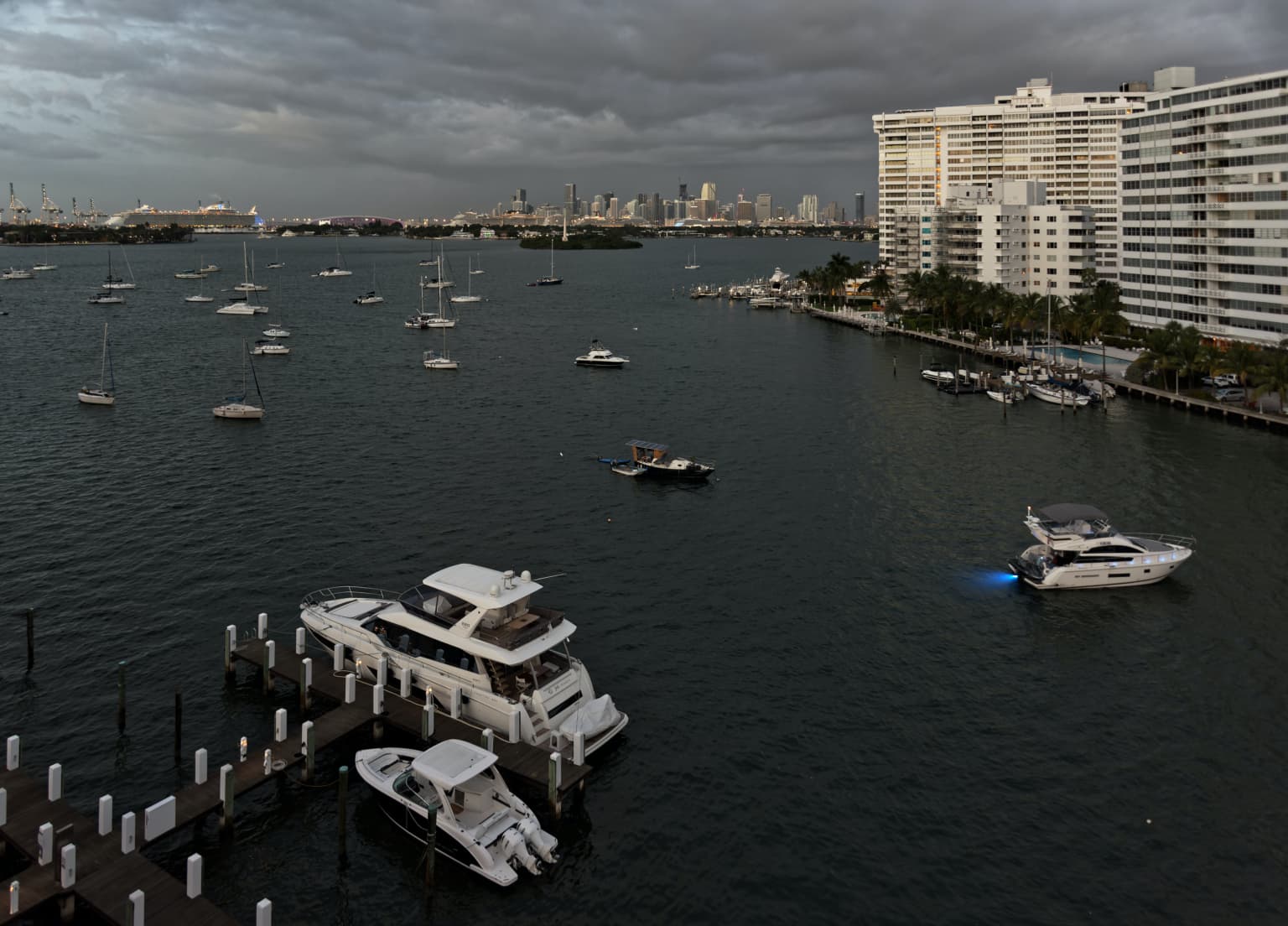
Last night some huge yachts anchored and docked just outside my condo, and I took a “night shot” with my iPhone. I decided to wake up early and capture the scene at sunrise. I woke up late, grabbed the Nikon 750, set it to 24mm to get in the whole scene (which I couldn’t do with the iPhone), rested the camera on the balcony railing, and took several shots as everything was getting lighter by the second. I didn’t have time to set up the tripod, which was right there, and I guessed at the exposure, as I was too sleepy to know what I was doing. Excuses. At any rate, five shots captured what I saw, and one of them gave me enough “room” to correct the parallax errors from a wide angle lens aimed downwards.

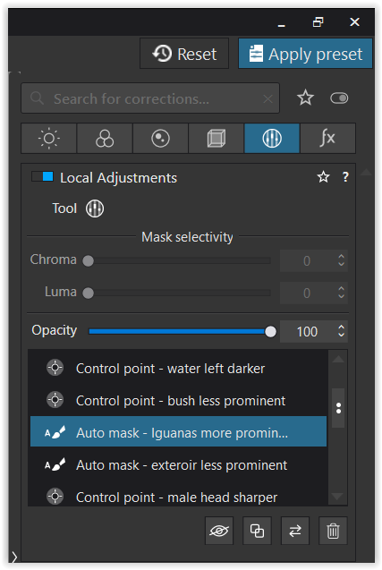
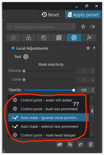
So many things Joanna forced into my brain all came together, like using the “8-points” correction, then forcibly rotating the image CCW after seeing the (G)rid view showed me it was still tilted. Then it was off to adjust for exposure, so nothing was blown out, and then I fiddled with the color controls so the image looked “normal” to me, and not all blueish. When everything was done, I tried to improve the sky, which was too “boring”. I did use the new “Line Control” tool, and I think (hope) I did it correctly. (Having second thoughts, maybe I should have just left it all blueish, or maybe that was because the 750 was still set for 5600K ? I just adjusted the color to look good to me, on my screen, but it is now more “what I felt” than “what I saw”.)

I got done just in time - the yacht with the underwater lighting sailed off, and the lighting quickly turned into full daylight, meaning all the lights on the ships and things in the background were turned off. This is something else I’m not sure of - I edited the image so it is “lit” nicely, but maybe it’s now “too bright”?

Here’s the image data:

_MJM9367 | 2021-10-30.nef (26.2 MB)

_MJM9367 | 2021-10-30.nef.dop (14.8 KB)

My original question was how to use Control Line more effectively, but I’m usually pleased to see how other people “see” my images. As a photojournalist, I’ve already broken all the rules, so this image is more “art” than “photojournalism”. And all the “stuff” at the lower left was left in to compensate for all the “stuff” at the top right, so the photo feels “balanced” to me


Meet the Iguanas

Ok Mike, let me pick up your pic from post #89. :slight_smile:

You took the photo in harsh light, turned up the overall contrast by lowering the shadow in the Tone curve plus enhancing Fine contrast and cropped to more or less centering on the male Iguana.

Well, I reset everything and changed the crop, so that the Iguanas now meet at around 1/3 of the frame, a more pleasant composition to me.

The concrete wall is a leading line, but very bright and in stark contrast to the rest of the pic – taking to much attention from the animals. I tried to change this, started with the Spot weighted tool and then moved on with Local Adjustments 


M = as shot, optical corrections only
VC 1 = your version
VC 2 = my version


_MJM9239 2021-10-26.nef.dop (838,7 KB)

To examine, I suggest to copy VC 2 to a new version and play with all settings.

have fun with experimenting

1 Like

Not bad at all :smiley:

But then, if you leave the camera in Program mode


Capture d’écran 2021-10-30 Ă  15.54.01

:roll_eyes: :stuck_out_tongue_winking_eye: :crazy_face: :grin:

Fortunately, you set -1.7 for the exposure compensation and avoided any blown highlights.

I’ve had a play and made a couple of minor adjustments, that you will find in the third version - just like Wolfgang’s


M = as shot, optical corrections only
VC 1 = your version
VC 2 = my version

Apart from that, a couple of things that you might like to consider.

  • you held the camera steady enough, considering an exposure of 1/40 sec, but at only 24mm there is no noticeable movement.

  • the boat on the right is slightly blurred, but it was moving. But also the entire right side is a bit soft.

    This is something we have had with one of our wider lenses and we found to be due to too large an aperture. Even if it means a tripod, you really need to avoid much less than around f/8 and you should find the sides get a bit sharper.

  • The white balance looks great. It doesn’t matter what you set it to, which is why I always leave it on 5600°K, so I get an idea of what colour the light was at the time before adjusting it to taste.

  • The reframing and perspective is spot on

  • You need to play a bit more with the pipette and mask selectivity on the Control Line. What you had effectively wasn’t really any different to a grad filter.

Well, I thought it needed the slightest of lifts but that is personal and I also boosted the greens using the colour wheel. I often find I have to put an image away for a while and come back to it in this kind of light. Preferably export a couple of versions and only look at them in isolation from each other, to avoid being swayed by the difference.

And yes, Helen and I both agree about the balance :nerd_face:

Here’s an export of my version


And here’s the DOP


_MJM9367 | 2021-10-30.nef.dop (42,6 Ko)


At the last minute, I removed the Smart Lighting and flattened the Tone Curve. I think this is possibly more like what you saw


When I turned on the camera, with me still mostly asleep, it was set at ISO200, Aperture mode, f/10, and 0 exposure comp. The image on the viewfinder was too bright. I meant to change it to Manual mode, but instead selected Program (oops!). Not knowing why it was messing up, I selected -0.7 exposure, as a guess, and by then it was using 1/5 second and f/3.5. I raised the ISO to 400, and it was then using 1/13 second and f/4.5. As the world got brighter, the shutter speed started to climb, eventually reaching 1/30th at f/6.3.

I deliberately had left it in the original settings for “walkabout” photos. Mistake #1 was I lowered the ISO way too much - if I had left it at ISO 400 or 800, that would have been better, and I’d likely have left it in Aperture mode. BUT I now understand that whatever the camera thought the right settings would be, I did better by selecting the -0.7 exposure comp. This was with center-weighted metering, which doesn’t make sense to me. The middle of my image ought to be underexposed
 but considering I lightened it up in PL5, maybe that’s the reason.

For “walkabout” mode, from now on I think I should select ISO 400 (but 640 might be a better compromise). From our discussions here, f/10 is good, but maybe f/8 is “gooder”. :slight_smile:

I’d like to leave it at settings that I can grab the camera and shoot, and have a reasonable chance of getting a useable image - fine-tuning things when I have time.

Oh, and sorry for the delay in getting back to this forum. I shut down my computer, updating Apple’s newest OS, Monterey. DxO has already turned off some functions that don’t play nice with Monterey, so I hope they’ll be back soon, and I’m anxious to be able to use my iPad Pro as a “third screen” for use during editing.

I put both our images on my screen at the same time, side by side, and looking at one at a time, they seem the same. Looking at them together, your water does show a bit more green and less blue, and I like your version more. I didn’t like my sky when I finished, and your sky look a bit less exaggerated. Something seems wrong though, as the water and sky don’t “match”.

In the original image, viewed as a JPG on the back of my camera, the water and sky “match” each other. I messed that up, and by working on what I had posted, your image now looks “messed up” the same way. When I click on the COMPARE button, the sky and water were originally almost identical, which makes sense, as the sky is being reflected in the water. Now, to me, both our versions look impossible. I didn’t realize this before. I’ll try to fix this, or maybe I should say, un-fix whatever I did wrong before


I put everything away, and started all over again with a “clean” Master image. I ignored all the stuff I did before, other than white balance, and all I did there was use the eye dropper tool to make the top of the yacht in the foreground “white”. Everything else changed accordingly, and now the water farthest away matches the sky above it. Not only that, but the lights on the cruise ships are bright once again, and stand out from the scene lighting.

That’s all this image is for - it needs all the other adjustments, but I’m just concerned with the water and sky for now.

_MJM9367 | 2021-10-30.nef.dop (43.3 KB)

1 Like

Finished image, the best I know how to do. Much less editing, and taking care to keep the water color similar to the sky color. Maybe “less is more”?

_MJM9367 | 2021-10-30.nef.dop (45.7 KB)

Hi Wolfgang,

how to you get those settings I marked in your screenshot?

Is this a Windows thing? Mine looks like this.

These are not settings. This is a list of local adjustments that have been made to the image, and then renamed. It works exactly the same on Mac.

1 Like

Next feature is spoken adjustment

“adjust clearview on iguanas”
“plus 1/3 global adjustment”
“10points vibrance on tree”
“add some blue in the sky”

Don’t be lazy and just say “repair my failures”
 De program will throw the rawfile in the trash! :rofl: :crazy_face:

1 Like

Thanks Joanna,

but it looks like, there are some more steps needed, still don’t understand. Seems to be a workflow I never used before. “Apply Preset” is missing in my example. Anyway, out now and trying to catch the fox :wink:

The “Apply Preset” button is the Windows equivalent of the “Presets” button on Mac. It also has nothing to do with the “Local Adjustments” panel

1 Like

Absolutely! And I’ve reduced the number of adjustments even more, whilst attempting to maintain your “look and feel” :stuck_out_tongue_winking_eye:

Basically, I removed the Smart Lighting and Selective Tone adjustments, in favour of a more precise Tone Curve.

Capture d’écran 2021-10-31 Ă  10.11.08

Try to avoid global Micro-contrast - Fine Contrast is, well, finer and you can also selectively apply it to shadows, mid-tones and highlights. This can help avoid too much crunchiness in waves or sky whist avoiding local adjustments.

I’ve also added a Control Line, with micro-contrast, to the sky to gently increase the cloud detail. Look carefully at where I placed an additional Control Point, to add in the top right sky and negative Control Points on the buildings, in order to limit the selection to the sky and avoiding as much of the buildings as possible.

Here is the DOP with my version replaced

_MJM9367 | 2021-10-30.nef.dop (45,0 Ko)