Thanks. I think I prefer your version over what I just created.
Question - I used to think that I would have an original image file, and a “.dop” that contained all the editing changes I made. Then I would get a new “.dop” file back from one of you, often Joanna, that had edits for both my original image file and a virtual copy, perhaps VC1. At any rate, the folder would have two image files, the original, and the VC. Maybe more, as people edited and created more VC files.
Am I correct that to use your edited information, I should create a new folder, containing the original raw file and your new “.nef.dop” file, after which I could export to DNG using the option of “Export with lens corrections only”? I don’t understand what you mean.
No, I mean an image that looks like a professionally produced image to be used as a post card, meaning bright colors, a clear blue pretty sky, sharp detail, and so on. I have always preferred images like that, but I don’t always work with my editors to create them. I prefer that over images that are “dull” by comparison, and don’t “jump up at the viewer, off the page or screen”.
Mark’s image was perfect, and I tried to re-create it, but maybe I went too far.
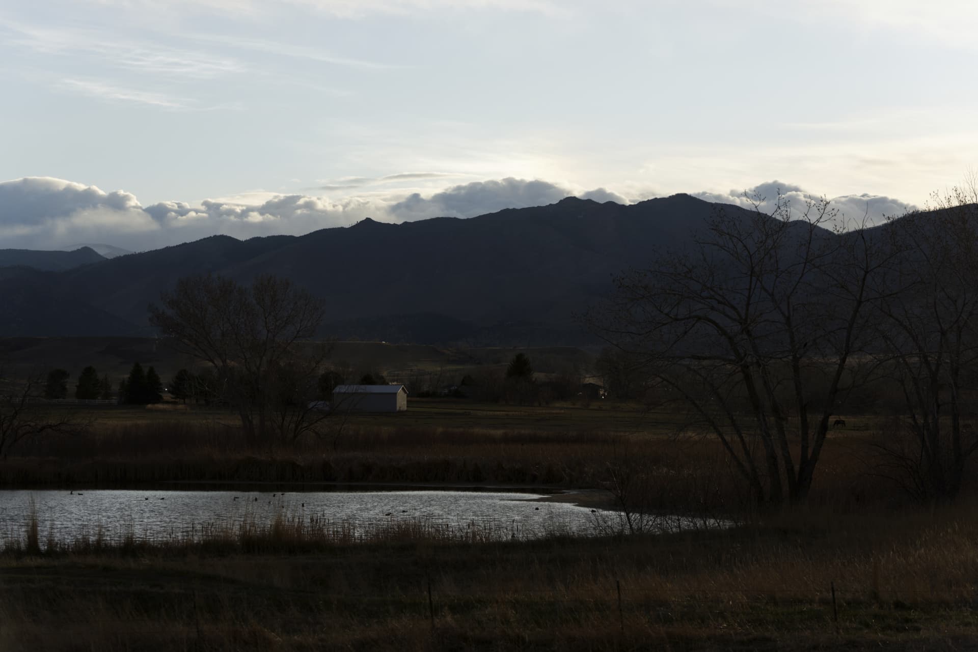
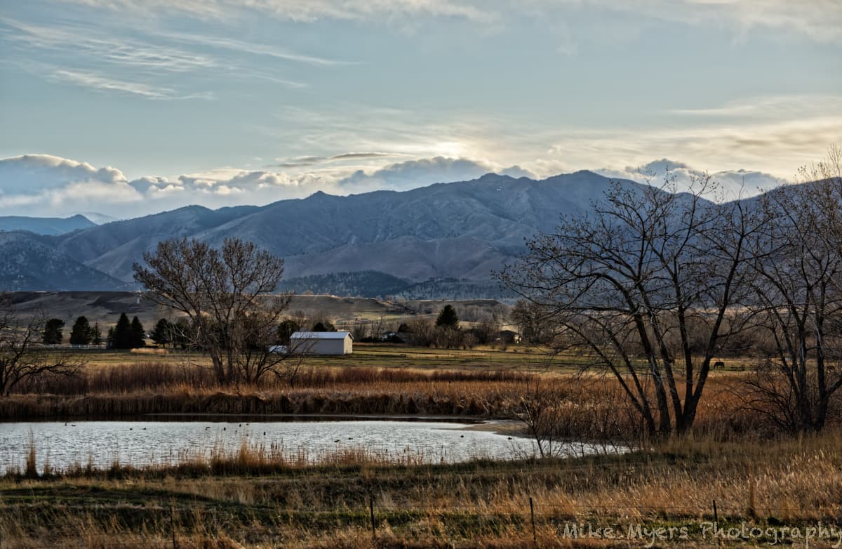
Some thoughts - what is the point of capturing all that detail, and then hiding it in the finished image? I’m thinking of the details in the side of the mountain, that were so clear to me when I took the photo. The clouds were what attracted me to take a photo in the first place. I thought they would look good in my “sunset photo”, but my sunset photos were a total failure. I suppose I should post one here:
I took several series of photos, but gave up on it. Other than the clouds, there was nothing much to see. I would have kept taking photos as the sun got lower, but I was far too cold, and my battery died, and I gave up on the idea. By the time I got back into the house, I was more interested in warming up than taking more photos.
I’ll post another image here later today. Very different from the above images.
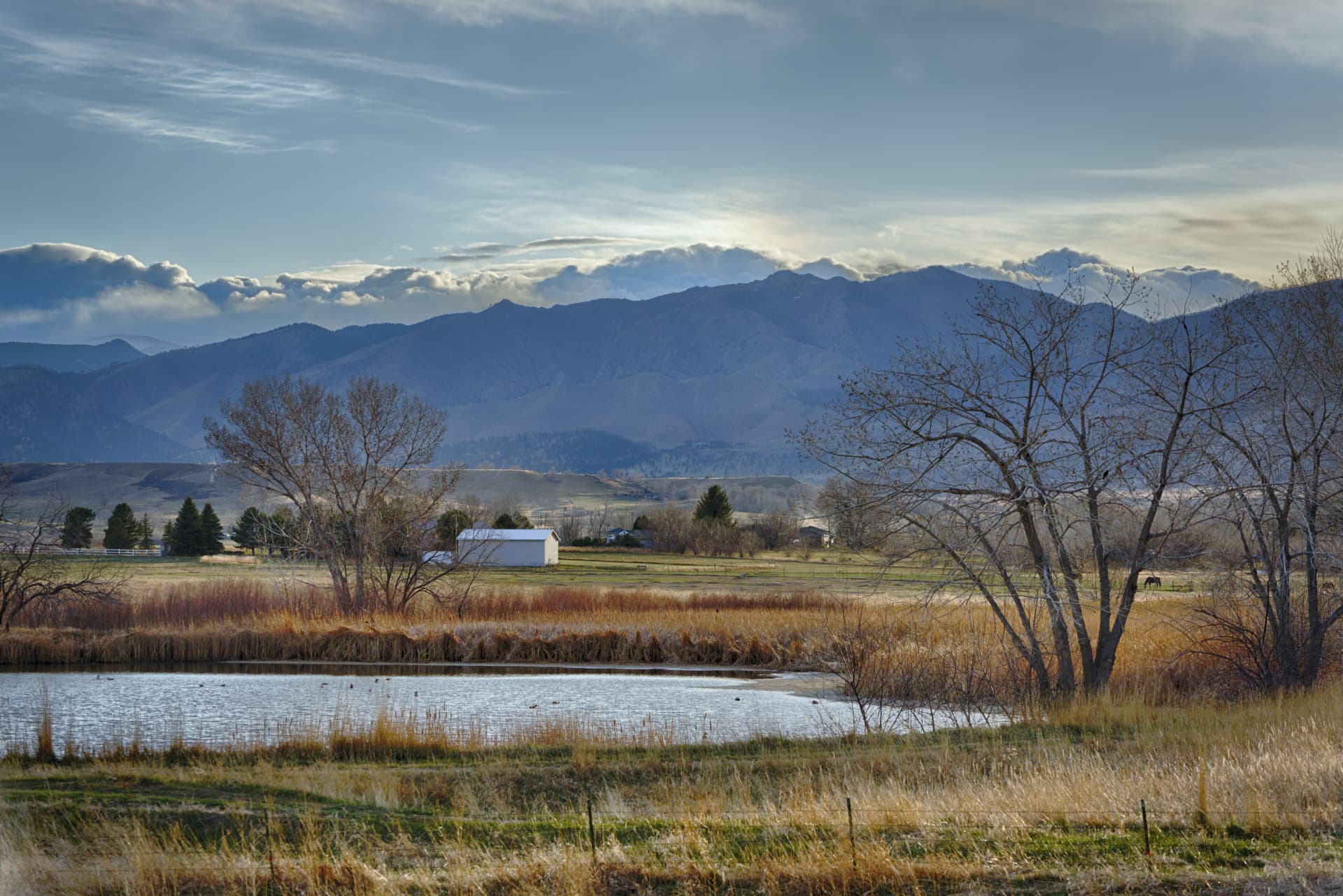
You know, it’s probably something “wrong” or at least “different” in the way I see things, but I look at @Wolfgang 's interpretation:
My “problem” is when I was standing there, there was no “soft light” - quite the opposite. His interpretation looks beautiful, but it is so different from what I saw and felt as I was standing there, starting with the clouds. I looked out the window from the house, and saw the mountain with these huge, contrasty clouds standing out from everything - that’s what grabbed my attention, but they look nothing like what Wolfgang created. I guess it’s just a different interpretation.
For me though, I want to capture what I saw and felt, meaning +10 for the contrast, saturation, and sharpness - to the point of looking so intense, it was almost not looking “real”. It really was “real”, as I saw it, but in Florida I never see sunsets like that.
The next photo I post won’t have these contradictions, and will be more “normal”.
Good effort.
(Maybe) If you tune back the front scene just a bit the mountains will be more visible as part.
Now i see a great sky and skyline and a colorfull foreground.
And a shadowed midsection, the mountains.
The golden glow is great just tune down that microcontrast at the front a bit.
Again, it’s a maybe better maybe worse kind of idea.
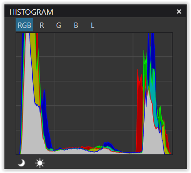
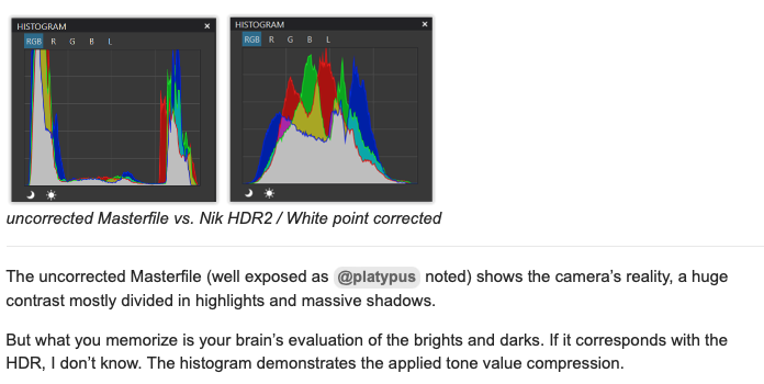
Nik HDR2 (from uncorrected Masterfile) / White point corrected in PL5
uncorrected Masterfile vs. Nik HDR2 / White point corrected
The uncorrected Masterfile (well exposed as @platypus noted) shows the camera’s reality, a huge contrast mostly divided in highlights and massive shadows.
But what you memorize is your brain’s evaluation of the brights and darks. If it corresponds with the HDR, I don’t know. The histogram demonstrates the applied tone value compression.
Just don’t mention ‘reality’. – Play with PL and have fun.
Of the 7 photos I took, bracketing, not one of them represents what I remember. I guess that’s why I did the bracketing.
I went back into PL, and reduced my “over-processing”. I left the sky light (it was very bright), I left the mountains showing the detail I had been staring at, and I left the foreground rather dark, as it was already starting to get dark when I took these - nothing like mid-day.
Your image looks like it was taken in the middle of the afternoon.
My image was taken perhaps 10 minutes or so before the sun dropped down behind the mountains.
I guess that doesn’t matter, or does it? If it looks “better” when it’s brighter, as what you have shown, is that a “better” image?
Other than the mountains, I enjoy looking at your last image, and if I didn’t remember staring at the details on the face of the mountain, maybe I wouldn’t care so much.
Ditto for the grass and weeds - had I not remembered what I saw, I would prefer your version, brighter, and with more color, and more green. Maybe I’m editing with my hands tied behind my back?
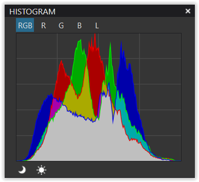
The “problem” with our vision is, that our eyes adjust their irises to brighten shadows and lower highlights automatically. When we look at the grassy foreground, the irises open and the grass appears brighter. When we look at the sky the opposite happens. Our brain remembers exactly that: brightened shadows and a darkened sky, which makes our memory different than what our camera has taken. The histogram of the memorized image would look like the HDR histogram added above by @Wolfgang.
Hi Mike,
thanks for the dop-file. Had a look with PL and mainly noticed, that you didn’t pour anymore ‘colour sauce’ (Color Accentuation) over the whole pic. Your global contrast settings, which in conjunction with other settings give you the sky & blue mountains you desired, simultaneously affect the lower landscape.
If you had to ‘sell’ this pic to me, you would have failed (don’t ‘buy’ this high landscape contrast → not balanced / believable). But does it matter?
All depends on
what you imagine your viewers like to see ( → common reception )
what you want to convey ( → reality … postcard )
So, there is a lot of interpretation going on.
The Nik HDR2 output was for demonstration (Tonal value compression).
While I don’t like its overall rendition, the perspective is not compressed by visually ‘sticking’ trees and foreground onto the blue mountains, but showing the natural distance ( → 3D ).
Please elaborate - what you wrote sounds not only plausible, but I think I have experienced it by “staring” at very bright areas, and very dark areas. The camera meanwhile does no such thing - it records the brightness accurately, based on the camera settings.
Implication - what I “remember” may not be, and probably is not, accurate. Maybe I remember the detail in the mountains, and in the grasses, and the sky not as they “really were”, but how they looked to me having stared at them. This being true, I am trying to recreate what I thought I saw, and not the way it really appeared before my eyes “compensated”.
So, if I accept this, how might I use it to edit my images?
Since @Wolfgang was not there with me, his interpretation is more like what I would have seen in mid-afternoon. For me, the sun was setting, and it was not “bright and sunny” when I took the photo.
(…another mistake - I guess I should have corrected the camera to local time, which I never thought to do…)
Does it matter? If I’m trying to show what I remember, it matters to me. I doubt it matters to anyone else. Your version of the scene looks more “plausible” than mine, but it doesn’t look like what I saw with my eyes, and it was getting darker every minute. I think it matters. In retrospect, I was probably trying to recreate what I remember, which was very exaggerated, and no longer realistic. For every day that goes by, I remember the original scene that my eyes thought they saw even less, and I see my original edit as being not real, and not plausible. It’s like I want to say something, but don’t have the words. I made the image more like what I imagined, and less like what I actually saw.
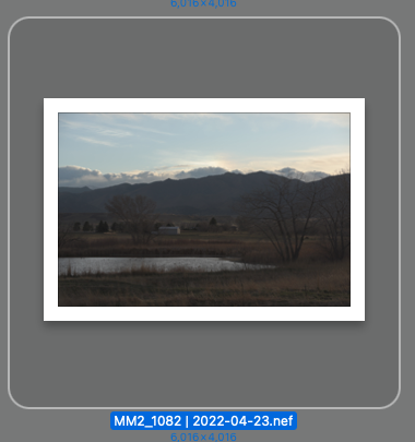
Interesting - a “real”, un-edited image would show a lot of very dark, and a lot of very light, which in fact does look like the un-edited image:
Does this mean that an un-edited view of the image would have looked like this to me, before my eyes and brain started playing their game to show me what was hidden in those dark areas? In that case everything I remember is potentially inaccurate. This reminds me of your histogram at the left, very dark areas, very light areas, and nothing in-between.
That is the reason why I decided to shoot bracketed images for HDR, and it’s fascinating and exciting to realize that with PhotoLab, that was a lot of wasted effort - all that data was captured in the single image MM2_1082 - this will good to know for the future, and honestly, it’s a big surprise to me.
Yes, will turn down the microcontrast for the foreground, probably late today - I’ve got appointments and other things I need to attend to first, so I need to pry myself away from my computer. …maybe… I’ll try, and compare.
You can edit your images as you like. There is no limit to (artistic) expression. Just be aware that what you saw is what you think you saw, which is what your brain did for whatever purpose, e.g. to protect your retina from being burnt, to see the dangers that might be around etc.
We can think of what we see as “true” and “real”, however, how it looked (again, how we think it looked) is probably the result of our brain’s self-defense, our mood, situation etc. and is therefore true to ourselves rather than true to life…
This is a fascinating topic! I had no idea that our eyes and memory would ‘adjust’ to such an extent. And I can see this presenting more dilemmas for Mike the (ex?) journalist. My hope is that this knowledge will actually free him more to create and edit images that are pleasing to him and worry much less about capturing ‘reality’.
ask 100 people to take the same tourboot at the same circumstances and ask to take photo’s from everything they like.
Then ask them what they have seen when they are back(without watching the taken images), and ask them to process there images after 1 month as close as they remembering that scene.
i think your surprised how many differences they deliver!
Hope you’re all doing finest. I’m for sure.
This topic has by far the most submissions and reads. I think I know why.
We’re all ‘struggling’ getting the most out of our RAW files. At least I am somewhat.
Speaking of RAW; the .CR2 that come out of my 77D sometimes (if not always) disappoint me to such an extent I always felt (and still feel) I’ve setup my camera totally wrong.
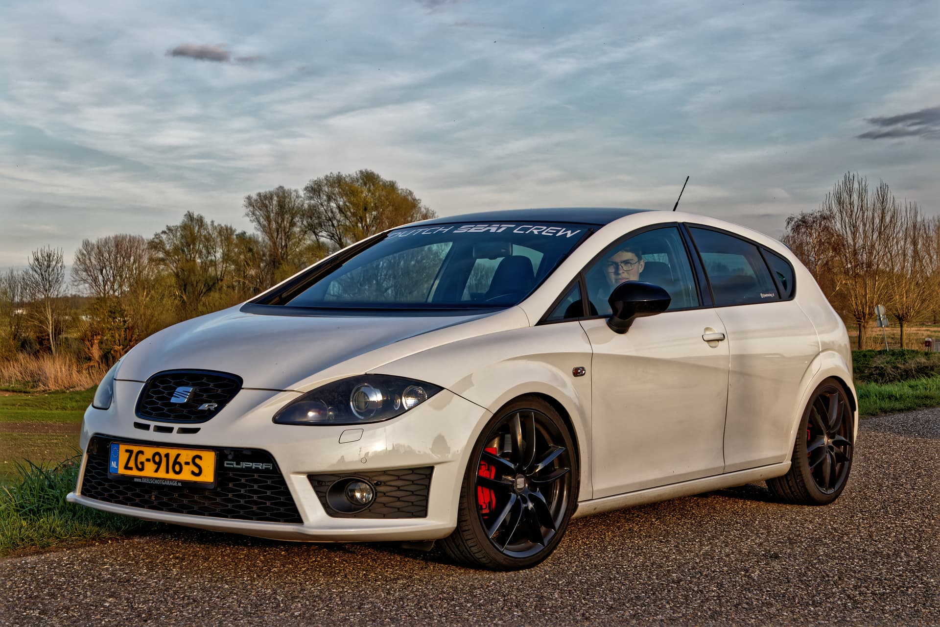
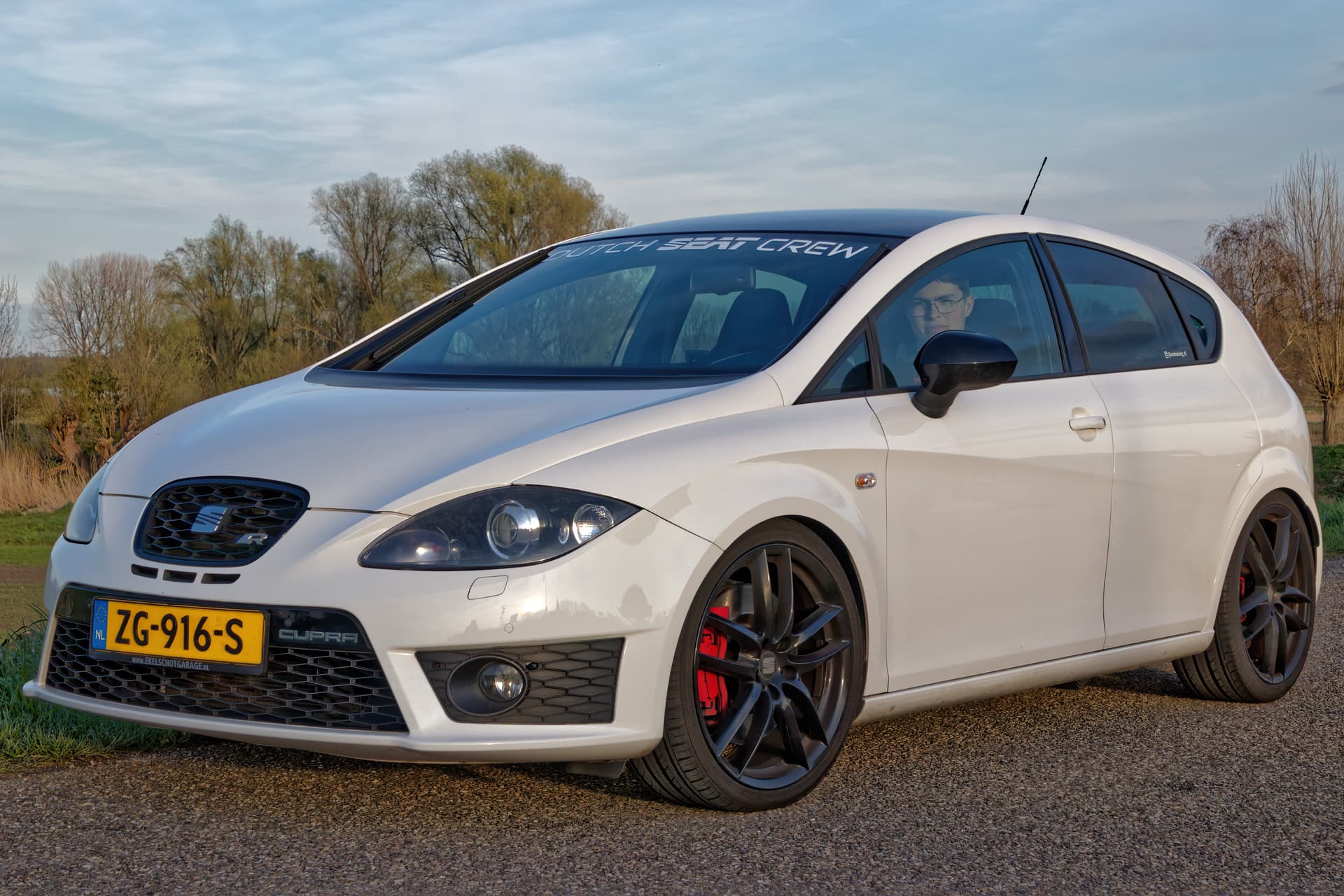
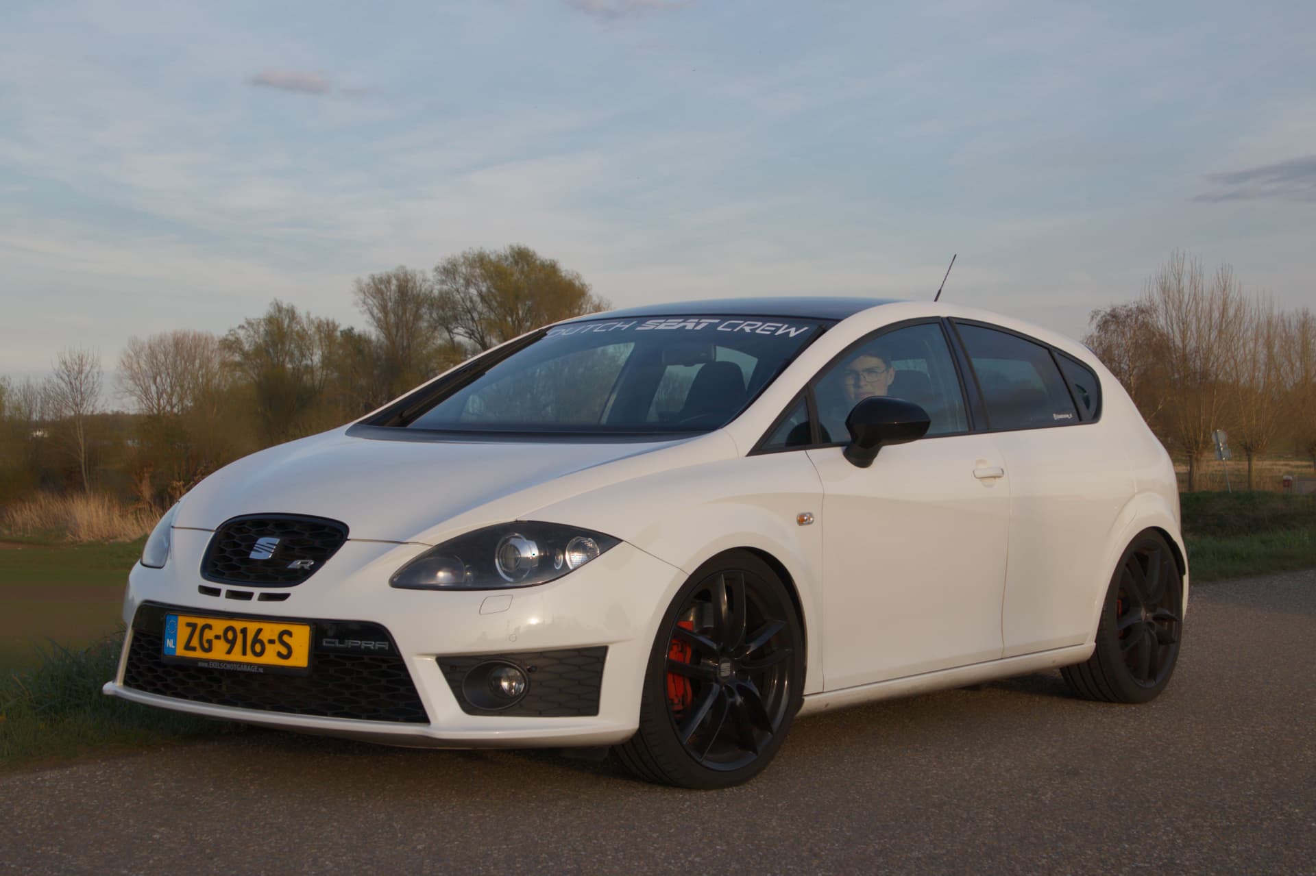
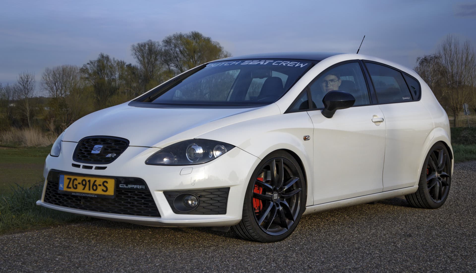
For instance, take this shot I took of my sons car the other day. IMG_5207.CR2 (26,7 MB)
Extremely dull, totally lacking any decent details and so on. Can anyone of you convince me the settings are proper for such and output? I mainly use F8 for aperture (TAMRON 16-300mm multi) and ISO 200 in general. Can someone tell me (based on the DOP attached) the basics are any right?
Luckily we all have PL5 to correct the flaws though.
This is my 2nd attempt in getting the most out of PL5 to my current knowledge.
(Yes, again… this might be a too ‘dramatic’ output and Mike shall love the skies for sure as I do myself.) However, most of you are some sort of ‘persuading’ (not the right wording, I know) keeping it more on the realistic side of things. Much can be said for that. Am still trying the HSL stuff as Wolfgang told me. ‘Brauche hier noch etwas mehr Übung es alles richtig zu Schaffen’
IMG_5207.CR2.dop (10,0 KB)
I can imagine the latter being generally better, but I kind of remain sticking to the somewhat darker outputs for some reason (Have 0EV though). Much to learn still, but happy to conduct on this followed by some progression. Thanks for any advise my friends.
Difficult lighting: The sun bang on a white car…but exposure is correct.
I’d definitely get away from f/8 in order to get rid of the background, I simulated it somehow - with a local adjustment featuring reduced micro-contrast.
If this should be a car shot, the surroundings should be less prominent and the sky, being too structured, will attract the viewer away from the car. If the person is of any importance, open the window and rip off that mirror ,-) - or take a shot of the vacated car. IMG_5207.CR2.dop (13.0 KB)
My thoughts, may or may not lead to what you want…
a) Your camera needs to be much lower, so if anything, it is shooting slightly UP at the car, not DOWN. Much of the foilage behind the car will then be gone if you do this.
b) Use a polarizing filter, which should remove the distracting reflections.
c) tell the driver to look in various directions, but NOT at the camera.
d) turn the wheels slightly to the left, instead of pointing straight ahead.
e) straighten the license plate
f) consider turning on the headlights.
g) if the radio antenna retracts, do that.
h) I like the clouds in the top photo more - but you already knew that.
I now feel it’s important to me to be able to do either, as long as I don’t represent my “artistic” versions as “reality” or vice versa. I don’t think is possible to do both - in this case, the “real” version would have been exposed for the middle, the top would be burnt out, and other areas would likely be black, and I would have used a “normal” lens.
M = optical corrections only
VC1 = Jeroen
VC2 = Platypus
VC3 = Wolfgang
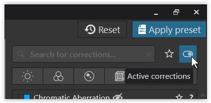
Active corrections → lists all my settings
I cropped the pic to emphasize the car, made use of that big light from the right + changed the white balance *), adjusted white point + gamma, lowered the sky’s brightness + cooled it down to contrast with the car, added a big vignette to direct the view, enhanced details + followed @platypus’ remark to reduce the background …
have fun
*)
changed the white balance by placing the picker on a yellowish looking part of the car body
my thoughts about this
a more neutral colour renditon emphasizes the shiny, brandnew looking car better
( focus on technical aspects, sportif edition, proud driver, Dutch SEAT crew … )
while an overall warmer rendition would be on the emotional ( ‘romantic’ ) side
→ adding a bit of warmth filter at the end to modify the complete pic
Just experiment to find out what you / your son likes the best.
I don’t know which color this car has but i think my advise would be to place white piece of something or a official graycard, colorchecker, near the car just outside your desired cropped frame.(piece of white copypaper and 4 weights would do fine)
(you could use repair/clone to hide that color checker afterwards also.)
And stand at a distance with a 100mm EFL or more to avoid prespective distortion, the more distance you have the better you can use aperture to control dof.
Bij using manual focus and focuspeaking, don’t know if your camera has that feature.
But then you can control the focusplane and dof layout at the max.
A tripod is then probably the easiest way.
Subject wouldnt move right? so preparationtime isn’t a problem.
Especially the key fact that we are constantly using an on-board neural processor to make sense of what our optical sensors are receiving.
A human being is reckoned to be capable of perceiving detail in a scene with around, or possibly greater than, 20 stops, at the same time. That is to say that the lightest part of a scene, in which we can perceive detail, can be 1,000,000 times brighter than the darkest part of a scene, in which we can perceive detail, at the same time
However, if I were to use Fuji Across 100 B&W negative film to record a scene, I would reckon on being limited to 14 stops range, which I would then have to expose and process carefully, in order to neither block shadow detail nor blow highlight detail.
The resulting negative would look very flat and lacking in contrast. I would have to use dodging and burning and multiple exposures of the negative under the enlarger in order to restore my perception of what I thought I might have seen, in order to create a printed image.
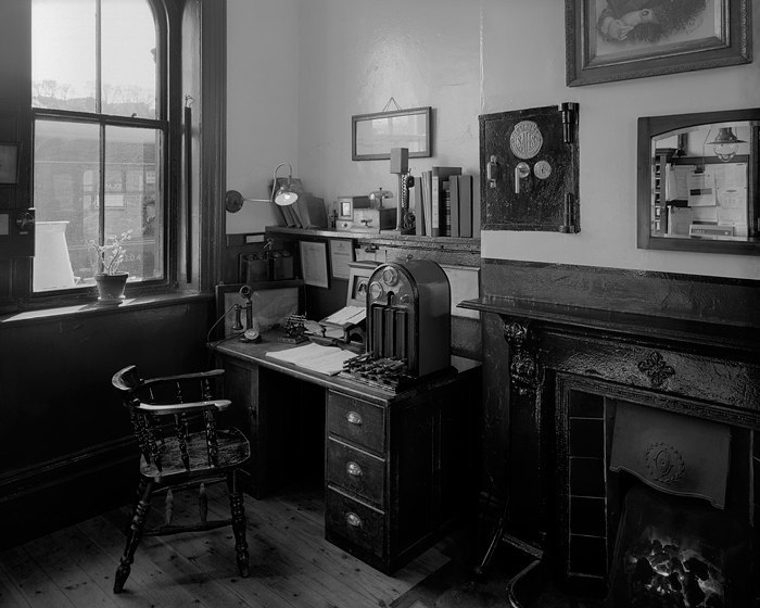
What you see here is a low resolution version of a 5" x 4" negative that has been scanned in order to give detail in both the deepest shadow and the brightest highlights.
The measured exposure range is around 14 stops, from the lit gas mantle or the sky to the bottom of the wall behind the desk and next to the fire. It is impossible to demonstrate, in such a low resolution, that there is indeed visible detail in these extremes but, looking at a 30" x 24" print, everything is there.
In fact, if you isolate the image against a black background, you get to see a whole lot more shadow detail than against a white background.
I had to over-expose at the time of taking and under-develop at the time of processing, in order to get a negative that contained all that detail and tonal range.
I had to use a tone curve when scanning (at 2400 ppi) to give me a 16 bit TIFF (positive) file with all that detail still in it, but the resulting file was very flat and lacking in contrast.
It was only when I processed it in Photoshop, at that time (but PL would do the same) in order to separate out the tonalities and detail.
Don’t forget that 14 stops range is the equivalent of saying that the lightest part of a scene, in which we can perceive detail, is 16,000 times brighter than the darkest part of a scene.
Whether I use an enlarger, or a scanner and printer, printing paper is only usually capable of rendering 6-8 stops. Which is why, when printing digitally, I calibrate my screen to have a luminance of only 80 cd/m².
So, the question is, does the finished print truly represent what I saw with my eyes when I was there?
The answer is both yes and no at the same time, because it depends on the millisecond at which I was looking at a particular part of the scene and how my brain processed the visual signal at that precise moment. But, since we don’t isolate our vision into millisecond slices, what we saw, or thought we saw, as @platypus points out, is a composite of multiple thousands of memories of instantaneous perceptions, all blended together by our brain.
@mikemyers I’ll bet, if you sit down and try to remember what you think you saw when you took the image, you would end up, not with one mental image, but with a series of memories of the detail in the grass, the detail in the sky, the detail in the mountains, etc. So how do you convey all those memories to someone without an image? You tell a story, which is a sequence of words that describe the scene, bit by bit, until the listener can form a mental image of what you saw. Of course, because you can’t see inside their mind, there is no way you can tell if what they are “seeing” is anything like what you think you remember seeing.
Ideally, you would want to take them to the scene and let them observe it for themselves. And, if you could have done that, they would not necessarily have seen what you saw in the way that you saw it.
Well, a photograph can go a long way to helping in that process of describing a scene to someone else.
But, just as taking someone to the scene in person would have allowed them to choose what and how they see, a well taken, well processed, photograph has to give them the same opportunity - unless you want to restrict what they see to your own interpretation.
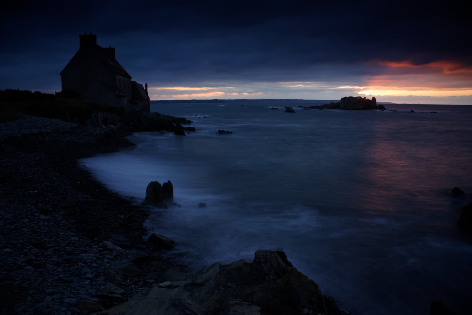
I’ve shown this digital image before, but it serves to make the point here.
The first image is nothing like what I saw when I was there. It is a JPEG export of a RAW file, which is the best the camera could produce by recording 1,000,000+ times more light in the bright sky than in the deep shadows - compressing them into the 16,000+ times more light that the sensor could cope with.
Not forgetting that I used two graduated neutral density filters, in front of the lens, at different angles, over different parts of the sky, in order to bring down the dynamic range to the 14.6 stops that my camera’s sensor can cope with.
So, even before I opened the image in PhotoLab, that image no longer represents what I “saw”, because to say that is to ignore all the thousands, if not millions, of memories and “snapshots” that my brain fused into the one mental image that I want to convey to you of how it felt to be there and to give you the opportunity to explore what was actually there, not what I was able to record on a digital device that is vastly inferior to anything your eyes and brain can record.
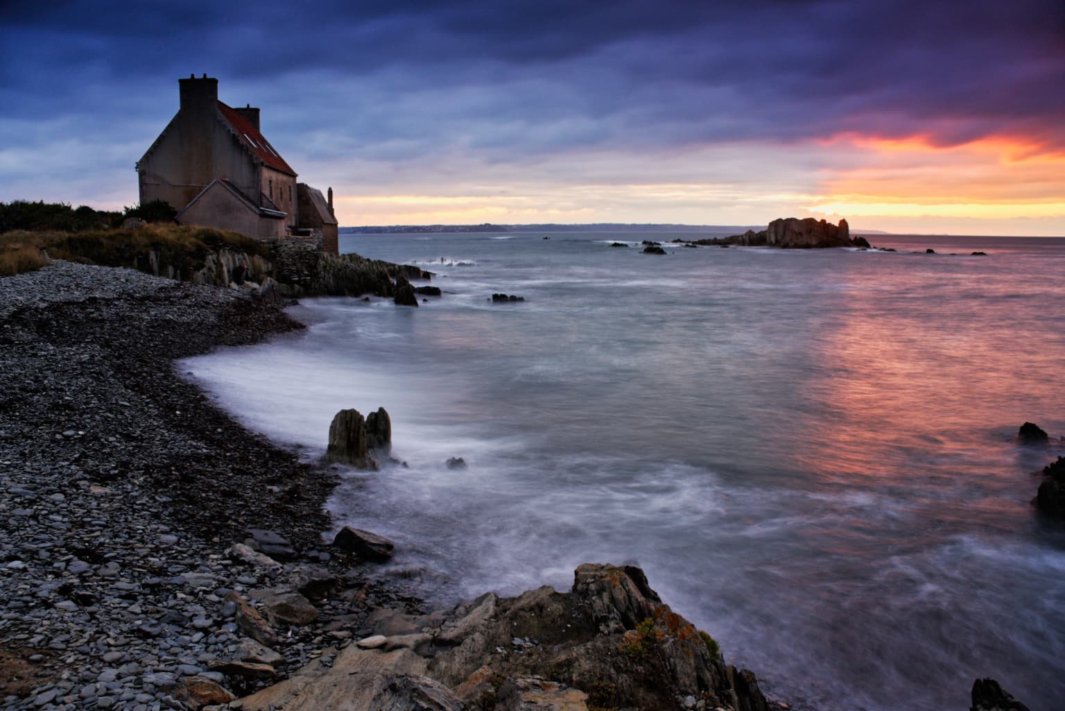
As I have just said, what the camera records is absolutely not real, when compared to what your in-built optical sensors and neural processor perceived and recorded during the time when you originally saw the scene.
Just as a B&W negative is not a true rendition of reality, neither is a digital RAW file. They are both severely limited and it is up to you to faithfully record and present everything you saw so that someone can interpret it in a way that is pleasing to them and choose to linger over the sky or the mountains or the grass, or all three.
Or have you never looked at a print and said to yourself, “I wonder what was in that area that is too obscure to see”?
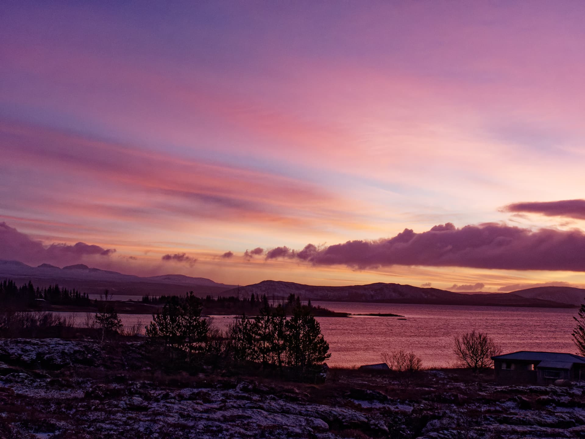
This is a very lightly processed RAW from a trip to IS last November.
And by lightly processed, I mean my personal ‘standard’ import preset plus some shifting of exposure in the mids and shadows. I certainly could have spent hours on it (and probably will before printing) but I think it looks very nice as it is.