DxO already has some of the best RAW processing and optical correction tools in the industry, but one major modern grading feature still feels missing (unless I’m completely missing it): dedicated tonal color grading wheels for lows, mids, and highs.
Modern workflows increasingly rely on tonal separation rather than only global color adjustments. Applications like Lightroom, Capture One, Resolve, and Premiere already provide shadow/midtone/highlight color wheels because they allow faster, more intuitive, and more precise creative grading than global curves or HSL adjustments alone.
Masking is not an effective option. For photographers and hybrid photo/video creators, this has become a standard part of modern color workflow.
FWIW, they have just introduced it in Nik Collection 9, so if you own it you have it now. I bet it won’t be introduced in PL, at least not in the near future.
Absolutely agreed, this is an urgent need to be competitive (both as a software product, and for us photographers) in modern editing trends and controls.
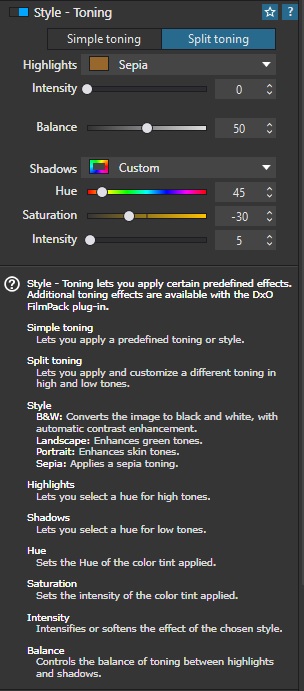
You can get shadow and highlight tone control, but it’s locked behind the purchase of the FilmPack add-on for Photolab. In other words; what other products package as part of their core offering, DxO makes you pay more for:
If you search the forum for “color grading,” you’ll find numerous feature request topics already open for this. With the feature now implemented in Color Efex 9 (Nik Collection), I think it’s all the more likely that PhotoLab will gain this feature eventually - possibly through FilmPack (hopefully in PhotoLab itself).
I’ll have to double check, but if I understand correctly, I may need to export my RAW from DxO PhotoLab as a TIFF, import it into Nik Collection Color Efex, do the grading there, export again, then re-import the TIFF back into PhotoLab just to continue editing. I really hope that isn’t the case because that workflow sounds incredibly cumbersome and laborious.
I’d also much rather continue working directly with the RAW file so things like white balance remain metadata-based rather than baked into rendered pixels. RAW still preserves the greatest flexibility for highlight recovery, shadow recovery, color interpretation, and overall grading latitude.
Even with a 16-bit TIFF, some of that sensor-level flexibility is inevitably reduced because the file has already been demosaiced and rendered.
That said, I suppose the advantage of a 16-bit TIFF workflow is that it still preserves extremely high image quality while allowing compatibility with external grading tools and layered pixel-based editing. I just wish the grading could happen nondestructively at the RAW stage instead.
If I’m doing this with batches of images, that’s potentially double the storage…or more.
I really hope I’m wrong about all this. I normally use C1 and Resolve for color grading my hybrid content, and just happened to use DXO for one project.
Within PhotoLab apply any optical edits and noise reduction to your raw file as well as any additional edits you feel would be appropriate before continuing to edit in Color Efex.
When you are ready, Select the Nik button located in the PhotoLab UI and then select the Nik Color Efex module .
That will automatically export the processed raw file with the applied edits to a Tiff file and open that Tiff file in the Color Efex module.
Once in Color Efex apply the color grading to the Tiff file.
When the color grading is complete select Apply and the Tiff file will be saved and returned to PhotoLab with the color grading applied.
You can then add any additional edits you choose to the updated Tiff file and when completed, you can export it to a Jpeg. The process is seamless.
Thank you for confirming that the workflow requires exporting RAW files to TIFF. That’s exactly the kind of workflow I’m trying to avoid. I really hope DxO eventually adds basic color grading tools—features already found in most mainstream RAW editors—directly into PhotoLab, instead of requiring users to export rendered TIFFs just to access grading features in a separate product.
One of the biggest advantages of working in RAW is maintaining full flexibility with white balance, highlight recovery, shadow recovery, and nondestructive editing. Having to render out to TIFF before color grading feels like sacrificing workflow simplicity and some degree of RAW flexibility in favor of segmenting features across multiple paid products.
Agreed. I don’t want to lose editing potential or end up with more large files for one shot by moving to a TIFF at any point in the process.
PhotoLab ought to be a one-stop-shop for editing RAW files. It’s not a pixel editor like PS or Affinity, I know that, but that’s not what anyone is asking for here.
As you say, more robust colour grading options are found across competing products. We shouldn’t need another bit of software to do grading, PL should be able to do it.
(And that’s even supposing I grudgingly pay for FilmPack because DxO decided they wanted to shift more copies of that, so they put colour grading in that instead of PhotoLab itself where it belongs).