I often feel that I get a washed out rendering when I push the shadows in PL6.
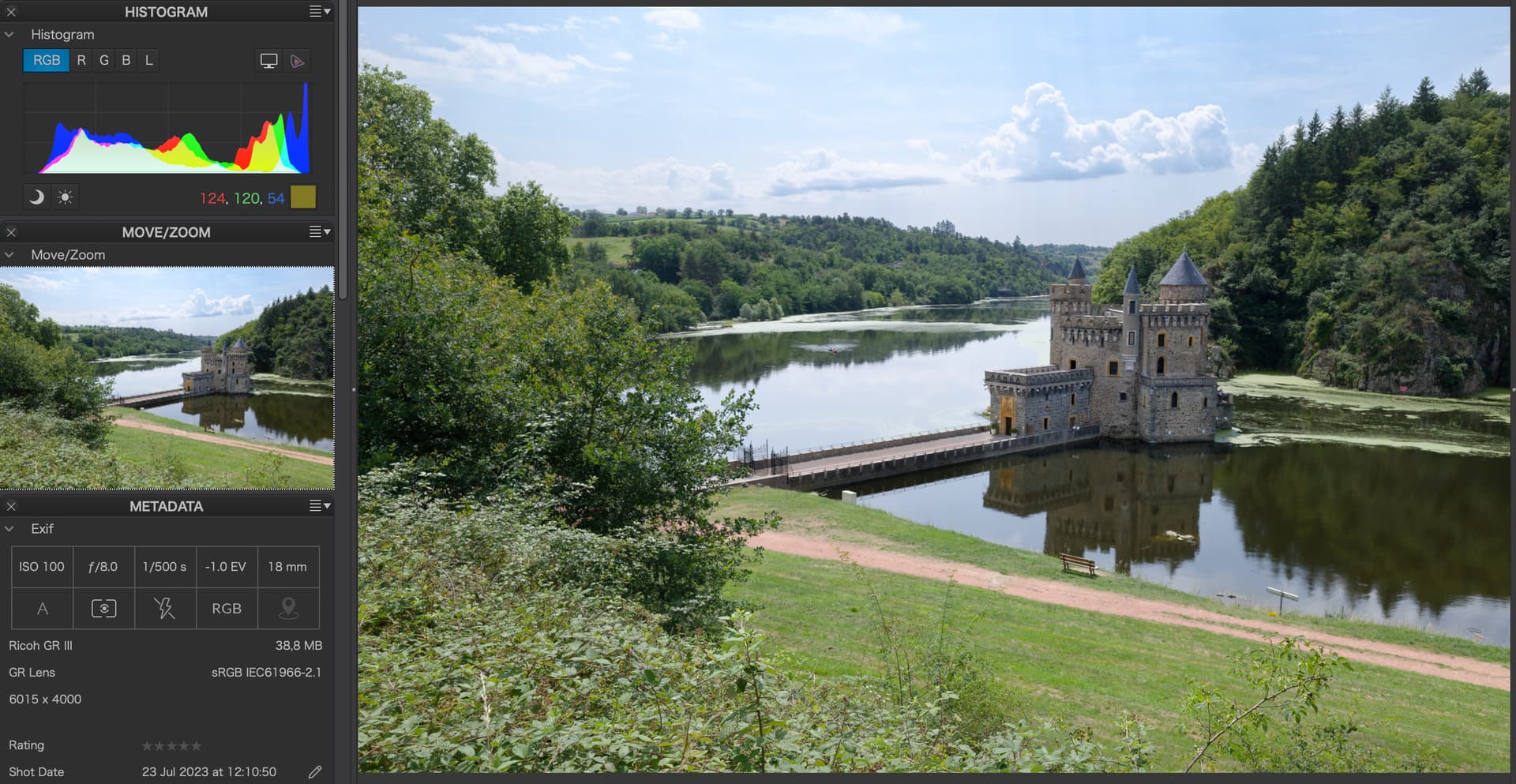
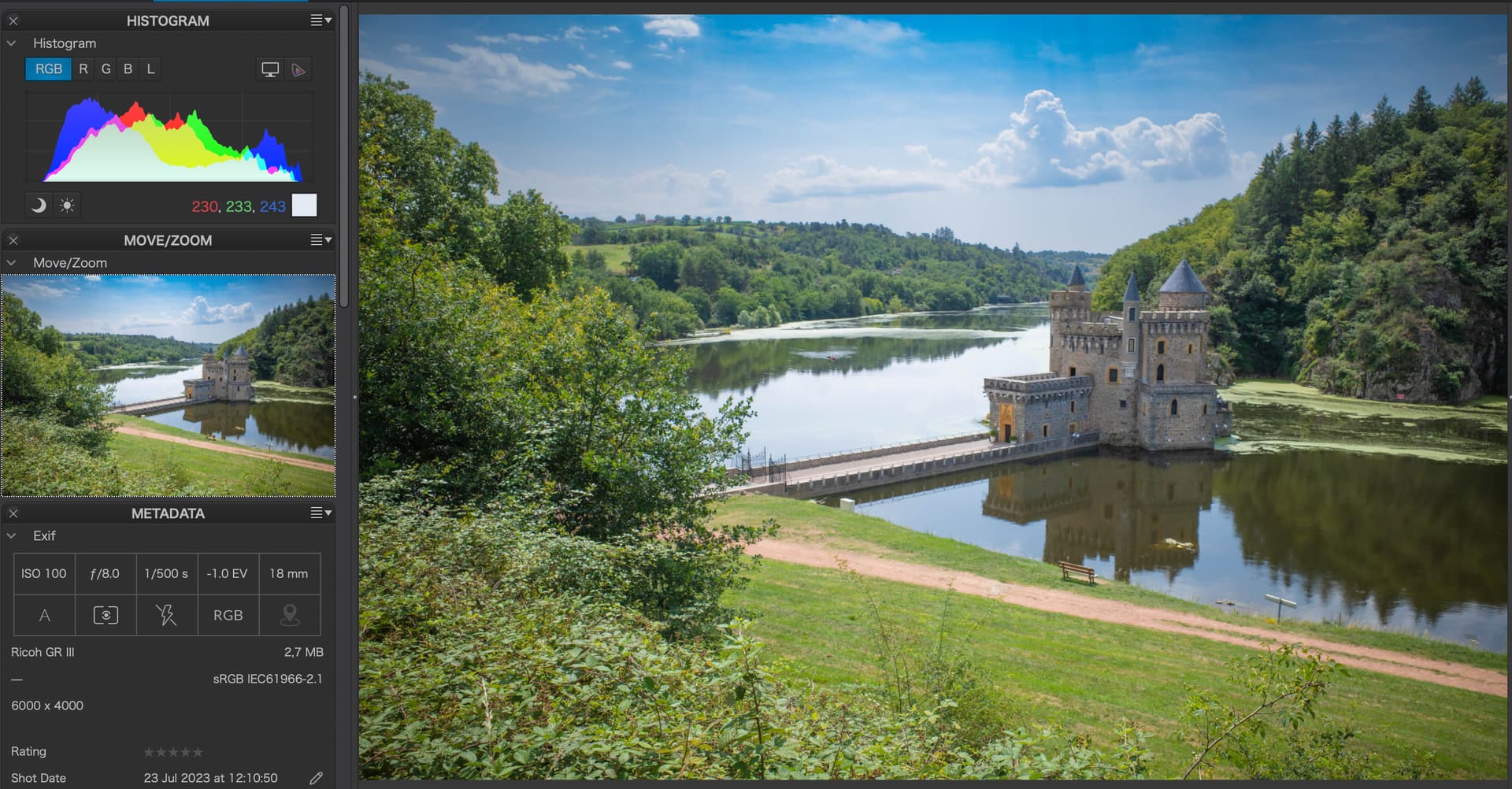
Here is an example of the same RAW file processed in PL6 and LrC.
Note the bushes in the foreground on the lower left part of the image.
The forest in the upper right part of the image seems much more pleasing in LrC.
Any tips on achieving how I can achieve a similar rendering in PL6 compared to LrC?
What strikes me is that the histogram seems crushed in the PL6 version. Most of the values are in the lower third (horizontally) of the histogram, whereas in the LrC version the shadow part of the histogram is a lot higher in general.
The global Shadows tool is overly aggressive and affects far too much of the mid-tones. I have found the best way to raise shadow ateas without affecting the tonality of other areas is to use Local Adjustment masks to target just to shadow areas and use the Local Adjustment shadow tool to raise the shadows. This approach also allows you to retrieve an enormous amount for deep shadow detail that would otherwise be hidden.
There are other techniques, but this is the one that I find most effective.
What mask I use will the depend on the image and the amount of shadow I want to raise as well as other considerations. For instance, let’s say I have taken a street photo which includes an interesting shop, but the window displaying its wares is in shadow in my shot and I want to see much more of the detail. For that I may just use the LA brush with feathering to raise the shadows, and depending on the results I may also add some LA contrast and/or sharpening. On other images my mask selection may be different.
Additionally, since raising shadows also raises noise within the shadow areas I process the image using DeepPRIME or DeepPRIME XD. DxO recommends using their AI based DeepPRIME or XD on all images. However, not everybody does which is why I mention it here.
I forgot to mention that another way to raise shadows without overly affecting the mid-tones is to use the Smart Lighting tool which, depending on the image, may give you exactly what you want. The Smart Lighting tool can also be used to pinpoint specific areas of an image to apply the Smart Lighting algorithm. Using the tone curve may also provide you with the results you want, but for some it is difficult to master.
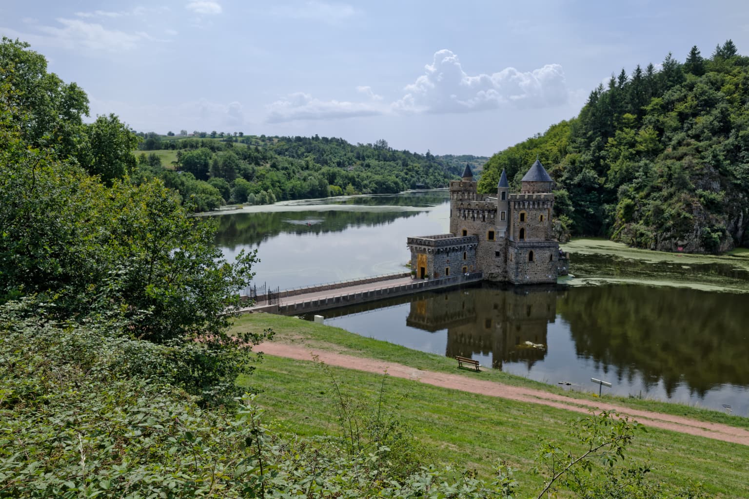
correct me if I’m wrong but, seem the bottom picture (Lr) as a vignette with not natural dark blue which PL doesn’t seem to have.
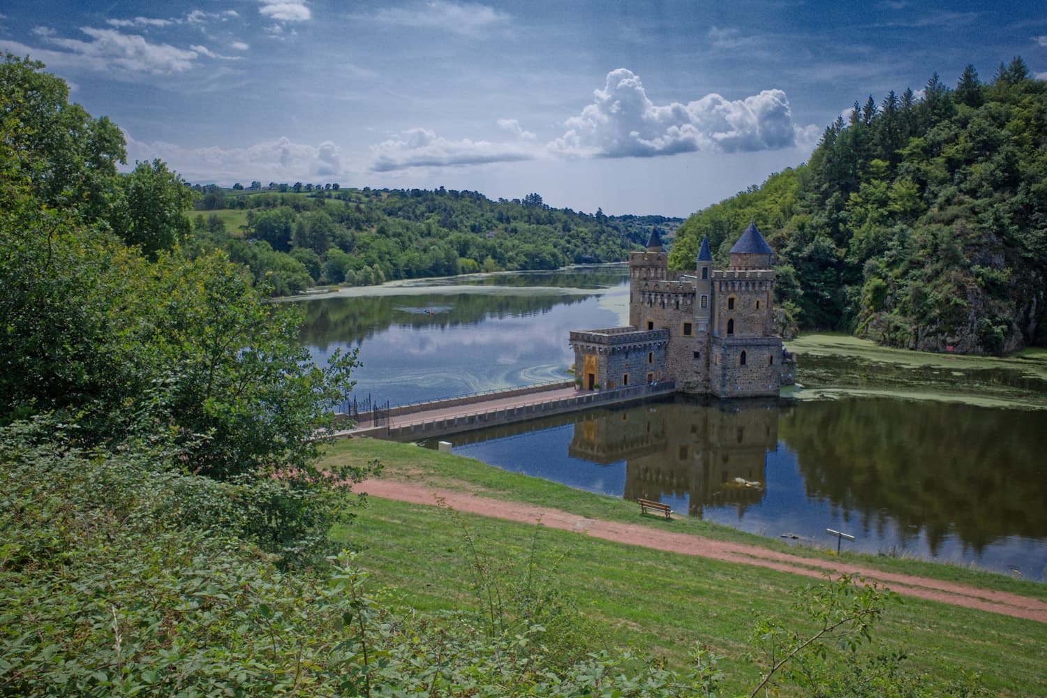
castle look better with some contrast on the PL picture than Lr.
It looks like that lightroom is aplying less vignette compensation than Photolab.
Try to reduce vignette in photolab and you’ll maybe get a little more of those unatural (for me) oversaturated and darker tones around the edges of the image.
The sky is grossly oversaturated in the LR conversion. The problem here is you’re not comparing the same settings, even if you think you are, because the sliders behave differently, the luminance ranges are different, you may have a different camera profile and in LR you will find it’s applying an Adobe colour profile, which are often more aggressive. Take a deeper look into LR colour profiles, and DXO camera body profiles, and presets in both. You can achieve near identical results, but default settings will always be different.
Personally I prefer DXO’s RAW conversions, but do very little in the way of tonal adjustments, only overall exposure, cropping and geometric correction, plus NR. I then send a tiff to Photoshop, which I then work on using ACR as I prefer the way Adobe handles tonal adjustments and I have never got used to PL’s way of working with control points (not a criticism), plus any pixel level or layer-based adjustments need PS. But DXO remains by far the best RAW converter in my view, giving the best sharpness, distortion correction, and NR.
Also note that “raising shadows” has become something of an obsession in digital imaging, and often a source of complaint about “dynamic range” of camera bodies. It’s wise not to overdo boosting shadow exposure, as it reduces contrast, and if used to correct for incorrect exposure, gives muddy, noisy, poorly detailed shadow areas that make images look worse. IMO of course!
Thank you all for your feedback, the LR picture was over-saturated for sure but it was just a test for me. I was trying to achieve the same tonal adjustment between Lr and PL, because I tend to prefer the Lr way in that specific area.
I created this post because quite often, I found that in PL I quickly get to the point where some kind of grey cast appears in the shadows or in the highlights when I push the sliders.
I felt that Lr has more wiggle room, or a more “natural” way of handling the tones than PL.
So I was mostly looking for tips on tonal adjustments in PL, because I think that PL is a far superior RAW converter.
I’m fairly sure that the tonality of the image can be remedied without FilmPack. And I share the view of FP’s Fine Contrast sliders to be of good value.
How come ClearView Plus has not been mentioned? I found that with the first jpeg, it produced good result in combination with the regular contrast settings. In combination with the additional ones even better.
Though for images taken with the sun like in this shot, I’d additionally use local adjustments and graduated filters - adding one to the sky in PL makes it look more like the LR file.
Hope this result isn’t too ‘postcard-like’. It’s not meant to be definitive. Anyway I hope that the attached .dop file lets you inspect my tweaks if you want to. All quite rough and ready. Some adjustments are local (control point-based).