Showing my ignorance, I can’t remember the last time I used a color filter on my camera, other than a polarizing filter. This is probably because I ignored B&W for decades. I remember that a colored filter allows light of that color to go through the filter, but it blocks light of the “opposite” color(s). I forget the proper word I’m trying to think of.
So, the same thing happens when converting a photo in PhotoLab from color to B&W. The filters do what they used to do on B&W cameras. …most of which I’ve forgotten. All I ever used filters for was to darken the sky.
Next time I want to use a color filter, I’ve got to do a lot more thinking about what you just wrote. Also, about what @platypus and @Lost_Manc wrote, for the same reasons.
So, in the future, should I be applying color filters as people used to do, or adjusting the Luminance of a channel? It’s good that PhotoLab can do all this. Even though it’s faded, I now remember color filters, and what they did, but I only had one purpose way back when, the sky.
You can do either. I use filters most of the time because I’m a bit old school, but there are also times when I can use either the colour wheel or the channel mixer.
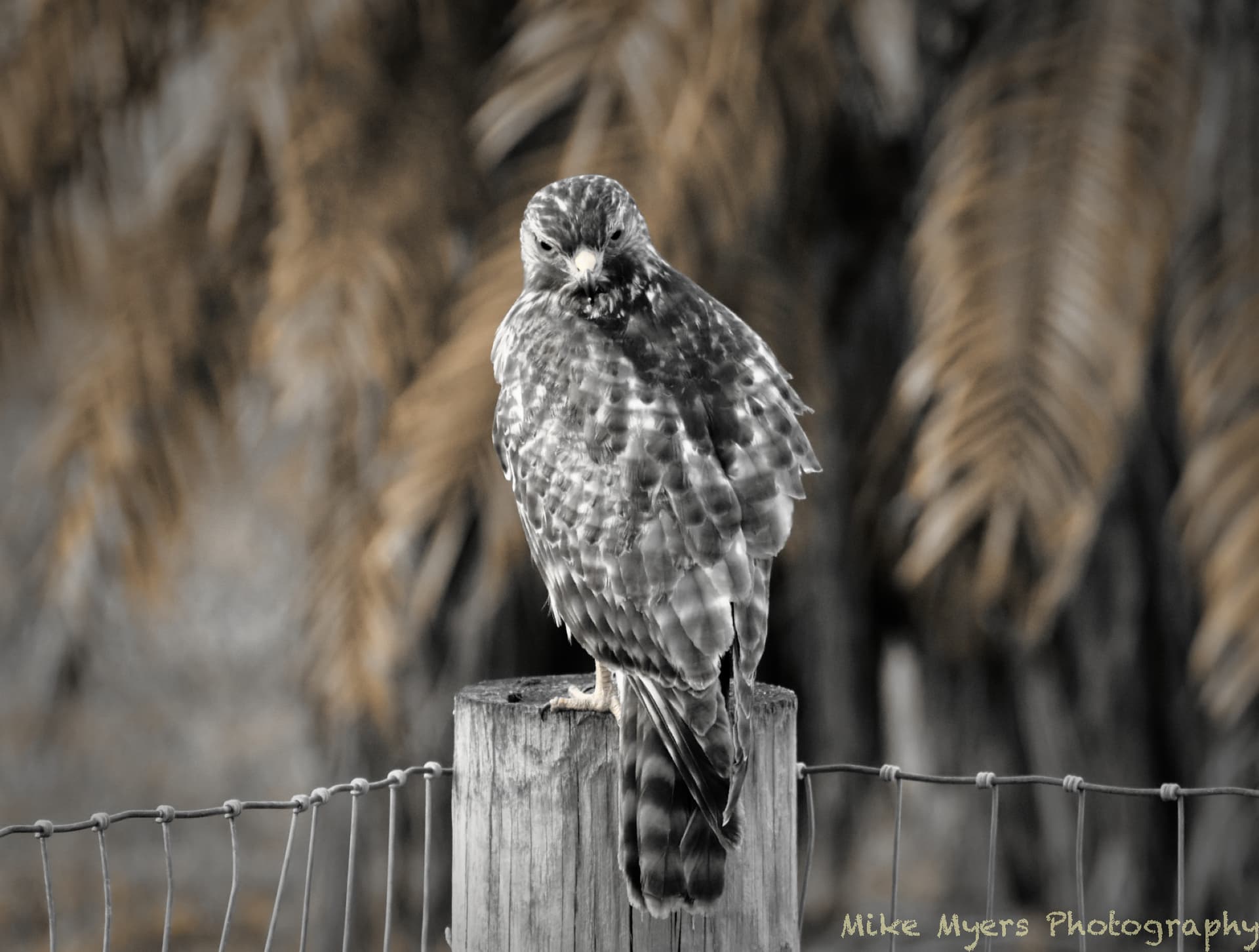
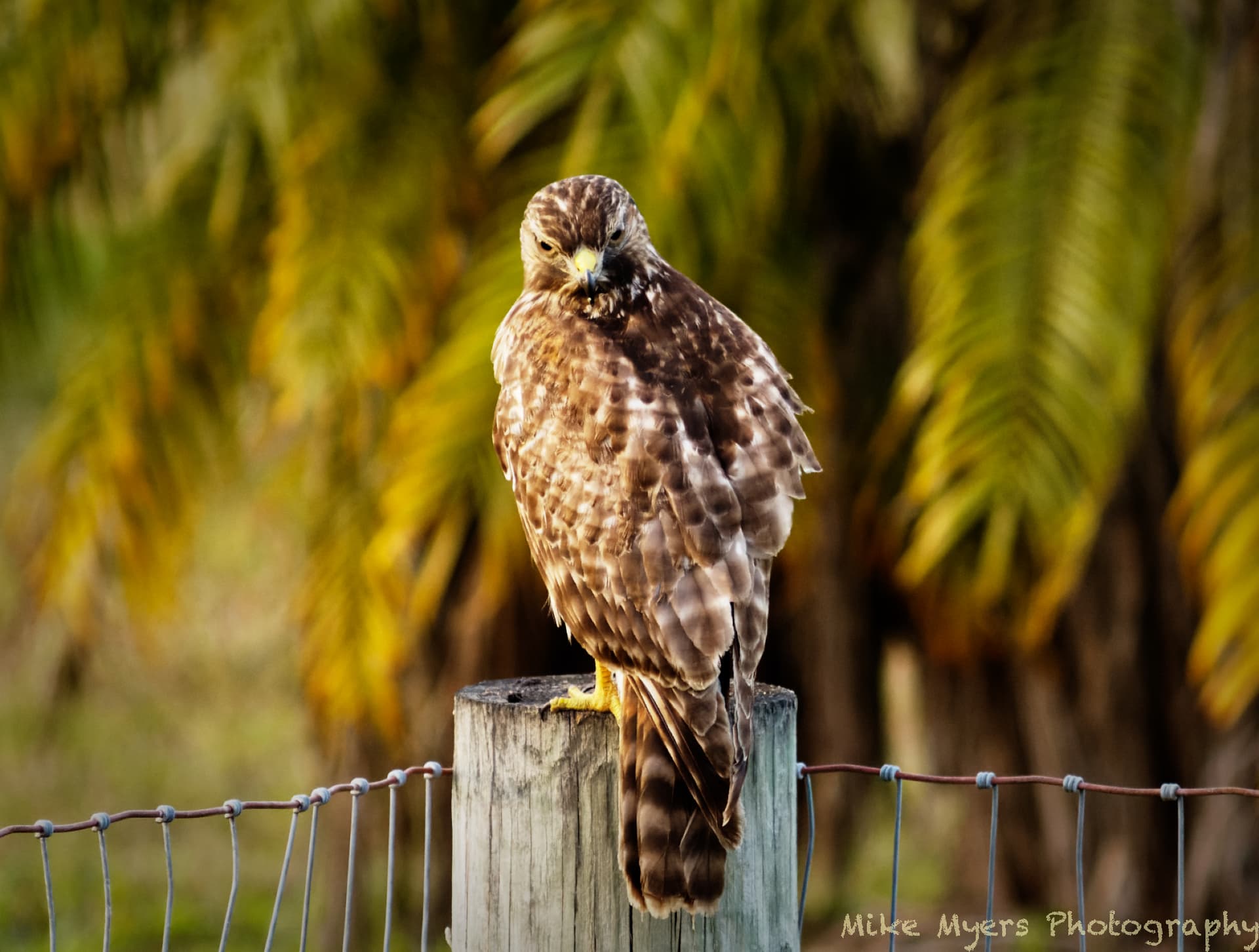
I wanted to try this again, and went back to last winter when I photographed a hawk on a post at my brother’s home. I finally got something I liked. On a whim, I went to convert it to B&W, and started clicking on films, one after another. I stopped here.
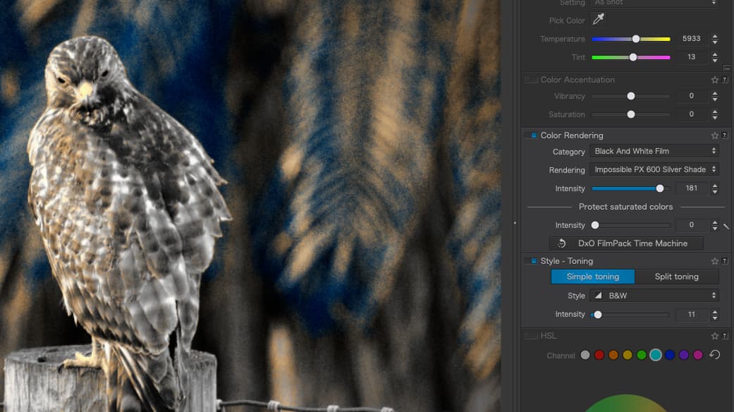
What in the world is “Impossible PX 600 Silver Shade”??? I left the “intensity” at 100, but where did the color come from? It makes the photo look very fake, like a stuffed bird on a post in front of a strange background. If indeed this is a B&W film, I can’t come up with any explanation…
The PX 600 is an old - IIRC - no longer in production instant Polaroid film from Impossible Project.
But why it’s show the color I don’t know.
Is that the default options or a value previously set by you but not reset by PL?
I edited the image in color, and when I finished I started going through the B&W films, one at a time. I don’t know enough to know if I set something unusual, but you can check my .dop file to find out. I was very surprised to find the effect, and left it that way.
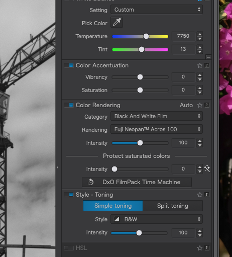
Under “Color Rendering” there is “intensity”, and also after “Style - Toning”, another "intensity.
Messing around with those settings gets the strange colors. If both are set to the default, “100”, I get something reasonable. By messing around with them, yikes!!!
Not sure why the image first showed up with the strange colors, but now I know how to get rid of them - or make them worse/ugly! I’ll no longer select this film for B&W.
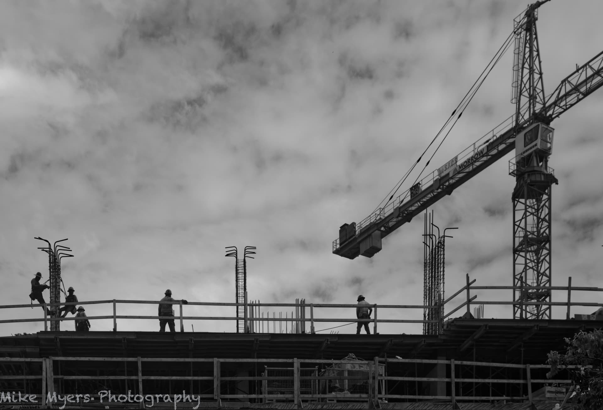
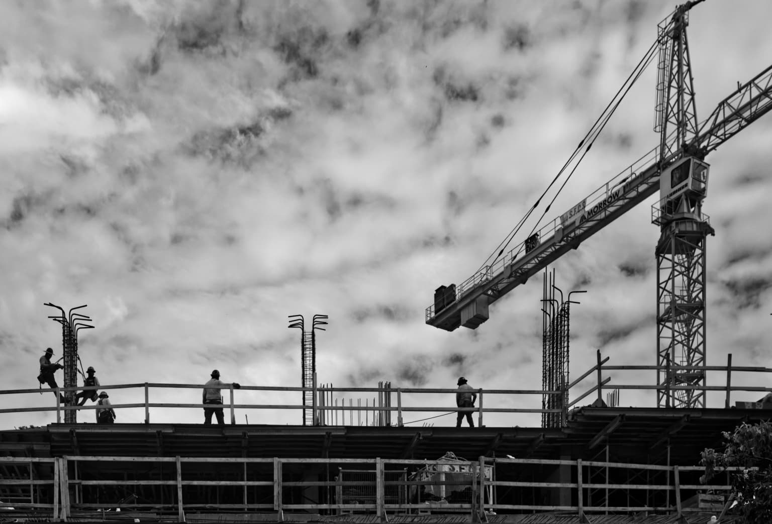
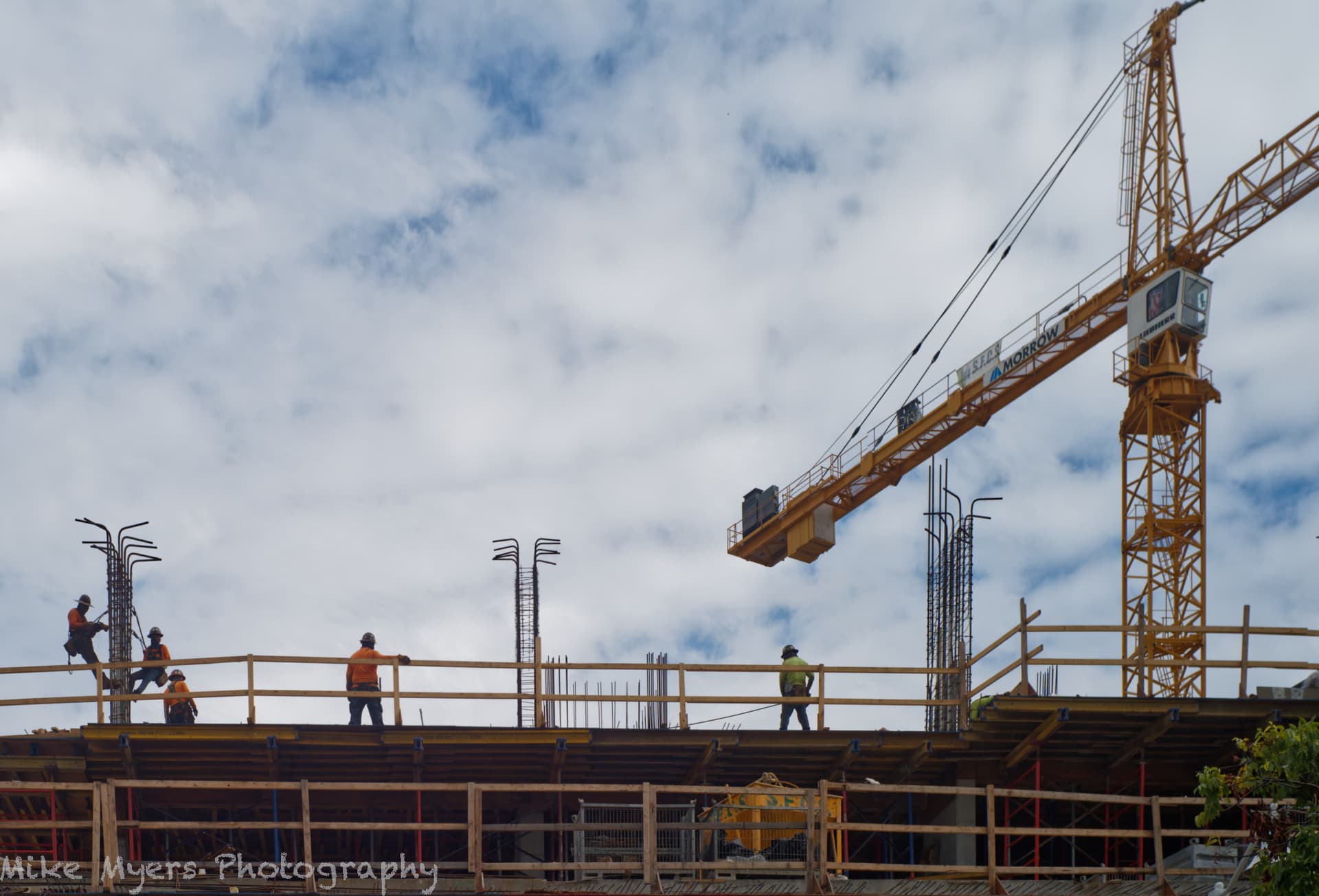
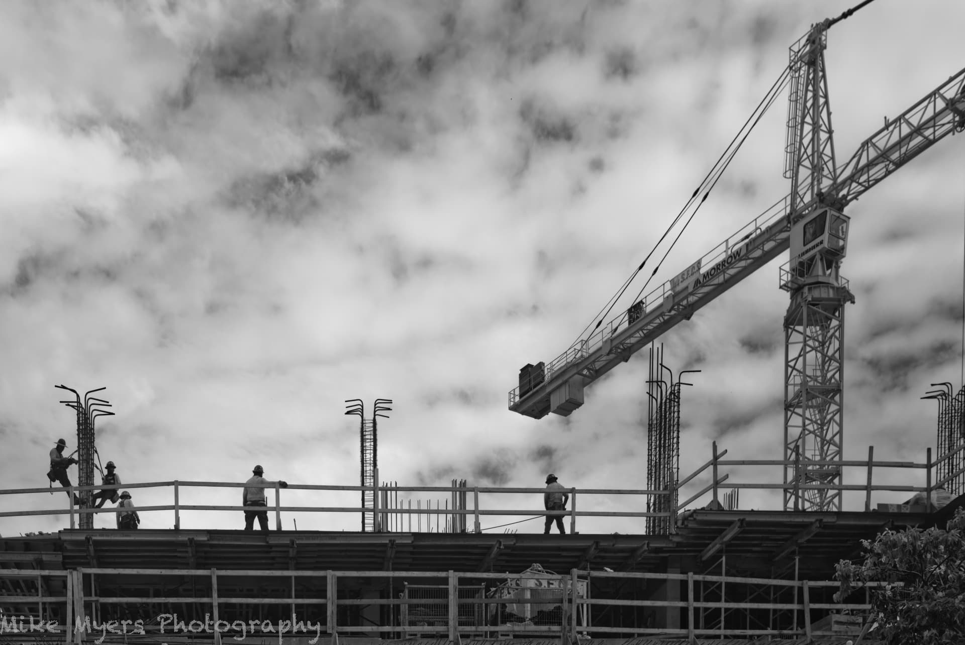
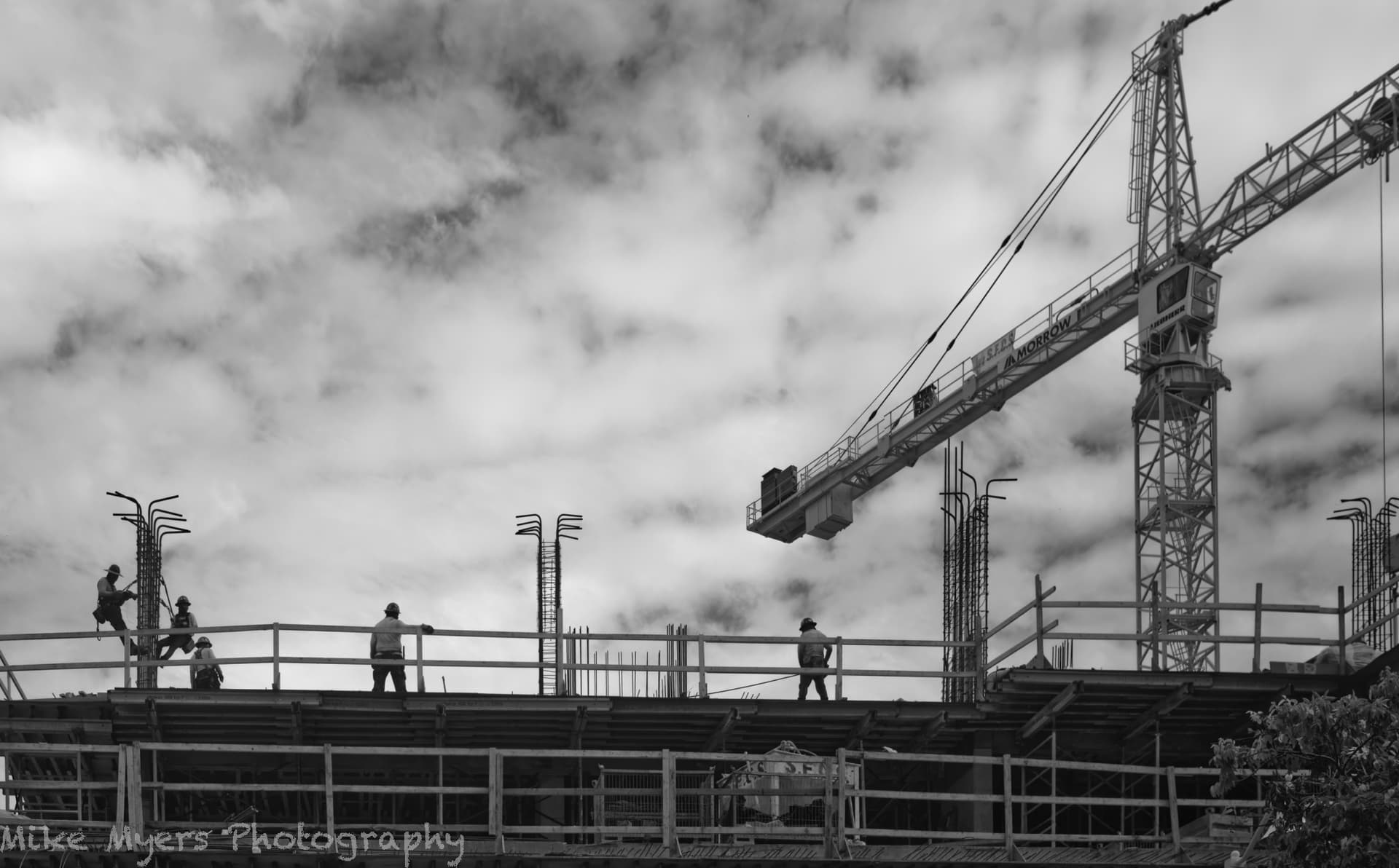
Back to the real world. I went walking today, and took my M10 with a 35mm lens, just looking for something that might be worth photographing. I saw these construction workers, and the crane, and I loved the composition. Taking the photo was easy. Making a color image was pretty easy too. Making the B&W - well, most B&W film simulations lost the sky, but Fuji Neon Acros 100 showed much of what I want. I then used a simple control point to emphasize the clouds.
If I would have taken this image with my film camera, I’d have been pleased. PhotoLab gave me all the controls to make the “geometry” look “straight”, although it really distorted it, a lot. Anyway, I couldn’t see any way to improve it (which I’m sure I’ll learn about in responses to this post), so here it is, for better or worser…
For some reason, you not only applied the Fuji Neopan Acros emulation, you also applied the B&W toning tool. This wasn’t necessary and really messed up the available tones.
You also shot it with a colour temperature of 19,475°K, which gives the colour version a horrendous Donald Trump orange coloration and messes up the tonal separations even more.
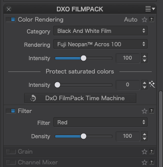
I just used the film emulation and a red filter plus a bit more fine contrast to make the sky more interesting.
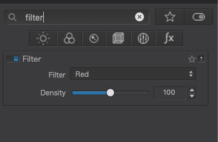
You can see that I properly selected the film, but where is the setting hiding to select a red filter? I found lots of stuff I didn’t want, but to make “blue” darker, I wanted a red filter, which you used so nicely. Yes, your sky is what I wanted, but I might not have thought of adding a bit more fine contrast.
I know it’s my fault, not the fault of PL5, but I hate it when I go to use a tool that I used before (a filter) and can’t find it anywhere. If I type “filter” in the search box, that is no help.
I still have this file open on my screen; I stopped to make dinner, and just now got back to the computer.
Anyway, I changed White Balance to “as shot”. The logical place for the filter selection is under the “Color Rendering” heading, but either I’m blind, or it’s hidden someplace else.
I’'m happy about what I was able to do, and frustrated that I didn’t know how to find the tool I knew I needed!
No complaints - I’m used to not being able to find things. Once you show me, I’ll know where it is for next time!
Maybe I should have left it in color… My current goal though is to learn how to make better photos in B&W, and I’m still trying with the M10. Maybe I’ll find a good scene to put the D780 to good use.
You think? I just checked and found that raising the colour temperature just dulled the whole image and didn’t change the contrast.
The filter tool is apart of the FilmPack palette…
… and searching for it…
Although I think the Color Rendering tool may be part of the Color palette by default. I have arranged my palettes to suit my workflow and, since Color Rendering manages films, I put it on the FilmPack palette alongside the Filter tool, which I would only normally use for B&W work.
Why? You went out to make a B&W image and found one. All you need to do now is continue to work on your “darkroom skills” to improve on the rendering.
BTW, adding in the Toning tool and setting it to B&W does absolutely nothing, unless you want to tint the B&W you already have as part of the Acros film type.
I’ll go to the PhotoLab site in a few hours, and try to purchased the latest additions to their software. I suspect you will beat me to it though, along with many others in this forum.
Maybe I need new glasses, but I already got new glasses.
Maybe PL6 will resolve this - in PL5 I select the B&W film in the Color palette, but the filter is down in the Filmpack palette. Seems logical to me that they should both be in the same place. Anything is easy to do, once you know how to do it. Yes, I applied the red filter and got a sky like yours. I think I will click on RESET to go back to the beginning, clear out all my settings, and do it again knowing a bit more about how to do it.
I will have to seriously consider once again going back to your Workspace, but changed to English. For now, I will attempt to use the PL6 Advanced Workspace, starting tonight. I guess I need to see if PhotoLab has created a PL6 Forum yet?
If I sound frustrated, I’m not. It’s all a learning curve. I wonder if most people create their own Workspace, as you do? For now, I think I prefer to use the default, as little by little I know how to find just about all the tools (all of you refer to) I need (want).
There’s this saying “Practice Makes Perfect”. How true that is. But there’s a lot more to PhotoLab than the tools I already know and understand. I stopped using any of my other editors. Everything is done now in PhotoLab. I have no desire to go back. In the Leica forum, they have all these preferences in Lightroom to get the most out of their new cameras, such as the M11. I ignore all that stuff - one of these days, I want to compare what one of my images looks like with no corrections (straight from the camera with just the “basic” settings), and compare that to what my images look like with the PhotoLab corrections for my camera and my lens. But not today.
If feels like every time I post an image here, I find out about a new tool I didn’t yet understand, or a better way to use (or not use) the tools I do know about. I suspect every so often I need to hit the RESET button and start all over again, as I’ve lost track of all the corrections I’ve made. @Joanna, you ask me why I used some tool, but maybe I was just testing it out, and decided I didn’t like it, but I forgot to un-check that tool. I need to be more careful.
I reset the image, then edited again in PL6, with the corrections and changes as described above, and after re-evaluating what belongs inside/outside my crop. Everything went fine, but it took longer to export, probably because of the new noise reduction tool "DeepPRIME XD"l.
It might sound absurd, but I enjoy the B&W image much more than I do the color image. That’s good, because my goal was to make a perfect B&W image that shows what I felt when I took the photo. To be honest though, I didn’t think much of the image while looking through my small Leica M10 viewfinder. I never really “saw” what was in the photo until I opened it in PL5, now PL6. And to be fully honest, what I saw with my eyes is not what I now see on the screen, after making all the vertical lines vertical. But that adds “something” to the photo, as I can tell things are distorted - I was shooting upwards, way over my head. That creates some kind of “tension” in the photo, which is exaggerated by my settings.
PhotoLab’s default set of palettes is usable and logical in a technical sense, but not necessarily from a usability point of view. I trust Joanna’s workspace to improve usability by a wide margin, but it will stay in the language she set, unless you rename the palettes and save the workspace again in English.
You could edit the workspace file if you wanted in order to rename things, but I suspect that you don’t like to do that.
Been there, done that. I got all the words back to English, and then I made lots of changes.
The default “advanced” workspace seems to be fine, and I’m learning where to find things. After a month or so, I may edit the workspace like last time.
I hesitate, because last time I apparently removed things I didn’t think I would ever need, and then I learned that I did need them, based on feedback in the forum. I may re-organize the order of things, so stuff I don’t use now will be at the bottom. But for several weeks, I will use the default ‘advanced’ workspace. There are more important things for me to work on, mostly learning all the tools that I don’t currently understand, such as the color wheel.
I’m not complaining, in any way. My early attempts at B&W were horrible, looking back at them. Thanks to feedback, they are improving to where I like them.
As long as I remember how to use the tools I need, and where they are in the menu, I’ll be satisfied. The biggest problem has been ME, not the workspace.
I don’t know yet what PL6 gives me, that PL5 didn’t. The single biggest difference I’ve found so far is in noise reduction. I suspect there are many more that I have’t found yet.
Before @Joanna points it out, I tried to make the vertical structures straight up and down, but they looked like they were leaning outwards. So, I deliberately leaned them inwards just a little, which fixed that. Now they almost look vertical, but they are actually leaning inwards.
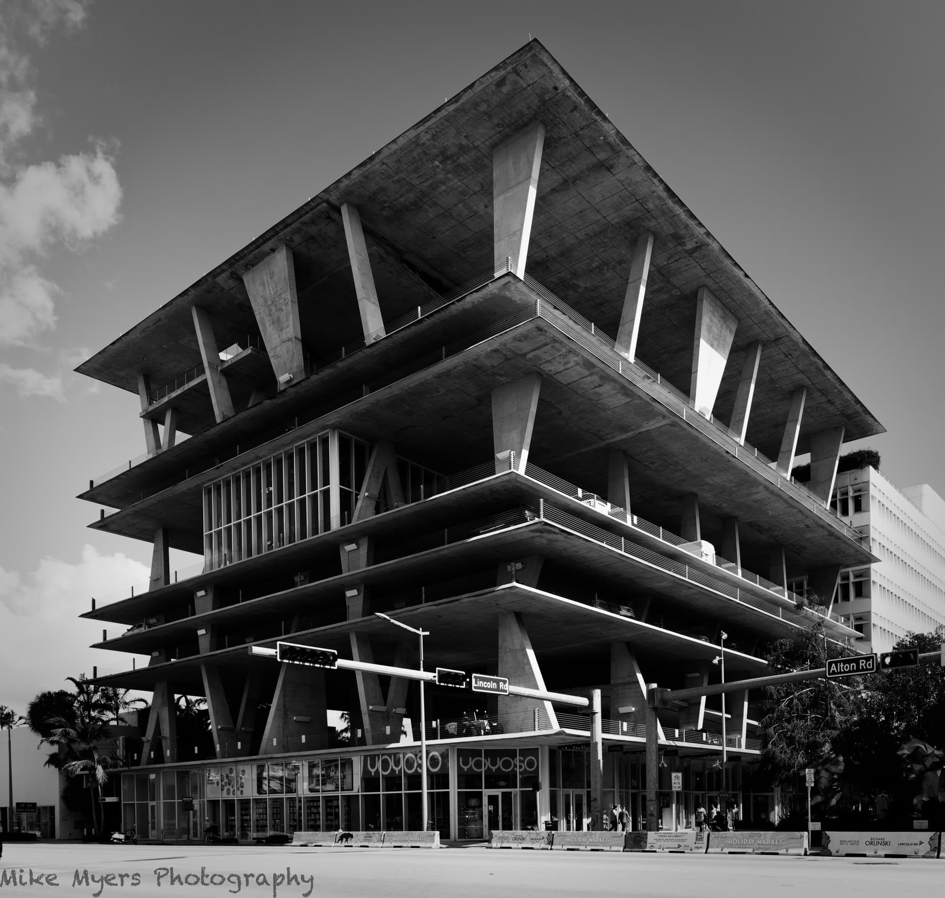
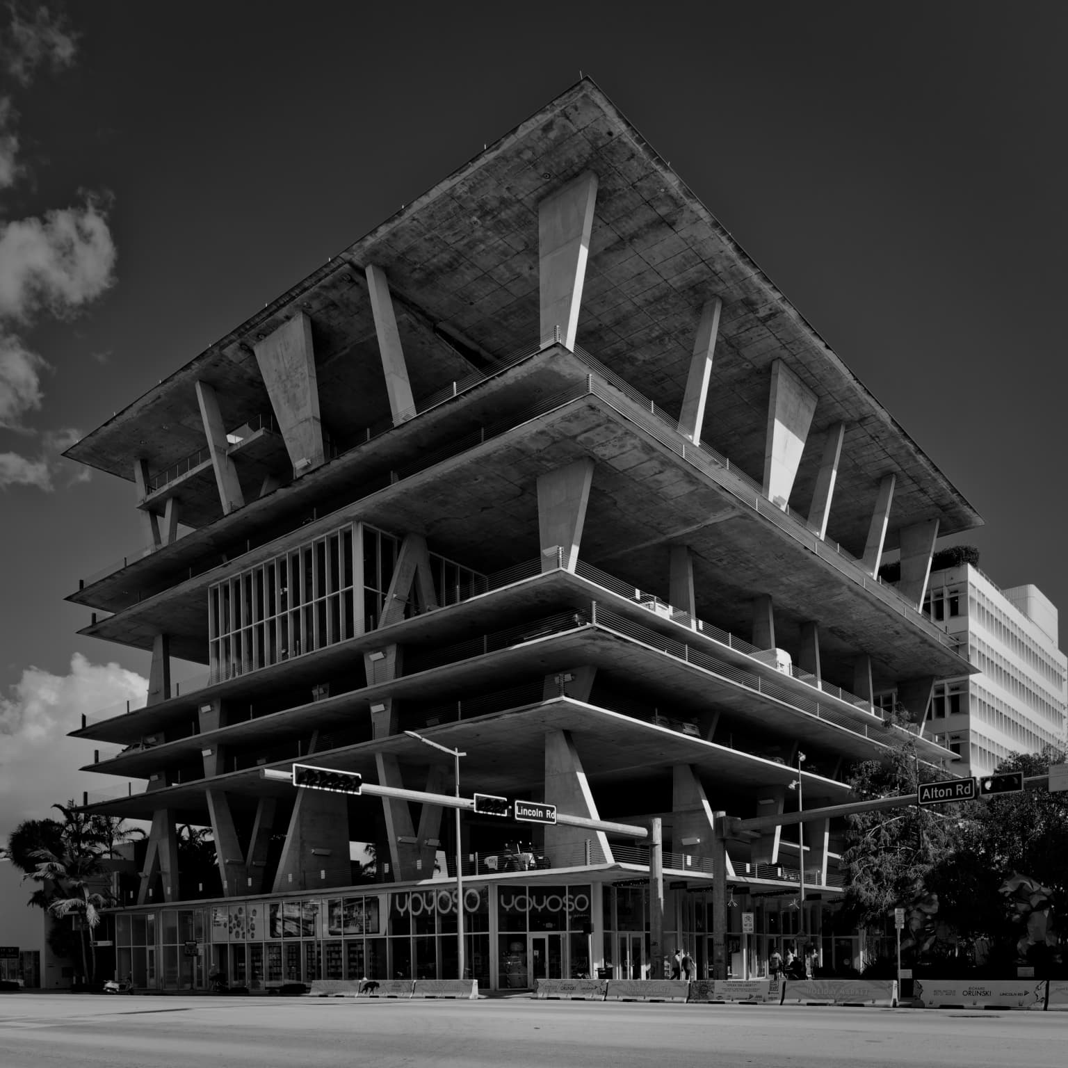
There is a now famous parking garage in Miami Beach, that I have been trying to photograph for years. There is only one spot I know of where I can capture the whole building, and now I’ve got my 20mm lens I could get the view I wanted. It’s certainly not a “journalistic” photograph, as it breaks their rules. I liked it in color, but I like it more in B&W as that puts all the emphasis on the shapes. I hope I cropped it in a way that emphasizes the building. I had to play with the tones, so the histogram looked acceptable, no warnings about exposure. Timing was another problem, as there is so much traffic on this street, I couldn’t exclude it long enough to capture my image - after a while, I had my opportunity. I hope the detail and shapes up above keep people from looking at the boring detail on the ground floor.
When I started to try my 20mm lens, and viewed the images in color, I wasn’t all that excited. With the Rollei Retro 80’s film for rendering, I got a result that exaggerated the shapes, much more than all the details. In doing so, I might have gone “too far”, but maybe that’s a good thing… I think it’s @Wolfgang I need to thank for making me aware of this film.
The idea of my version is to “unify” the tonality of the main building with that on the right and isolate them both by darkening the sky with the red filter.
@Joanna, I prefer your version but I think the sky should be slighter lighter. The arrowhead shaped roof line from this perspective get a bit lost in the sky.